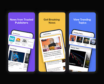
Enhancing Dailyhunt’s App Interaction
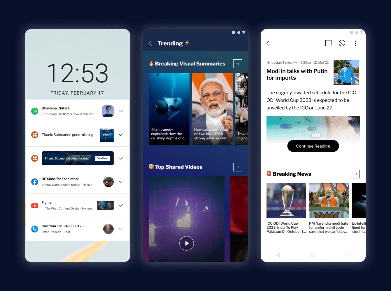
Introduction
Dailyhunt, a platform with 300 million users and content in 14 languages, caters to a sizable group known as thin users. These users have low engagement, primarily interacting through notifications and limited news detail page visits.
Recognizing the importance of engagement, a 2-week sprint aimed to convert thin users into heavy users was initiated.
Goal of the sprint
To come up with potential solutions to increase Thin user engagement in Dailyhunt. And finalize on changes that could be incorporated quickly.
Metrics to be tracked:
Frequency of visits.
Average time spent.
Understanding thin user behavior
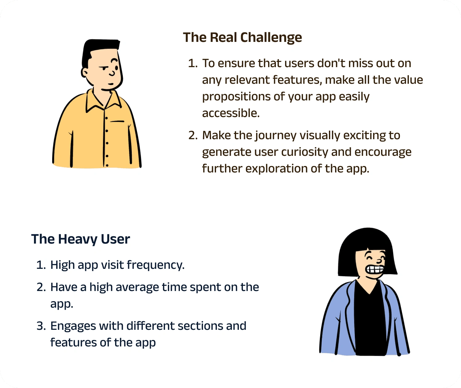
Dailyhunt has broadly 2 active user base
What drives the engagement?
Two primary factors influence the engagement of a user.
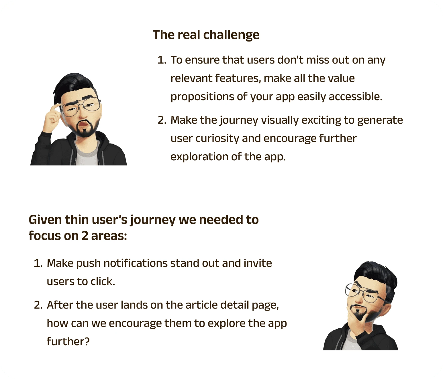
Relevance: If it’s not relevant then it’s not worth engaging.
Curiosity: I won’t engage with it if it doesn't excite me.
Unlike heavy users, a thin user has only a limited time to spend on your app. This leads to the following question
Where does a user spend their time when they are not using your app?
A useful metric for measuring relevance is the amount of time spent on it.. Now looking from the eyes of a thin user if I am not spending much time on your app then perhaps:
I only have that much time to invest
I have enough time, but your app's value proposition is not relevant enough for me to invest more time in it.
If it’s the former then there isn’t much that we can do; but if it’s the latter, then that raises another question
How can a user assess the relevance of the app's value propositions without first exploring the app?
If a thin user comes to this conclusion after exploring your app, there is not much you can do. But if they haven’t explored your app then it’s because:
Effort to explore is quite high.
The app isn’t generating enough curiosity to encourage exploration.
Research
As we had only two weeks to execute the project, we couldn't conduct thorough research. Our primary focus was on analyzing the competitors' strategies for push notifications and visual hooks to engage users on their platforms.
Post analyzing over 20+ apps these were our observations:
Push Notification
The apps that target Android 11 or lower allow users to customize push notifications, making them stand out among other notifications. But this was no longer the case for the apps targeting Android 12 or higher, that promote standardization of all notifications, and there’s only limited room to make any custom changes.
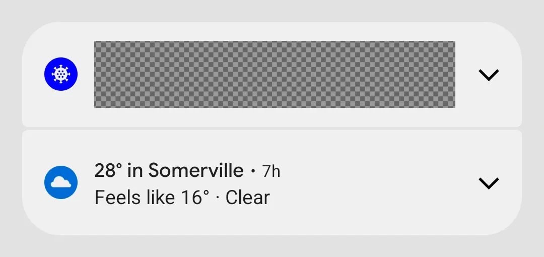
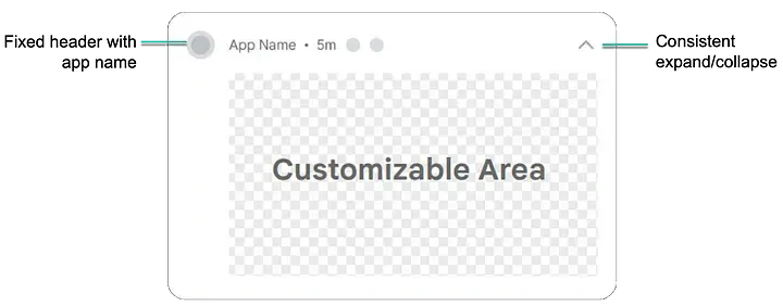
Android notification guidelines: Link here
In the previous version, one had more freedom to customize their notifications with any element. However, the latest Android version has added restrictions and limited real estate for customization to ensure consistency across all apps.
After reviewing the previous experiments, we limited our testing to three parameters.
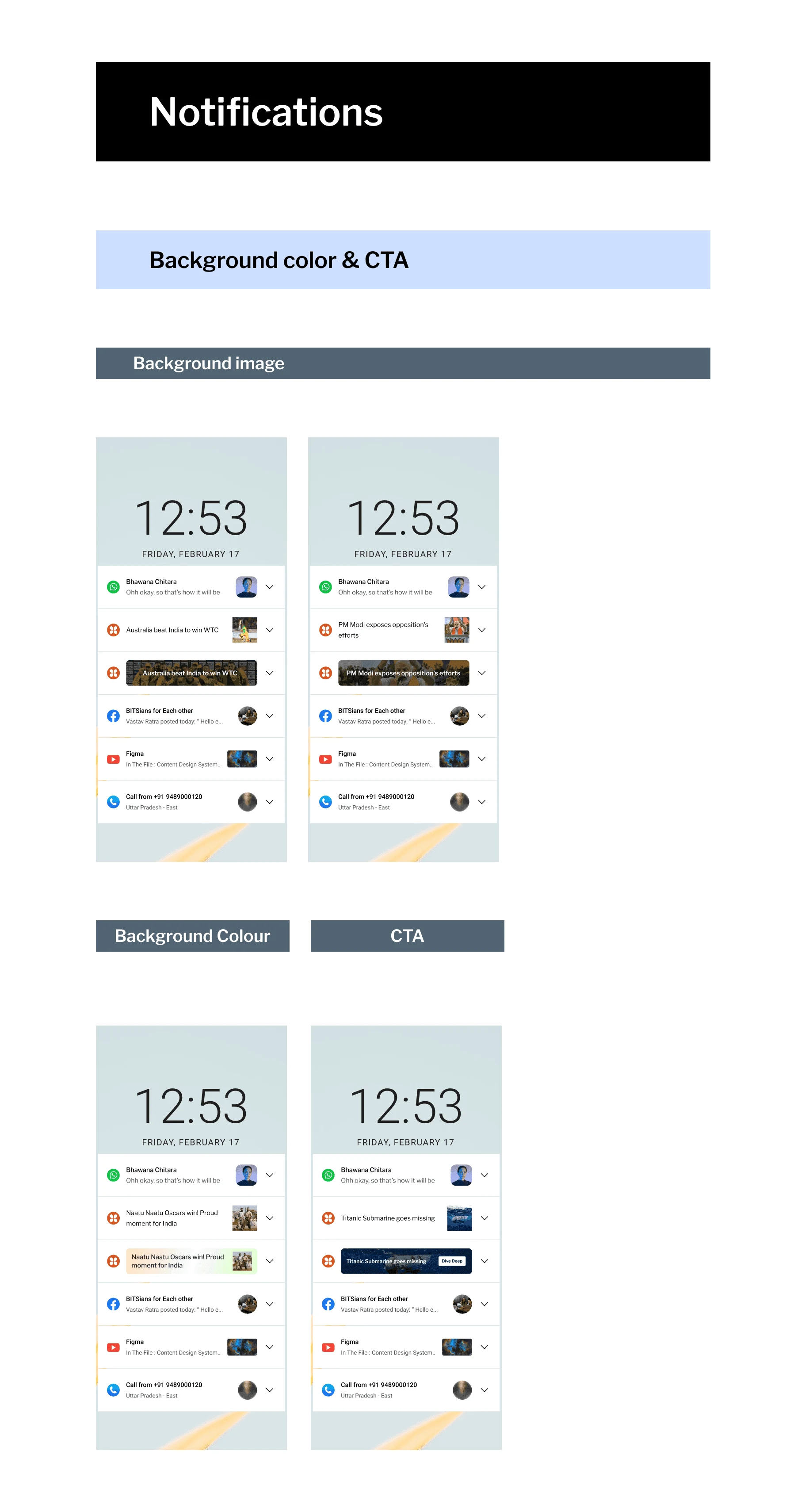
Background image
Background color
CTA
Article Detail Page
After reviewing various competitors, we have identified three techniques to create a visual hook that will engage users.
Feed Intervention: Taking inspiration from a competitor Artifact, the idea is to form a hybrid of both the article detail page and the home feed.
Progressive Disclosure
FAB- Floating action button to enable zone discovery via curiosity.
Design and execution
Push notification
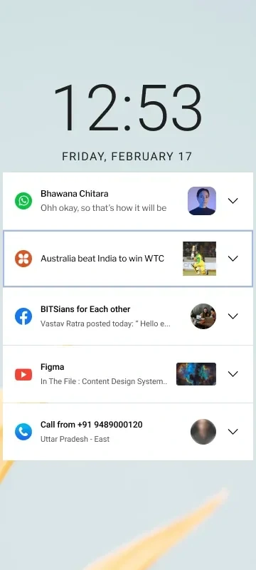
Notification challenges
To make the notification stand out in the sea of notifications
Make it inviting enough for the user to engage with it.
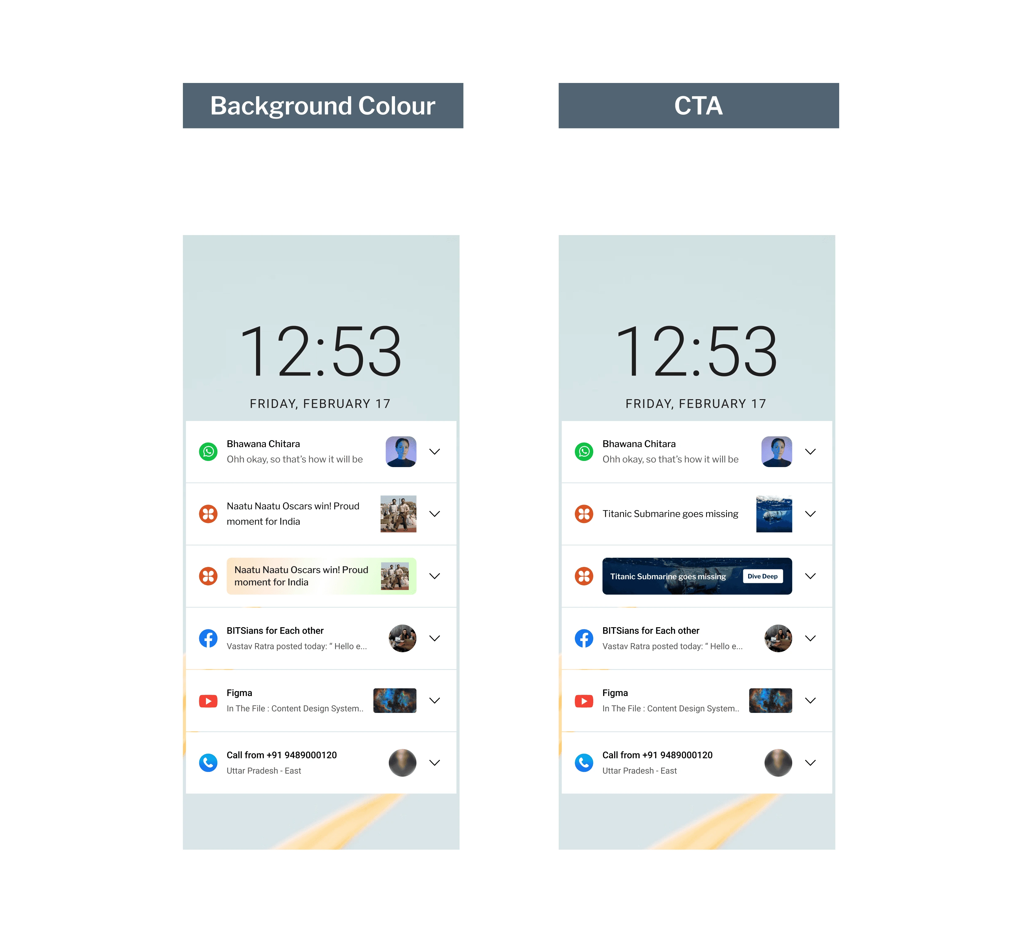
As we discussed earlier, we have developed notification variations based on three parameters.
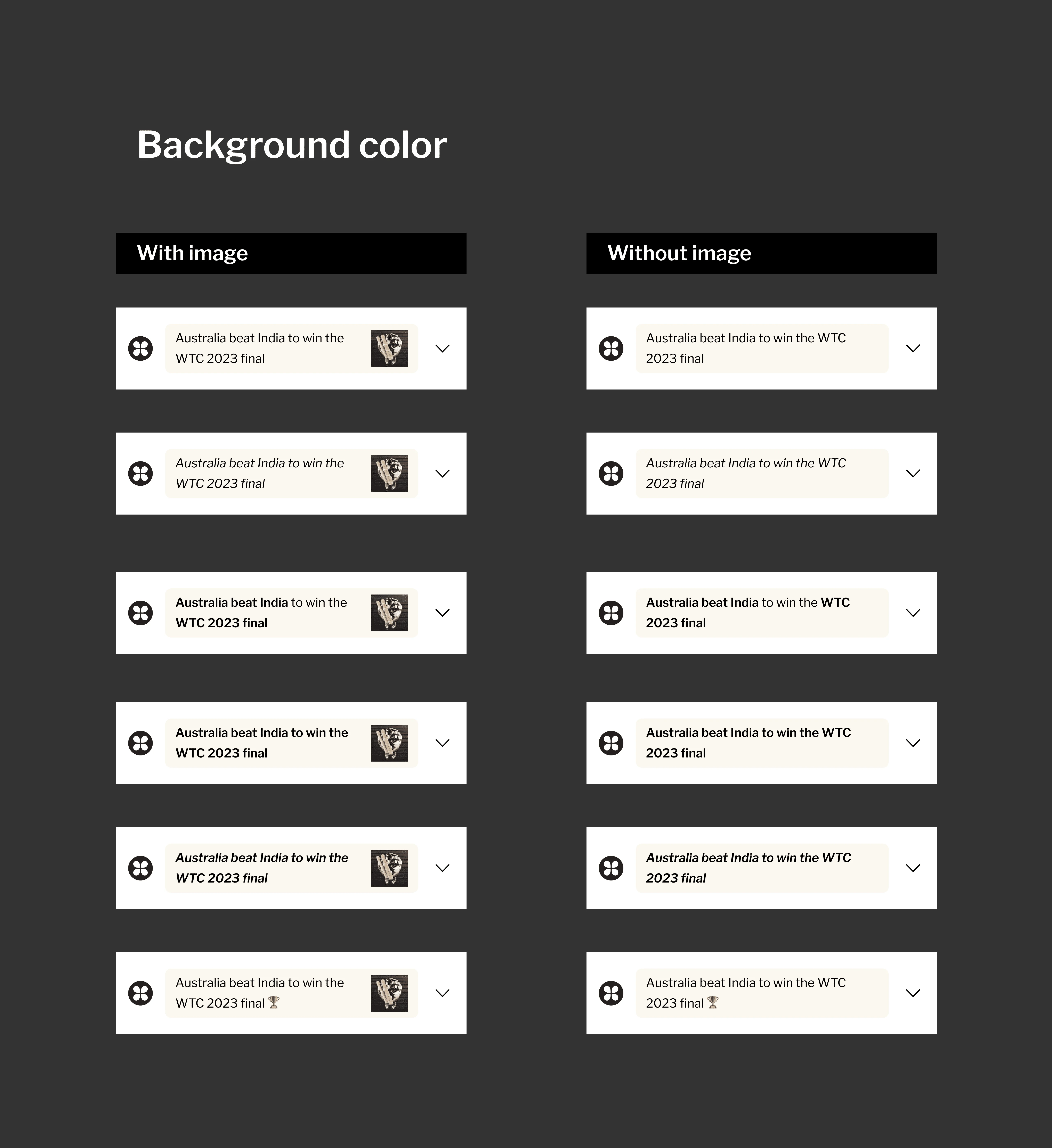
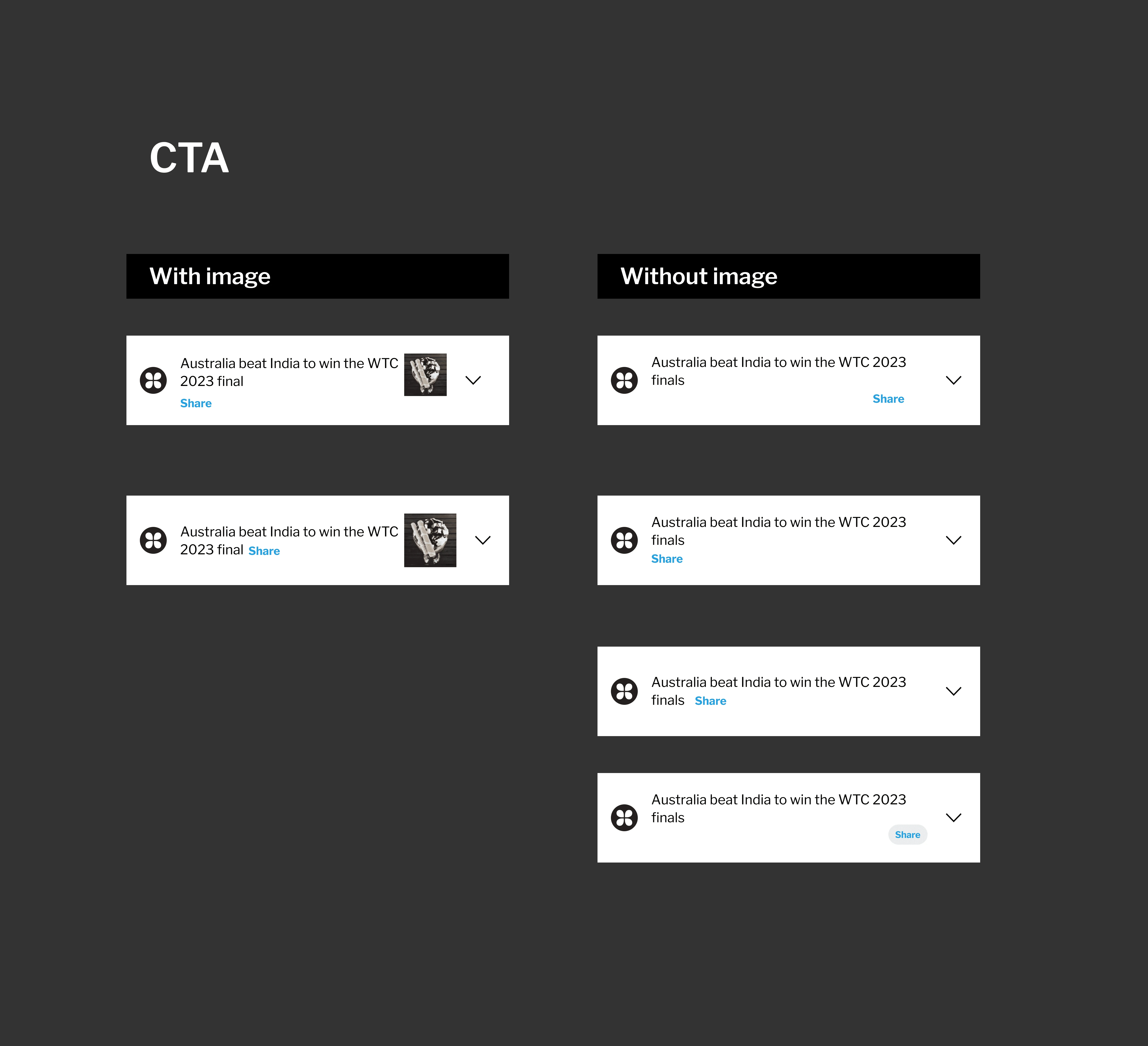
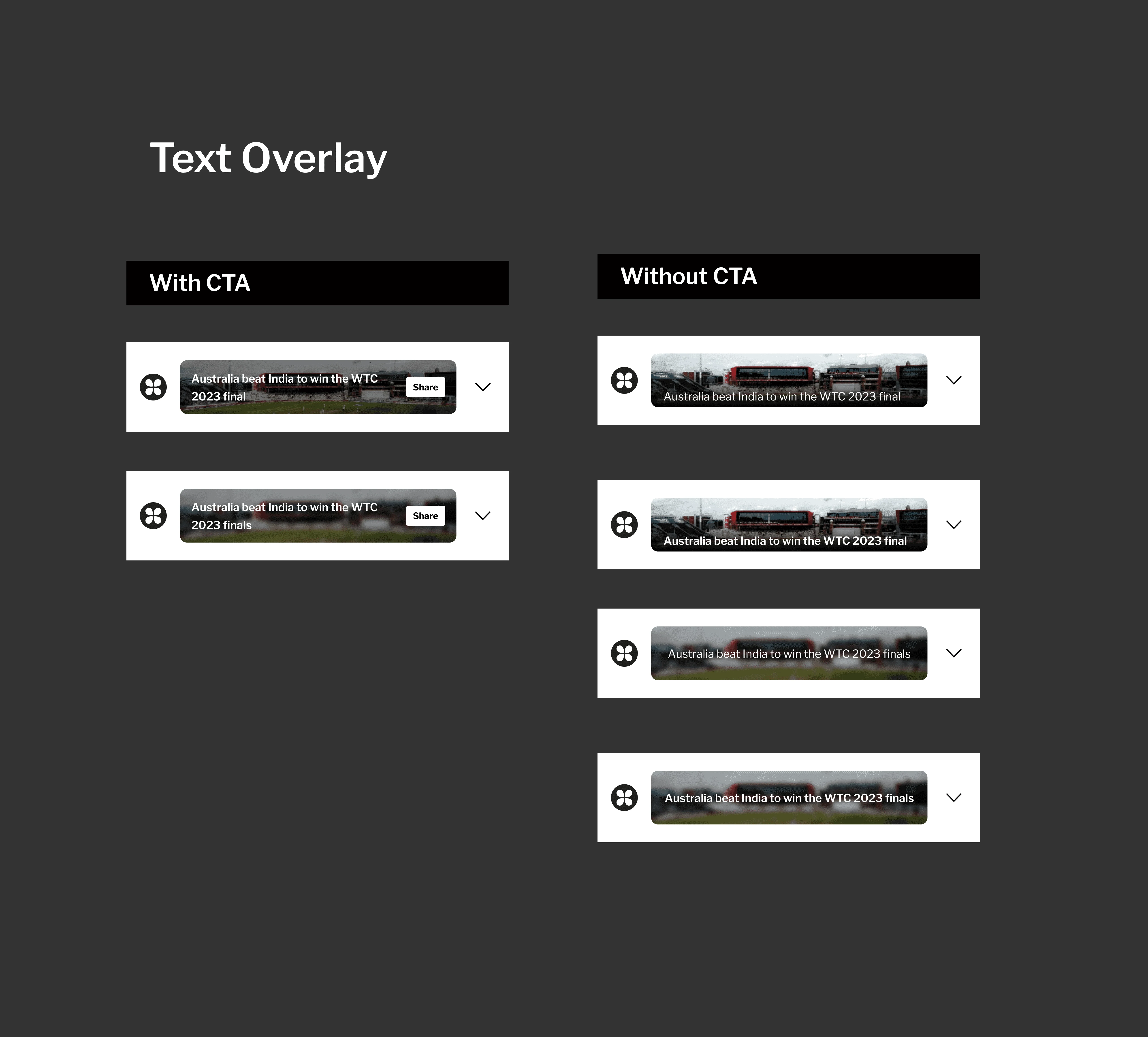
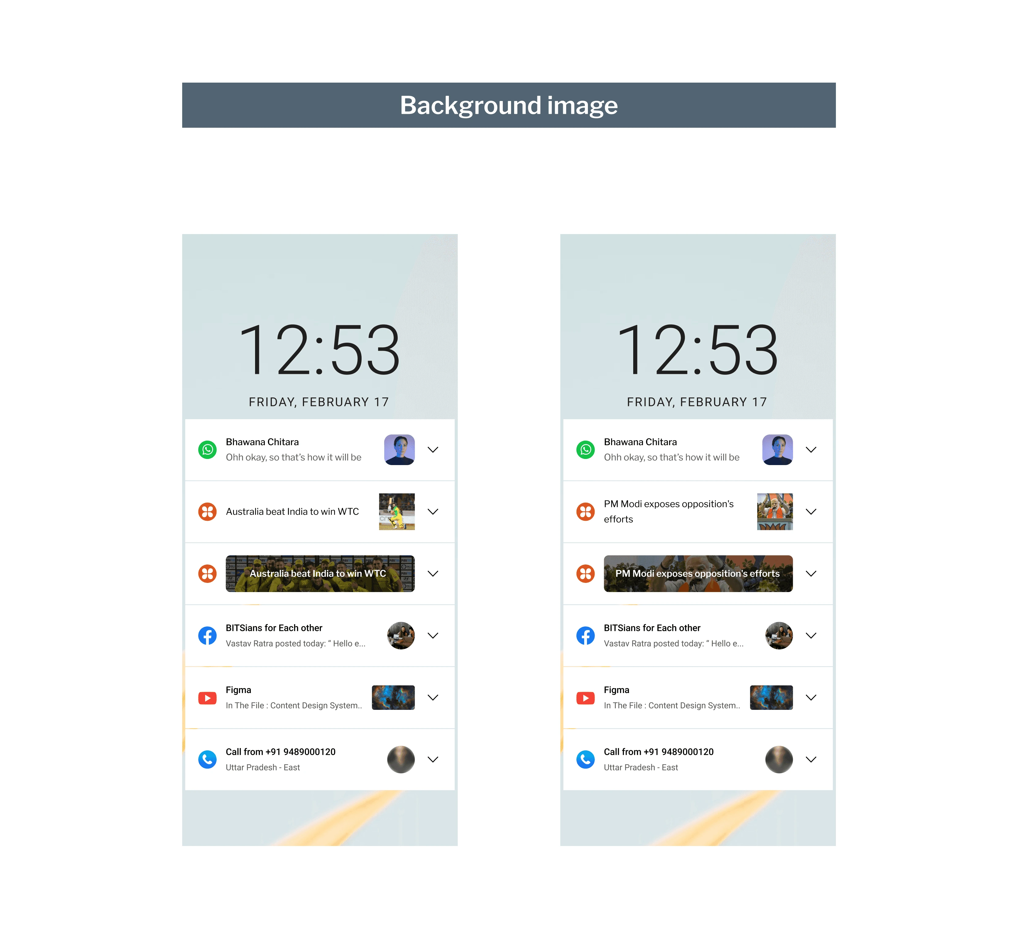
We compared the variants against the notifications of the most used app and the current Dailyhunt notifications. Eventually, we narrowed down the variants for experimentation.
New Dh notifications against existing and competitor notifications- LTR
Detail page
Detail page challenges
Most users don't scroll down on detail pages, missing interesting sections.
To prevent users from exiting the app directly from the detail page.
Feed interventions

This is what the Dailyhunt home feed looks like. Which shows 1.5 cards in the first fold.
Advantages of home feed:
The app has a topic bar and a bottom bar that are available to facilitate easy exploration of the app.
It's easy to find interesting news articles by browsing through different ones.
Users who don't scroll to the bottom of an article miss out on exploring the app. So we decided to follow a Feed Intervention approach.
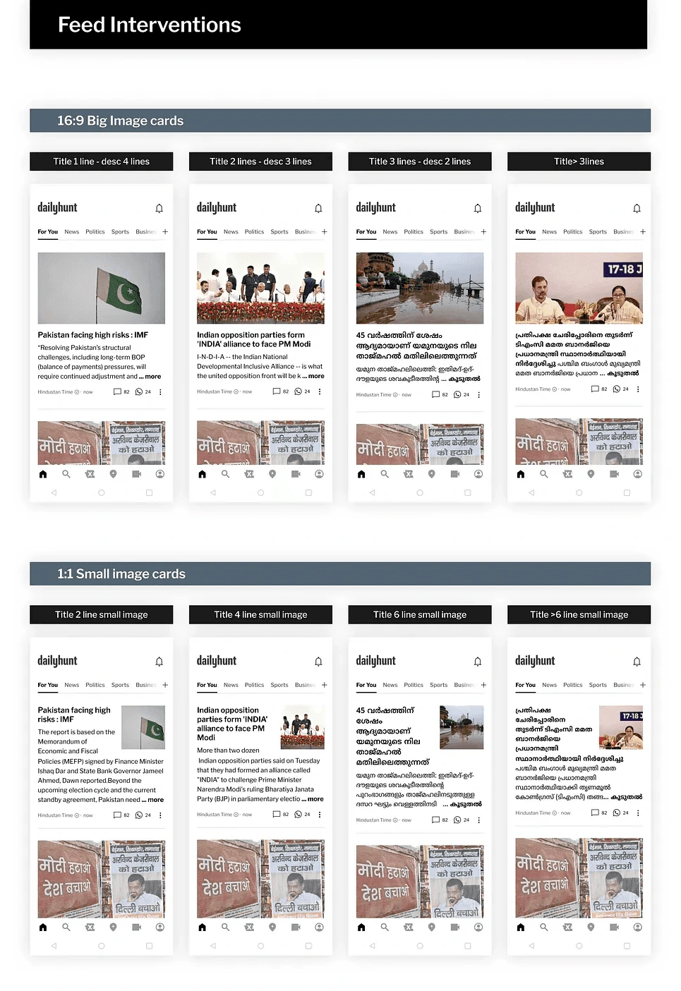
The idea behind Feed Intervention was:
To provide a different journey for a thin user after clicking on a notification.
Users will now be redirected to the home feed instead of directly landing on the article detail page.
The first card in the home feed will display the news article that the user clicked on via notification.
In this card, we display a short excerpt of the article to let the user decide whether to read more or not.
On the detail page, users have to scroll all the way down to find something interesting.
Exploring requires less effort with the added benefits of a feed.
Constraints and Challenges
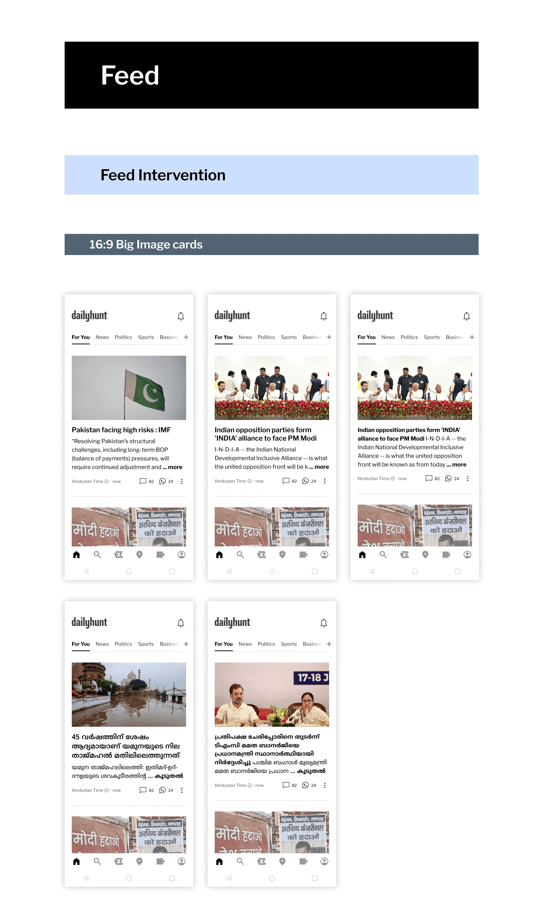
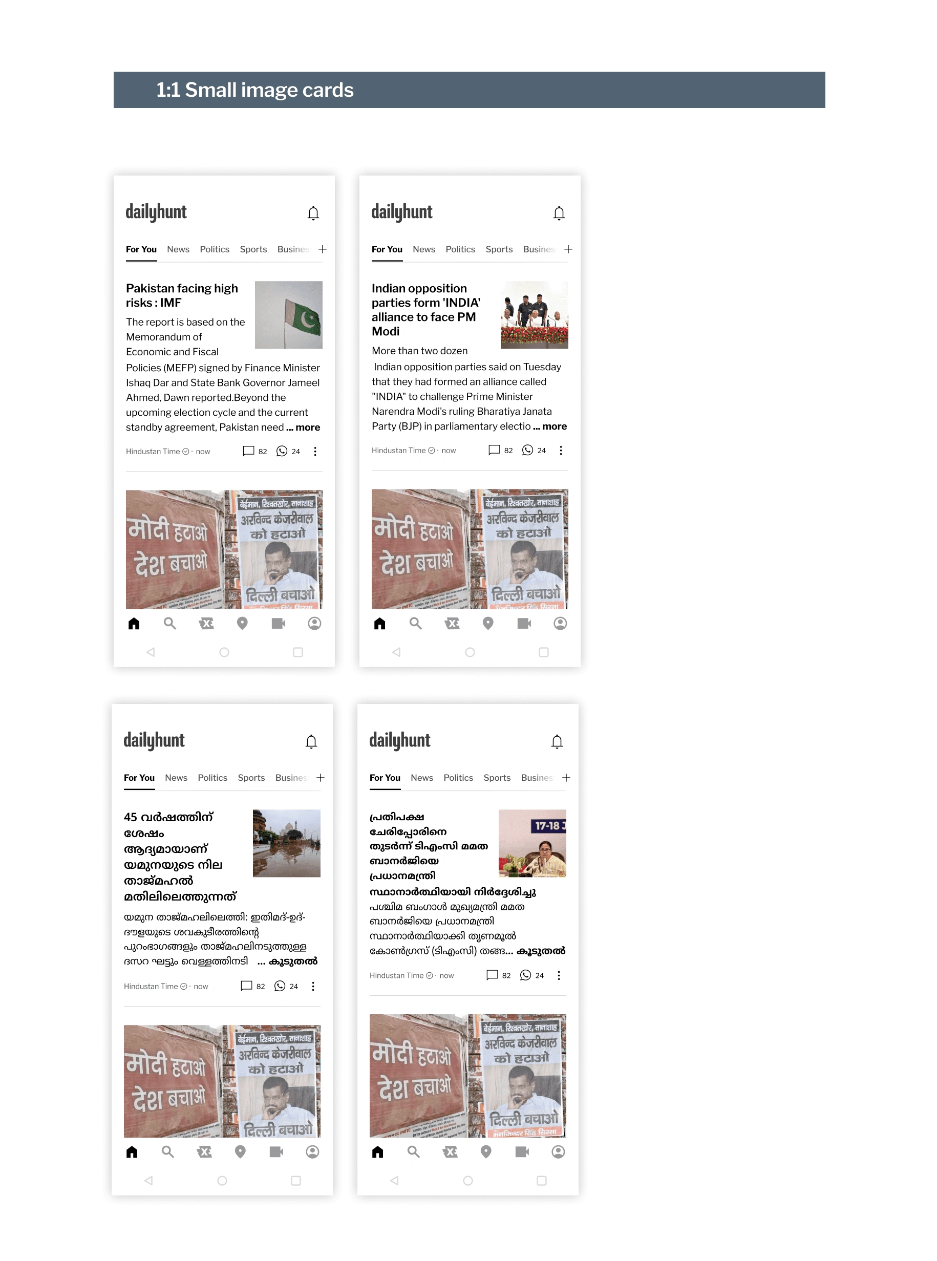
We set the size of the first card to show at least 30% of the second card on the feed without scrolling.
With Dailyhunt being available in 14 different languages, a two-line title in English may become a four-line title in Malayalam. This leaves limited space for the main news to be displayed on the card.
Hence, we created separate card designs for different cases, as displayed in the above examples. The cases were defined based on:
Image Size
Lines occupied by the title
Moving on to the next experimentation, FAB.
FAB ( Floating Action Button )
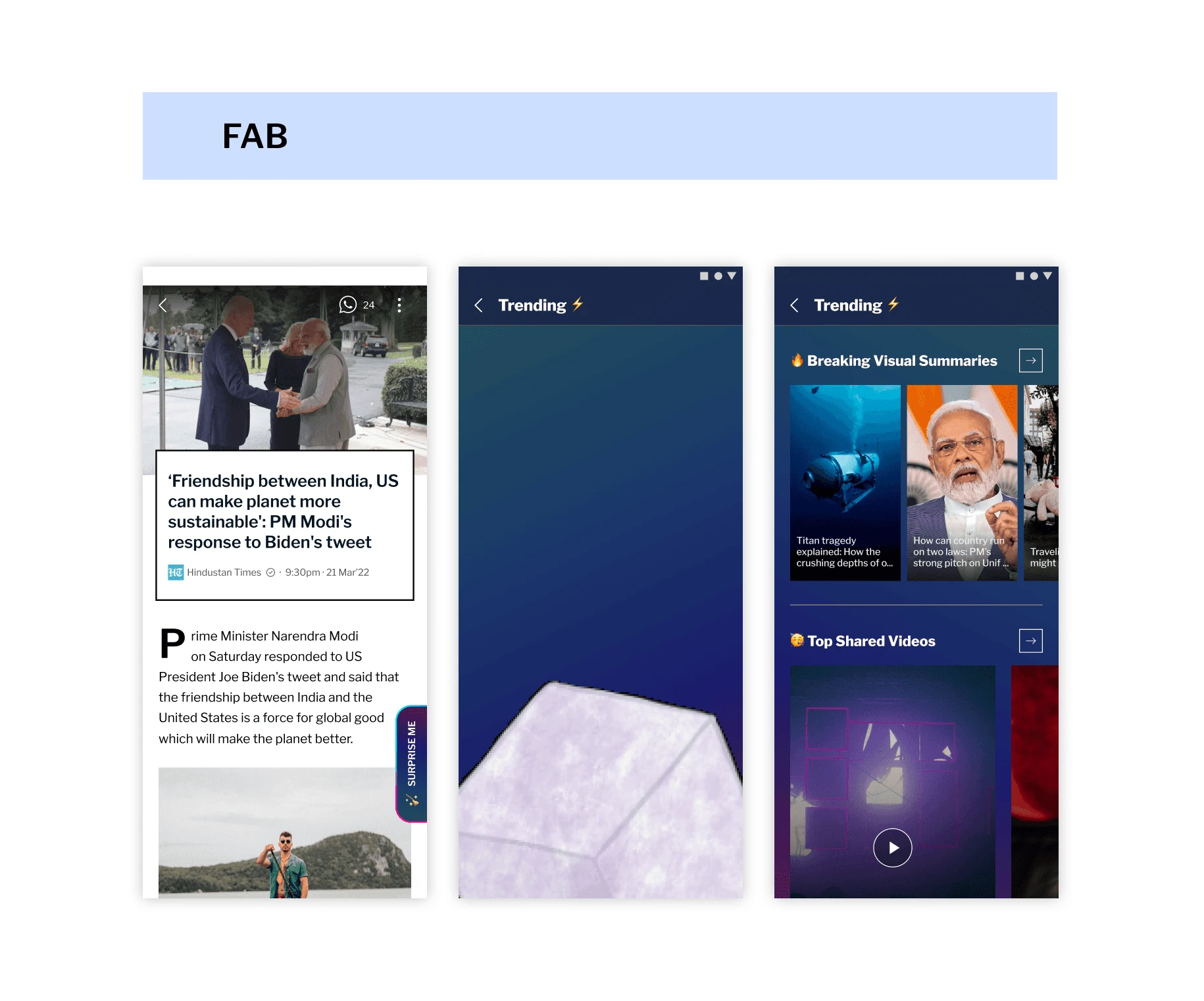
The FAB (floating action button) was created to encourage users to explore. Even if the user does not scroll down the page, an attractive FAB can pique their curiosity and entice them to click on it. Once clicked, the user will be directed to a distinctive section where they can easily interact with all available app formats.
The more time a user spends on the app, the better we can understand their preferences. This allows us to show more relevant content on both the feed and notifications, creating a proper feedback loop.
Partial disclosure
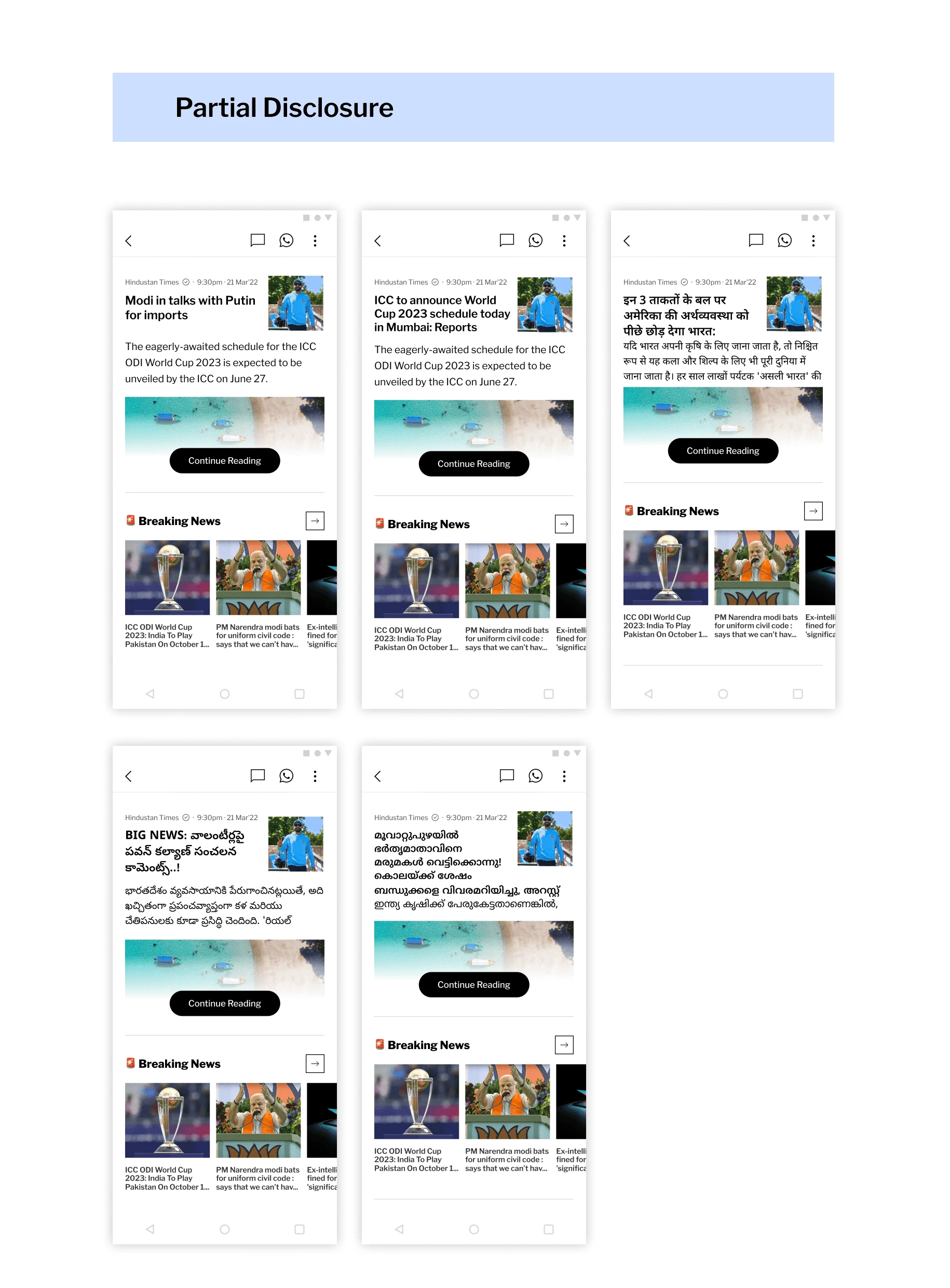
Partial Disclosure is a technique that can spark curiosity by revealing only a portion of the complete image. If this idea is applied to the articles on the detail page, it would allow the user to determine whether they would like to read the whole article or not. Simultaneously reducing the efforts for the user to further explore the app. These are the variations we came up with:
Swipe up to go to the home feed:
In this variation, the user is shown both the article and the home feed, prompting them to take action.
As we spend a lot of time on other apps, our first instinct is to scroll. On this platform, when you scroll, you land on the home feed, which allows you to easily explore articles. This is done in a seamless manner.
2. Swipe up to go to explore more section:
After swiping up you will land on to explore more page with the top bar gone and turned into a back FAB.
3. Continue Reading to Detail Page
Clicking on the continue reading button will take you to the detail page of the article.

Disclaimer
These designs are preliminary and subject to further improvement based on testing insights.
Results and impact
A beta testing was done for the given designs and these were the results
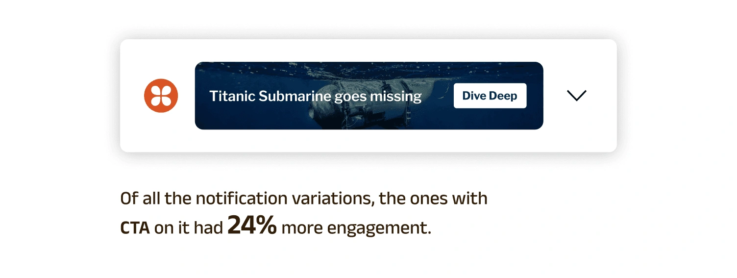
This indicates the need to prioritize CTA-based notifications and find ways to enhance them for better engagement.
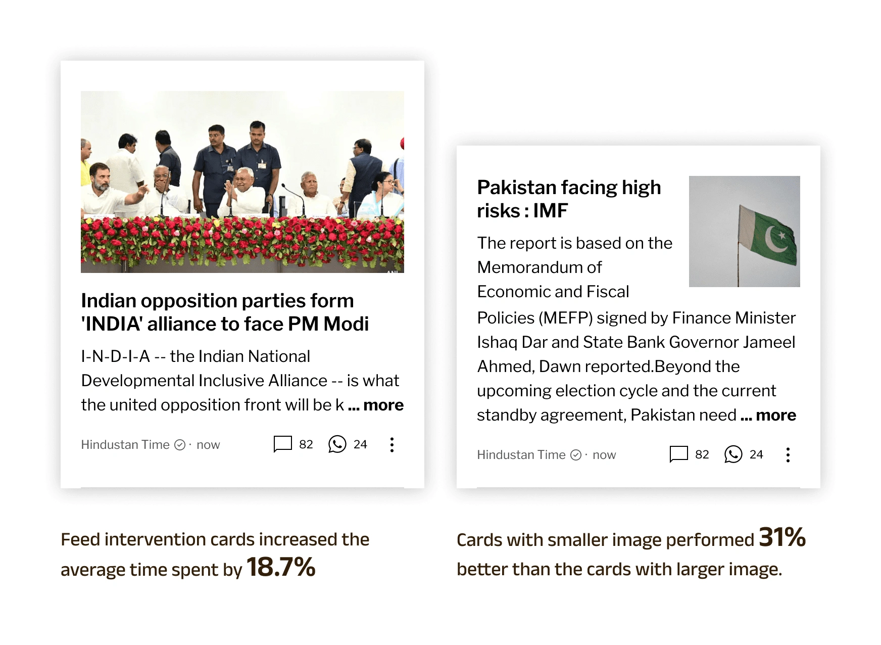
Proving Feed intervention to be an effective method to increase thin user engagement.
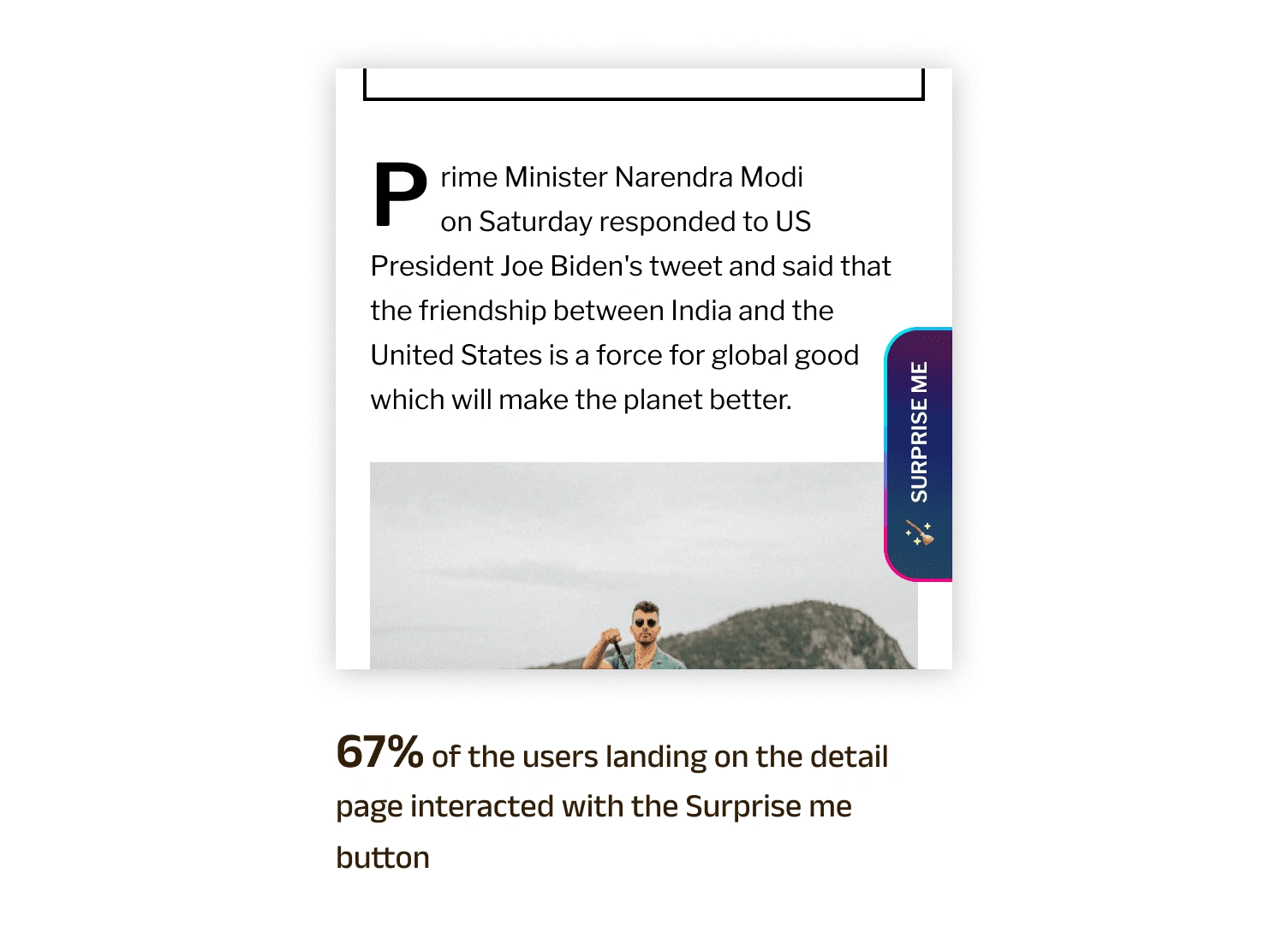
This confirmed our hypothesis that a Thin user would engage with an element that piques their curiosity. The next step would be to re-evaluate the page this button will take the user to. So that the user isn’t disappointed after clicking on the FAB.
Key learnings.
It’s important to understand the emotional journey a user undergoes while acting.
Avoid using click-baits to drive curiosity as they can cause more harm than good in the long run.
Prioritizing our designs based on the Effort-to-reward ratio.
When working on a sprint, don’t aim for perfection. Begin with a decent solution and iterate as you progress.
When creating an application that supports multiple languages, it is crucial to take into account all possible scenarios and corner cases.
Like this project
Posted Mar 18, 2024
Tackling low engagement on Dailyhunt by aiming to increase how often and how long occasional users stay. And exploring smart solutions to enhance their experien


