
VERUM is a concept brand for a real estate advisory, where clients buy judgment before they buy property. The brand had to feel calm, cinematic and certain, because the people it speaks to are making the biggest decisions of their year.
I designed the identity and the website as one system, then built the site in Framer.
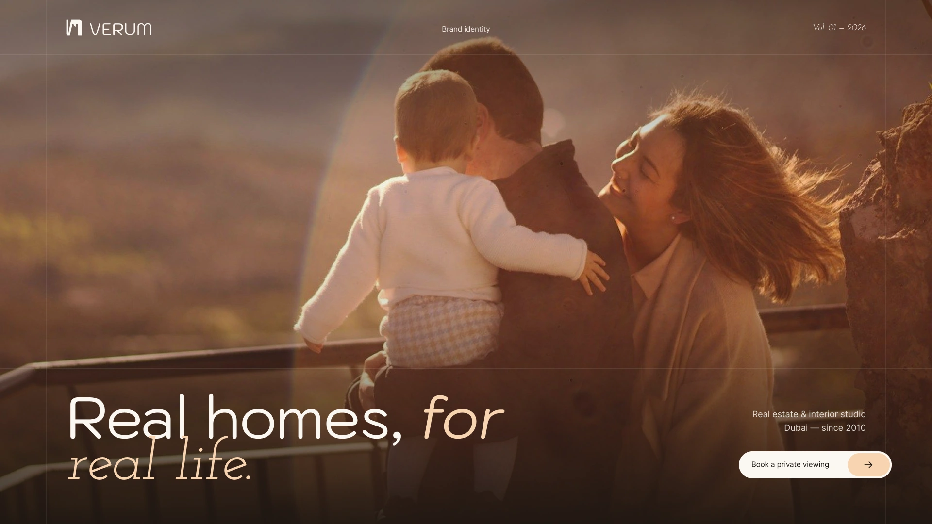
VERUM brand opening frame
The challenge
Trust, not hype. Real estate sites tend to shout. An advisory has to sound like the calmest person in the room.
Cinematic without noise. The brand needed movement and atmosphere, but effects could never get in the way of the message.
One look everywhere. The same identity had to work at billboard scale on the website and at a few pixels on a business card.
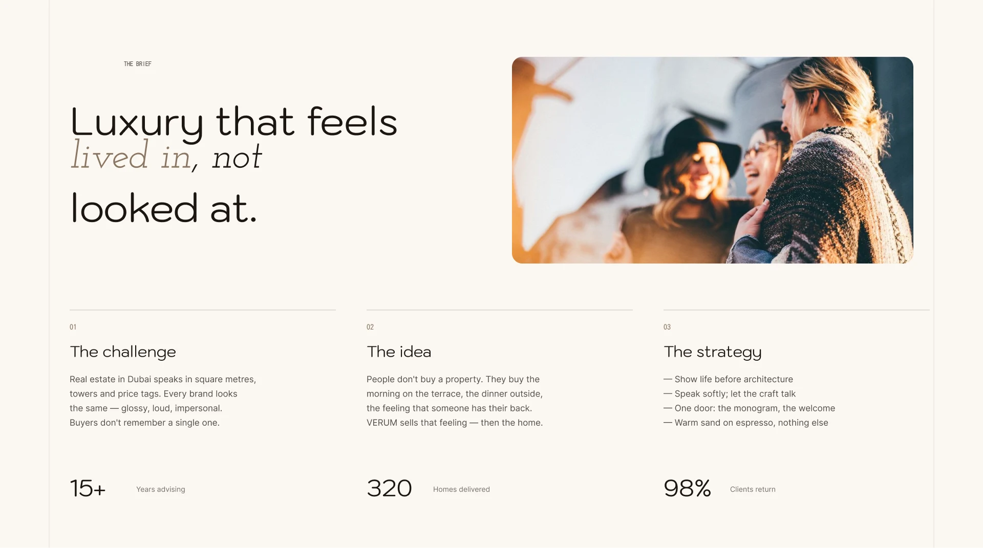
The brief
The idea
Borrow the language of cinema: framing, contrast and timing. Every page is treated like a shot, with moments of impact and quieter frames to read and pause. That one decision shaped the logo, the layout and the motion.
The mark
The logo is the anchor of the system. It holds the identity together in large expressive compositions and in small functional uses, and comes in a set of lockups.
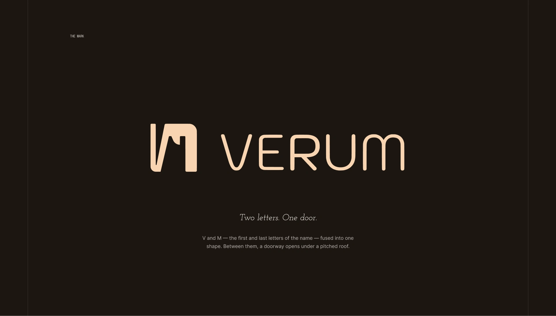
VERUM logo
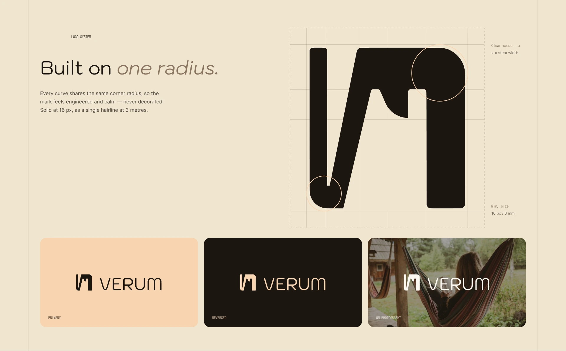
VERUM logo system and lockups
The website
The site opens on location: a full-bleed hero that sets the mood before a word is read. From there the pages run as one continuous sequence rather than separate screens, and each transition carries the visitor forward.
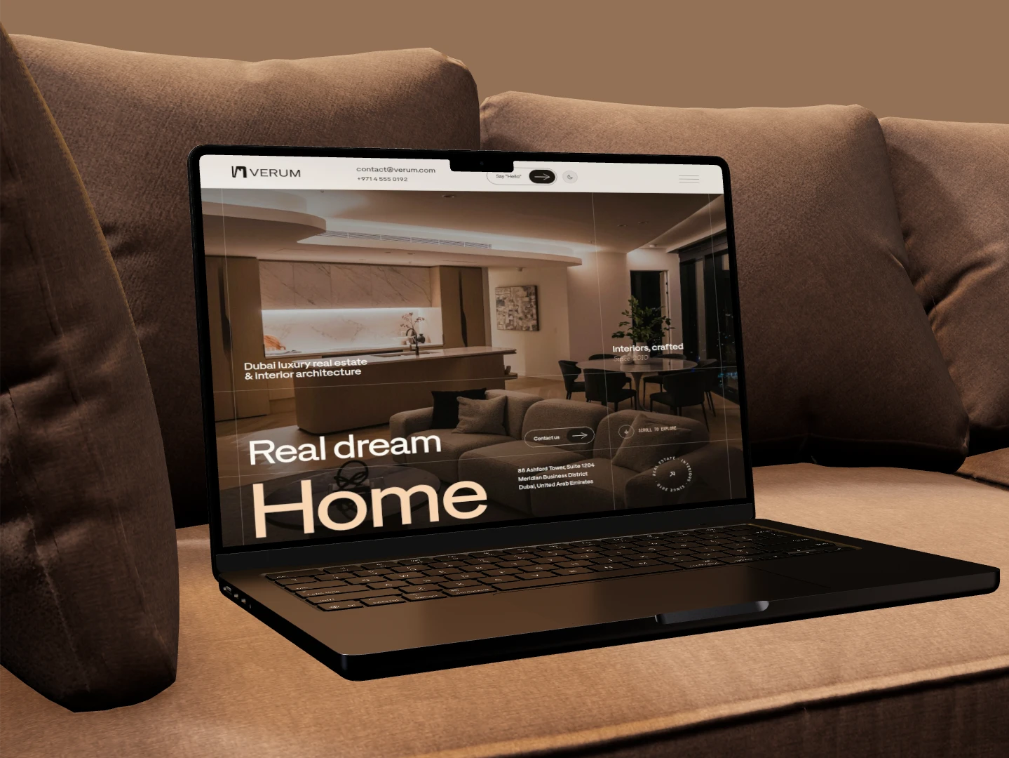
Hero section

Home page, full scroll
In use
The system carries the same energy from the website into social media and stationery. Typography, colour and composition stay consistent, with room for the brand to shift in tone and scale.
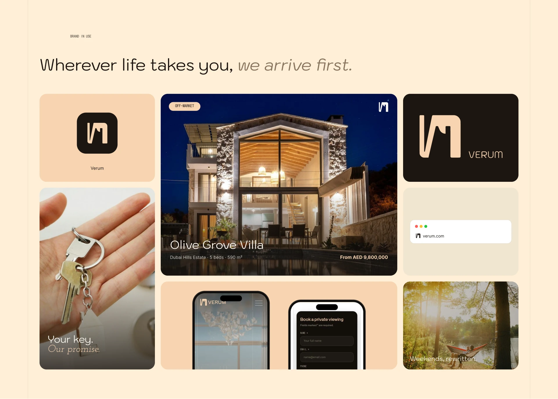
Brand in use
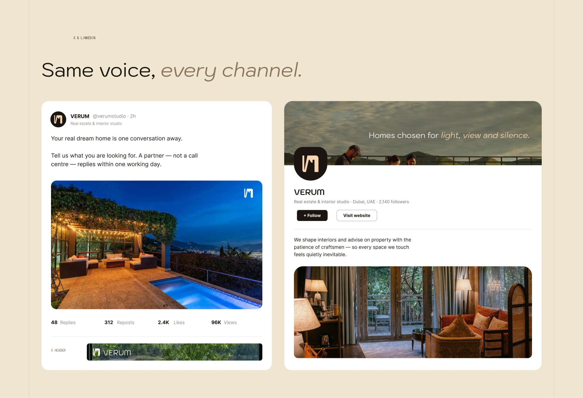
Social media applications
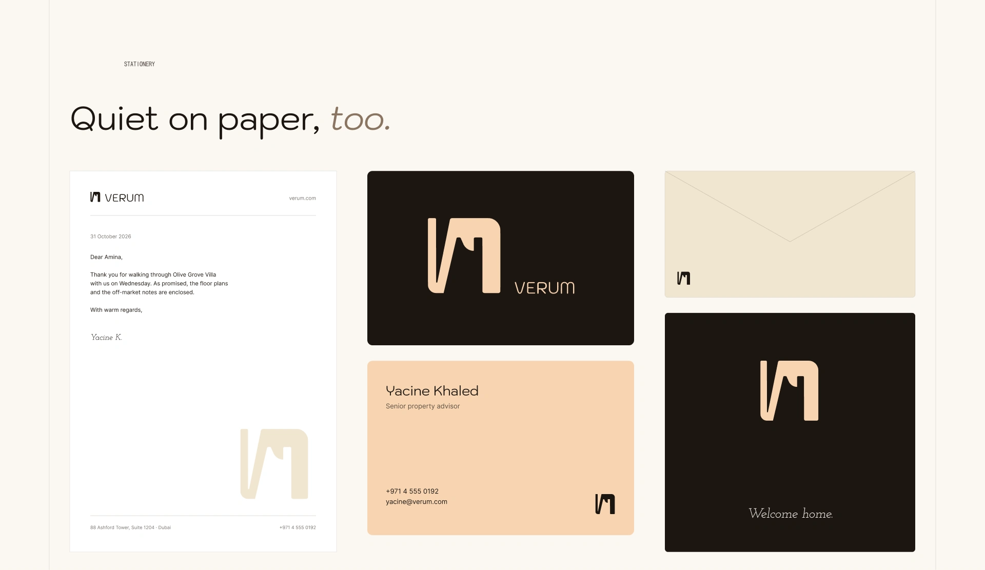
Stationery
Built in Framer
Designed in Figma and built in Framer, with responsive layouts and scroll-led motion. The live site is linked on this project.
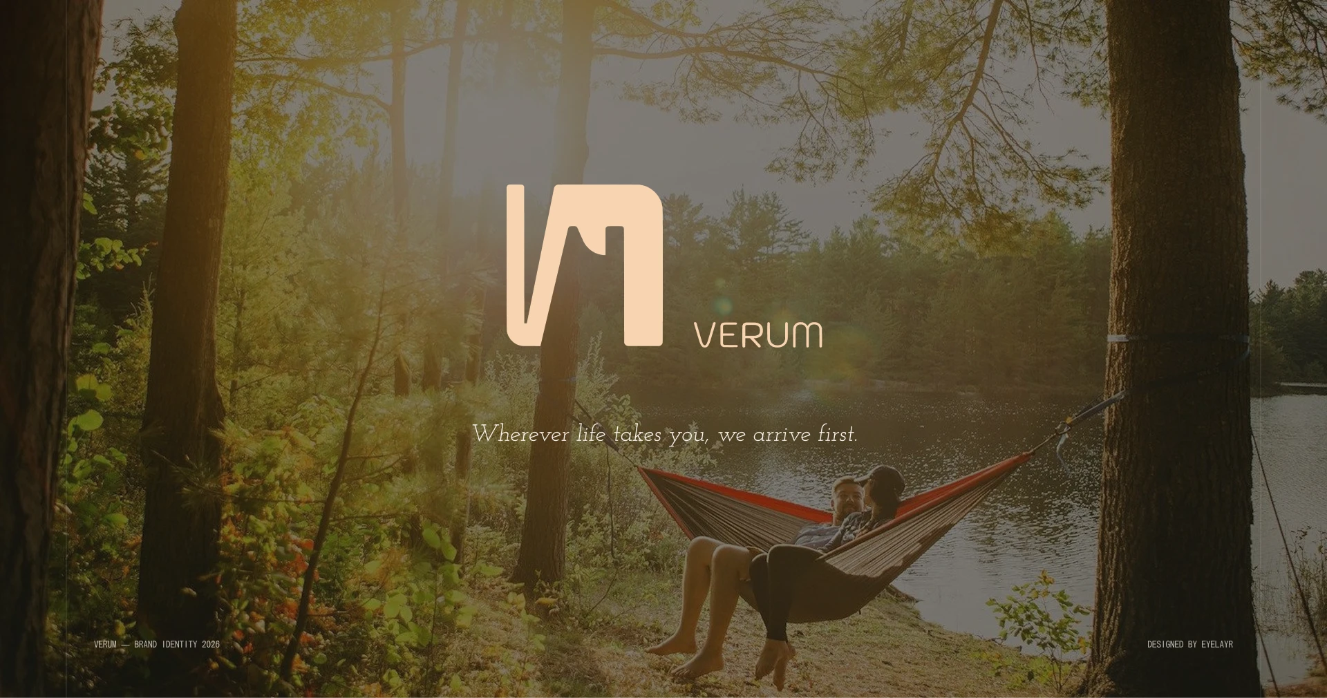
Closing frame
Concept note
VERUM is a concept. The brand, copy and properties shown are fictional and were created for this design.
0 likes · 2 views · Nov 9, 2026
An advisory brand that sells trust before listings. Cinematic motion, quiet typography and one connected system, from the logo to the website, social and stationery.

