
NOIR/STUDIO is a concept website for a branding studio whose pitch is simple: bold brands. If the studio promises boldness, its own site has to prove it first.
I explored the visual direction in Figma, then built the experience in Framer.
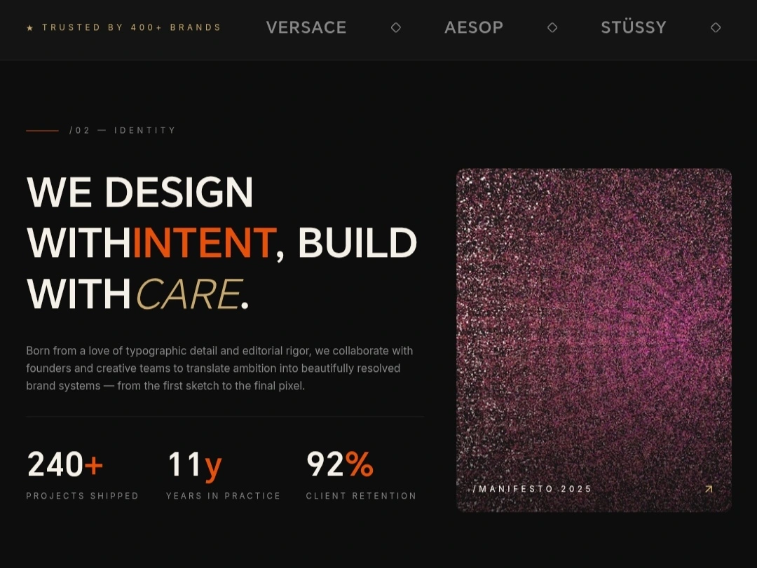
Studio identity and hero
The challenge
Practise what you sell. A studio that sells bold brands can't have a timid website.
Loud but readable. Oversized type had to grab attention without making the work hard to browse.
Easy on every device. The same impact had to hold on a phone.
The idea
Confidence as a layout. A dark base, giant type, "Crafting Bold Brands", and one orange accent that marks every action. Nothing else competes for attention.
Selected works
Projects lead the page, in a clear grid with hover states that reveal each one.
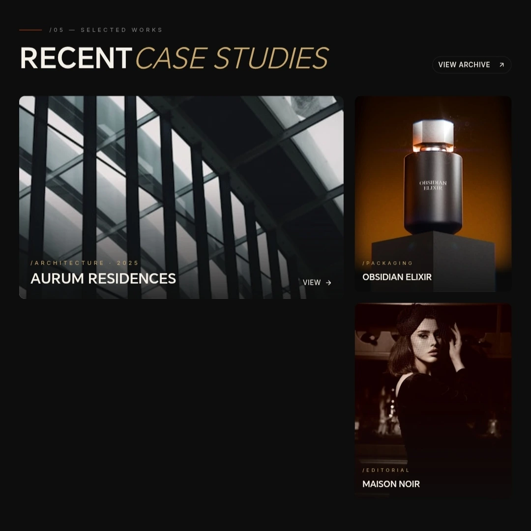
Selected works
Services
Services are set in the same bold type system, short enough to read at a glance.
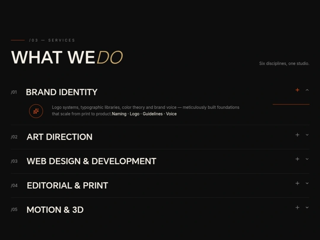
Services
Process
A clear process section shows how a project moves from first call to launch.
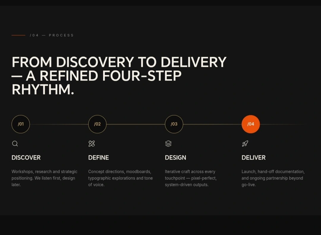
Process
Built in Framer
Responsive for desktop, tablet and mobile, with smooth scroll animations, hover states and transitions that support the direction without slowing the site down.
Concept note
NOIR/STUDIO is a concept. The studio name, projects and copy shown are fictional.
0 likes · 26 views · May 8, 2026
A website for a branding studio that leads with confidence. Oversized type, one sharp orange accent and nothing else competing for attention.

