
This is a concept website for a film production studio, where the work has to speak before the copy does. A studio like this is hired for taste, so the site itself has to feel like a film.
I set the art direction and page structure in Figma, then built the responsive site in Framer.
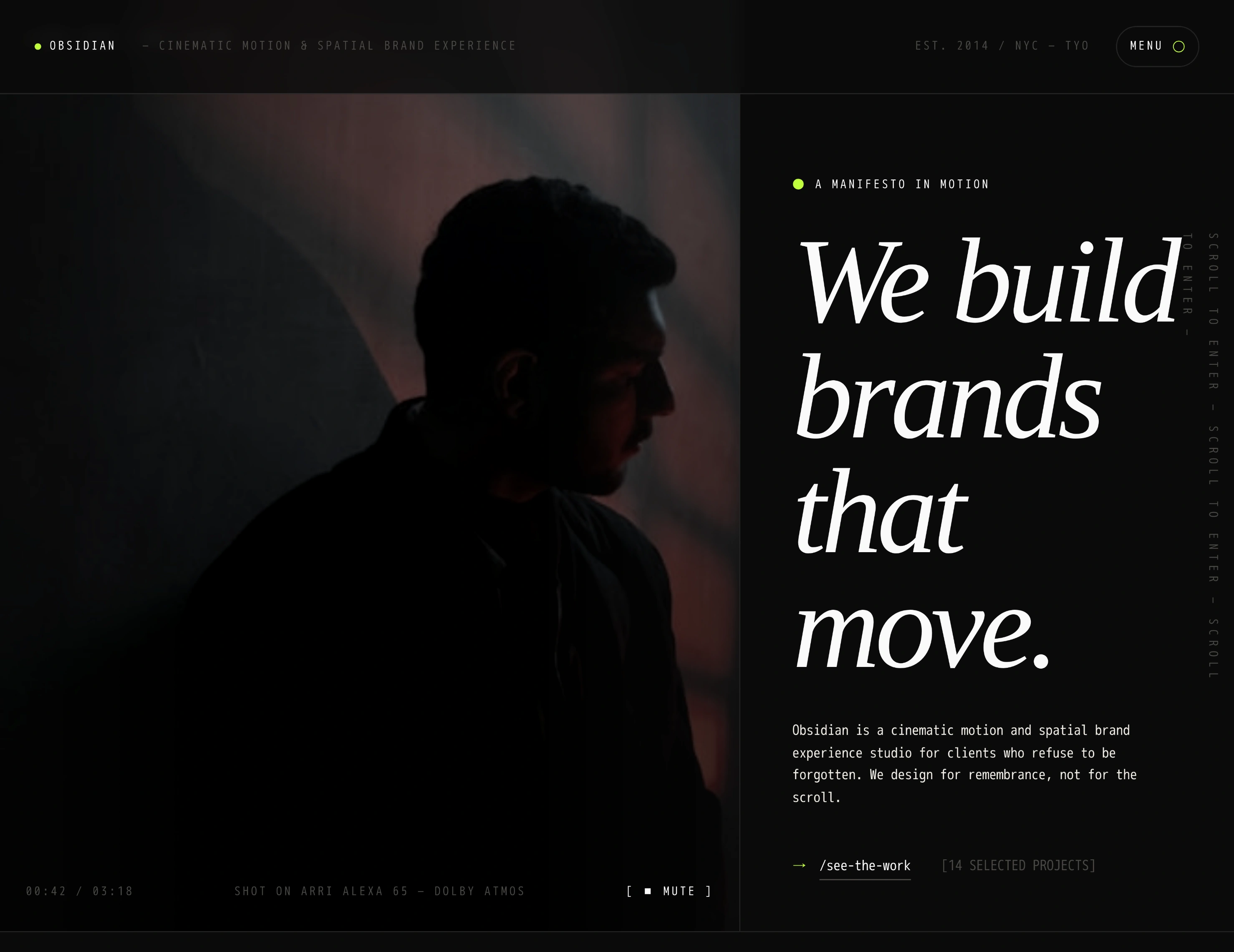
Hero section
The challenge
Mood in one screen. A visitor should feel the studio's style before scrolling once.
Work first. Film stills and featured projects had to lead, with interface and text stepping back.
A clear path. Behind the atmosphere, the page still needed to move a visitor from first impression to enquiry.
The idea
Pace the page like an opening sequence. Deep black, white and a single gold accent, with high-contrast type, negative space and movement that arrives on cue.
Navigation
The menu is part of the experience, not a bar of links. It opens full screen in the same cinematic language as the rest of the site.
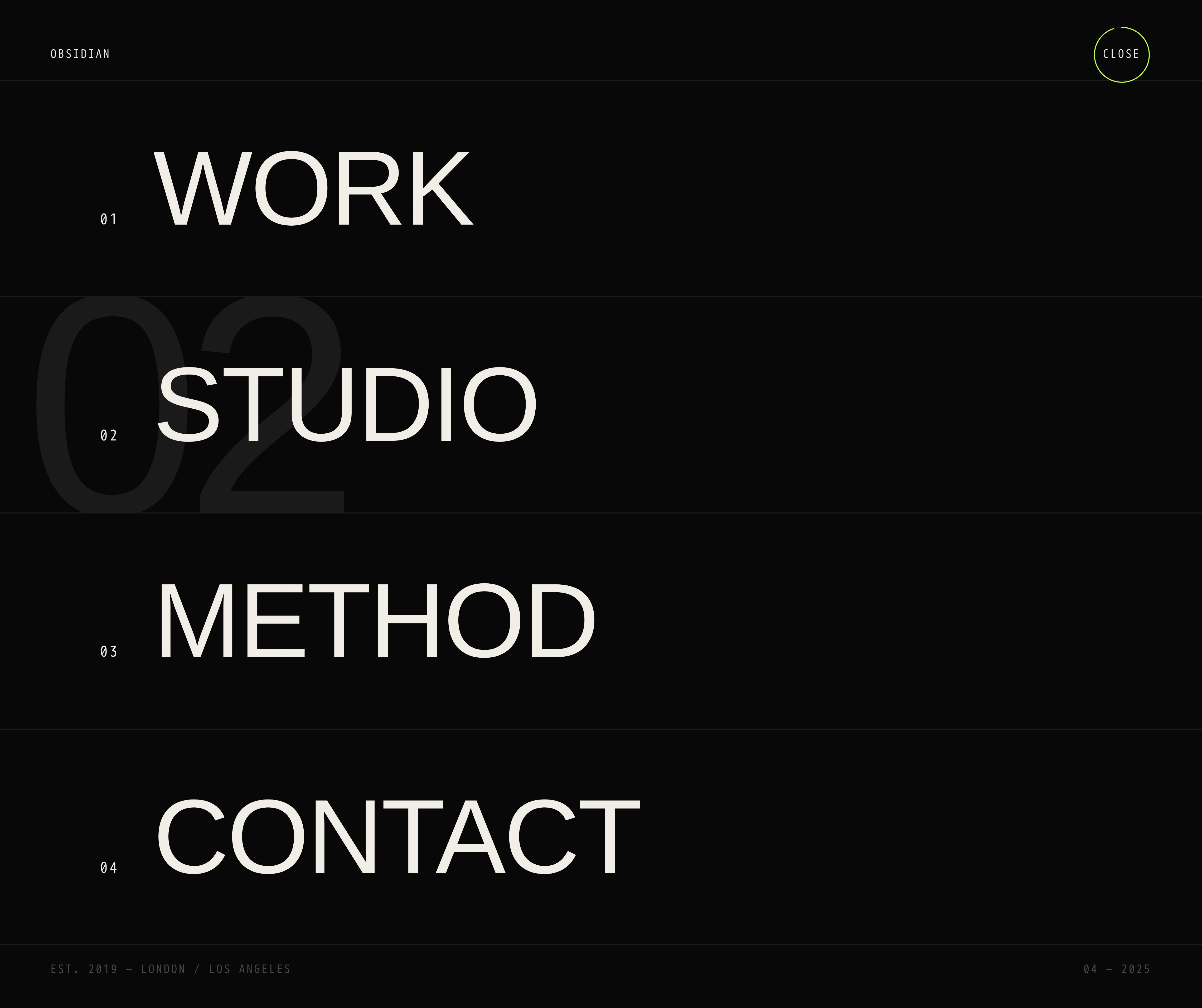
Menu
The studio
A short philosophy section introduces the studio and its point of view before the work appears.
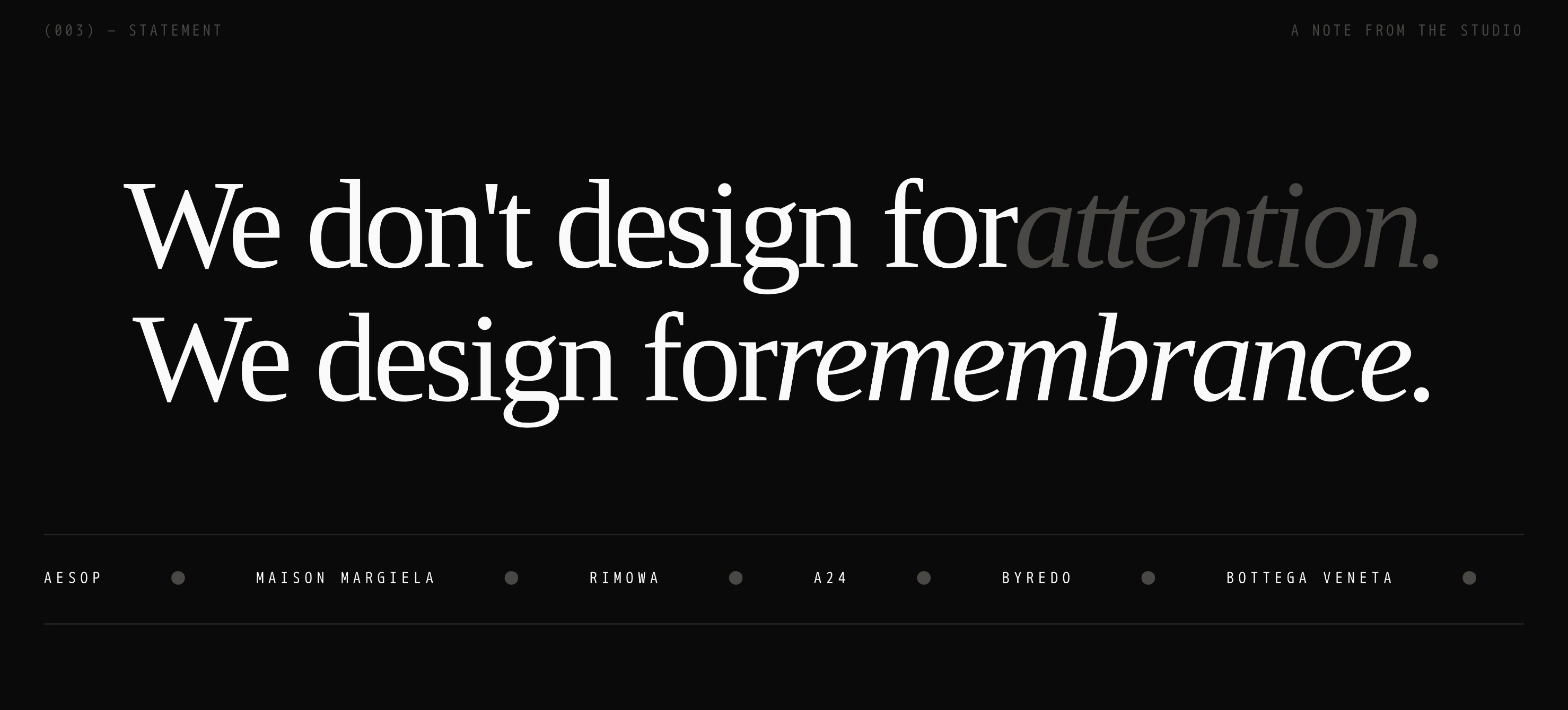
Studio philosophy
The work
Featured films are presented as poster-style cards, so browsing feels like walking past a cinema wall. The archive keeps every project one tap away.
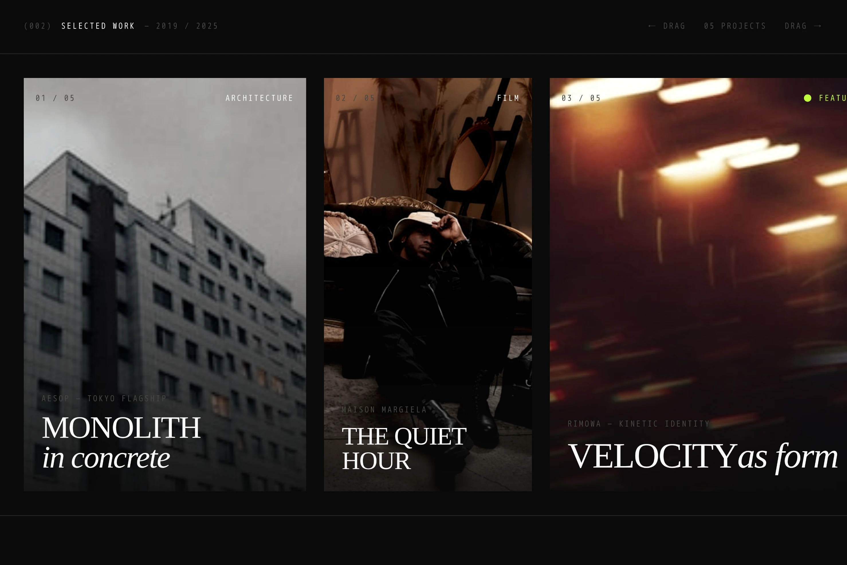
Featured films
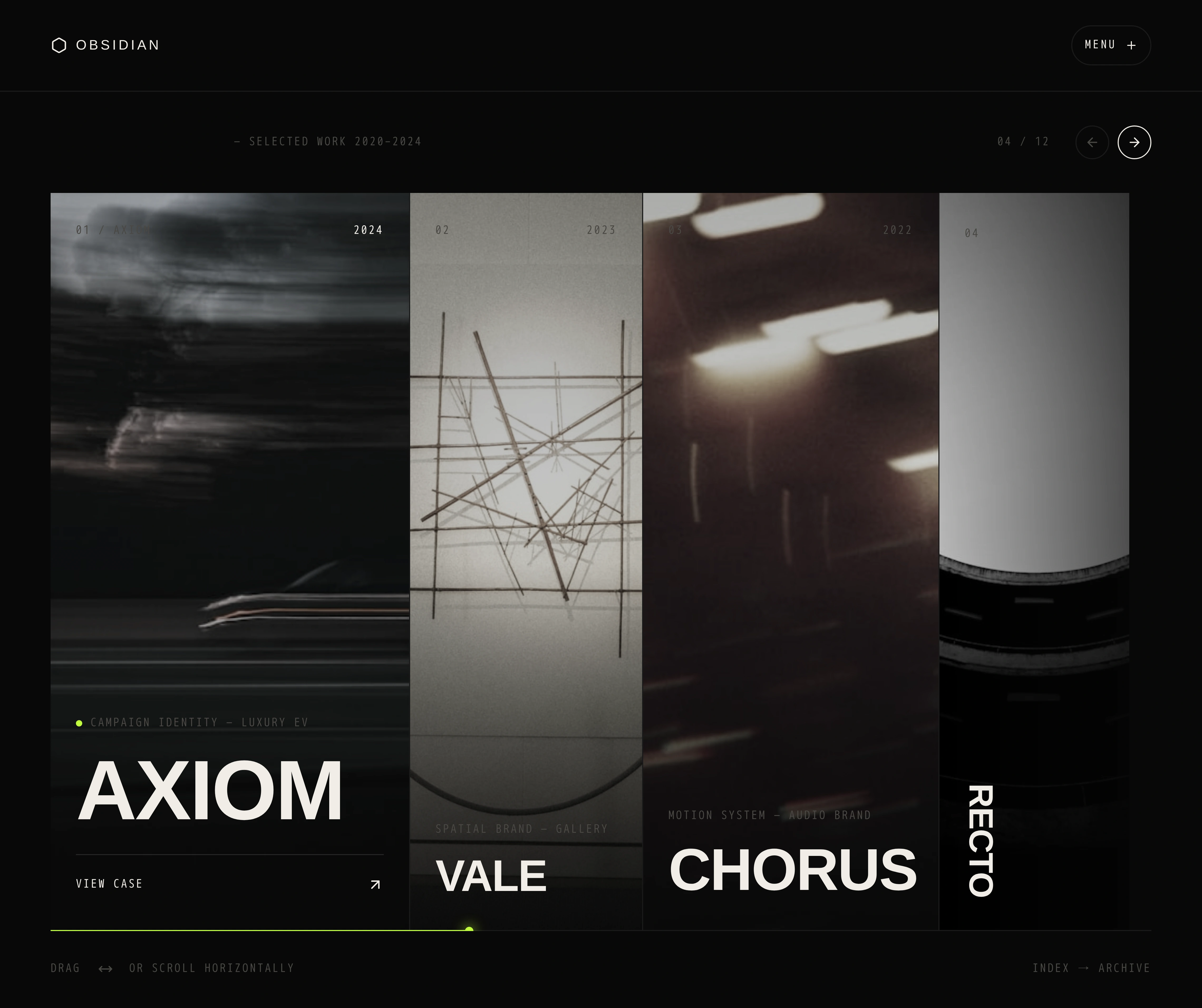
Archive
Process and enquiry
A clear process section shows how a production runs, then the page closes on one call to action.
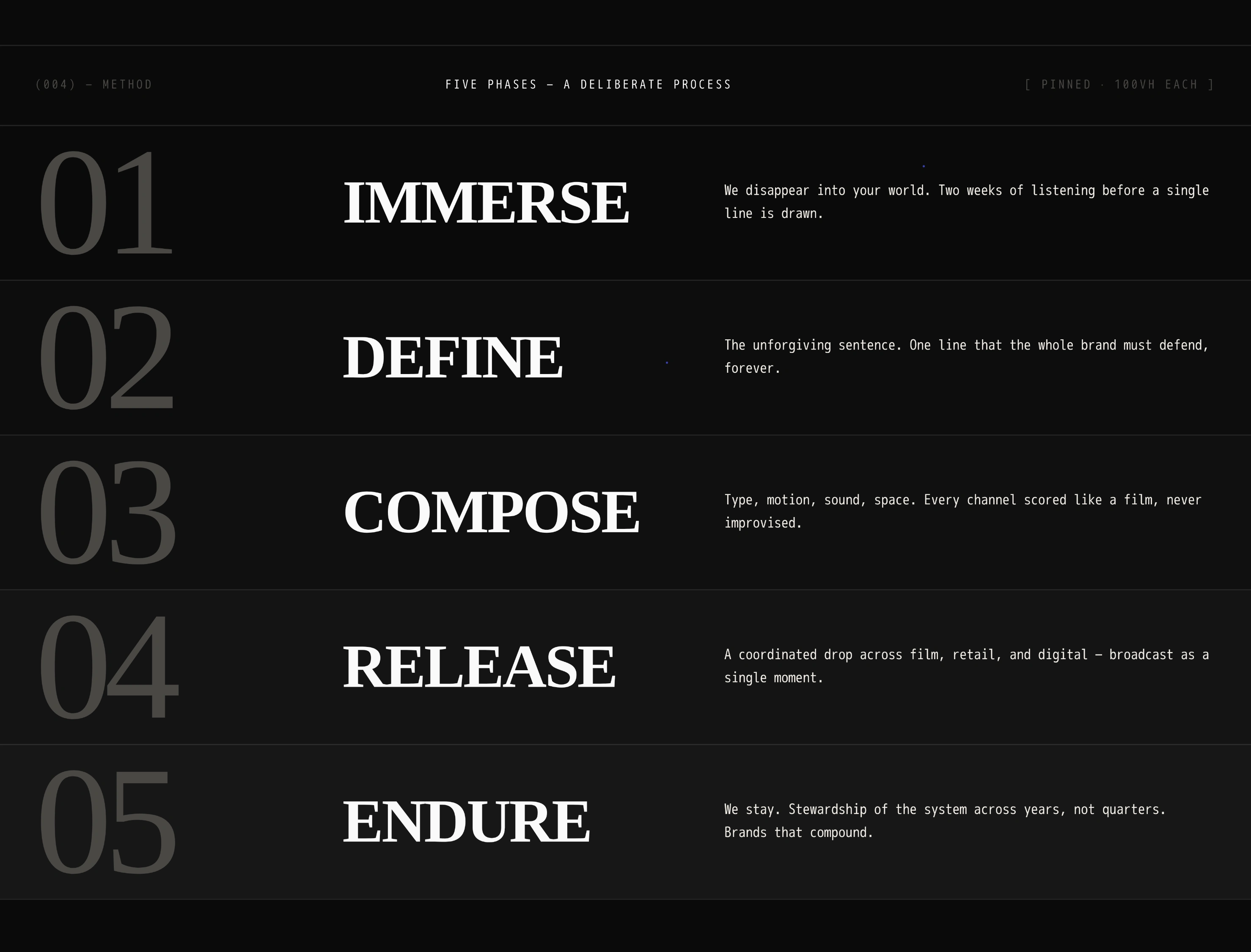
Process section
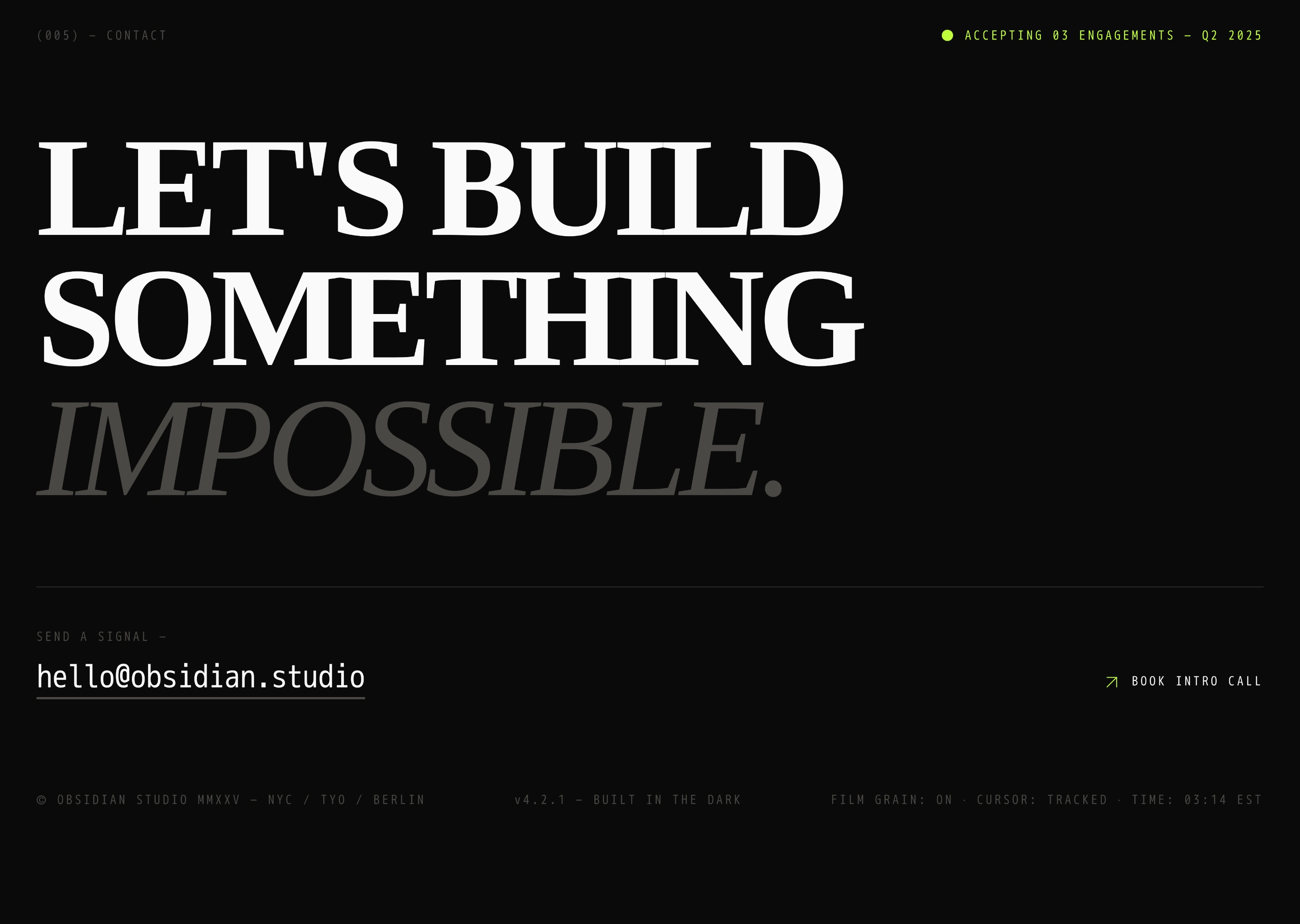
Final call to action
Built in Framer
Responsive for desktop, tablet and mobile, with hover and scroll interactions that add depth without overwhelming the content.
Concept note
The studio name, films, copy and contact details shown are fictional and were created for this concept.
0 likes · 39 views · May 7, 2026
A website for a film studio that sells mood before services. Full-bleed stills, poster-style project cards and a page that paces itself like an opening sequence.

