Packaging Design for a natural supplement brand
Dominika Dobrzalski
Brand & packaging design for Fevana, a natural supplement brand built from scratch. A strong identity & positioning helped establish it in a competitive market.
Scope
Brand Strategy
Brand Identity Design
Packaging Design
Website Design
Design Guideline (Digital Brand Portal in Frontify)
About the Brand
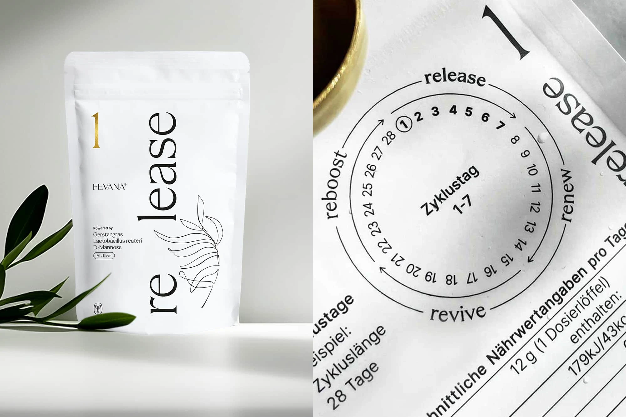
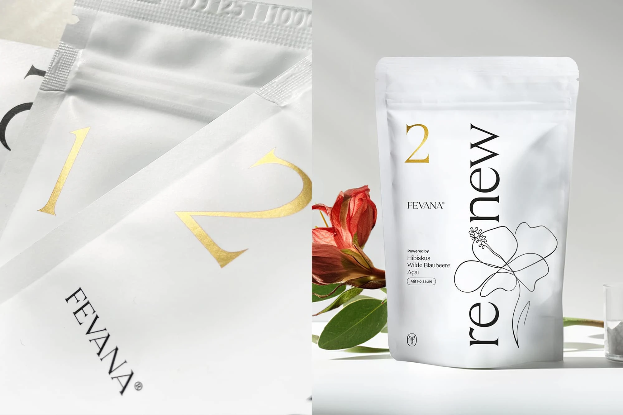
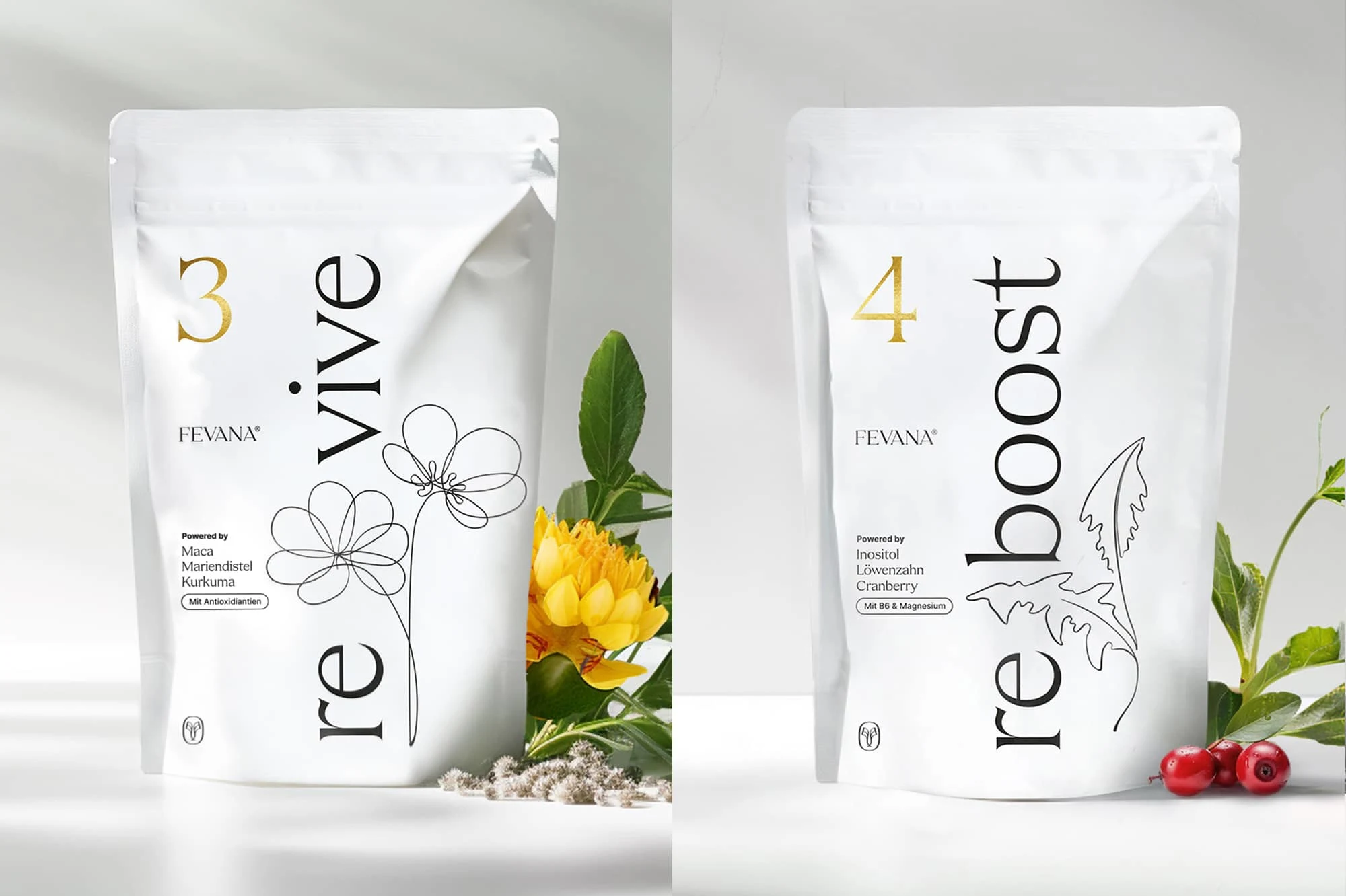
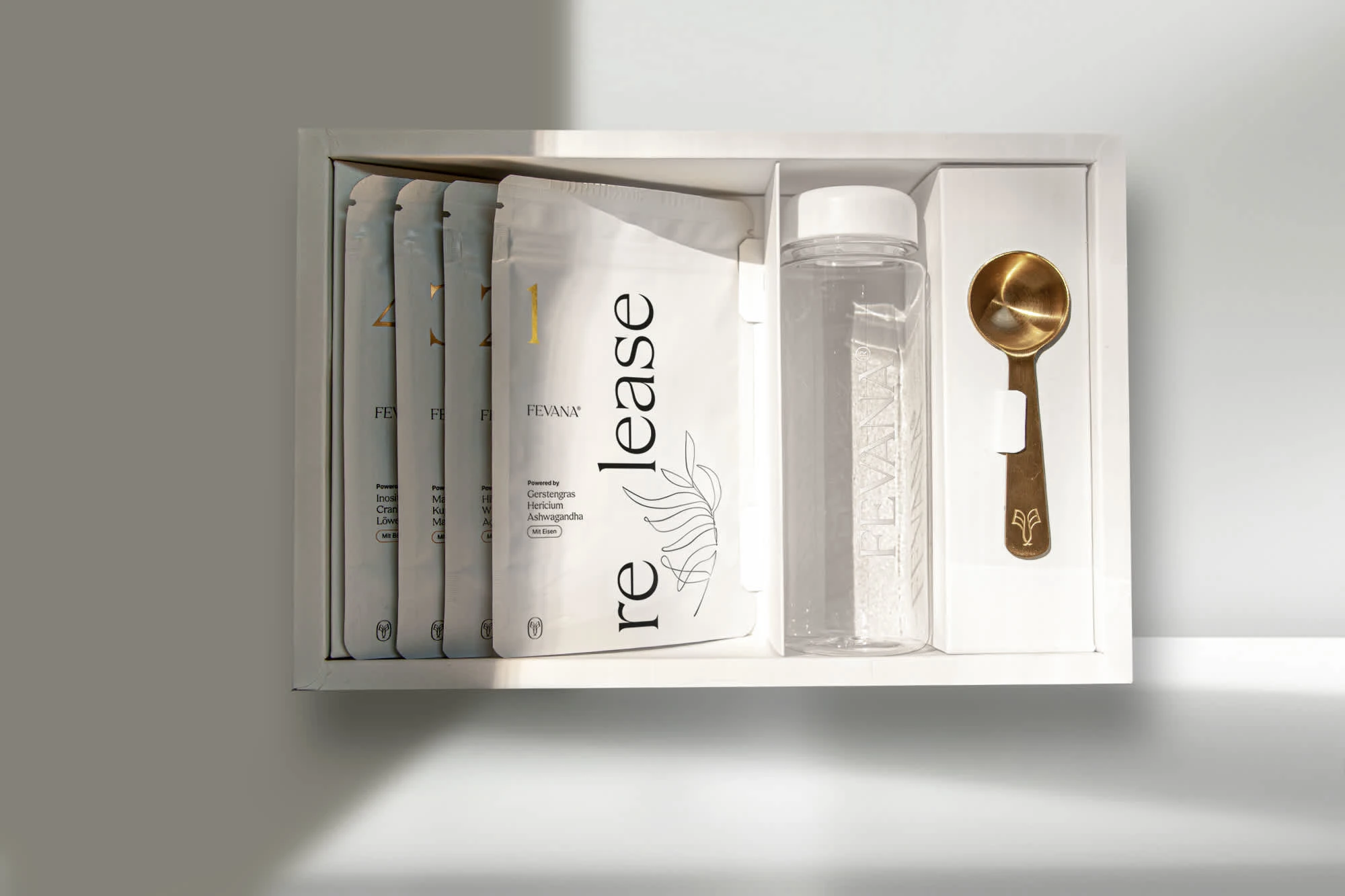
With four carefully coordinated food supplements made from natural ingredients, Fevana has developed a product that is intended to enable women to optimally supply themselves with the most important nutrients in all four phases of their menstrual cycle and balance their hormones in a natural way.
The Challenge
The development of the packaging design for the four products from scratch, giving the high-quality product a suitable face. As the basis for this task, a brand strategy was developed together with the customer in a joint branding live-workshop, positioning the brand at the cutting edge of the medical sector, appealing to an exclusive, female demographic.
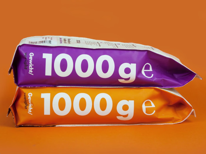
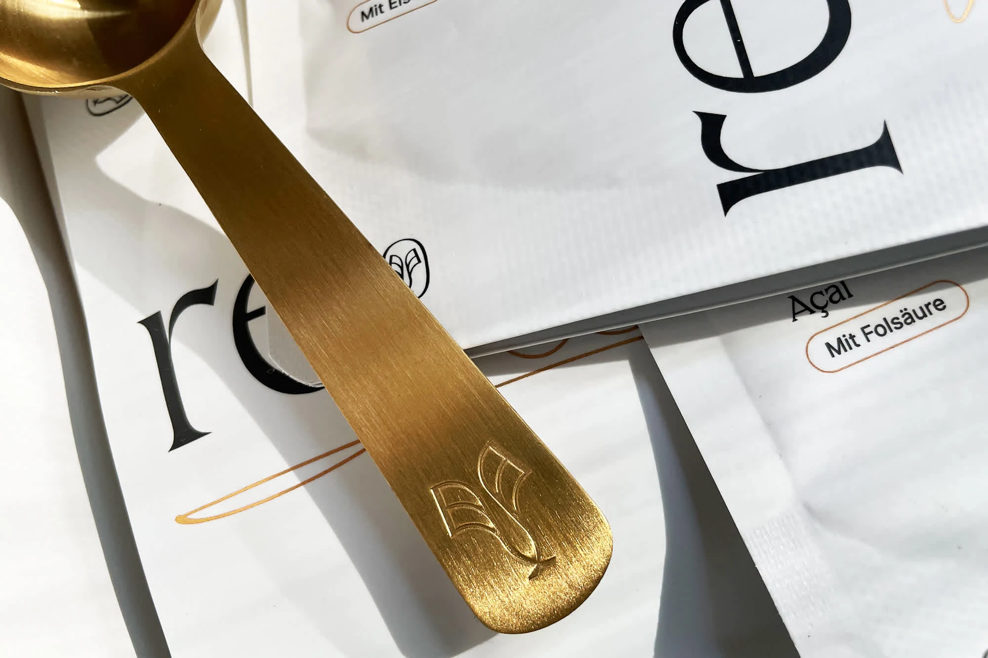
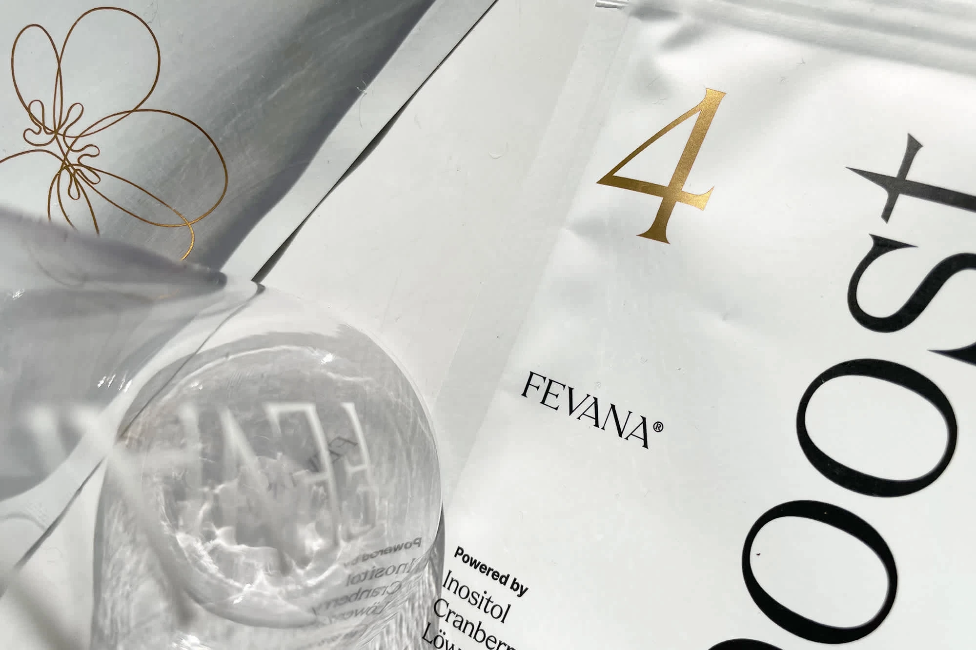
The Packaging Design
The packaging design reflects the rational, medical side of the brand and is kept in pure white and black, with a clear, minimalist design language in which a striking use of the elegant corporate font focuses on the naming of the four products, complemented by curved line illustrations.
The generous use of white aims to lend clarity and elegance to the brand and visually represents the pure, unadulterated nature the product stands for, rounded off by selected accents finished in gold on the product packaging.
Like this project
Posted Nov 3, 2024
Brand & packaging design for Fevana, a natural supplement brand built from scratch. A strong identity & positioning helped establish it in a competitive market.