Built with Framer
Skip - Events Ticketing
Zantana


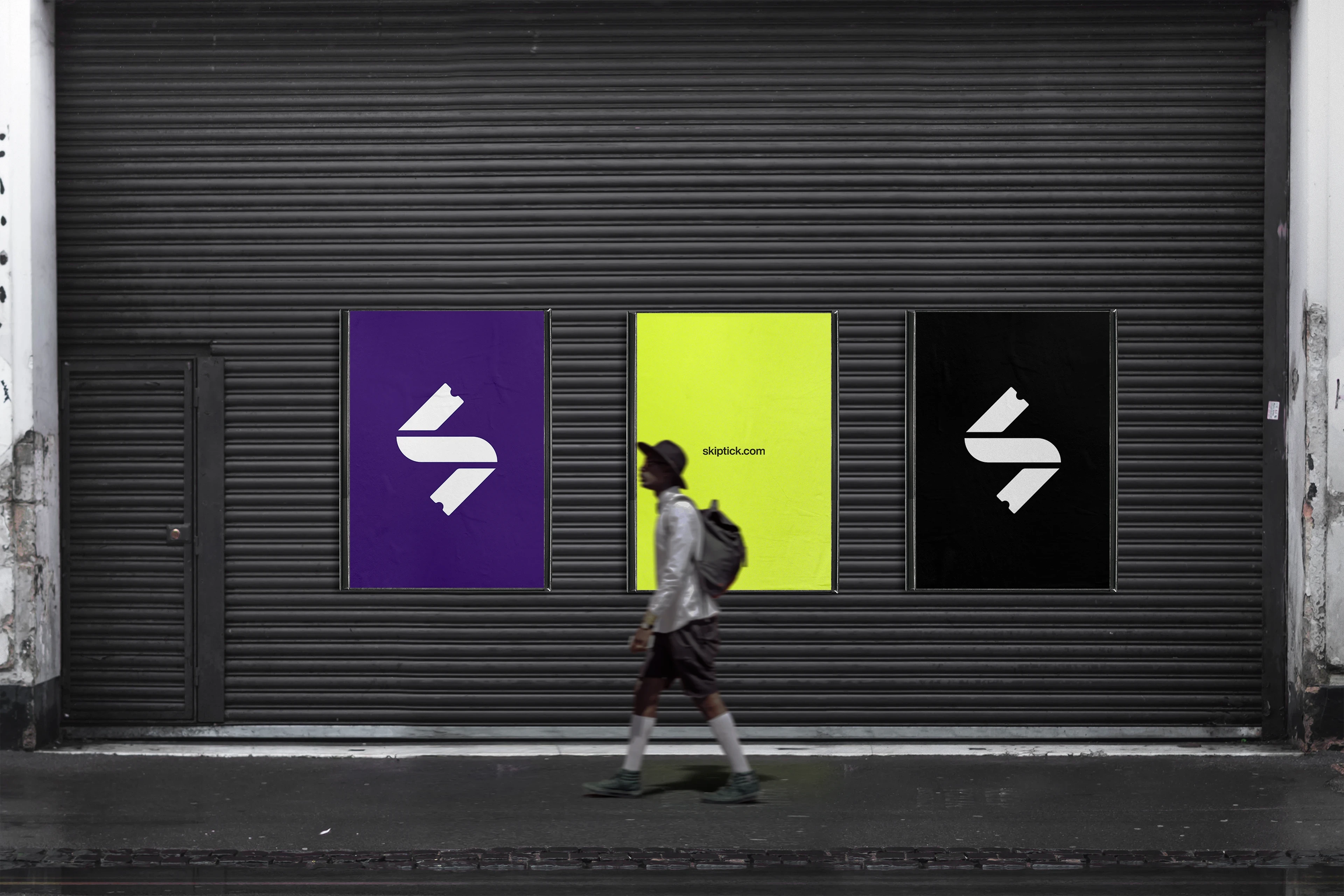
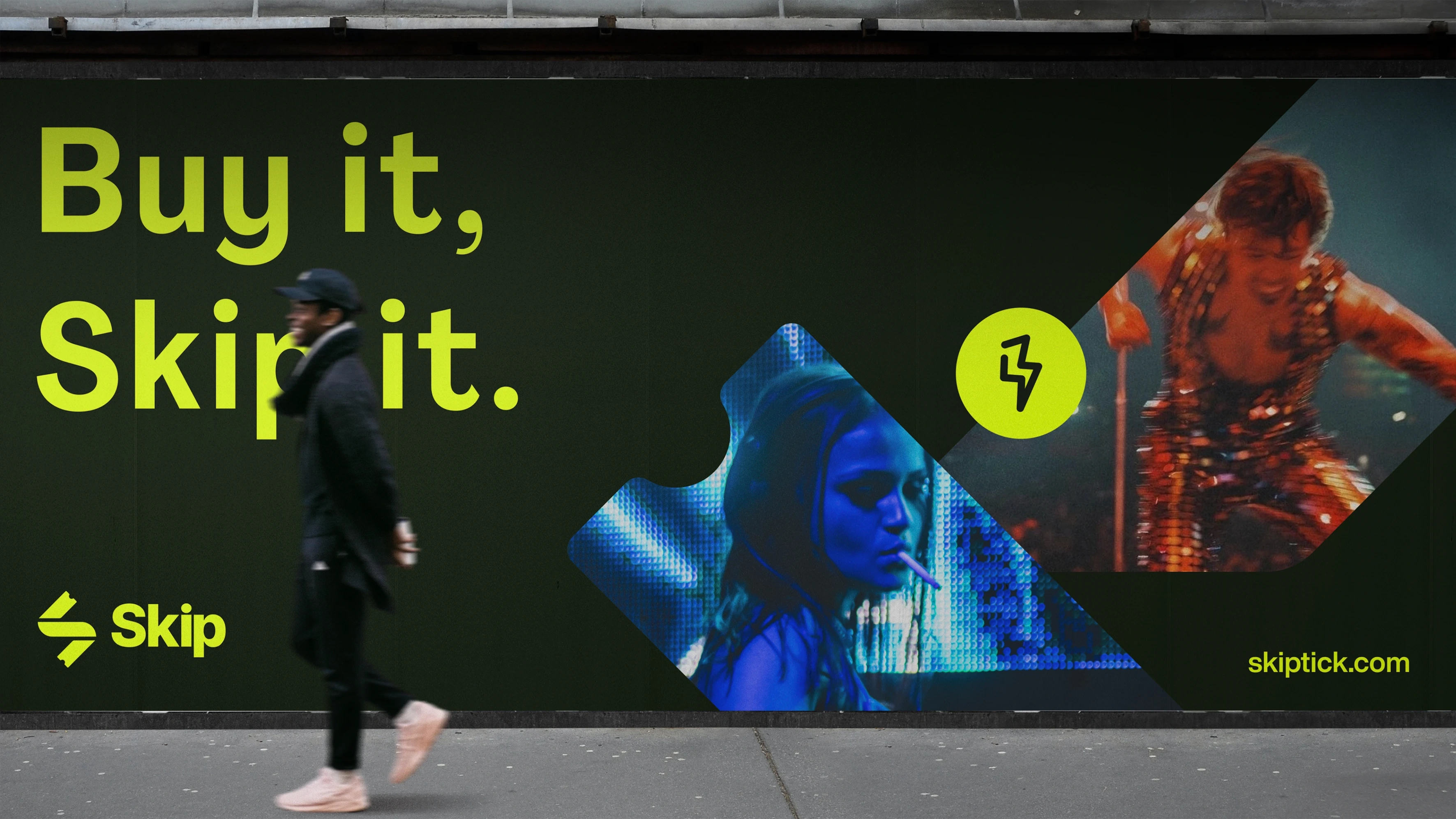
Skip’s visual identity captures its disruptive, experience-driven essence. Built on the pillars of innovation, fluidity, and empowerment, it bridges aesthetics and functionality to reflect the revolution the brand brings to the world of live entertainment.
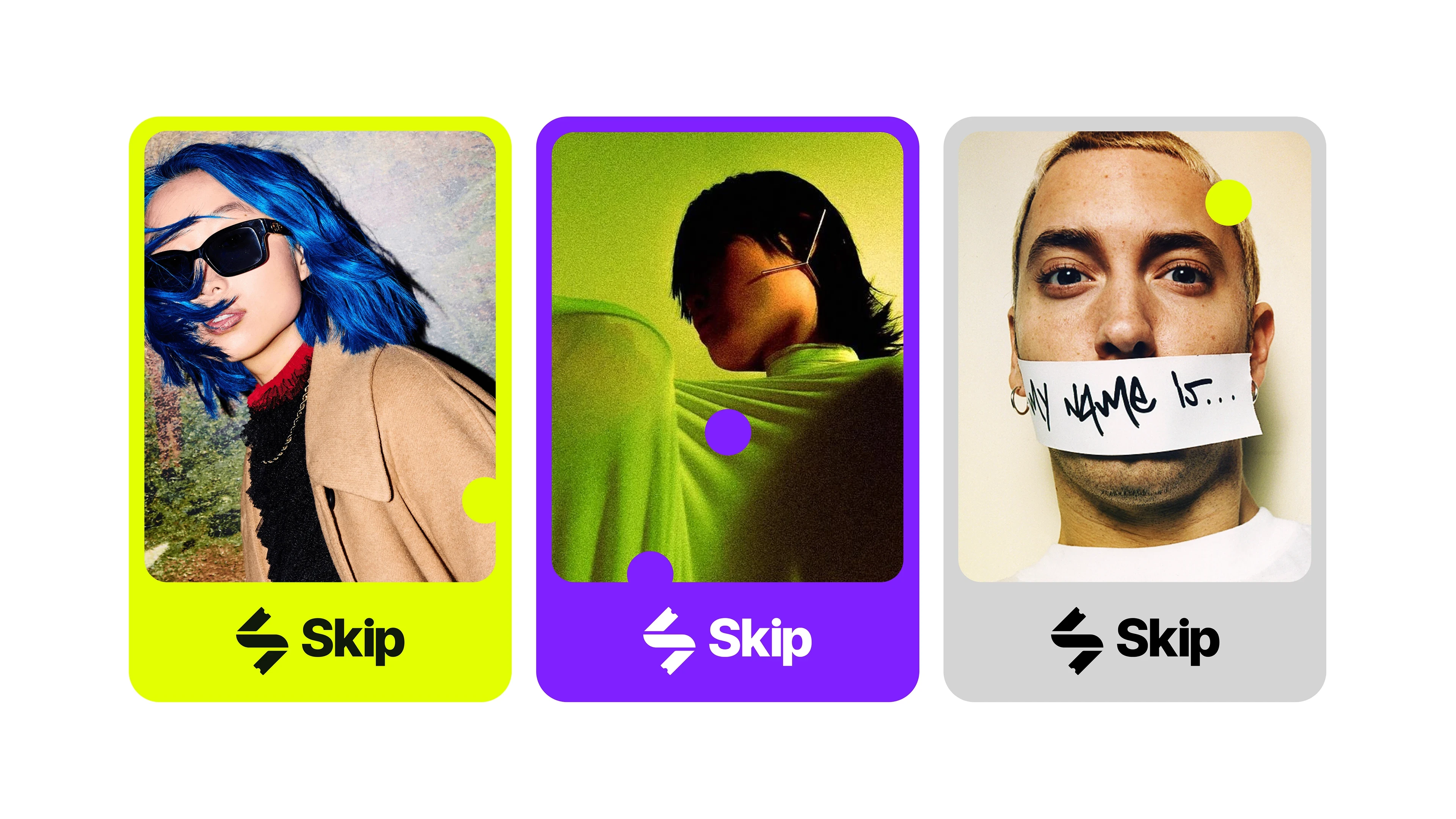
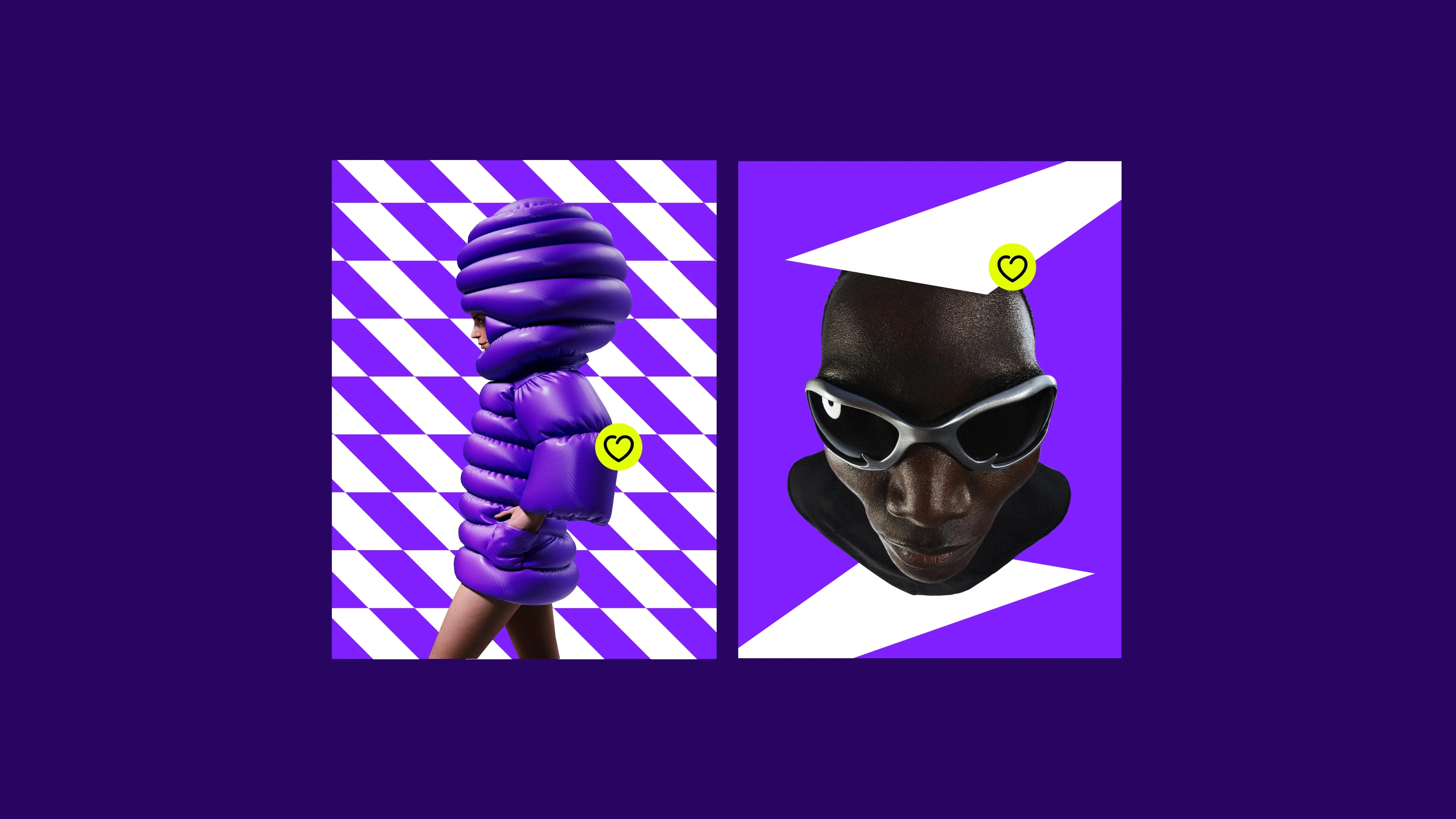
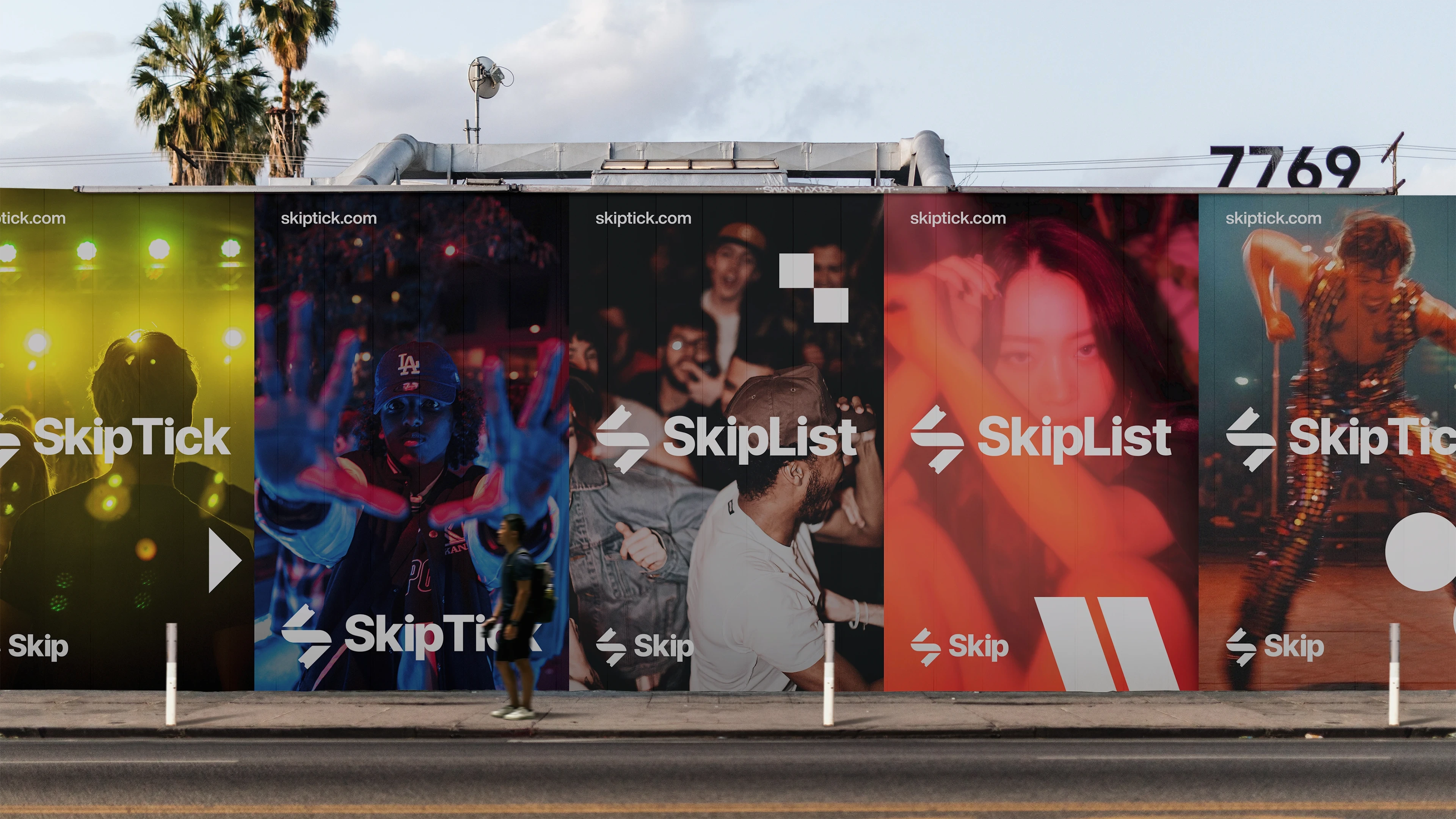
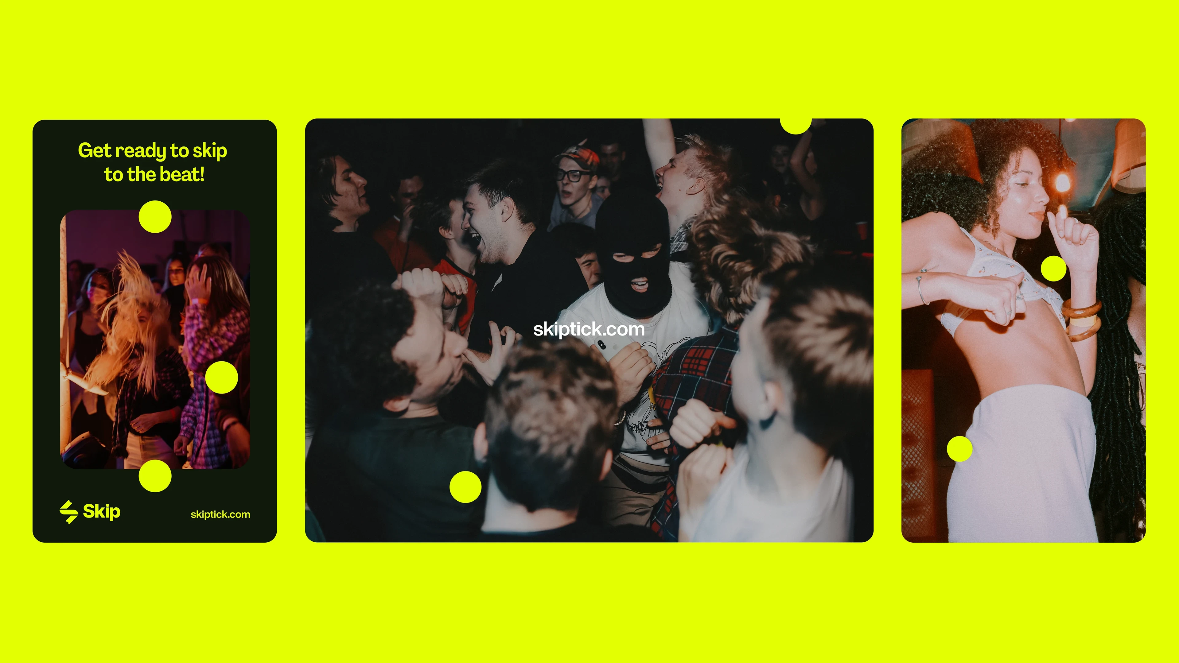
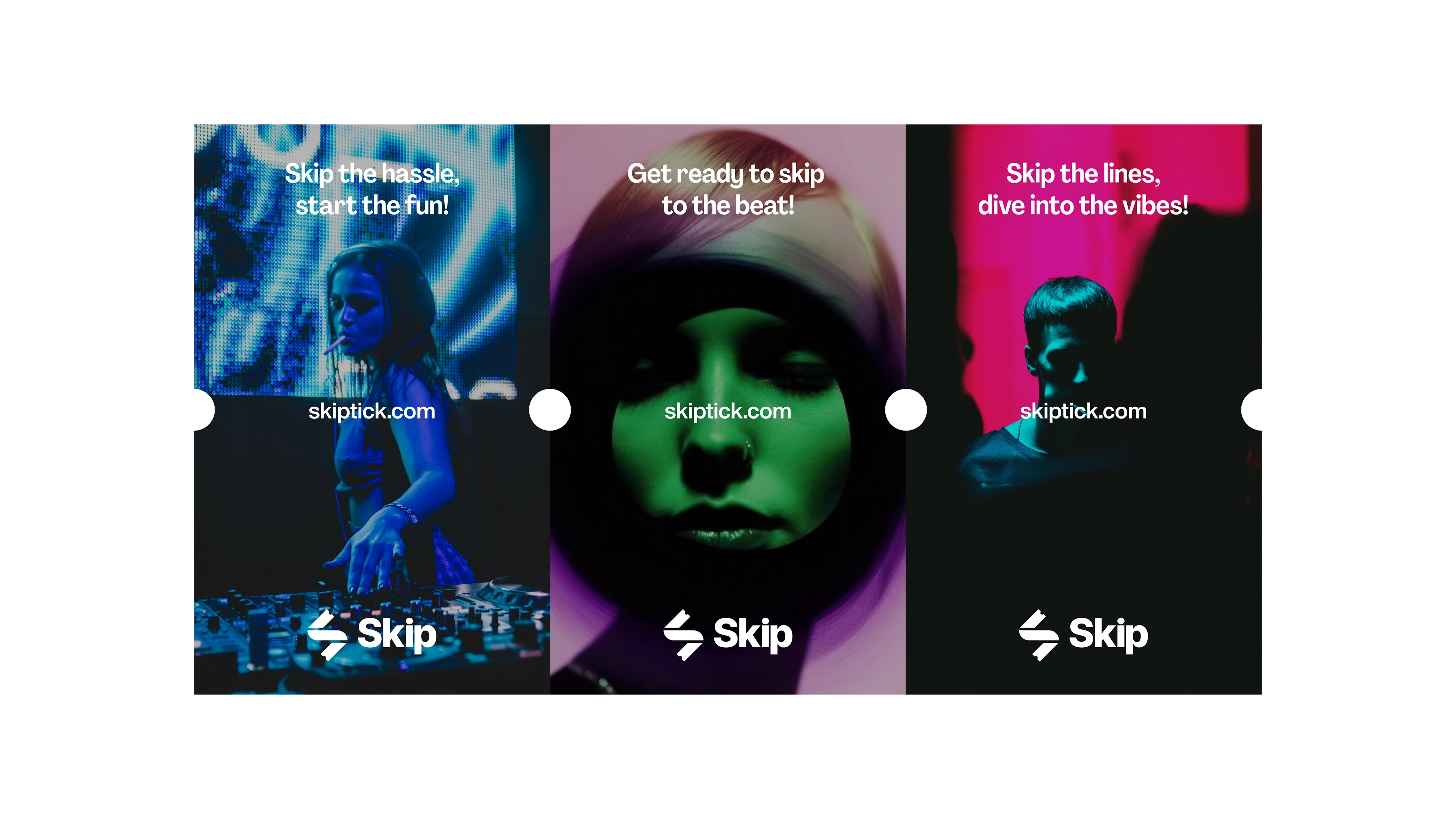
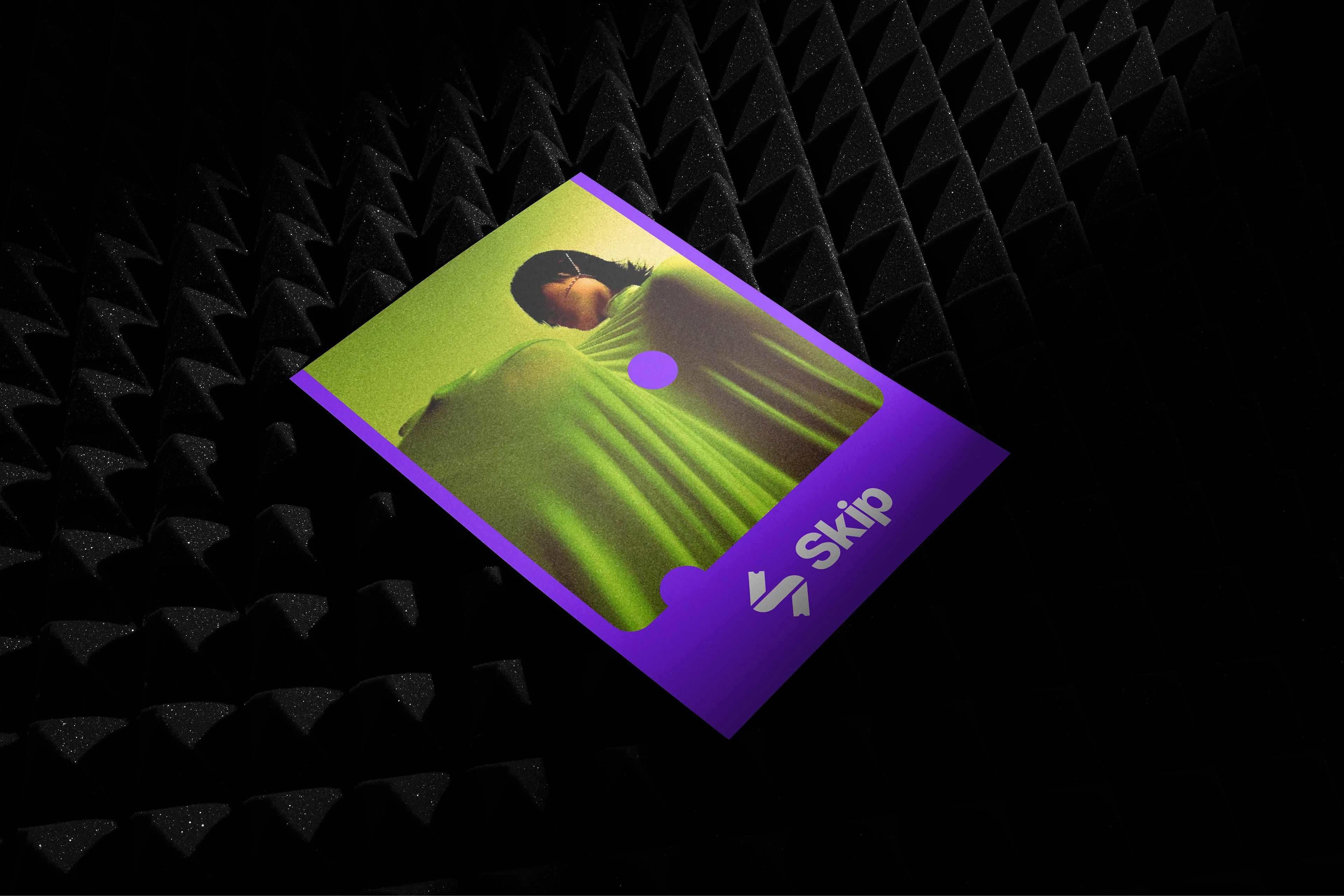
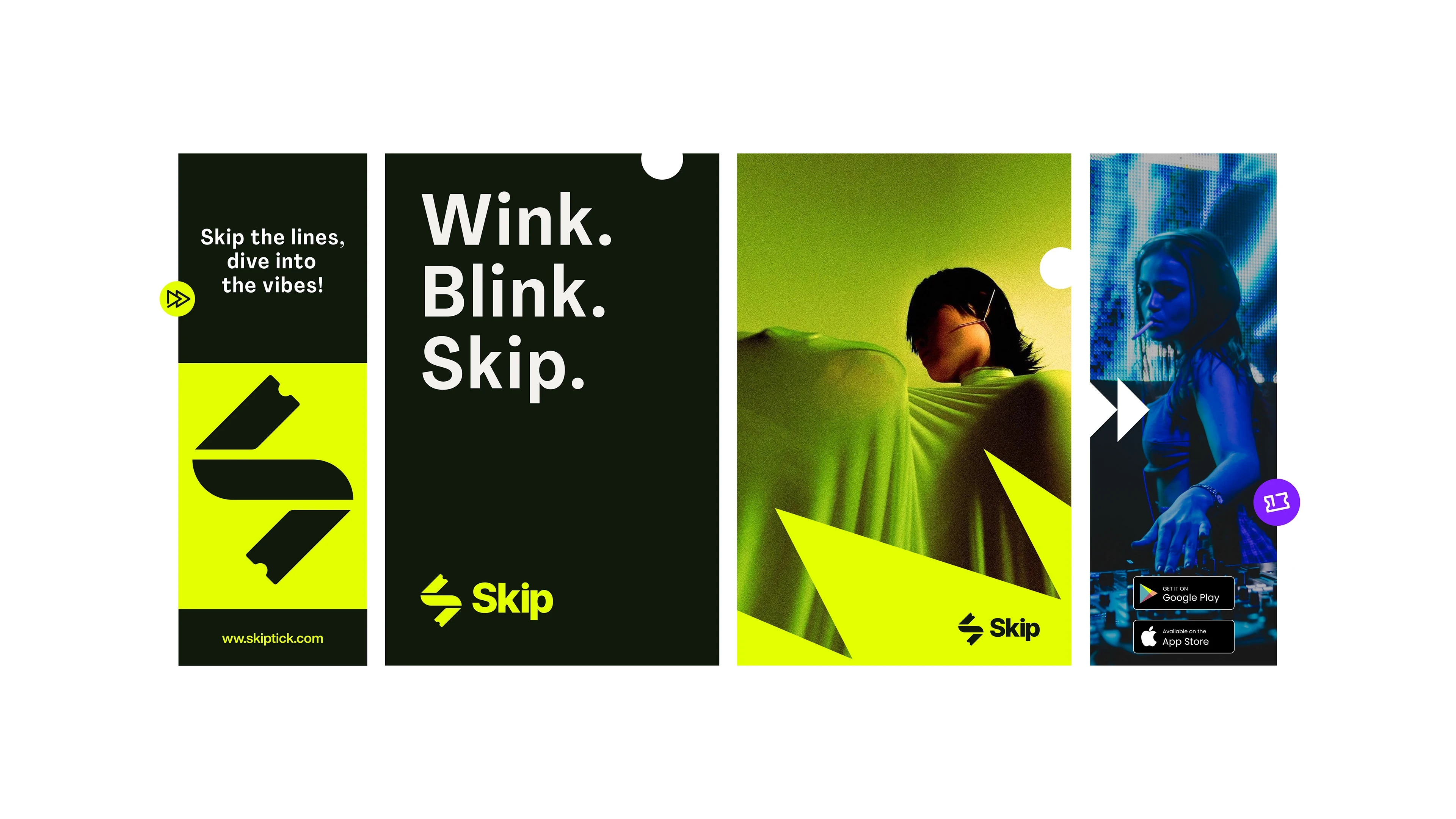
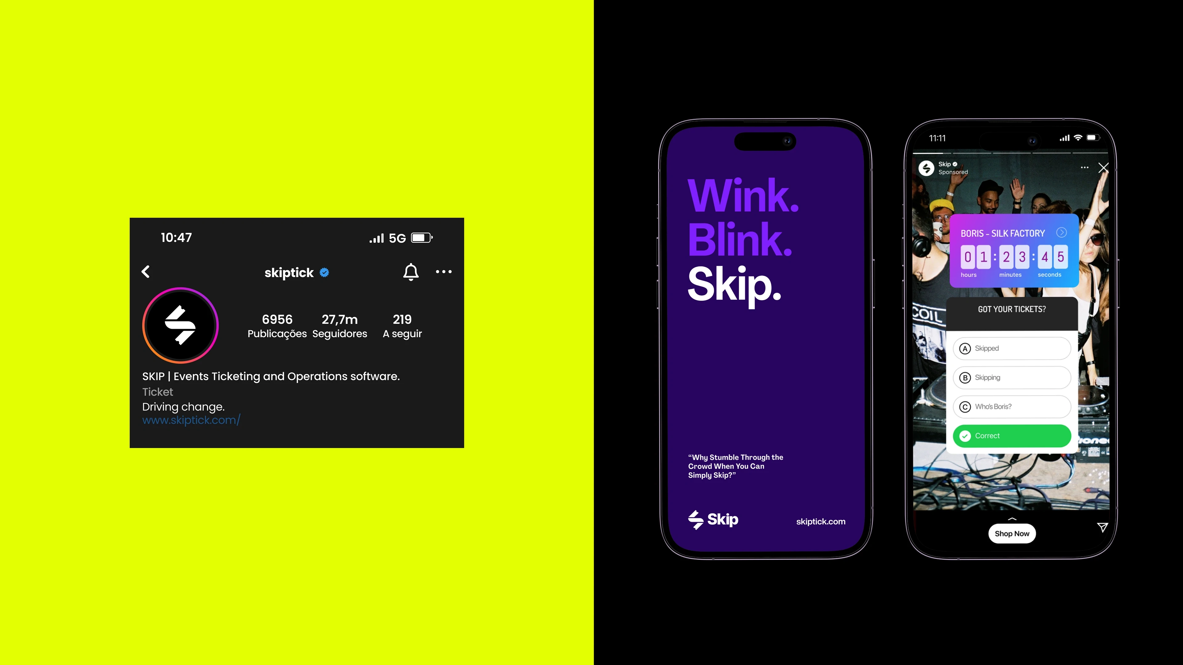
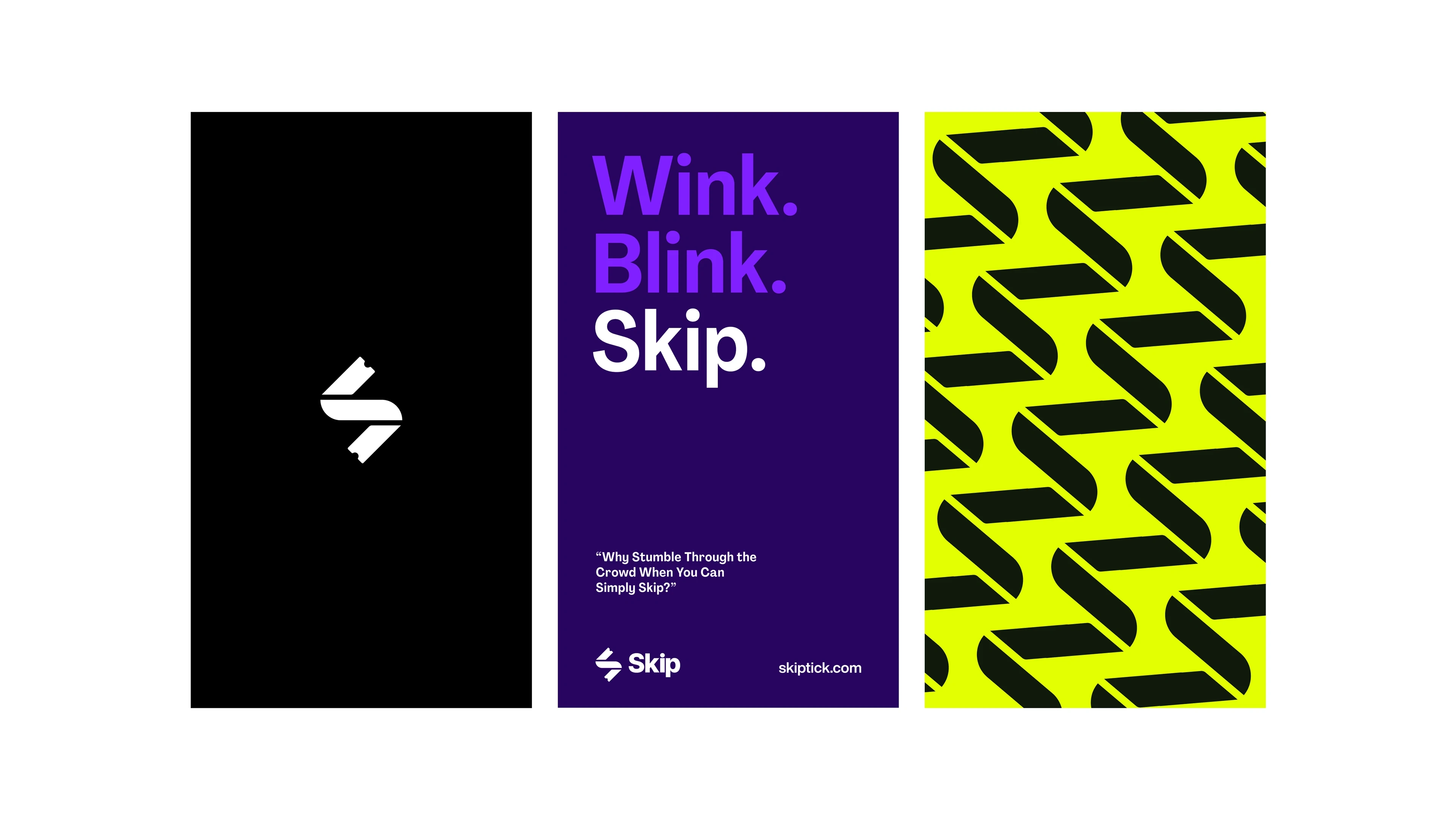
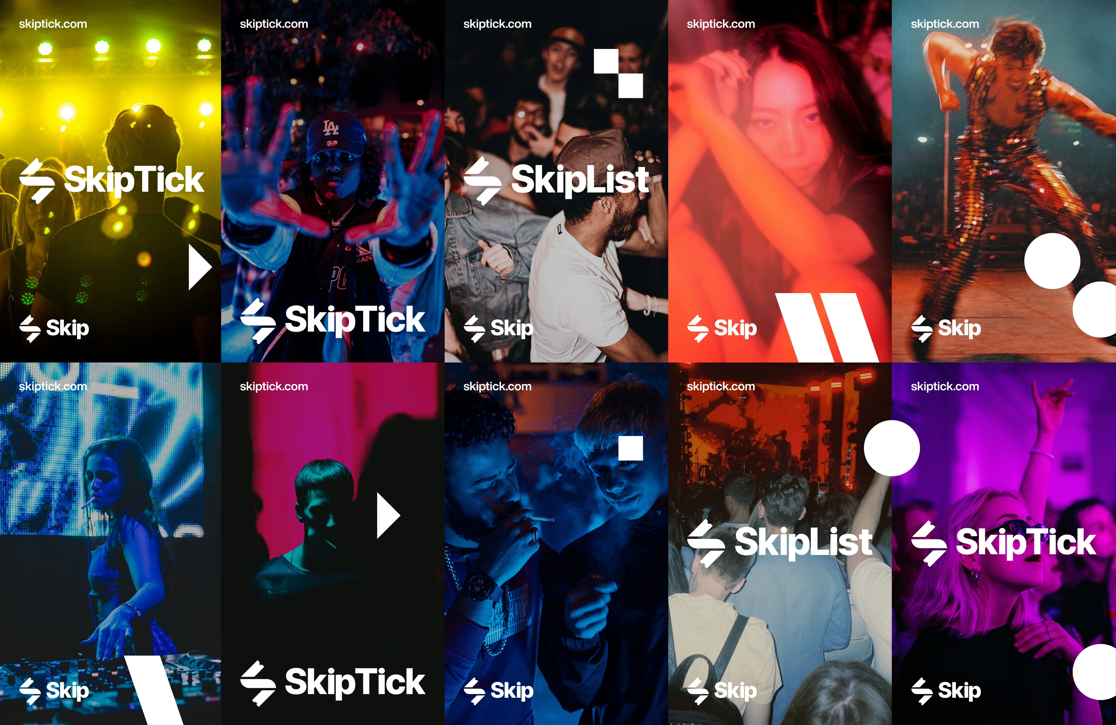
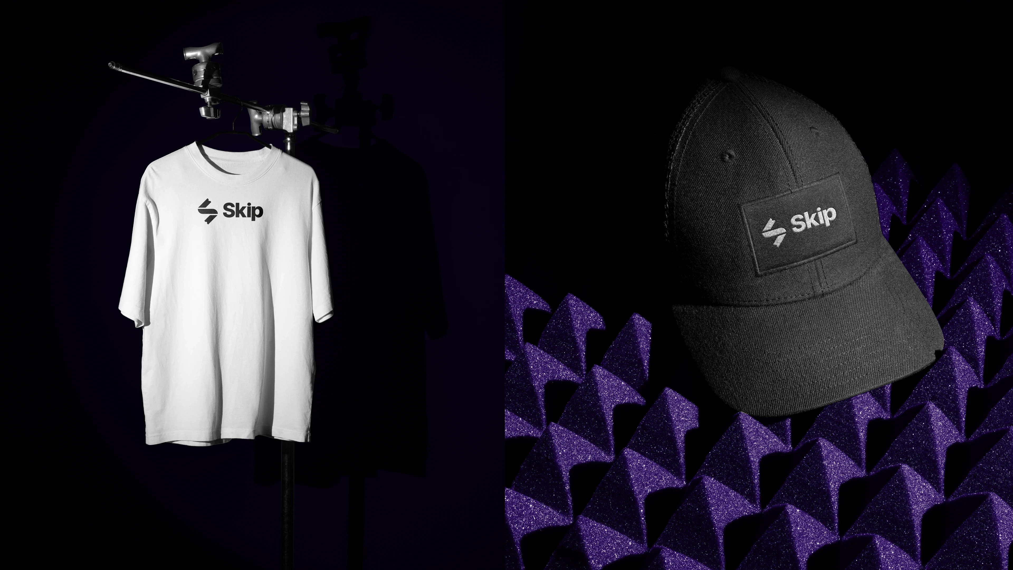
The Skip visual system is not static. It is designed to move, adapt, and interact. Every element is crafted to reinforce the brand’s mission: removing complexity and placing control in the hands of the user. It is ultimately a direct reflection of the seamless and empowering experience that Skip delivers. The visual language is bold, vibrant, and action-oriented. Imagery and graphic elements follow this energy with clean compositions, light backgrounds, and visual cues that express fun and community. Skip’s color palette is designed to balance functionality with expressiveness. This chromatic approach makes the brand versatile and adaptable. It maintains visual consistency while resonating with diverse audiences and occasions. The intentional use of color contributes to a brand experience that is lively, intuitive, and memorable.
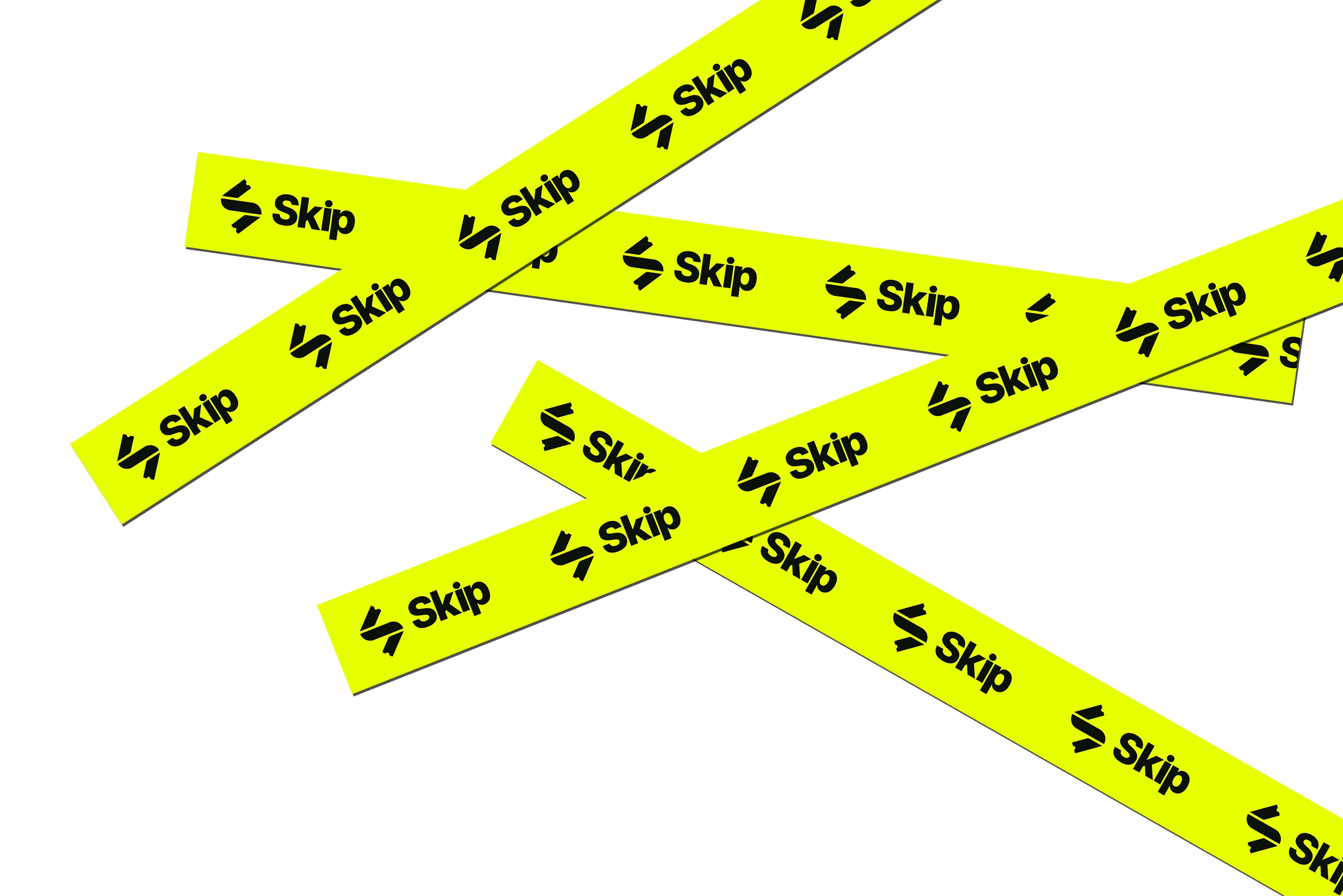
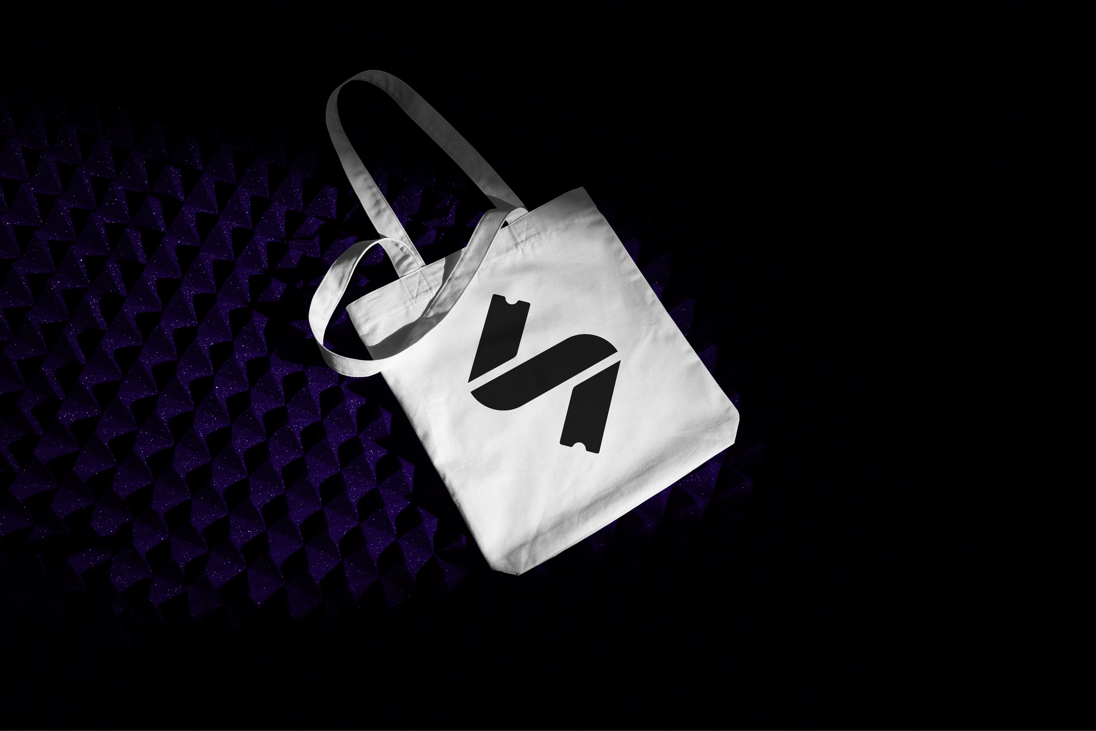
Skip’s symbol is a clever abstraction of the letter “S,” with ticket-shaped ends that nod directly to the events world. More than just an icon, it represents the connection between creators and audiences, a symbol of dialogue, motion, and shared energy.


Like this project
Posted Jun 17, 2025
Built on the pillars of innovation, it bridges aesthetics and functionality to reflect the revolution the brand brings to the world of live entertainment.
Likes
6
Views
33
Timeline
Apr 11, 2025 - Ongoing