Built with Framer
Aperture & Co. - Camera Gear Store, Built to Sell Trust

Zakria Asim


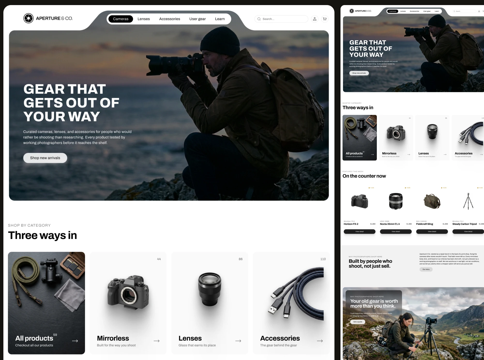
What if a camera store website could earn trust before it earns a sale?
Aperture & Co. is a conceptual camera gear store. Not a client project, a self-initiated exploration into a question that kept nagging me: why do most gear ecommerce sites feel like they were built by people who have never used the gear they're selling.
So I built one that doesn't.
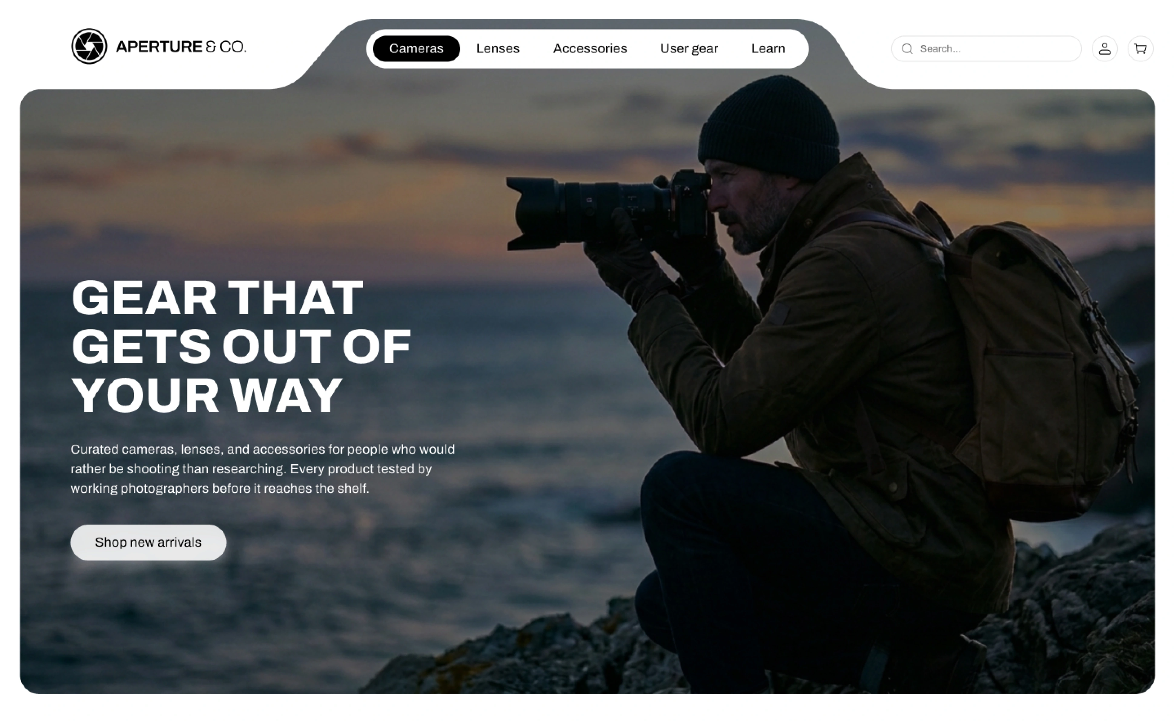
Camera & Gear Store Website desgned by zakria asim - Hero section
Hero Section
When approaching the homepage, I didn't want to open with a product grid. Gear buyers in this category research obsessively before they buy, and a generic hero shot of a camera on a white background tells them nothing about whether this store actually understands photography.
What I did:
I opened with a working photographer, mid-shoot, on a coastline at dusk. Not a studio shot. The headline "Gear that gets out of your way" sits directly over it, doing double duty, it's a promise about the product and a mood about the brand.
Why this matters:
A buyer's first three seconds decide whether they trust the store enough to keep scrolling. Showing the gear in use, not on a shelf, answers the unspoken question before it's asked: does this place actually get it.
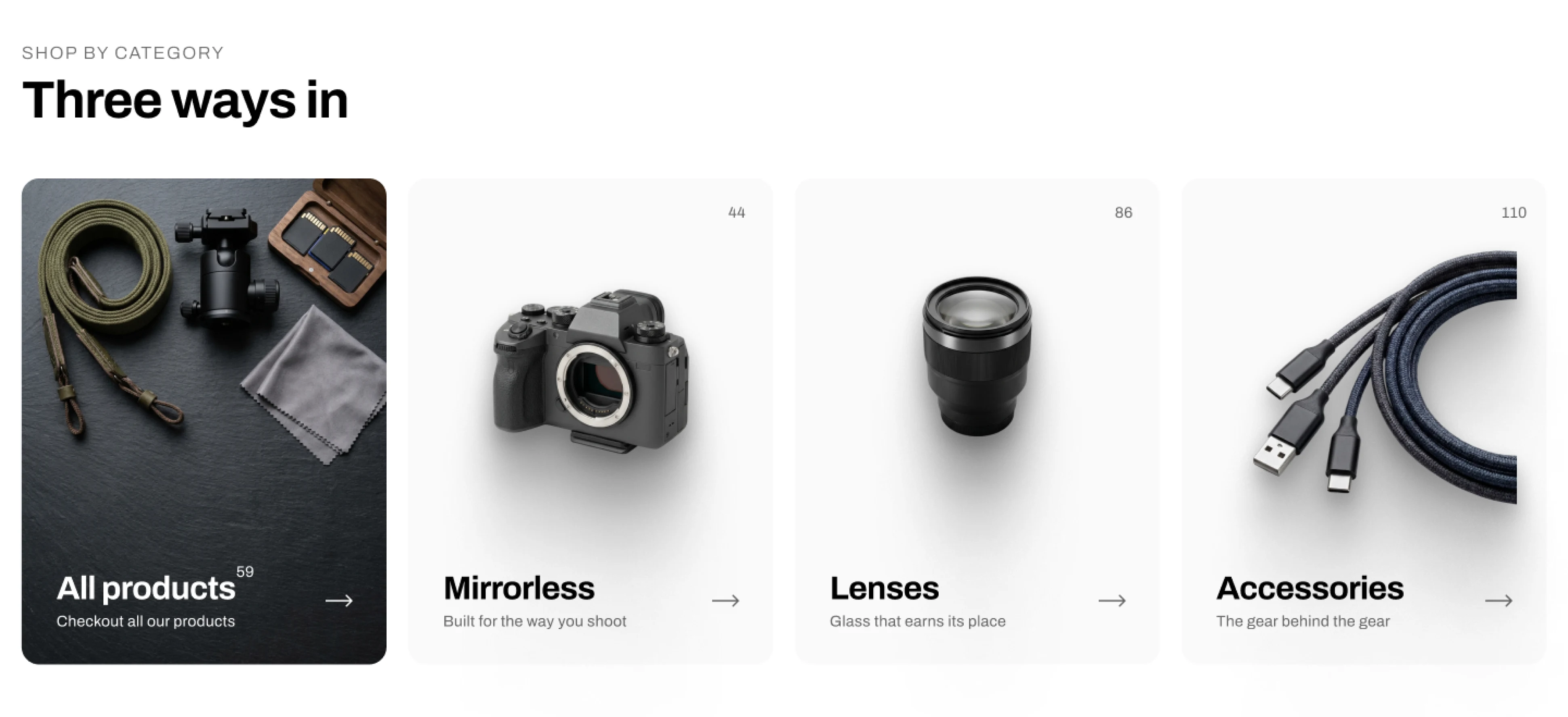
Camera & Gear Store Website desgned by zakria asim - Category section
Shop by category
After the hero, I moved straight into "Three ways in," All products, Mirrorless, Lenses, Accessories.
What I did:
I kept this to four cards, not a sprawling mega-menu. Each card carries a product count and a one-line tag ("Built for the way you shoot," "Glass that earns its place") instead of generic category copy.
Why this matters:
Someone who already knows what they want shouldn't have to think. This section exists for the buyer who typed "mirrorless" in their head before they even landed on the page.
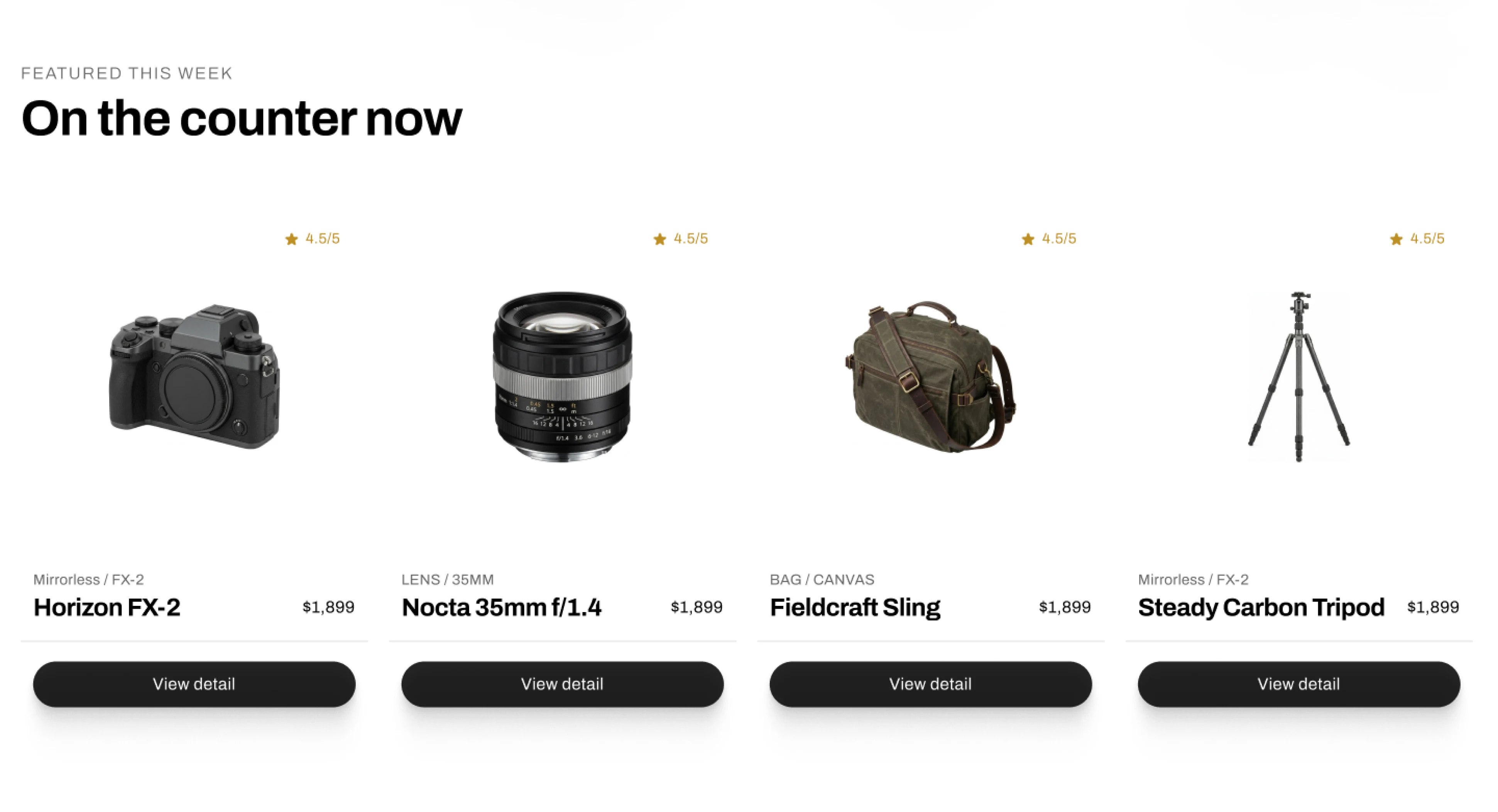
Camera & Gear Store Website desgned by zakria asim - Product grid section
Featured this week
What I did:
I added a "On the counter now" row, four in-stock products with ratings, prices, and a single "View detail" action each. No carousel, no auto-scroll, just a flat, scannable shelf.
Why this matters:
Featured sections often try too hard, big banners, countdown timers. I wanted this to feel like walking past a counter in a real shop, not being sold to.
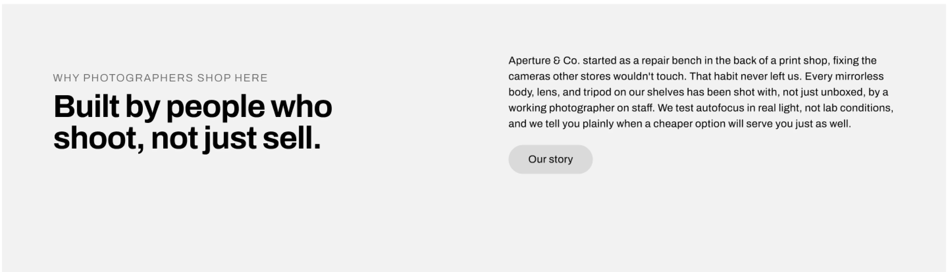
Camera & Gear Store Website desgned by zakria asim - Brand story section
Why photographers shop here?
This is the section I spent the most time on, because it's where the store either proves its differentiator or just says it.
What I did:
I wrote it as an origin story, "started as a repair bench in the back of a print shop," and paired it with the actual claim that matters: every body, lens, and tripod is shot by a working photographer on staff, not just unboxed. I included the line "we tell you plainly when a cheaper option will serve you just as well," because that's the kind of honesty a specialty buyer actually trusts.
Why this matters:
Anyone can write "quality gear, expert advice." Almost no one backs it with a specific, slightly uncomfortable admission like recommending the cheaper option. That's what makes a claim believable instead of decorative.
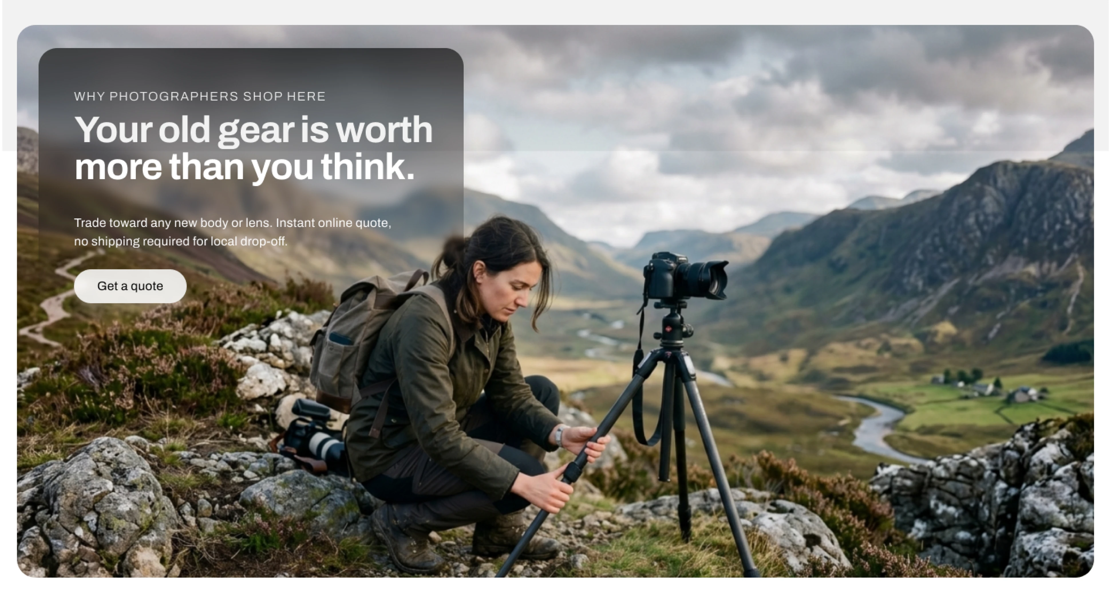
Camera & Gear Store Website desgned by zakria asim - CTA section
Trade in
What I did:
I closed the homepage with a second conversion path, "Your old gear is worth more than you think," aimed at buyers who came to sell, not just to buy.
Why this matters:
Camera gear has real resale behavior built into the category. Ignoring that path means losing a whole segment of intent the page could have captured.
Mobile
What I did:
I rebuilt the layout for mobile as a stacked flow, hero, then category cards, then featured products, then the trust section, then trade-in, keeping the same order and hierarchy as desktop instead of cutting sections to save space.
Why this matters:
A lot of gear buyers browse mobile first and buy desktop later. If the mobile version loses the trust-building sections to save screen space, it loses the buyers it needs most.
Designed and built in Framer.
Contact me if you have similiar project in your mind
I would love to make your brand shop experience unforgetable.
Like this project
Posted Aug 8, 2026
A conceptual camera gear ecommerce site designed to earn buyer trust before the sale, not just showcase products.
Likes
0
Views
17
Timeline
Aug 6, 2026 - Aug 8, 2026