Colour Me Intrigued - Brand Presentation
Debarati Sarkar
About the Brand
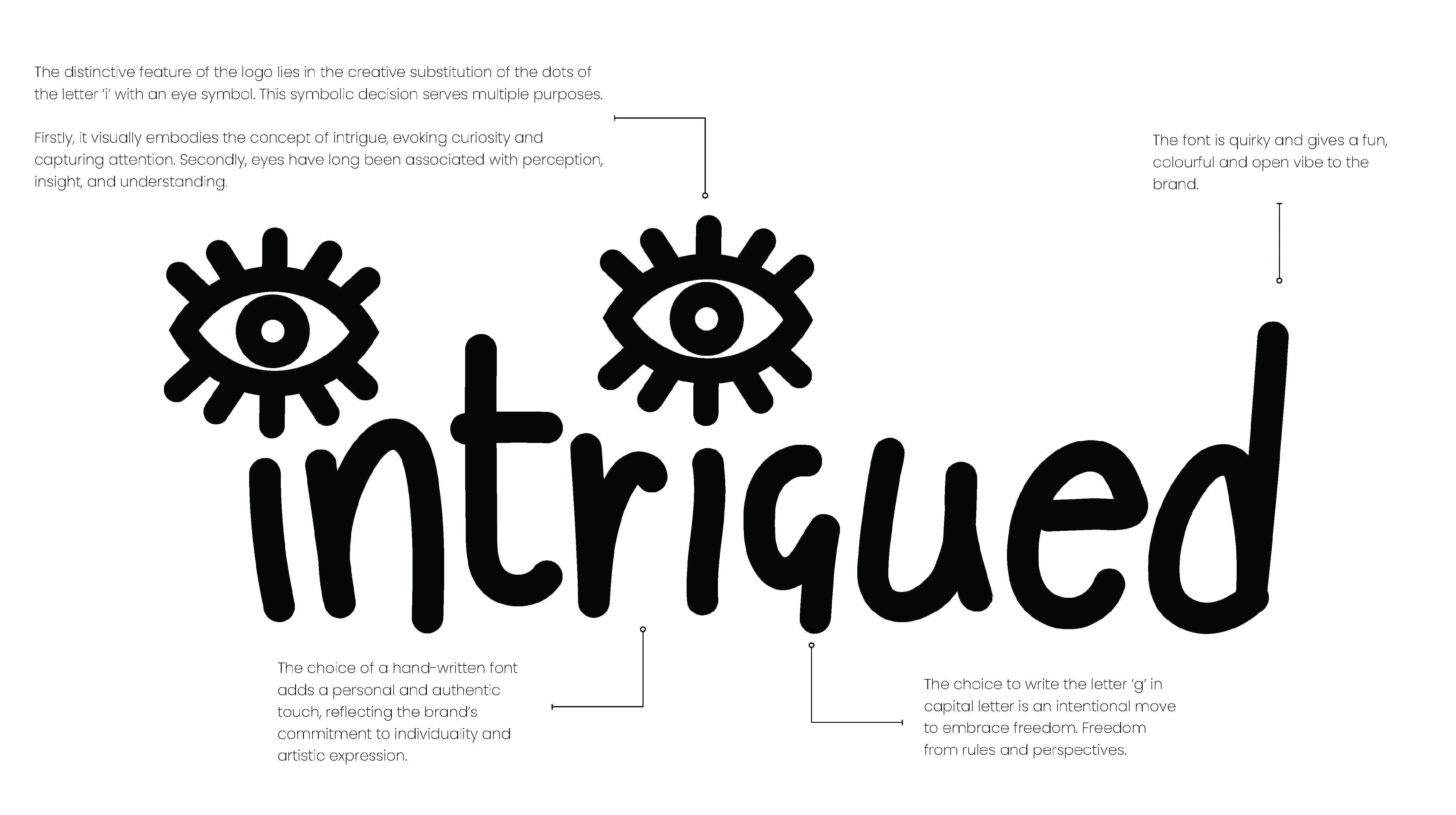
Colour Me Intrigued is a vibrant and expressive art brand that revolves around being intrigued by nature and its surroundings.
‘Intrigued’ specialises in creating and showcasing original, one-of-a-kind paintings and selling prints; the brand invites art enthusiasts of all kinds to immerse themselves in a world of beautiful art. Each artwork reflects the artist’s innermost thoughts and emotions, bridging the gap between imagination and reality.
With a focus on expressionist art, ‘Intrigued’ offers a diverse collection that evokes deep emotions and sparks meaningful connections. The brand aims to create a space where art lovers can discover unique pieces that resonate with their individuality and bring colour and intrigue to their spaces.

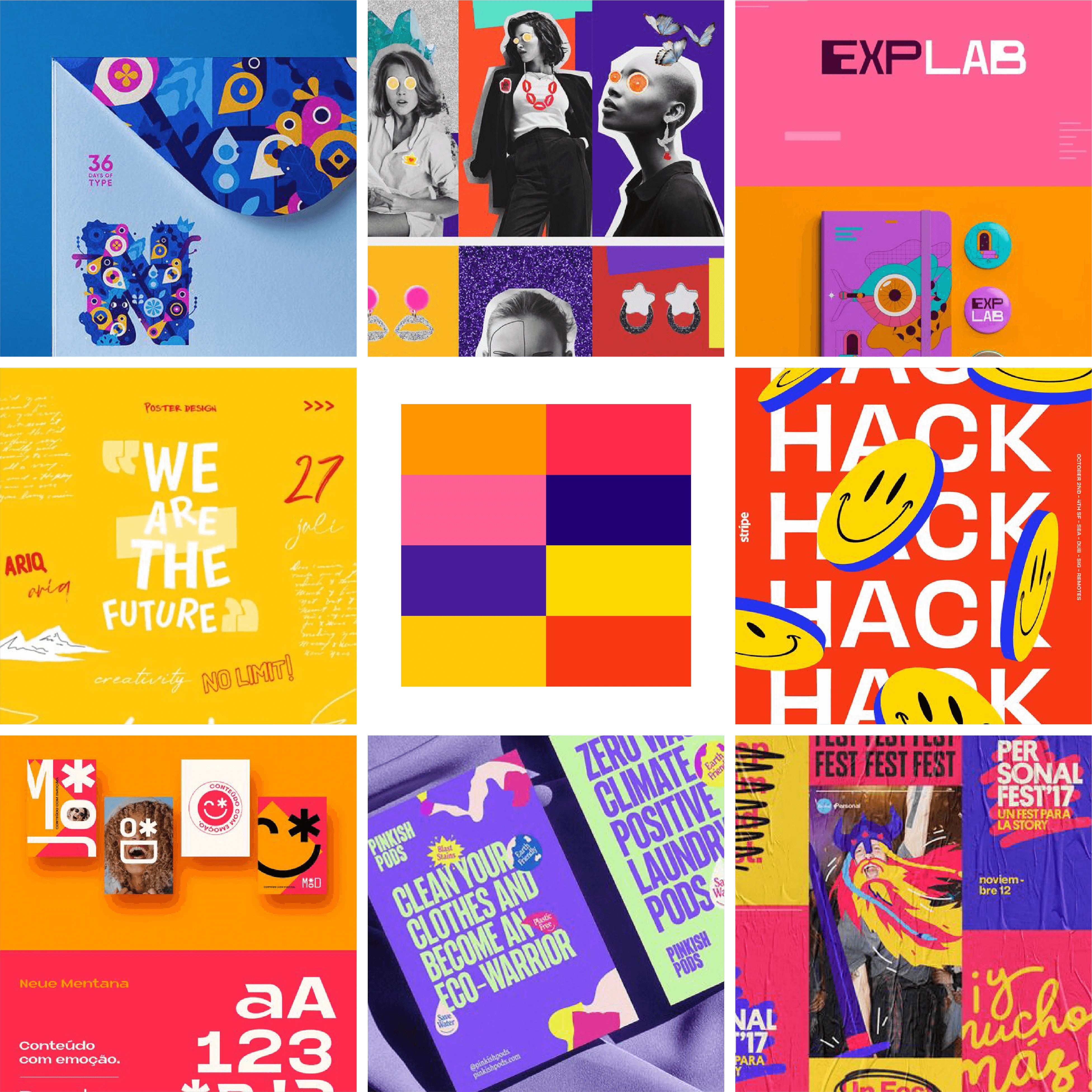
Moodboard
The mood board to the right was agreed upon with the client and chosen to give direction to the brand proceedings.
A mood board is a great starting point for this brand to have a visual reference point for the overall aesthetic and style. The right mood board can inspire and guide creativity, which can help the final product to meet the client’s expectations.
It involves the essence of the brand and the colours that will go along with the brand values.
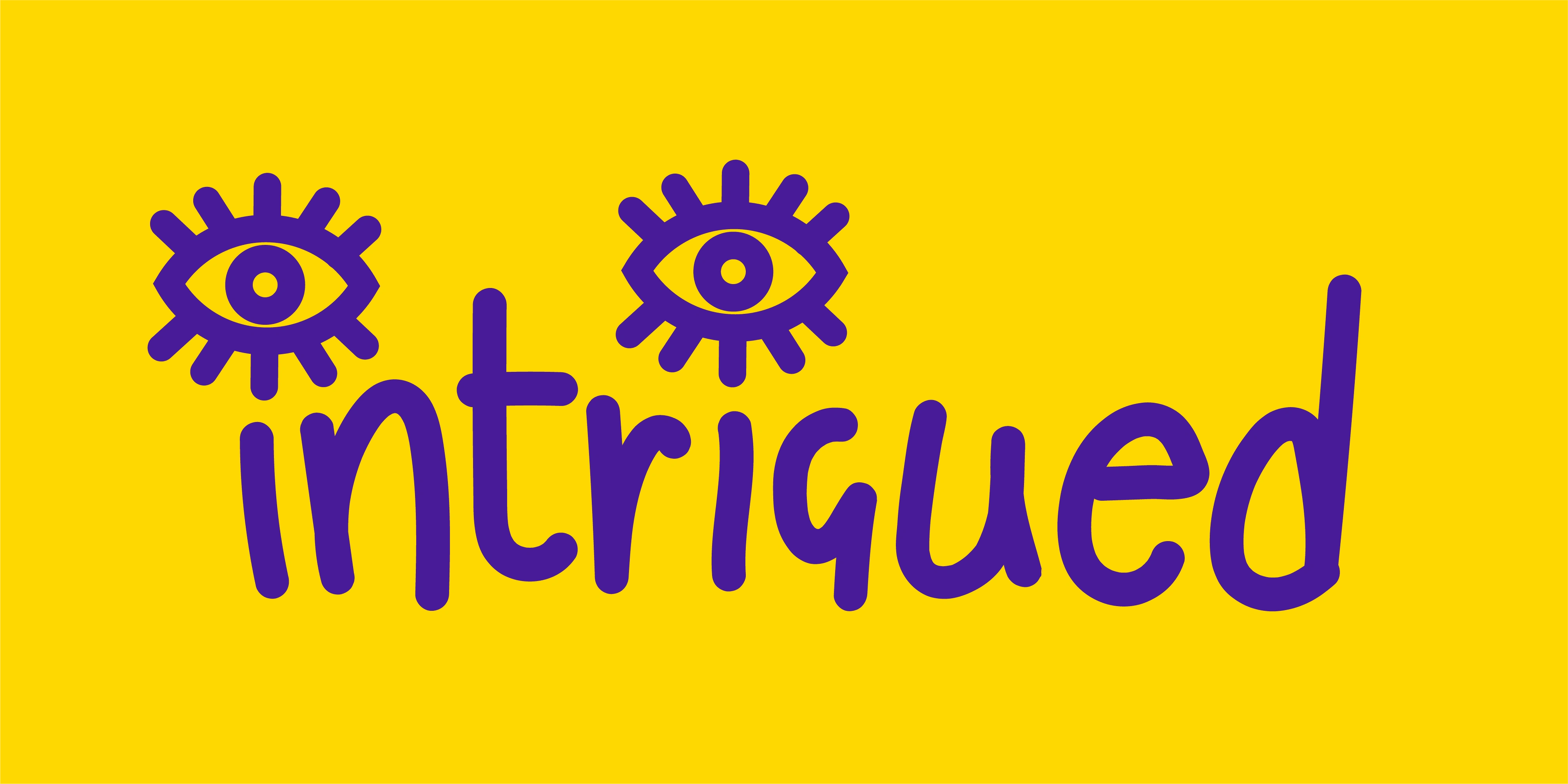
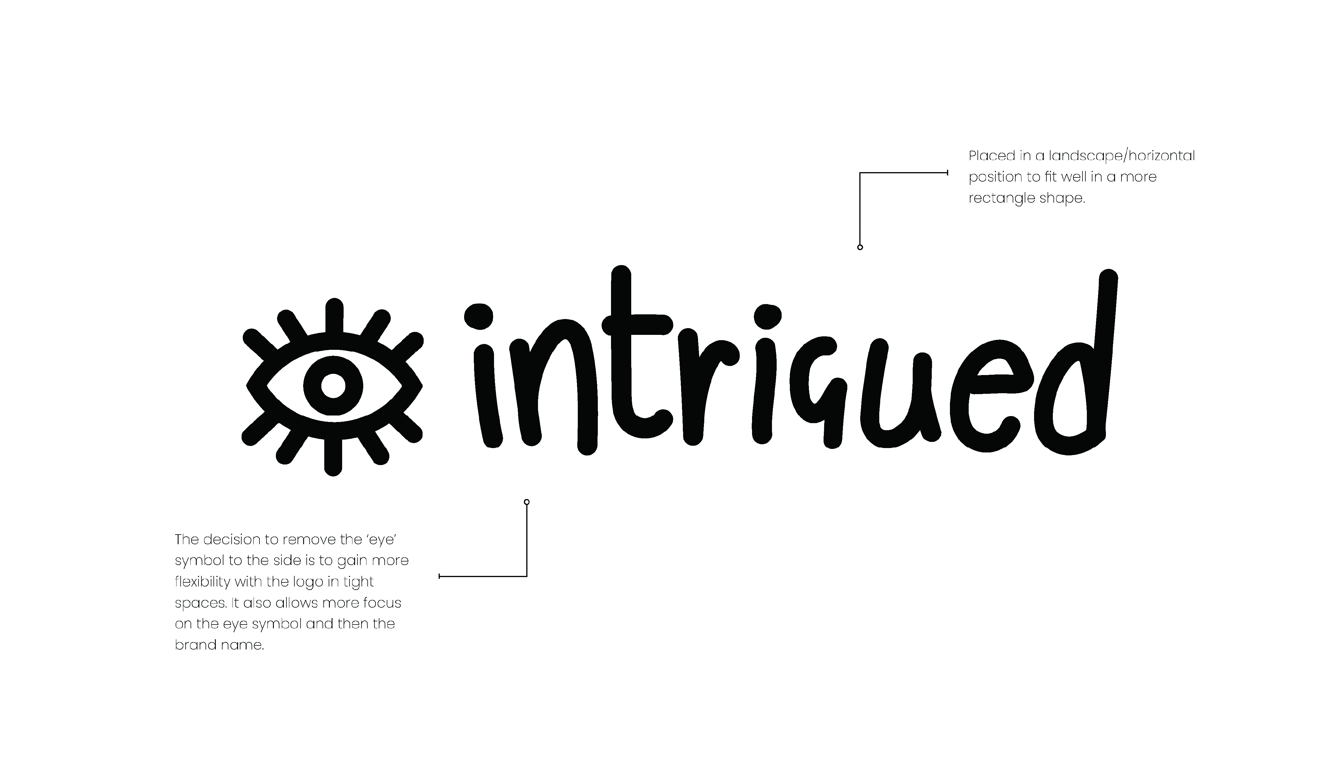
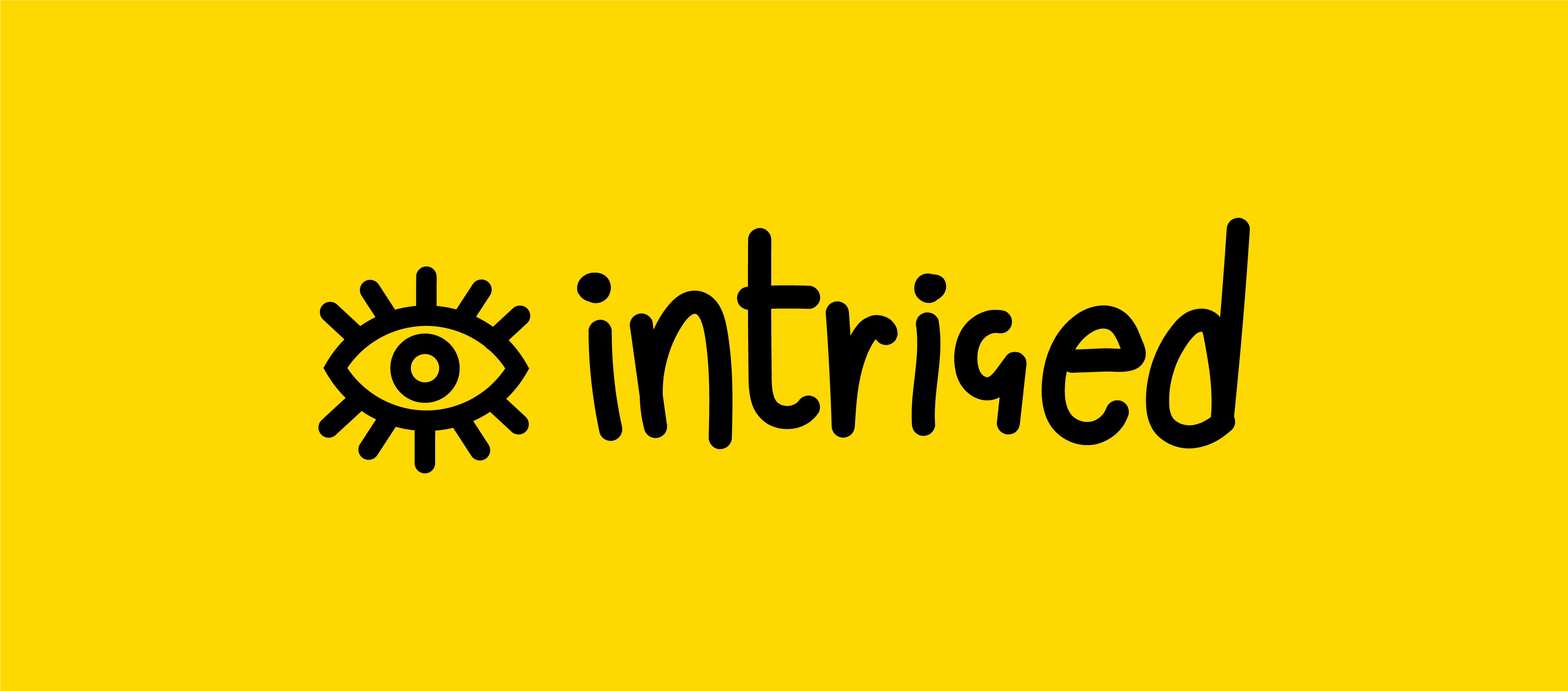
Primary Logo
The primary logo is the most prominent expression and symbol of the brand.
Using this logo more often when enough space is available is recommended.
Think of the primary logo as the tree trunk, with the additional logo marks and variations acting as branches.
Secondary Logo
The secondary logo or the ‘alternate logo’ still uses elements from the primary logo but uses a different layout.
Having this logo allows the brand more flexibility in different settings and layouts. For example, if the primary logo does not fit within a particular space, your secondary logo or logo marks can be used.
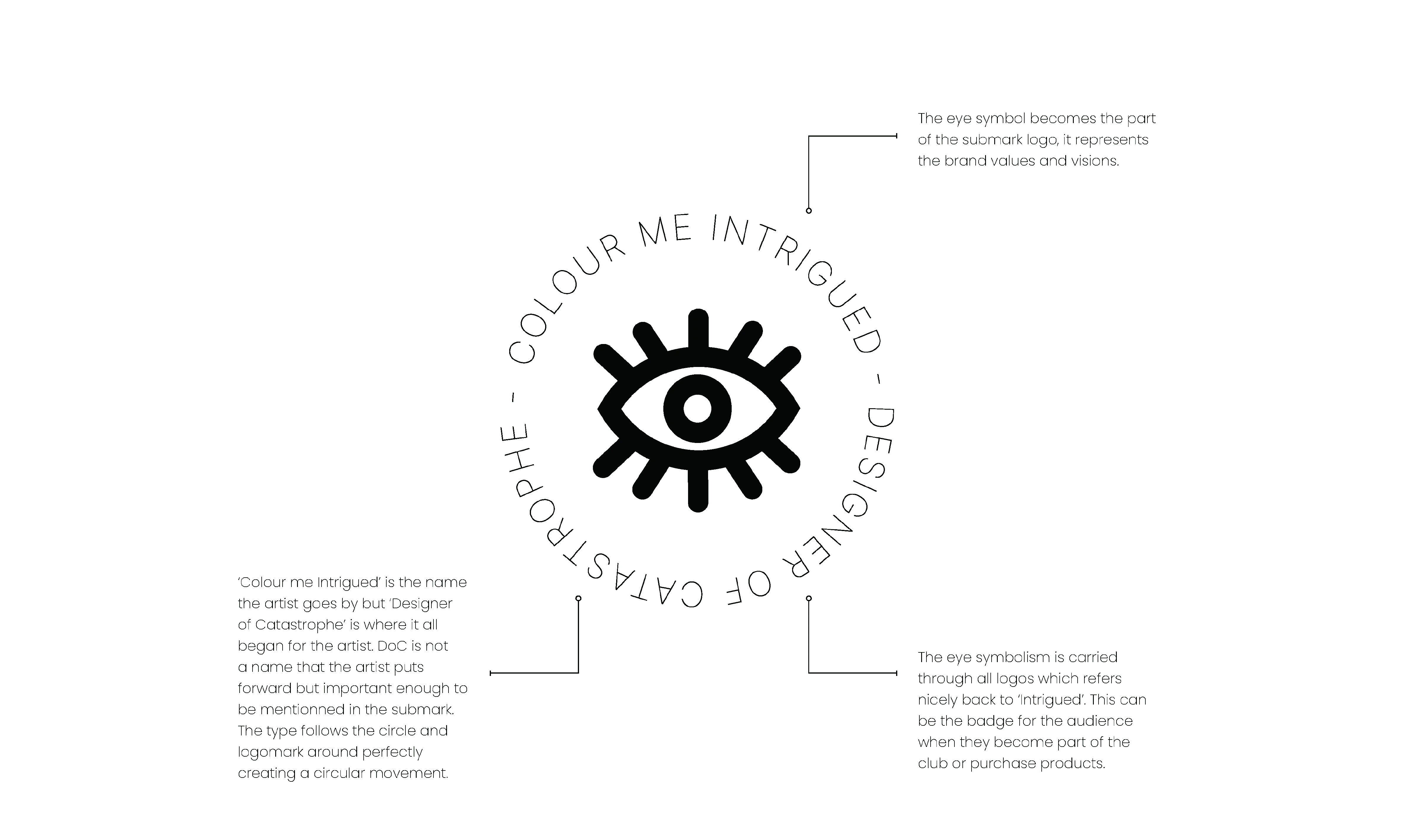
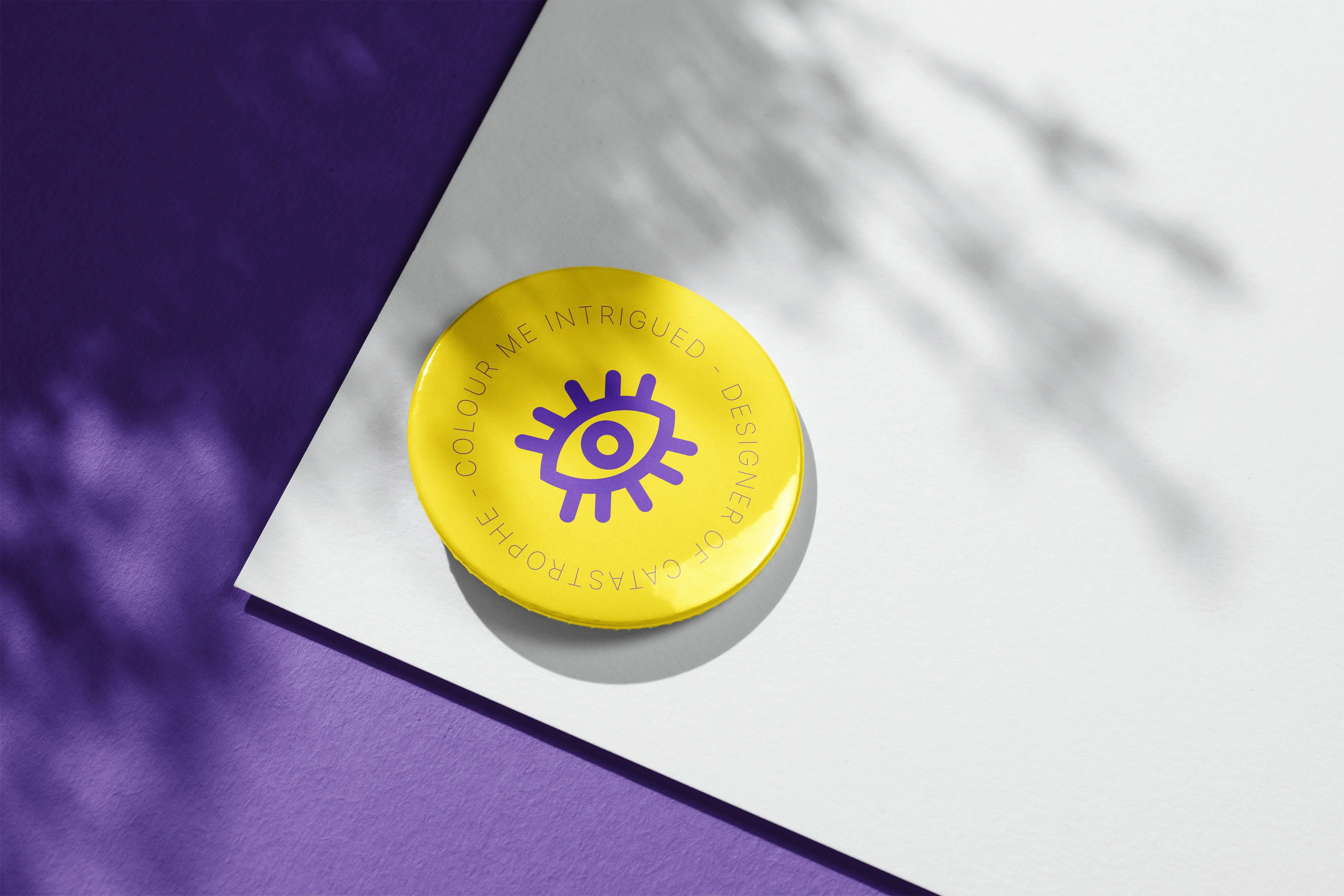
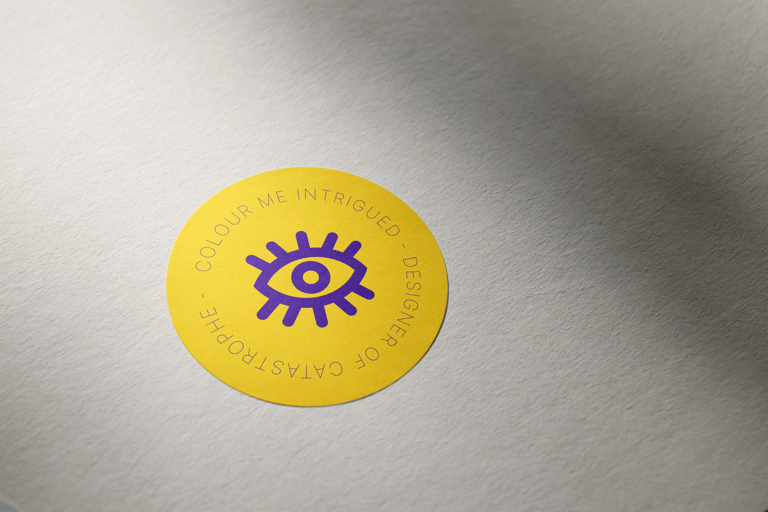
Submark Logo
The submark logo is also an alternative version of the primary logo, allowing the brand more flexibility in different layouts.
If the other versions of your logo do not match the necessary dimensions, this particular logo will be utilized.
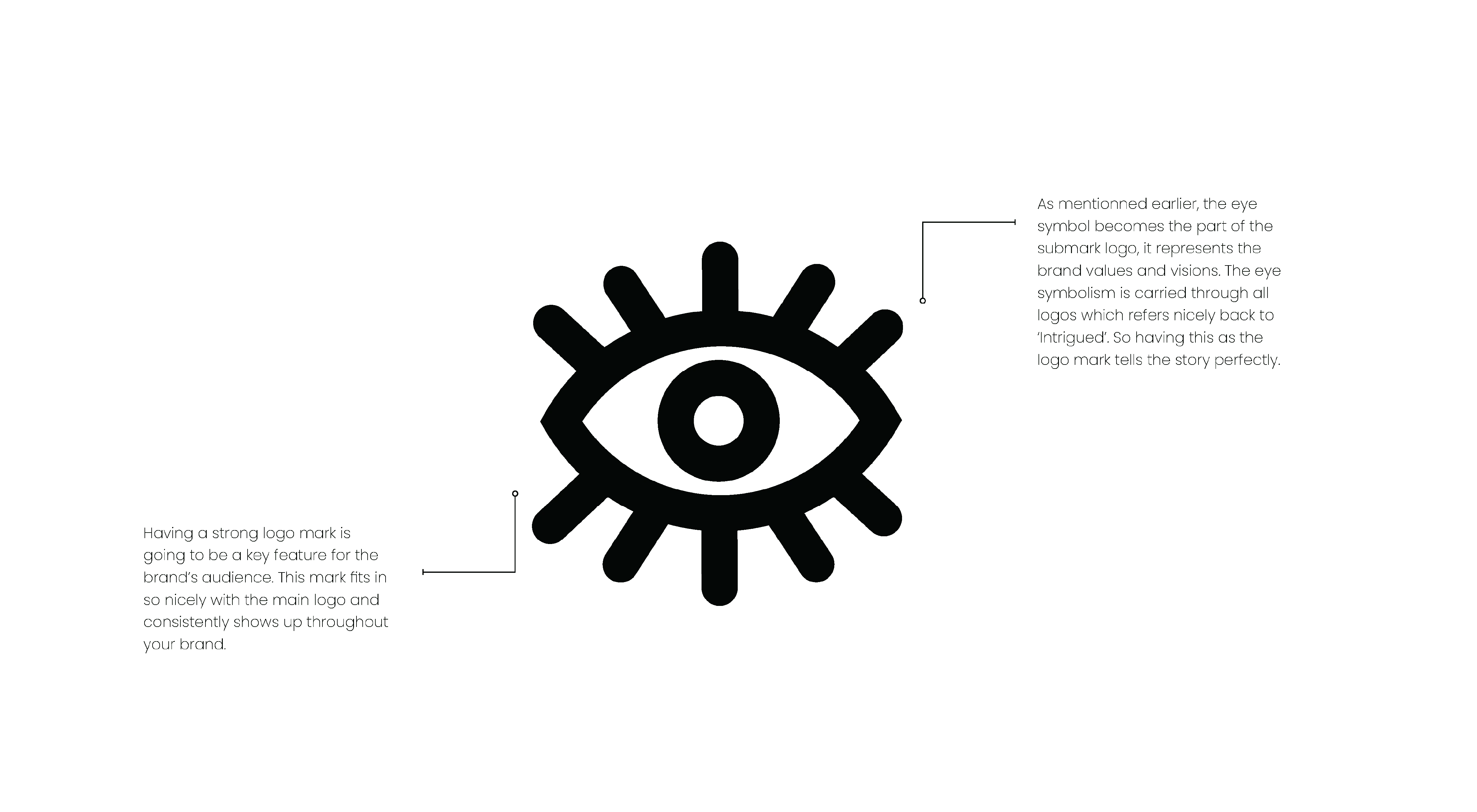
Logo Mark
Logo marks are a simplified rendition of the primary logo.
The logo mark sometimes consists of 2 letters or a symbol that fits within the space, depending on the situation.
Having something simpler works well when a more confined space exists.
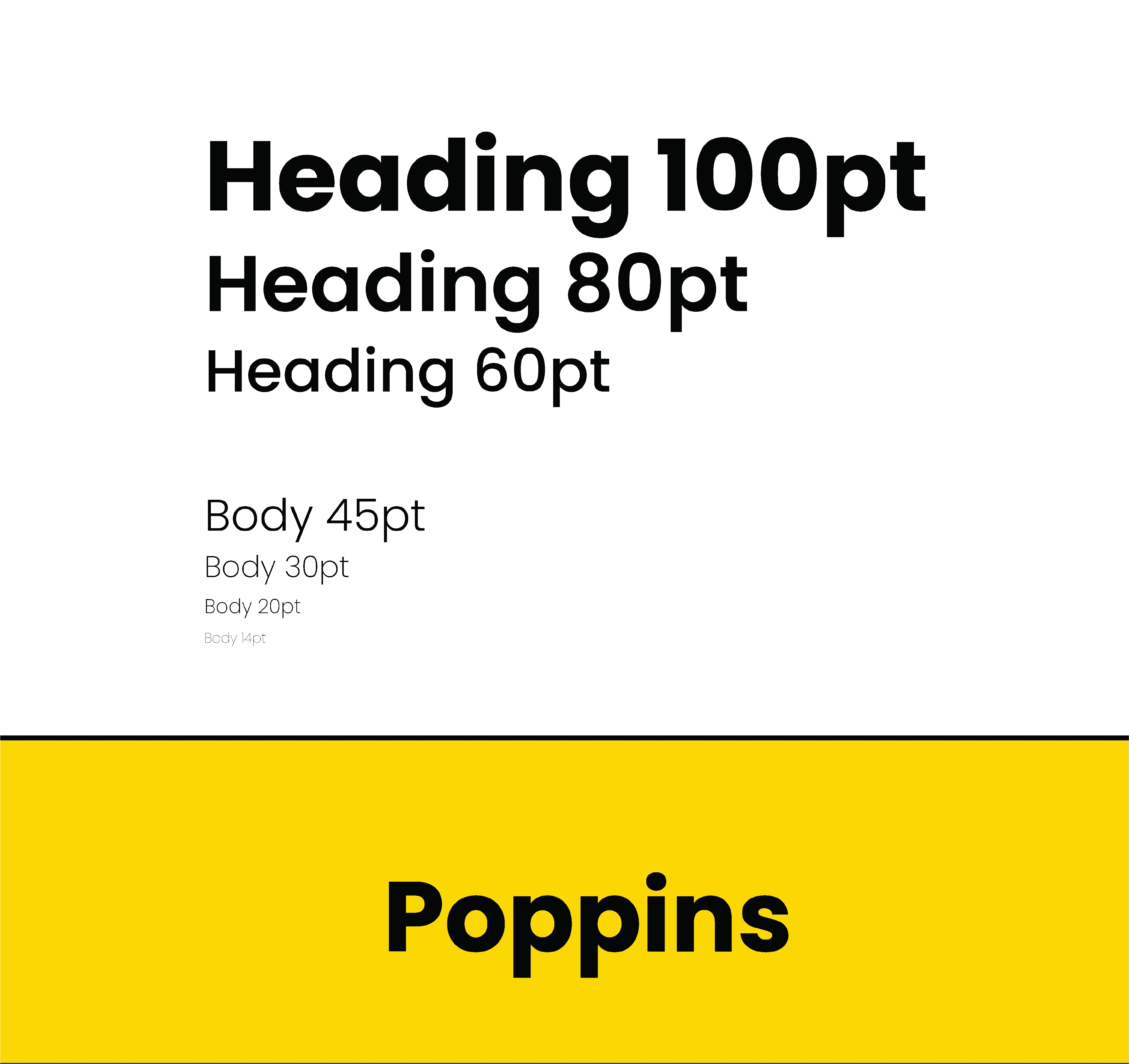
Font in use
Typography can convey emotions and personality, making it an essential aspect of branding. Choosing the right typography can help your audience connect with your brand on a deeper level.
The brand fonts use one font family with different weights. Choosing the suitable typeface, font size, and style can make a big difference in how a brand is perceived by its target market. To keep the brand’s simplicity in mind, the font chosen is Poppins.
Ensuring that the typography stays consistent is crucial in making the brand more easily remembered and recognized.
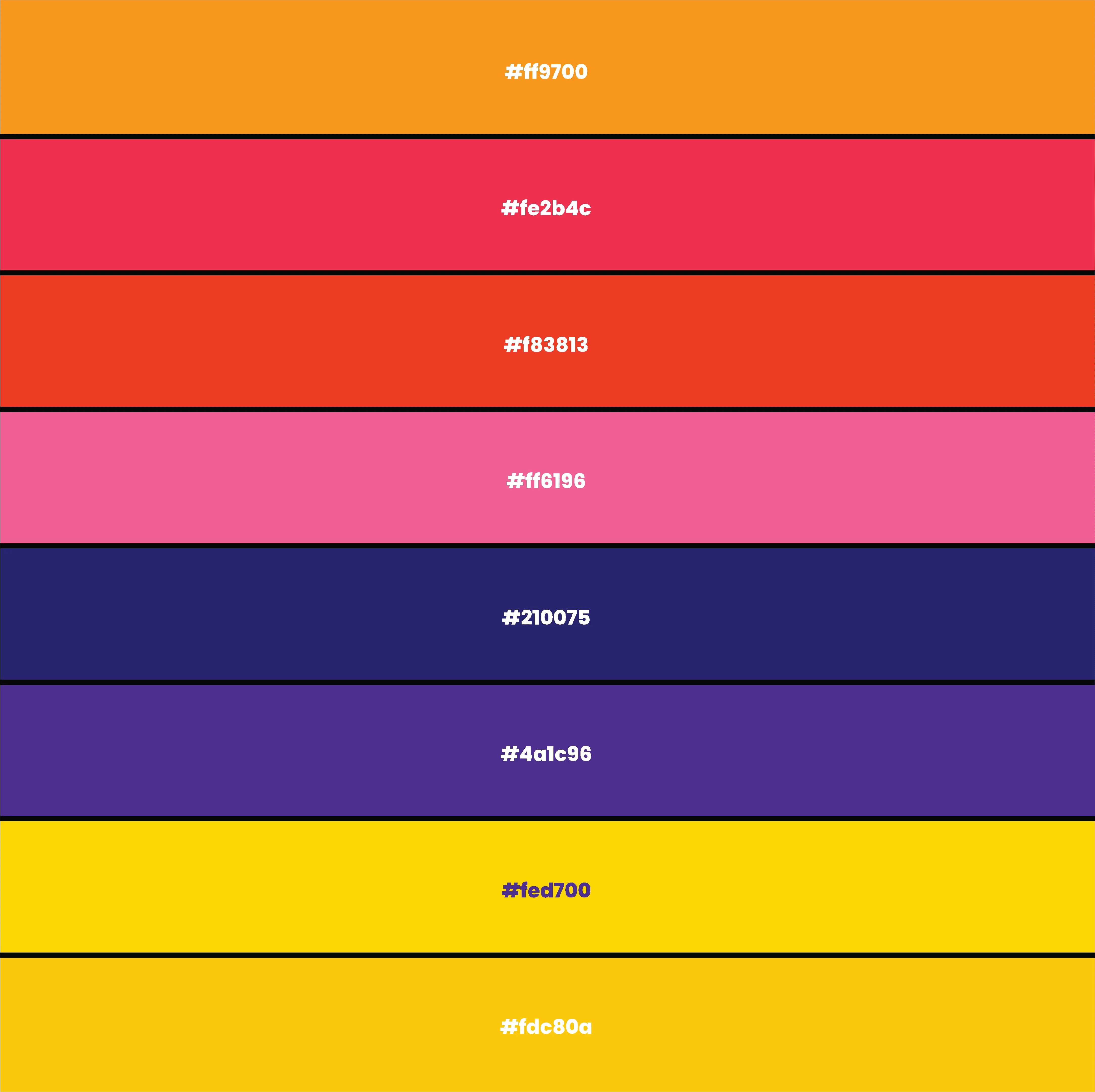
Colour Palette
Creating a distinct and complimentary colour palette will be essential to people recognizing the brand. The colour palette will be used across all the brand’s socials, stationary, website, etc.
The colours orange, red, vermilion, and pink often create a warm and inviting feeling. They are associated with energy, passion, and excitement. On the other hand, blue and violet are often used as complementary colours and are associated with calmness, peace, and serenity.
The primary colours for the brand are shades of yellow, which can represent happiness, optimism, and positivity. These colours can be used for all variations of the logo and logo marks.
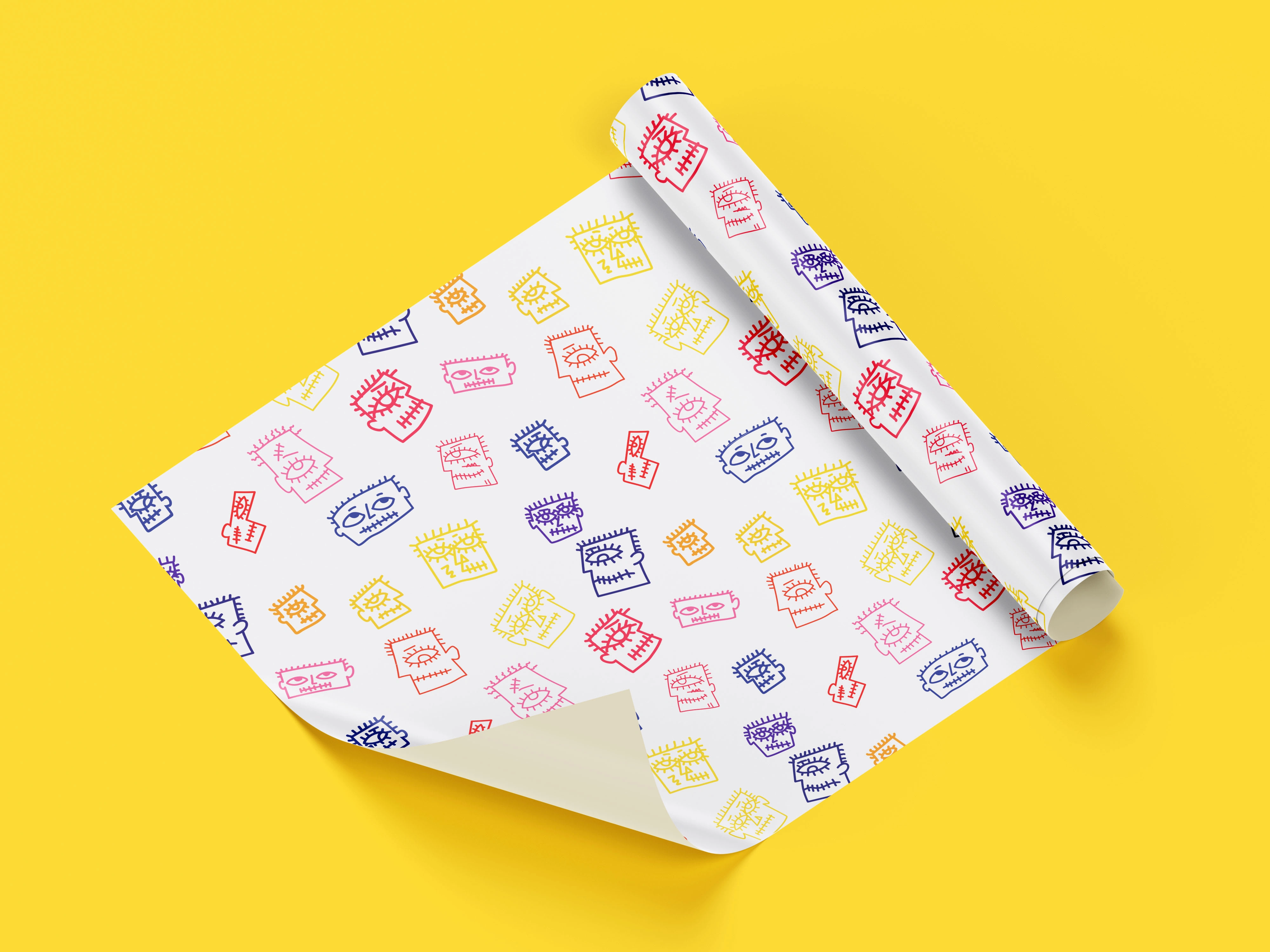
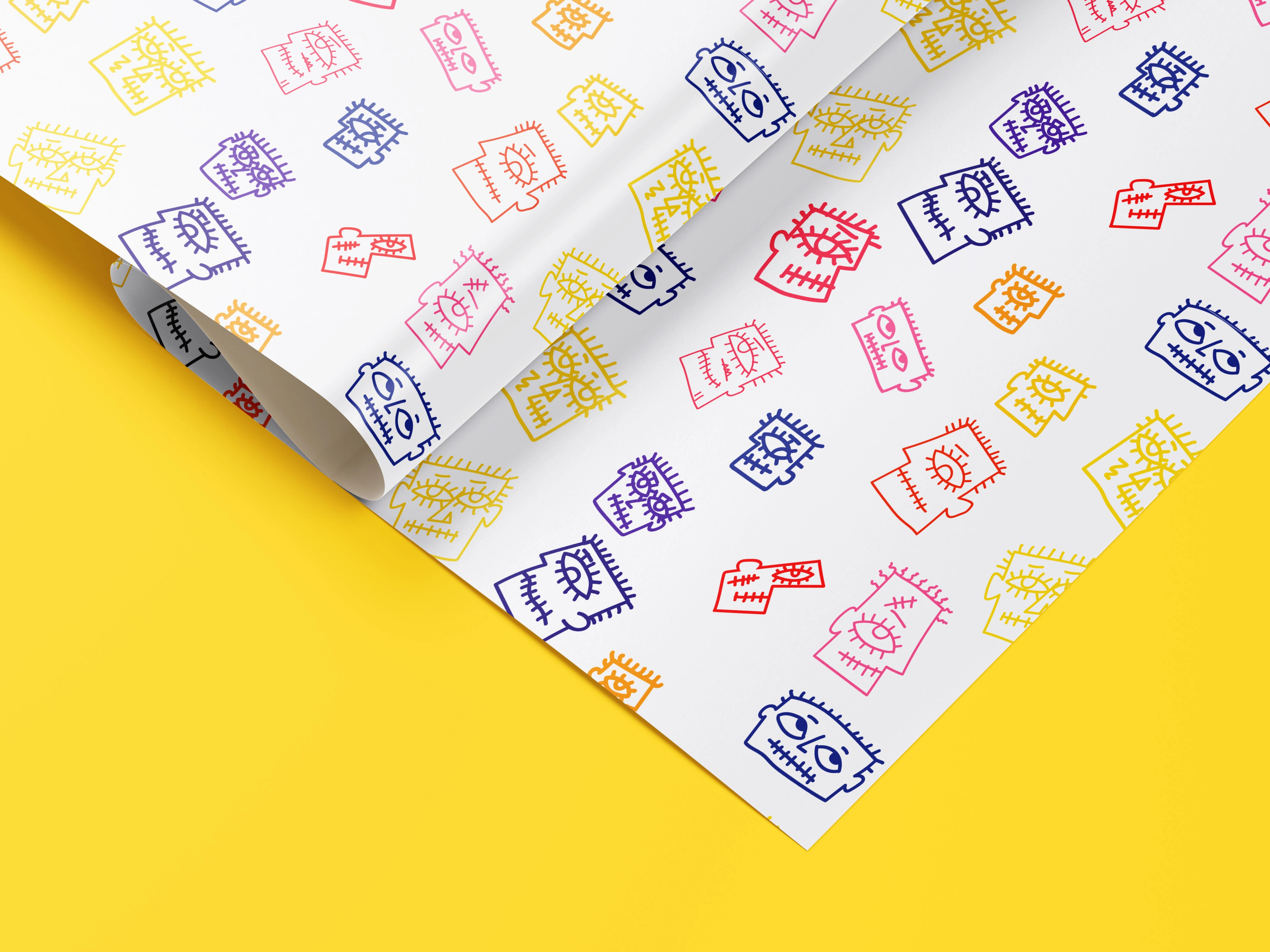
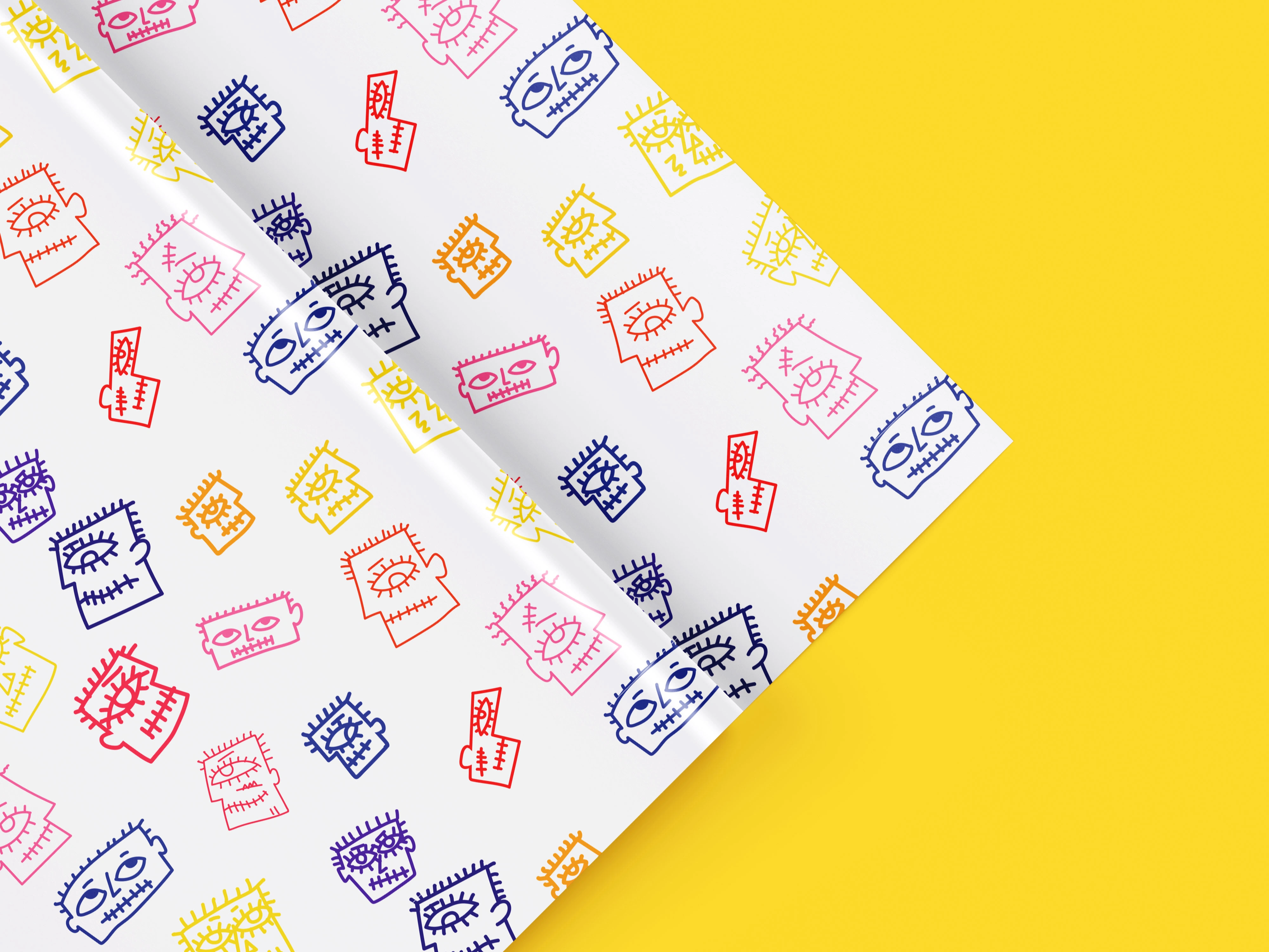
Brand Pattern
Brand patterns are an exciting aspect of a brand that allows its personality to shine. They create a memorable brand experience that can truly enhance its overall image.
Building brand recognition is essential for businesses, and using effective methods can help maintain a cohesive brand across all touchpoints, including physical presence.
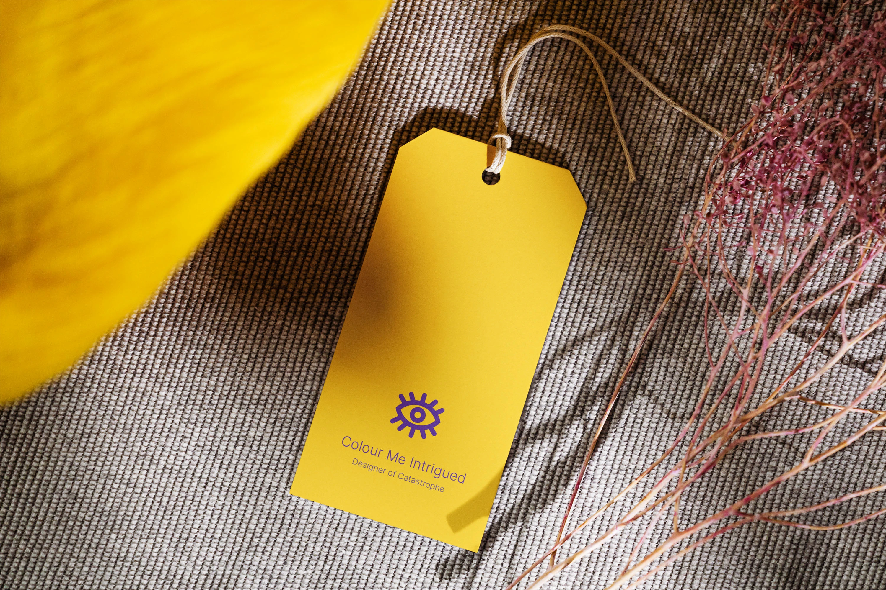
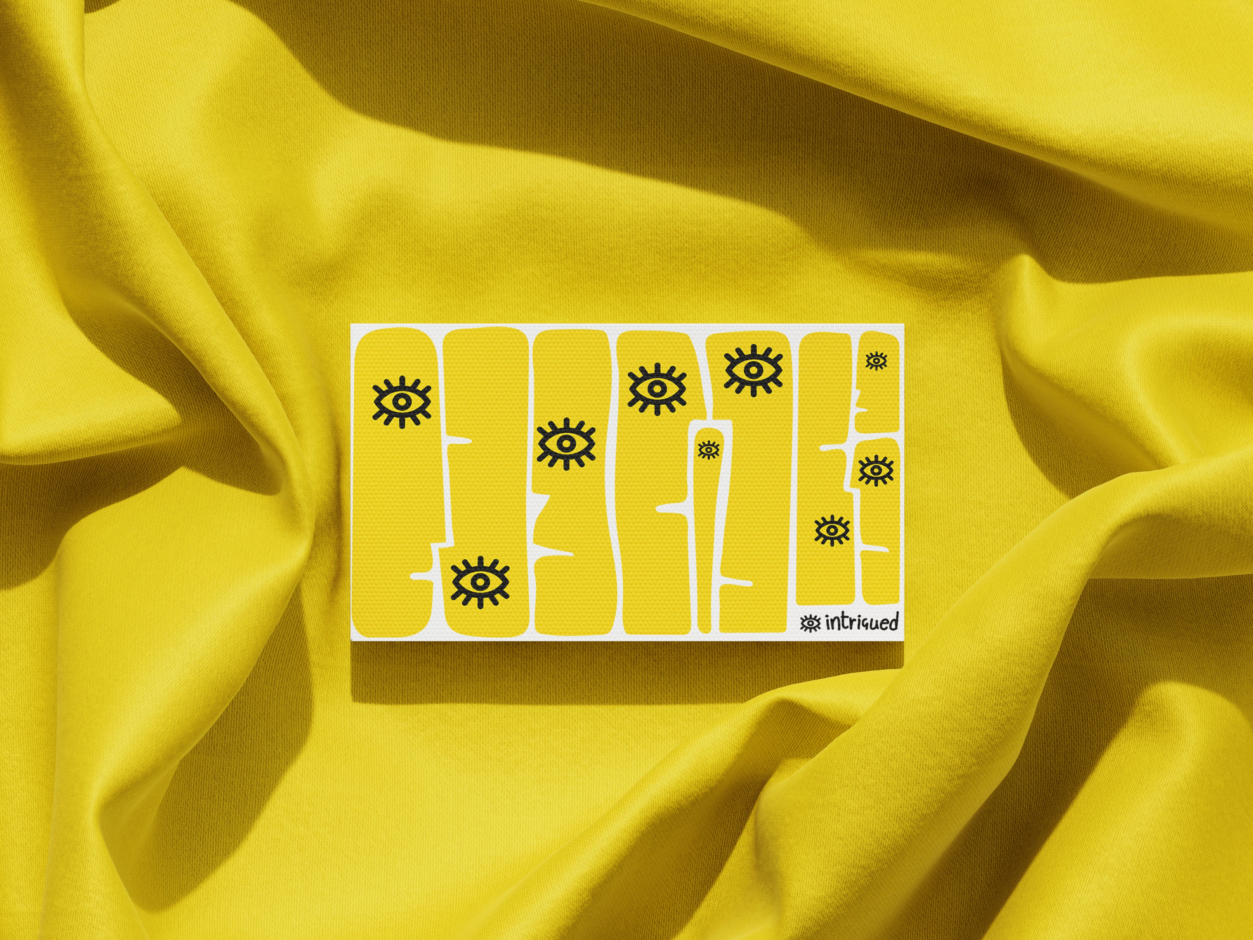
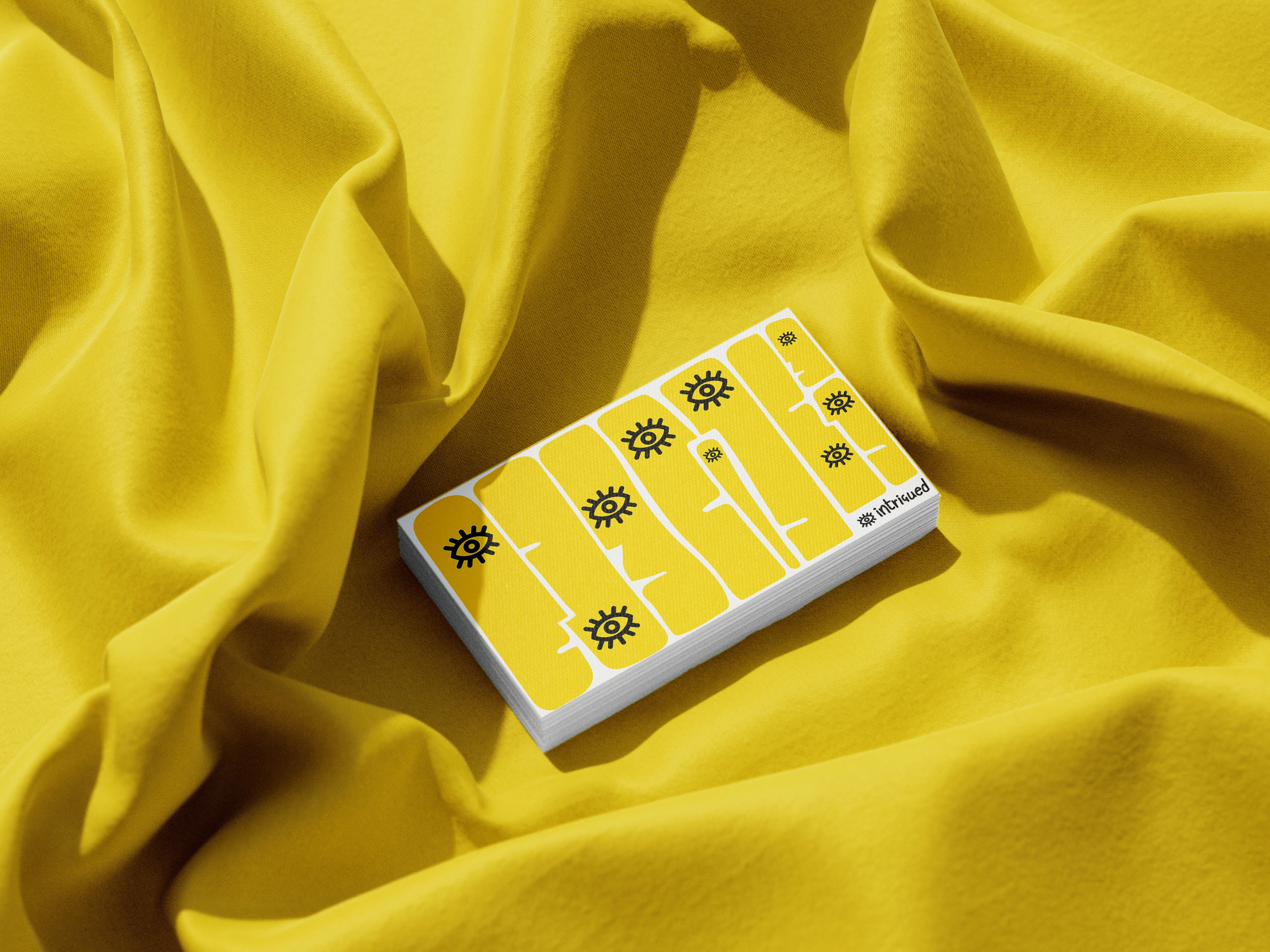
Business Cards
Visiting cards are essential for a brand as they represent its identity and create a lasting impression on potential clients or collaborators.
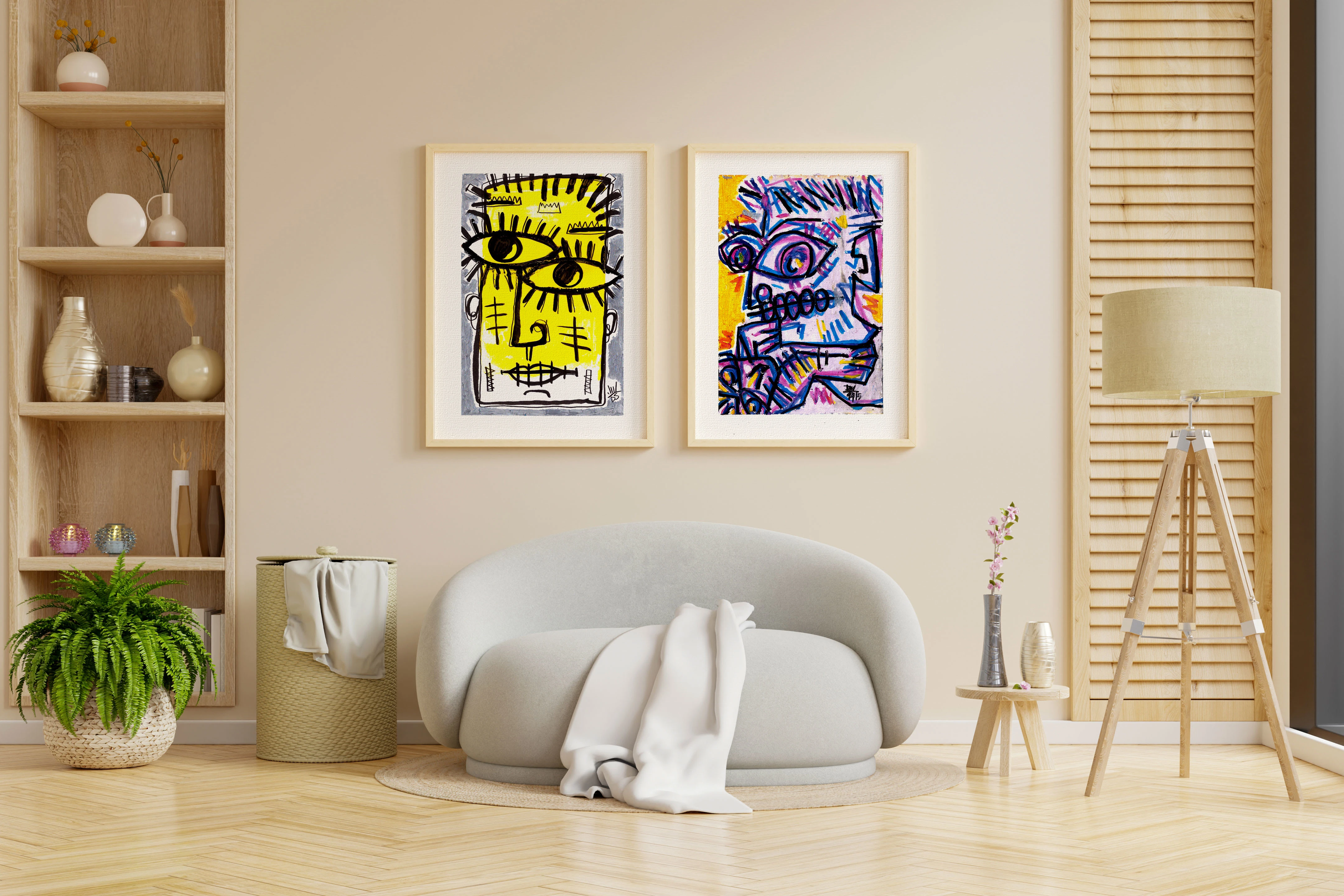
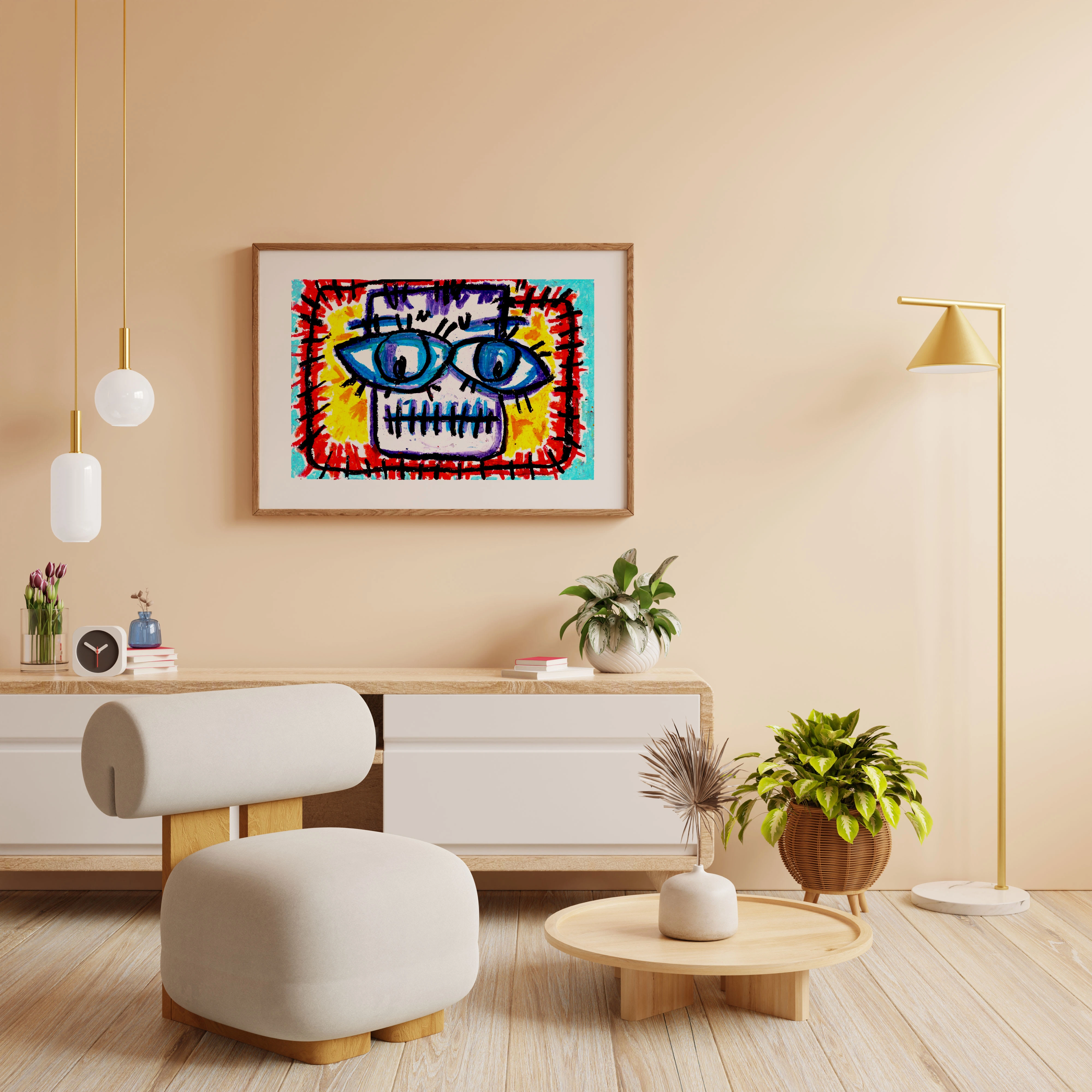
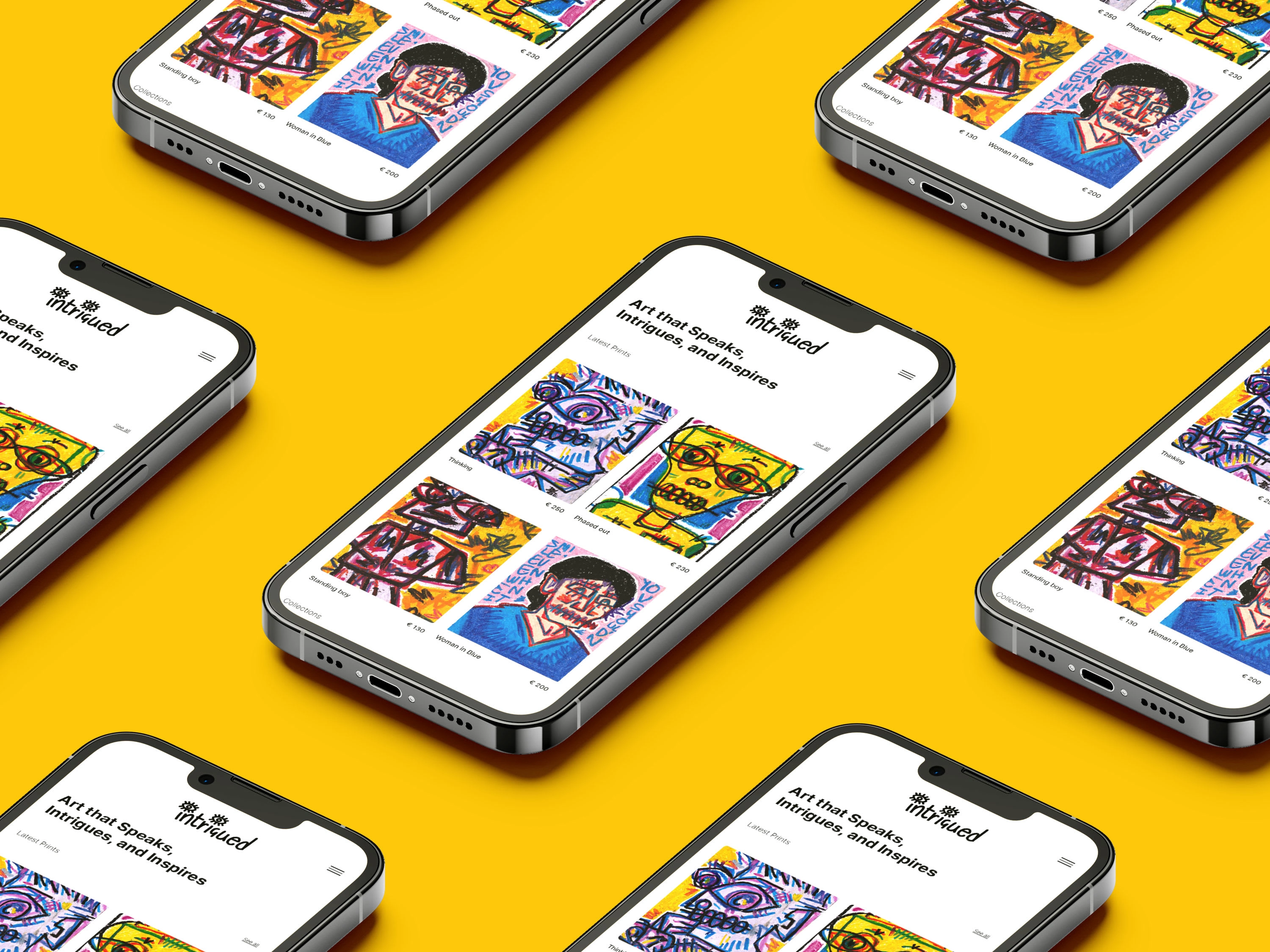
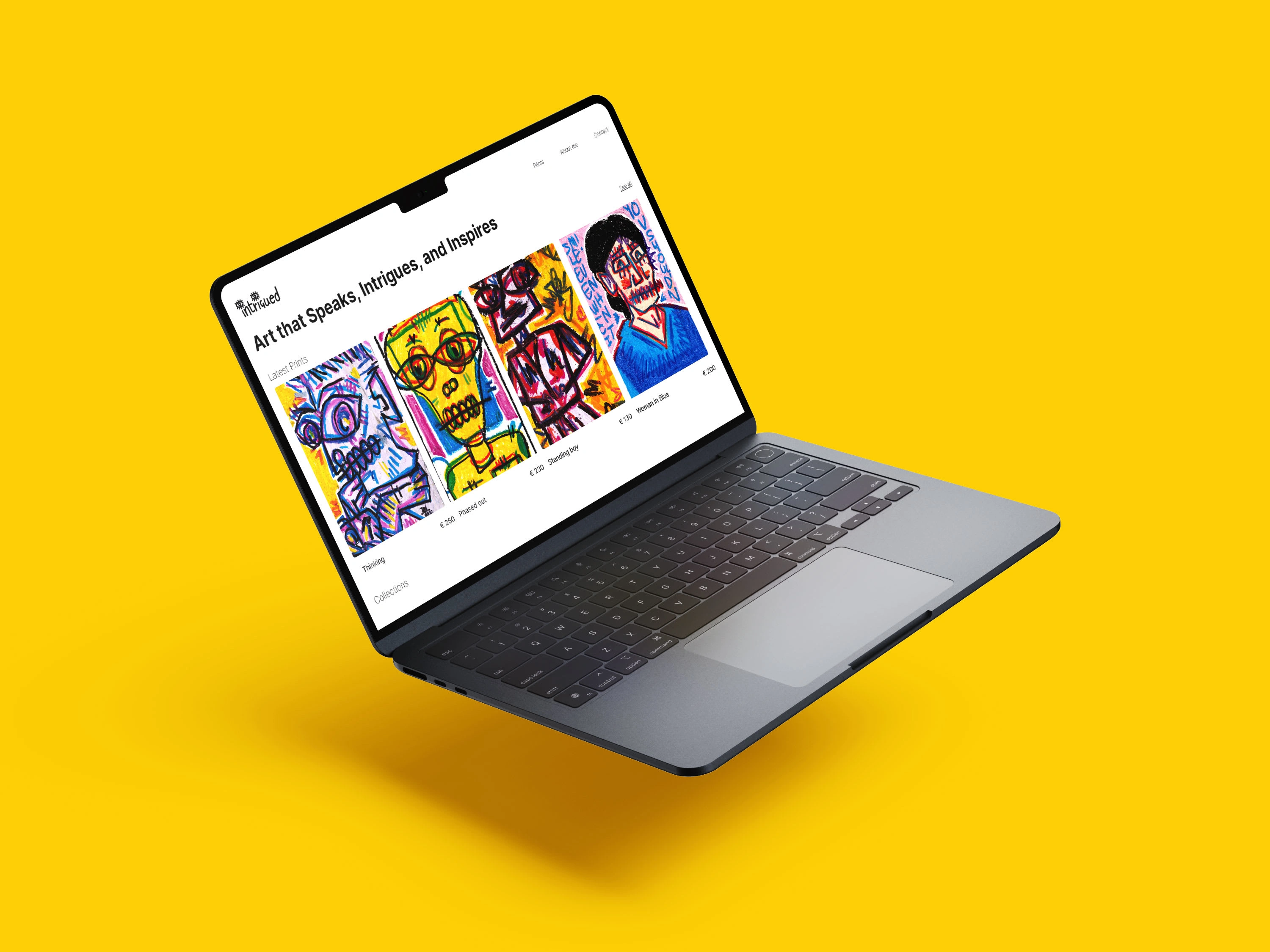
Brand in Action
The visual representations allow the brand to display products or services in a realistic setting, helping potential customers envision how they could benefit from the brand. Mockups are also great for social media and website graphics, as they provide a professional and polished look that can help elevate your brand’s image.
Thank You!
Like this project
Posted Sep 20, 2023
Brand guidelines for art as a service. Colourme_Intrigued