Built with Relume
Snagged
Check it out ↗
https://www.snagged.com/
Intro
Snagged.com, a premium domain brokerage, needed a fresh redesign. The new site combines bold visuals, retro charm, and playful animations, capturing the brand’s unique character while improving usability.
This redesign was commissioned by Moon Landing Agency, where I took the lead in the design process.
My Role
As the design lead, I handled the overall web design and create Minimum Viable Branding (MVB) to establish a unified, retro-inspired aesthetic. I also contributed a small part to the web development, specifically focusing on structuring and styling the blog section.
The Brief
When I received the project brief to redesign of Snagged.com, a premium domain broker, three things stood out:
The Fisherman – Featured on the T-shirt they just made, it became a symbol of the brand’s essence.
The Contrasting References –
One: straightforward, polished commercial websites.
The other: a wild 90s style website — Ling’s Cars — a chaotic, over-the-top relic of web design history, still alive and kicking!
Retro – A key vibe the client wanted to channel.
My Creative Process
1. Moodboard
Based on the brief, reference websites, and input from Mark & Alex at Moonlanding, I created a moodboard to explore different directions:
Optimized Current Site – Clean, professional, and conversion-driven.
Character-Led – Playful, approachable, and memorable with a cartoon-driven narrative.
Underwater Theme – A treasure-hunting concept.
I also gathered aesthetic references to shape the overall look and feel.
2. Design Draft
Turns out the client was drawn to a landing page reference I found (https://www.supclub.xyz/). When designing, I kept it next to my own work for guidance.
Inspired by its bold and chunky font choice, I selected Gasoek One and paired it with Bricolage Grotesque.
Gasoek One is not just a thick font, but one that has character and gives a unique impression. Bricolage Grotesque channels a balance between nostalgia and contemporary style.
Together, they create something fresh, playful, retro with a modern twist, and memorable.
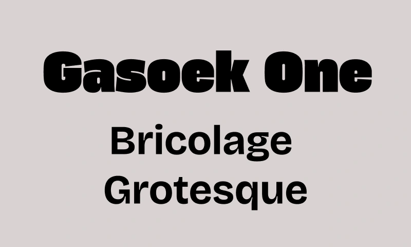
Gasoek One + Bricolage Grotesque
The fisherman became the "north star" to guide the design. I borrowed its color palette—creating a mix of orange, dark blue, and beige to define the brand color.
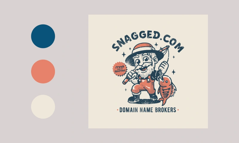
The fisherman, our North Star to guide the design
3. Iterate
As we dove deeper into the underwater and treasure-hunting theme, the design started to simplify and evolve. What began as detailed underwater illustrations transformed into clean, geometric wave patterns.
The domains, once wrapped in fish-like shapes, now became simple blocks with logos, arranged as running marquees across the page.
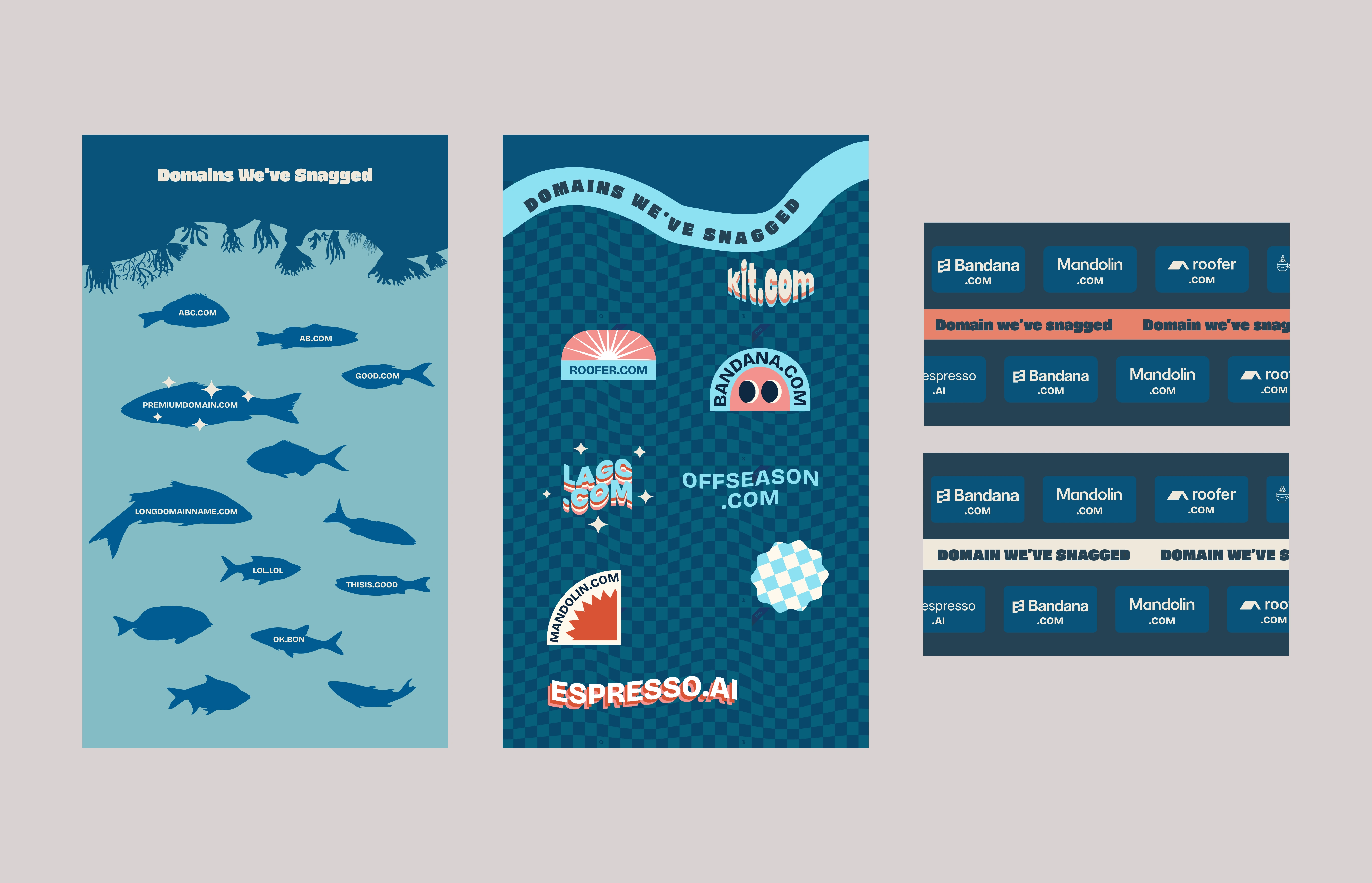
The evolution of "Domain We've Snagged" section
After about three rounds of refinement, it’s finally starting to take shape.
Experience it firsthand ↗
Like this project
Posted Nov 21, 2024
Snagged.com, a premium domain brokerage, got a bold redesign with retro charm, playful animations, and improved usability to reflect its unique character.

