

Problem Statement
Complex workflows and overwhelming options presented without clear visual hierarchy
Inconsistent UI elements that made it difficult for administrators to scan and act quickly
Unclear navigation and task flows, leading to confusion around core actions such as managing tests, tracking candidates, or generating reports
Visual clutter and lack of guided interactions, increasing cognitive load for users during high-impact tasks
Solution
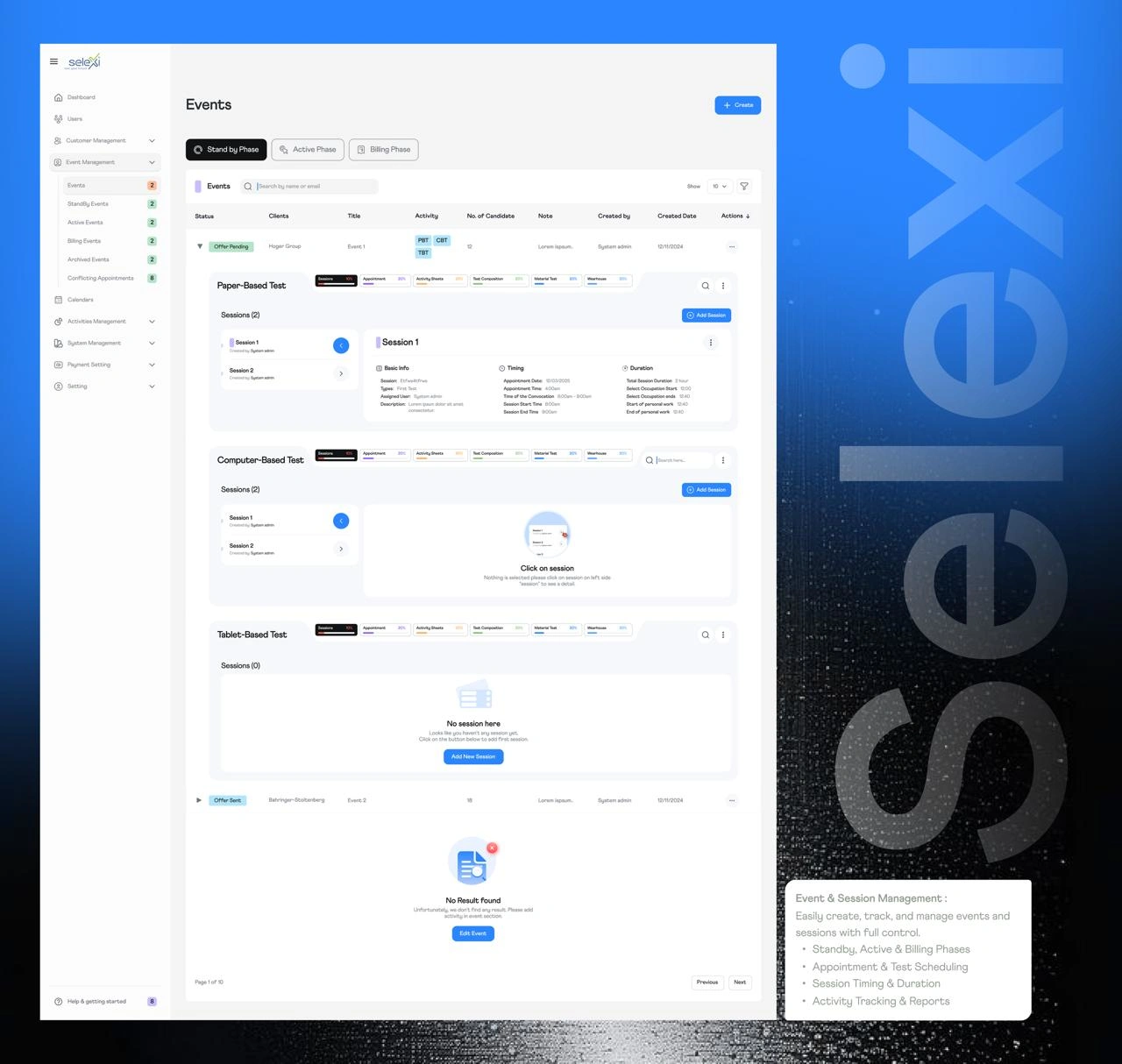
Redefining the information architecture to simplify how workflows and tools are grouped and accessed
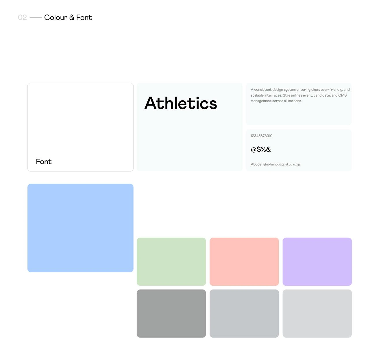
Introducing a clear visual hierarchy with consistent typography, spacing, and iconography to help users quickly locate key features
Designing intuitive navigation that aligns with user tasks, making frequent actions easy to find and complete
Improving usability with contextual guidance and feedback to reduce user errors and support decision-making
Creating responsive layouts and visual patterns that support clear task flows across larger screens and reduce mental effort
1 like · 10 views · Feb 21, 2026
Designing Clarity for High-Volume Systems
