Yuniro | UI/UX Solutions for Innovative Software & VR Products
Khansa Abdul Rasheed
Problem Statement
The original website faced several usability and visual issues:
Information was not easy to scan or understand
Visual design felt outdated and inconsistent
Navigation was unclear for first-time visitors
The value of services was not immediately obvious
As a result, users struggled to connect with the brand and often left without engaging further.
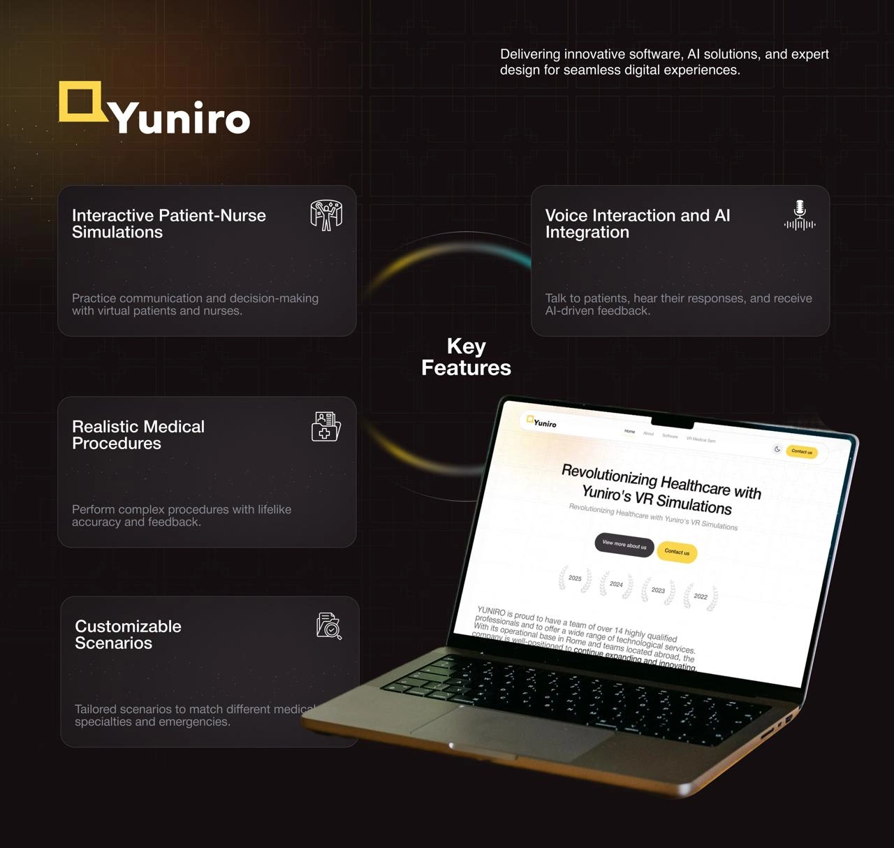
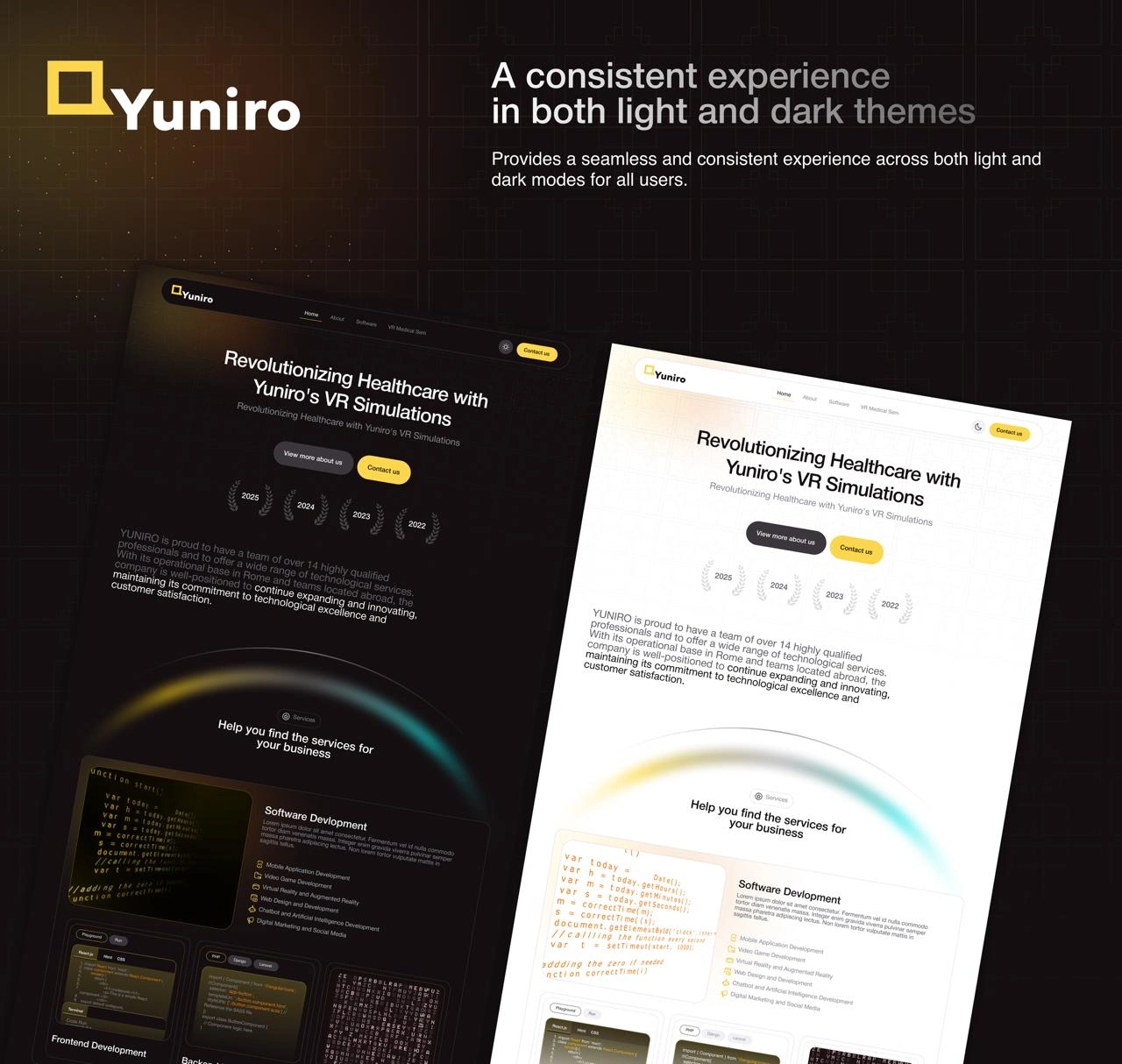
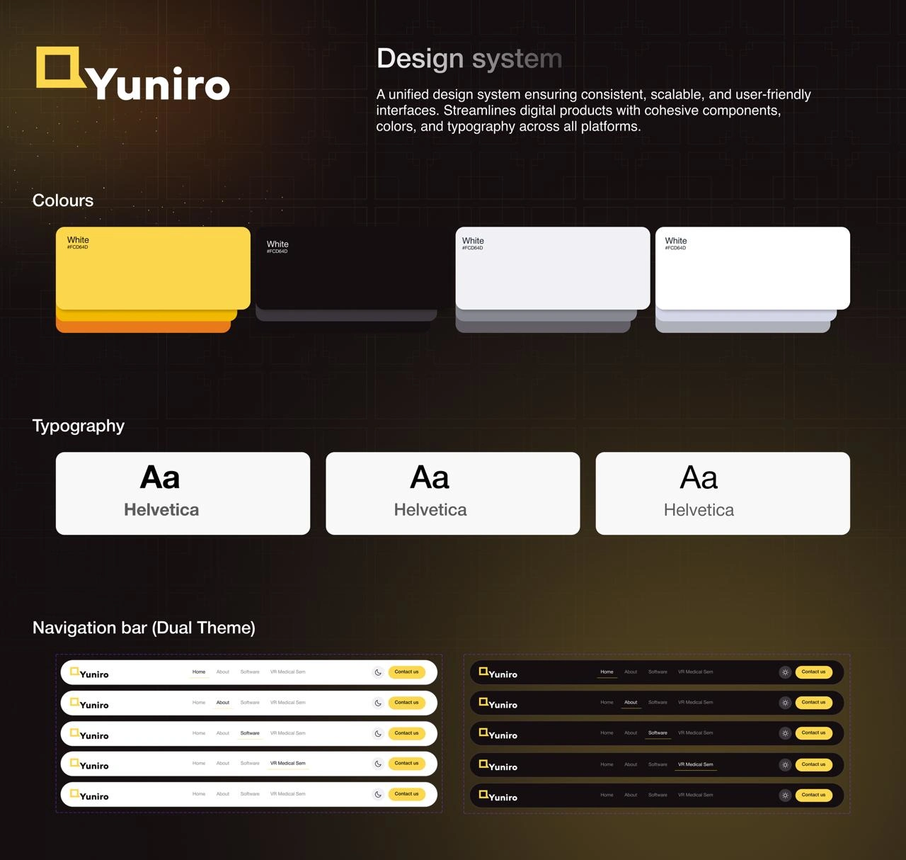
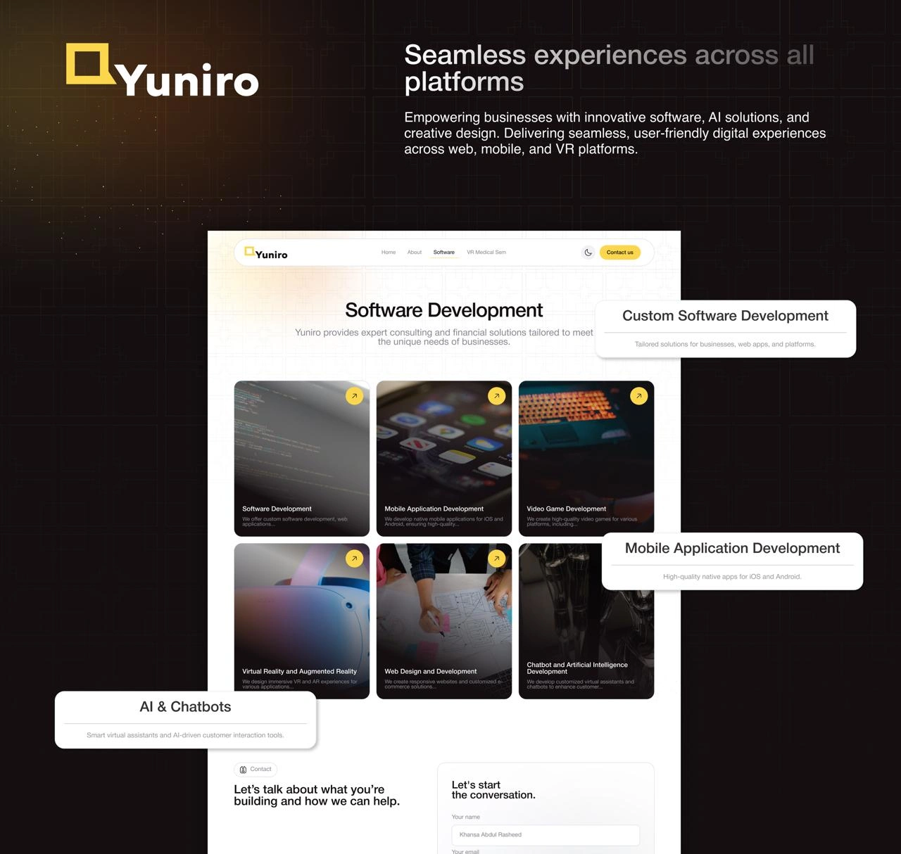
Our Solution
A clean, modern layout that feels familiar to users worldwide
Clear content structure to guide users step by step
Improved visual hierarchy to highlight key messages
Simple navigation that reduces confusion
Strong, well-placed calls to action
Like this project
Posted Feb 16, 2026
The redesign emphasizes clarity, smooth navigation, and a clean layout so visitors can quickly understand the services and take action without friction.
Likes
3
Views
5