Clair | Branding | Graphic Design
Anne-Lise Kakudji
Overview
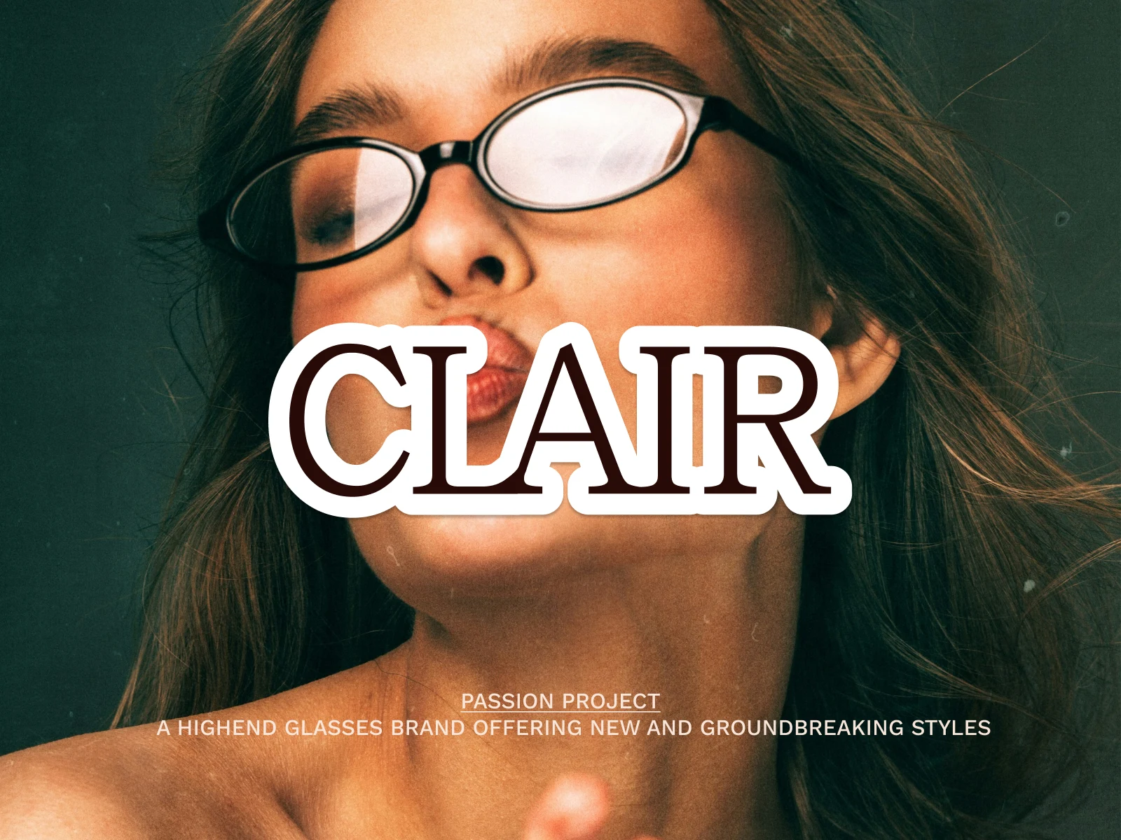
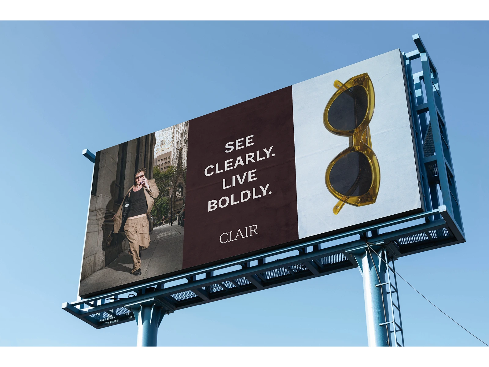
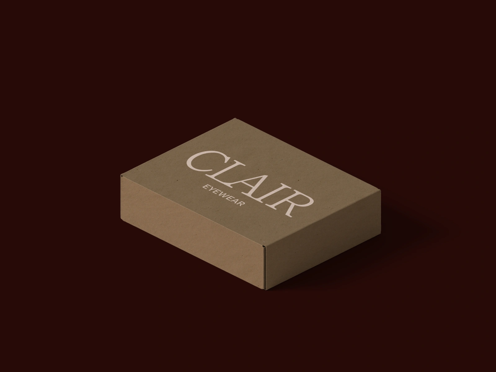
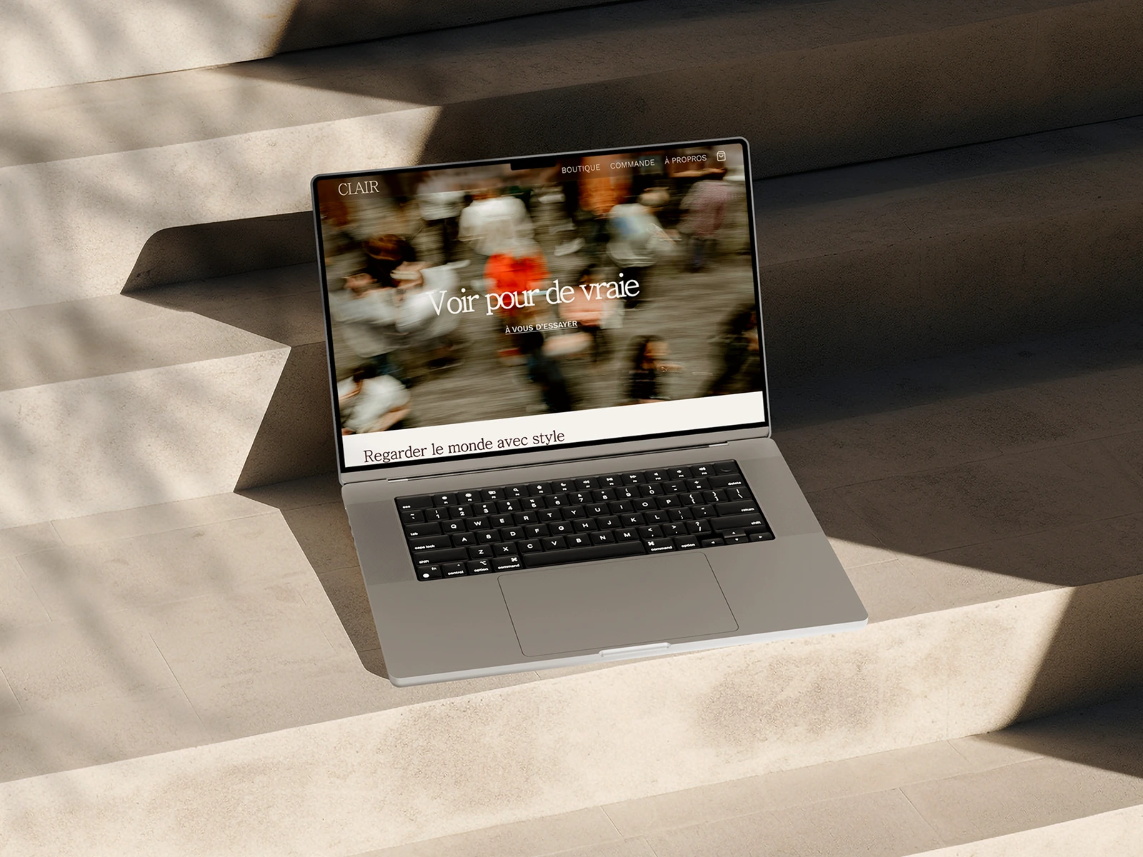
In the context of my design interaction class I created a fictional brand identity for a glasses brand. I wanted to create a high end brand that made classy but groundbreaking styles offering variety and innovation for its customers.
Behind the design
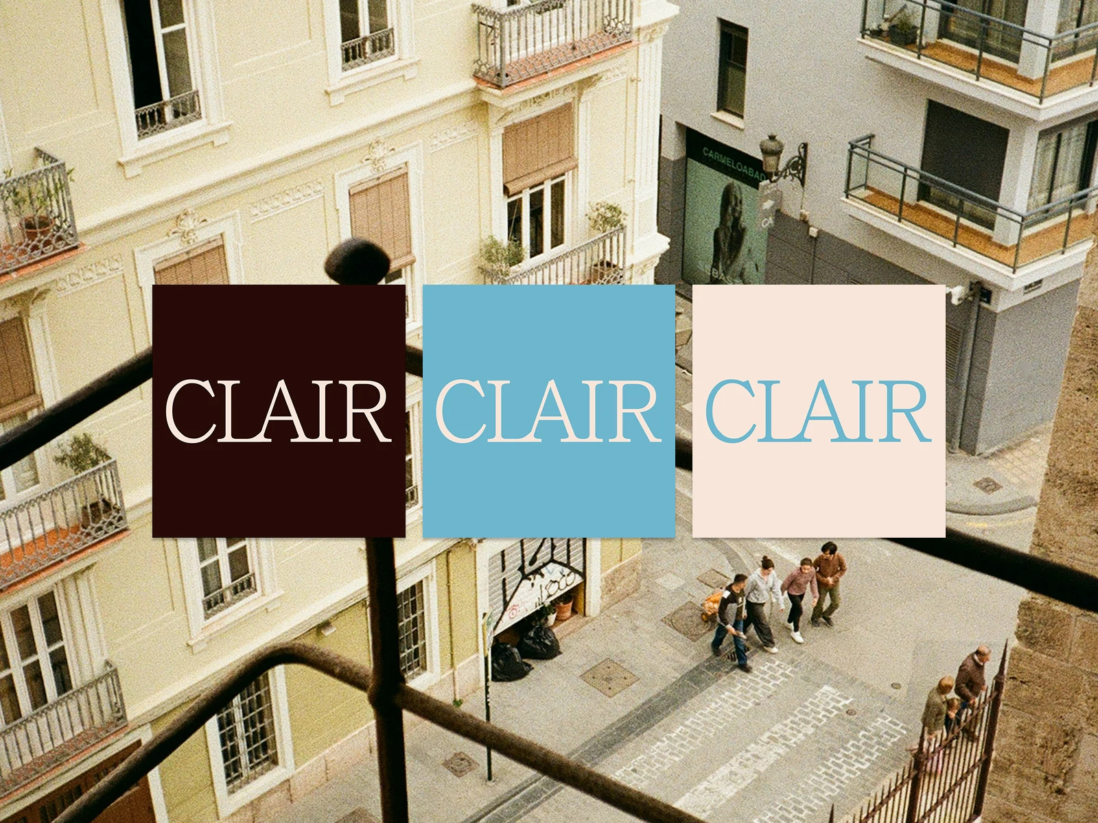
I chose 3 colours the Brownie(#270A07) being the main one, Pink Skin(#F8E6DA)the secondary and Sky(#6DB6CE) being the Accent colour.
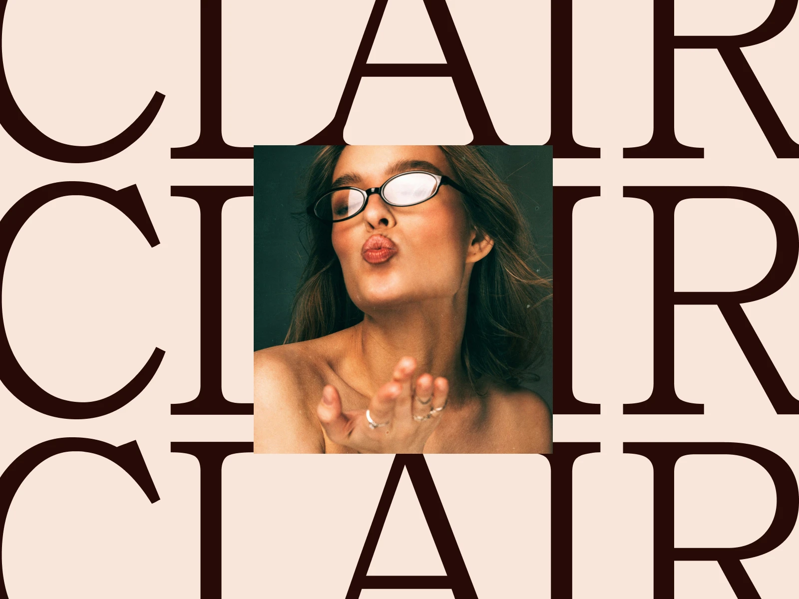
The logo merges the letters L, A, and I, symbolizing how, when vision becomes blurry, shapes and objects blend together. Inspired by my own experience with myopia, Clair transforms that challenge into a statement of style, proving that blurry vision can also be beautifully designed.
To see more of my work:
Instagram: @analyse.png
Like this project
Posted Jul 30, 2025
Designed a fictional brand identity for a high-end glasses brand.