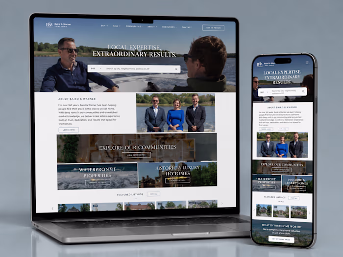
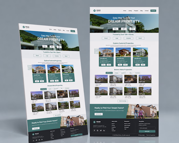
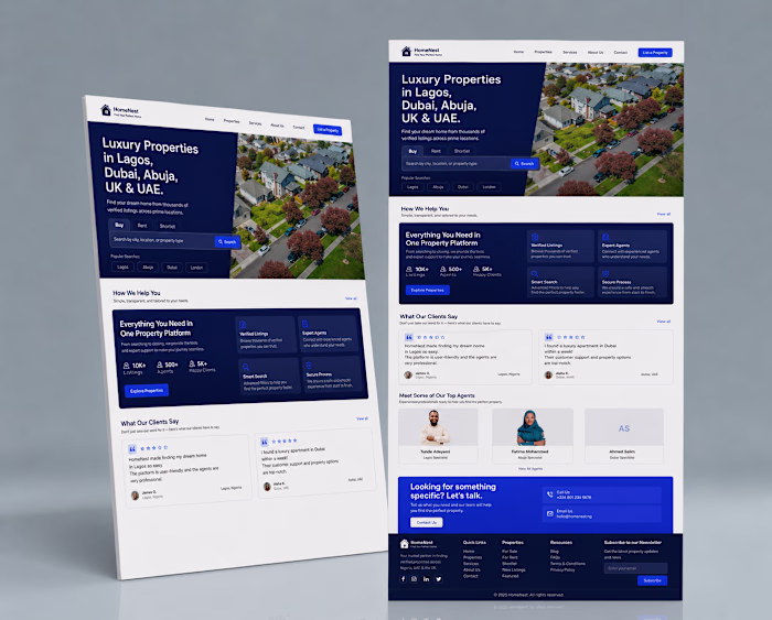
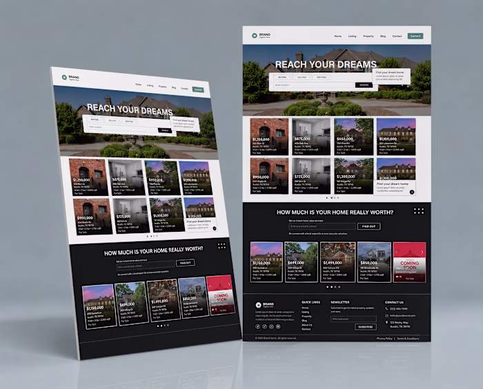
Today's concept focuses on responsive
Muhammed Akintomiwa
Today's concept focuses on responsive web design.
A website shouldn't just look good on a desktop screen it should feel seamless across every device. That's why I explored both desktop and mobile layouts while maintaining visual consistency throughout the experience.
When designing for LearnWorlds creators and online education businesses, mobile optimization becomes even more important because many users discover courses from their phones first.
The challenge is balancing aesthetics with usability.
Every design decision should improve clarity, accessibility, and user flow.
This concept was built with scalability and responsiveness in mind while maintaining a premium visual identity.
Designed in Figma.
#LearnWorldsDesigner #ResponsiveDesign #WebDesign #MobileDesign #CourseCreator #OnlineCourses #UXUI #WebsiteDesign #FigmaCommunity #LandingPageDesign
Like this project
Posted Jun 14, 2026
Today's concept focuses on responsive web design. A website shouldn't just look good on a desktop screen it should feel seamless across every device. That's ...
Likes
0
Views
0