Another day, another redesign concept. This
Muhammed Akintomiwa
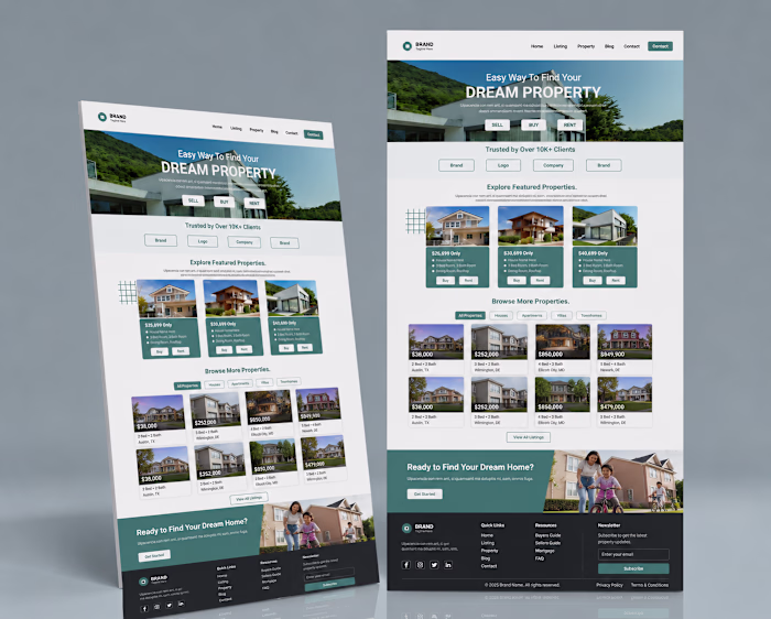
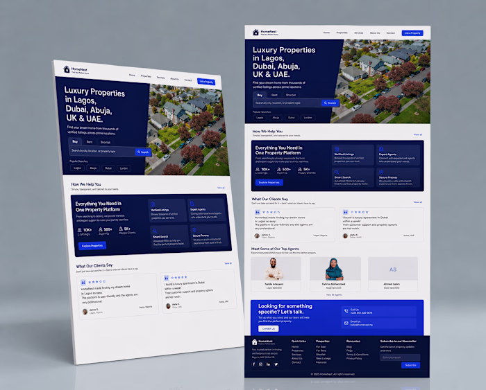
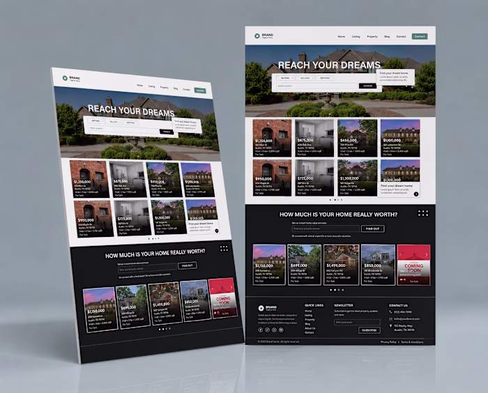
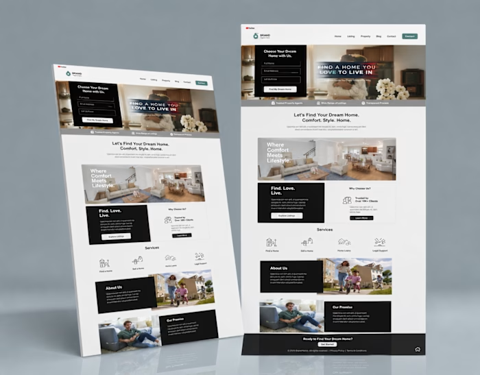
Another day, another redesign concept.
This project explores how a traditional website can be modernized through cleaner layouts, better hierarchy, and stronger visual organization.
Rather than packing information into every available space, I focused on creating breathing room between sections. This improves readability and helps users focus on the most important content first.
The same design principles are critical when building LearnWorlds course websites. Students need clear pathways, easy navigation, and confidence in what they're about to invest in.
Simple experiences often outperform complicated ones.
Designed entirely in Figma.
#LearnWorldsWebsite #WebDesign #CourseWebsiteDesign #LandingPage #OnlineLearningPlatform #UXDesign #FigmaDesigner #WebsiteRedesign #LearningManagementSystem #UIDesign
Like this project
Posted Jun 14, 2026
Another day, another redesign concept. This project explores how a traditional website can be modernized through cleaner layouts, better hierarchy, and stron...
Likes
0
Views
0