Exploring a darker visual direction
Muhammed Akintomiwa
Exploring a darker visual direction for today's website concept.
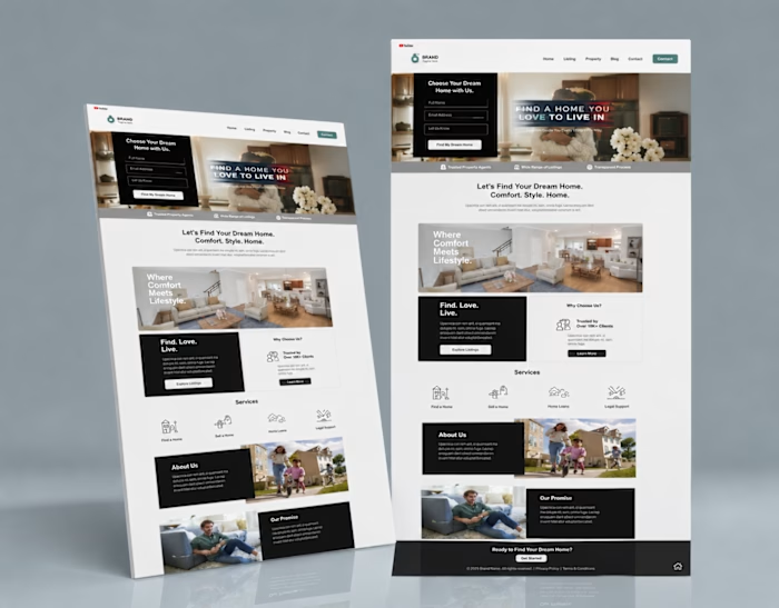
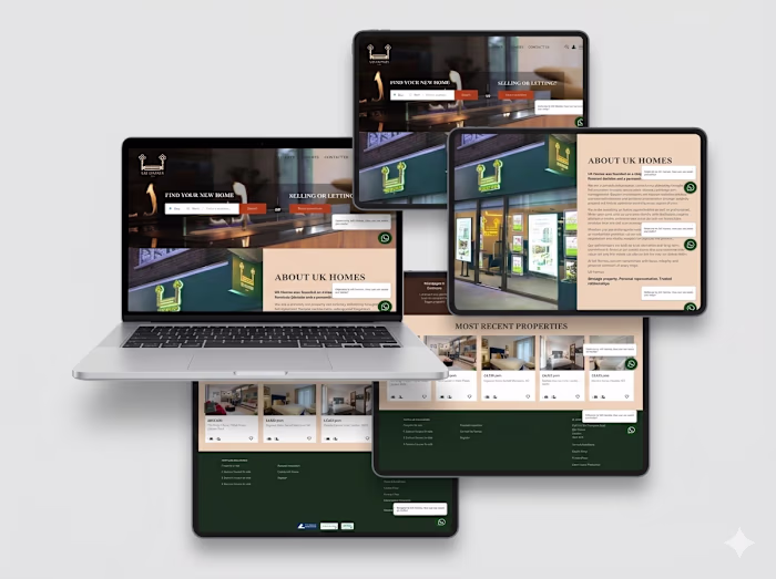
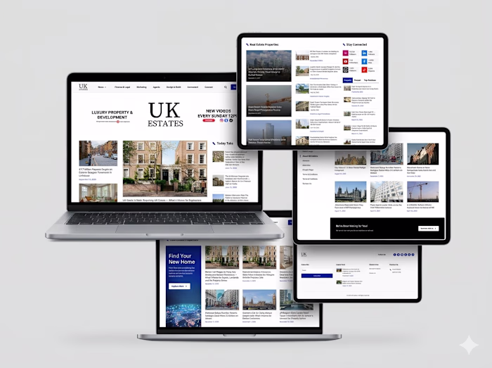
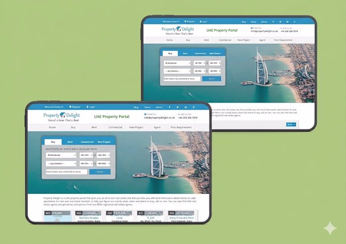
This premium real estate design uses contrast, typography, and imagery to create a more luxurious experience. Instead of relying on excessive visual effects, I focused on spacing, hierarchy, and content organization to make information easier to scan.
One thing I constantly think about when designing websites is how quickly users can understand what a business offers. Whether it's luxury properties or an online course platform, clarity always wins.
The layout emphasizes featured content, credibility indicators, and strong calls to action that guide users toward the next step.
Good design isn't decoration it's communication.
Designed in Figma as part of my daily design challenge.
#LearnWorlds #LearnWorldsWebsiteDesign #WebDesigner #UXUI #LandingPage #CourseCreator #OnlineCourseBusiness #Figma #WebsiteInspiration #ProductDesign
Like this project
Posted Jun 14, 2026
Exploring a darker visual direction for today's website concept. This premium real estate design uses contrast, typography, and imagery to create a more luxu...
Likes
0
Views
0