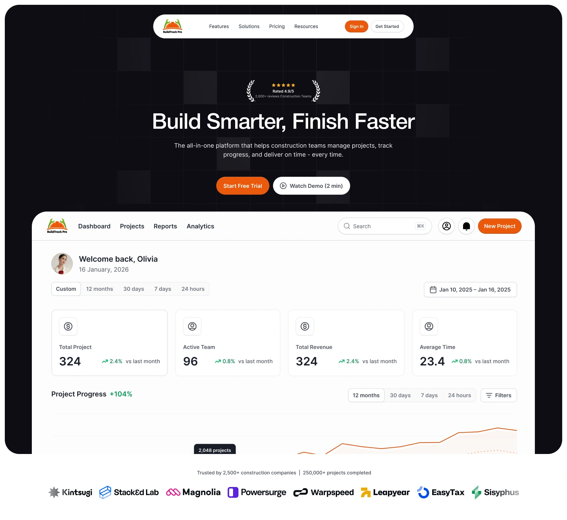
BuildTrack Pro — SaaS Landing Page (Concept)
Mustofa Al-Ameen Mustafa
Cover
Type: Concept / spec project (not a client engagement)
Role: UI/UX Designer, Content Strategist
Industry: Construction SaaS (ConTech)
Tools: Figma, competitive research
What This Is
BuildTrack Pro is a concept construction management platform. I designed a conversion-optimized landing page to explore how B2B SaaS in construction should communicate value to contractors who are skeptical of new software.
What I Did
Researched the construction SaaS landscape — analyzed competitors to identify visual and messaging patterns: light backgrounds dominate, blue/orange signal trust, product screenshots outperform abstract visuals, free trials convert better than demos
Defined the page strategy — value proposition ("Build Smarter. Finish Faster."), mobile-first experience, ROI-driven messaging, strong social proof, low-friction conversion paths
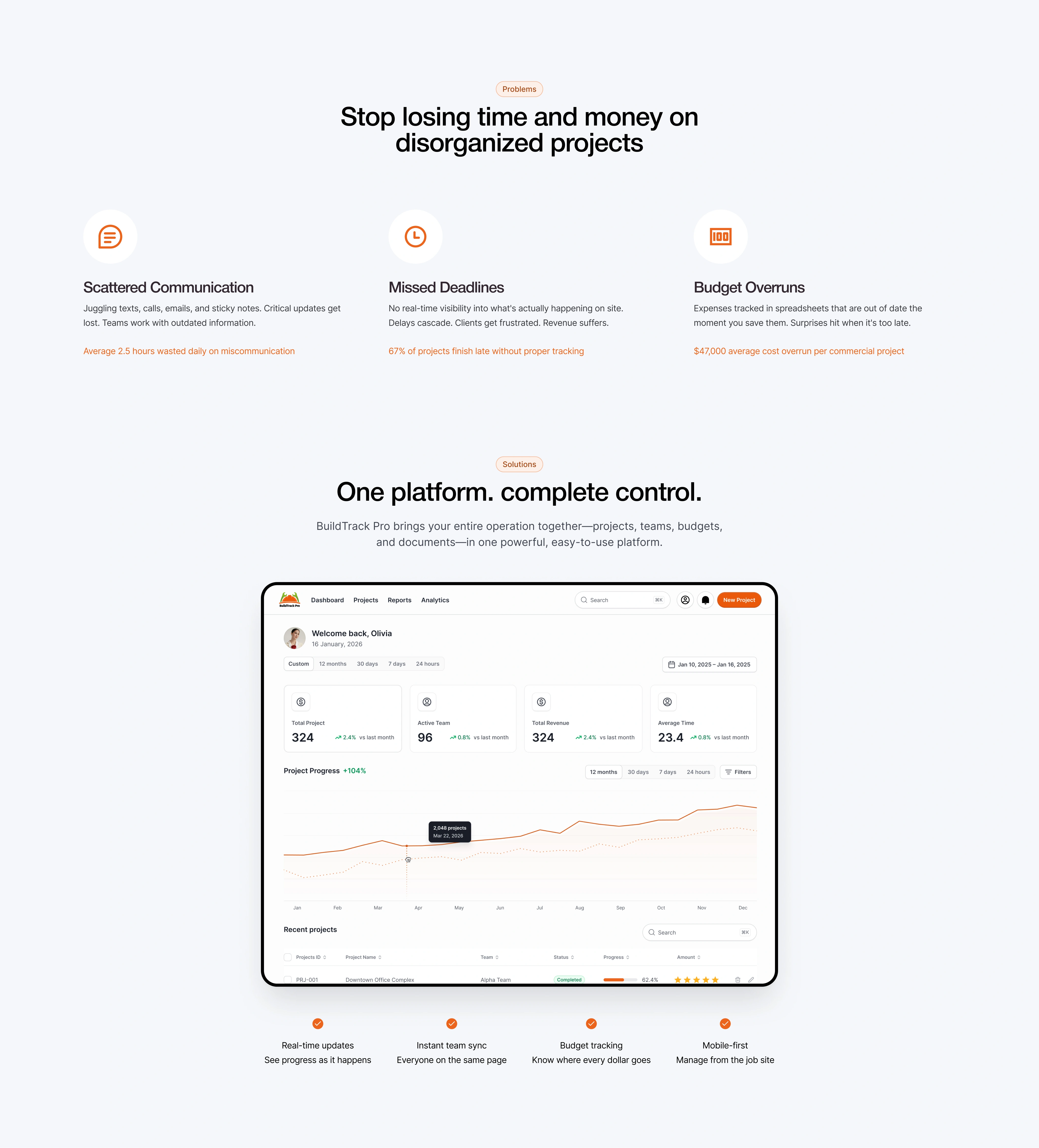
Designed the full landing page — hero with rating badge, problem-to-solution flow, feature highlights with dashboard preview, testimonials, 3-tier pricing, FAQ, and final CTA
Built a design system — orange (#F97316) primary, navy (#1E3A8A) secondary, Inter/Montserrat typography, high contrast with large touch targets
Key Design Decisions
Rating badge above the headline — instant trust signal before the user reads anything
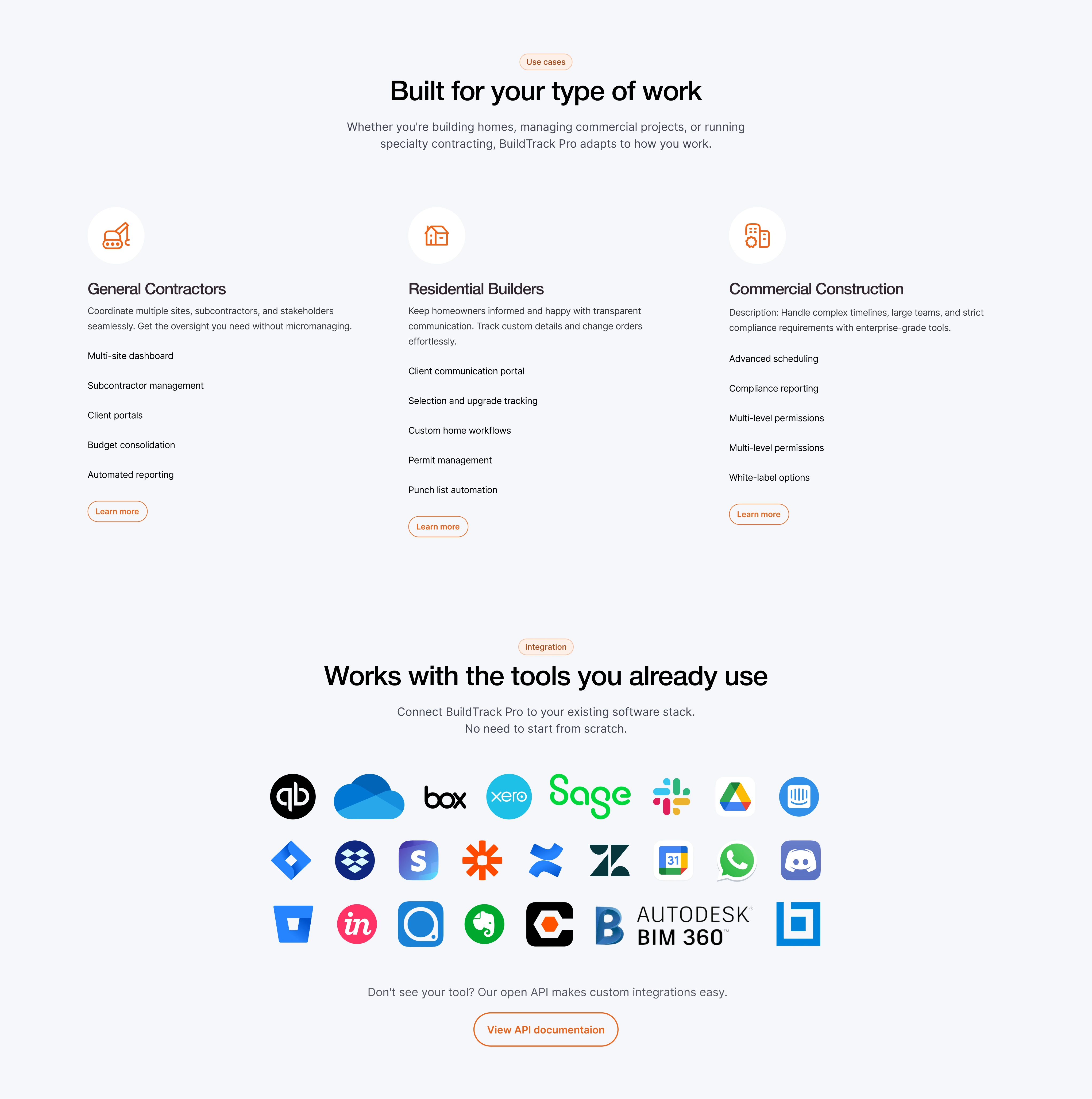
Real construction photography over stock visuals — credibility matters in this industry
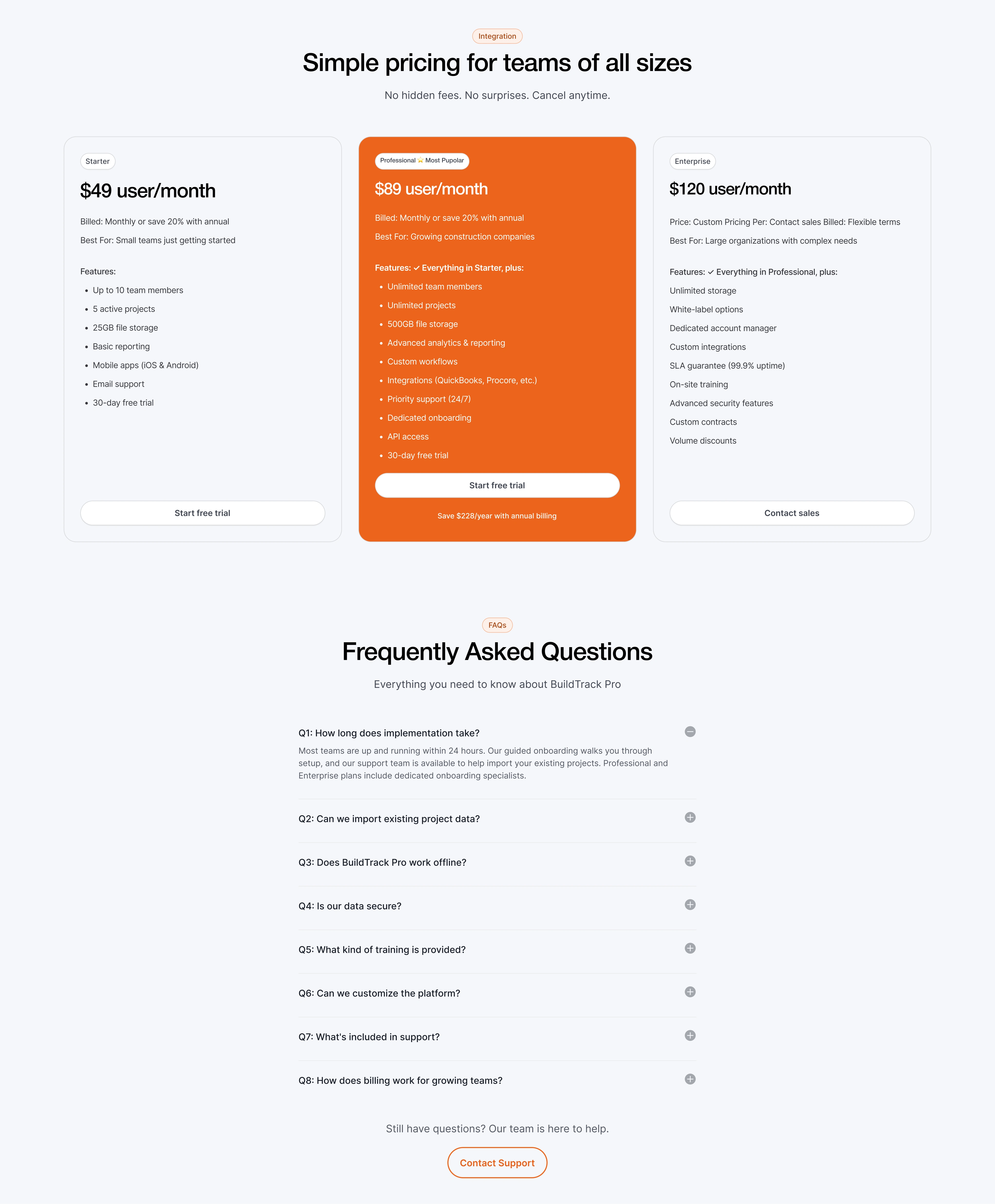
Transparent pricing — reduces friction for contractors who want to know cost before committing
"Start Free Trial" as primary CTA — no credit card required, based on research showing free trials convert better than demo requests in this space
Why This Matters
This project demonstrates landing page strategy for B2B SaaS: how to research an industry, translate findings into a page structure, and design for conversion.
Hero section
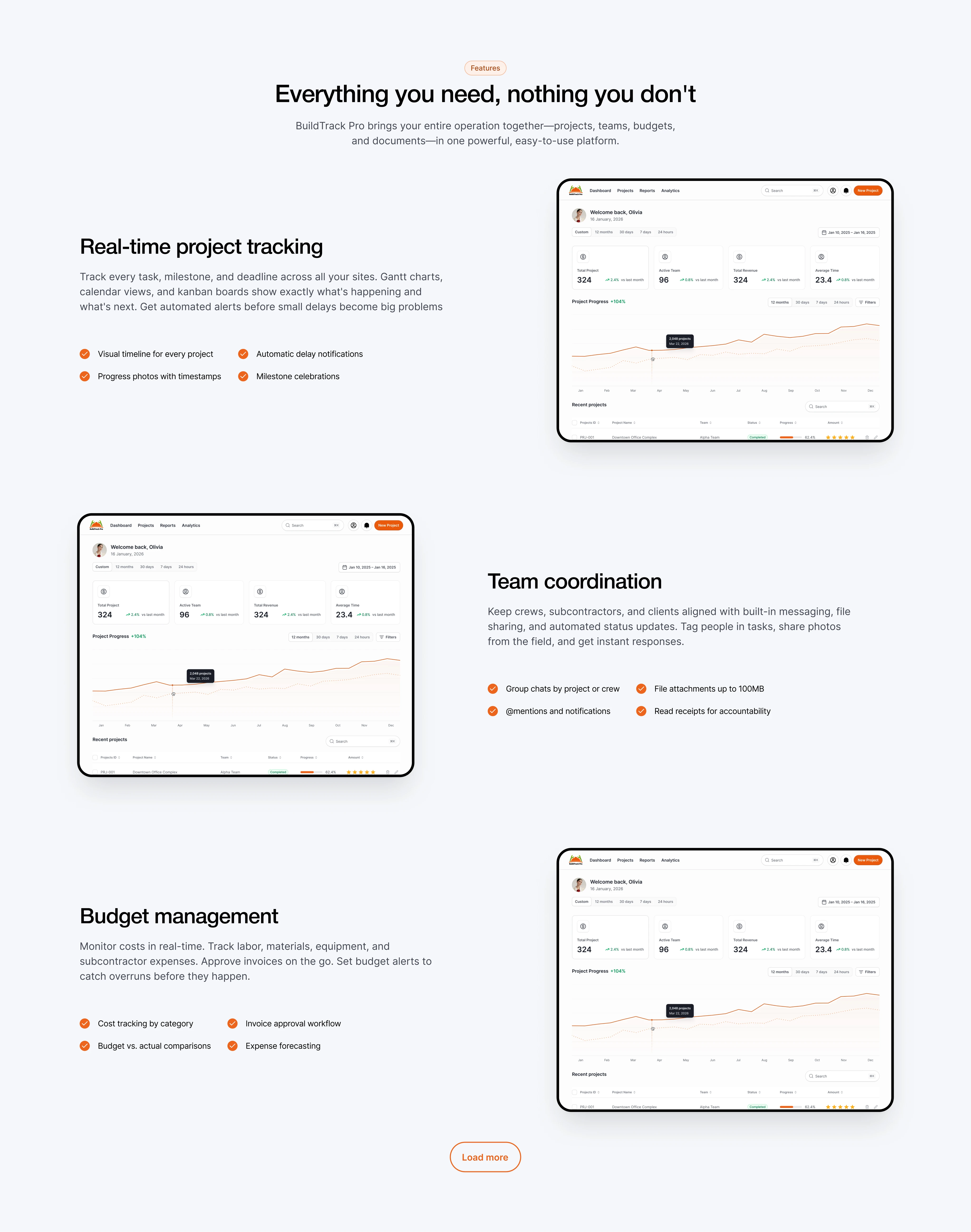
Features
Pricing
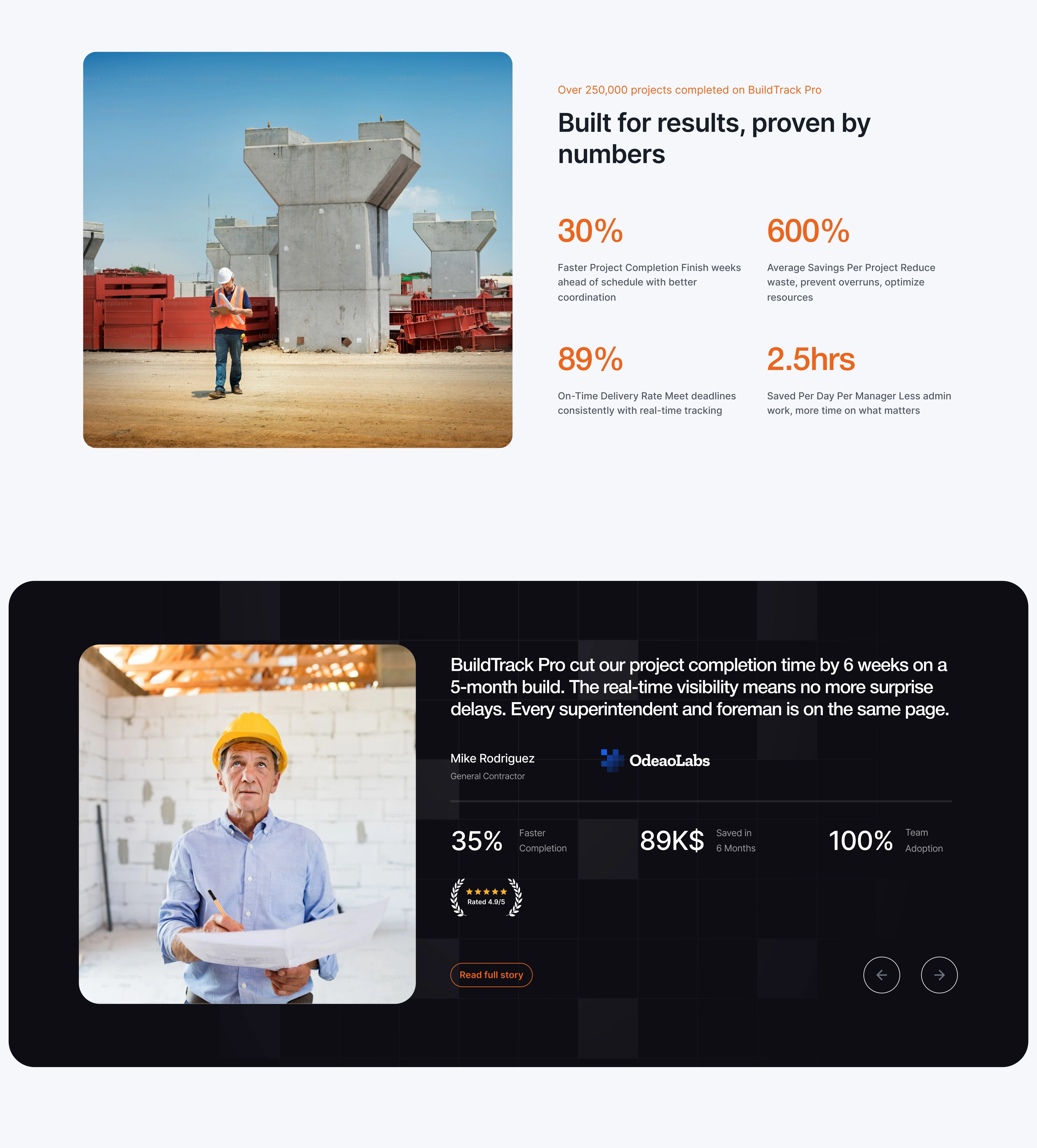
Testimonials
FAQ
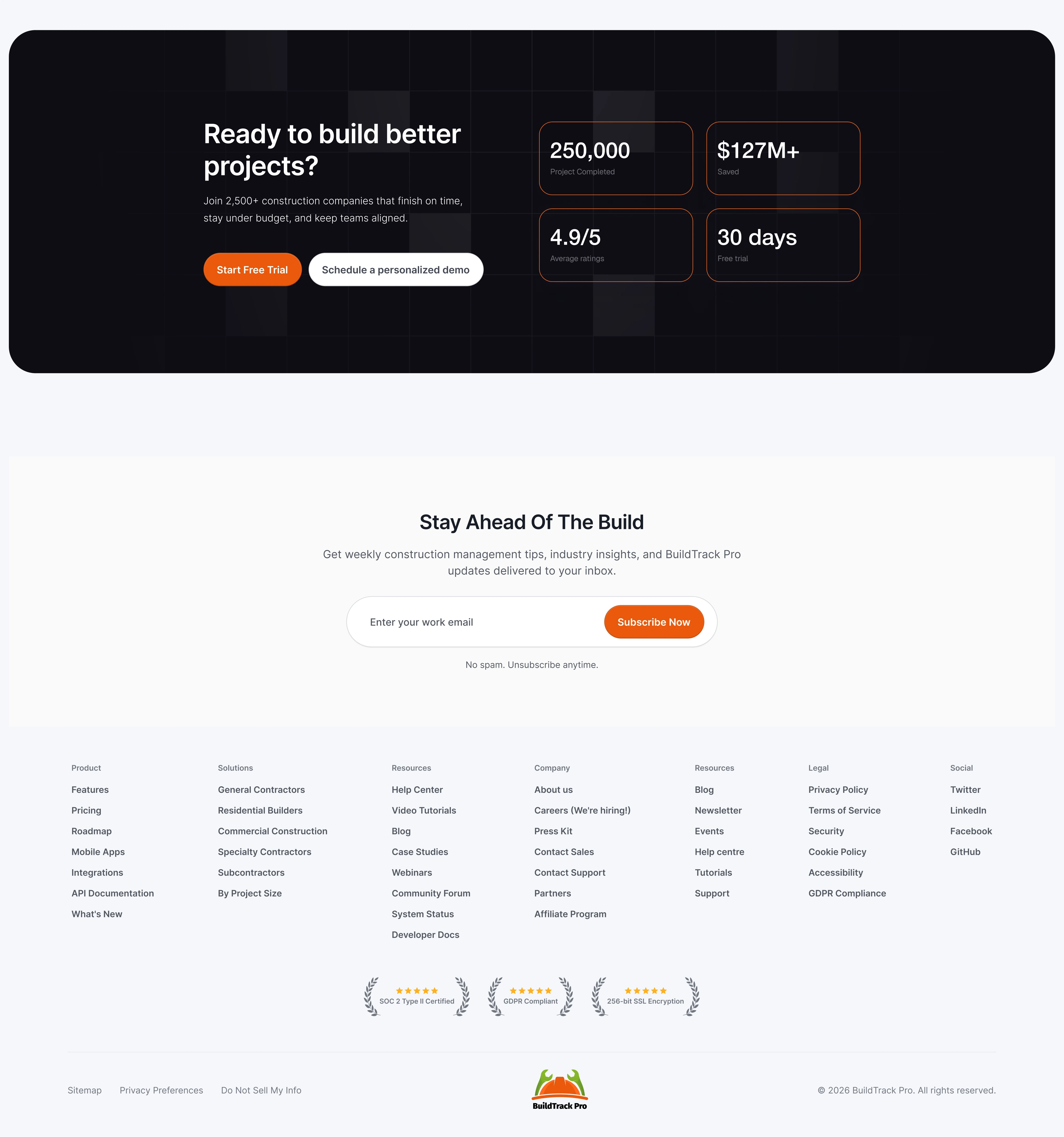
Footer
Like this project
Posted Feb 5, 2026
Concept project: designed a conversion-focused landing page for a construction management SaaS platform.