KIRIM.EMAIL Brand and Product Redesign

Sidiq Prihatno


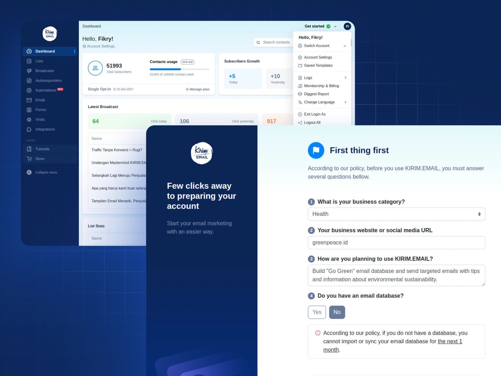
When I joined KIRIM.EMAIL, the product worked, but it didn’t feel designed.
The whole platform was built on generic templates without a dedicated designer. It did the job, but the experience, branding, and visual identity felt plain and inconsistent.
My goal was simple: turn a functional tool into a cohesive, modern product and brand, without slowing the team down.
Step 1: Understanding “Before”
Before any changes, I mapped how the product looked and felt:
Inconsistent colors across pages
Multiple font choices with no clear hierarchy
Mixed icon styles and visual elements from different sources
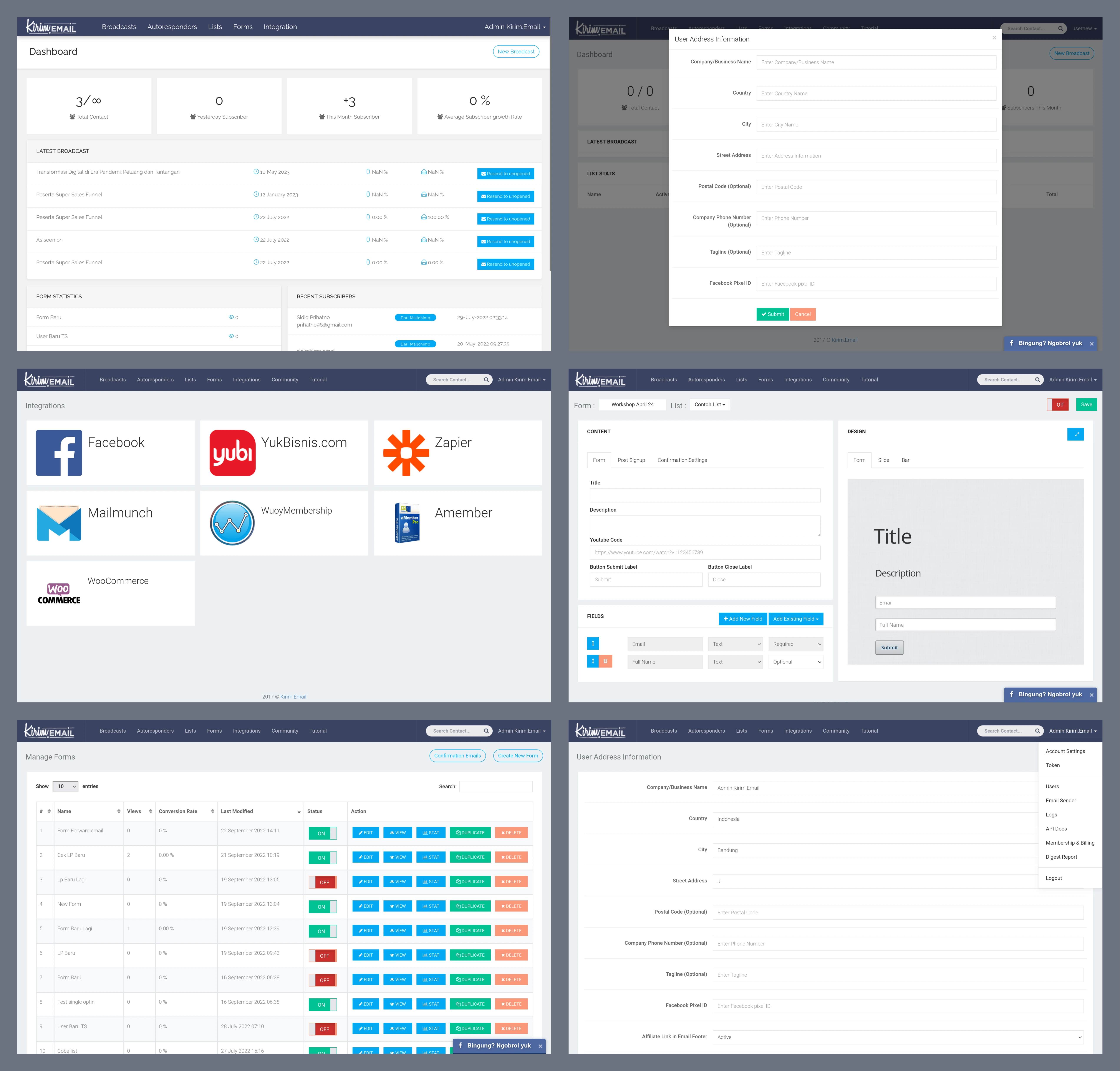
It felt more like a collection of pages than a single product.
This “before” state became my baseline for every improvement that followed.
Step 2: Start with Color, Not a Big Rebrand
KIRIM.EMAIL launched in 2016. Around 2019, I noticed a clear trend: many companies were refreshing their logos and color systems. At the same time, display technology (screens, resolutions, color accuracy) had improved a lot. Colors looked sharper and more expressive.
This felt like the right moment to modernize the brand.
A full rebrand would have required more time and resources than we had. So I focused on the highest impact, lowest friction changes:
Define a clear primary color and supporting palette
Make sure the colors worked well across UI, marketing pages, and dark/light backgrounds
Improve accessibility and contrast where possible
This gave the product a more confident and recognizable visual identity without changing the logo.
Step 3: Typography, Icons, and Brand Assets
Next, I refined the core visual system:
Switched the main font from Raleway to Roboto for better readability and versatility
Standardized icons using Feather Icons, then designed custom icons in the same style when we needed something specific
Cleaned up illustrations and supporting graphics so they felt part of one system, not a mix of styles
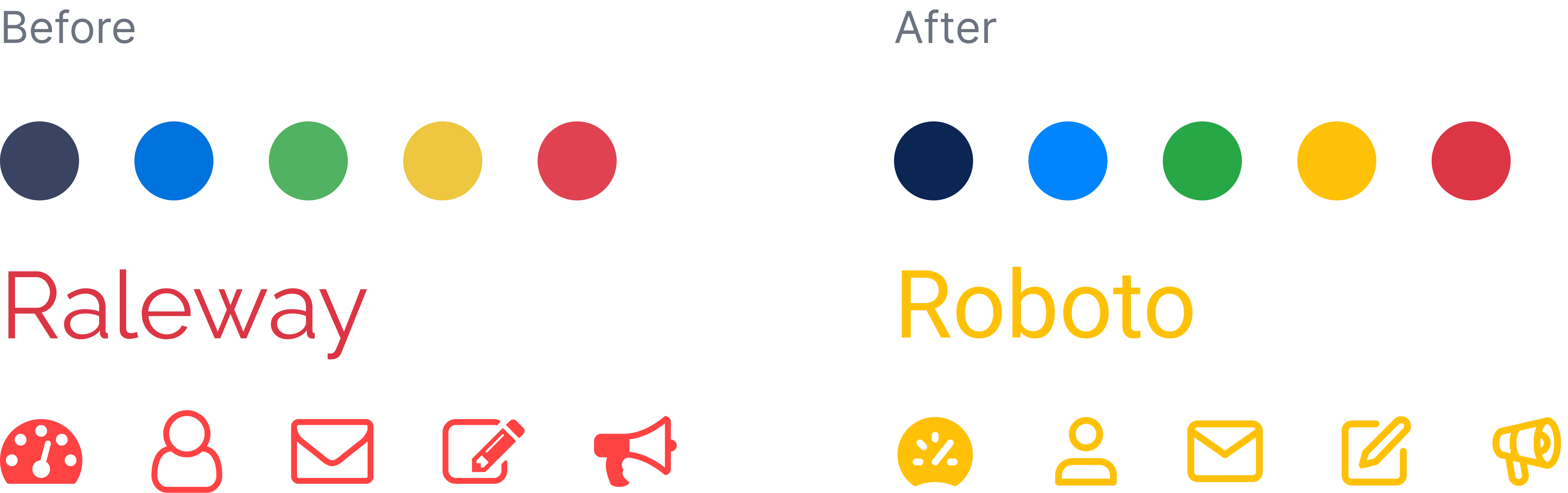
These changes made the interface feel lighter, more modern, and easier to scan.
Step 4: Designing in Figma, Then Shipping in Code
To avoid a gap between design and reality, I didn’t stop at Figma files.
I worked directly with the frontend code to:
Implement the new color system, typography, and spacing scale
Create reusable components and templates for buttons, forms, layouts, and states
Refine interactions and micro-details without requiring big backend changes
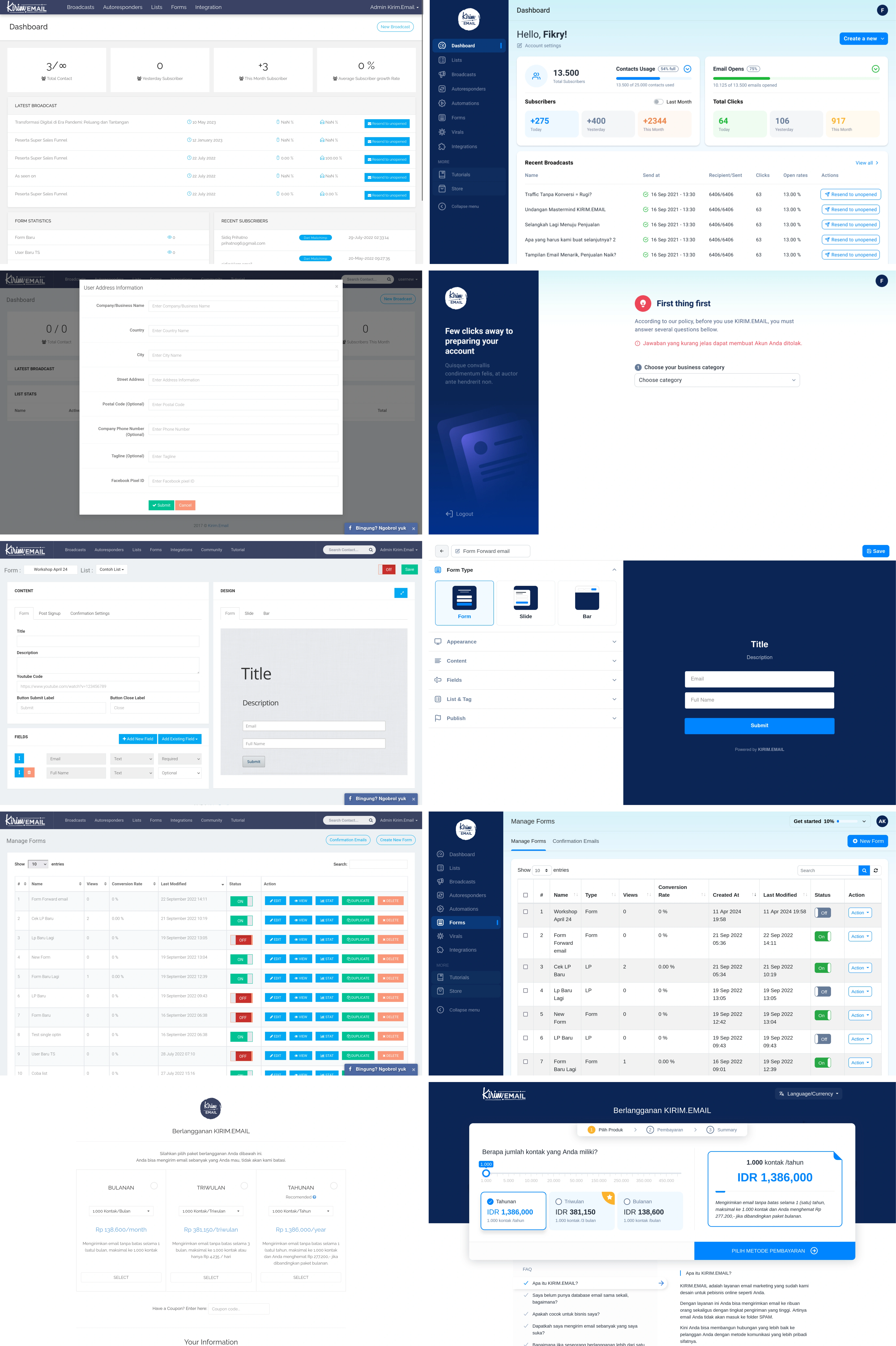
By touching the frontend myself, I could iterate quickly and keep the experience consistent across the app.
Step 5: Extending the System to Marketing
Once the product experience felt solid, I brought the same system into marketing:
Redesigned the main landing page with clearer hierarchy and more focused messaging
Updated company email templates to match the new design system
Revamped social media visuals to ensure the brand’s consistent presence across platforms.
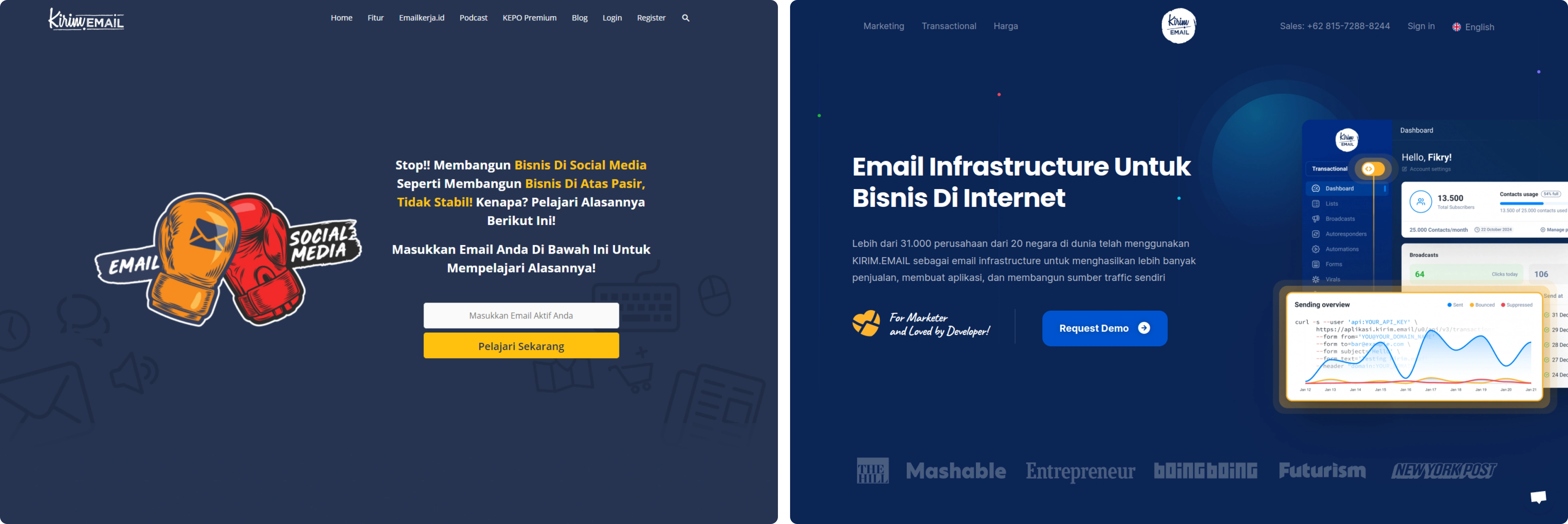
This unified KIRIM.EMAIL, presenting it as a single brand rather than separate identities across different products and marketing channels.
Results
The result was a clearer, more mature product and brand:
A cohesive UI/UX across the app instead of disconnected templates
A visual language (color, type, icons) that scales across product, website, and email
A frontend structure that made future changes easier and faster
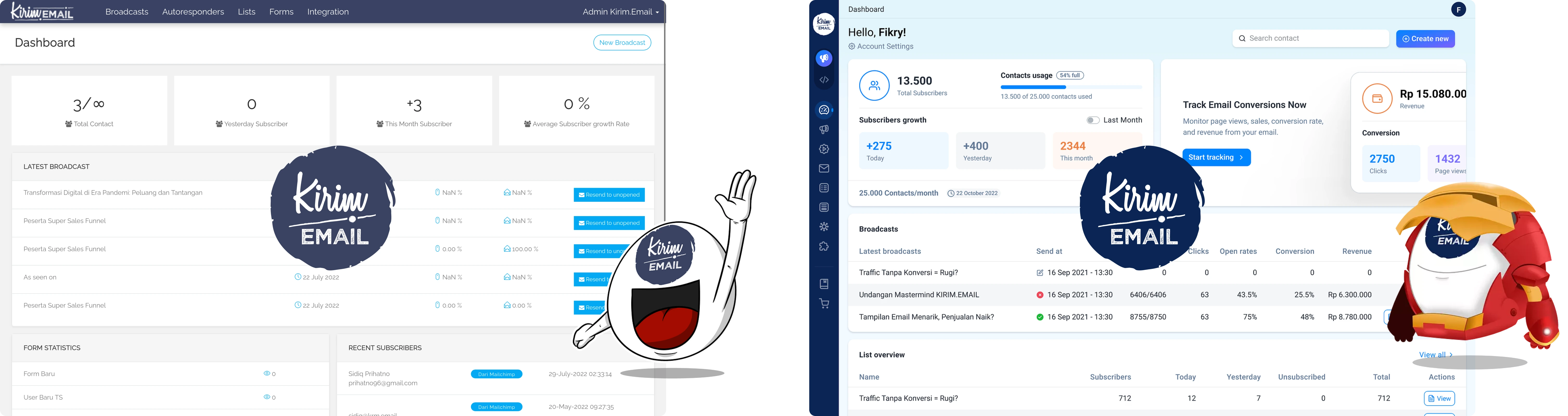
KIRIM.EMAIL evolved from “it works” into a more polished, trustworthy platform, ready to serve both local Indonesian customers and a growing global audience.
My role in this process focused on integrating brand, product, and frontend execution. I transformed abstract goals into a concrete design system that the entire company could build upon, while collaborating with our illustrator on elements like the mascot to keep everything aligned.
Like this project
Posted Aug 13, 2026
Transformed KIRIM.EMAIL into a cohesive, modern product and brand.
Likes
0
Views
3
Timeline
Jan 1, 2019 - Ongoing