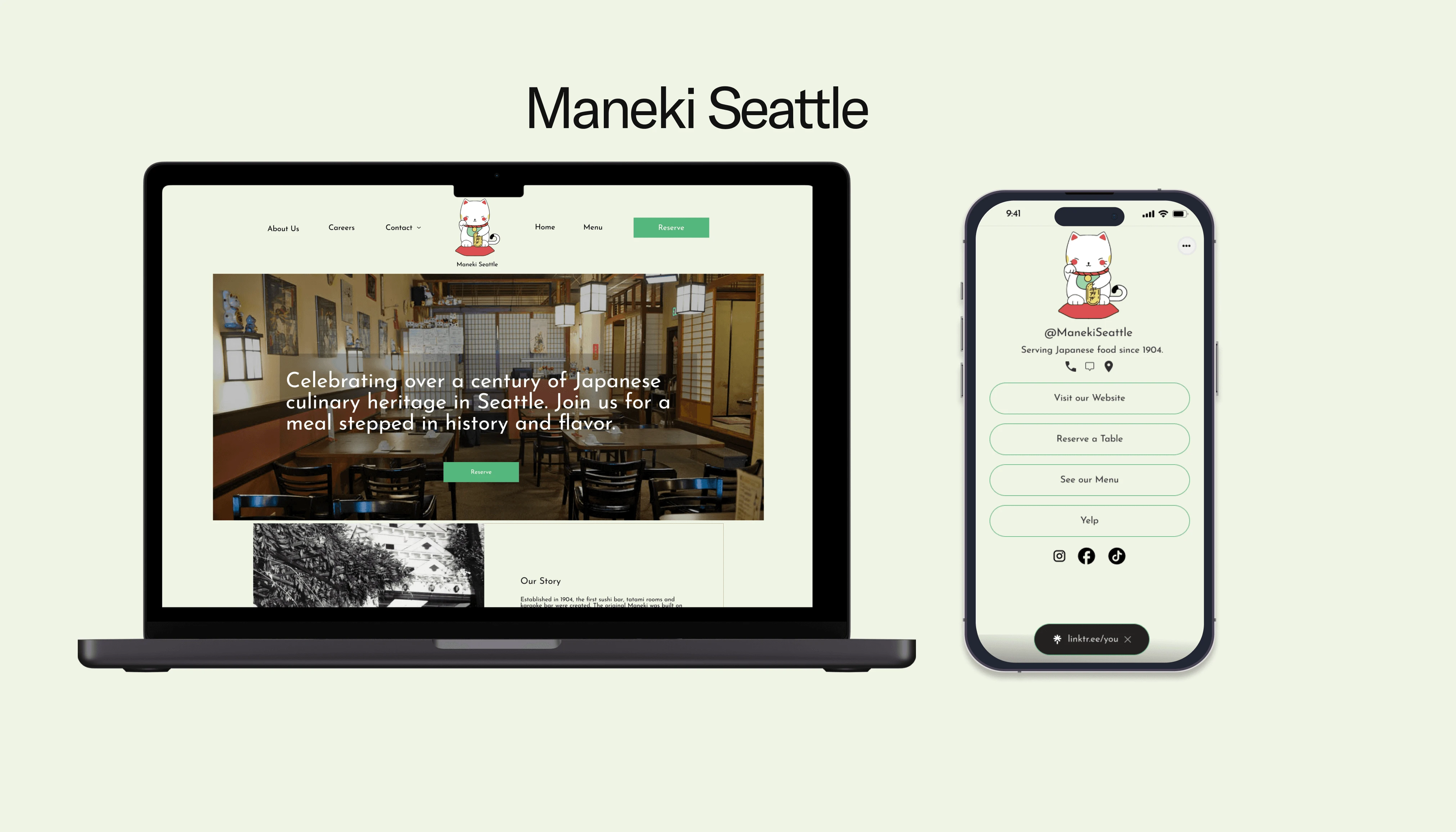
Rebranding and Redesigning Maneki Seattle
Timeline
Project
Responsive Webdesign
Tools
Figma, Zoom, Figjam, Photoshop
Introduction
What is Maneki Seattle?
Maneki Seattle is a historic Japanese restaurant located in Seattle's Chinatown-International District. Established in 1904, it is one of the oldest Asian restaurants in the West Coast.
Context
The Initial Curiosity
I loved my experience at Maneki as a customer and knew how the restaurant had struggled before, so I wanted to find out why. I thought it was because of the oudated design of the website and the menu not being included, but I found other reasons mainly one.
The Problem
Reservations
Foodies in the past have waited too long for a response to make a reservation. They rather have an immediate and certain knowledge than having to wait for a back and forth.
The Solution
An Online Reservation Tool
We light the way, so you can feel safe
Using the Resy online reservation tool, foodies can immediately know about a reservation. Other parts of the redesigned website have optimized the experience for the foodie to know more about the restaurant.
Why Maneki Seattle?

Maneki Seattle has gained prestigious awards and notoriety as well as garnering a renowed reputation with a historical legacy, so I want to be a part of the process to honor it and to help it continue to grow.
Yet where did it all begin?
The Process
Discover
Competitor Analysis
User Interviews
Card Sorting
2.Define
Affinity Map
Empathy Map
User Persona
3.Picture
HMW
Feature Roadmapping
Sitemap
Task Flow
Branding+ UI Kit
4.Build
Lo-Fi Wireframes
Mid-Fidelity
High Fidelity
5.Listen
Usability Testing
Design Decisions
6.Hands-Off
Final Screens
Next Steps
Reflection
1
Discover
The Competition
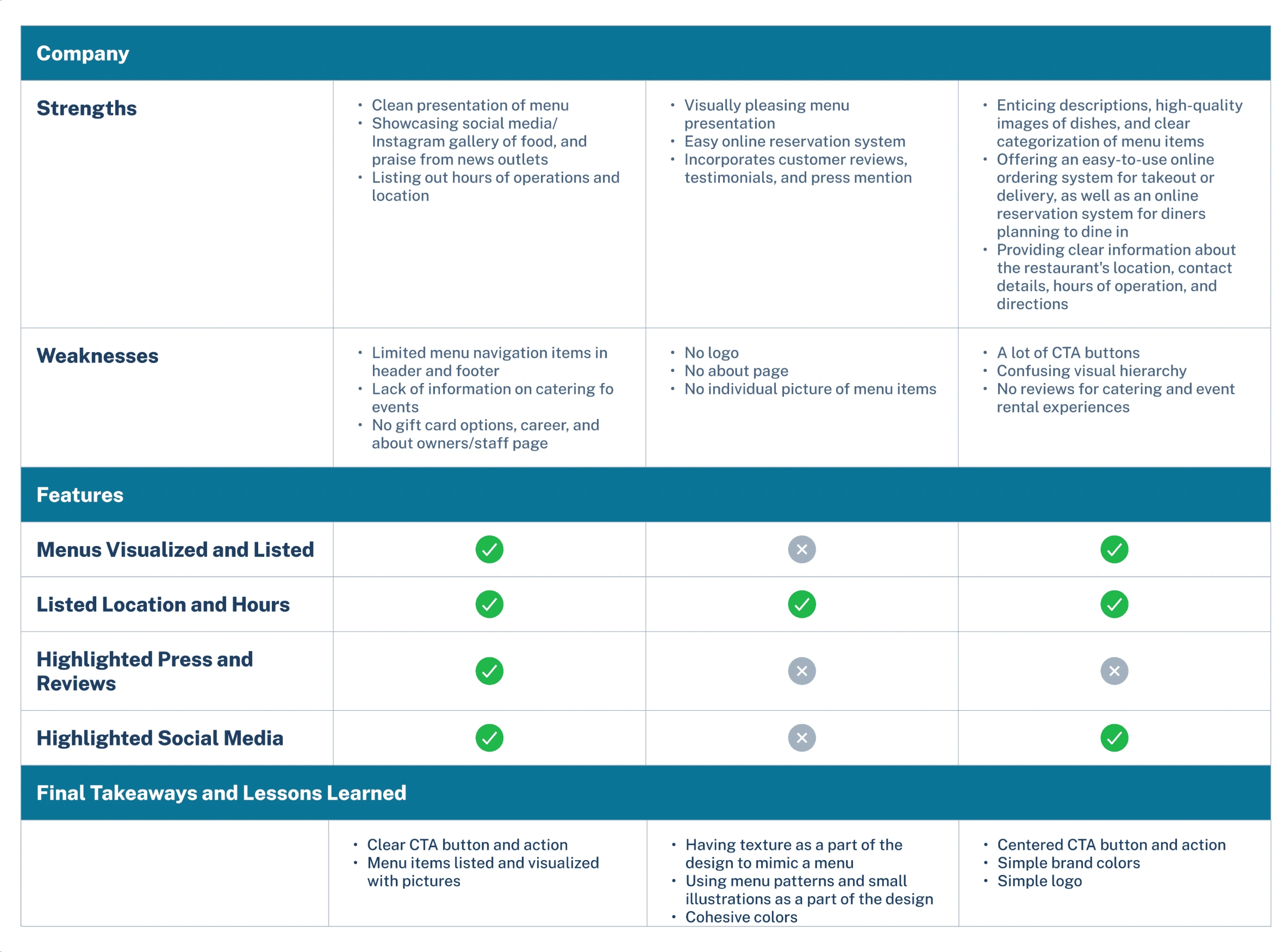
Competitive Analysis
Taiwan Bear House
Kings Co Imperial
Fuji Sushi Seattle
I also learned from our
From researching the competitive landscape, I learned the importance of information hierarchy, brand simplicity, and having clear CTA buttons. Yet they lacked a personal touch in letting a customer know more about the history of the restaurant or its cultural impact.
User Interviews
The Questions
What I asked
What prevents you from making a reservation?
What happened when there wasn’t in walk ins at a restaurant?
How do you ensure making a reservation?
What apps or tools do you use to find a new restaurant?
The Responses
What I heard
"I forget to call during business hours and it totally slips out of my mind after that."
"I asked how long that wait was and if it's too long I try to find another restaurant."
"I check on the website and through email to confirm."
"Yelp, GoogleMaps, Tiktok, or Instagram."
I also used another test called a
Card Sorting
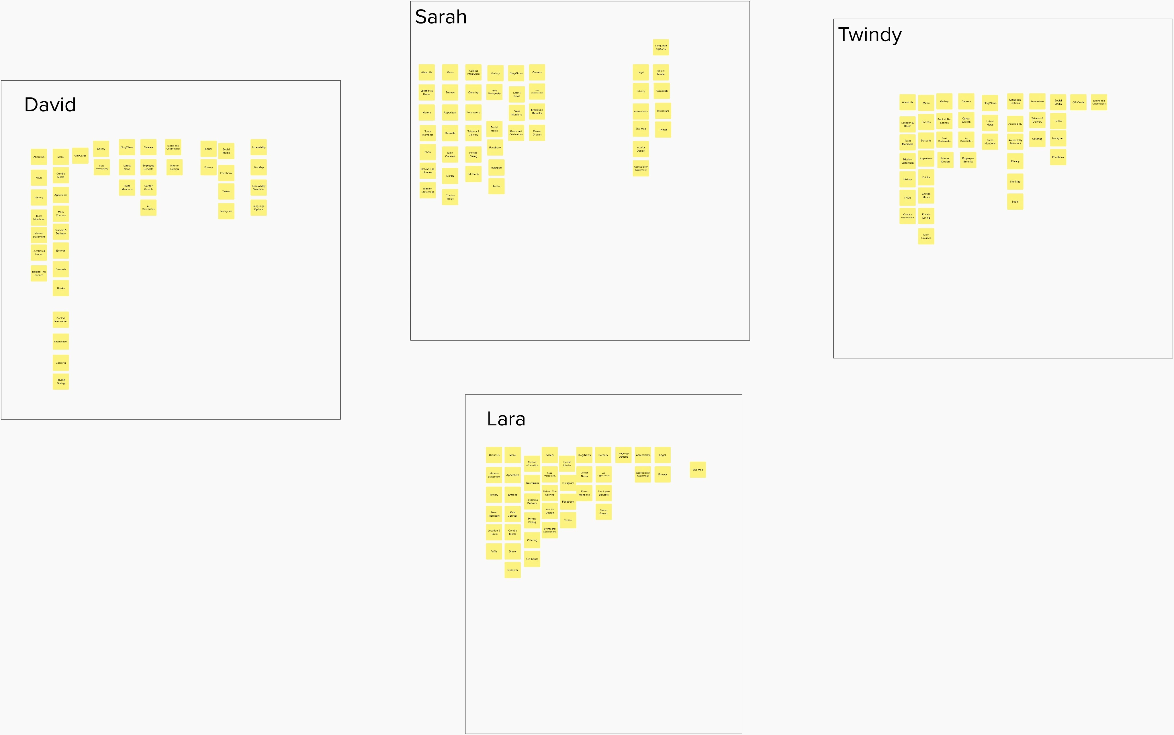
I conducted a sort test to understand how users naturally categorize and prioritize information related to using the Maneki Seattle website. The biggest takeaway that I learned was how foodies navigated and organized information.
2
Define
Afterwards I compiled the data into a
Synthesizing the Research
Affinity Map
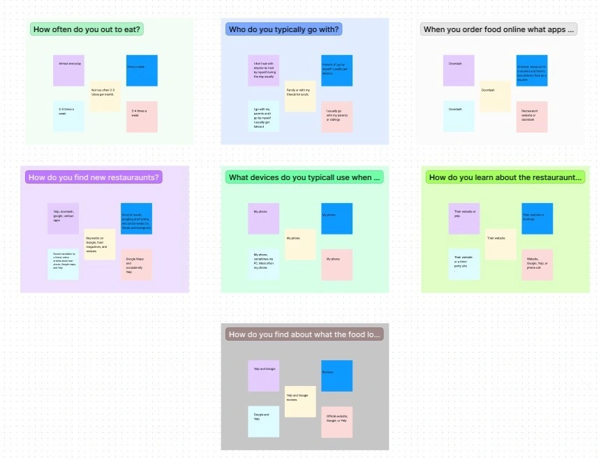
Identifying patterns was challenging at first, but after mapping out the responses there was more clarity. This approach helped me understand the common behaviors and streamline the process to figuring out ideas and solutions.
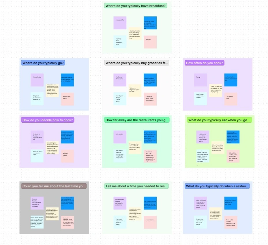
After analyzing the responses, I organized the data into smaller, focused clusters. This breakdown helped me pinpoint key issues and recognize growth opportunities.
Not only did I use an affinity map to synthesize the data, I used another tool to immerse myself in the user's shoes.
Understanding the User
Empathy Map
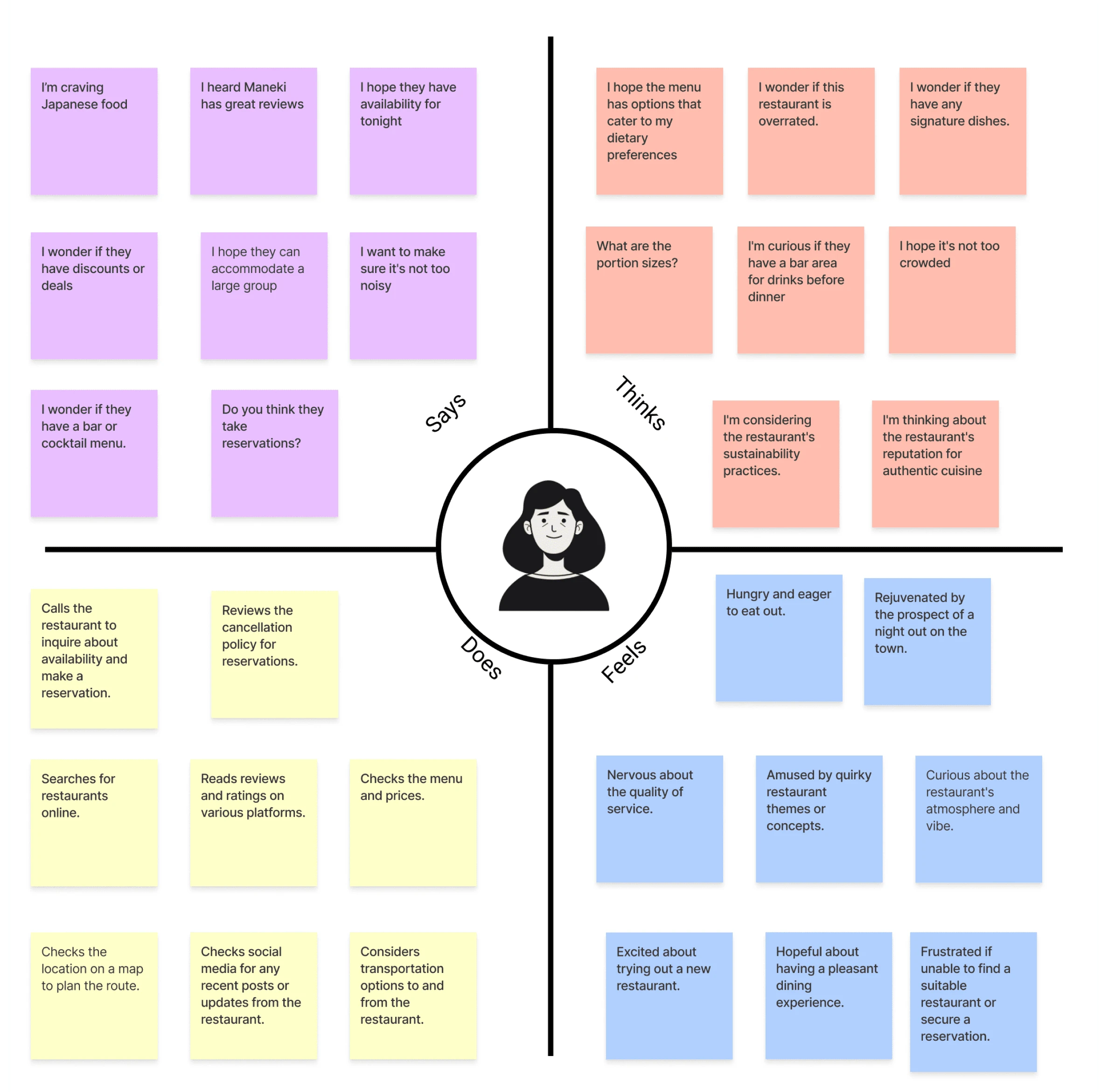
The results helped me to gather insights into their feelings, thoughts, and motivations, enabling a more comprehensive understanding of their needs. By organizing these insights visually, I could effectively prioritize ideas and solutions that resonated more with the user's perspective.
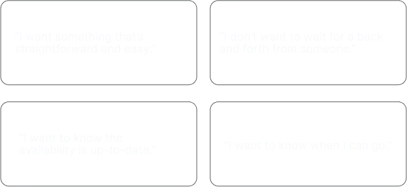
Another result was 4 insights emerging from the affinity mapping and empathy mapping.
What I learned
The Insights
Starting from that point, I compiled all that data into the foodie. The foodie was shaped by an in-depth analysis of user interviews. By discerning recurring behaviors and responses, the foodie can represent the typical user's needs and motivations.
User Persona
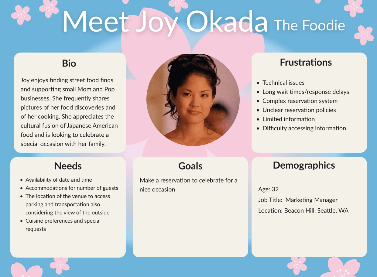
Consolidating the typical user’s needs and motivations help in the process to consider a pivotal question answering.
The Problem Statement
Reservations
The foodie needs to make a guaranteed reservation quickly without needing to wait too long for a response.
3
Picture
Brainstorming Session
HMW
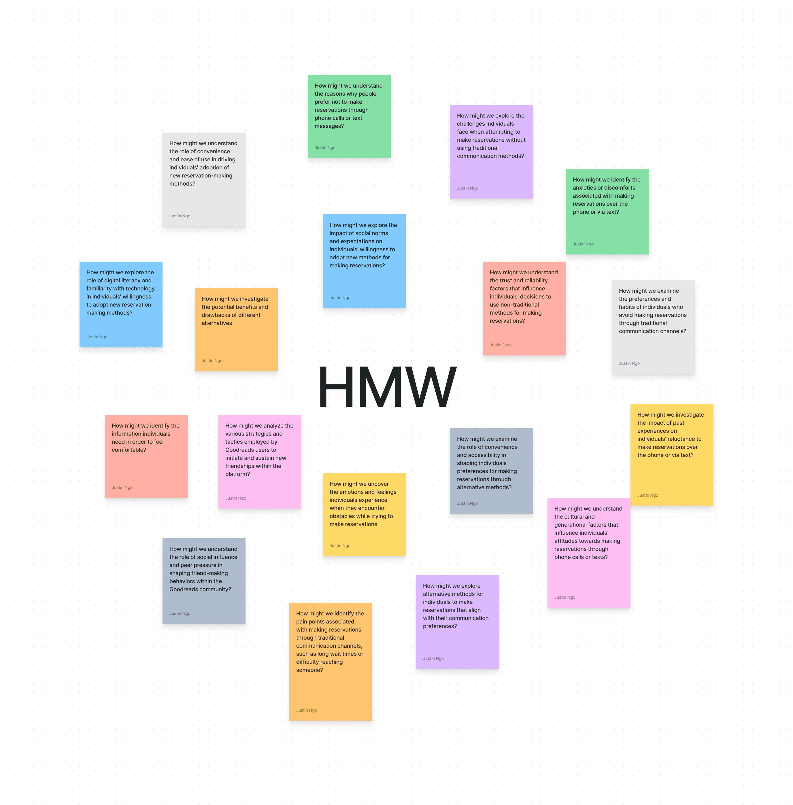
I brainstormed several HMW questions and landed on a central question...
The HMW
How might we reduce the response time for reservation requests?
The HMW statement served as a central guide for refining ideas and generating solutions. Through testing and other tools, ideas were evaluated based on scalability, impact, and user alignment. This iterative process of ideation and prioritization was instrumental in developing effective solutions. The first step in this process was a
Sitemap

Building from the card sorting testing, the sitemap visually represents the structured content hierarchy, aiding in identifying user pathways and content relationships. These outcomes informed the development of a
Feature Roadmap
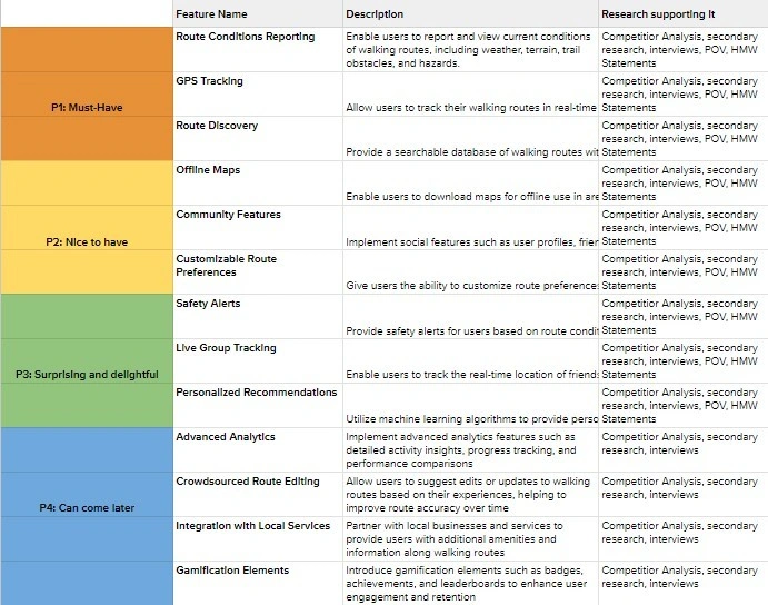
The results of the feature roadmap provided a clear direction for development. After that I wanted to visualize the steps a foodie would need to accomplish their task, so subsequentally I mapped out the sequential interactions and decisions necessarily for the user to make, from the entry point to the desired outcome. Hence why I made a
User Flow
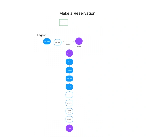
The reason why I wanted to visually represent the flow was to identify potential pain points, optimize navigation paths, and guide design decisions. And I also considered the
What do we want walkers to feel?
Branding
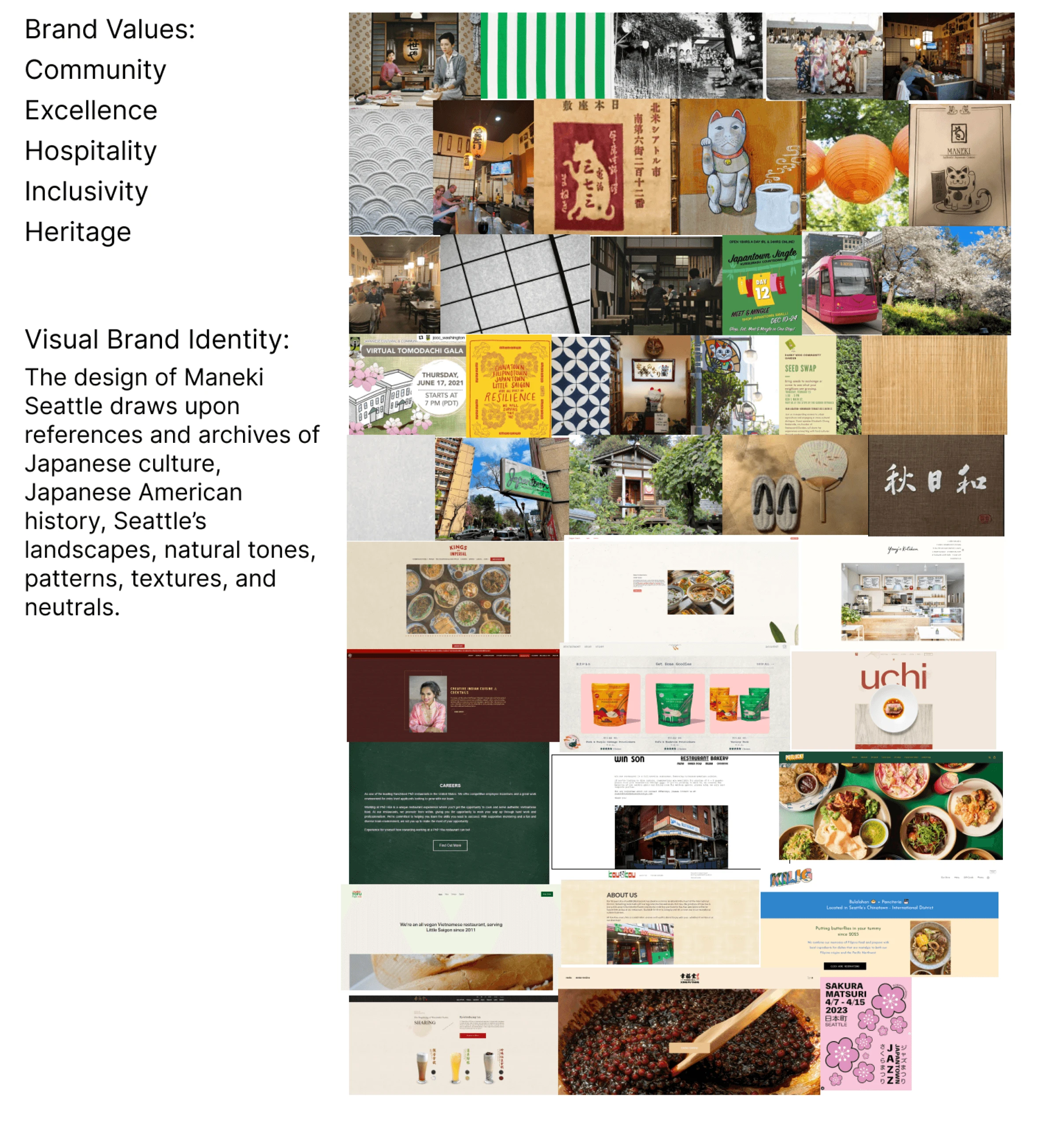
I had a difficult time to capturing he restaurant's ambiance, character, and history into a visual way. I thought about how best to translate it. The process includes gathering inspiration that reflect the restaurant's unique atmosphere, colors, textures, and overall aesethetics. In curating this moodboard, I was aiming to evoke a serene and calm emotional response from website visitors.
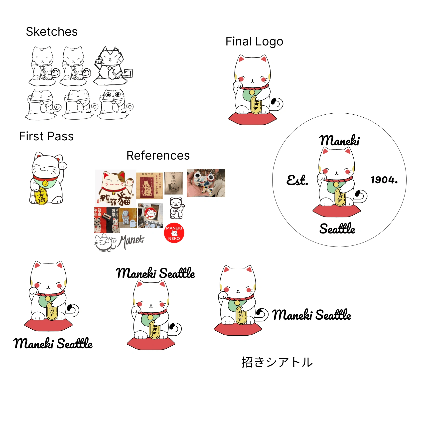
I collected references and made several sketches. I asked for feedback and made a first pass then stuck with the final logo. After the final logo was made I experimented with the placement of the restaurant’s name. I decided on the logo after the namesake of the restaurant and the restaurant’s iconography.
The branding was further developed through a
UI Kit
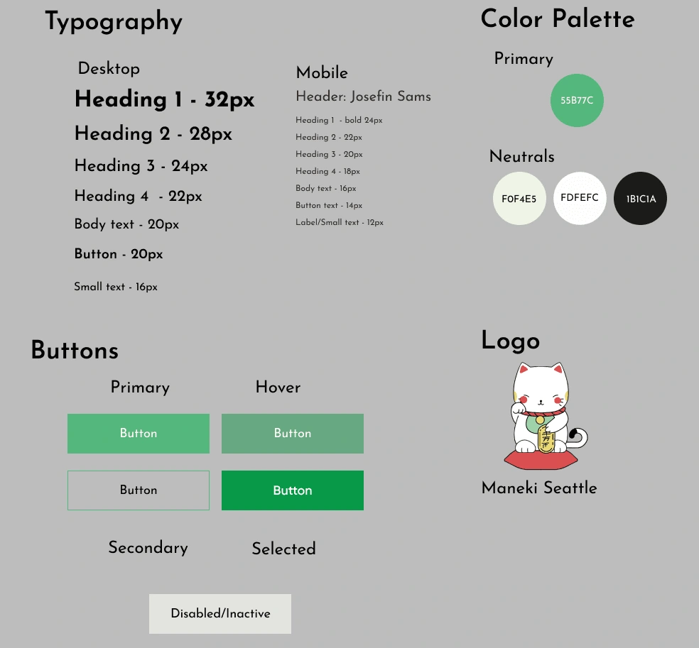
The UI Kit assisted in the process of building resuable components and elements which helped me in the step afterwards.
4
Build
Lo-Fi Wireframes
The shift from lo-fi wireframes to mid-fi wireframes allowed for experimentation, realization, and iterative design changes.
Mid-Fi Wireframes
Through usability testing of the mid-fi wireframes, insights were gained on necessary improvements and informed subsequent iterations.
High-Fi Wireframes
5
Listen
What I tested
Usability Testing
The participants were prompted to make a reservation
Success Metrics
100 % task completion rate
5 minute task time
Few errors or misclicks
4 out of 5 star rating for satsifaction and understanding
Results
100 % task completion rate
All participants finished under 5 minute
All users had few errors or misclicks
4.4 star rating for satsifaction and understanding
Iterations
Design Decisions
I observed how participants had a hard time figuring out the reservation CTA as it had less visibility and looking for the home and menu areas, so I rearranged and made the reservation more clear as a CTA button.
I changed the hero section to be larger and to be more readable on both mobile and desktop.
Finally I noticed how lost participants were with the spacing of the RESY button and the expanded policy option, so I included a text above it to direct the participants towards the RESY button more. I implemented other UX text changes and alterations in language and with UI elements.
6
Delivery
Gif/Prototype
Final Screen
Next Steps
Expand on mentioned features in roadmap
Solicit customer reviews and testimonials to showcase on the website.
Implement customer support features such as live chat or FAQ sections.
Reflection
I learned the importance of having a card sorting test and how they gage how users sort information
I struggled with understanding the user, but being equipped with more than one of placing myself in their perspective really helped me such as the empathy map
So much can change in the iteration process and I learned to let go and experiment with designs
@2024 Justin Ngo
Table of Content
3.Picture
4.Build
6.Hands-Off
Like this project
Posted Jul 25, 2024
Made with Framer


