Overlord Platform UX Redesign
Jessie Fournie
Overlord - Transforming a complex investment platform into an intuitive solution
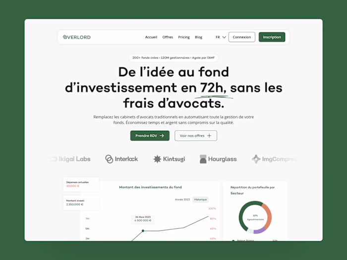
Overlord is a white-label investment solution for fintech players. It gives investors access to opportunities in real estate, tech, and crypto via an interface that can be customised according to product type or user role.
The problem
Despite the ingenuity of the product, the tool suffered from several major problems:
Confusing navigation, particularly with poorly differentiated user roles
Investment process too long: too many steps, resulting in many users abandoning the process.
Overly technical jargon: a major barrier to engagement.
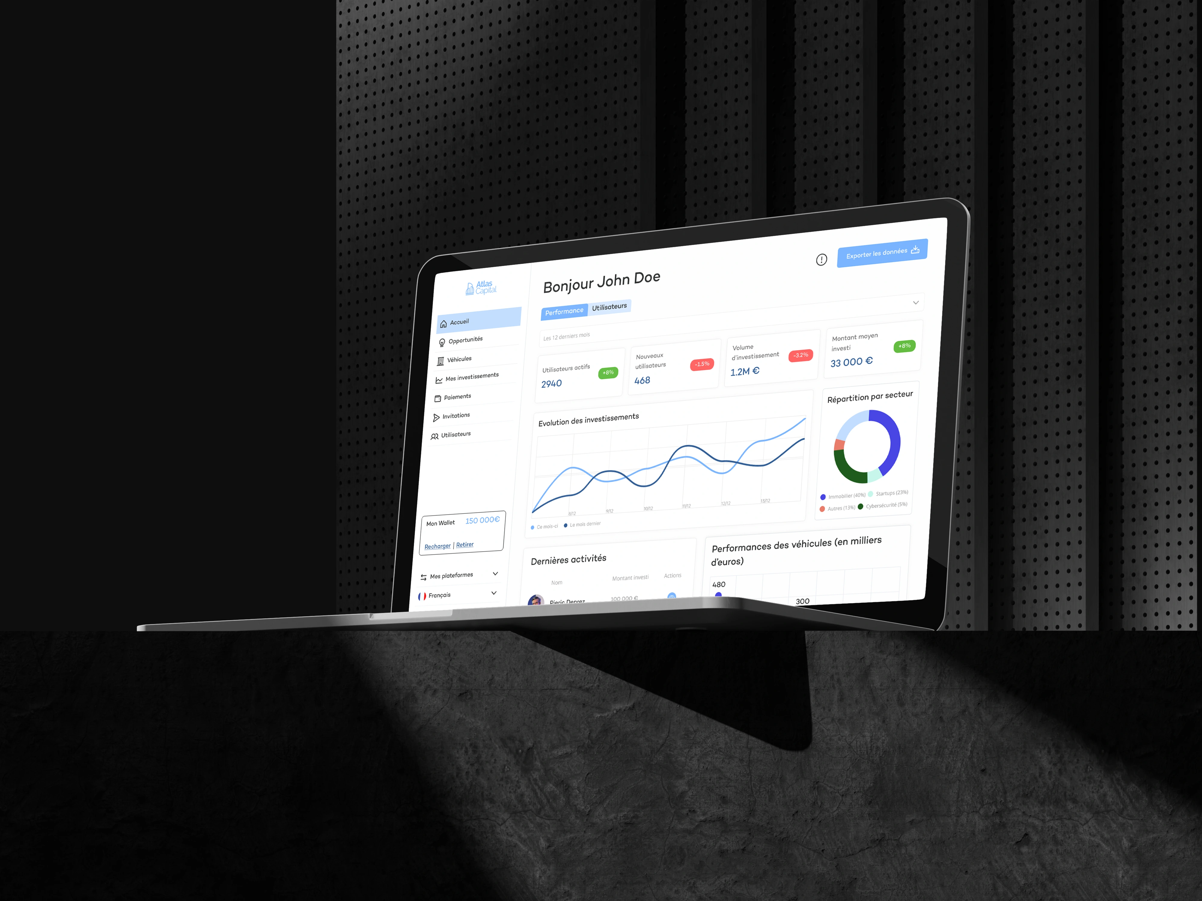
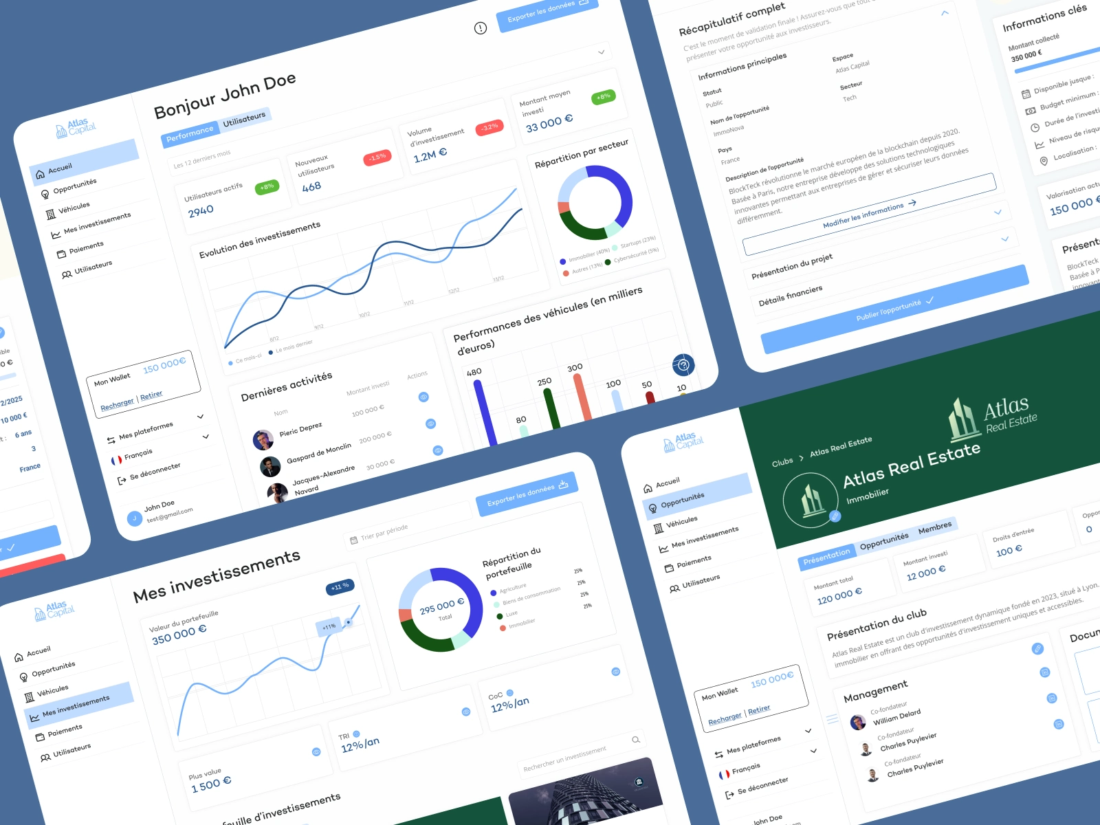
A dense, difficult-to-read interface, with an omnipresent sidebar occupying 30% of the screen
Unguided journeys where each role had an identical interface that was poorly suited to their needs.
A rigid interface that was not very compatible with mobile or multi-sector uses
The conclusion: a platform that was solid in substance but was losing many users because of its form.
Create a service
The presented solution
The UX audit was the strategic starting point for the project. It enabled us to identify the main barriers to adoption of the platform by analysing the different flows according to user roles. To do this, we conducted an in-depth study of usage patterns and expectations.
We began by comparing Overlord with several competing platforms in the sector (Bricks, Fundora, Rentable) to identify best practices. Next, we designed three personas representing the key roles on the platform : investor, distributor and manager, taking into account their levels of expertise and objectives. This work enabled us to map all user journeys and pinpoint the specific friction points for each profile.
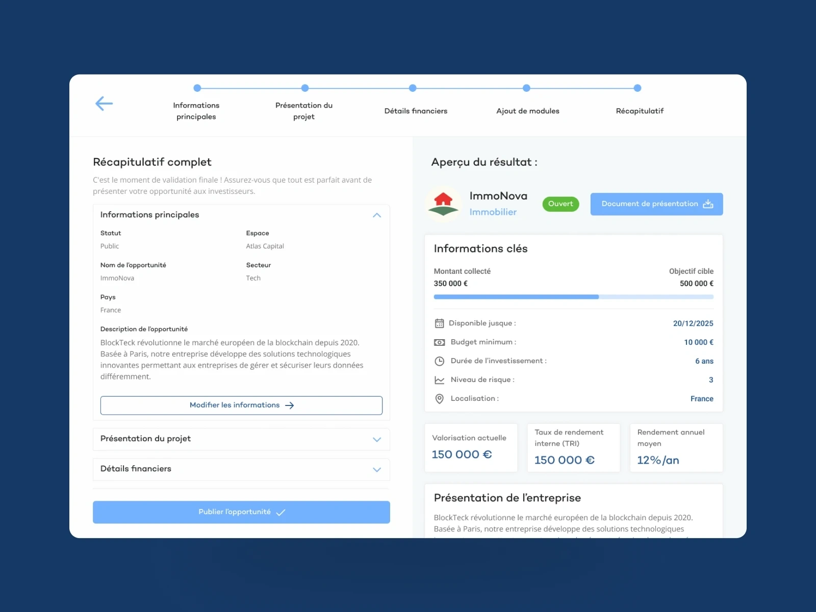
On this basis, we completely redesigned the information architecture to suit each role. We then created sector-specific templates for real estate, start-ups and crypto, in order to align the experience with the specificities of each type of investment. Finally, we implemented a modular system that allows each white-label platform to easily customise its opportunities.
This system is based on responsive templates, ready to use according to the sector, combined with drag & drop modules to enable teams to build or modify their content with ease. Each modification can be previewed in real time, which significantly speeds up iterations.
At the same time, we have integrated a secondary marketplace directly into the platform. This offers a unified interface for managing opportunities, investments and resales. Price suggestions are generated automatically, and the order book interface has been simplified to offer an experience similar to the best trading apps.
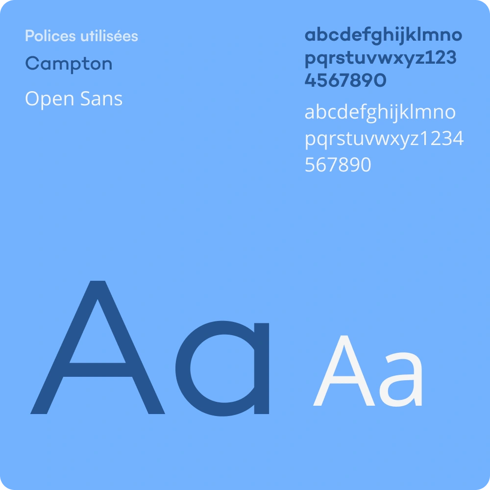
Fonts Used
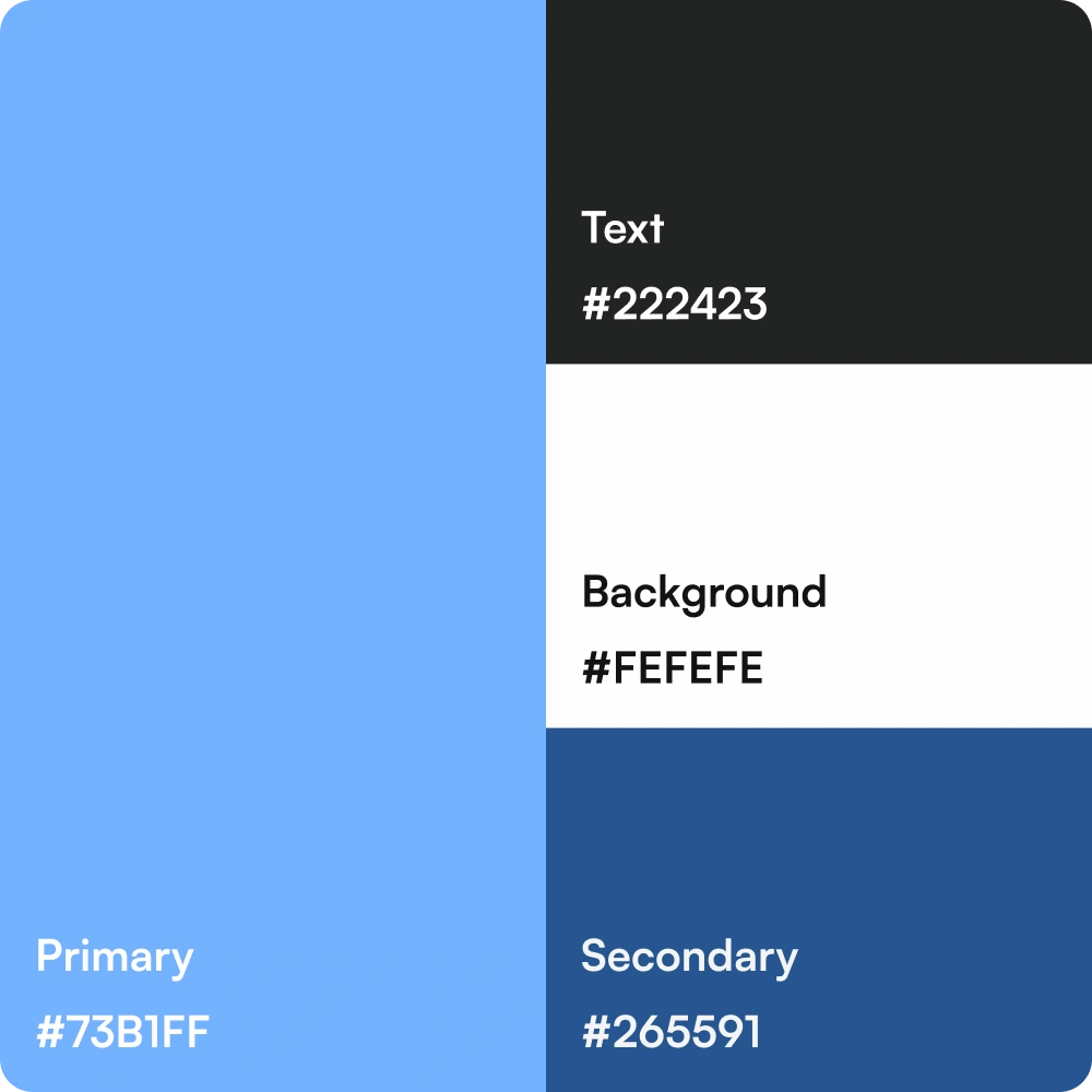
Color Palette
Results
Following this project, the investment process was halved in order to simplify it. Navigation and usability were greatly simplified to ensure clarity and comfort for the user.
The key takeaway from this project is that a successful UX is one that guides, not explains. Design is not a cosmetic layer, but a strategic lever. We do not design for an ‘average user’: each role deserves its own dedicated journey.
Like this project
Posted Oct 9, 2025
UX redesign of Overlord, a B2B investment platform, to halve the investment journey and offer a clear and guided experience.
Likes
0
Views
9
Timeline
Jan 23, 2025 - Aug 29, 2025
Clients
Overlord