Oolga | Branding & Visual Identity
The Client
Oolga is a boutique marketing agency, founded by two creative woman, who grew tired of their former corporate roles in marketing and communication and decided to build their own company, providing impactful branding solutions with a close and personal approach.
Challenge
The client aimed to change the way marketing and sales interact in modern organizations, addressing the dissatisfaction with the disconnect between these two areas.
Solution
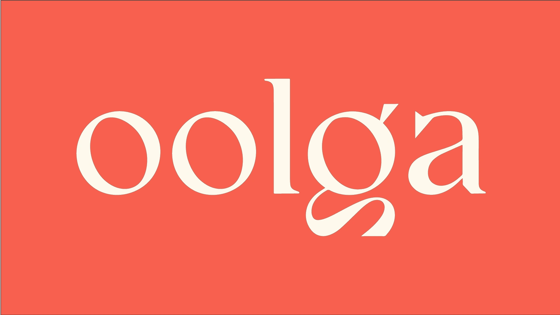
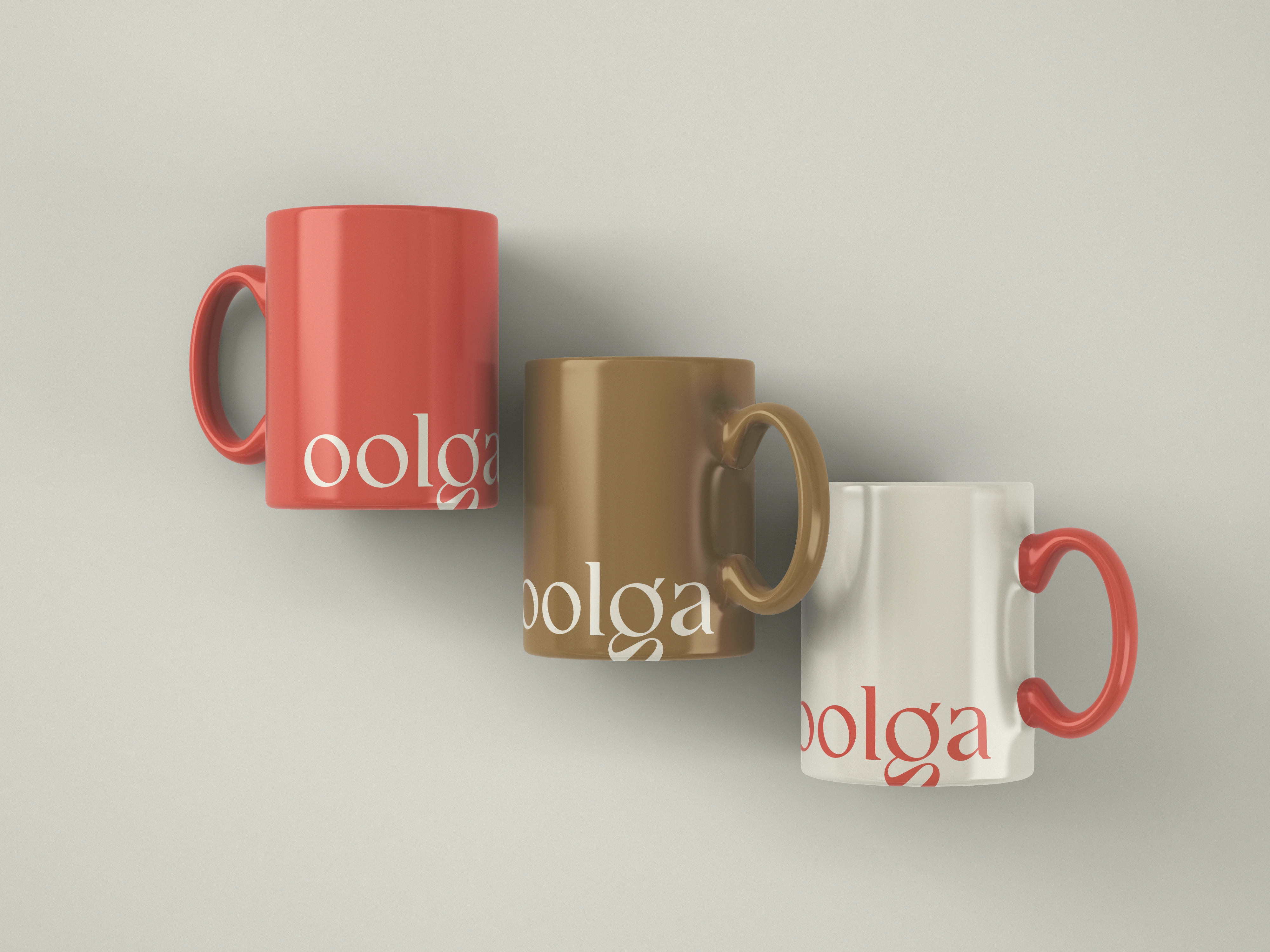
Brand Identity: Developed a contemporary serif typography for the brand's signature, evoking sophistication and modernity reminiscent of the Art Deco style. The typography was chosen to reflect the brand's clarity, security, and constant evolution.
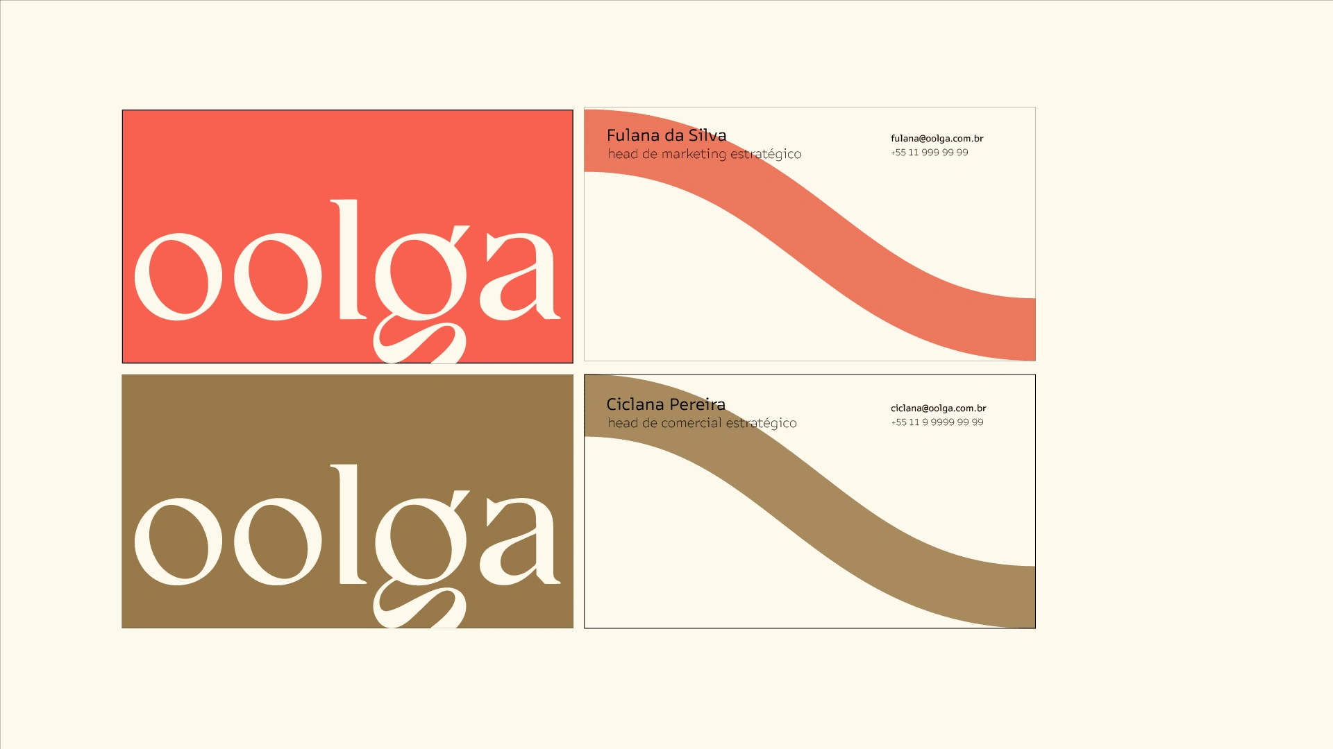
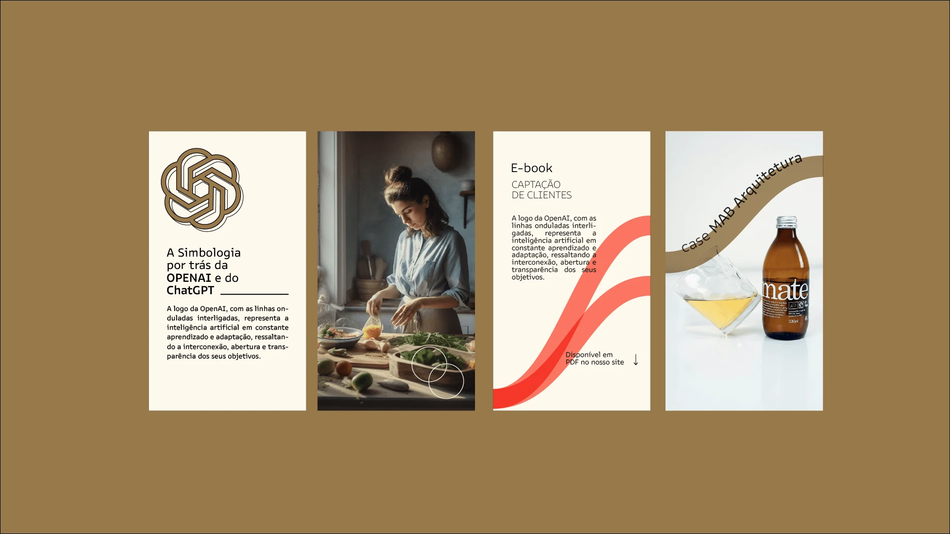
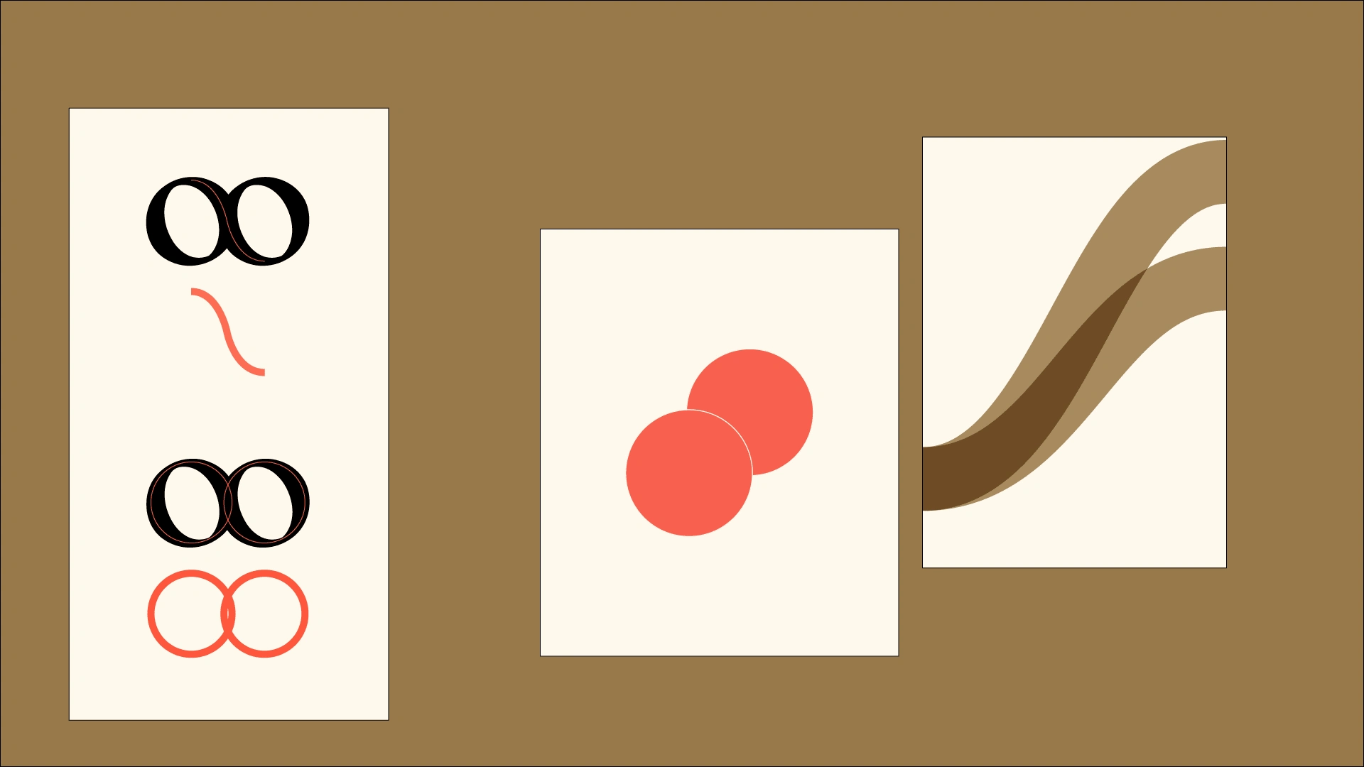
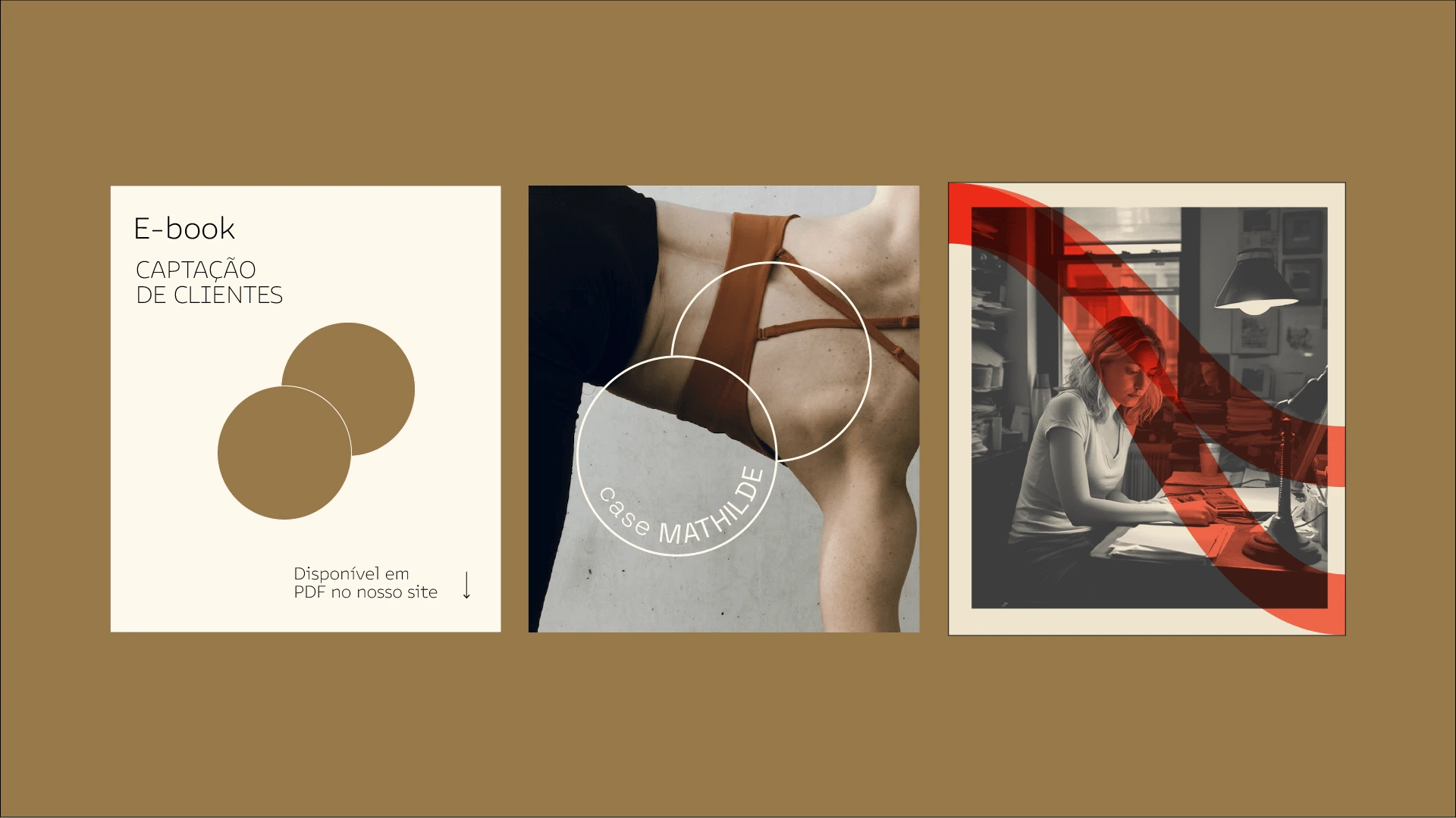
Logo and Graphics: Deriving from the shapes of the two "O" characters from the logo, I designed the main graphic elements of the brand. One represented waves, symbolizing Oolga's adaptable and versatile approach, similar to an octopus's tentacles. The other, a link of two circular shapes, representing both founders and partners of the company. Each represents a different aspect of the business, working fluidly to drive various areas of the client's business.
Color Scheme: The branding utilizes a color scheme that complements the sophisticated and modern typography, creating a cohesive and visually appealing identity.
Deliverables:
Logo design and brand guidelines
Typography and color scheme
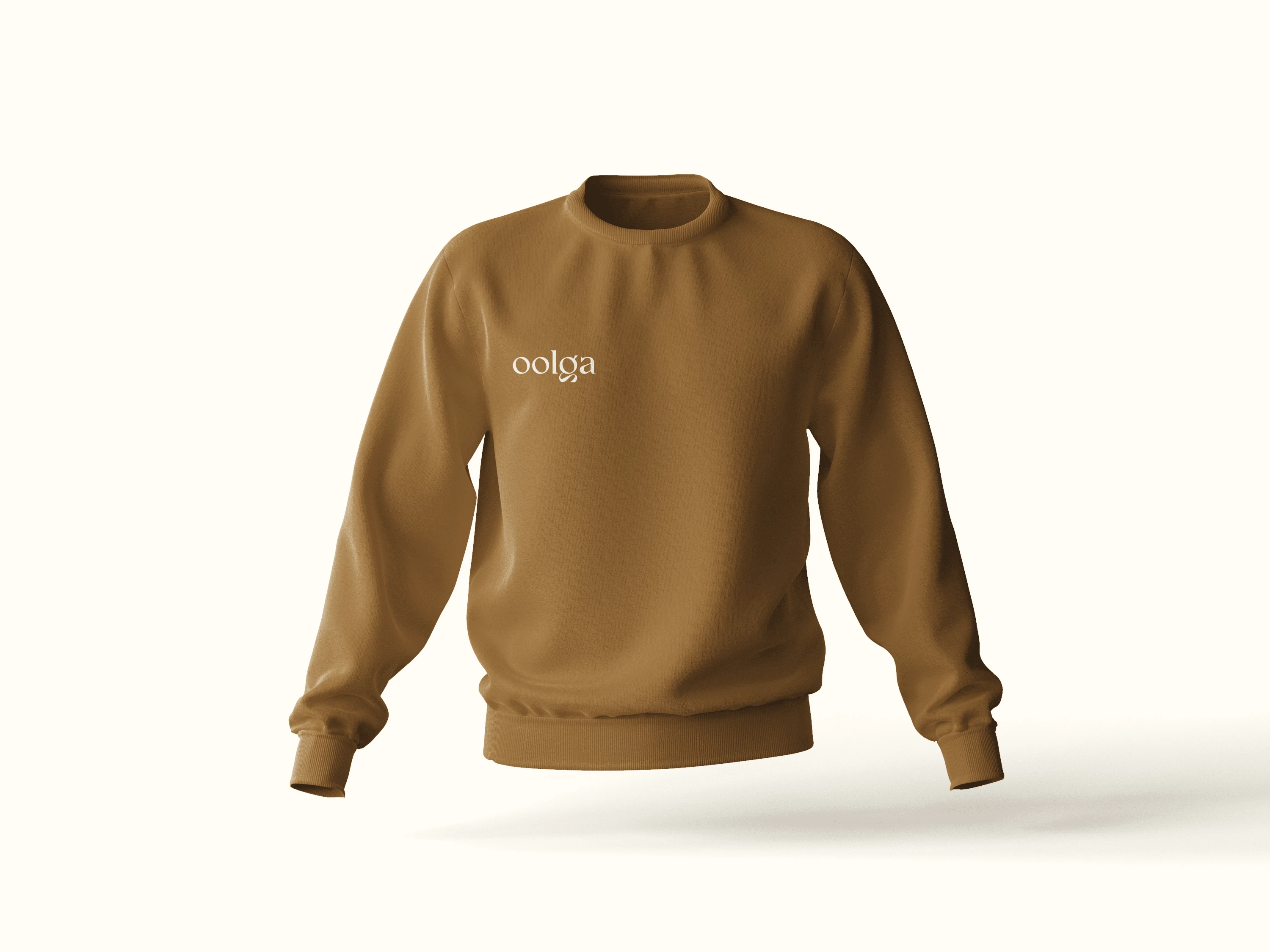
Branding assets for digital and print use

Like this project
Posted Mar 19, 2024
Turning creative stories into a powerful and impactful brand: Oolga's identity showcases innovation in marketing and sales for small businesses.

