Rim Source - Brand Identity
Jimmy Viquez
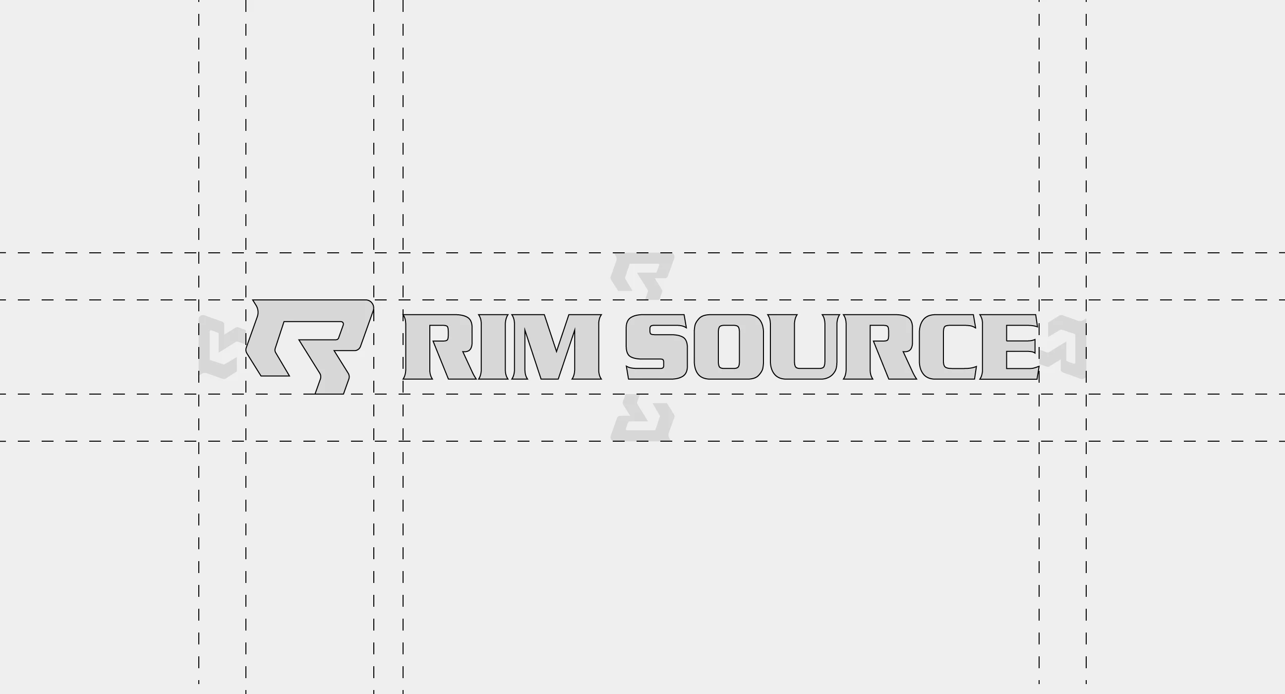
Rim Source
The Brief
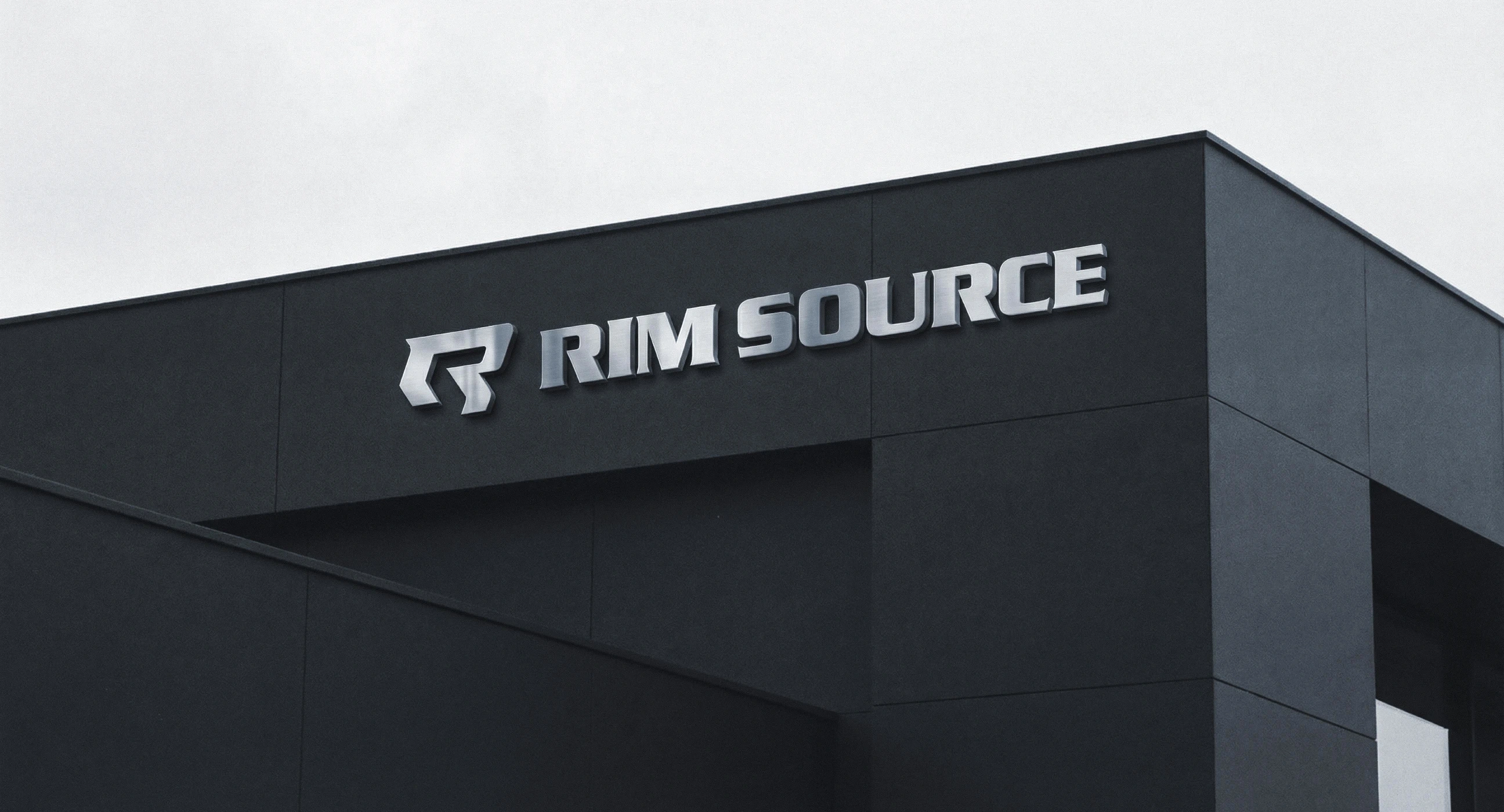
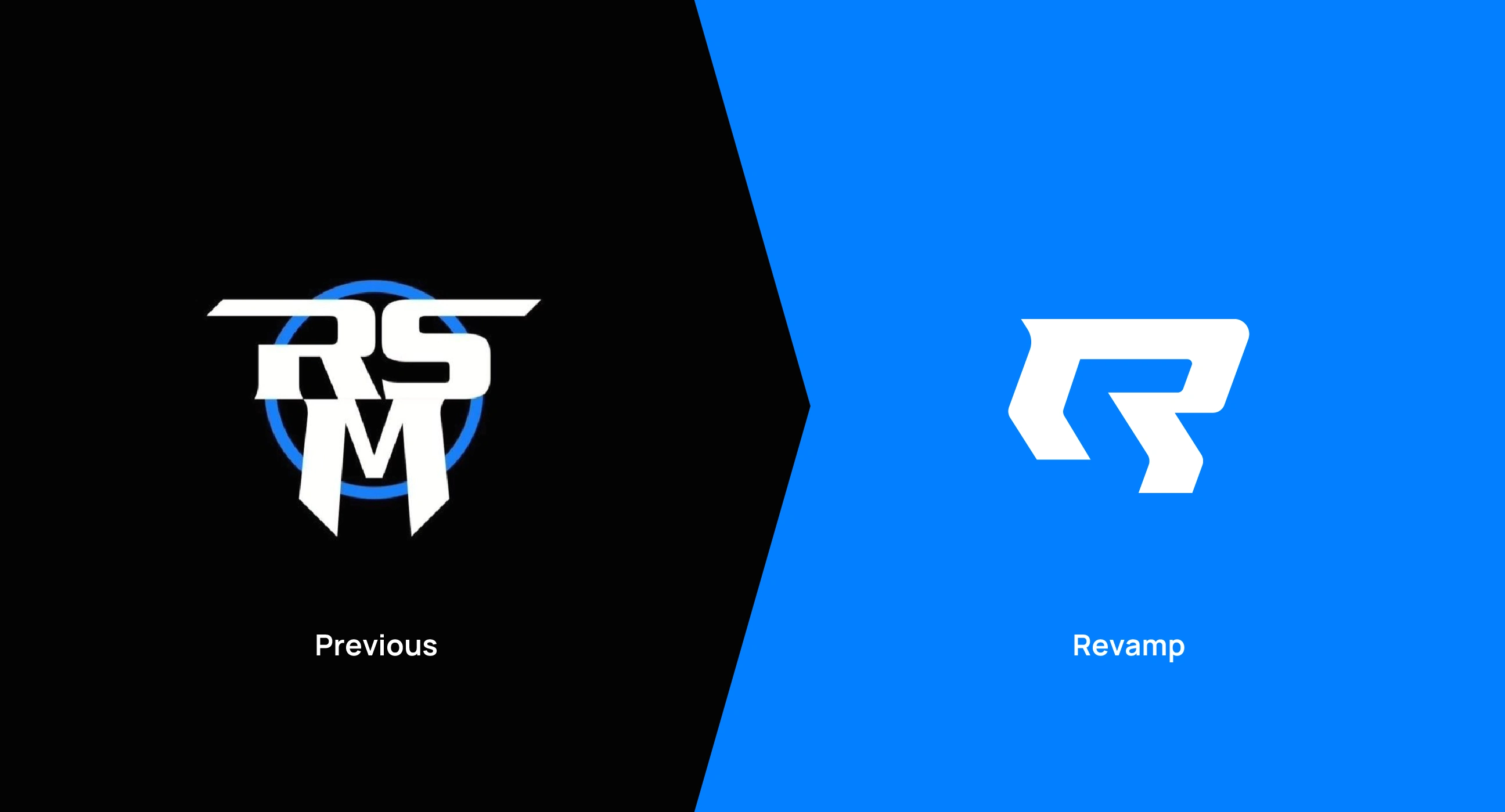
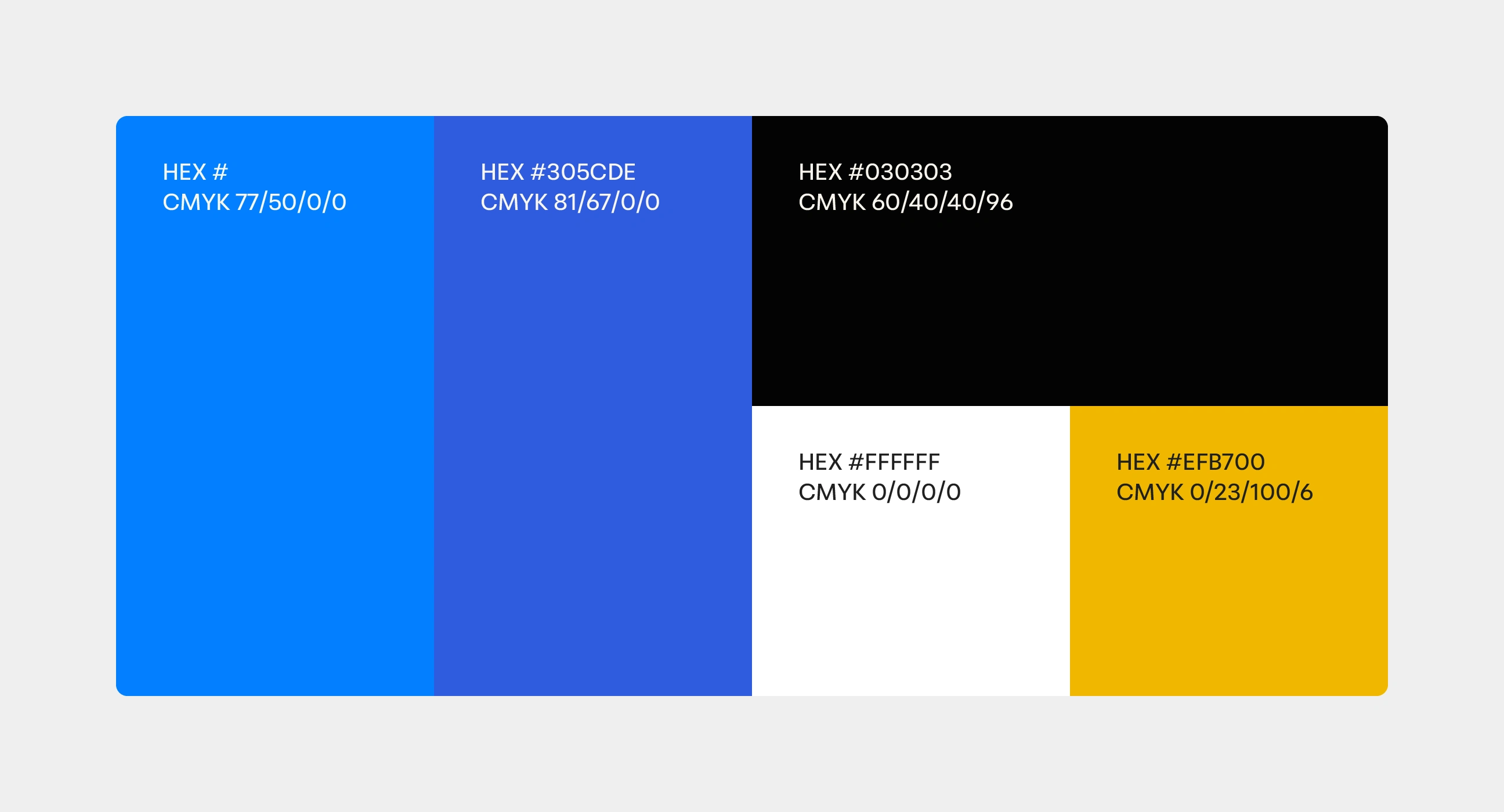
Rim Source grew from a one-bay Baltimore garage into what they call the largest custom rim shop in the world. The reputation was built on speed and deep inventory, but the visual identity needed to catch up to the business it represented. The logo mark, a dated "RSM" lockup, was the main culprit. The goal was a brand refresh, not a reinvention. The wordmark had equity, the color palette was staying, and the direction was clear: modern and bold, closer to a premium gym than a traditional auto shop.
The Work
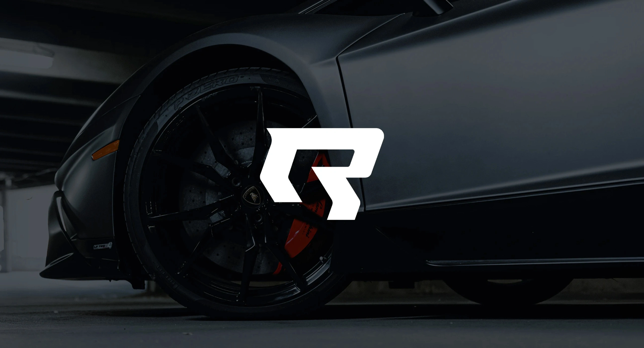
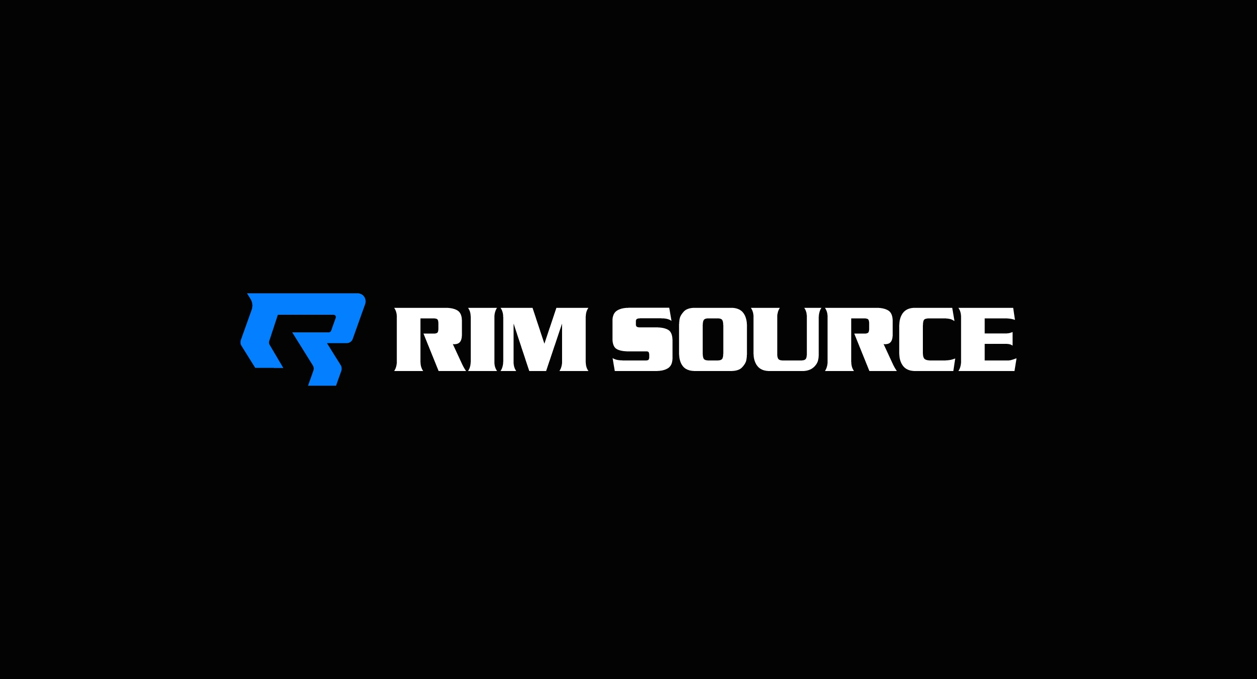
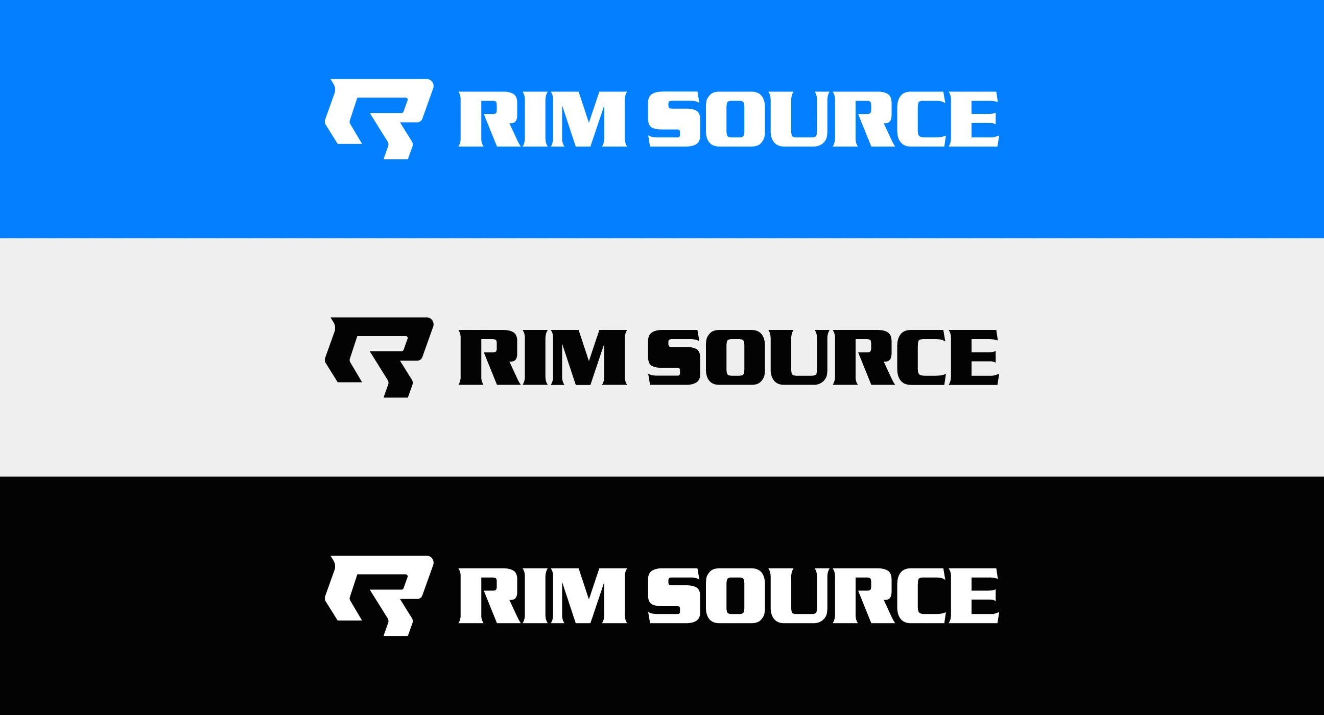
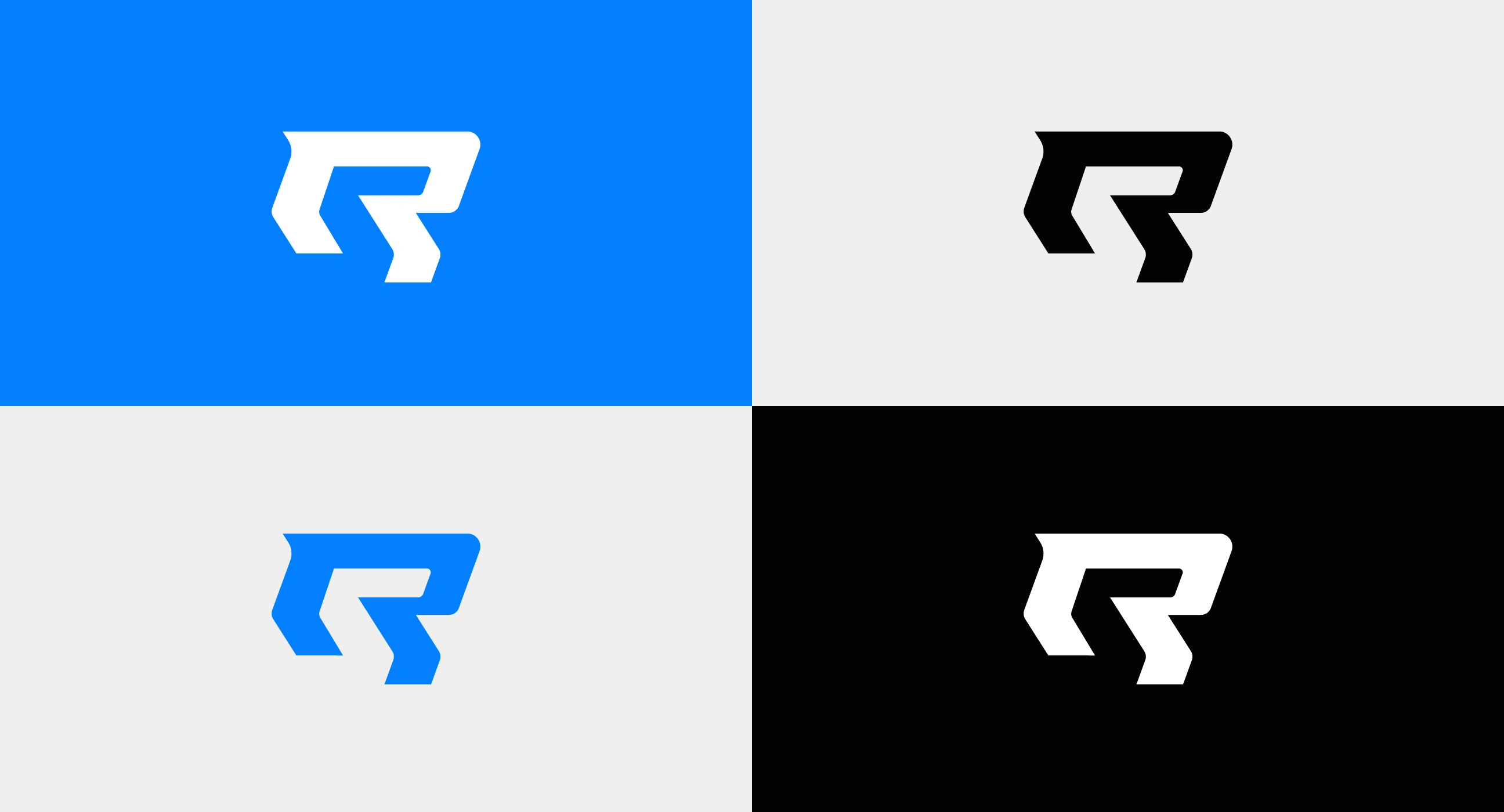
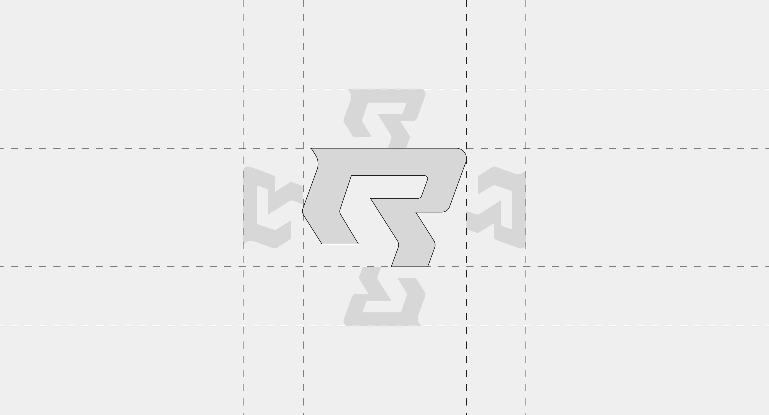
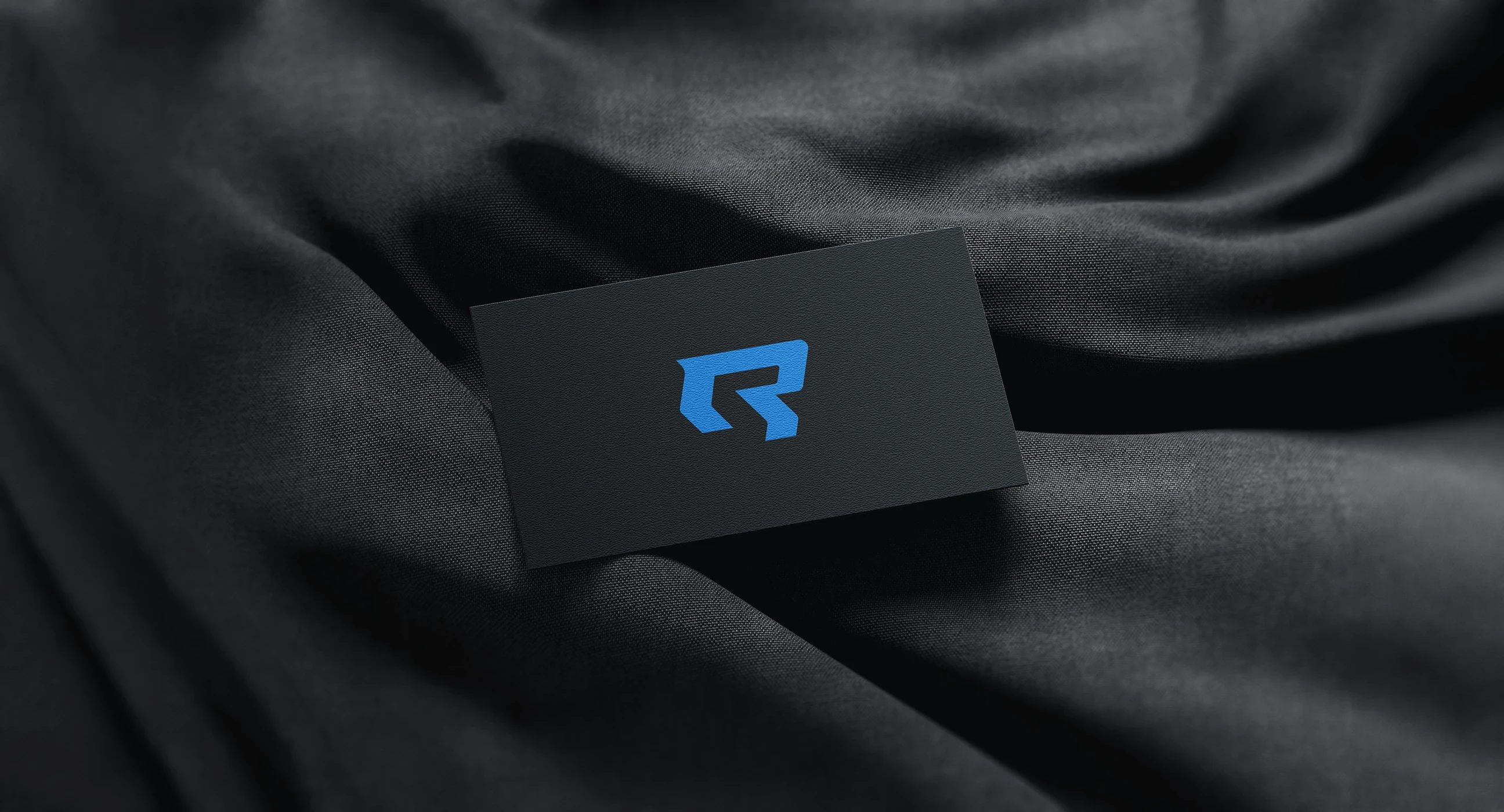
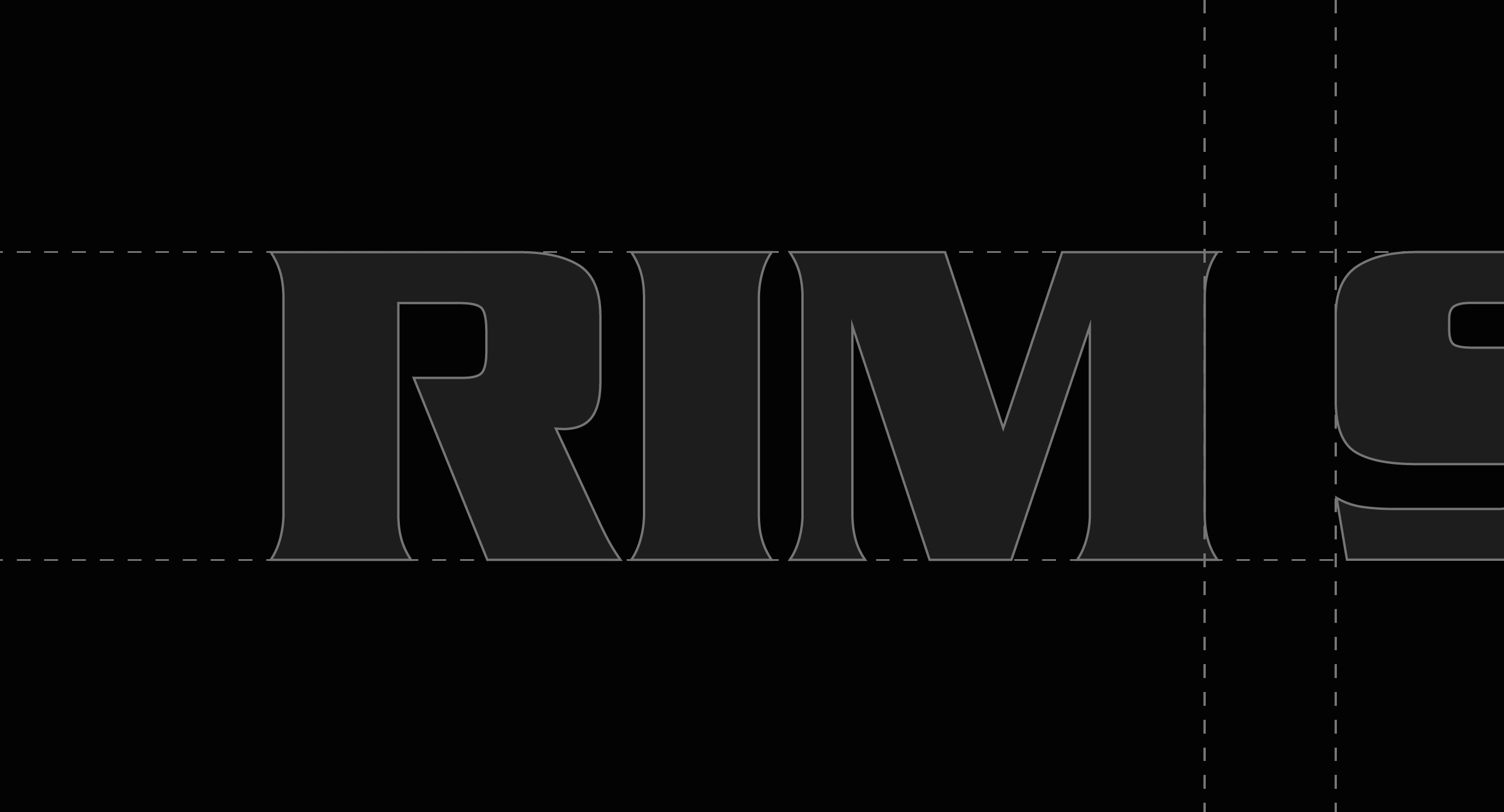
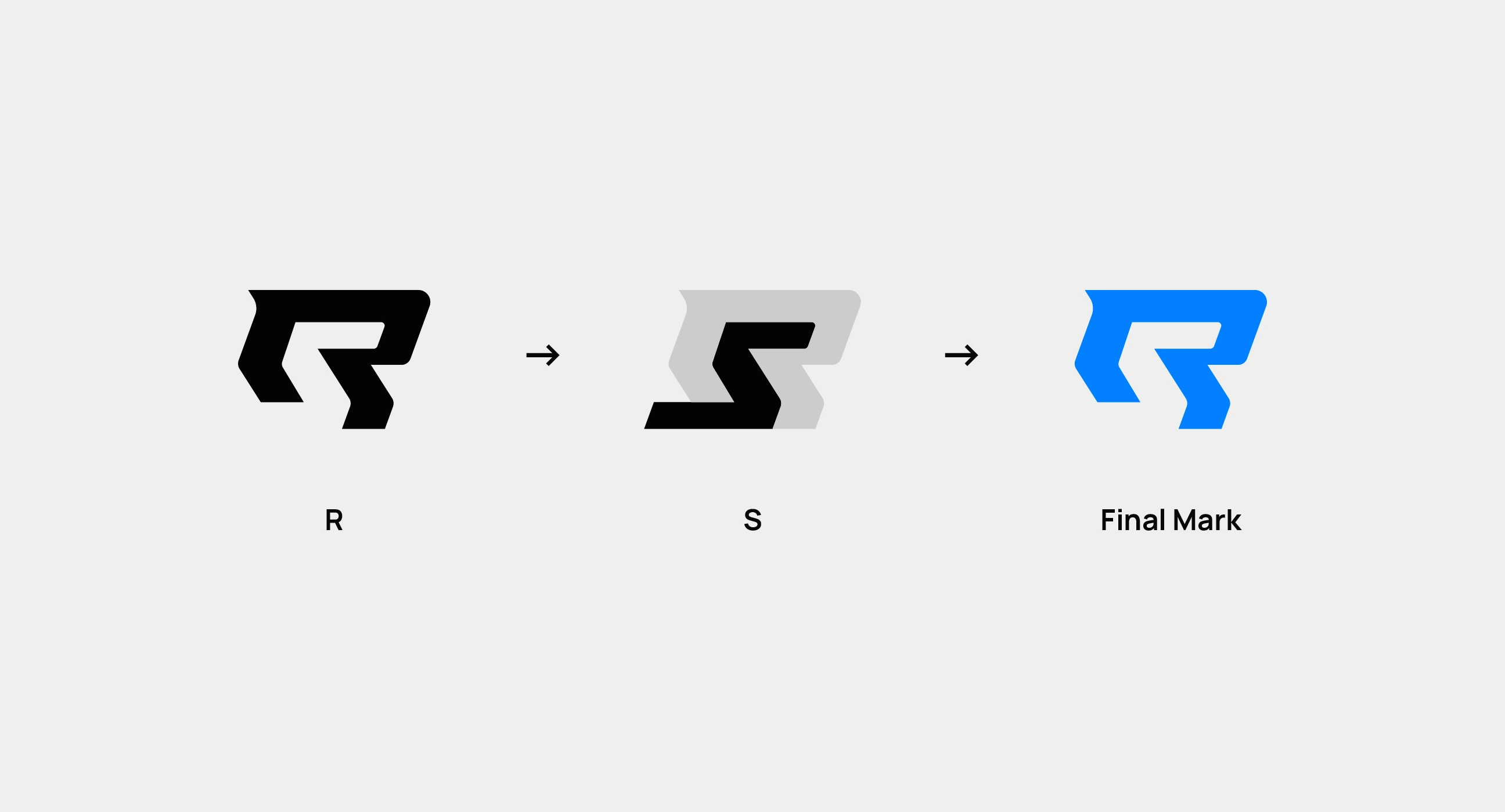
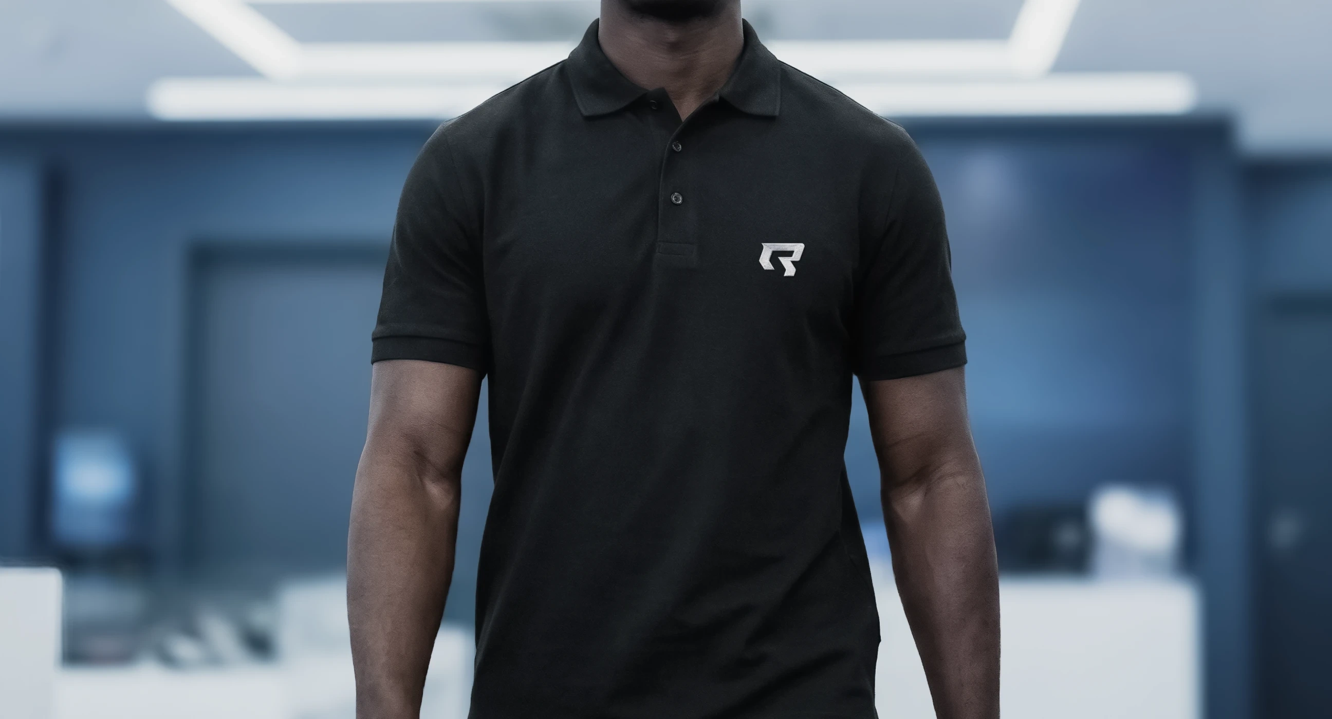
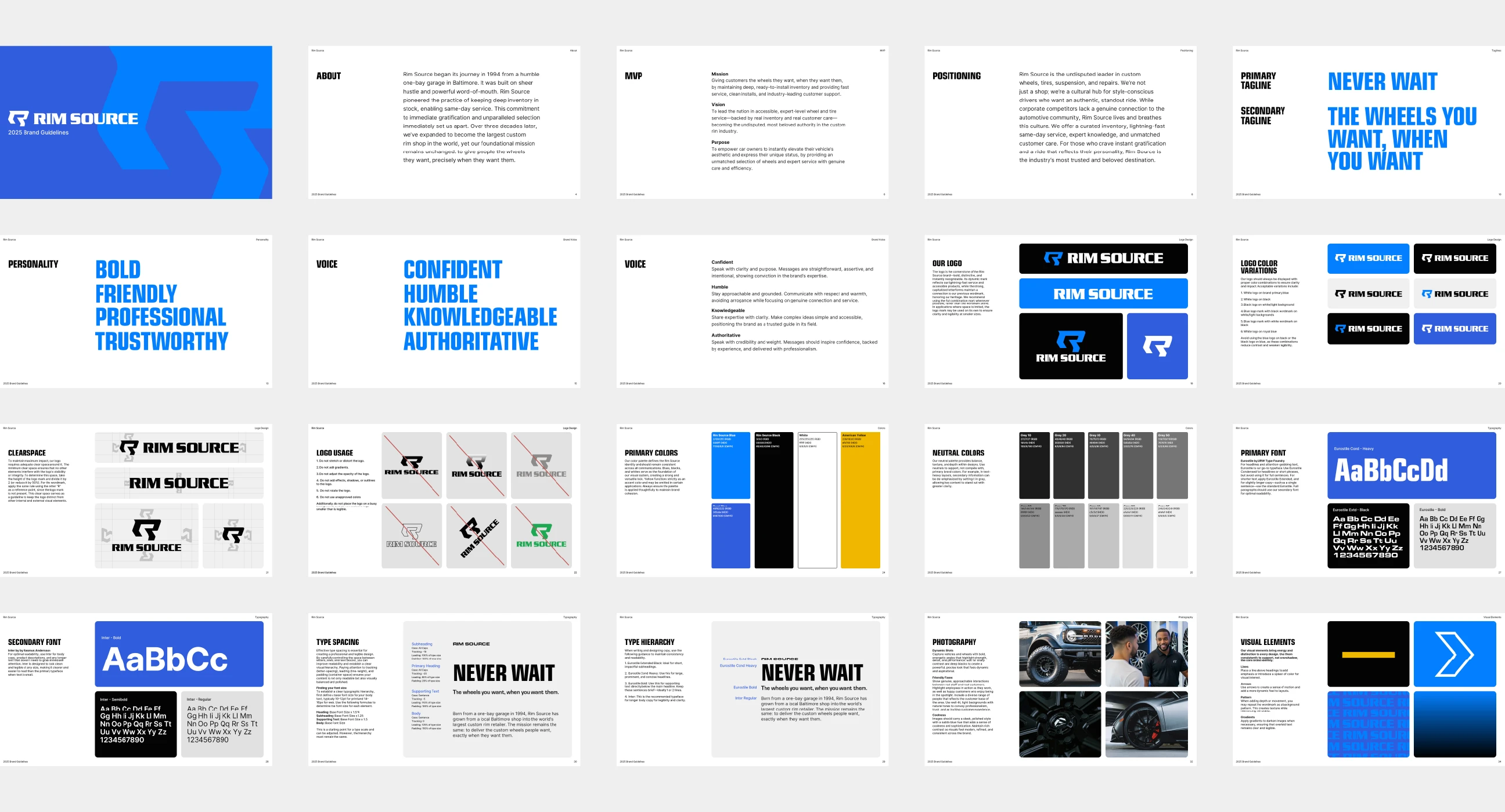
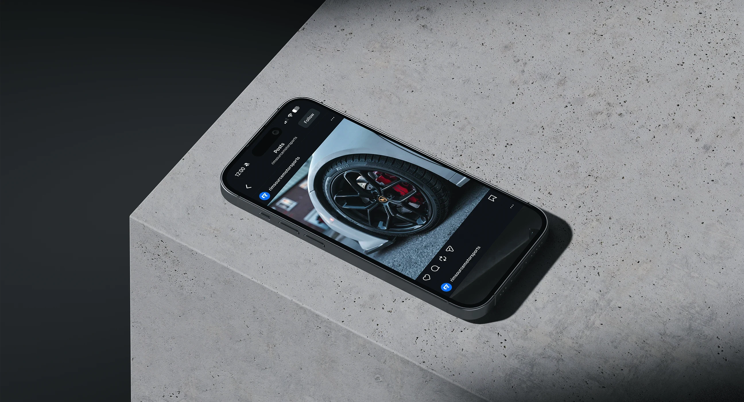
The core challenge was designing a new mark that felt like it belonged with the existing wordmark rather than replacing it entirely. The solution is built around a dual-letter concept: the positive space reads as an R, the negative space carves out an S. The forward-leaning geometry wasn't decorative. It was a direct translation of what Rim Source stands for: speed, confidence, and no waiting. The wordmark received subtle refinements to complete the system. From there, the guidelines were built to give the brand a foundation it can actually use, covering color, typography, logo usage, visual elements, and photography direction, so every touchpoint from here forward feels like the same brand.
Like this project
Posted May 26, 2026
A bold, cohesive brand system that positions Rim Source as the industry leader they already are, with the visual foundation to back it up.