Brand Identity Design for Las Vegas Apothecary

Yusra Shoaib
Verified


Las Vegas Apothecary – Brand Identity Design
Crafting a clinical boutique identity for a new standard of personalized pharmacy care
Las Vegas Apothecary is an independent 503A compounding pharmacy built for physicians, wellness clinics, med spas, and patients who expect a more personalized standard of pharmacy care. The pharmacy prepares custom sterile and non-sterile compounded medications across hormone replacement therapy, weight management, and specialty wellness needs. The goal was to create a brand that communicates medical credibility while carrying the refinement of a boutique service.
I was responsible for designing the complete brand identity, including brand positioning, primary wordmark, monogram, logo guidelines, color system, typography system, type hierarchy, imagery direction, and the full brand guidelines document.
The challenge was to create a pharmacy brand that feels clinically trustworthy without feeling cold, and premium without feeling decorative.
The Challenge
Most pharmacy brands look and feel the same: white backgrounds, blue or green crosses, generic stock photography, and an identity built for retail volume rather than personal care.
Las Vegas Apothecary needed to feel different.
The identity had to:
Earn immediate trust from physicians and clinical partners
Feel at home inside luxury med spas and wellness clinics
Communicate precision, discretion, and personalized care
Avoid every visual cliché of the retail pharmacy category
Reference Las Vegas without leaning on neon, glitz, or casino imagery
Work consistently across clinical documentation, packaging, signage, and digital platforms
Most importantly, the brand needed to position Las Vegas Apothecary as a partner in personalized medicine, not just another place to fill a prescription.
Strategic Direction
The brand was built around one central idea:
Clinical confidence, expressed through quiet luxury.
Rather than choosing between medical credibility and boutique sophistication, the identity holds both in balance: the credibility of a medical practice, the discretion of a boutique service, and the confidence of a pharmacy built for personalized care.
Every design decision followed three guiding principles.
Precision
Every element should feel exact, considered, and clinically sound.
Restraint
Premium comes from what is left out. No decoration without purpose.
Trust
The brand should feel steady and reliable at every touchpoint, from a prescription label to a physician-facing presentation.
The Solution
1. Brand Foundation
The identity began with a clear positioning: an independent compounding pharmacy that bridges the gap between standardized medicine and personalized care.
This foundation shaped the brand’s voice and visual language, emphasizing partnership with clinical providers, clarity in communication, and close attention to detail.
2. Primary Wordmark
The primary wordmark is the core expression of the identity.
A refined, high-contrast serif set in a stacked composition creates a confident and memorable presence, while the supporting descriptor “503A Compounding Pharmacy · Est. 2026” anchors the brand in clinical legitimacy.
The wordmark is used across brand communications, clinical materials, packaging, signage, and digital platforms.
3. Brand Monogram
The LVA monogram serves as a compact secondary mark for moments where the full wordmark isn’t required.
The letterforms are interlocked so the V and A share a stroke, creating a distinctive mark that feels both precise and elegant.
It’s designed for:
Packaging details and dropper bottles
Social media icons
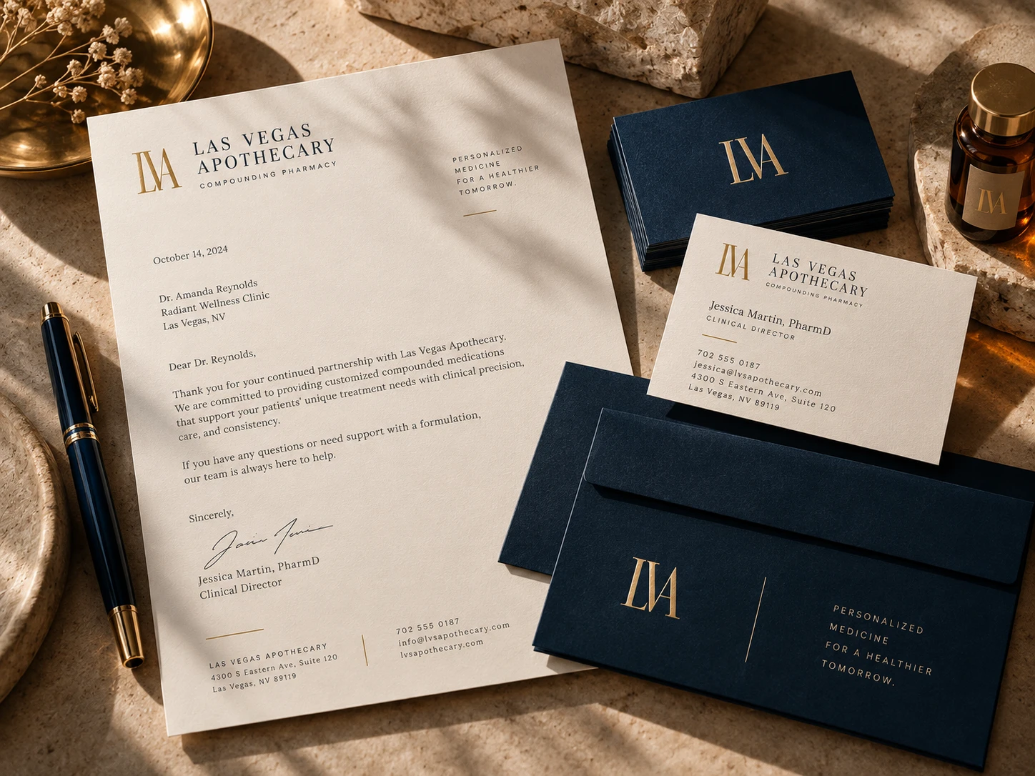
Seals and stationery
Labels
Subtle brand patterns
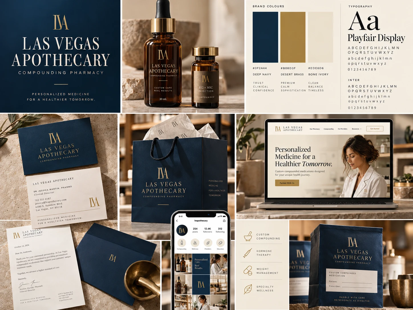
4. Color System
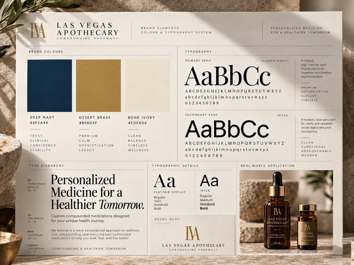
The palette is built on three primary colors, each with a clear role:
Deep Navy (
#0F2A44) is the foundation of the system, communicating clinical credibility, professionalism, and quiet confidenceDesert Brass (
#B08D3F) adds warmth and premium distinction, a subtle nod to Las Vegas expressed as quiet luxury rather than spectacleBone Ivory (
#EDE6D6) provides a calm, elevated canvas for clean and sophisticated layoutsTwo functional system colors support everyday use:
Ink (
#1A1A1A) for body text and long-form clinical documentationStone Gray (
#6B6B6B) for captions, labels, annotations, and metadataThis controlled hierarchy keeps the system minimal while ensuring clarity across packaging, digital interfaces, and operational documents.
5. Typography System
The type system pairs two complementary typefaces:
Playfair Display brings editorial elegance to headlines, section titles, hero statements, and brand covers, reflecting the boutique side of the brand
Inter delivers modern clinical readability for body copy, labels, navigation, digital interfaces, and informational content
A defined type hierarchy (headline, two subheading levels, and body text) ensures every message feels premium and expressive without sacrificing readability.
6. Imagery Direction
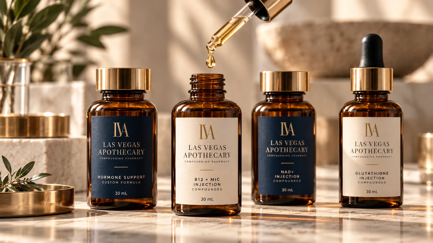
The imagery guidelines define a photographic language that feels refined, clinical, and carefully composed.
The direction includes:
Close-up details and premium textures
Amber glass and apothecary vessels
Precise tools and clean surfaces
Soft, warm lighting
Natural, confident human portraits
Generic retail pharmacy visuals are explicitly avoided. Every image should reflect personalized clinical care.
Design Process
Discovery & Positioning
The project began by understanding who Las Vegas Apothecary serves and what those audiences need to feel.
Physicians and clinical partners need confidence in quality and consistency. Med spas and wellness clinics need a partner whose brand sits comfortably alongside their own premium experience. Patients need clarity and reassurance.
This revealed a key insight:
In healthcare, premium isn’t communicated through decoration. It’s communicated through restraint, consistency, and care.
Brand Architecture
The logo system was structured around a clear hierarchy:
Primary Wordmark for main brand applications
Brand Monogram for secondary and compact applications
This structure gives the brand flexibility across large and small touchpoints while keeping it instantly recognizable.
Visual Language
The identity embraces a minimal, editorial design language built on generous whitespace, fine rule lines, high-contrast serif typography, and a disciplined color palette.
Deep Navy and Bone Ivory create a strong, calm contrast, while Desert Brass is used sparingly for section numbers, labels, and the monogram, adding warmth and distinction exactly where it matters.
Logo Governance
A complete set of usage rules was developed to protect the identity as it scales.
It includes:
Clear space defined by X, equal to the width of the letter “O” in the wordmark
Approved color combinations and contrast standards
Rules against altered transparency, rotation, strokes, and effects
Rules against stretching, distorting, or recoloring the logo
Guidance on avoiding busy or low-contrast backgrounds
This foundation ensures the brand stays consistent no matter who is applying it.
Key Brand Elements
Brand Positioning
Primary Wordmark
LVA Monogram
Logo Clear Space System
Logo Usage Guide
Primary Color Palette
System Colors
Brand Typography
Type Hierarchy
Imagery Direction
Brand Voice Examples
Deliverables
Brand Strategy & Positioning
Brand Overview & Foundation
Primary Wordmark
Brand Monogram
Clear Space Guidelines
Logo Usage Do’s and Don’ts
Primary Color Palette
System Color Palette
Typography System
Type Hierarchy
Imagery Guidelines
Complete Brand Guidelines Document
The Outcome
Las Vegas Apothecary now has a cohesive identity that positions it as a trusted clinical partner with boutique-level refinement.
Rather than blending into the retail pharmacy category, the brand stands apart through quiet confidence: a disciplined palette, elegant typography, and a visual language built on precision and care.
The result is an identity that feels equally credible in a physician’s office and at home in a luxury med spa, with guidelines that keep it consistent across every touchpoint.
Final Reflection
The strongest healthcare brands don’t try to look impressive. They make people feel safe, understood, and well cared for.
With Las Vegas Apothecary, the objective wasn’t simply to design a logo for a pharmacy. It was to create an identity that reflects a higher standard of personalized care, one where clinical precision and quiet luxury exist side by side.
The final brand system combines refined typography, a restrained color palette, and thoughtful imagery into a cohesive identity built for trust.
Like this project
What the client had to say
Yusra designed our full brand identity - logo, monogram, and brand guide. Polished, cohesive work, and she stayed detail-oriented and communicative through every revision. We've already hired her again for our website.


Andrew Roth, Las Vegas Apothecary
Jul 4, 2026, Client
Posted Oct 15, 2026
Developed a brand identity for Las Vegas Apothecary, emphasizing clinical credibility and boutique sophistication.
Likes
0
Views
1
Timeline
May 22, 2026 - Jul 4, 2026
Clients
Las Vegas Apothecary