Universal Tone

Yusra Shoaib
Verified


Chronically Awesome – Brand Identity Design
Creating an optimistic identity for a modern chronic wellness brand
Chronically Awesome is a wellness-focused brand created to empower people living with chronic health conditions through technology, education, and community. The objective was to develop a visual identity that felt hopeful, modern, and approachable while avoiding the sterile appearance common in healthcare branding.
I was responsible for designing the complete identity system, including the logo, color palette, typography, visual language, brand guidelines, and digital product applications.
The challenge was to create a brand that represents resilience and positivity without relying on traditional medical symbols.
The Challenge
Most healthcare brands lean heavily on predictable visual cues.
Medical crosses.
Blue color palettes.
Clinical typography.
Cold, institutional design.
Chronically Awesome needed to feel different.
The identity had to:
Feel optimistic without becoming playful
Balance healthcare credibility with emotional warmth
Appeal to both younger and older audiences
Translate seamlessly across digital products and marketing materials
Build recognition through a distinctive symbol rather than medical clichés
Most importantly, the brand needed to celebrate living well instead of focusing on illness.
Strategic Direction
The creative direction centered around one simple idea:
Strength through positivity.
Rather than designing around disease or treatment, the identity focuses on confidence, progress, and everyday wellness.
Every design decision was guided by three principles.
Optimism
The brand should feel encouraging and uplifting at every touchpoint.
Simplicity
A clean visual language allows information to remain accessible while creating a premium appearance.
Memorability
The logo and visual system needed to remain recognizable whether viewed inside a mobile app, on social media, or within educational materials.
The Solution
1. Signature Logo System
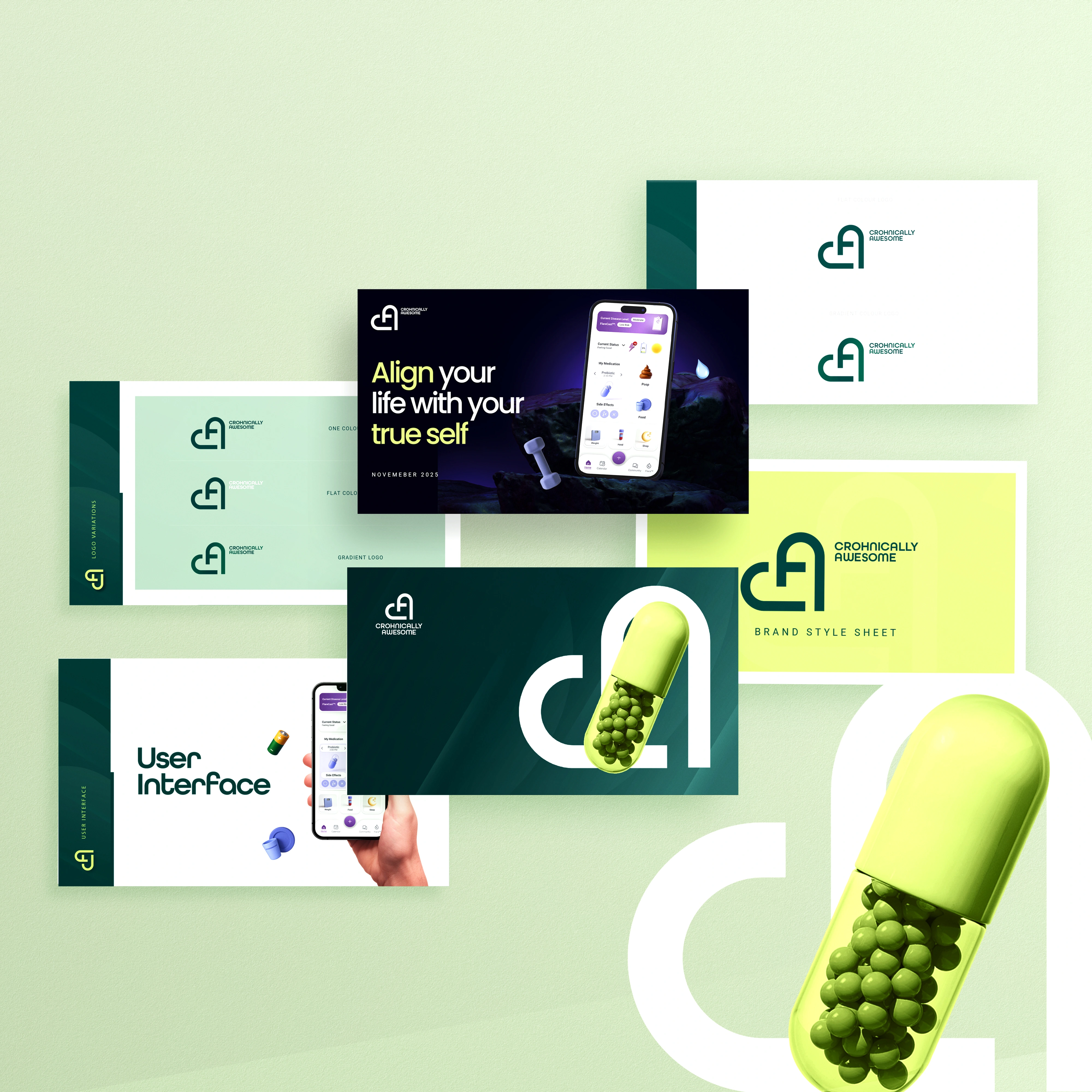
The identity is built around a custom monogram that combines the initials C and A into one continuous mark.
The rounded geometry creates a feeling of:
Care
Connection
Balance
Progress
Humanity
Rather than appearing clinical, the mark feels welcoming while remaining highly recognizable.
Its simple construction also allows it to scale effectively across digital interfaces, print materials, and app icons.
2. Modern Color Palette
Instead of traditional healthcare blues, the identity introduces a vibrant wellness-inspired palette built around deep teal and energetic lime green.
The palette creates an immediate sense of freshness while maintaining a premium appearance.
The system balances:
Trust
Energy
Growth
Calm
Accessibility
Neutral whites provide breathing room while allowing the accent colors to stand out naturally.
3. Contemporary Typography
The typography system emphasizes clarity without sacrificing personality.
Rounded geometric letterforms complement the logo while maintaining excellent readability across both digital and print applications.
The combination creates a friendly yet professional voice throughout the brand.
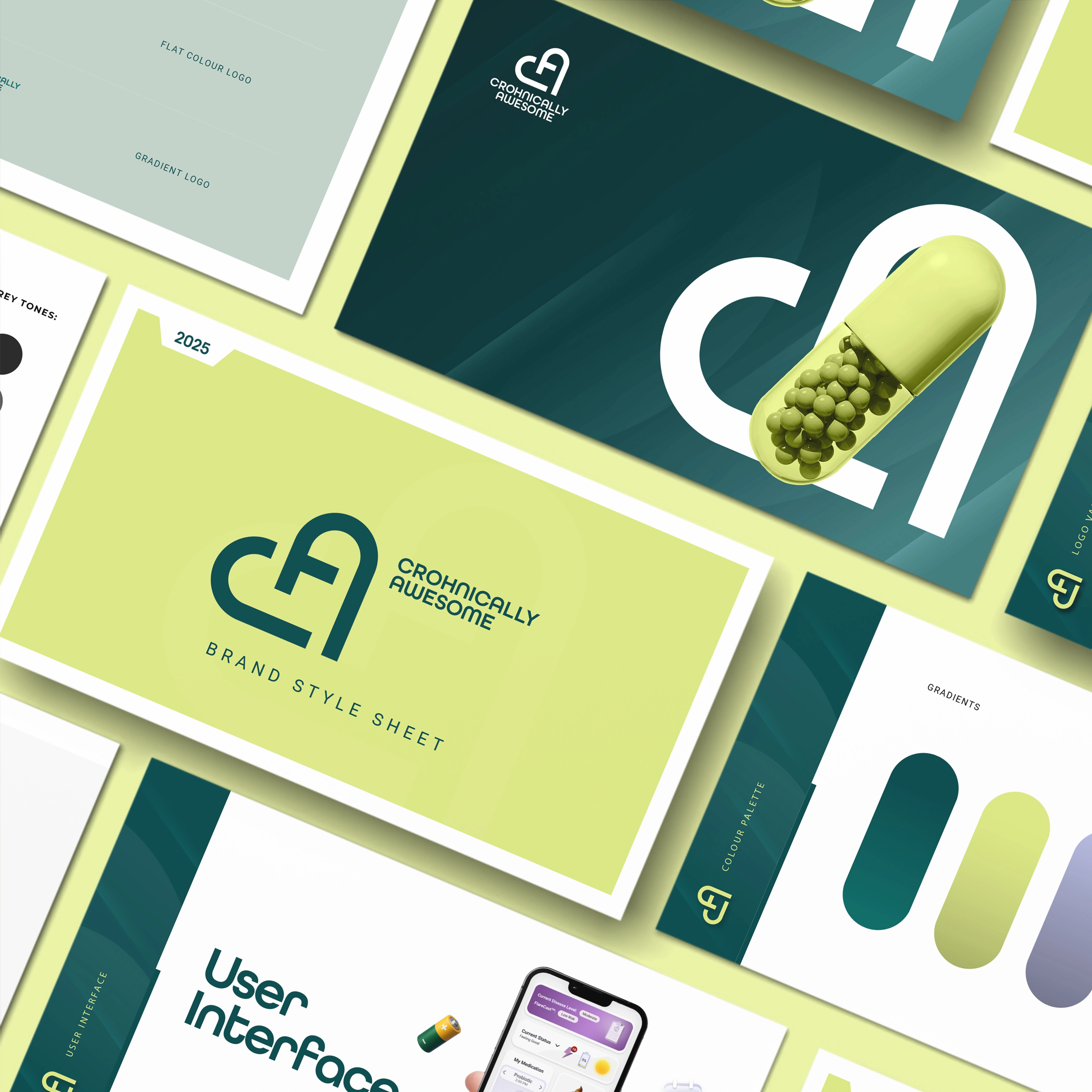
4. Brand Applications
The identity was extended beyond the logo into a complete visual system.
Applications include:
Brand guideline presentation
Logo variations
Color specifications
User interface previews
Marketing assets
Digital mockups
Every application reinforces a consistent visual language while demonstrating how the identity performs across different touchpoints.
Design Process
Research & Discovery
The project began by exploring existing healthcare, wellness, and lifestyle brands.
The goal was to identify opportunities to create something more optimistic than traditional medical identities.
Research highlighted one recurring issue:
Many healthcare brands communicate treatment exceptionally well but fail to communicate hope.
That insight became the foundation of the visual direction.
Concept Exploration
Numerous logo concepts were explored around themes including:
Growth
Wellness
Human connection
Resilience
Simplicity
The selected concept merged the initials into a single continuous symbol that feels both modern and approachable.
Identity Development
Once the logo direction was finalized, the visual language expanded into a complete branding system.
This included:
Color hierarchy
Typography system
Brand presentation
UI integration
Marketing compositions
Digital applications
Each element was refined to ensure consistency across every customer touchpoint.
Brand Validation
The identity was tested across multiple environments, including:
Digital
Mobile application interface
Website branding
Social media graphics
Presentation assets
Brand
Logo variations
Brand guidelines
Marketing materials
Digital campaigns
The visual system maintained clarity, flexibility, and recognition regardless of scale or medium.
Deliverables
Primary Logo Design
Secondary Logo Variations
Custom Monogram
Brand Color Palette
Typography System
Brand Guidelines
Digital Brand Applications
UI Mockups
Marketing Assets
Presentation Design
The Outcome
The final identity positions Chronically Awesome as a modern wellness brand that feels optimistic, trustworthy, and human.
Rather than communicating illness, the brand communicates confidence and possibility.
The combination of the custom monogram, vibrant color palette, clean typography, and cohesive visual system creates a memorable identity that can scale naturally across future digital products, educational content, and community initiatives.
Final Reflection
Great healthcare branding isn't defined by medical symbols—it's defined by how it makes people feel.
For Chronically Awesome, the goal wasn't simply to design a logo. It was to build a visual identity that reflects resilience, optimism, and everyday progress.
The result is a flexible brand system that feels approachable, contemporary, and unmistakably its own.
Like this project
Posted Jul 16, 2026
Developed an optimistic brand identity for a modern chronic wellness brand, creating a cohesive visual system that inspires trust and positivity.
Likes
1
Views
22
Timeline
Jun 23, 2025 - Dec 1, 2025