Empowering Beauty: Unveiling Women's Strength with Kio Cosmetics
Synthetiq Lab
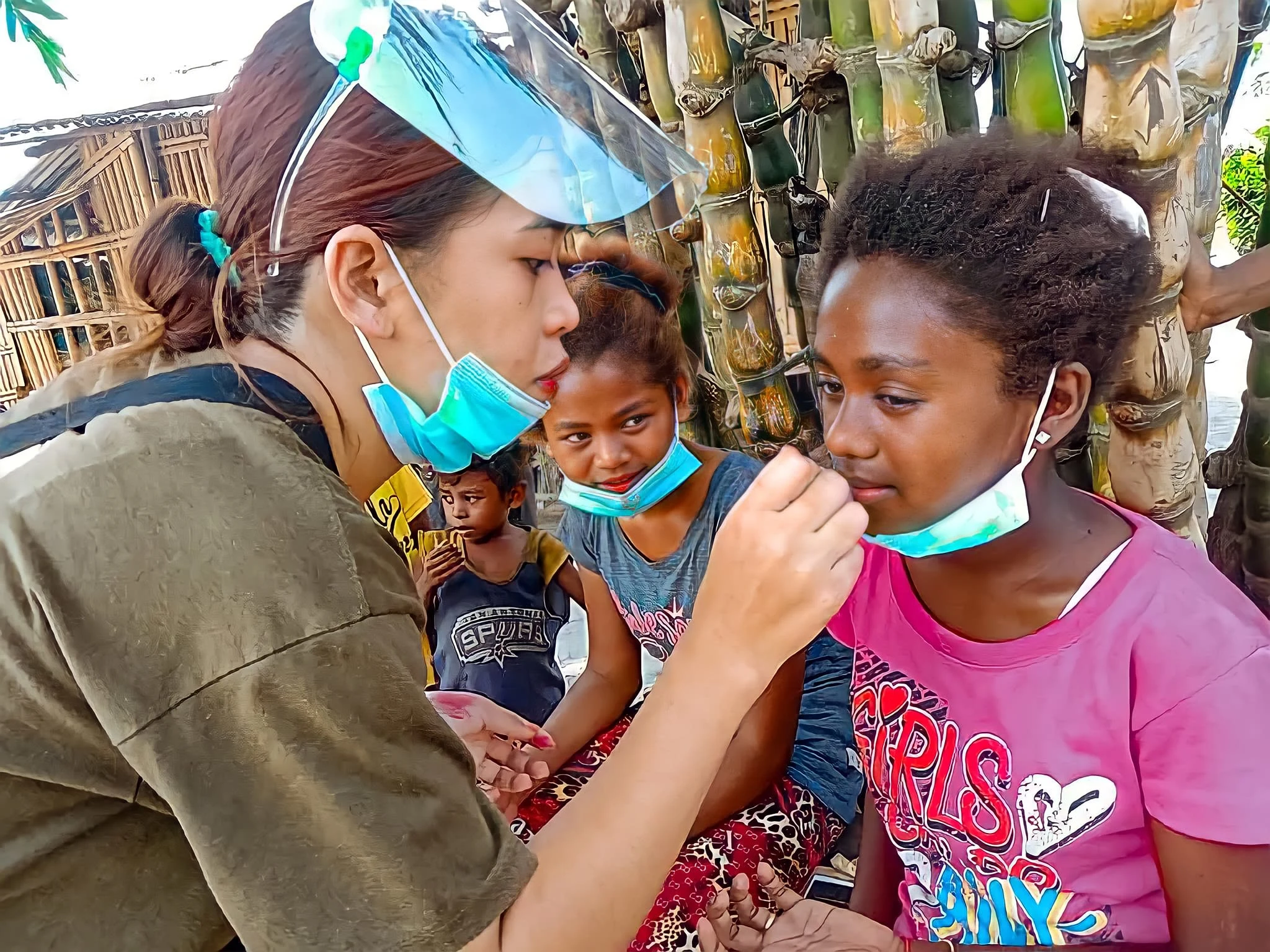
Kio Cosmetics is a local beauty sanctuary founded by our friend Kristine. Much more than a cosmetics brand, Kio is an ode to empowerment, celebrating diversity and inspiring women to express their unique strength through makeup artistry.
About the Brand
Kio Cosmetics is a local cosmetics brand that transcends traditional beauty norms. Founded by Kristine, the brand is a testament to the power of self-expression and empowerment. Kio Cosmetics believes in beauty that goes beyond the surface, inspiring women to break free from societal expectations and embrace their unique strengths. Their product line are infused with cultural meanings, they are a fusion of elegance and boldness. Kio Cosmetics isn't just about makeup; it's a journey of celebrating diversity, daring to be different, and redefining beauty on one's own terms.
Brief
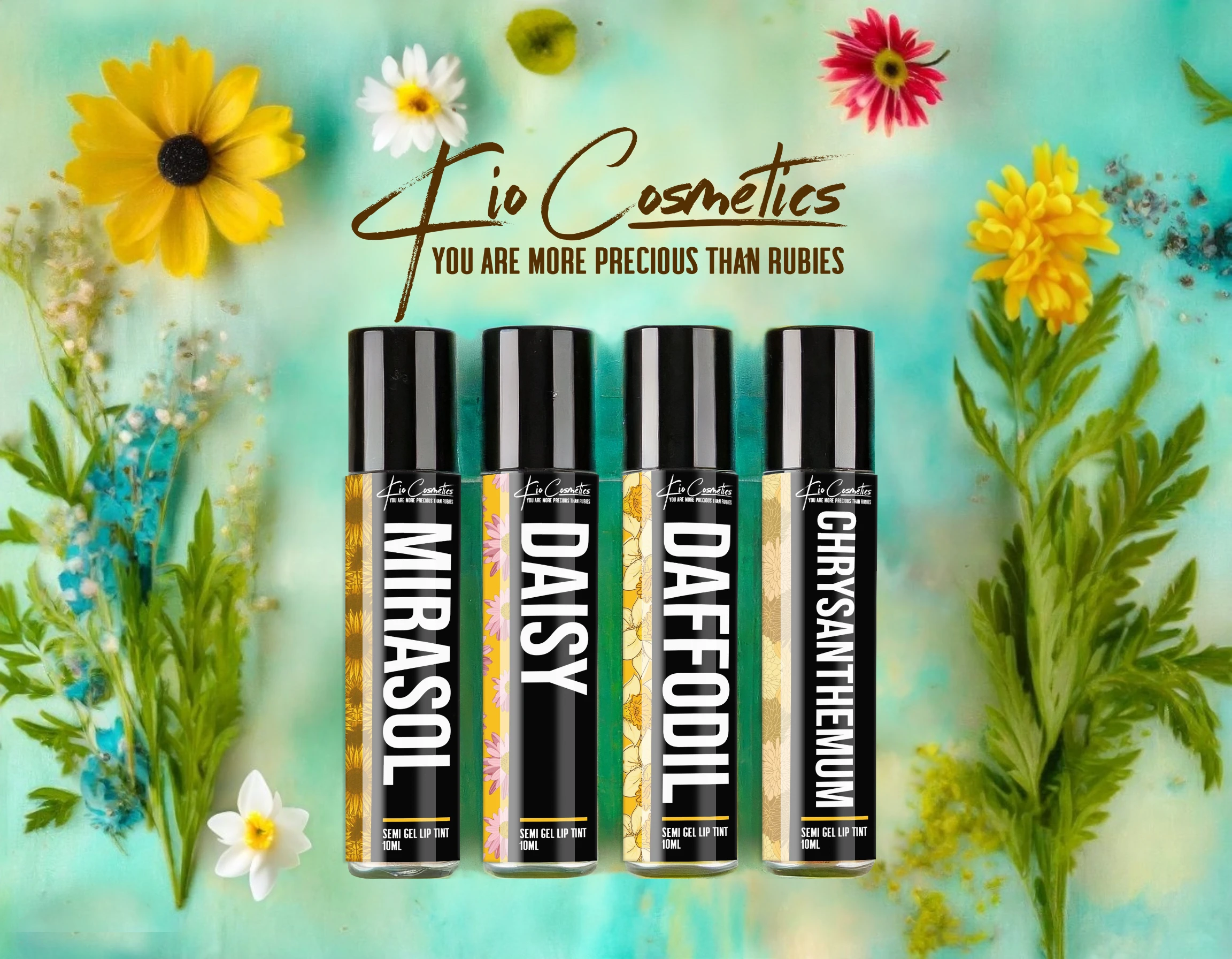
Kristine wanted to communicate what women are capable of through her products. She wanted to empower women to not settle for less, strive for their dreams, and express themselves for who they are. Thus, her slogan was “You are more precious than Rubies”. Kristine also wanted to incorporate various cultural meanings of her favorite flower as her product names, emphasizing the brand’s goal of celebrating women’s diversity and beauty. Moreover, she wanted to explore the idea of a woman being daring and pushing her limits through her Kio’s Fierce collection.
Solution
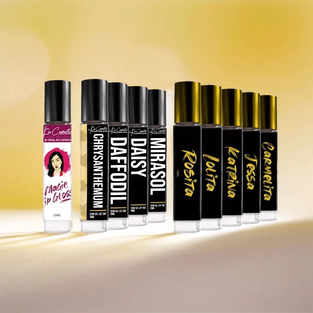
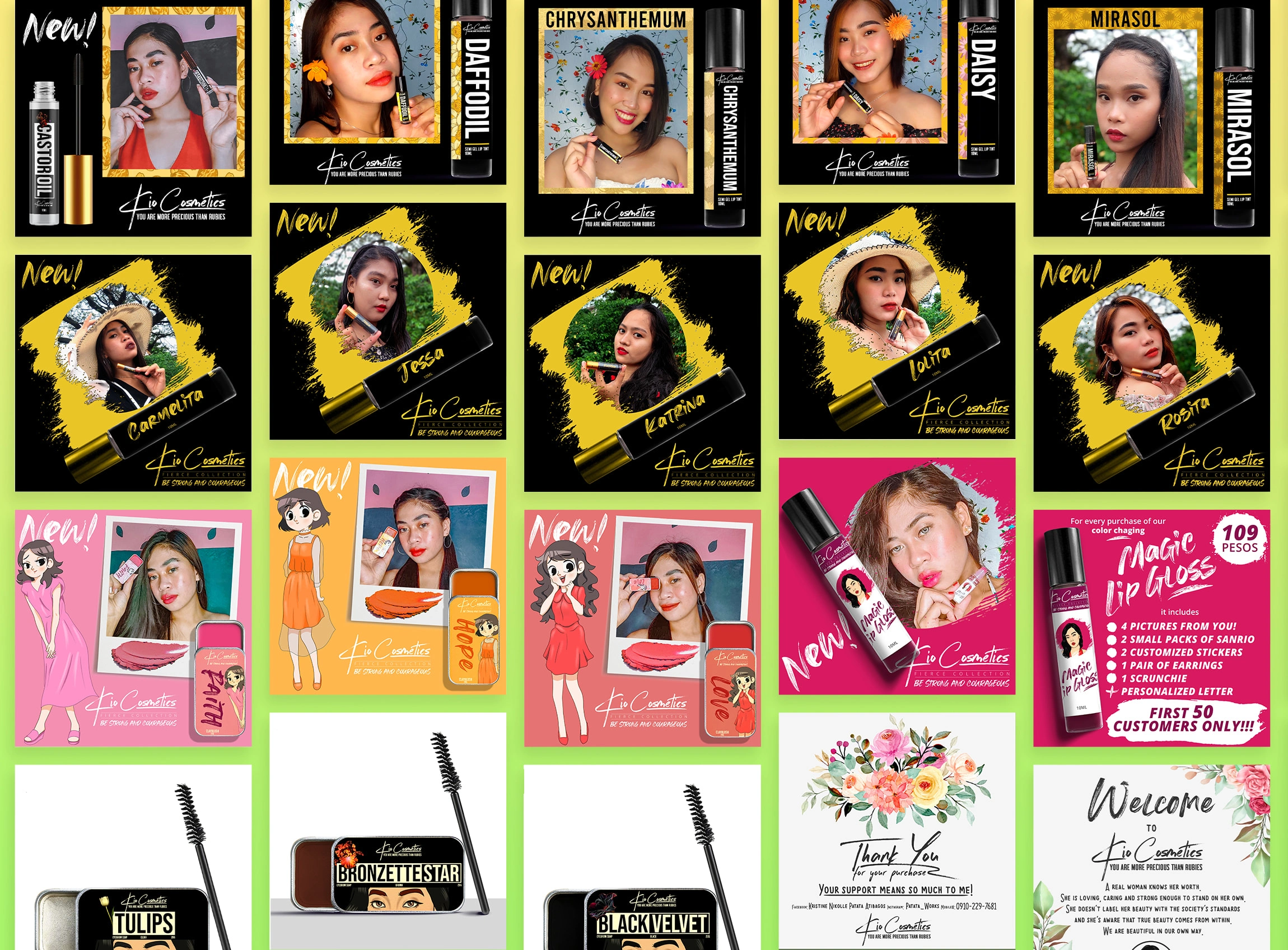
We decided to use the inherent cultural meanings of these flowers: Daffodil, Daisy, Mirasol, and Chrysanthemum, and infuse them with the brand’s goal of empowering and inspiring women. We chose a modern bold typography and a calm-toned color palette to create a sense of elegance and sophistication. For the Fierce Collection, we used these names: Carmelita, Jessa, Katrina, and Lolita, and we opted for an exciting brush stroke-inspired typeface and strong contrasting colors to reflect the value of boldness and free-spiritedness.
Result
We created a cohesive visual identity that attracts women to support Kristine’s values through her cosmetic products. The logo, branding, package design, and social media design all work together to create a memorable and distinctive brand image that stands out from the crowd.
In a world saturated with beauty products, Kristine aimed higher. Her vision for Kio Cosmetics wasn't just about makeup; it was a statement of empowerment. Let's explore how we brought this vision to life.
A Vision Beyond Beauty
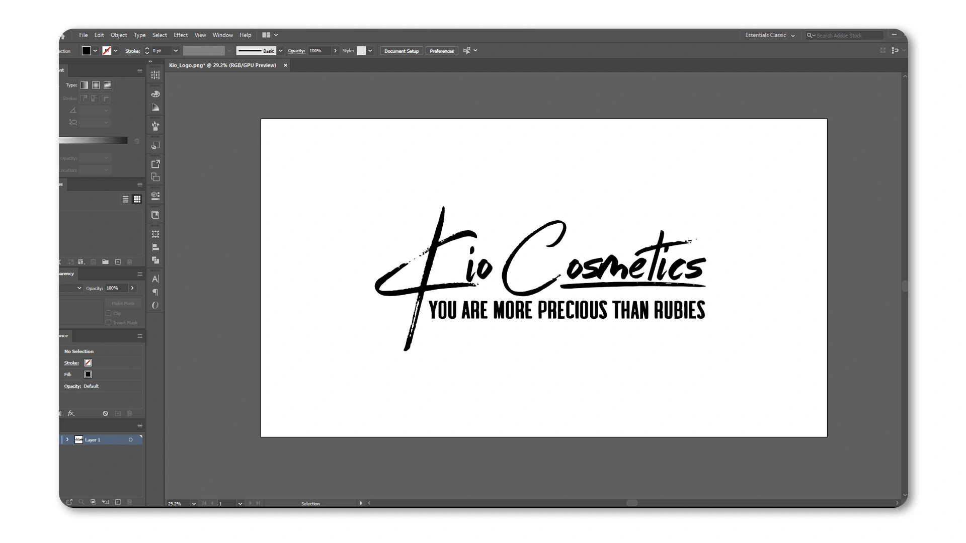
Kristine envisioned a brand that went beyond superficial beauty. Her desire to inspire women to aspire for more than society expects became the driving force. With the slogan "You are more precious than Rubies" she sought to redefine beauty standards.
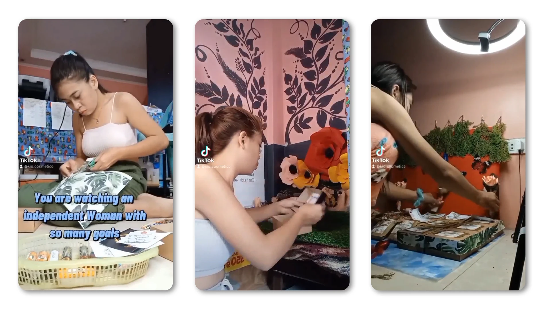
Kristine, working on Kio's product offerings.
Because of that Kristine approached us to help her with a cosmetic brand she was about to launch. We were thrilled to work with her and create a suitable brand identity that reflects the values she wants to convey.
Cultural Fusion and Daring Designs
Bridging the gap between cultural significance and bold design choices, we embarked on a journey to infuse Kio Cosmetics with depth. We explored the cultural meanings of flowers, introducing Daffodil, Daisy, Mirasol, and Chrysanthemum, and courageously pushed boundaries with the Fierce Collection.
Phase 01: Research & Creative Direction
The first phase of our process is all about research. Just like a makeup artist studies their canvas, we delve into understanding your business, target audience, and competition. We conduct thorough research on your industry, your audience's preferences, and your competitors. This knowledge forms the foundation for crafting a brand identity that resonates. As we navigate through this phase, we shape a creative direction tailored to elevate Kio Cosmetics in a way that captivates their audience.
Iniital moodboard used to gather visual inspirations.
Phase 02: Ideation & Production
With a canvas painted by research, we transition into the artistic phase of ideation and production. Here, our creative brushes come to life as we generate initial concepts for Kio Cosmetics. We craft conceptual sketches that serve as the visual language to communicate Kio's brand’s unique message. This phase is where ideas are born, refined, and polished, ensuring each stroke contributes to Kio Cosmetics' visual identity.
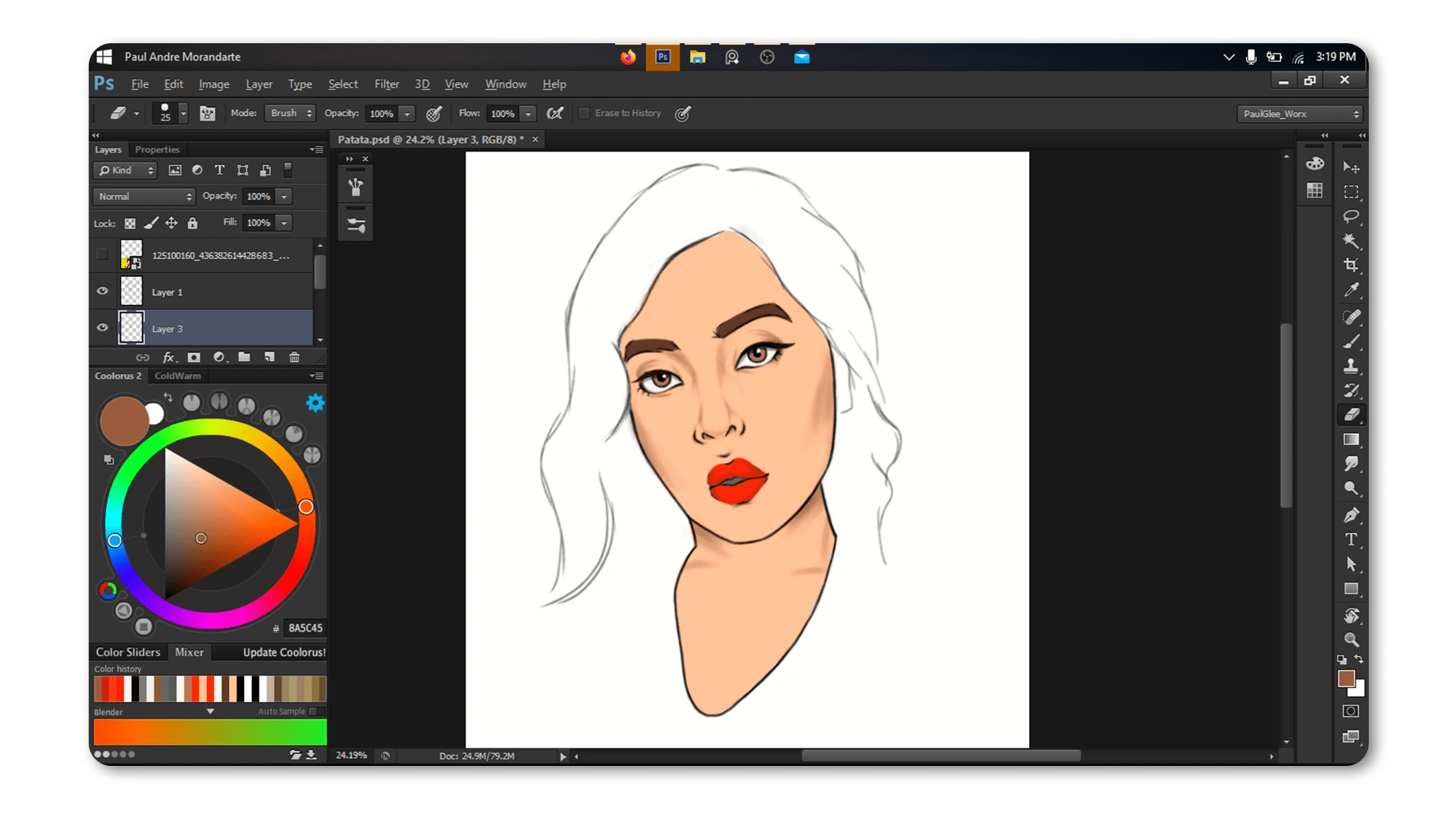
Kristine’s portrait as a logo is a great way to establish a human connection with her customers.
Phase 03: Brand Touchpoints
In the final strokes of our artistic journey, we focus on creating brand touchpoints, the immersive experiences where Kristine's customers engage with Kio Cosmetics. From the delicate touch of packaging to the bold statement of social media presence, we collaborated with Kristine to design a cohesive set of brand touchpoints. This ensures that every interaction, whether online or in-person, becomes a memorable and harmonious extension of Kio's empowering identity.
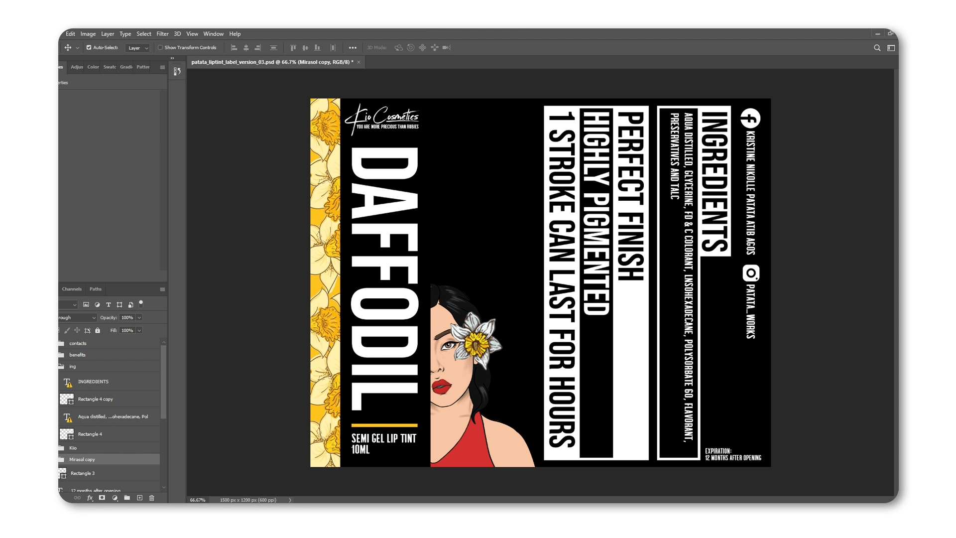
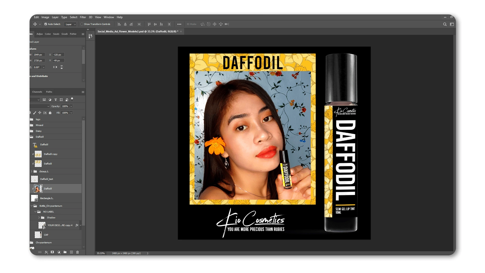
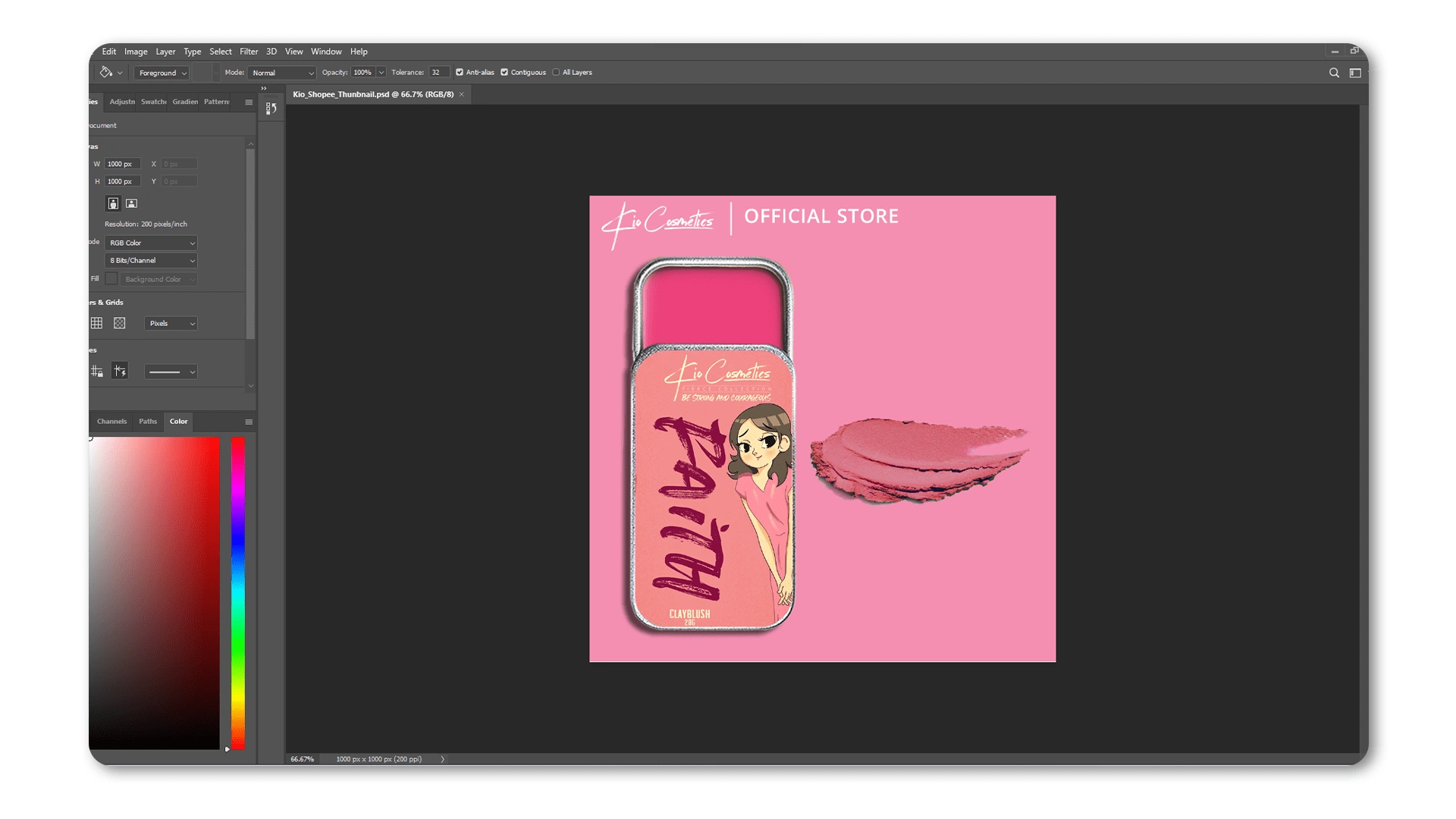
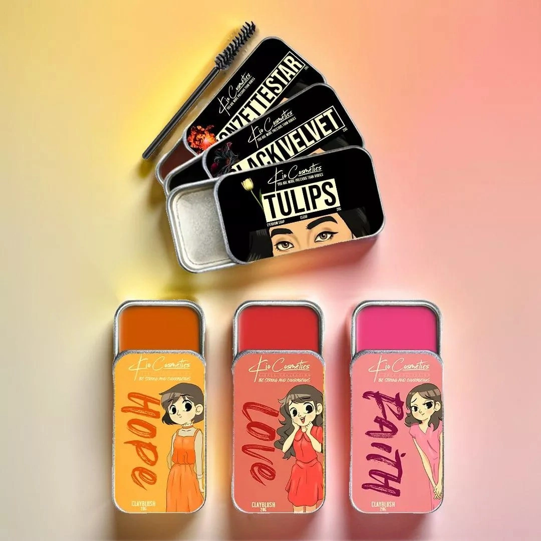
Packaging designs that reflect Kio’s value on women’s empowerment.
From Concept to Reality
The transformation from conceptualization to reality. Feminine typography and a calm-toned palette elegantly encapsulated Kio's core values. The Fierce Collection, featuring Carmelita, Jessa, Katrina, and Lolita, took shape with daring brush stroke-inspired typefaces and vibrant, contrasting colors.
Bold Choices Pay Off
Embrace the risks taken during the design process. Bold typefaces and contrasting colors were not merely choices; they were calculated risks. These played a pivotal role in shaping Kio Cosmetics into a brand that stands out with audacious allure.
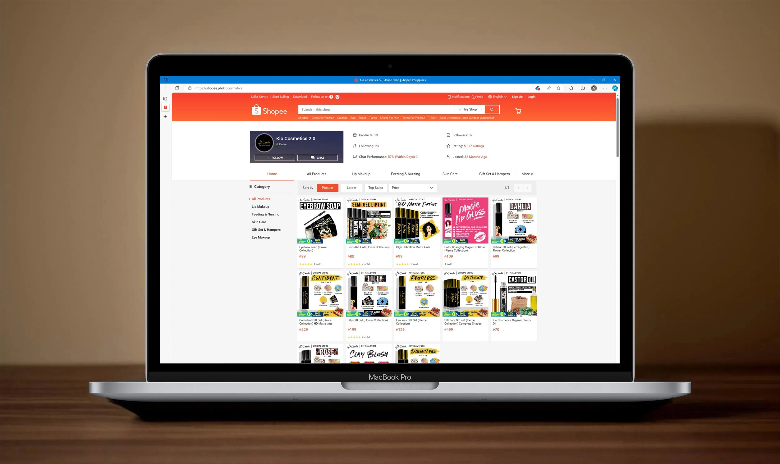
The face of Kio’s online store.
Empowering Through Design
The impact was profound. Our designs seamlessly wove together to create a visual identity that not only attracted attention but spoke to women on a deeper level. Kio Cosmetics became a beacon of empowerment, inviting women to support Kristine's values through the language of design.
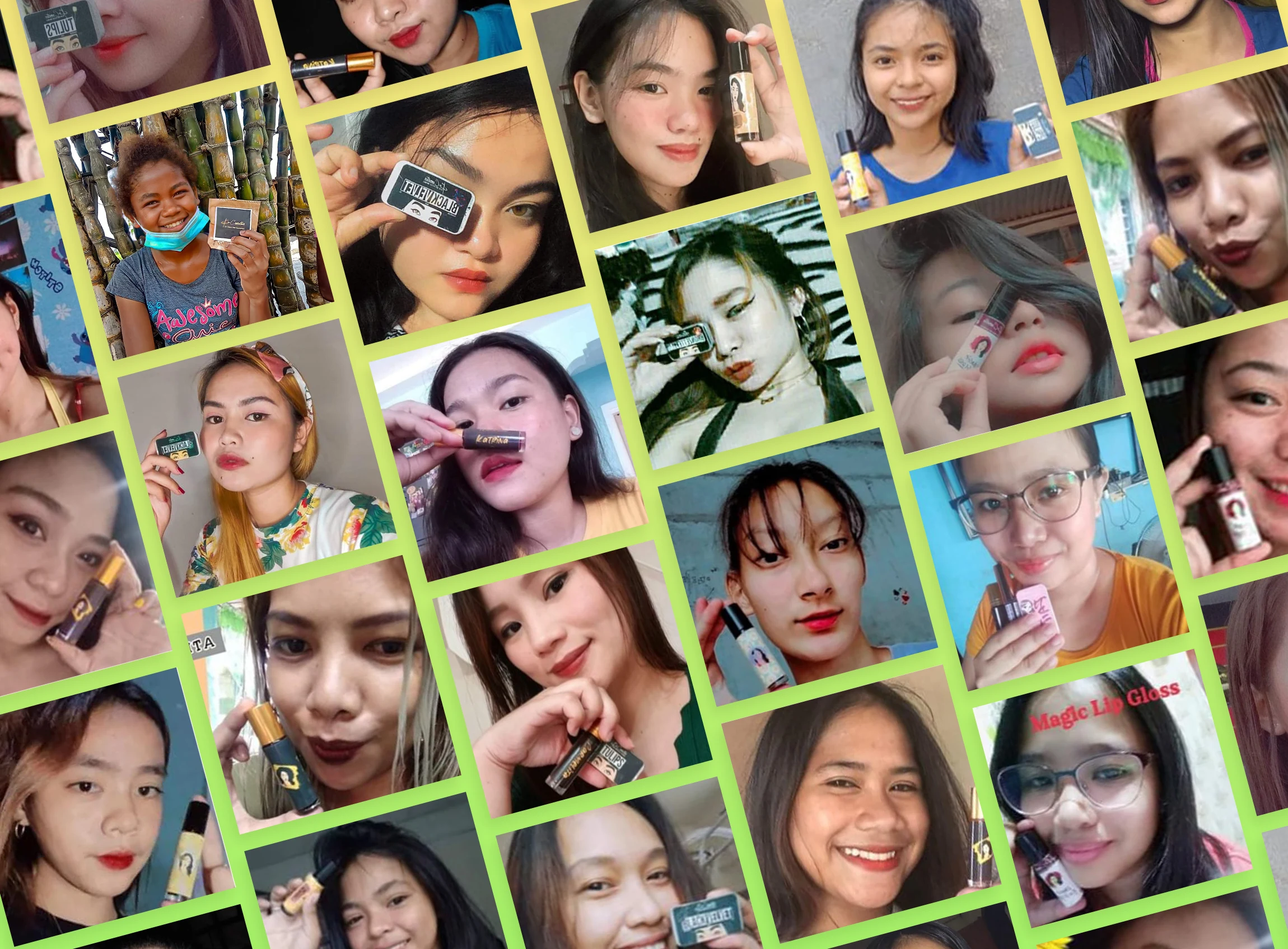
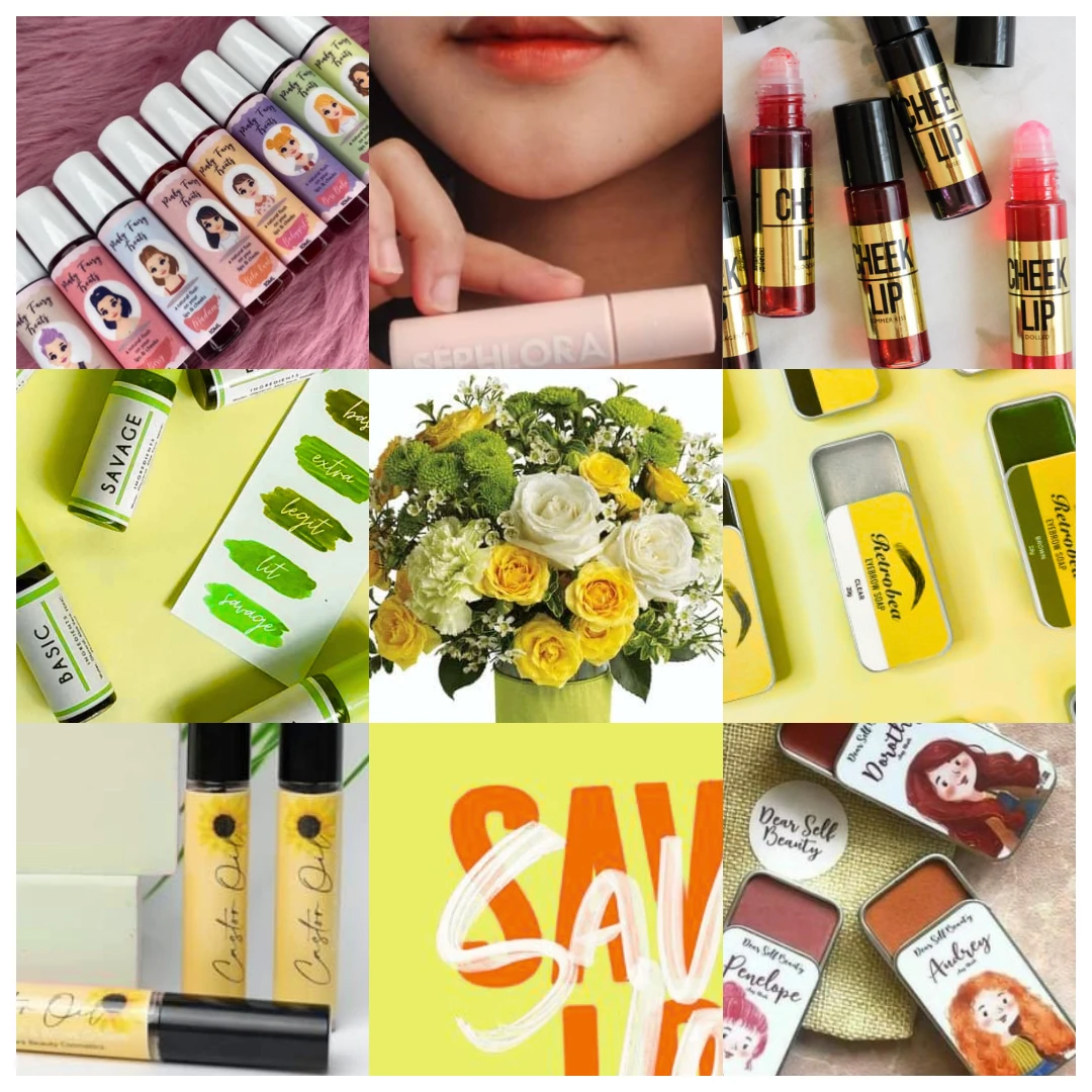
Empowered women who shared how they love Kio Cosmetics
"Find a friend that will pull you up!... So proud of you Paul! The person behind every amazing layout designs of Kio Cosmetics!”
Kristine Nikolle Atibagos - Owner of Kio Cosmetics
Like this project
Posted Nov 15, 2023
We helped Kristine launch a cosmetic brand that inspires and empowers women with a distinctive and elegant visual identity.