Elevating E-Commerce Aesthetics for CosmeticStoreBG
Plamena Dimitrova
Case Study: Elevating E-Commerce Aesthetics for CosmeticStoreBG
Project Snapshot
Role: Graphic & Web Designer
Client: CosmeticStoreBG
Timeline: 10 Days
Tools Used: Affinity Studio
1. The Spark
CosmeticStoreBG is a beauty retailer offering a curated selection of top-tier bulgarian and other cosmetic brands. While the products themselves were high-quality, the website's visual presentation was lagging behind.
The client was previously relying on DIY assets created in Canva. These legacy banners suffered from:
Low Resolution: Images appeared pixelated on modern, high-DPI screens.
Inconsistent Branding: There was no visual harmony between the different brand sections.
Lack of Hierarchy: The "call to action" and value propositions were lost in cluttered designs.
The client needed a complete visual refresh for their four primary brand categories to build trust and signal quality to visiting customers.
The Goal: Transform the "Hero" section of the website from a DIY project into a premium, trustworthy e-commerce storefront.
BEFORE
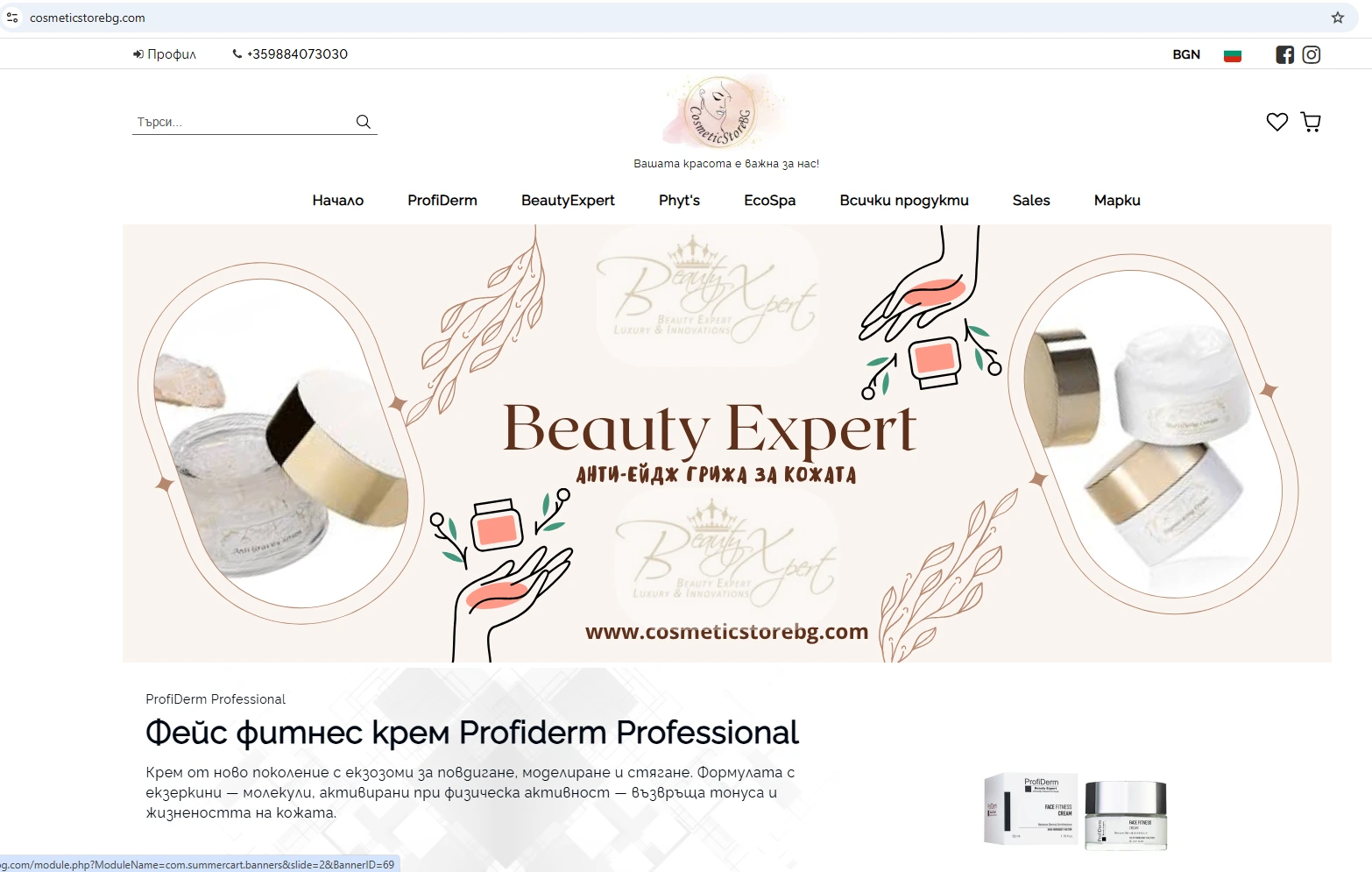
Before
2. The Solution
To elevate the user experience, I moved away from template-based designs and created four bespoke hero banners tailored to the specific identity of the brands being resold.
My Approach:
High-Fidelity Assets: I sourced and edited high-resolution product photography to ensure crispness on all devices.
Strategic Composition: I utilized the "Rule of Thirds" to balance product imagery with copy, ensuring the text was legible and the Call to Action (CTA) was clear.
Brand Alignment: Each banner was designed to reflect the unique mood of the specific cosmetic line (e.g., clinical and clean for skincare vs. vibrant and bold for makeup) while maintaining a cohesive look for the main store.
3. The Visual Transformation
We focused on the store's four core brand pillars. Here is how we refreshed the look:
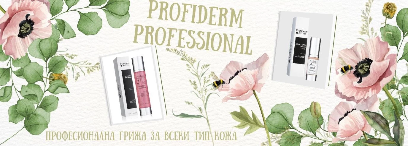
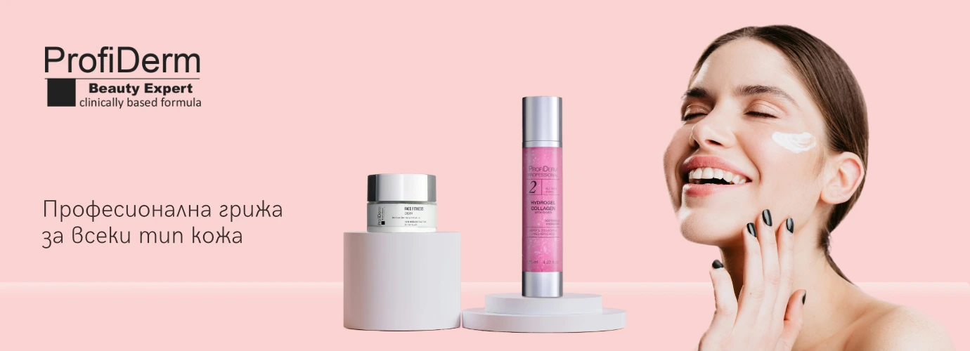
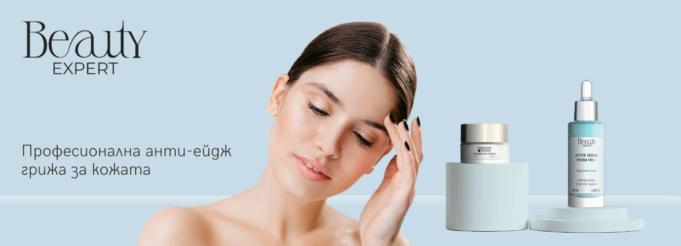
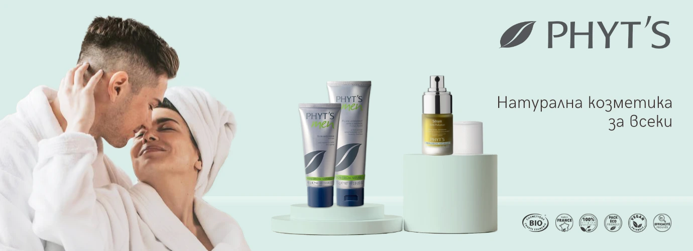
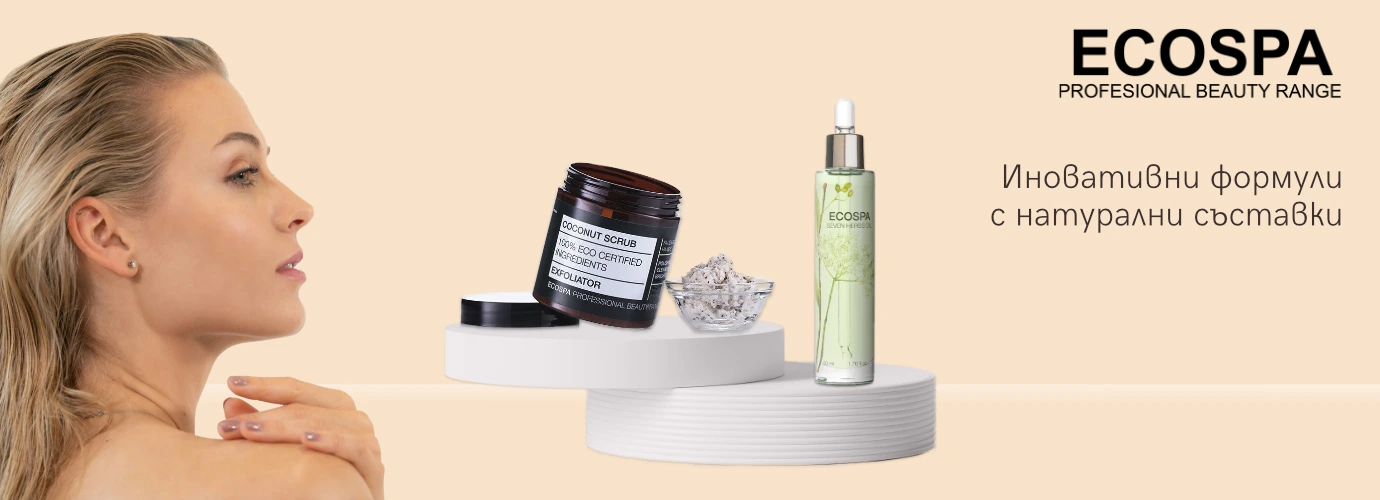
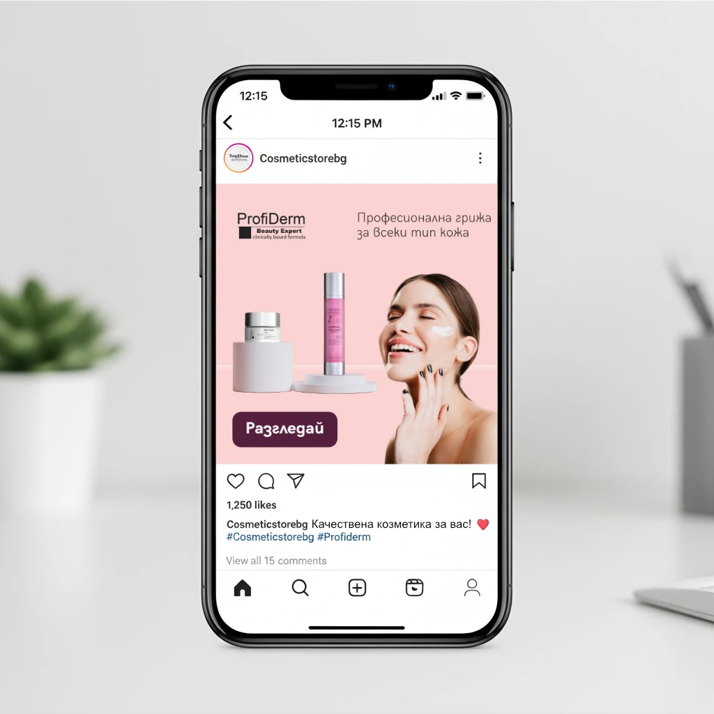
Banner 1 (Face care): Shifted from cluttered text to a minimalist, "spa-like" aesthetic to emphasize purity and health.
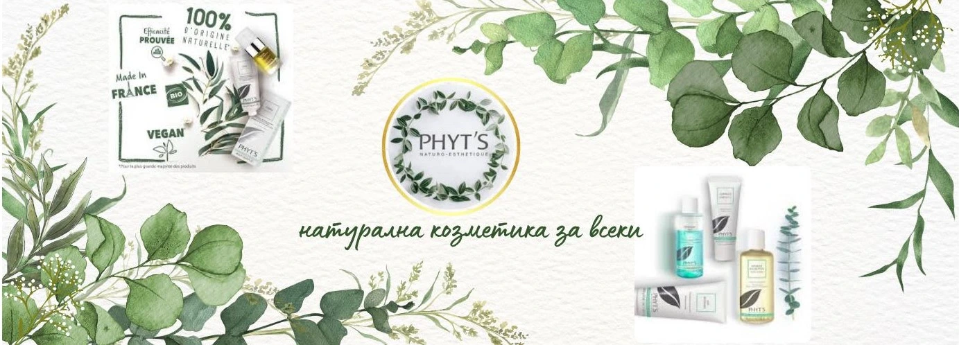
Banner 2 (Skin care): Used high-contrast, glossy imagery to showcase pigment and texture, replacing the previous flat, washed-out visuals.
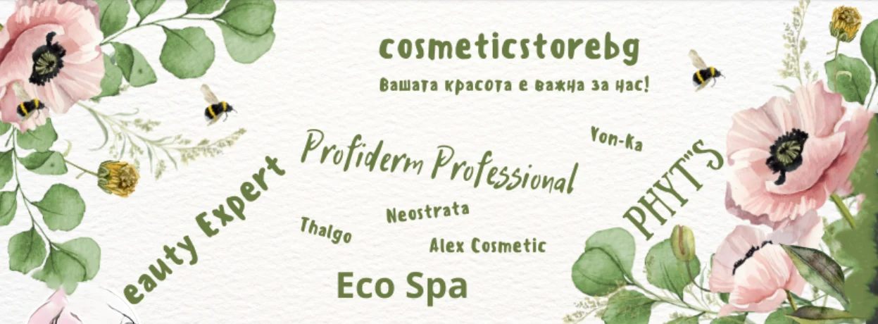
Banner 3 & 4 (Couple care): Focus on couples – they can take care of each other with natural products.
Banner 4 (Body care): Introduced lifestyle elements to help the customer visualize the result of using the products.
4. The Results
The new hero images have completely changed the first impression of the website. The storefront now looks professional, established, and ready to compete with larger beauty retailers.
Instant Credibility: The site now visually matches the high price point and quality of the products being sold.
Mobile Optimized: Unlike the previous banners, the new designs scale perfectly across mobile and desktop views.
Client Satisfaction: The client successfully moved away from the "startup/DIY" look to a polished brand aesthetic without needing a full website recode.
Client Review
"The difference is night and day. The new banners make the shop look legitimate and stylish. Exactly the refresh we needed."
A. Stoev
Like this project
Posted Dec 1, 2025
Refreshed CosmeticStoreBG with 4 premium hero banners, transforming low-res DIY graphics into a stylish, high-converting e-commerce look.
Likes
2
Views
16