Qcozy Branding 🙌🏻
eve san
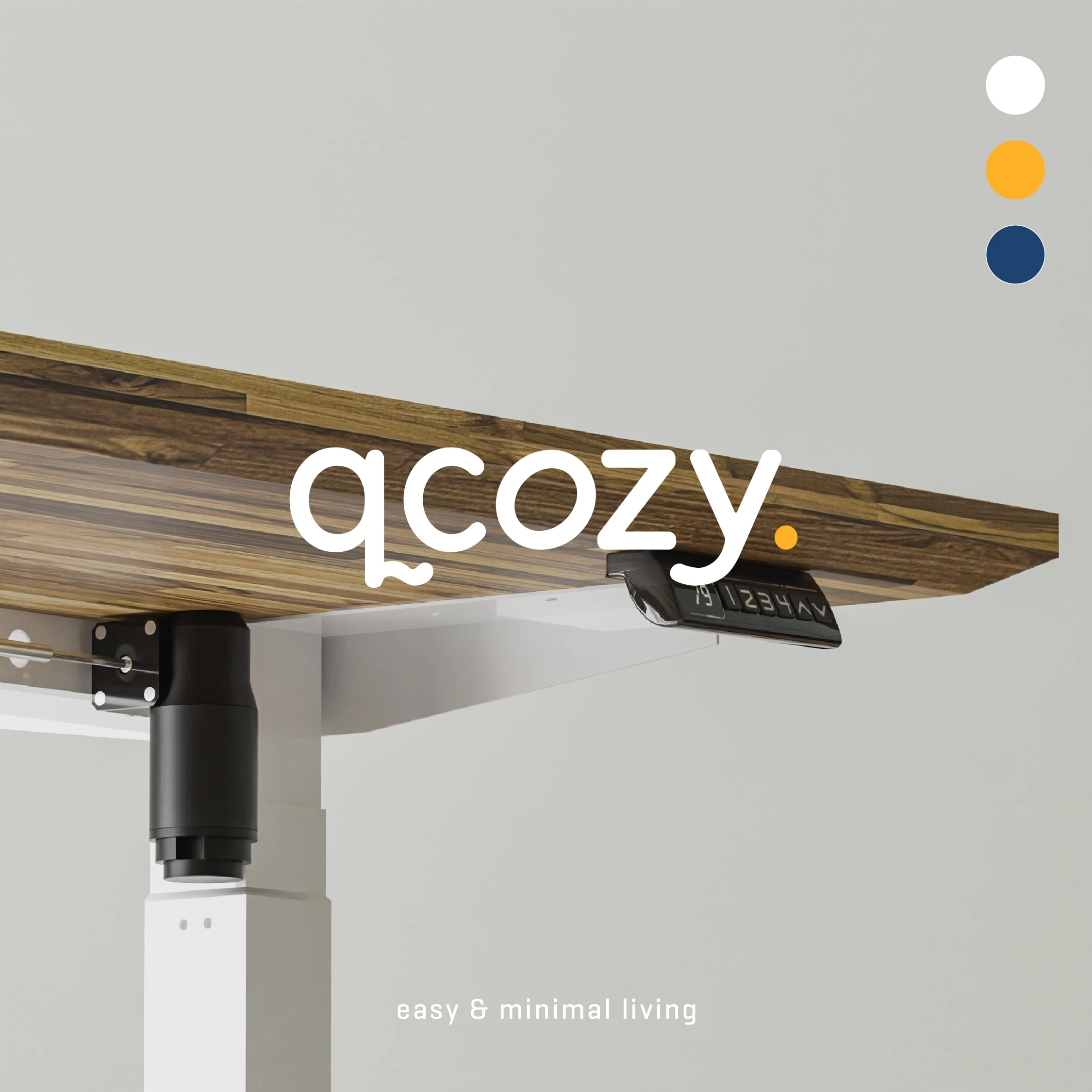
Qcozy is a brand that specializes in selling high-quality and durable ergonomic furniture, offering a path to an organized and productive living space. Their mission is to transform your space into a haven of comfort and functionality, empowering you to "live big" even in limited spaces 💫
The qcozy logo serves as a representation of the brand's fundamental principles: comfort, simplicity, and modern living. Its thoughtful design, featuring clean lines and inviting elements, effectively communicates these values and establishes a lasting brand identity 🌟
The logo incorporates rounded edges and a subtle flair, creating a sense of softness while maintaining a minimalist aesthetic that reflects the brand's dedication to uncomplicated living. The modern sans serif typeface reinforces Qcozy's contemporary appeal, conveying sophistication and innovation. Overall, the qcozy logo serves as a potent symbol of the brand's commitment to providing comfortable, simple, and modern living solutions 🙌🏻
Branding, Design, Art Direction: More Than
Photo & videography: Bonnyfasius Tan
Illustration: Jingga Nur Hamzah
Qcozy Look & Feel
Qcozy Primary Logo
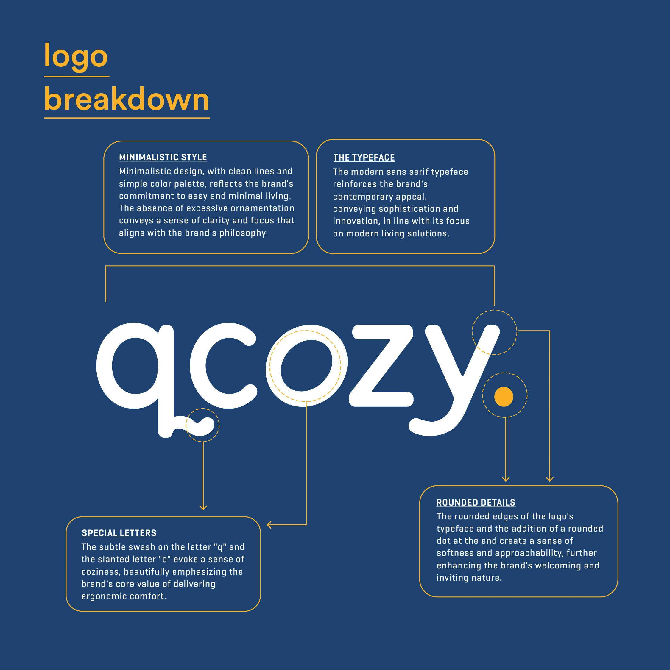
Qcozy Logo Breakdown

Instruction Manual and Authentication Tag
Like this project
Posted Apr 8, 2023
The brand's clean and minimal typography, paired with a warm orange color, reflects the coziness and comfort that Qcozy aims to provide.