Patina & Light — Brand Identity for Curated Living

SanganakHQ
Verified


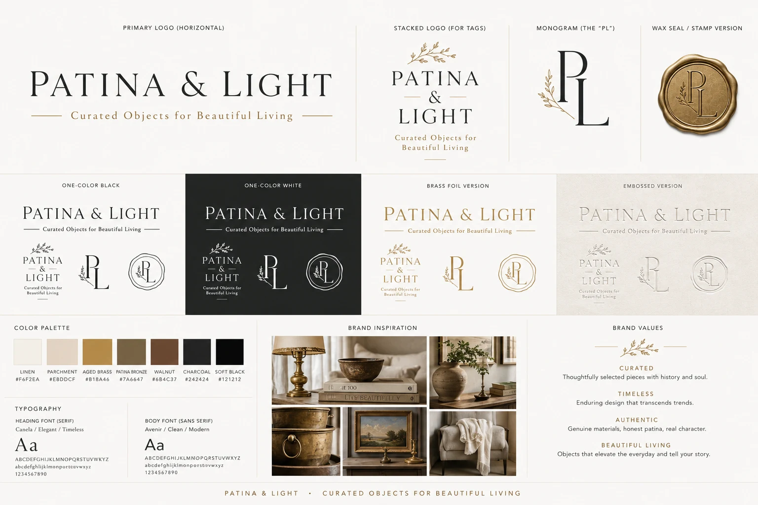
When Mary Wilson reached out, she had something most founders don't: clarity. She knew her brand, her audience, and her aesthetic down to the letter spacing. What she needed was a design partner who could match that precision and turn a locked brand concept into a production-ready identity system.
Patina & Light is a curated lifestyle brand for affluent homeowners, interior designers, and gift buyers. The brief wasn't "make me a logo." It was "build me a system that belongs on a museum exhibition card, the spine of a collectible art book, and a certificate of provenance." That's a different conversation entirely.
The Brief
Brand concept, typography, fonts, and color palette were already locked. This was pure production, but production with a point of view. Every mark needed to carry the same weight: timeless, understated, editorial, quietly distinctive. Less luxury fashion, more beautifully curated gallery.
The target audience doesn't buy logos. They buy trust. And trust, at this level, lives in the details: letter spacing, foil weight, how a monogram sits on a wax seal.
What We Built
We delivered a complete brand identity system across 7 distinct marks:
Stacked Logo — the primary mark for collection tags, packaging, and printed materials
Monogram — compact brand mark for favicons, wax seals, and square applications
One-Color White & Black — production-ready variants for any background or print context
Brass Foil Version — for premium packaging and physical collateral
Embossed Version — tactile expression for stationery and high-end materials
Museum Wordmark — pure typography, exquisite spacing, no seal, no monogram. Built to feel like archival stationery
Horizontal Lockup — "Curated Objects for Beautiful Living" for website headers, email signatures, invoices, and shipping labels
Every asset delivered in SVG, EPS, AI, and PDF with documented color specifications and spacing rules.
How We Worked
Initial concepts delivered within 24 hours of receiving the reference materials. Collaborative refinement over multiple rounds: dialing in letter spacing, giving the ampersand more character while keeping it restrained, positioning the tagline to read like an exhibition subtitle rather than a marketing line.
When the scope naturally grew (Mary realized she needed the museum wordmark and horizontal lockup), we scoped it transparently with a separate proposal and delivered within days. No scope creep. No surprises. Just clean communication and fast execution.
The Outcome
Mary called the final system "exactly as I had hoped." A brand identity that scales across digital, print, packaging, and physical retail without losing its editorial character. The kind of system where every touchpoint feels intentional, because it is.
This is what we mean when we say we design brand systems, not logos.
Like this project
What the client had to say
Aryabhatta is an excellent designer and an even better collaborator. He asked thoughtful questions, welcomed feedback, and refined every detail until it perfectly matched my vision. Highly recommended!


Mary Wilson, Mary Wilson Studio llc
Jul 20, 2026, Client
Posted Jul 28, 2026
Complete brand identity system for a luxury curated lifestyle brand. 7 marks, museum-grade typography, and production-ready assets.
Likes
5
Views
15
Timeline
Jul 15, 2026 - Jul 20, 2026
Clients
Mary Wilson Studio llc