Visualizing Australia Wildfire on a Dashboard
Visualizing Australia Wildfire on a Dashboard
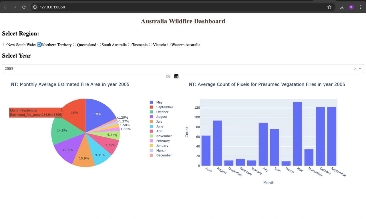
The Pie Chart displays Monthly Average Estimated Fire Area for the Regions from Year 2005 - 2020
The Bar Chart displays Monthly Average Count of Pixels for Presumed Vegetation Fires for the Regions from Year 2005 - 2020
The visualization updates dynamically over time as the year is changed

Developed an interactive dashboard using Dash and Plotly to visualize historical wildfire data for different regions in Australia.
Implemented features for selecting a region and year, allowing users to dynamically view key statistics, such as the monthly average estimated fire area and the average count of pixels for presumed vegetation fires.
Extracted and processed data from a CSV file containing historical wildfire data, and created visualizations using pie charts and bar graphs to display trends and patterns in fire activity across different months and years.
Like this project
Posted Aug 29, 2024
Visualizing Australia Wildfire on a Dashboard.
Likes
0
Views
16


