Unbound Sacco Annual Event Branding
Mactech Design hub
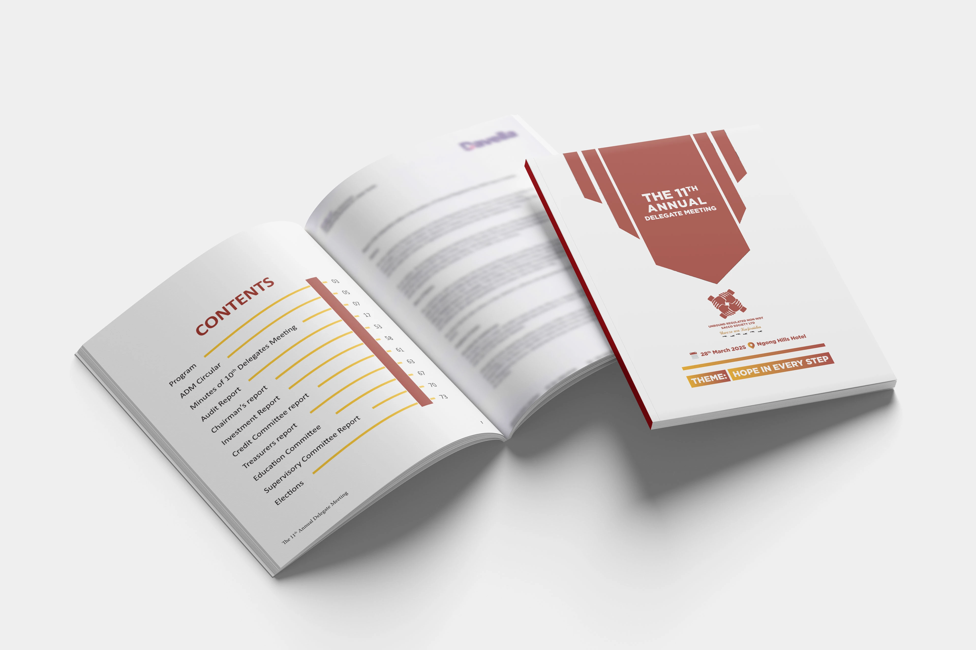
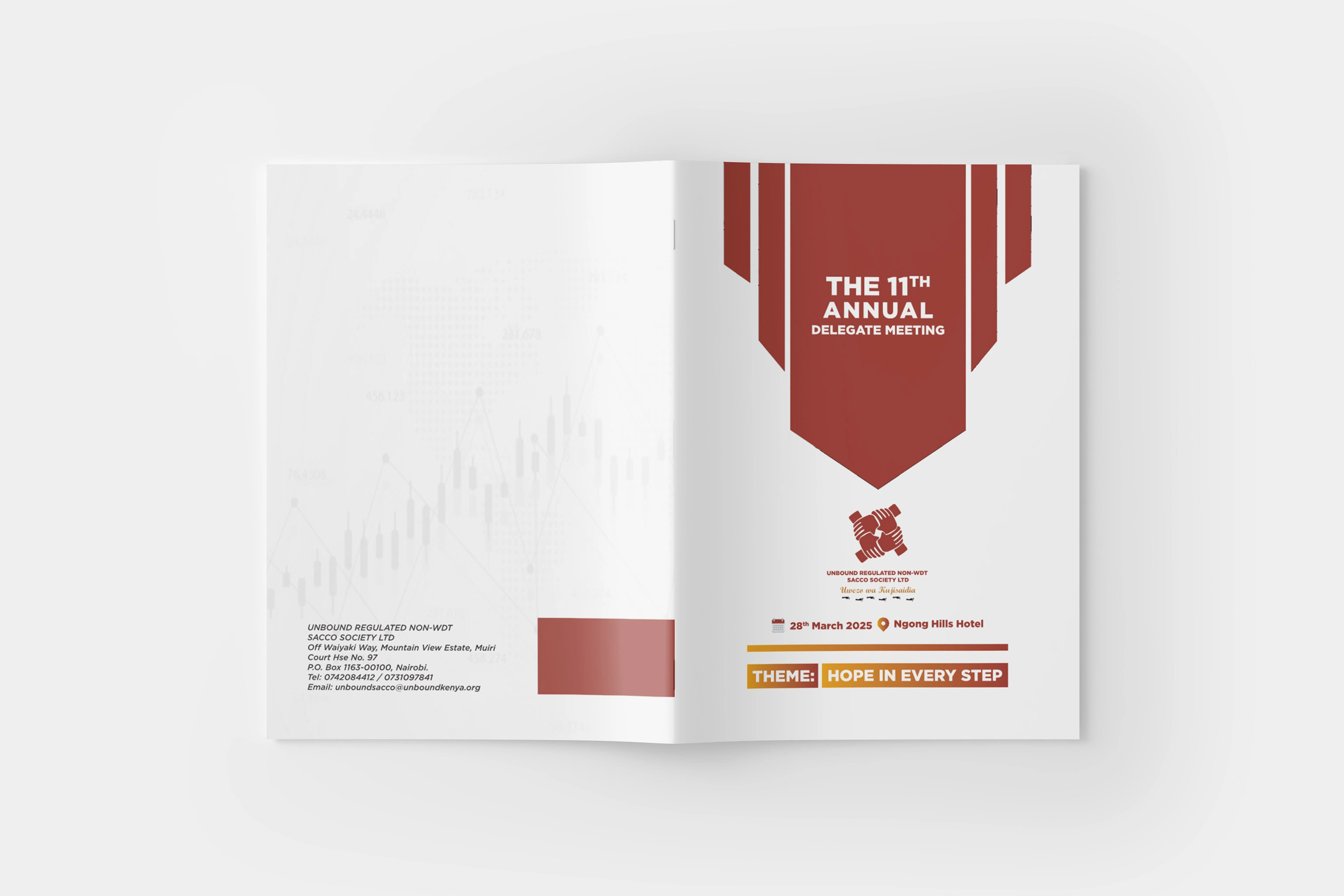
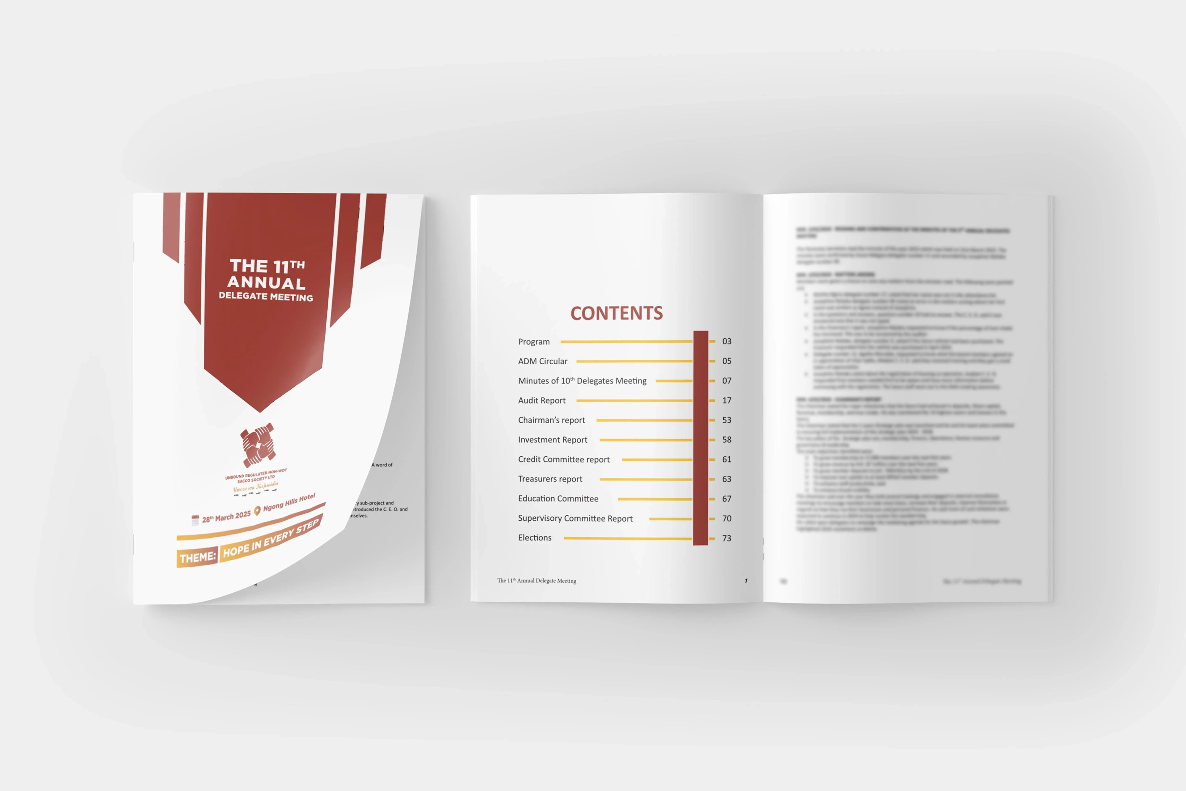
Project Overview
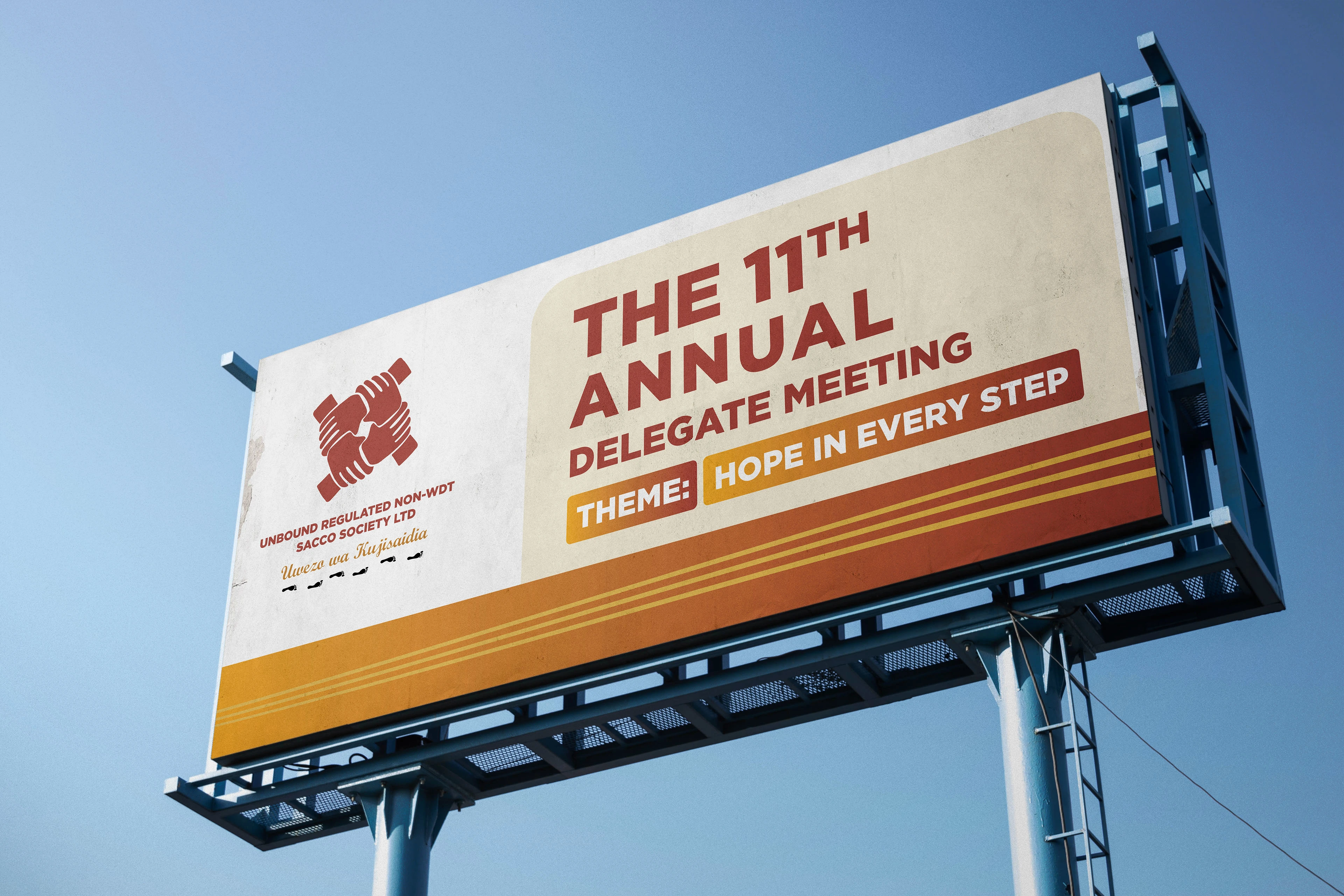
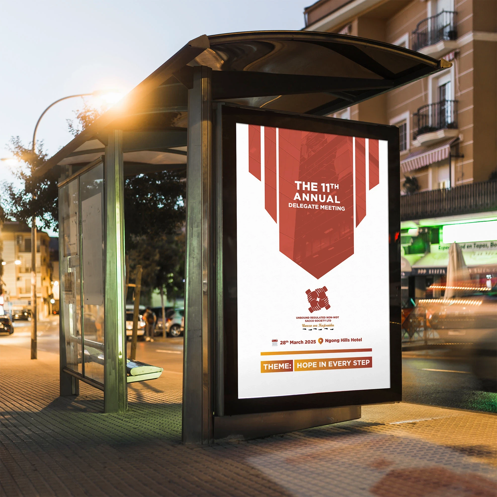
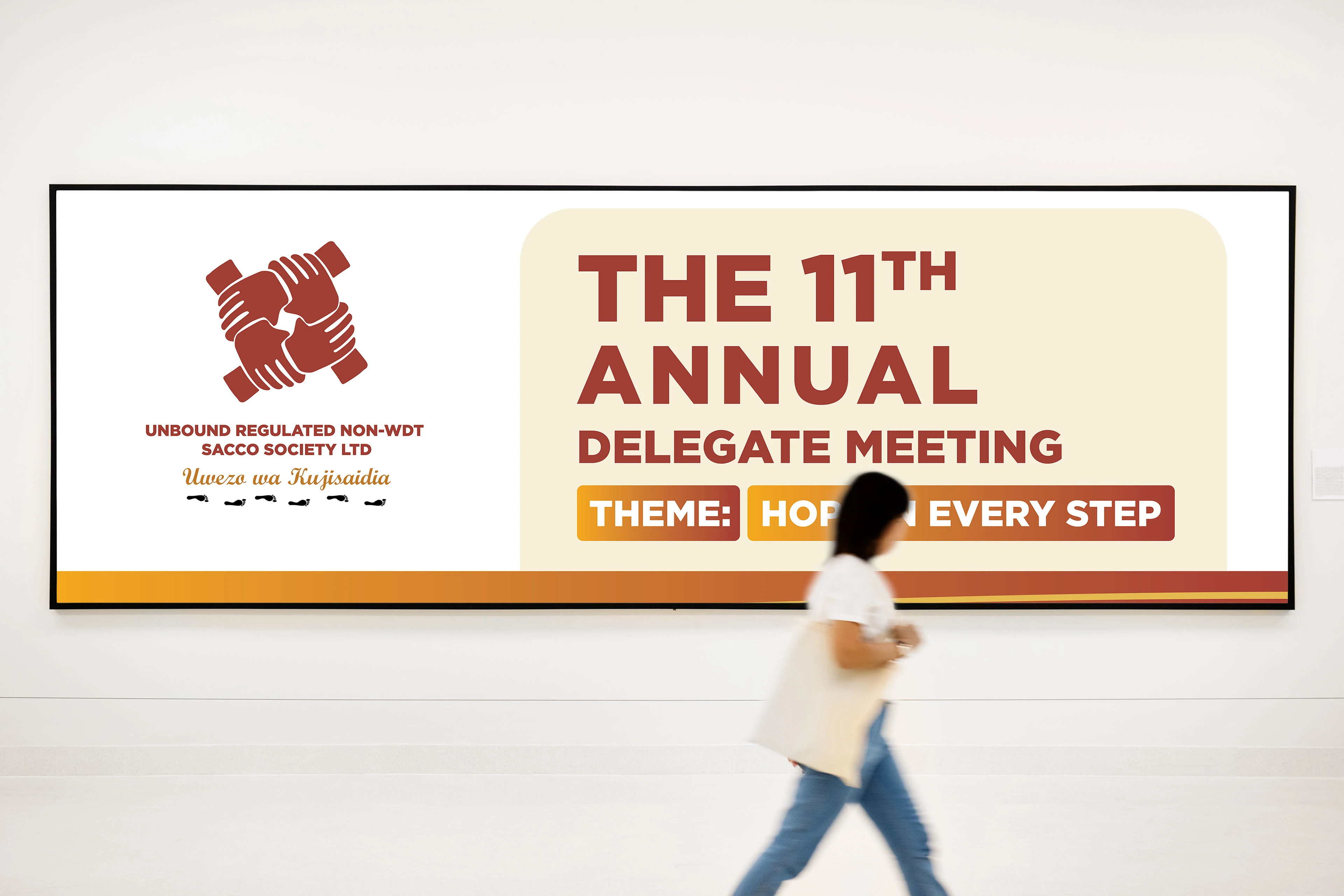
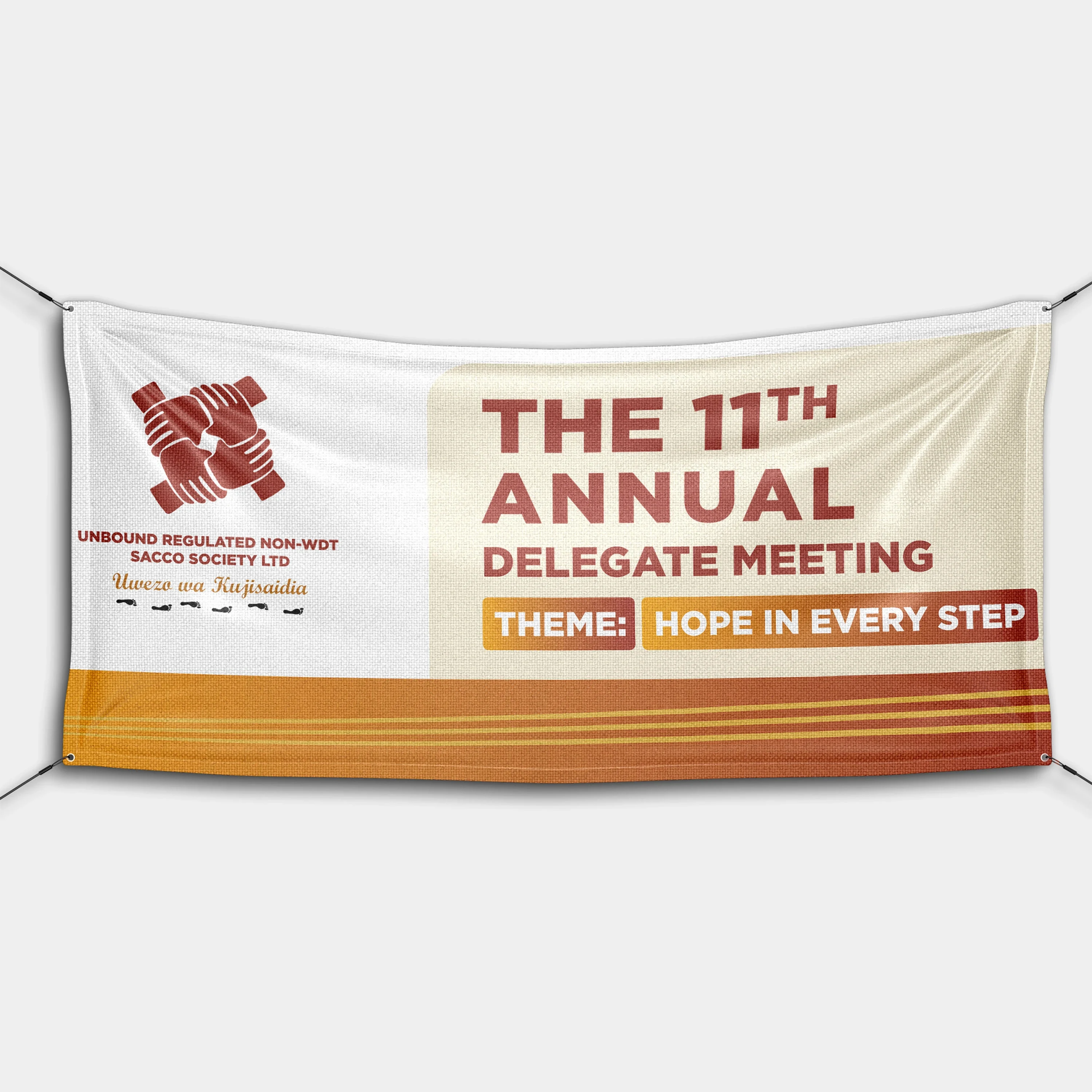
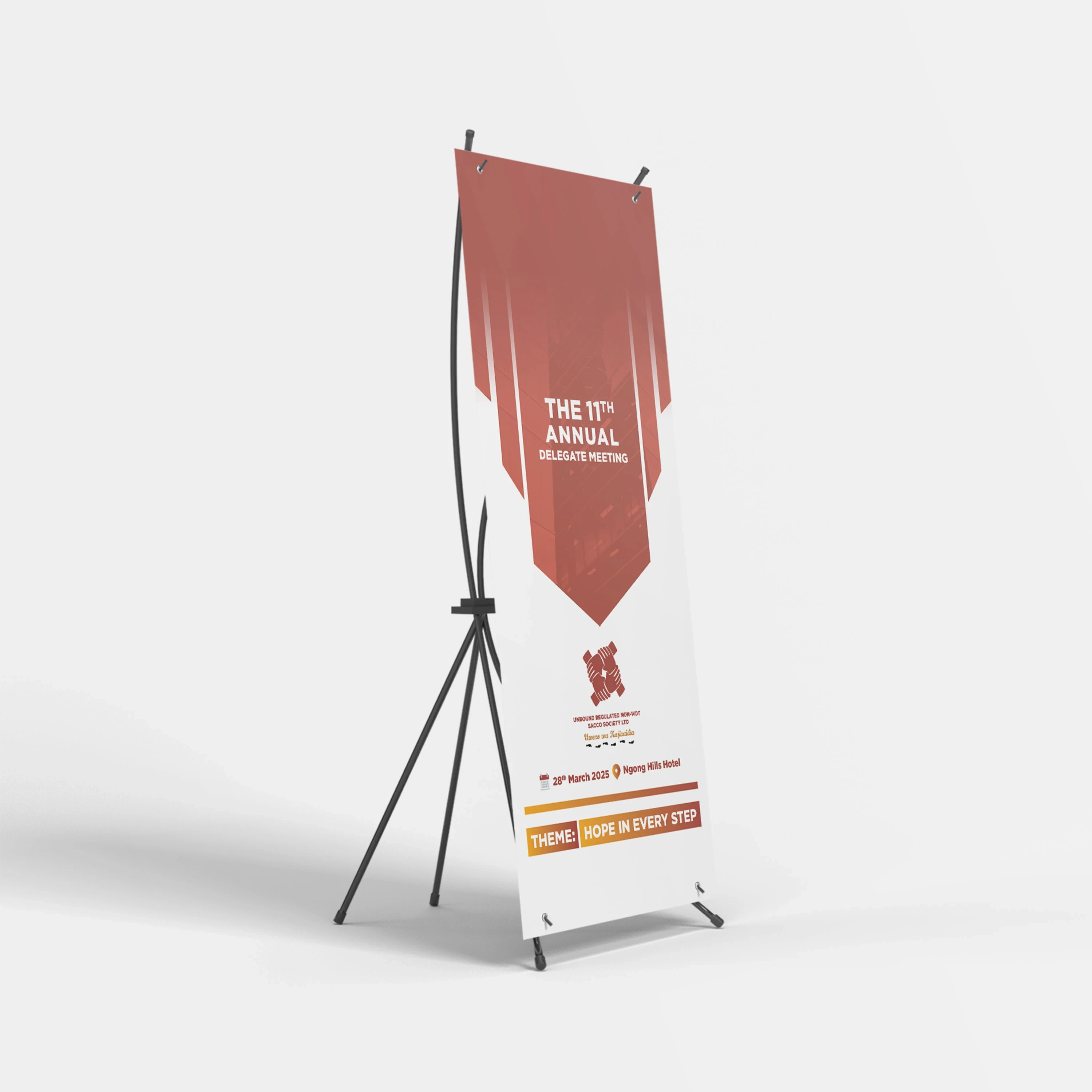
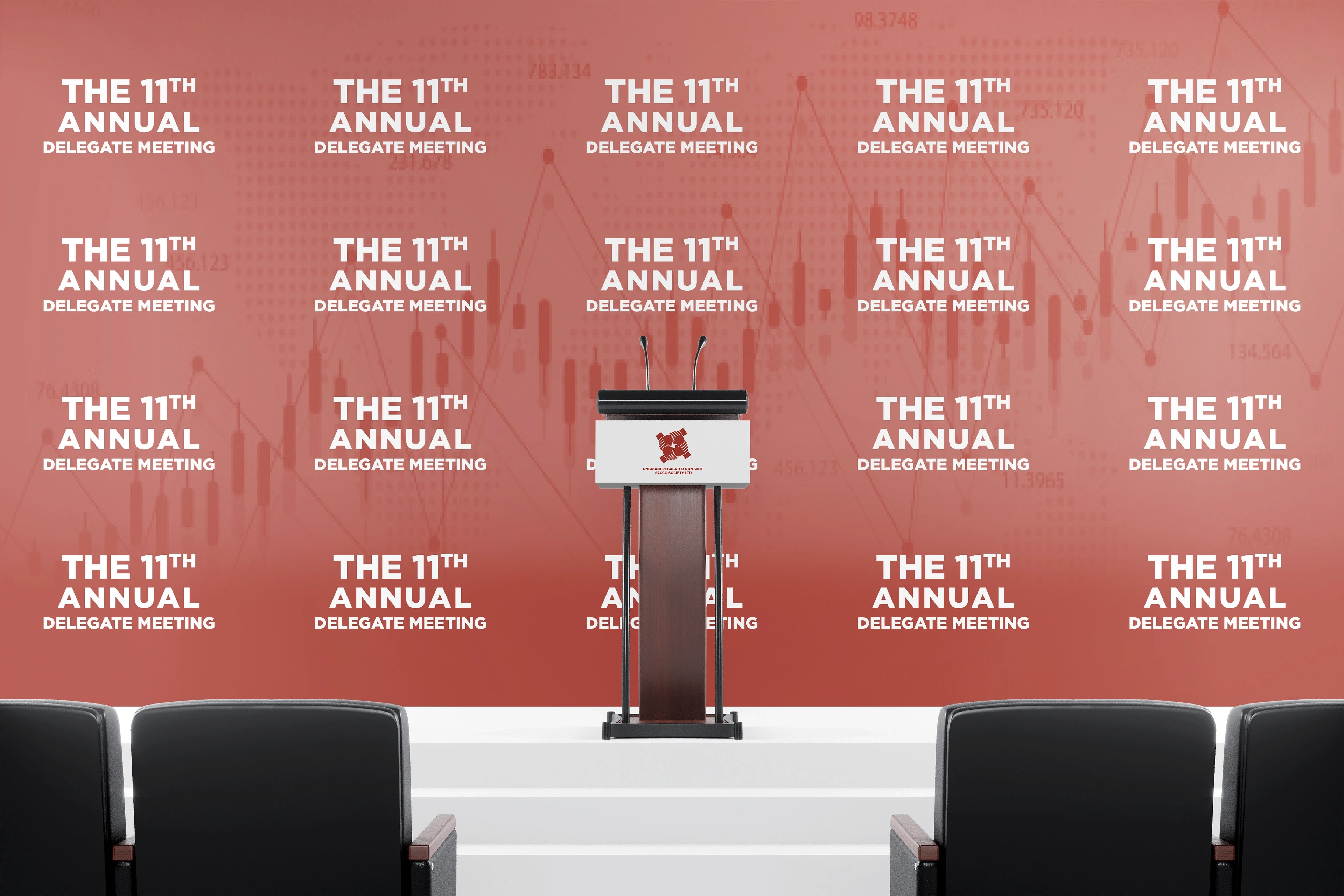
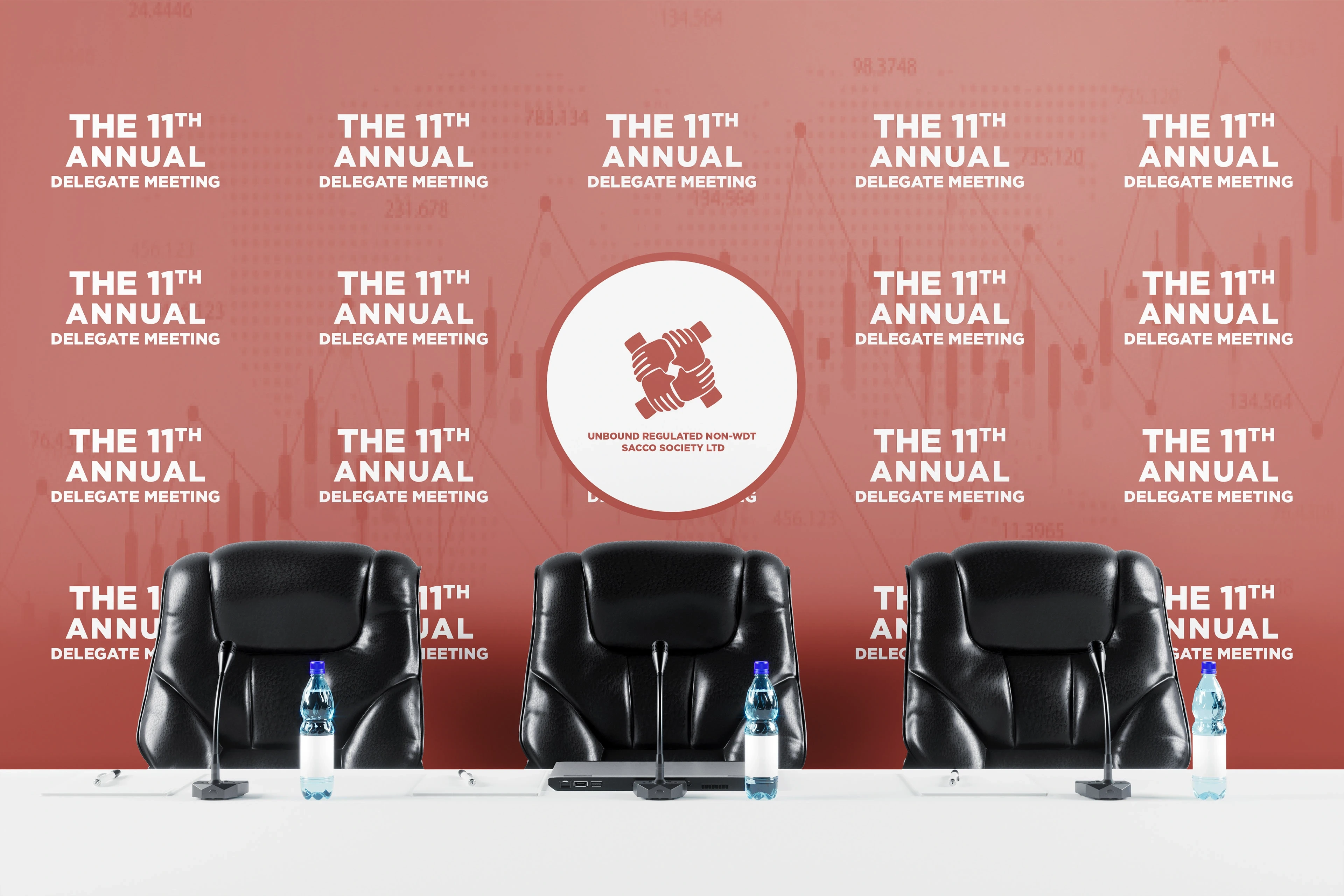
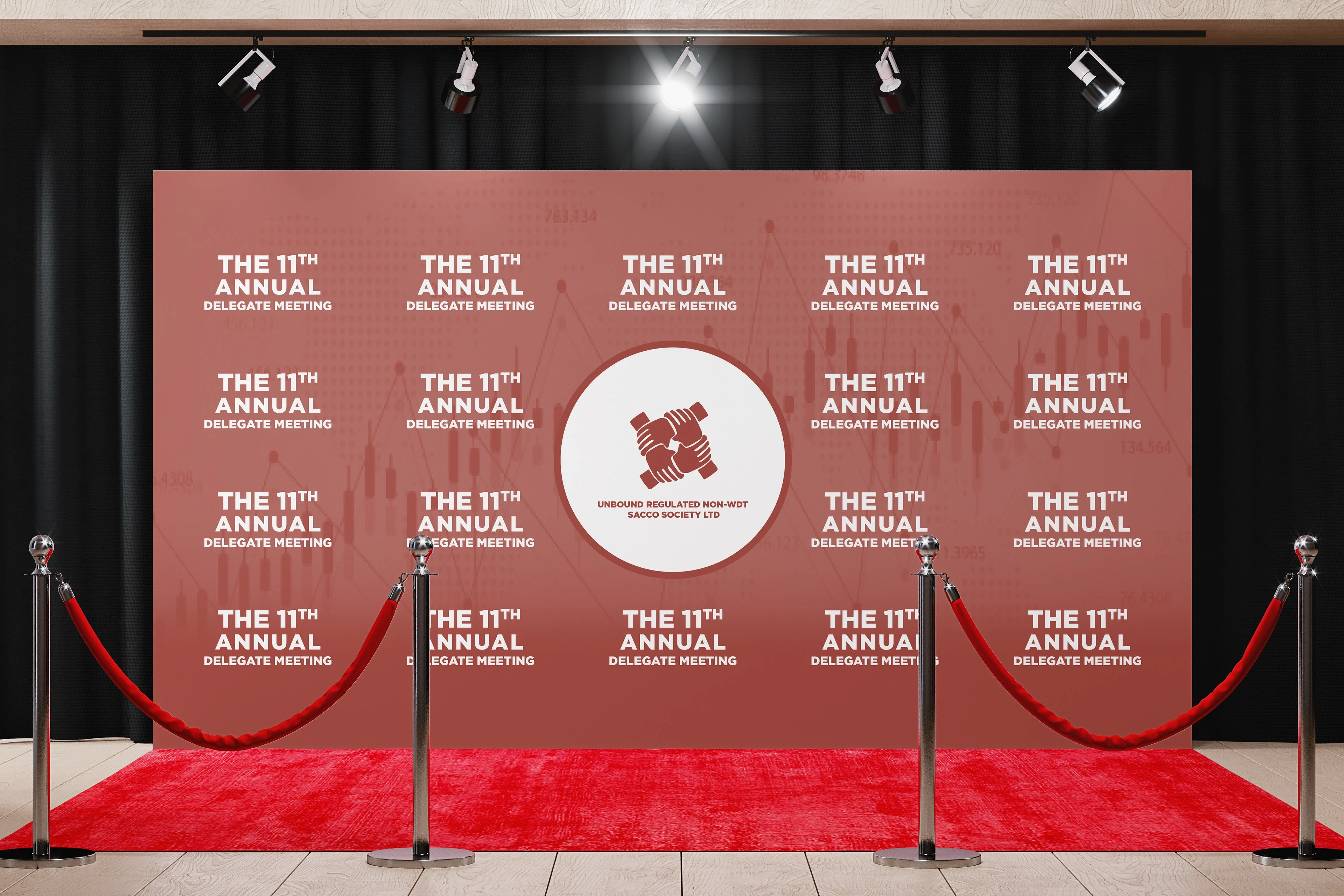
Unbound Sacco needed help with branding and design assets for their annual event. The goal was to create a cohesive, engaging visual system that would work across print, digital, and physical event formats.
Key deliverables included:
A large-format advertising banner
The cover design for the annual booklet
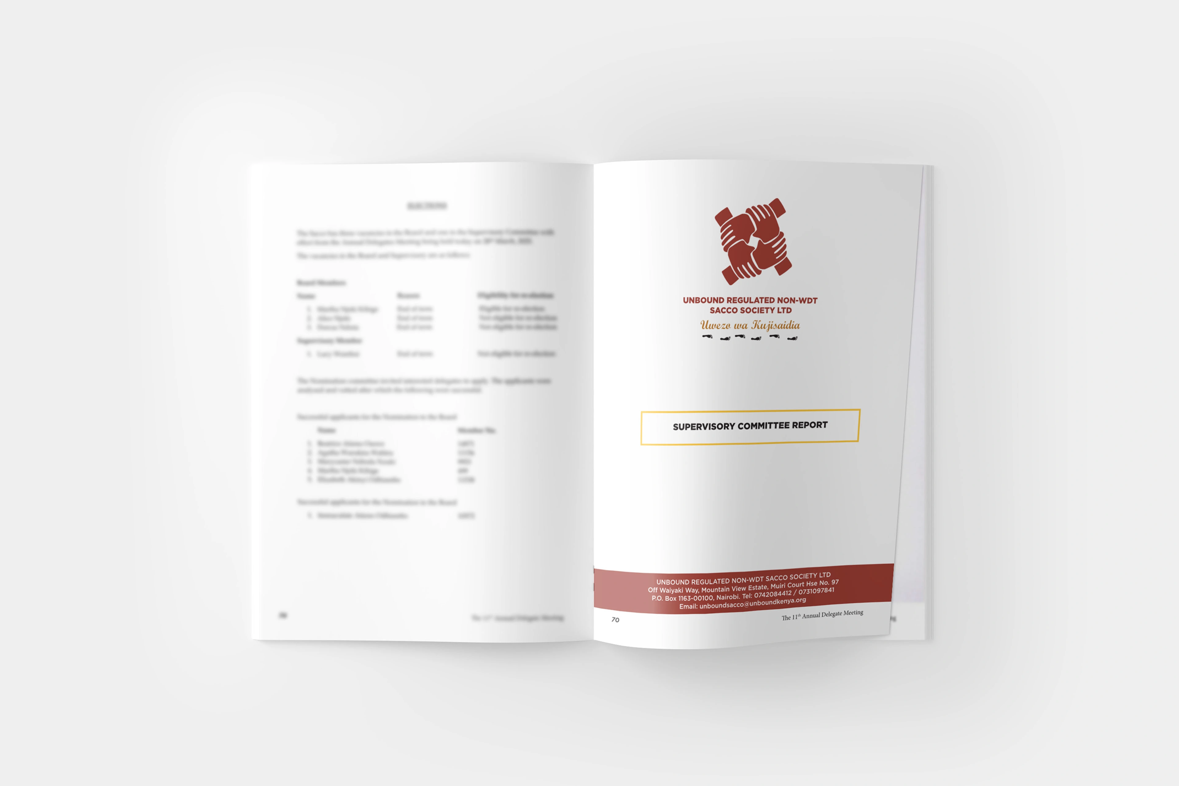
Custom section dividers and layout refinement for the booklet
Design Approach:
The visual system draws inspiration from the Sacco’s brand values while keeping the aesthetic professional and easy to navigate.
Typography: Balanced legibility and hierarchy for easy reading
Color use: Matched the brand palette
Layout: Clear divisions and flow across booklet sections to guide the reader effortlessly
The outcome?
Delivered clean, print-ready files ahead of schedule
Reinforced brand consistency across all touchpoints
Improved readability and presentation of annual data in the booklet
This project brought together editorial thinking and event branding. The result: a cohesive visual presence that supported both information clarity and community pride.
Like this project
Posted Jul 12, 2025
Created cohesive visual system for Unbound Sacco's annual event across print, digital, and physical formats.