AI For managing Weight loss Apps

Aditia Kurniawan

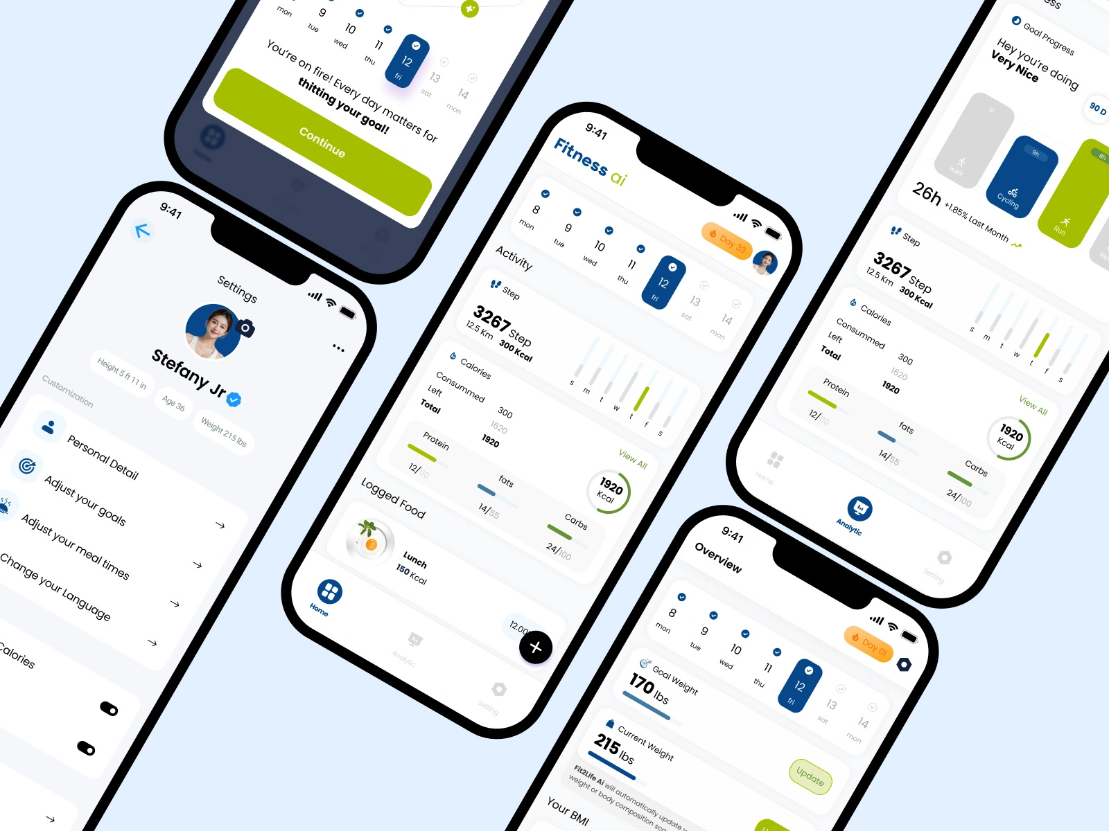
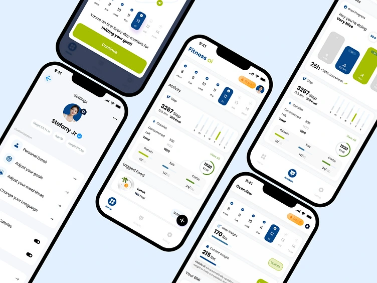
Showcasing the core screens for a Weight Management application concept. The challenge was to integrate three complex user journeys (onboarding/sales to daily tracking) into a single, fluid, and premium experience.
The design adheres to a minimalist, high-contrast aesthetic, drawing inspiration from high-end brands to make complex health data feel accessible and elegant.
Key Design Highlights :
Aesthetic Purity: Strict use of a monochromatic base with a singular, muted accent color (green) to maintain a professional, uncluttered feel.
UX Simplification: Successfully merged multiple distinct user flows into a cohesive vertical structure for daily use, ensuring key inputs (Steps, Calories, Macros) are easily scannable.
Elegant Data Visualization: Utilizing thin, refined graphics and clear progress indicators to transform dense nutritional data into intuitive visual elements.
Cross-Platform Ready: Design employs universal UI patterns suitable for consistent implementation on both iOS and Android.
Outcome & Validation:
This design was recognized as the Runner-Up in an international design competition, validating its capability to deliver a functionally clear and visually premium user experience within a challenging domain.
THANK YOU
Looking for a design partner who delivers results? I specialize in creating user-centered products and impactful websites. Click 'Contact' and let's discuss how I can help you achieve your goals
Like this project
Posted Oct 28, 2026
THANK YOU Looking for a design partner who delivers results? I specialize in creating user-centered products and impactful websites. Click 'Contact' and let's discuss how I can help you achieve your goals
Likes
0
Views
0