Publer.io
What I do
I am a UX/UI Designer at Publer, a social media marketing platform with 240K+ users
I design the Web-based platform striving to create the best experience for social media managers and freelancers who want to build their online brand.
New experience design
When I joined the team at Publer, the platform was already up and running and attracting new users daily. Despite its impressive growth, the design of the platform was not up to par. To address this, the Publer team was focused on a complete rebranding and redesign effort to elevate the overall user experience.
I worked with the developers to improve our user experience, to not only meet the competitive baseline but to exceed it. We have completely audited and improved our core experience, from creating post experiences to new user onboarding and navigation.
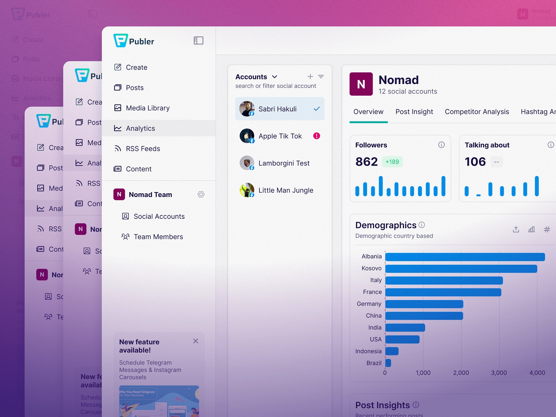
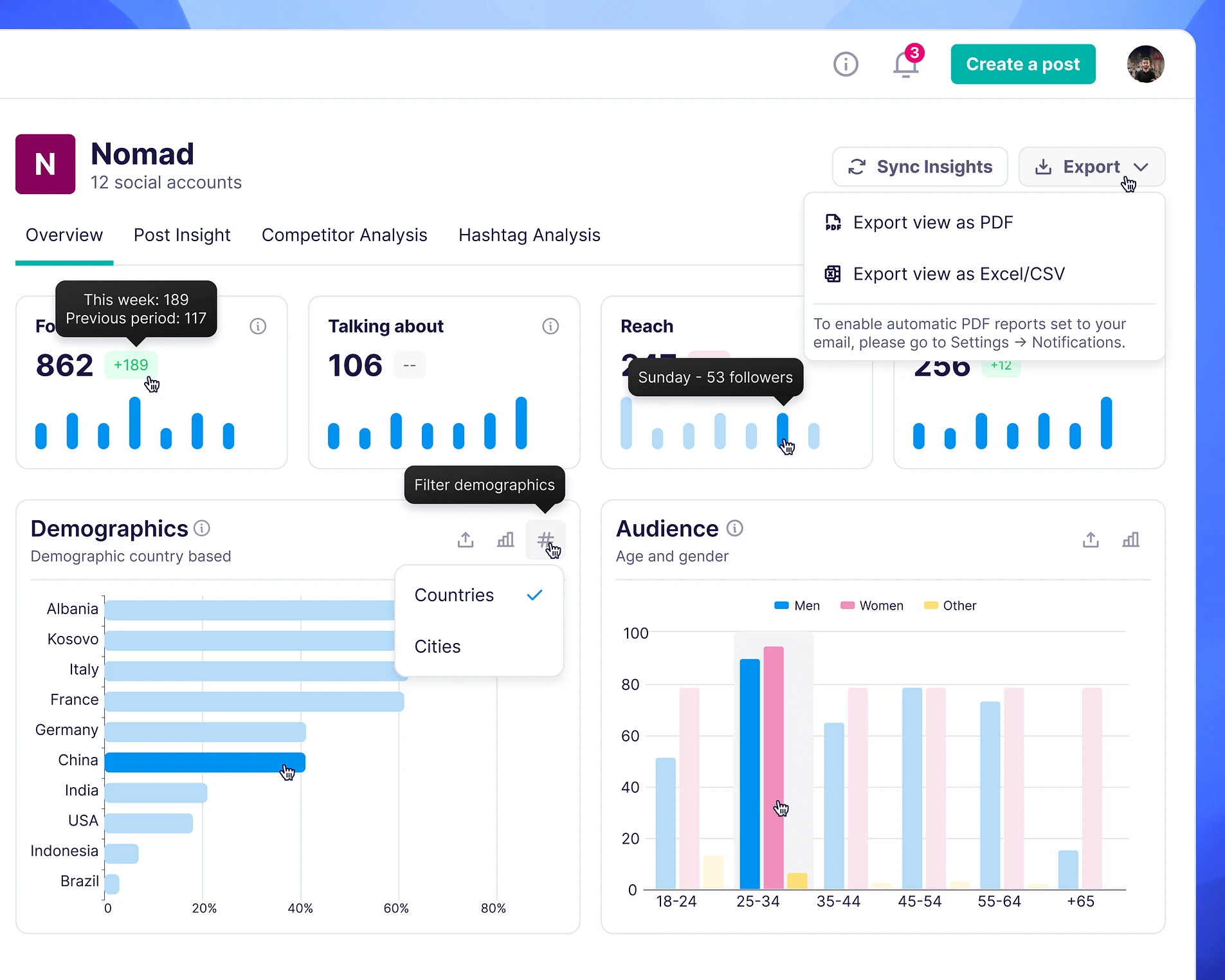
Analytics
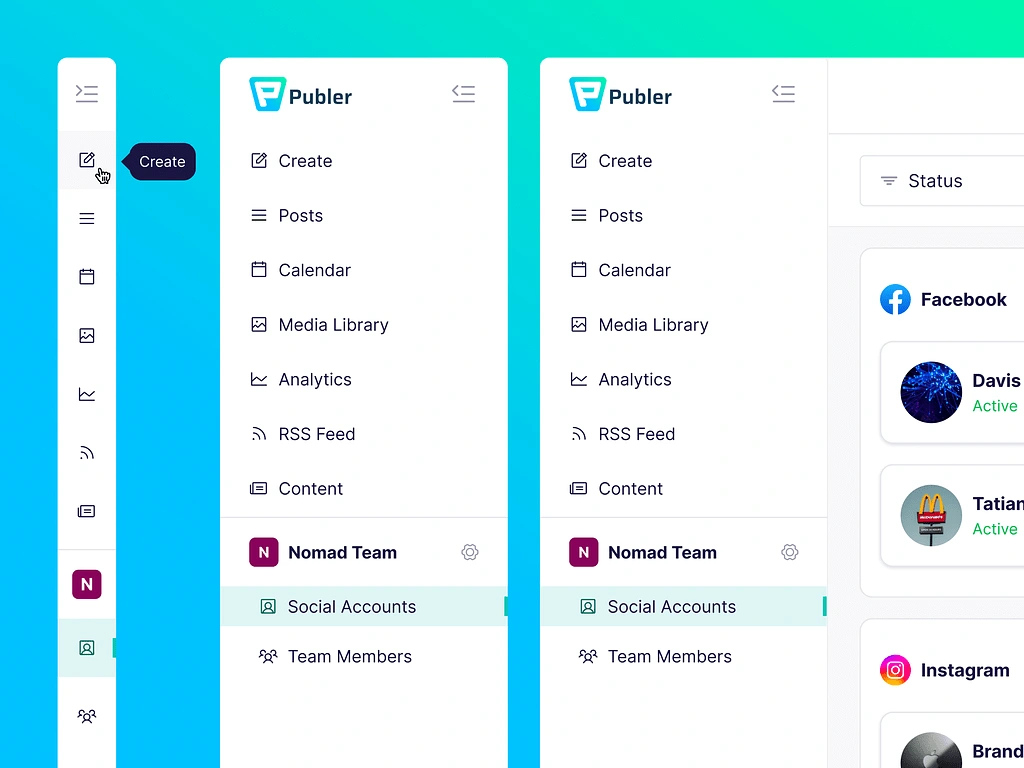
Collapsed Sidebar
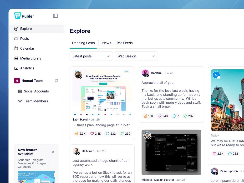
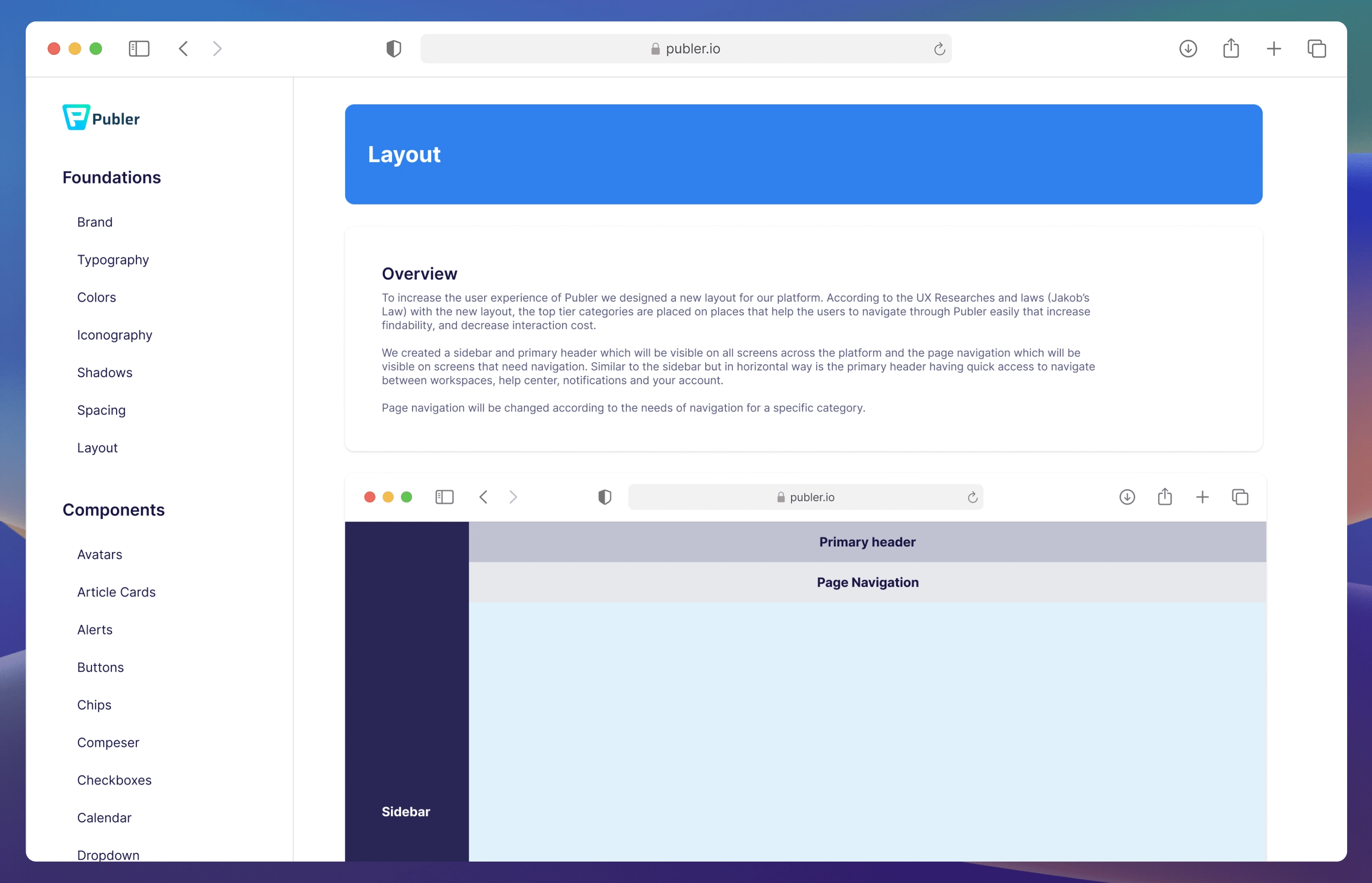
Guided by the UX Research and Laws for the new layout, we decided to place the top-tier categories in more accessible places that help users navigate through Publer easily, increase findability, and decrease interaction costs.
Social Accounts
At Publer in the Social Account tab, you can add, edit, or delete social accounts.
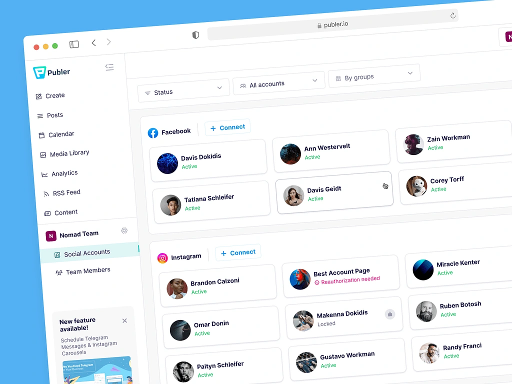
In the Social Account tab, you can add, edit, or delete social accounts.
Plans & Billing
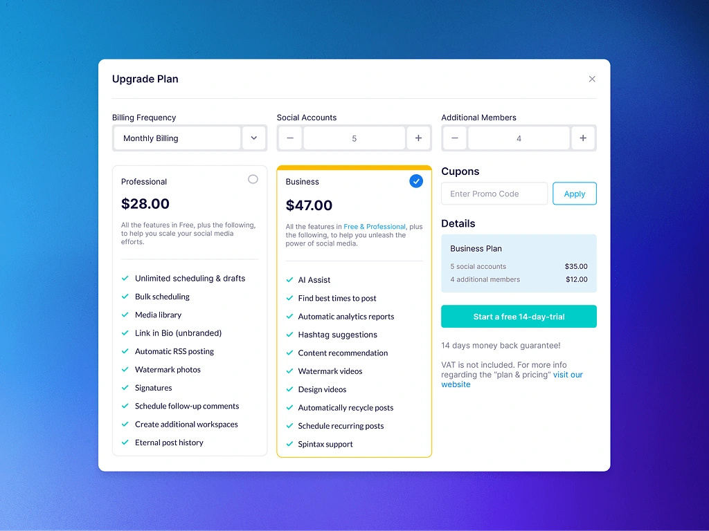
Plans and billing experience
Design System
Creating a consistent design system
The Publer Design System is the backbone of the user experience, providing a clear, simple, and visually appealing interface. It benefits designers, engineers, and users by offering a solid design foundation, reusable interface components, and a consistent user flow with clear expectations.
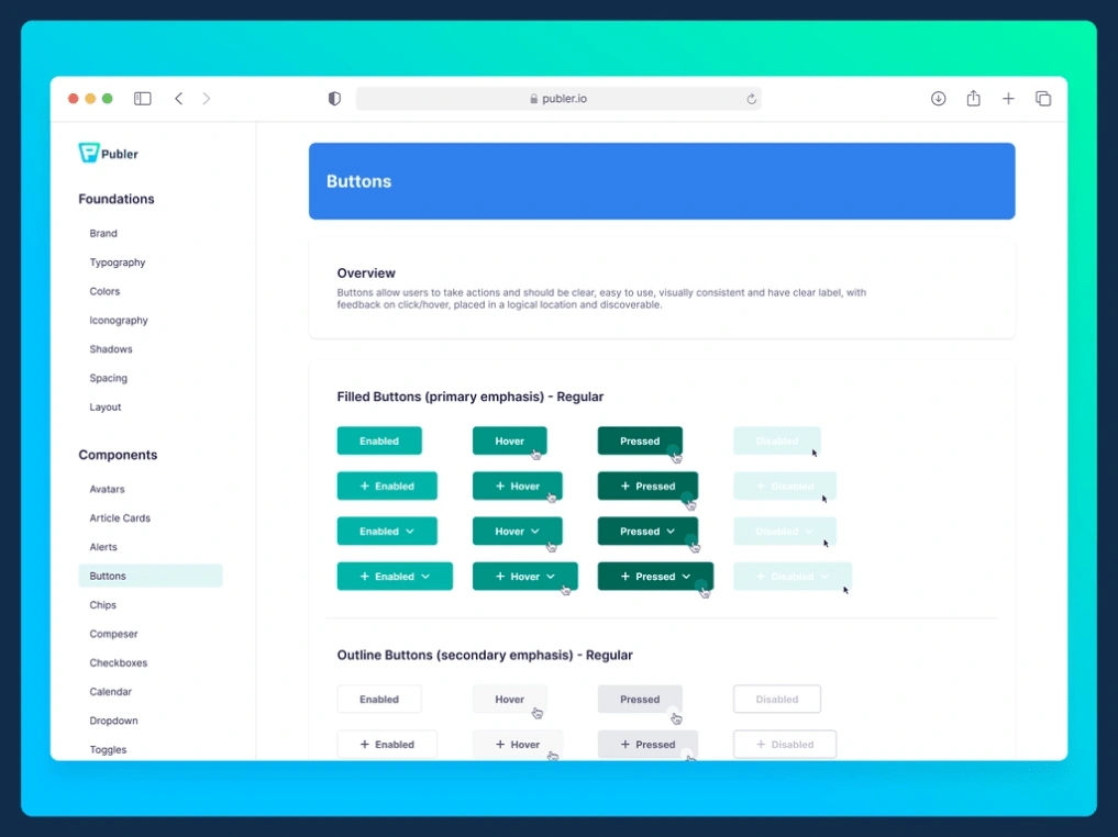
Buttons
When placing buttons on a webpage, it is important to clearly communicate to the user what will occur when the button is clicked. These buttons, also known as call-to-action (CTA), should have concise, action-oriented labels with precise language and avoid technical jargon.
To make buttons stand out, use a contrasting background color. Capitalization style can also convey tone to the user and elicit an emotional response.
It is important to keep font size consistent with body text, typically between 16-18px, to avoid overwhelming the user.
Buttons should have a realistic appearance and include padding. Additionally, adding hover and focus effects, such as a darker background color or outline, can enhance interactivity and accessibility.
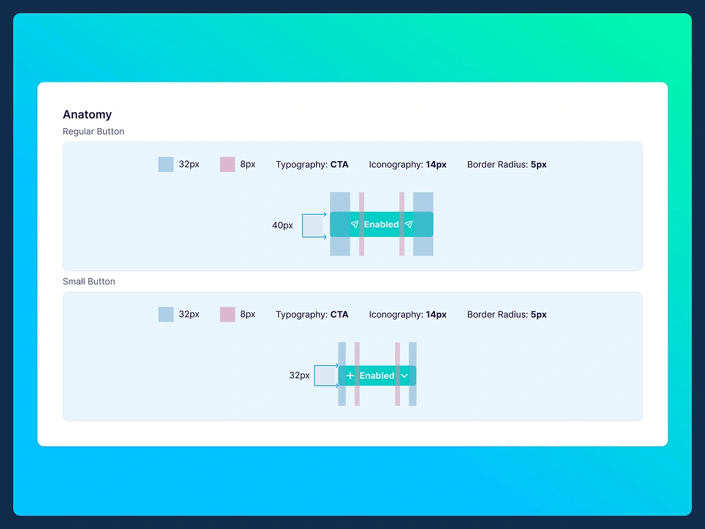
Button anatomy
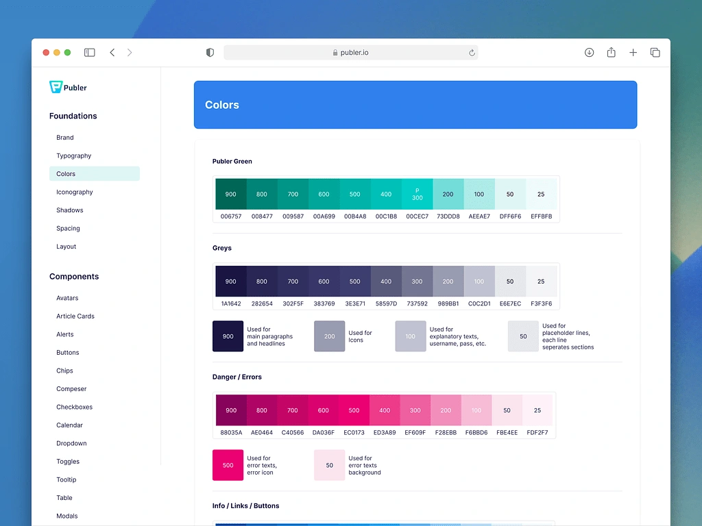
Colors
The color palette is composed of 7 different colors, each with 11 unique shades.
The shades play a key role in creating the overall hierarchy of a screen. Using them is an easy way to change the hierarchy and draw a user's attention to the right place.
Layout
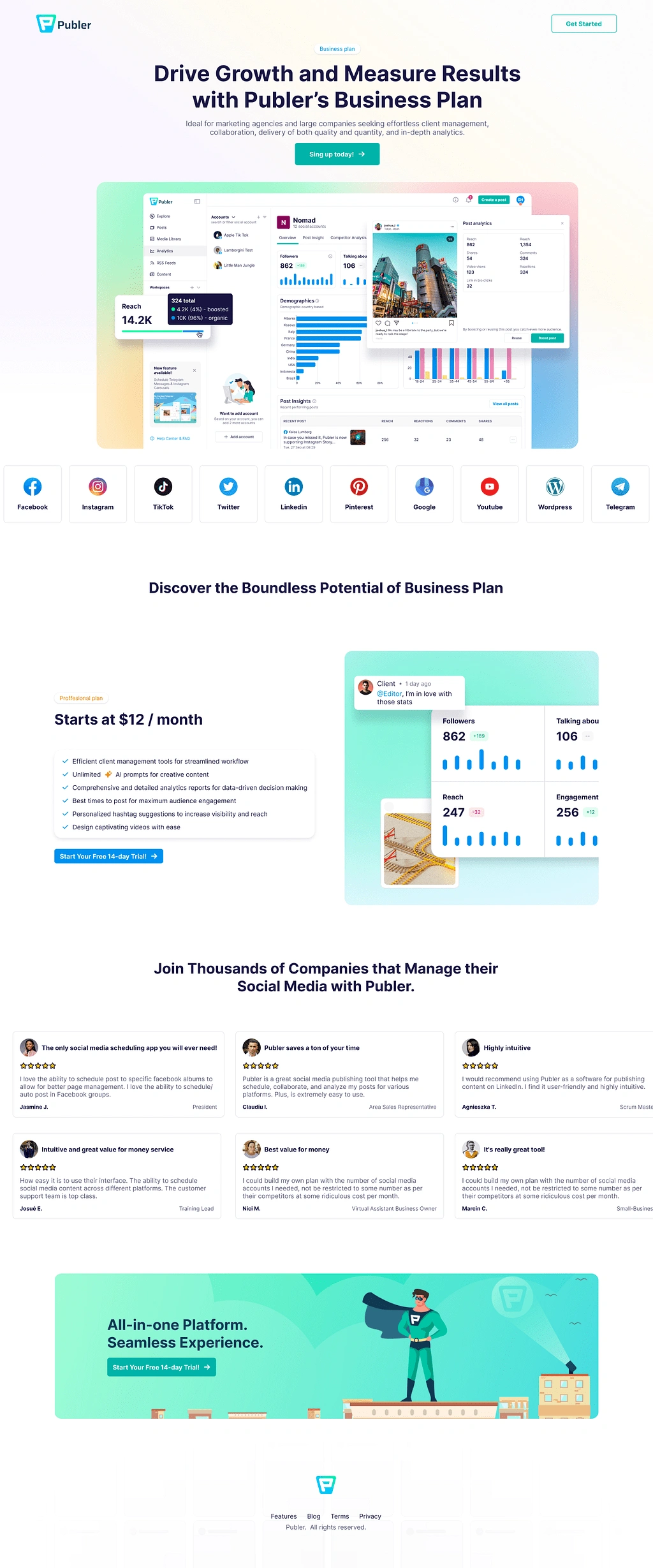
Other Landing pages for the marketing team
There are much much more screens and an entire design system.
Follow my Dribbble Portfolio or LinkedIn profile where I publish and talk about Publer
Like this project
Posted Jul 13, 2023
UX/UI Designer at Publer where I design user-friendly interfaces for easy social media management.
Likes
0
Views
44

