Donation Microsite & E-Catalogue Experience for a Non-profit
Theresa Lau
Optimizing checkout to drive donations
Hands Offering Organization is a nonprofit that empowers culinary students in Quintana Roo by providing essential tools, ingredients, and opportunities to build a brighter future. This microsite transforms charitable giving into a meaningful shopping experience. For Hands Offering Hope, I designed a digital gifting catalogue where donors can “buy” real items that empower culinary students in Mexico. The interface follows a familiar e-commerce flow, guiding donors from browsing to checkout with clarity and emotion. The design emphasizes storytelling through visuals and structure, helping every purchase feel like a direct act of hope.
The Challenge
Donations often stop short not because people don’t care, but because the process can feel confusing, time-consuming, or disconnected from the cause. Hands Offering wanted to change that. They envisioned a digital catalogue where donors could “shop” for impact selecting tangible gifts that directly support culinary students. Their hope was a design flow that feels joyful, purposeful, and frictionless.
Crafting a Frictionless Donation Experience
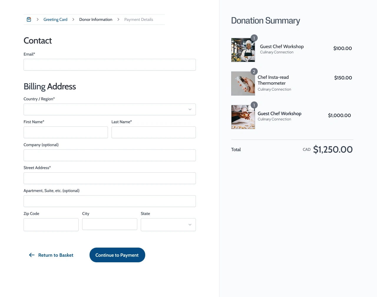
Using core UX principles, I planned a thoughtful user journey with clear,
progressive steps that allow users to move forward or go back without friction. Throughout the process, I made sure the interface remained visually consistent and aligned with the charity's branding to build trust and encourage donor confidence.
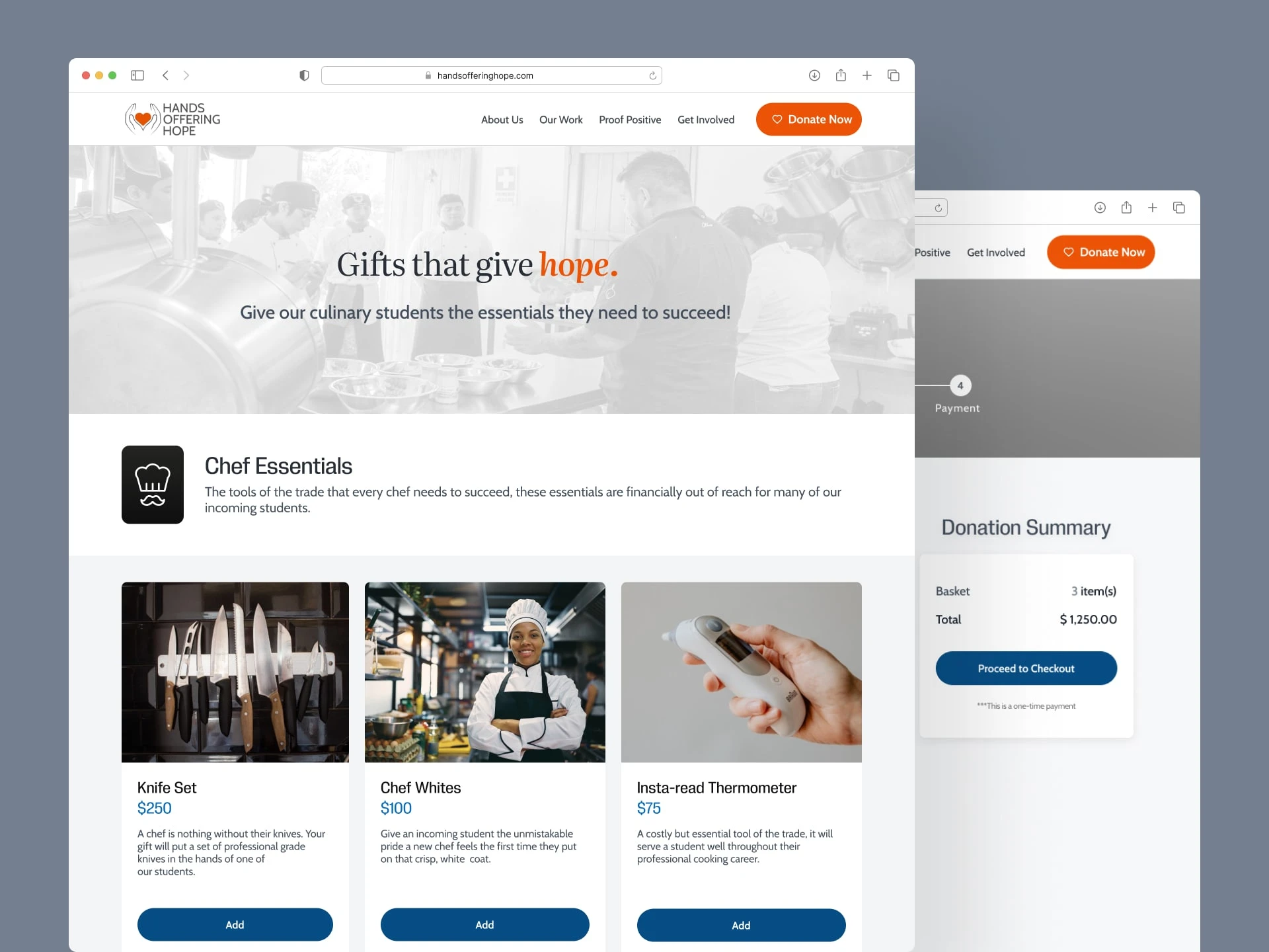
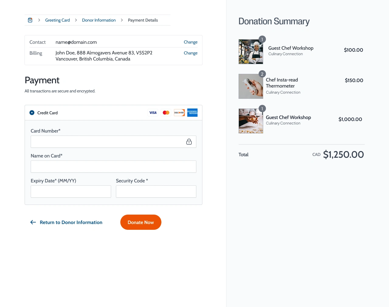
The Concept: “Gifting Hope”
Instead of a generic donation form, I created a structured catalogue experience where users could browse curated gift categories, such as Chef Essentials, Ingredients for Growth, and Community Connections.
Each item displayed its price and purpose, allowing donors to see how their contribution helps students thrive in the kitchen and beyond.
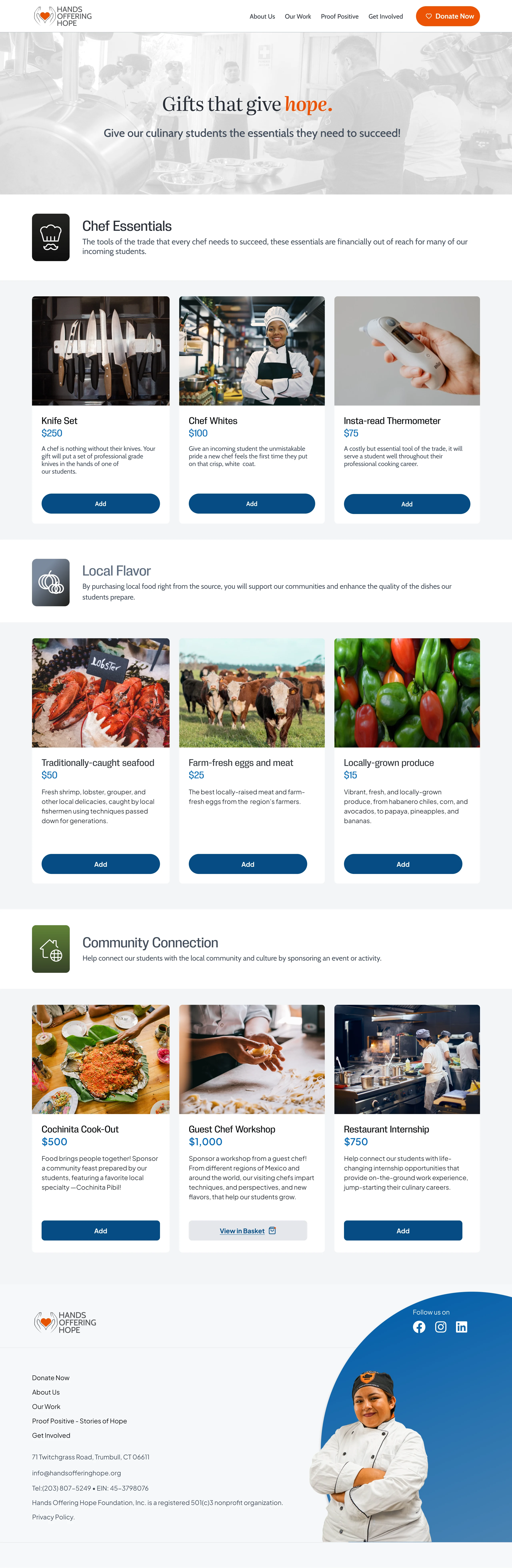
Home screen for the charity catalogue
Design Approach
1. Simplifying the Flow
Every screen was minimized to reduce mental exertion, guiding users step by step through the donation process.
2. Emotional Clarity Through Color
While the brand color is red, I introduced a dark blue secondary palette for the donation flow. The calm tone creates a sense of trust, balance, and serenity helping donors feel confident in their giving decisions.
3. Empowering Control
Users can navigate freely back and forth through the screens, ensuring they never feel trapped or rushed. This flexibility promotes confidence and reduces abandonment during checkout.
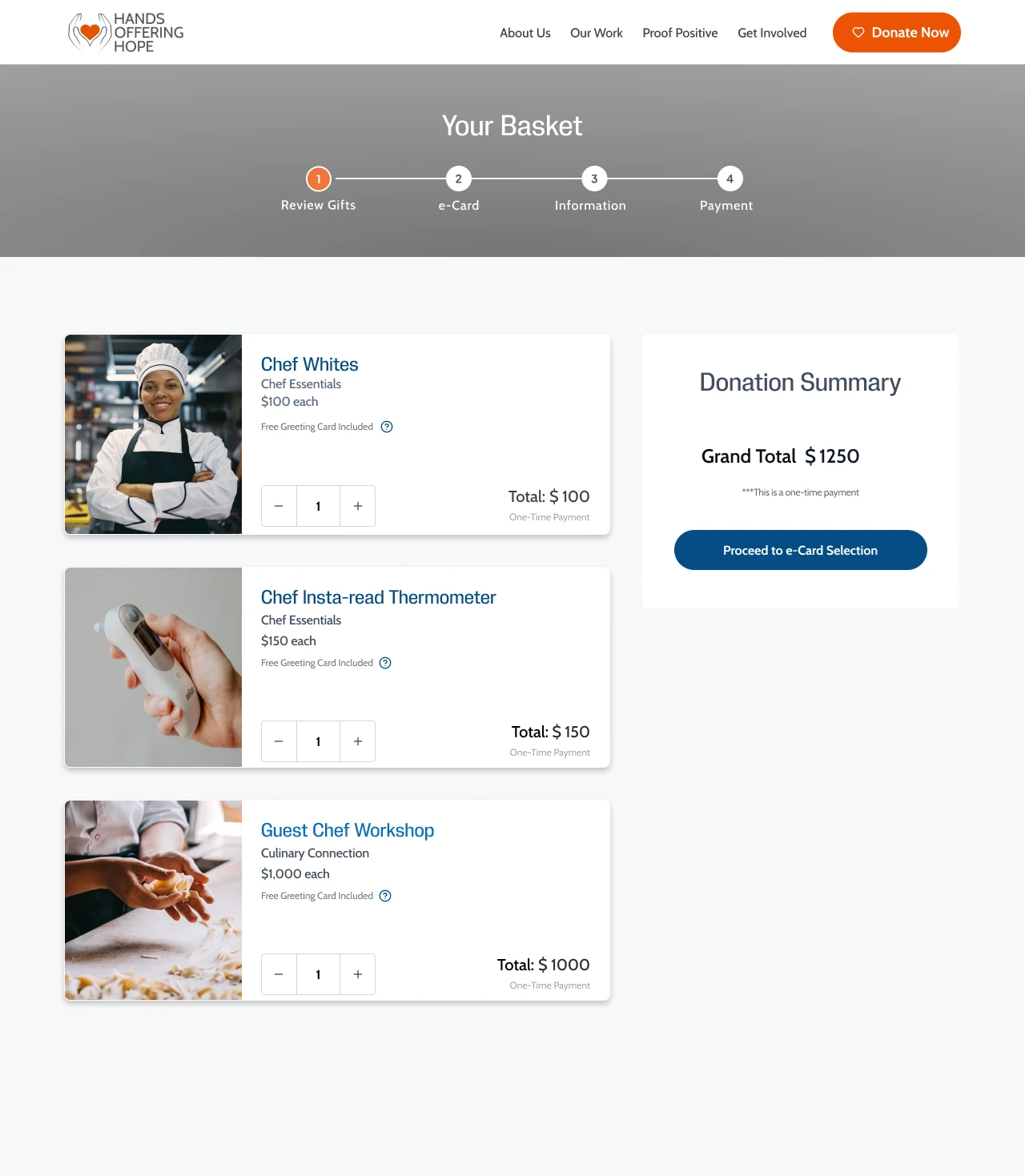
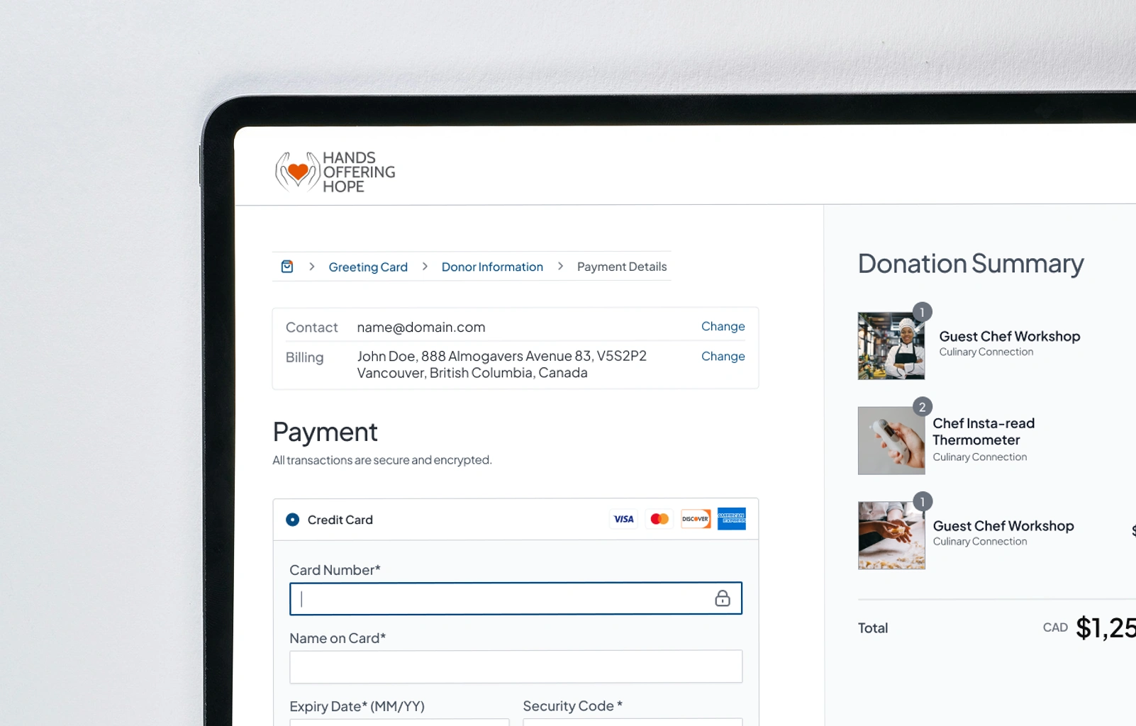
Reviewing items in cart
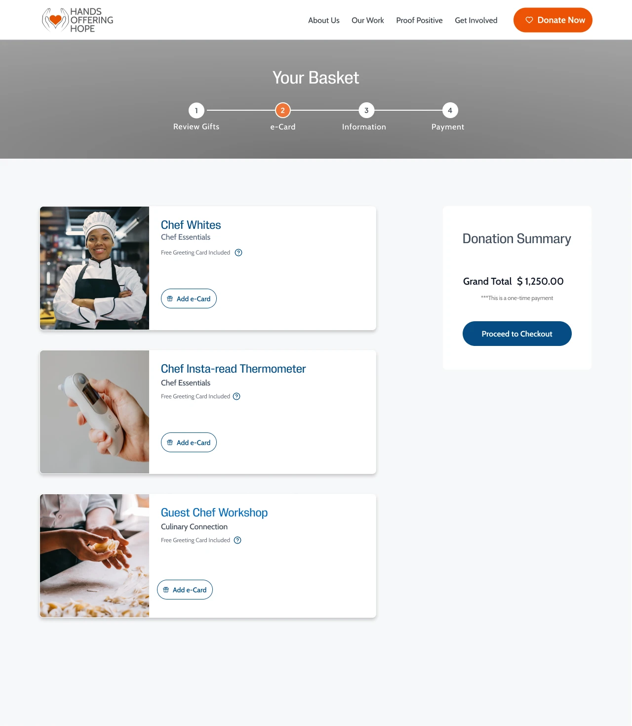
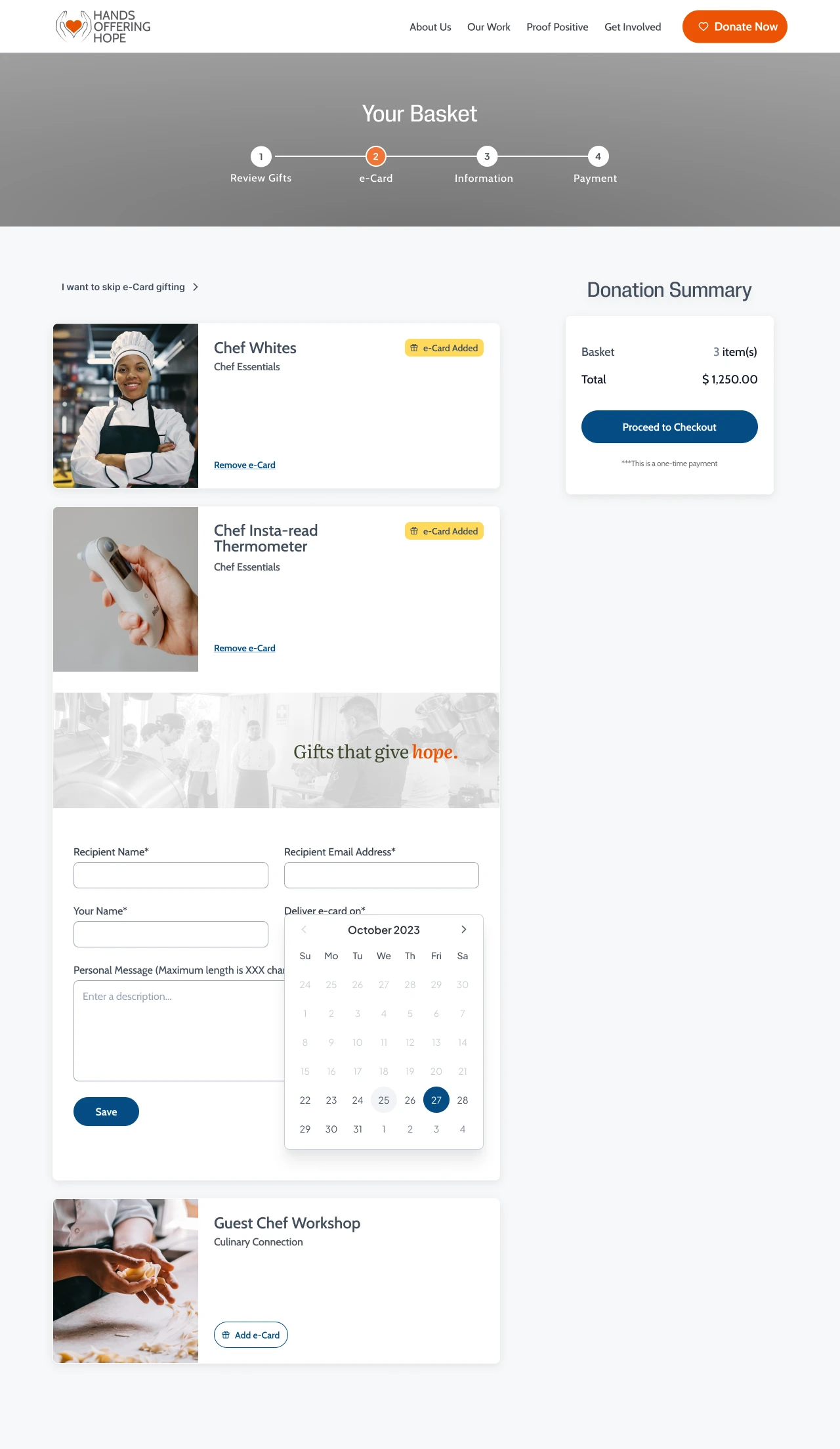
donors have an option of adding e-card with the gift they purchase
Outcome
The final design delivers a streamlined and trustworthy donation experience, built on clear navigation, real-time feedback, and brand consistency. By aligning the interface with the charity’s visual identity and minimizing friction throughout the journey, the solution is designed to build user trust, support confident decision-making, and encourage successful donation completions.
Like this project
Posted Oct 7, 2025
An e-commerce-style microsite where donors easily give by purchasing gifts that empower culinary students.
Likes
0
Views
7