Over 100 Active Users: PunhubCentral Design Case Study
6 min read
Over 100 Active Users: PunhubCentral Design Case Study
One of the features that helped to gain more users was our "SEO-optimized web page", But before diving into this feature, let's first look at the backbone of our approach.
Context
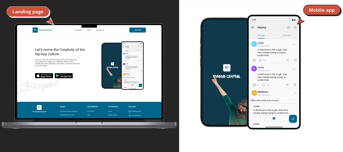
PunhubCentral is an entertainment app that allows users: - post witty lines and see contexts of lines from their favorite rap and hip-hop artist, - Data Source For Music Companies that need punchline data to mine for AI - Music App That Helps Listeners Explore Music by discovering the punchlines and bars - Lyrics and Punchline Selling Program - Online Users-Sponsored Cyphers - Exporting Other Genre of Black, Mixed Race and Minority People music through their lyrics - A place to advertise upcoming music, lifestyle, pop and youthful events - A very valid place to promote lyrical content - A non-biased place to settle the “who is a better rapper” wars (not using upvotes but how the bars are) - A non-violent place to use punchline polls to settle beefs rather than on twitter or worse “the streets”. When i joined Punhubcentral there were accessibility issues with both the android application and the iOS application, as they were not in conjunction with the material design guideline and human interface guidelines, respectively. we saw a remarkable improvement in product usability which lead to more active users.
PunhubCentral Team Structure
In PunhubCentral team, I was the only Product Designer and worked closely with the mobile developer, backend architect and frontend engineer. We were the driving force behind the product launch. I was working closely with the developers ensuring that our product worked seamlessly and aligned with the company's overall goal.
PunhubCentral Design Process
Establishing a sustainable design process at PunhubCentral was challenging and at the same time paramount for the success of the product. We typically had three key stages: Investigate, Design & Collect Feedback, and Implement & Measure.
Investigate:
This initial stage was crucial. It involved setting clear goals for the Product, conducting thorough research, understanding the problems, and brainstorming solutions for the product.
Design & Collect Feedback:
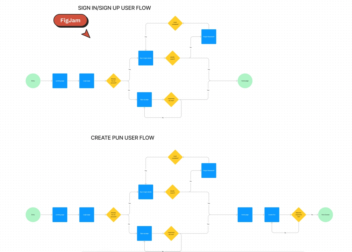
Here, I designed user flows in FigJam and crafted low-fidelity prototypes. This early version of the design was crucial for gathering user feedback before finalising the UI. Several rounds of feedback were conducted to refine the MVP designs, with a focus on ensuring usability and speed of development in collaboration with the developers.
Implement & Measure:
Once the MVP was ready, we launched it. This stage is critical for measuring the improved design impact and effectiveness. Based on the data and user responses, we can make informed decisions about further investing in the product or pivoting to new ideas.
Improved Design and "SEO-Optimized" landing page Impact
Now that we've looked at Punhubcentral design and team setup, let's talk about something the improved usability and SEO-optimized landing page impact, It was a huge hit and helped improving the product usability and also increasing the users. Improved Usability: the touch area for android in conjuction with material design standard is 48px by 48px while that of iOS is 44px by 44px, following these guidelines with other set out design guidelines for each device respectively, was important in greatly improving the product usability. SEO-Optimized search page: when users search a punchline or any form of witty line from their favourite rapper/hip-hop artist, google suggests content from our product and take them to the web page once the link is clicked, where they can see similar lines and are also prompted to download the app when they try to react or comment. This is an important feature to bring more users in, unlike when there was no webpage for the product. Now, let’s look into how we crafted and rolled out this feature.
Problem
PunhubCentral was looking to improve its usability and also enhance its growth, but the existing UI-design wasn't as effective as desired. The challenge was twofold: new users were needed, and user retention needed improvement. The goal was clear: find a creative solution to increase the app awareness, and also add value to their experience and the overall product.
Solution
Introducing the "SEO-Optimized" Search page. This allowed users search a punchline or any form of witty line from their favourite rapper/hip-hop artist, through any search engine, contents from our mobile application and take them to the web page once the link is clicked, where they can see similar lines and are also prompted to download the app when they try to react or comment. It wasn't just about having an app landing page; this feature also strategically helped us increase our reachability and reduce our Customer Acquisition Costs.
Design Process
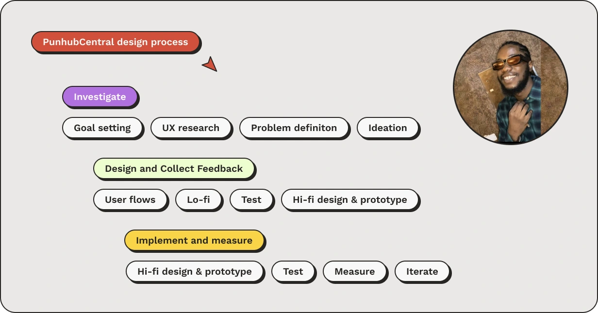
We followed our flexible PunhubCentral design process for launching the ' feature. The main steps in this process included:
Leveraging past insights: our first step involved analyzing feedbacks from the existing product, which confirmed the poor usability and poor reachability.
Competitive Research: Subsequently, we researched the way popular apps such as twitter, Instagram, and Gen. Our goal was to understand what made these aapps successful, focusing on their simplicity, and how easy they are to come across.
Brainstorming Solutions: Coupled with our competitive research, we had a brainstorming session. It was here that we proposed the search page approach, reaching more punchline fans with controlled Customer Acquisition Costs. This idea was well-received, and I proceeded to sketch in figma, which helped us identify and discuss any potential development blockers with our developers.
Wireframing and Prototyping: Following the brainstorming phase, I developed initial wireframes and low-fidelity prototypes. This step was crucial for UX research to gather user feedback.
High Fidelity design and Implementation: Once we received a green light from user feedback, I shifted focus to high-fidelity designs in Figma. This stage involved deciding on finer details, such as maintaining every detail of the product design system element. Collaborating closely with developers, I worked on creating visuals for the landing page and improved app design while ensuring an appealing design and maintaining functionality with primary focus on improved user experience also. This phase was marked by extensive testing and iterations to achieve the desired outcome


Testing and Launch: Finally, we tested the feature on different user segments, considering factors like lifecycle (new users vs long-term users), engagement (time spent in-app, frequency of use, daily steps), location (EN-speaking countries), and Accessibility for each device type (iOS, Android).

Summary
PunhubCentral, is an entertainment app. the project aimed to enhance the app usability and expand its user base. Facing UI design challenges and seeking growth, the team implemented an SEO-optimized search page feature. This feature allowed users to search for punchlines from their favourite rap artists, leading them to a web page with similar content and prompting app download. The process involved leveraging past insights, competitive research, brainstorming, wire-framing, prototyping, and high-fidelity design. Extensive testing ensured effectiveness across user segments and devices, resulting in improved usability, increased reachability, and reduced customer acquisition costs. The collaborative effort between the product designer and development team drove the success of the feature launch. Next steps, would involve continuous testing and monitoring of the app progress with constant user feedbacks taken also.
Other Projects
Like this project
Posted Jul 4, 2024
PunhubCentral is an entertainment app that allows users: - post witty lines and see contexts of lines from their favorite rap and hip-hop artist.
Likes
0
Views
2


