Dashboard Design
Shaheer Malik
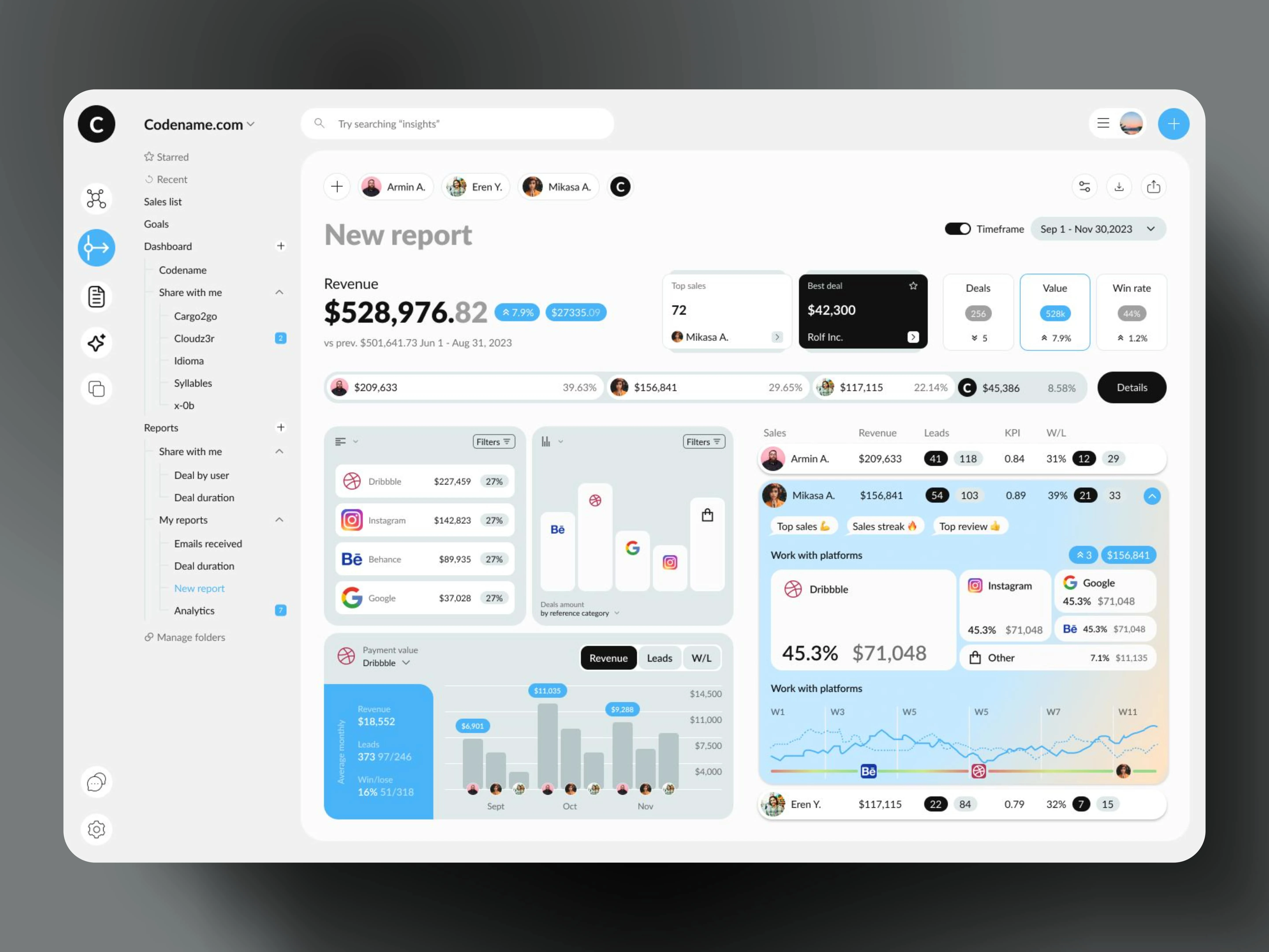
I specialize in designing clean, modern, and data-driven dashboards that enhance usability and streamline complex information. My approach focuses on clarity, visual hierarchy, and intuitive navigation, ensuring users can quickly access key insights without feeling overwhelmed.
For this dashboard, I crafted a sleek and structured UI with a balanced use of whitespace, typography, and subtle gradients to create a visually appealing yet highly functional experience. The design prioritizes:
Effortless Navigation – A clear sidebar for quick access to reports, analytics, and key sections.
Data Visualization – Engaging graphs and charts that make metrics easy to digest.
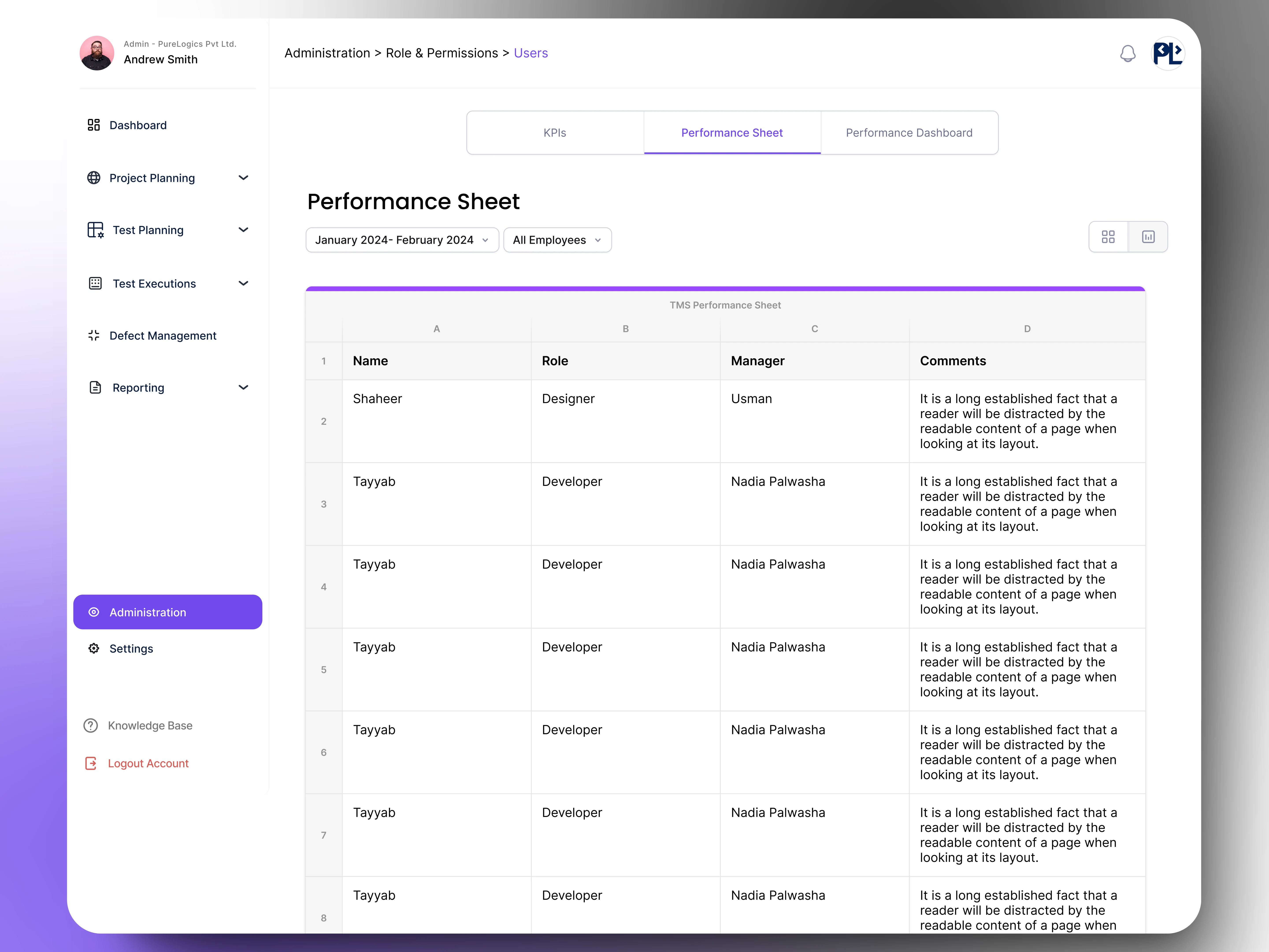
User-Centric Interaction – Interactive filters, customizable timeframes, and performance tracking for better decision-making.
Modern Aesthetic – A soft, rounded UI with a light theme, enhancing readability and user engagement.
I always aim to transform complex data into an intuitive experience, ensuring that users can focus on what matters most. Want something similar for your project? Let’s build something amazing together! 🚀
Like this project
Posted Feb 24, 2025
As a UX designer, I focus on creating dashboards that balance functionality and aesthetics, ensuring users can analyze data effortlessly.
Likes
1
Views
60
Timeline
May 16, 2024 - Jan 7, 2025