Foundational UI for a Chess Application
Justin Chang
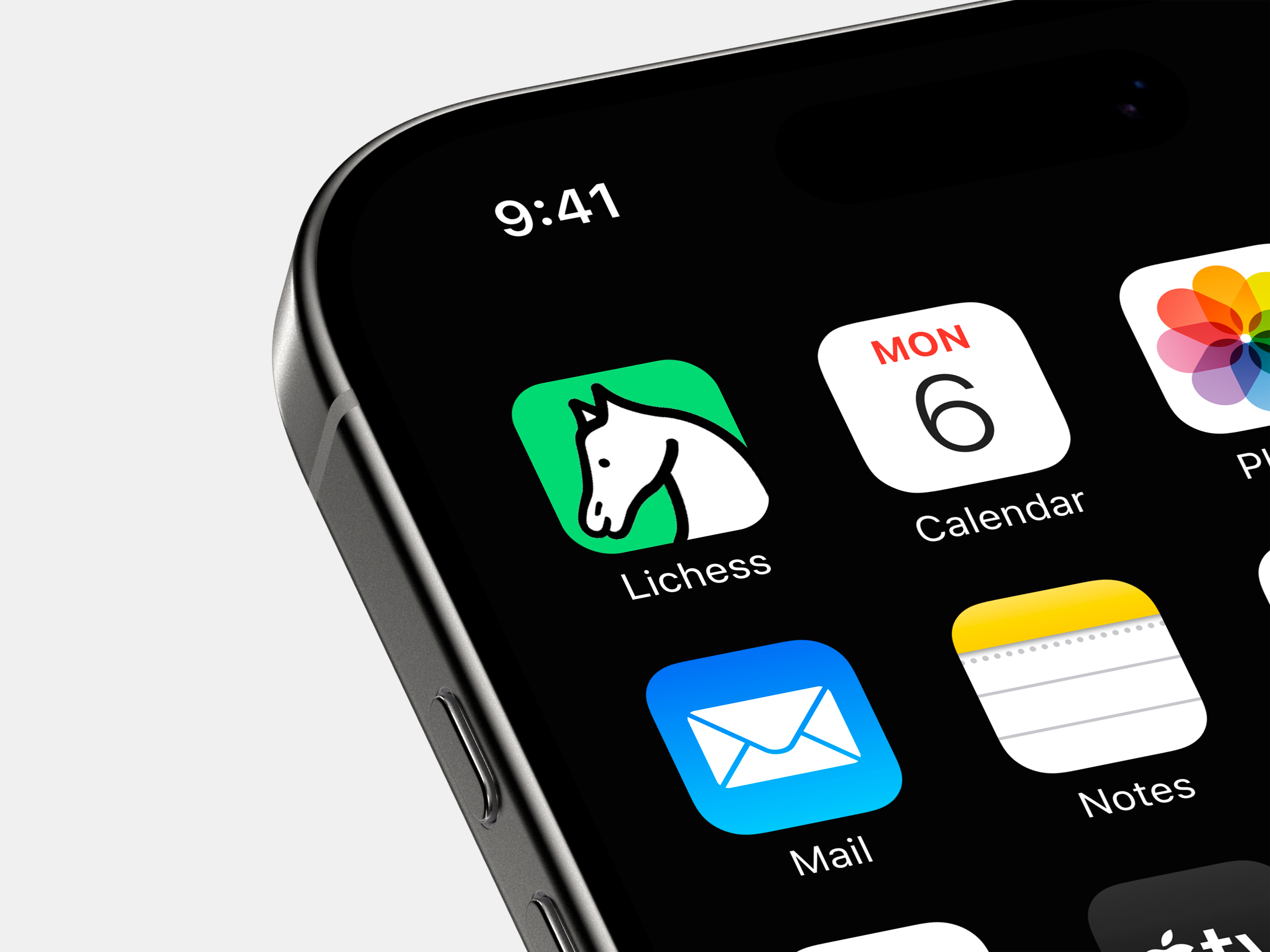
Founded in 2010, Lichess was built and coded by Thibault Duplessis as a side project to introduce an open source chess server to the world. The mission was simple: create a transparent chess platform for the chess community that anyone can inspect, contribute to, or improve. Fast forward to 2024, and Lichess continues to grow as one of the largest chess apps in the world with over four million active users.
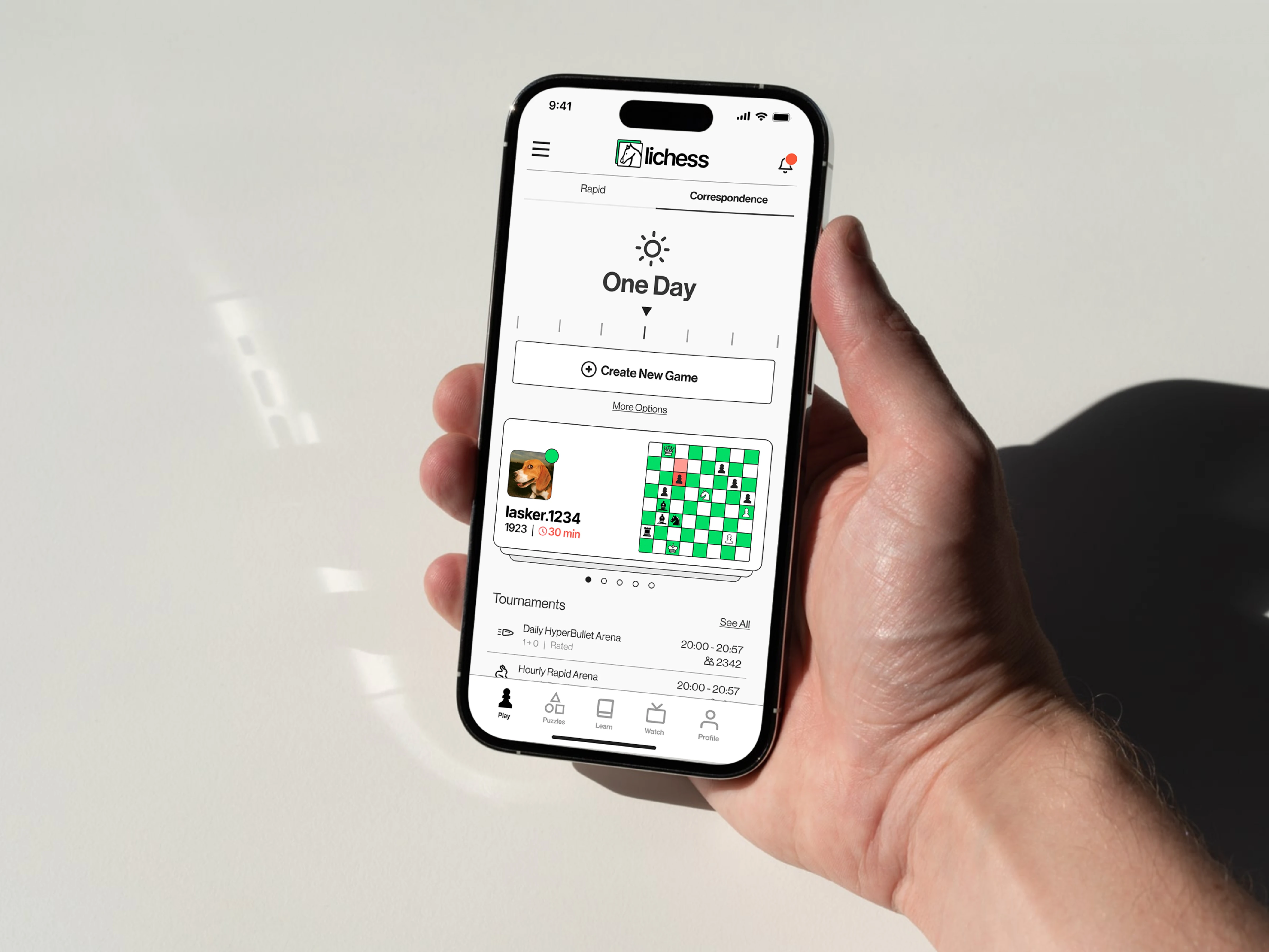
As Lichess grew, it was clear that their interface and branding remained stagnant since its inception. And though the rules of chess haven't changed in the past five centuries, its global popularity has grown exponentially in the past decade in spite of the myriad of indirect competitors in the streaming age.
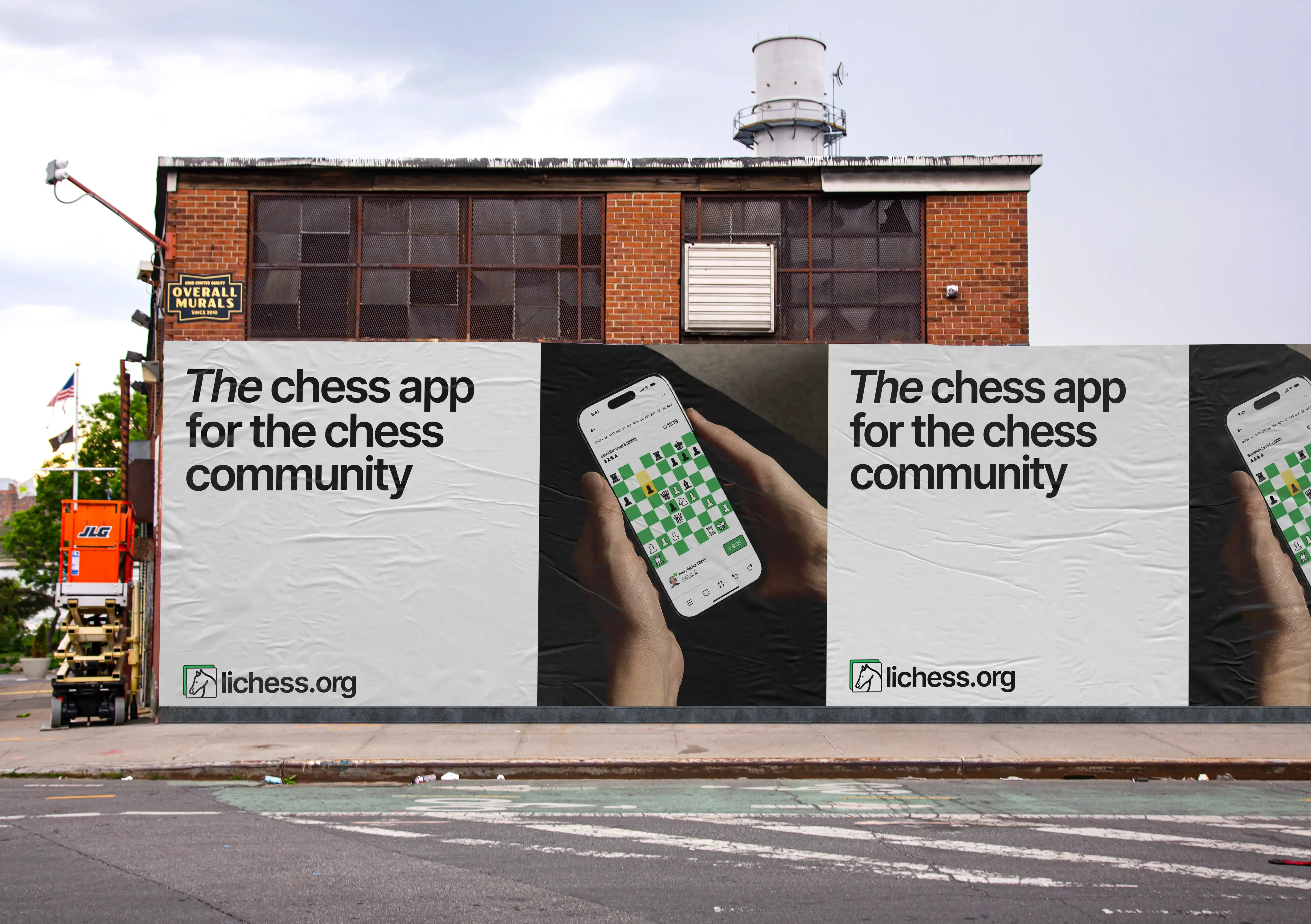
Newer offerings and cleaner interfaces from larger competitors like chess.com meant that Lichess needed to adapt similar strategies to cater to the growing international market. One of the key issues was that Lichess seemed to lack a distinctive identity. We felt there was no strong color identity behind its minimal palette. Nor did its logo, albeit created pro bono by a fan, convey an encompassing tone. The wordmark is functional, but it lacks any distinctive character and its sizing and weight didn't properly attach to the previous knight logo.

Like this project
Posted Mar 27, 2025
Founded in 2010, Lichess was built and coded by Thibault Duplessis as a side project to introduce an open source chess server to the world.