Logo Design for a Tech-Facing Consulting Firm
The Ask:
Solenoid Labs is a consulting firm that provides data analysis and process optimization insights to early-stage tech and AI companies. The client has operated independently for years but had not yet properly leveraged any brand strategy or custom logo.
Solenoid Labs came to me in early 2024 with a clear request: a new logo, along with a basic style guide and print collateral, that properly conveyed and distilled Solenoid Lab's comprehensive knowledge of statistical analysis, data science, and QA in an appropriate pictorial mark.
The Logo:
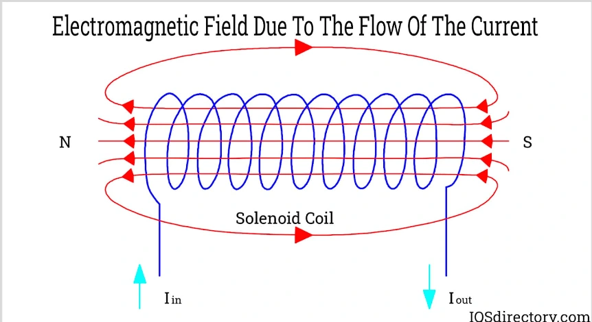
The agency's namesake comes from the solenoid, a wire coil that generates magnetic fields when electrified. Though vital in primarily mechanical and electrical engineering, they have significant applications in a myriad of different industries.
Initial discovery phases captured the groundwork for keywords and moods that resonated with the client's brand vision. Words like entropic, cognitive, empirical, and recursive were thrown around, and from this, I knew that the logo would have to be a representation of one concept: scientific discovery and analysis.
The client also asked for the logo to reflect a loosely Mid-Century vintage style mixed with organic neo-futurism, while maintaining its objective edge. We also felt that a monochromatic, pictorial logo with a wordmark would be the most suitable way to convey Solenoid Labs' mood.
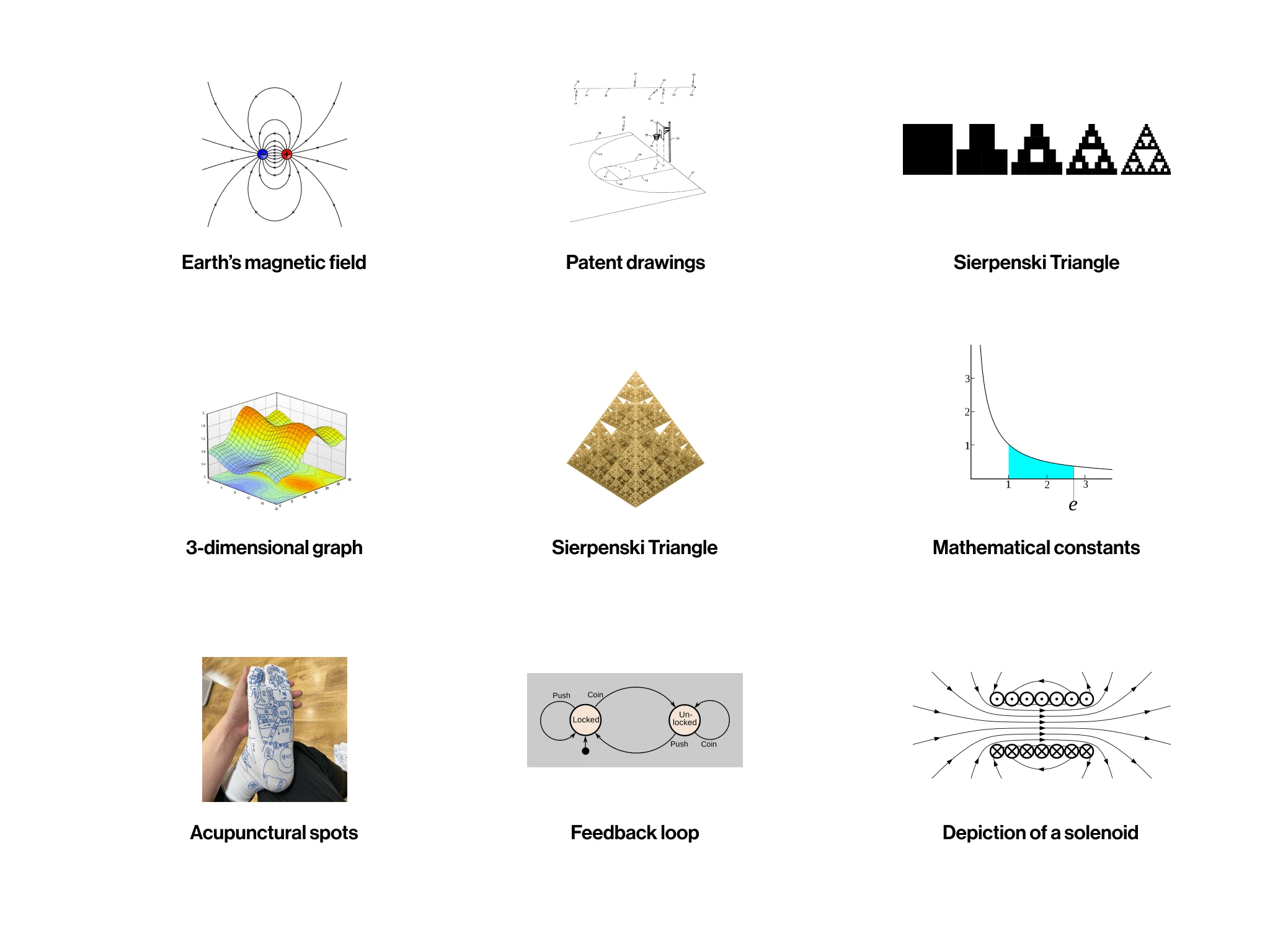
Early moodboarding and conceptualization focused on scientific schemata, technical drawings, and mathematical allusions
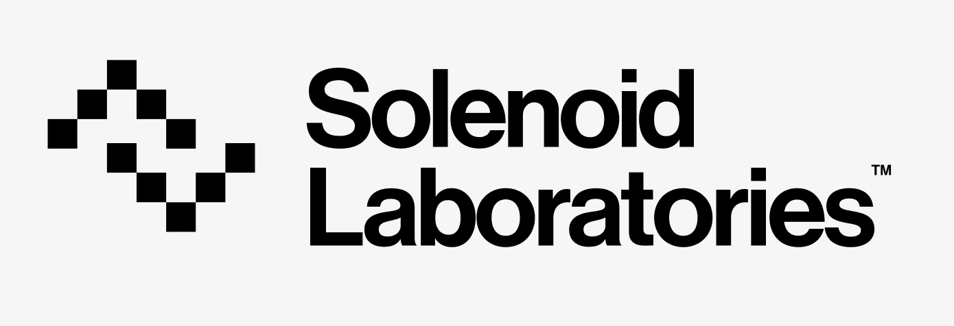

The client liked the initial direction, but we both agreed the initial concepts felt a bit lackluster and generic. It lacked the pertinent abstraction and imagery of the mood we were seeking. We wanted to ground it in more to the spark of scientific discovery.
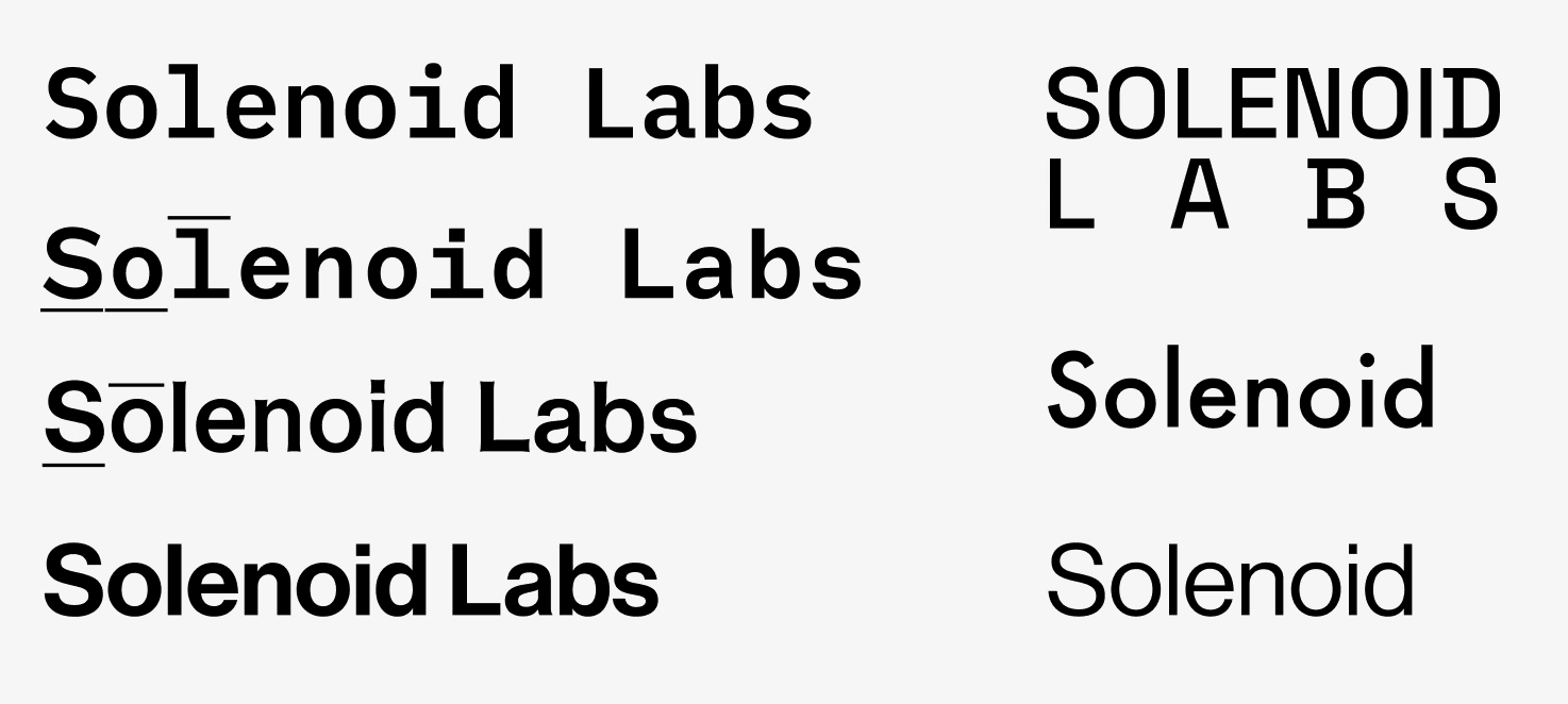
The first concepts explored font placement, including attributes like all caps, keeping laboratories as is or shortened, tracking/kerning options, and alignment. Sans-serif was always a given from the start. We discounted the idea of a monospaced font, or tracking Labs to fit the same width as Solenoid. Light and Bold/Black fonts were also discounted as the former would feel too minimalistic/luxurious, and the latter too brutish.
Initially, I challenged myself to explore figures that were not obvious to the company's namesake. But my mind convulsively drew itself to one cylindrical form.
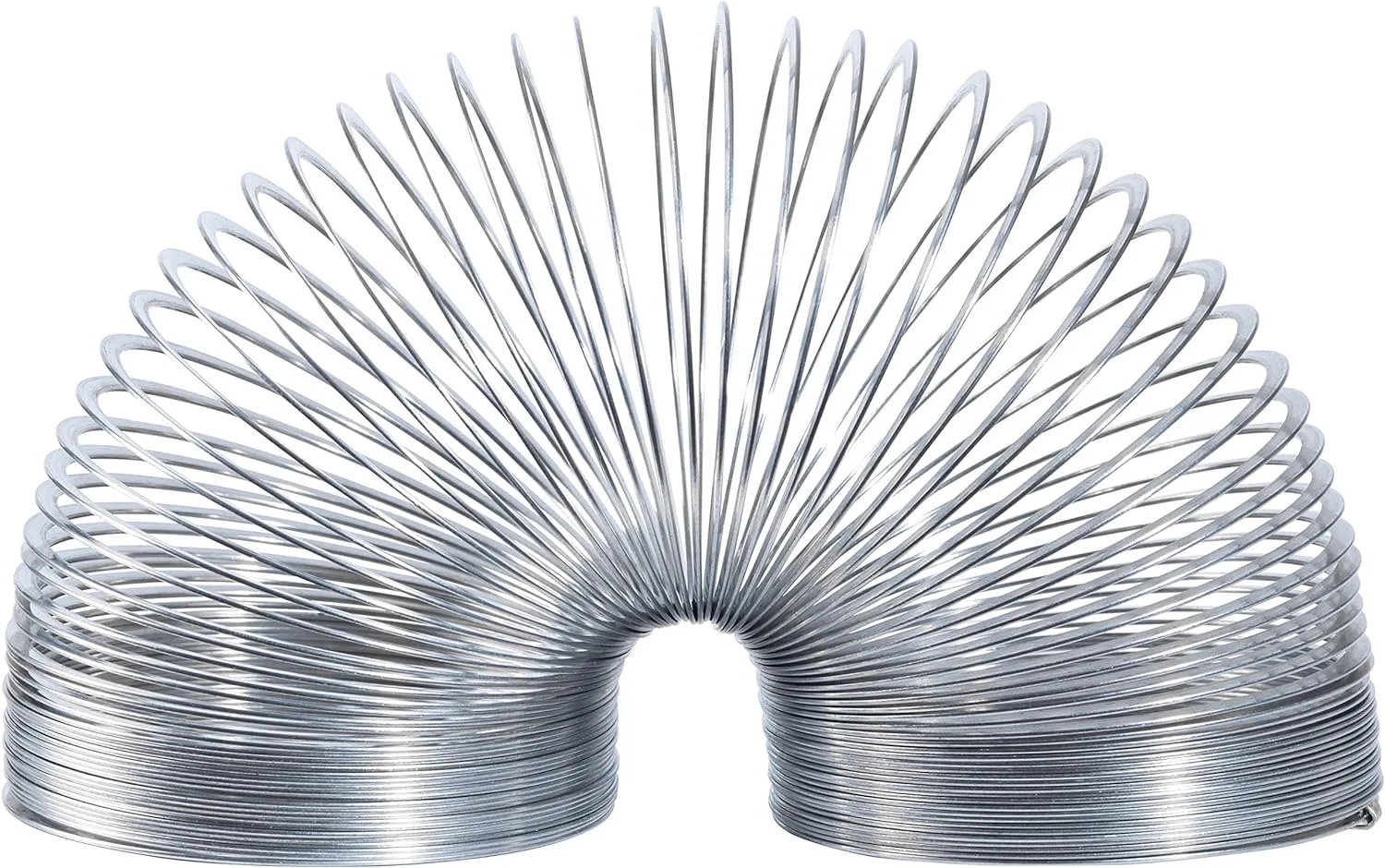
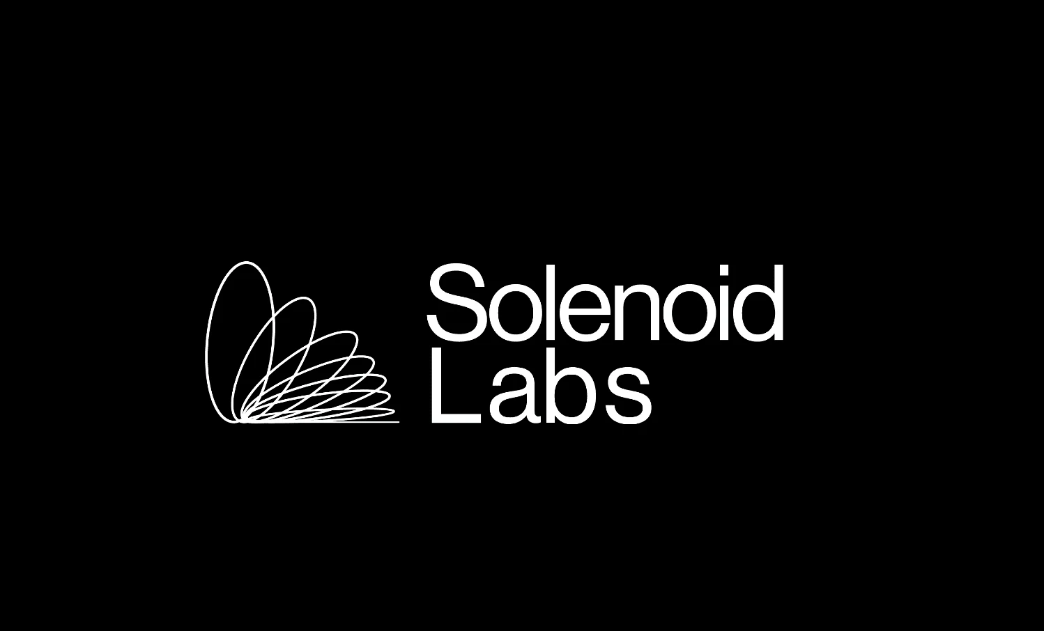
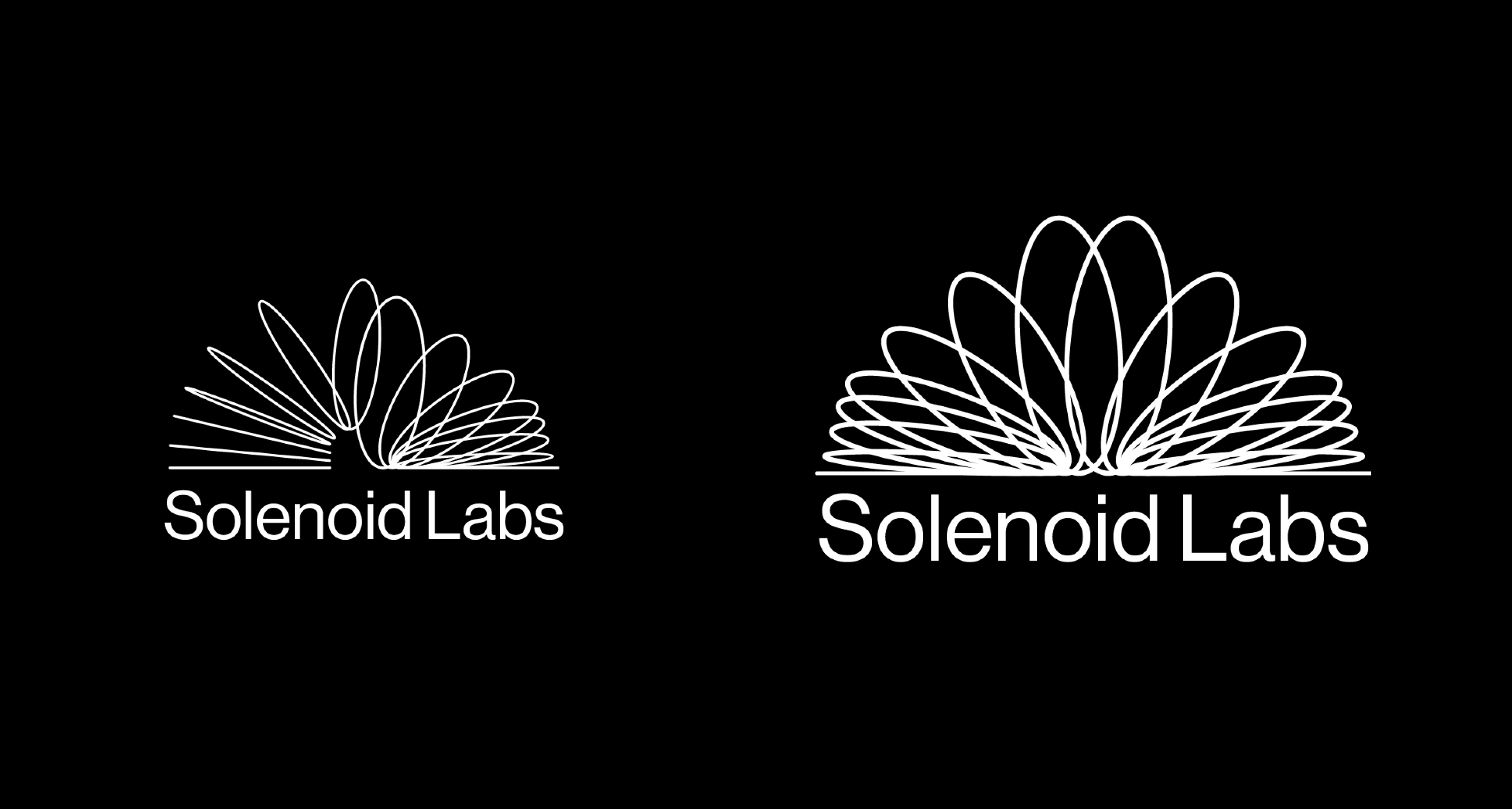
The Slinky. A timeless, classic toy. Product of the Space Age. Playful, but smooth and futuristic. Appealing to all adults. Both share a helical coil structure which is crucial to their functionality. Both share energy transformation and propagation.
The result led me to two new concepts. The first of which was a dimensional elliptical spread.
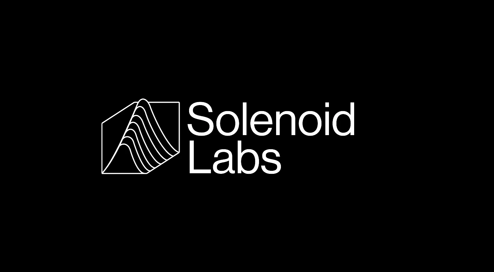
The second, more universal, was a 3D graph with parabolas.
The Final Version:
After a contested decision among the Solenoid Labs team, the 3D graph model was selected due to its universality and potential easier visibility.
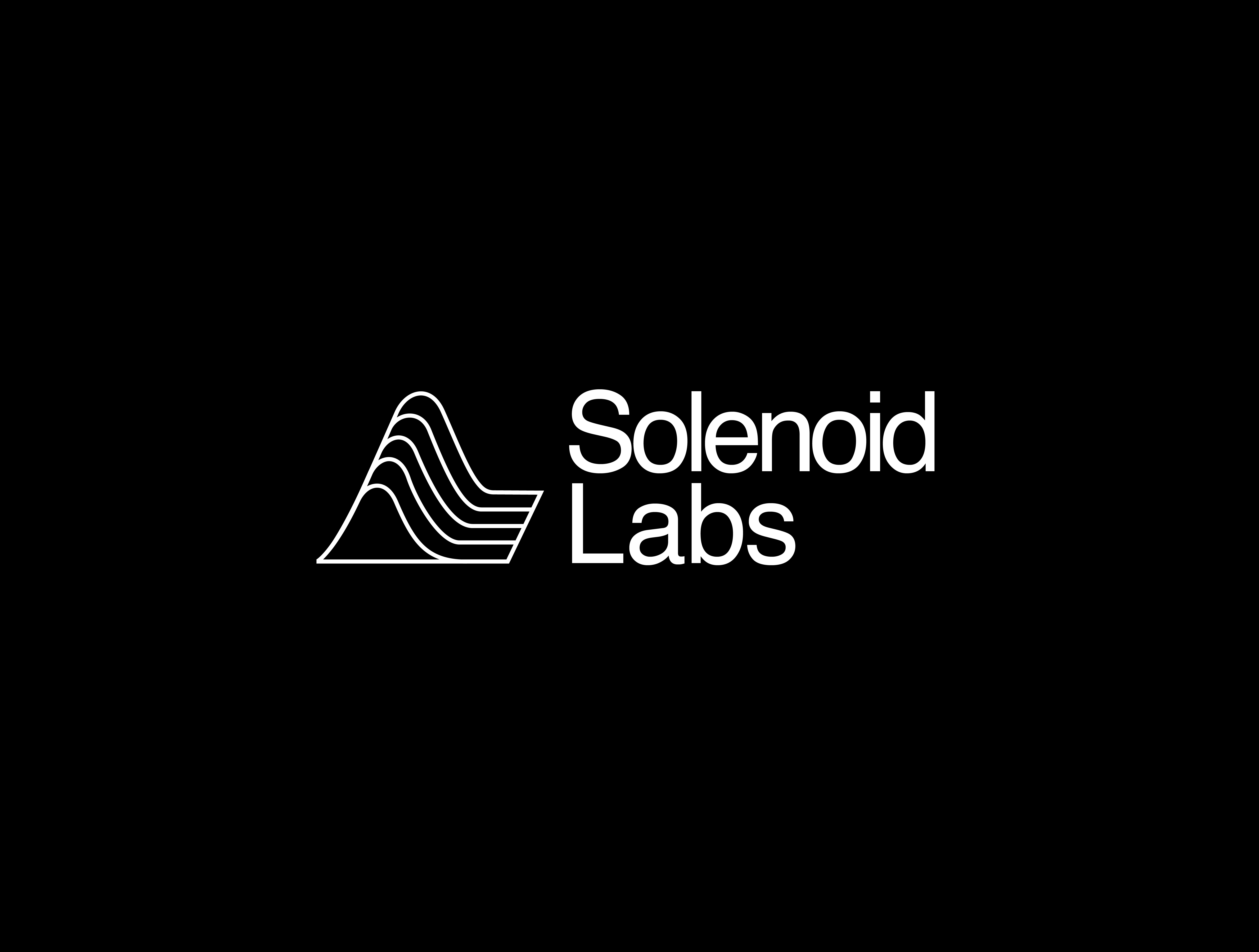
The final result
Further revisions included thickening and reducing the number of strokes for visibility, adjusting text placement, and widening the gaps between parabolas. I also decided to remove the z-axis and sloped the lines to form a plane to create ambiguity as to the lines' purpose, hence creating a more universal application. They could be a section of a circuit board, a multivariate function, or a topological map.
Like this project
Posted May 18, 2024
Logo and branding styles for Solenoid Labs, a tech-focused consulting firm
Likes
0
Views
43
Clients
Solenoid Labs

