Bahari Estates Luxury Landing Page Design
Nikita Maryniuk

Bahari Estates — Luxury Real Estate Investment Landing Page
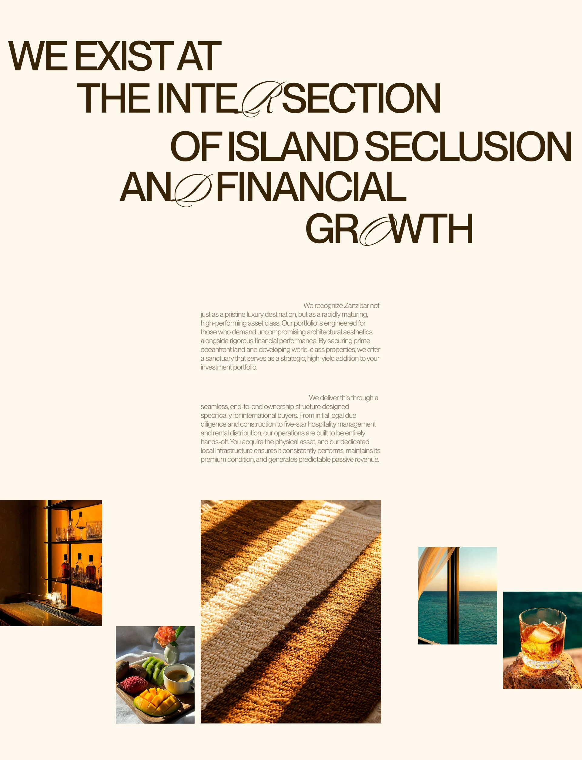
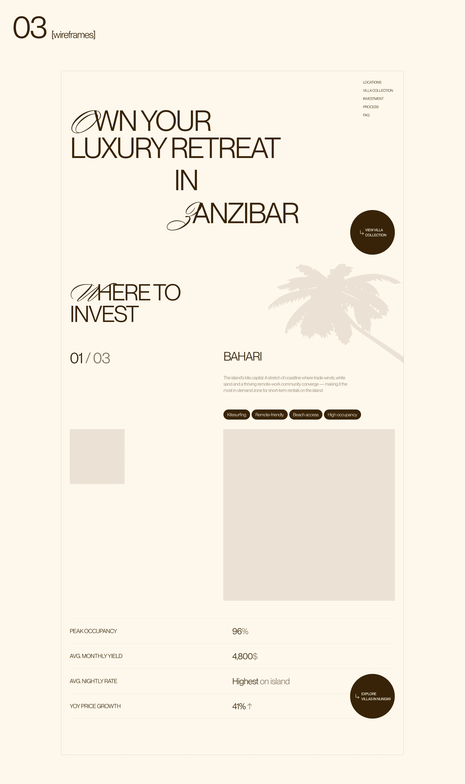
Bahari is a concept project for a luxury villa investment platform targeting high-net-worth European investors seeking oceanfront assets in Zanzibar. The goal was to design a landing page that communicates serious investment credibility without losing the physical beauty of the location.
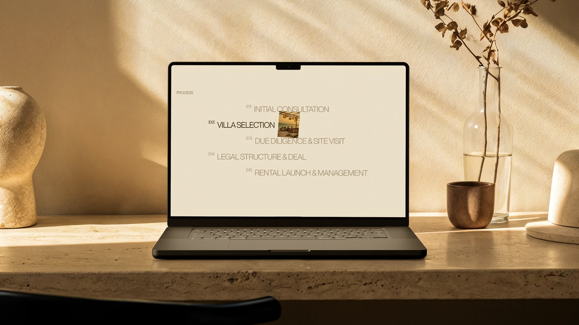
The visual direction centers on a warm off-white palette with dark brown typography, referencing the language of private wealth management. Every section was designed with conversion in mind: an investment thesis hero, a property showcase that makes the asset feel tangible, and a consultation CTA built for a high-ticket buyer who doesn't respond to pressure.
Full scope included brand direction, typography system, copywriting, and a complete landing page from hero to footer.
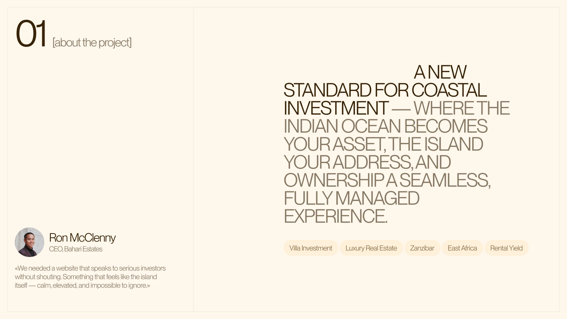
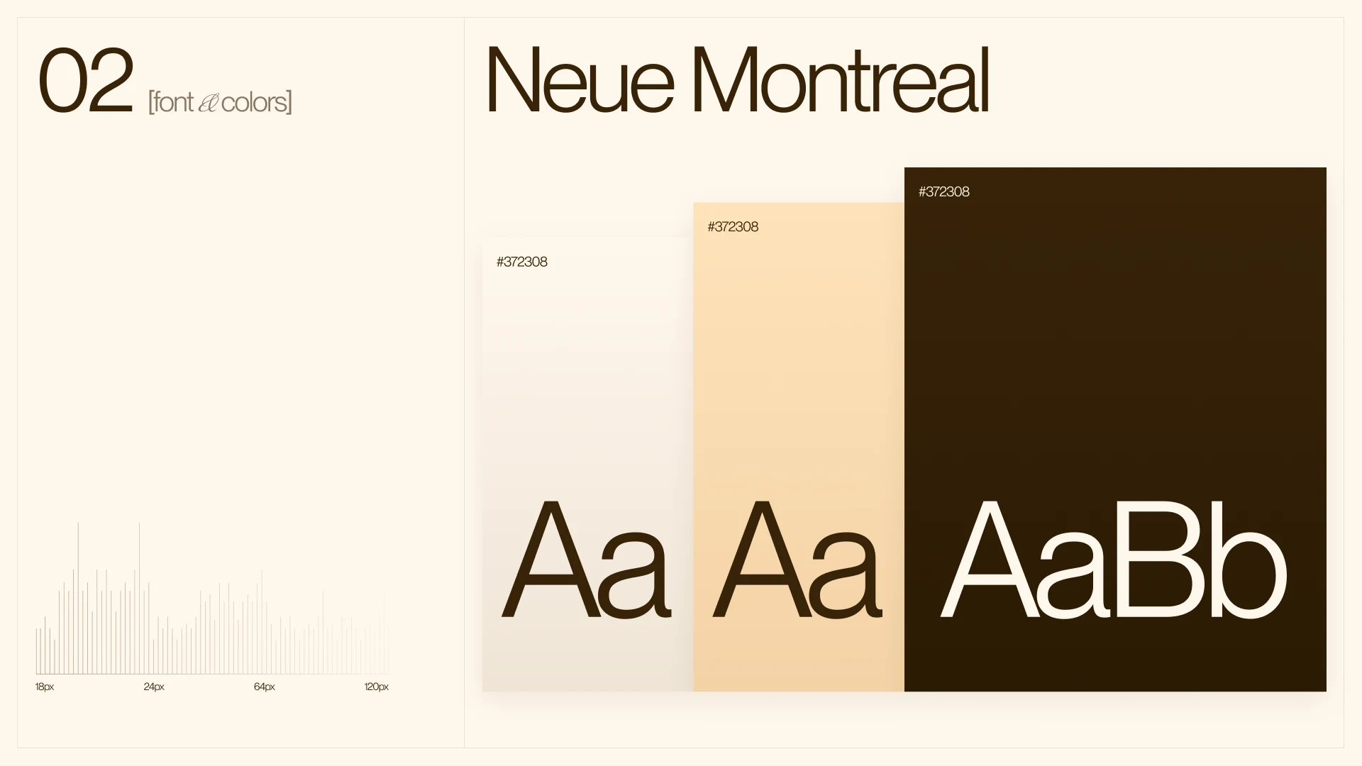
The design system was built around editorial typography as the primary visual element. Large-scale headlines with selective serif letterform accents create a language that feels distinct and ownable - closer to a luxury publication than a property listing.
Spacing and layout decisions were made to let the content breathe, reflecting both the island environment and the confidence of a brand that doesn't need to shout.
Like this project
Posted Jun 19, 2026
Designed a luxury real estate landing page for Bahari Estates, targeting high-net-worth European investors seeking oceanfront assets in Zanzibar
Likes
0
Views
12