Reach by Guilherme LimaReach by Guilherme Lima

Reach

Guilherme Lima

Guilherme Lima

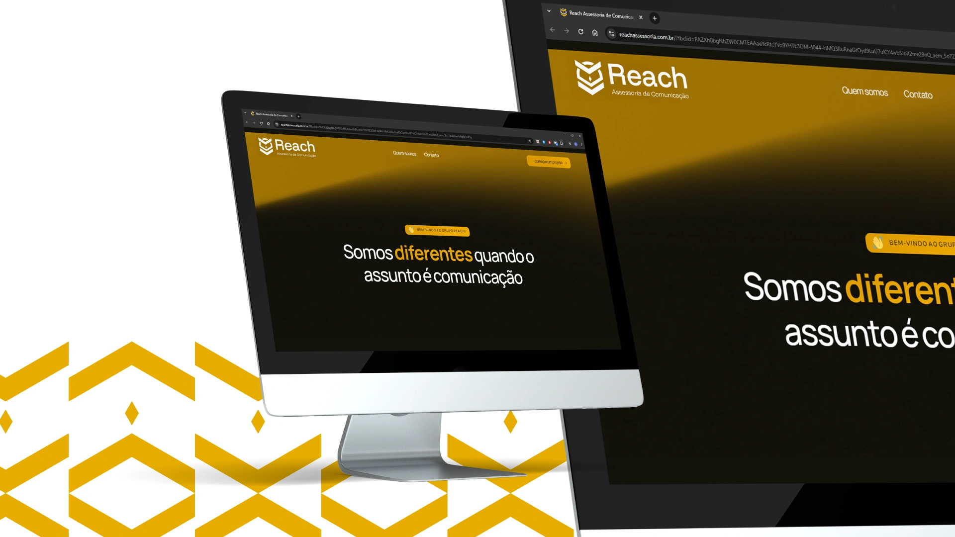
"Somos diferentes quando o assunto é comunicação"
A Reach é uma assessoria de comunicação especializada em oferecer soluções estratégicas para instituições de pesquisa e sociedades científicas. Seu principal objetivo é ser uma ponte eficiente entre a produção científica e o público, tornando a comunicação mais clara, acessível e impactante.
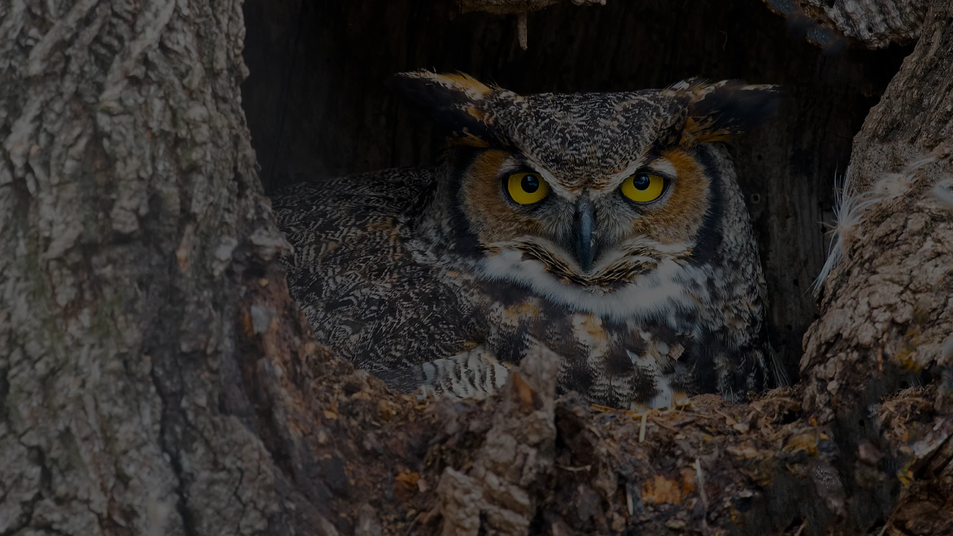
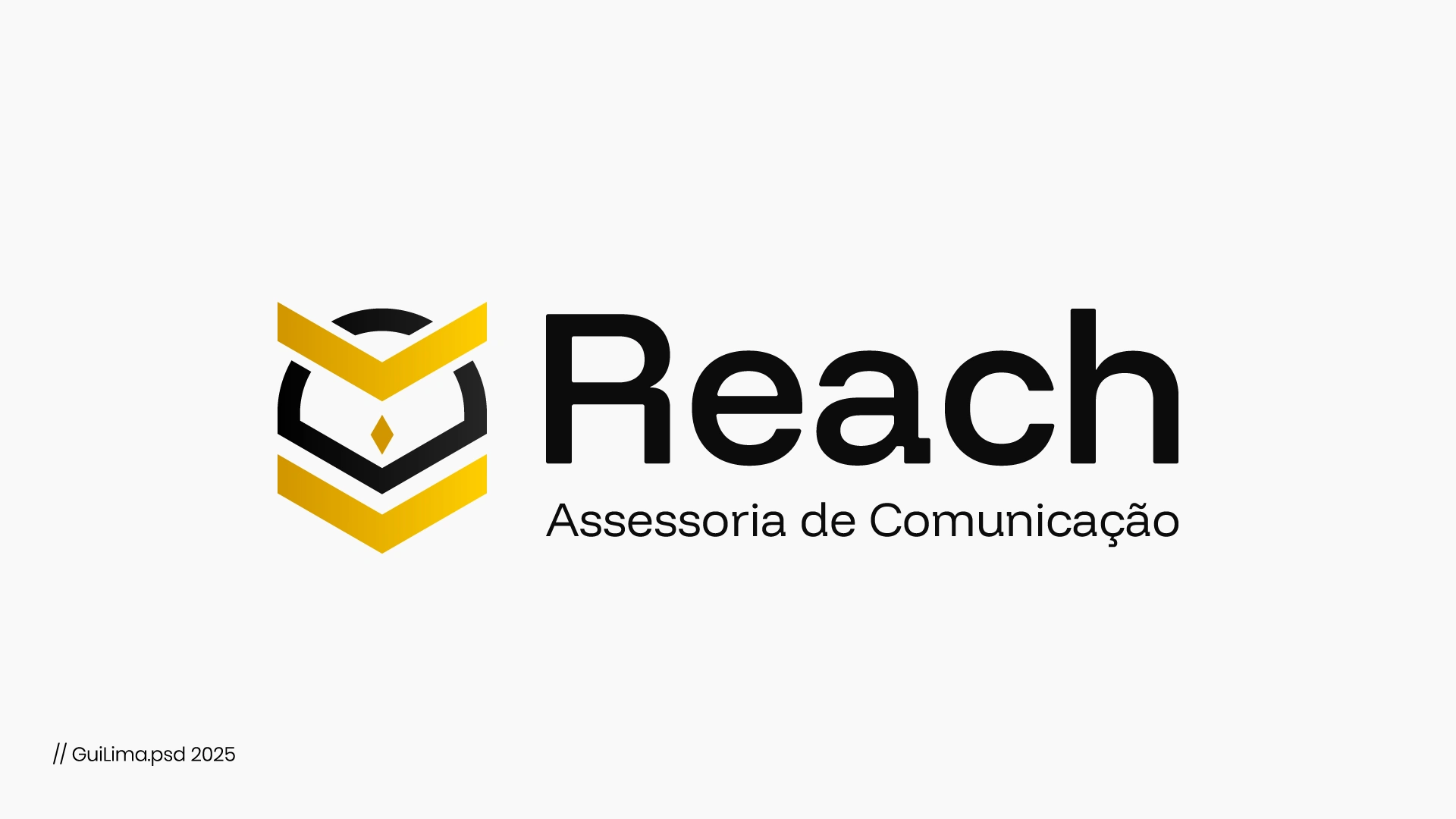
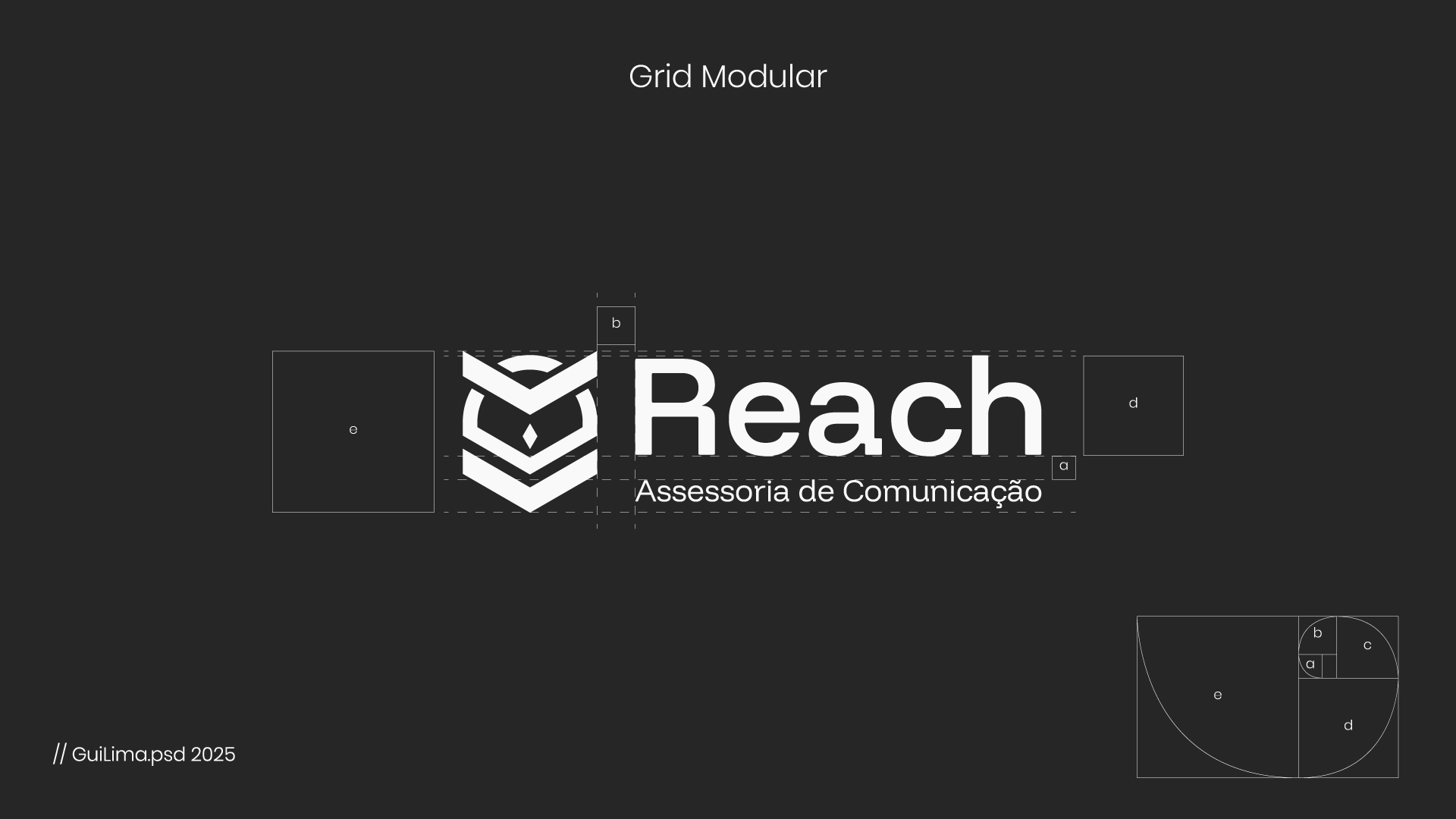
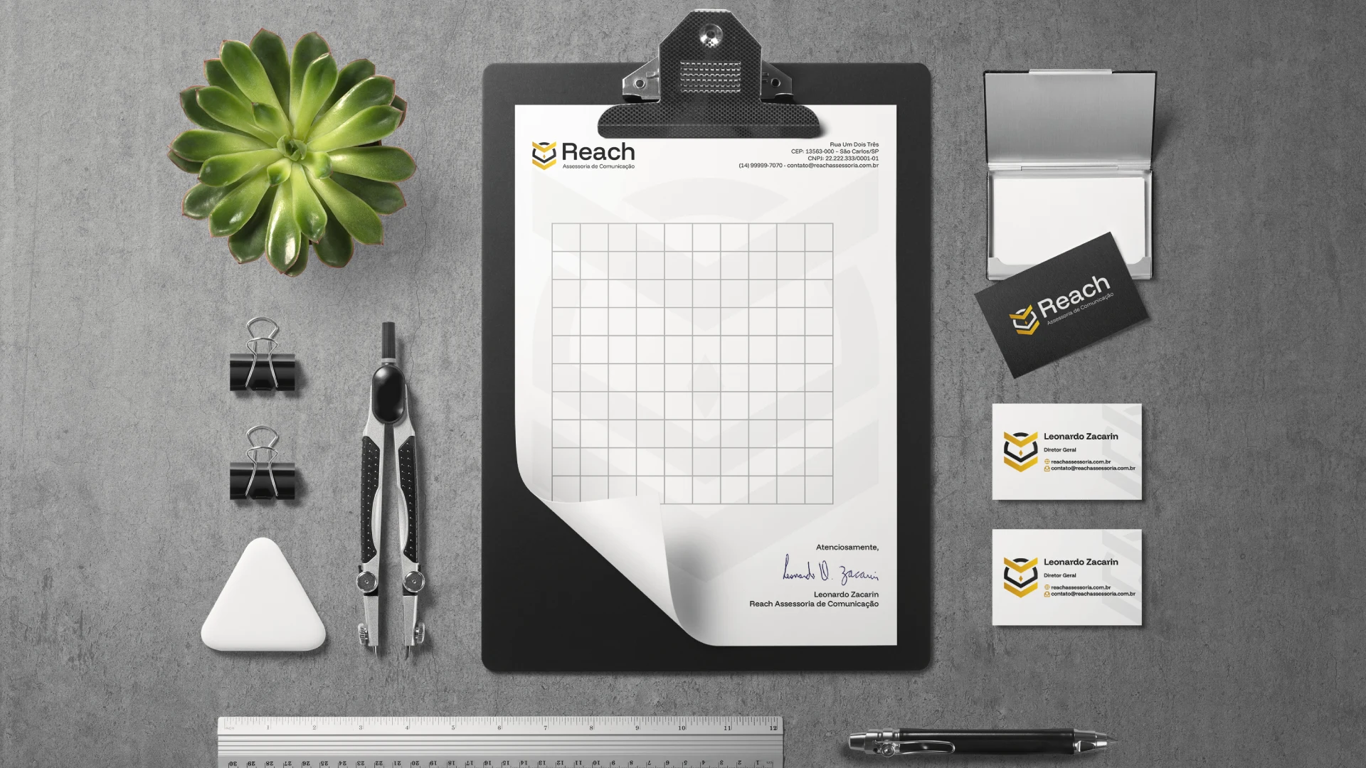
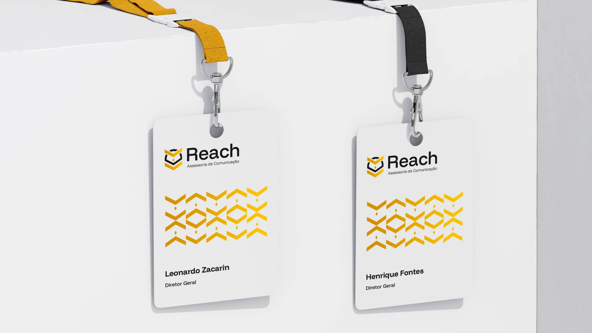
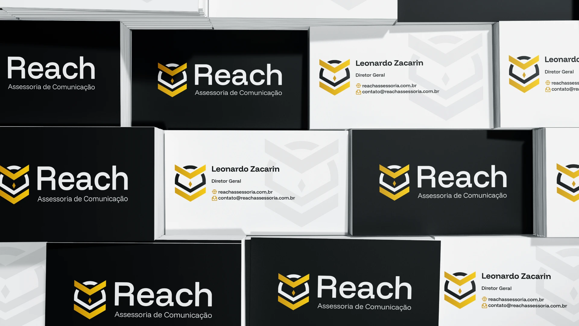
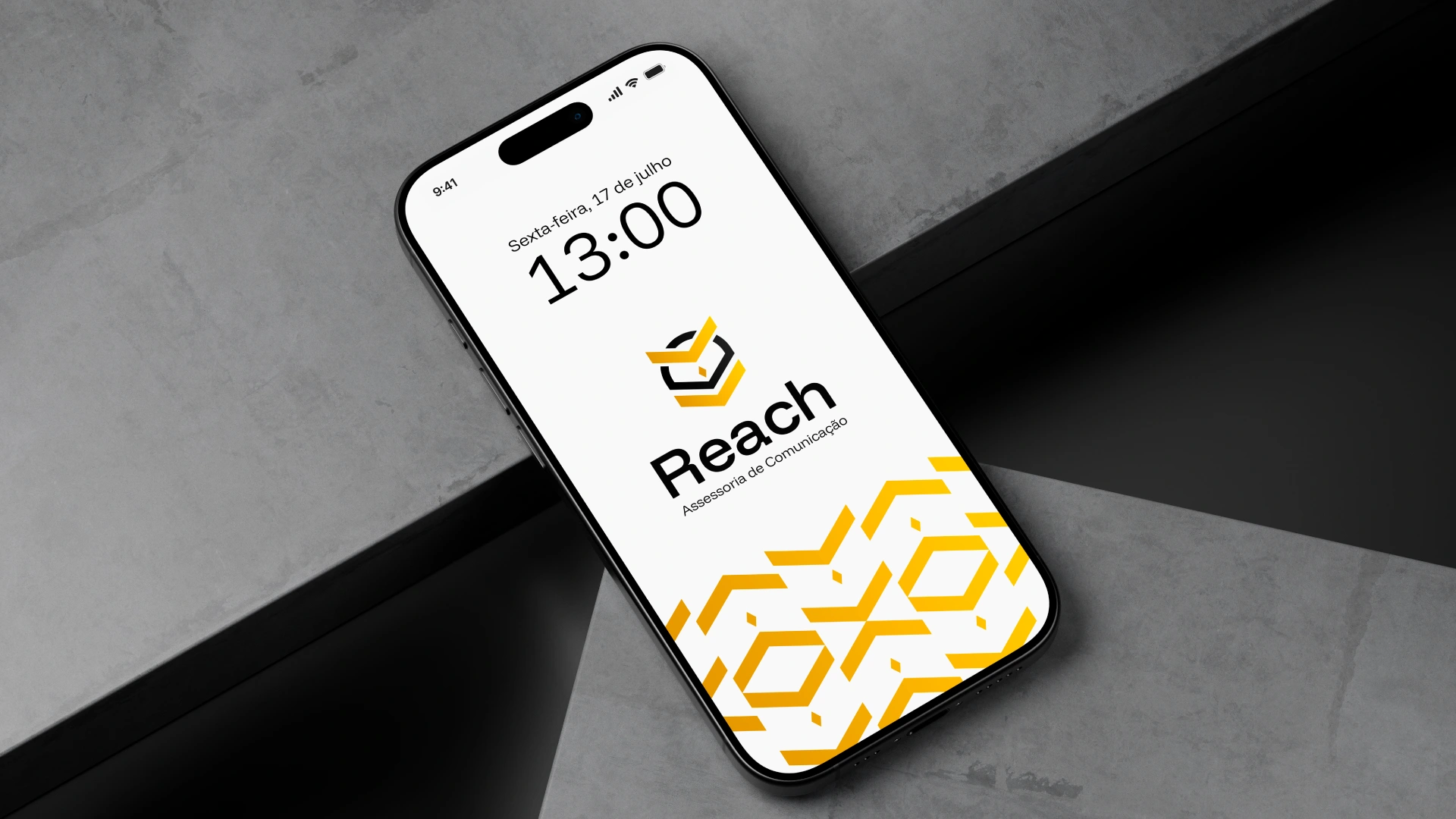
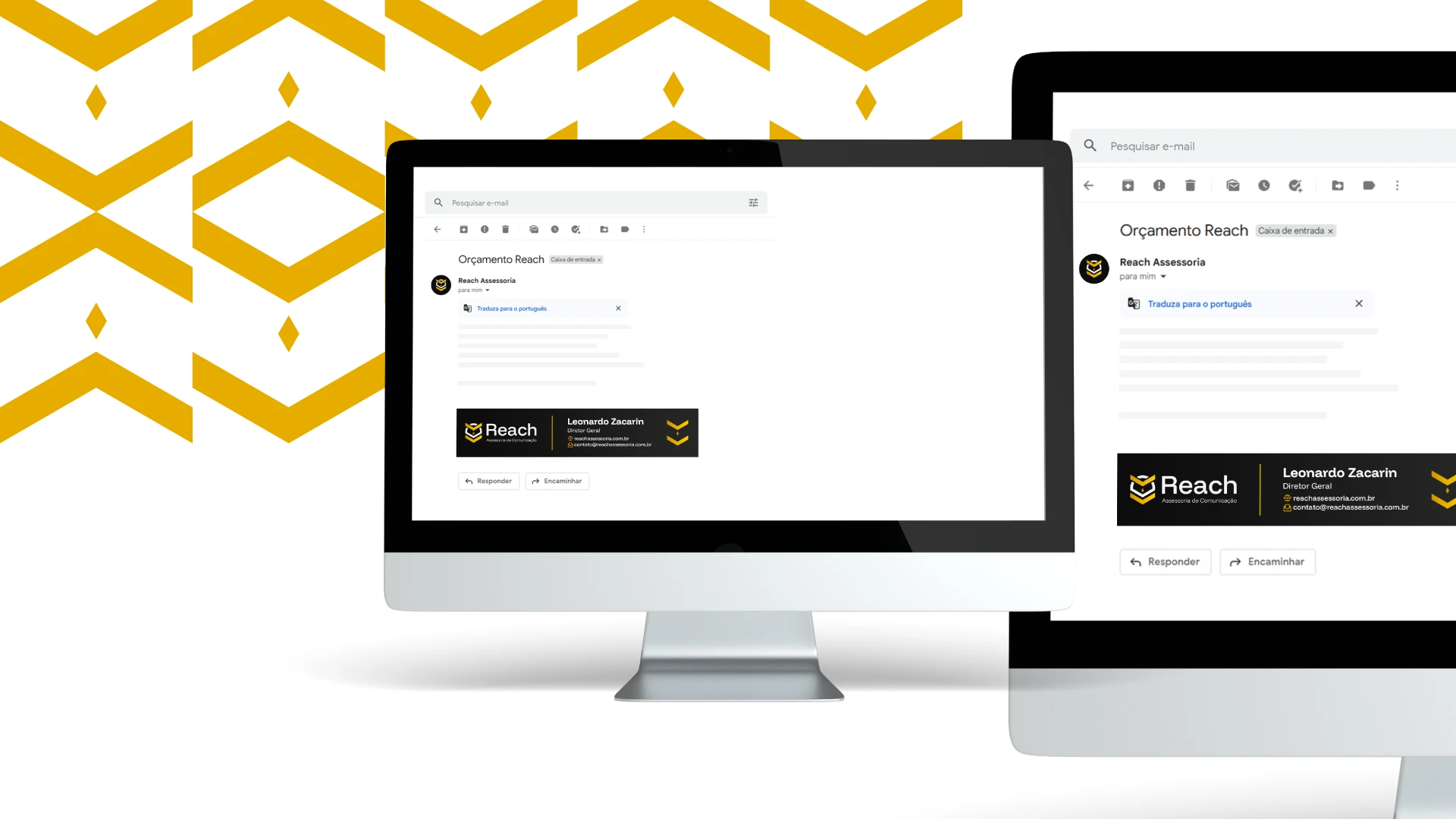
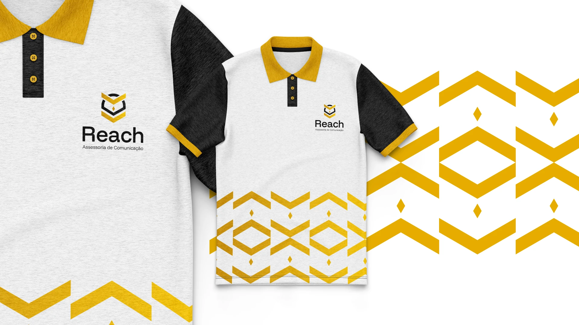
Desenvolvemos a identidade da marca a partir do próprio nome – Reach, que em inglês significa "alcançar" – refletindo nossa missão de ampliar o alcance da ciência e dos clientes. O símbolo da coruja foi escolhido por representar sabedoria, inteligência e visão estratégica, qualidades fundamentais para uma comunicação eficaz no ambiente científico.
A estética clean e objetiva da marca foi pensada para transmitir clareza, confiança e profissionalismo. A simplicidade visual permite que a mensagem se destaque, ao mesmo tempo em que reforça a sofisticação e a seriedade do trabalho da Reach. -
"Communication is where we make the difference."
Reach is a communication consultancy specialized in delivering strategic solutions for research institutions and scientific societies. Your goal is to be a reliable bridge between scientific production and the public, making communication clearer, more accessible, and impactful.
The brand identity was developed around the name Reach—symbolizing our mission to extend the reach of science and the clients. The owl icon was chosen for its associations with wisdom, intelligence, and strategic vision—key qualities for effective communication in the scientific field.
The brand’s clean and straightforward visual identity was designed to convey clarity, trust, and professionalism. This minimalist approach allows the message to stand out while reinforcing the sophistication and seriousness of Reach’s work.
Like this project

Posted Jun 3, 2026

"Communication is where we make the difference." Reach is a communication consultancy specialized in delivering strategic solutions for research institutions and scientific societies. Your goal is to be a reliable bridge between scientific production and the public, making communication clearer, more accessible, and impactful. The brand identity was developed around the name Reach—symbolizing our mission to extend the reach of science and the clients. The owl icon was chosen for its associations with wisdom, intelligence, and strategic vision—key qualities for effective communication in the scientific field. The brand’s clean and straightforward visual identity was designed to convey clarity, trust, and professionalism. This minimalist approach allows the message to stand out while reinforcing the sophistication and seriousness of Reach’s work.