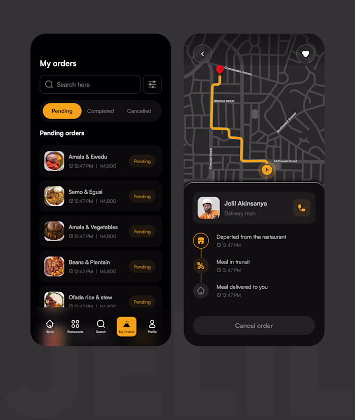
One color. That's all it
ajao jelil
One color. That's all it took. 🟡
I designed this food delivery landing page for ChopHub and the entire visual language runs on a single primary color: amber.
No complex gradients. No trendy glassmorphism. Just disciplined use of one warm, high-energy hue against a deep black surface.
Here's the color strategy behind it:
✦ Amber = action. Every interactive element, buttons, active states, highlights, promo tags, lives in amber. Your eye always knows where to go next.
✦ Black = amplifier. Dark backgrounds don't just look premium, they make warm colors louder. The amber hits different on black than it ever would on white.
✦ Gray = support. Supporting text, inactive nav links, subtle UI elements, all in muted tones. They carry information without competing for attention.
The result? A UI that feels energetic, focused, and on-brand without visual noise.
This is color hierarchy in action. Not color variety. Not color trends. Just knowing where your primary color should live and protecting that space.
If you're building a brand-forward product, try this: strip your design down to ONE primary color + neutrals. You'll be surprised how much cleaner and stronger it gets.
🛠 Tools: Figma
🎨 Palette: Amber #F5A623 + Near-black #0E0E0E
📱 Type: Food delivery app landing page
Open to new projects. Hit Hire Me if you want a UI that works as hard as it looks. 🚀
Like this project
Posted May 6, 2026
One color. That's all it took. 🟡 I designed this food delivery landing page for ChopHub and the entire visual language runs on a single primary color: amber...
Likes
0
Views
1
Tags