Green Beer Day Event Website design
Syed Usman Ali
Case Study: Green Beer Day Chi '26 – Digital Event Presence
1. Project Overview
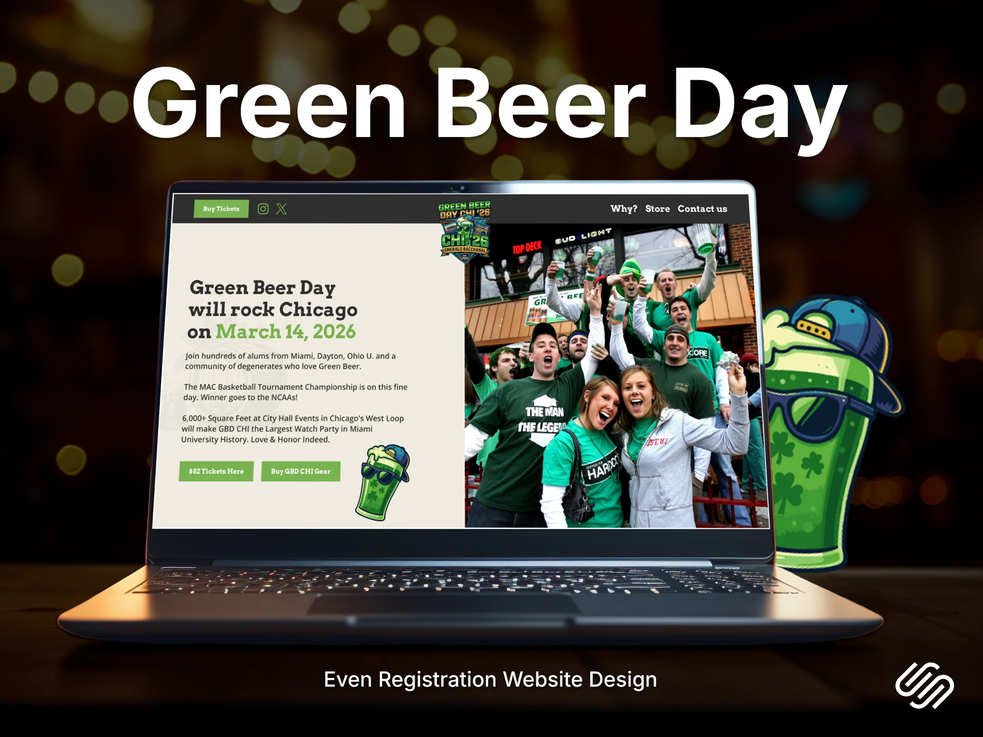
Green Beer Day Chi '26 is a high-energy alumni and community event held in Chicago, celebrating a long-standing collegiate tradition. The goal was to design a comprehensive digital registration platform and brand identity that captures the excitement of the event while providing a seamless flow for ticket sales and information.
Role: Lead UI/UX Designer & Brand Strategist
Target Audience: College alumni, Chicago locals, and "Green Beer Day" enthusiasts aged 21–35.
Objective: To create a "Super Green" digital experience that drives ticket registrations and highlights the event’s unique Chicago location.
2. The Design Challenge
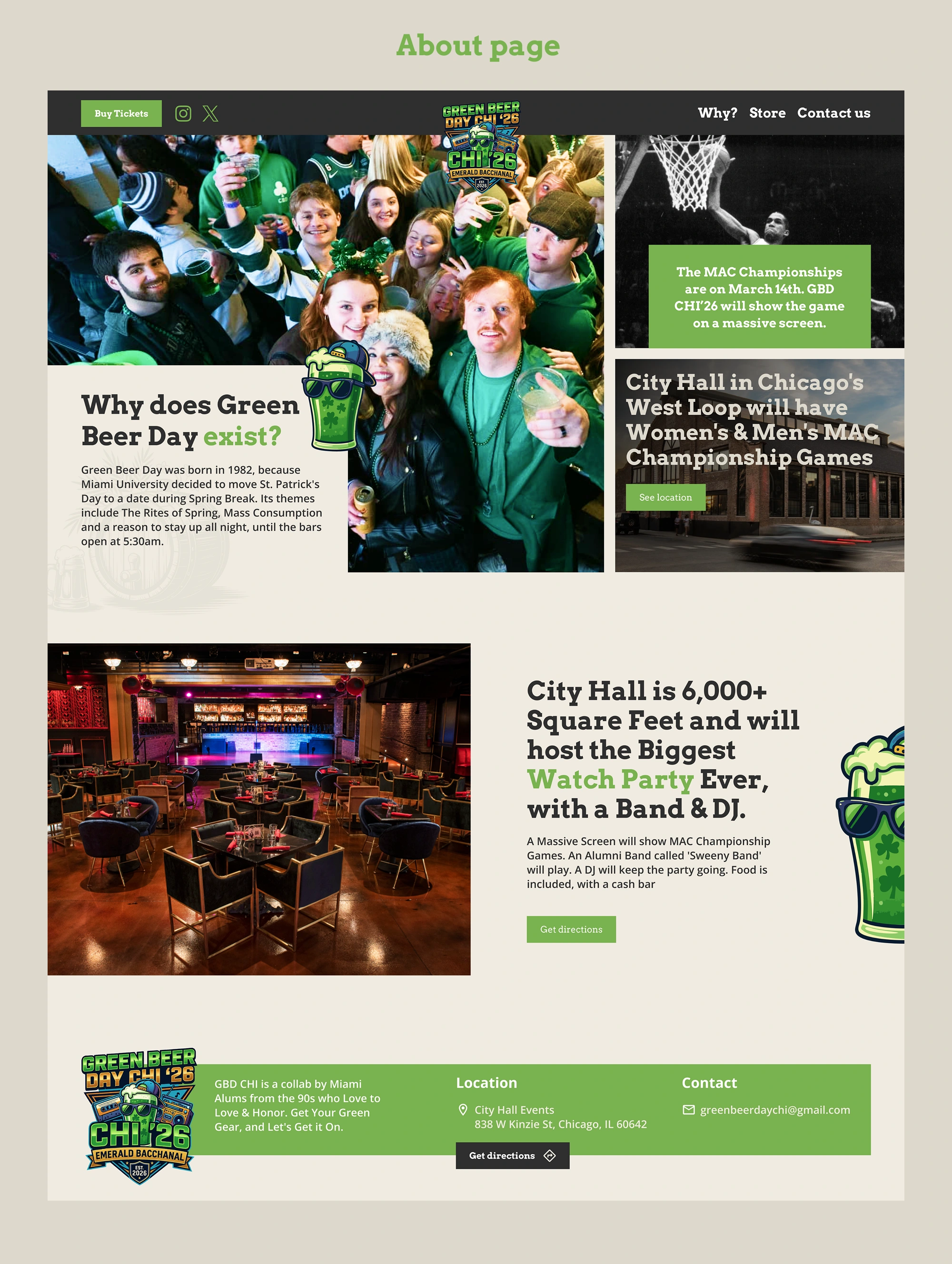
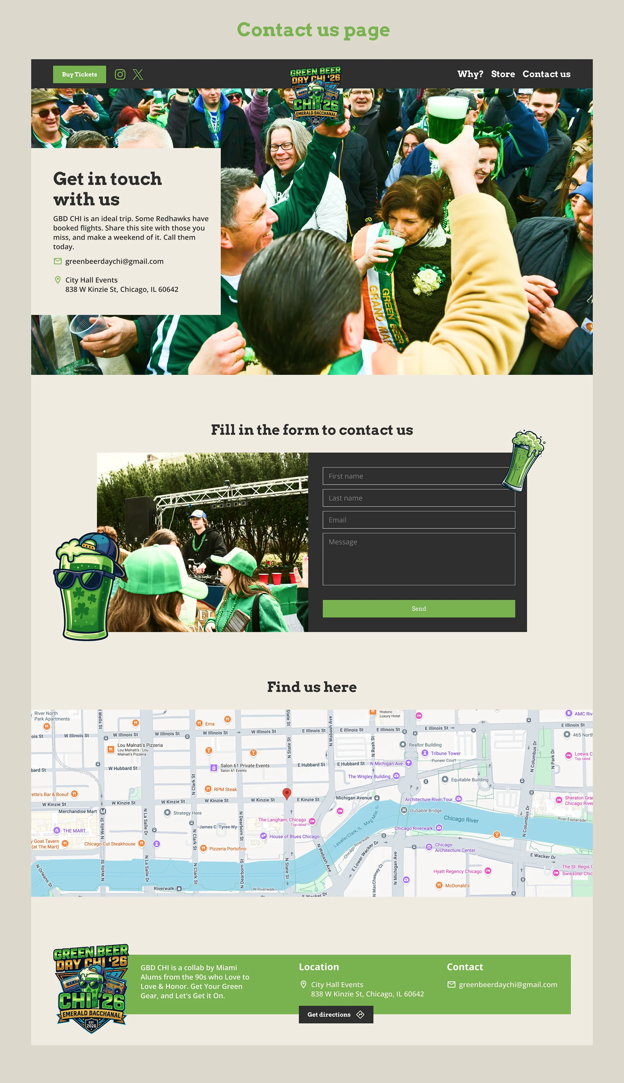
The primary challenge was to balance a "party aesthetic" with information hierarchy. Event websites often become cluttered with photos and lose the "Register" button in the noise. I needed to ensure that while the site looked like a celebration, the path to buying a ticket was always clear and accessible.
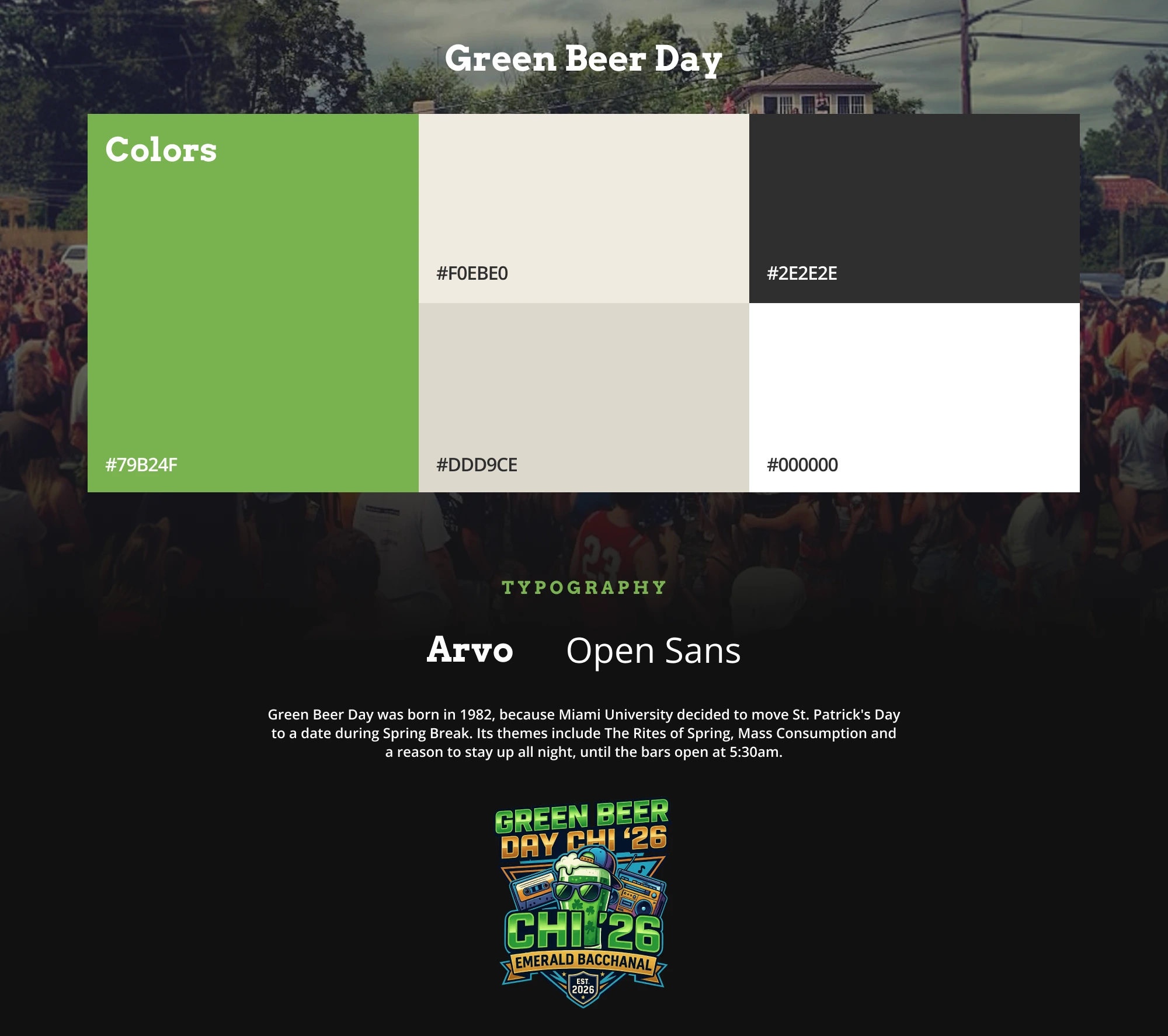
3. Brand Identity & Visual Language
I developed a custom style guide to ensure the "Green Beer" theme was consistent across all touchpoints.
Color Palette: "The Neon Brew"
Electric Lime (#75B24F): Used as the primary action color for buttons and highlights to represent the signature green beer.
Deep Charcoal (#2E2E2E): Used for backgrounds to make the green and white elements "pop" and provide a modern, nightlife feel.
Bone White (#F0EBE0): Used for body text to maintain high readability against dark backgrounds.
Typography
Heading (Arvo): A bold, slab-serif font that gives a "collegiate" and "varsity" feel, nodding to the event's university roots.
Body (Open Sans): A clean, modern sans-serif to ensure event details and locations are easy to read on mobile devices.
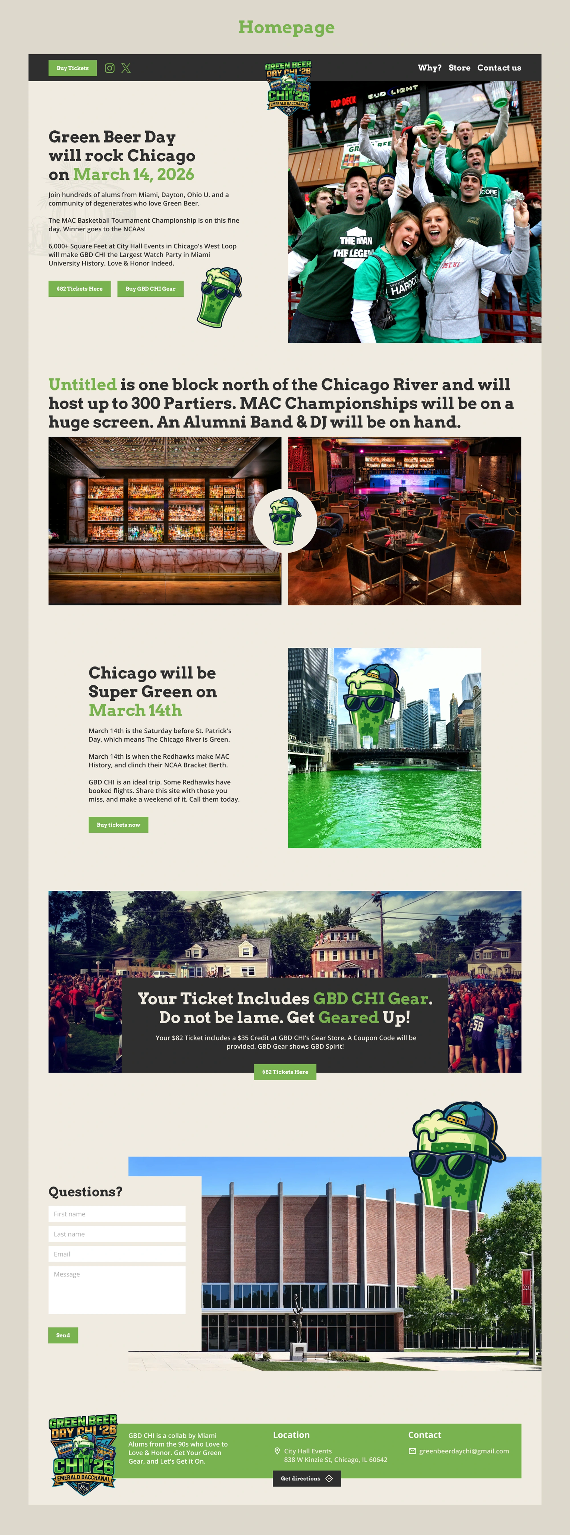
4. Web Architecture: The Homepage
The homepage was designed as a high-conversion "One-Page" layout to keep users focused.
The Hero Section: Featured a bold countdown and "March 14, 2026" date to create a sense of urgency.
The Narrative: I integrated the history of Green Beer Day (born in 1952) with modern Chicago imagery, such as the dyed green Chicago River, to create a sense of belonging and tradition.
Social Proof: Large imagery of crowds and previous events was used to build FOMO (Fear Of Missing Out).
The Venue Spotlight: A dedicated section for "Untitled," the host venue, featuring interior photography to set expectations for the upscale yet energetic atmosphere.
5. Technical Solutions & UI Features
Sticky Registration: The "Get Tickets" button remains prominent to ensure conversion isn't lost while scrolling through photos.
Mobile-First Grid: Given that most event seekers find details via social media (Instagram/TikTok), the grid was optimized for single-column mobile viewing.
Iconography: Custom beer-character illustrations were used throughout the site to add a "mascot" feel and make the brand more approachable and fun.
6. Key Takeaways
This project successfully combined nostalgia with modern UI practices. By using a dark UI theme and high-contrast lime green accents, we created a digital space that feels like the event itself—vibrant, loud, and unmistakable.
Results:
Established a cohesive brand identity for the 2026 Chicago chapter.
Streamlined the registration process into a 3-step mobile flow.
Created a scalable design system that can be adapted for future event years.
Like this project
Posted Apr 26, 2026
Designed a high-capacity registration platform on Squarespace, balancing vibrant brand energy with CMS stability for massive traffic surges.