KEISH Design Studio | Rebrand + Logo Design
Ashlyn Jackson
I had the pleasure of creating the branding and logo design for KEISH Design Studio, a newly established creative agency poised to cater to various design requisites, encompassing graphic design, UX/UI, web design, social media, branding, and other related services.
The distinctive logo features a lowercase 'K' intricately designed to incorporate a unique configuration. It comprises a distinctive half of the 'K' complemented by a stacked, three-kidney bean design on the right side. The symbolism behind the three kidney beans emanates from the proprietor's personal narrative, having undergone a kidney transplant, which results in a person having three kidneys instead of any being removed. The complementary half of the icon is meticulously fashioned to emulate a chair, providing a visual association for the bean character.
Within the framework of our brand, The Bean character has organically evolved to assume a pivotal role in our illustrative materials. This character is a captivating narrator, guiding our audience through our brand's diverse offerings and engaging narratives.
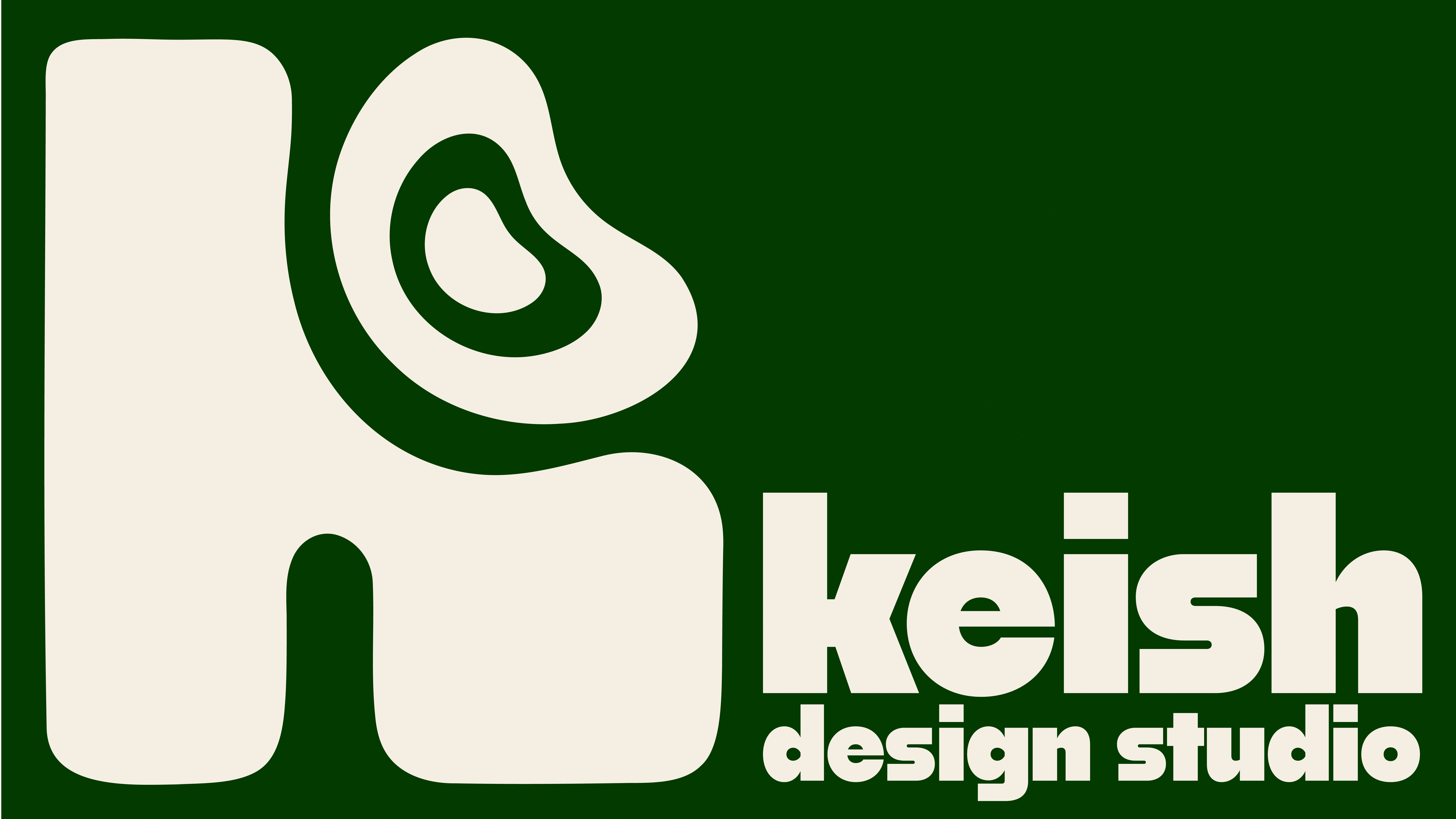
Logo Design
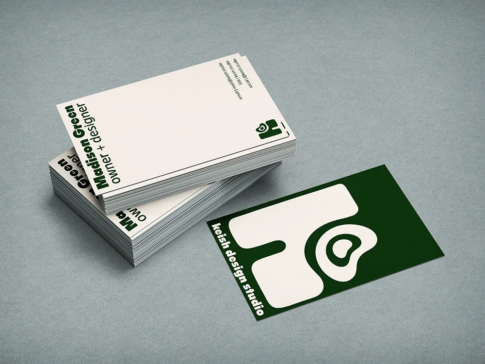
Business Cards
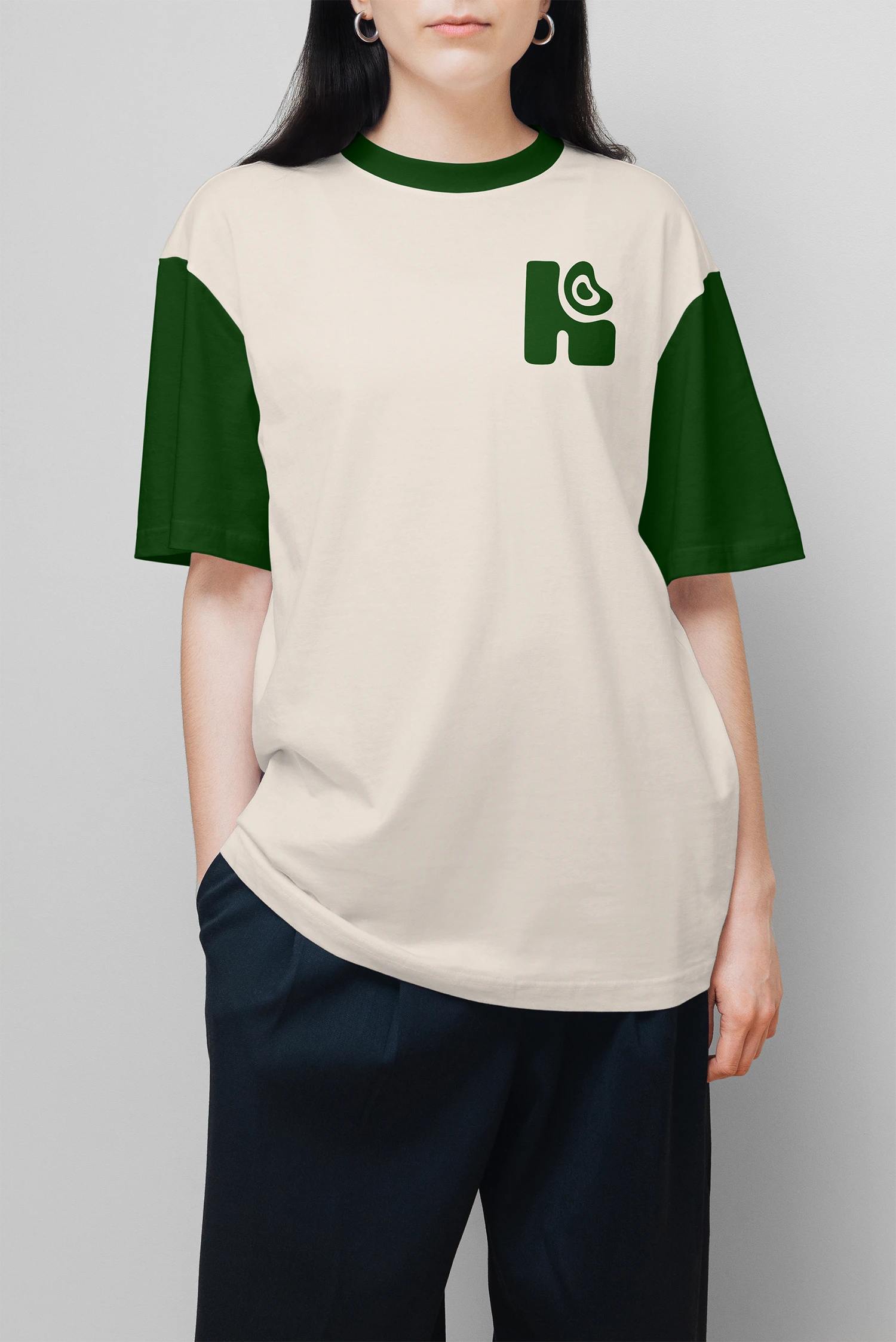
Front Shirt Design
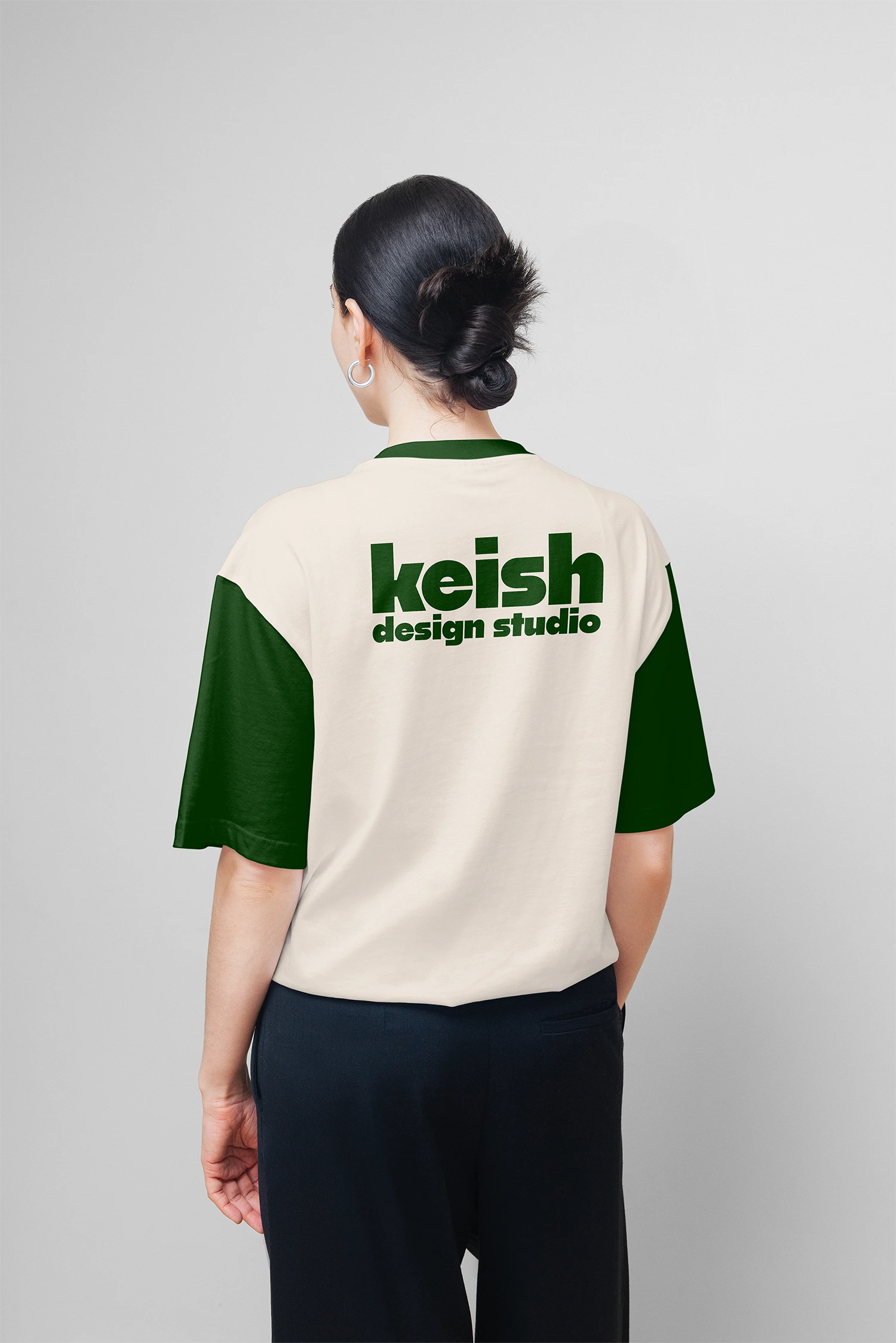
Back Shirt Design
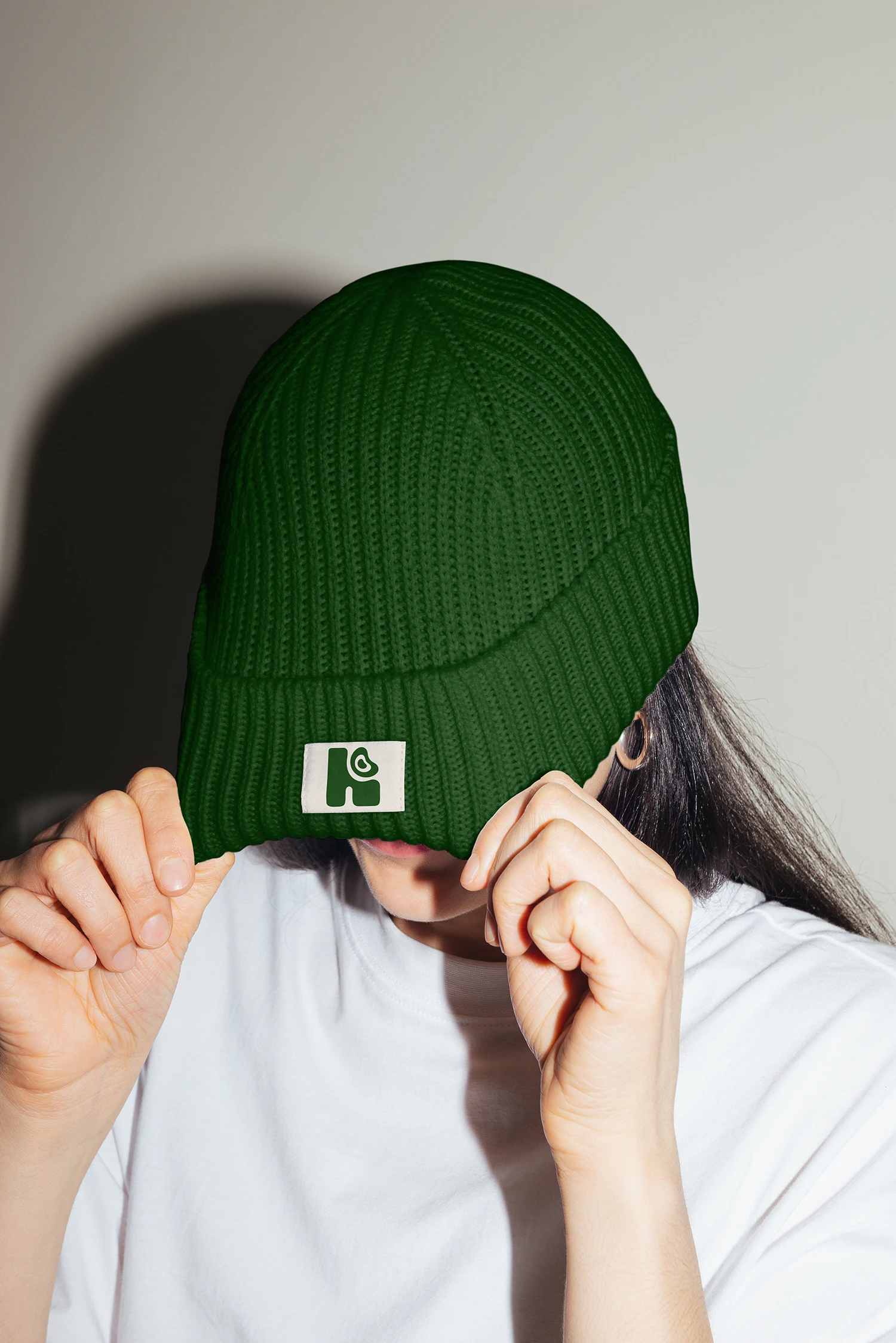
Beanie Design
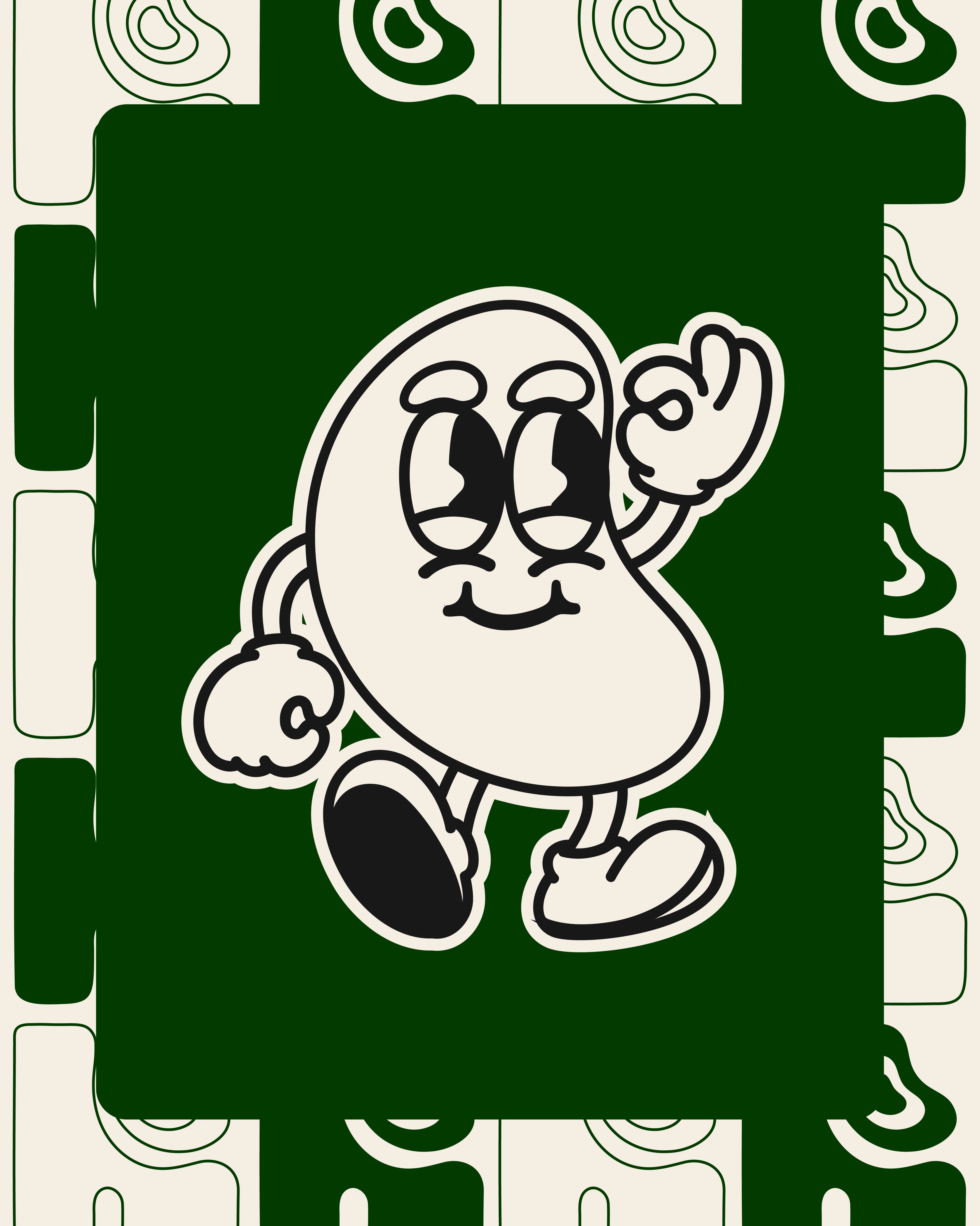
Bean Character
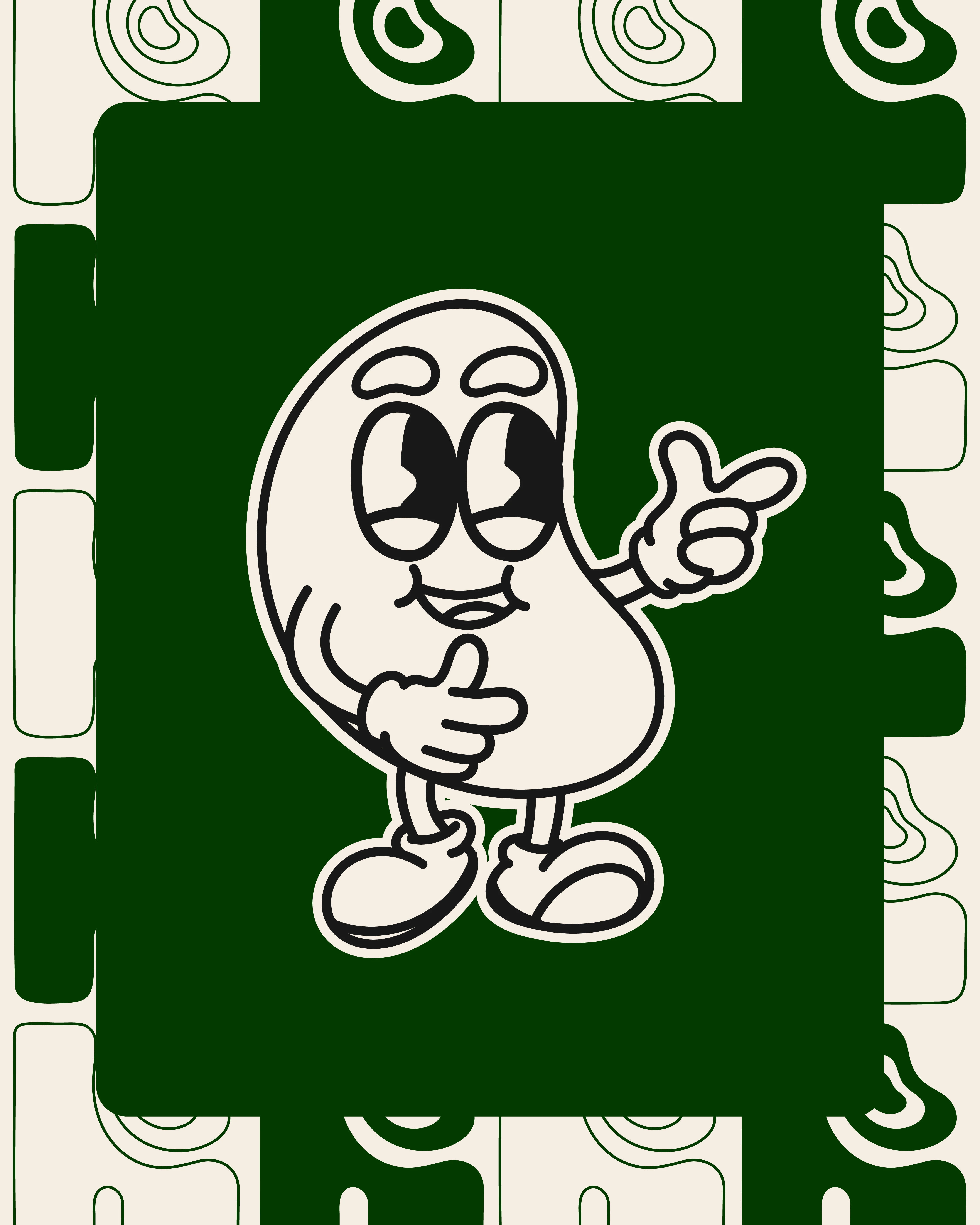
Bean Character
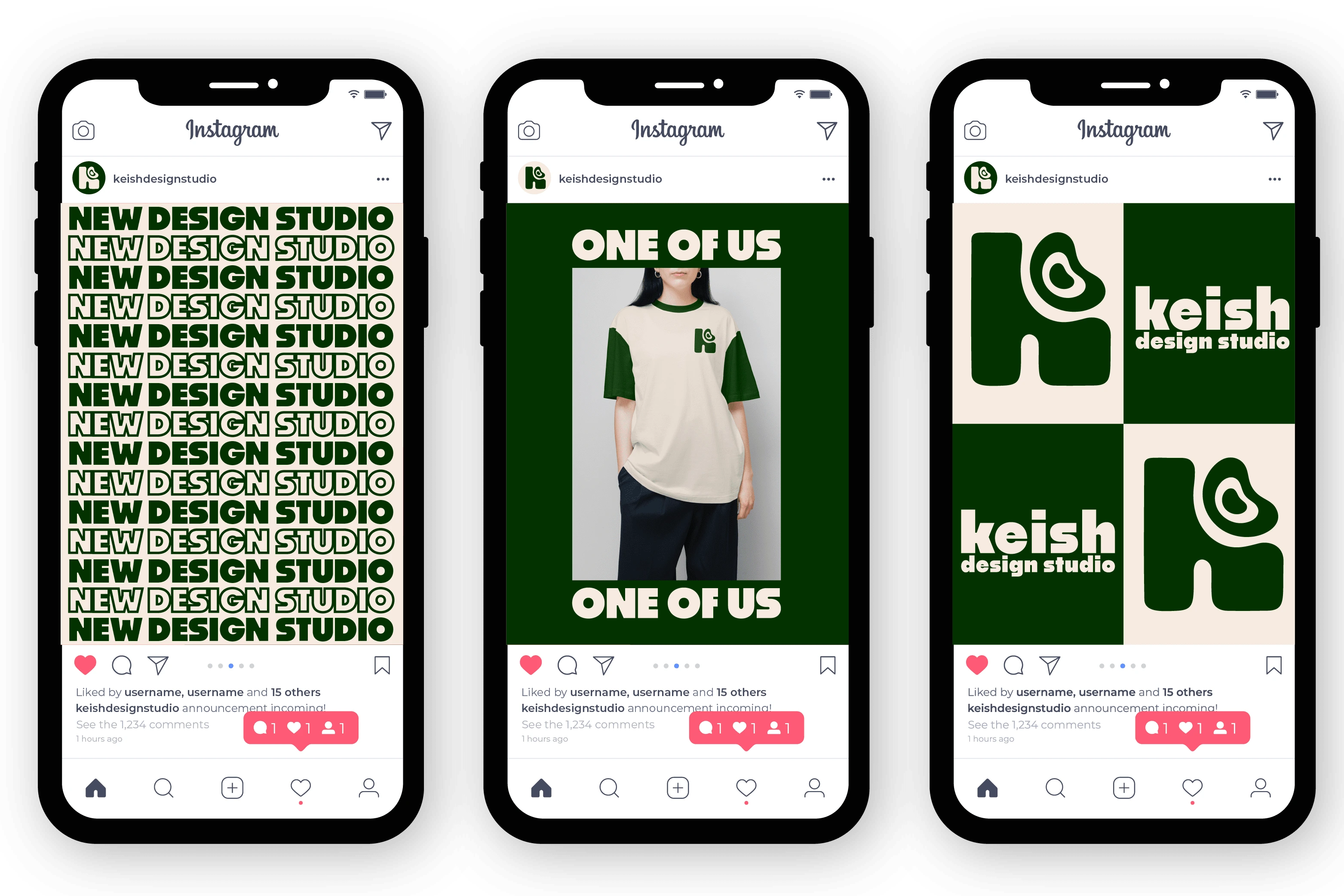
Social Media
Like this project
Posted Sep 30, 2024
Rebranding project for an already existing brand design. Updated the logo design and created a more engaging brand.
Likes
3
Views
110
Clients
KEISH Design Studio