Dedoose Responsive Site Design
Stephanie Spencer
Redefining the creative direction of an acclaimed research platform
Overview
Dedoose, a web-based app trusted by educators, medical professionals, UX researchers, and government agencies, needed a fresh creative direction to better reflect its reputation and attract new users. As Creative Director and UX/UI Designer, I partnered with Business Development and Digital Communications to modernize the brand and website, ultimately improving user experience, brand perception, and acquisition potential.
The Challenge
Despite its credibility among researchers, Dedoose’s digital presence didn’t reflect its influence. The marketing website felt dated, the brand lacked consistency, and teams struggled with updating and maintaining content. My goal was to deliver a modern, consistent brand system and website that stood shoulder-to-shoulder with leading SaaS competitors in user research software.
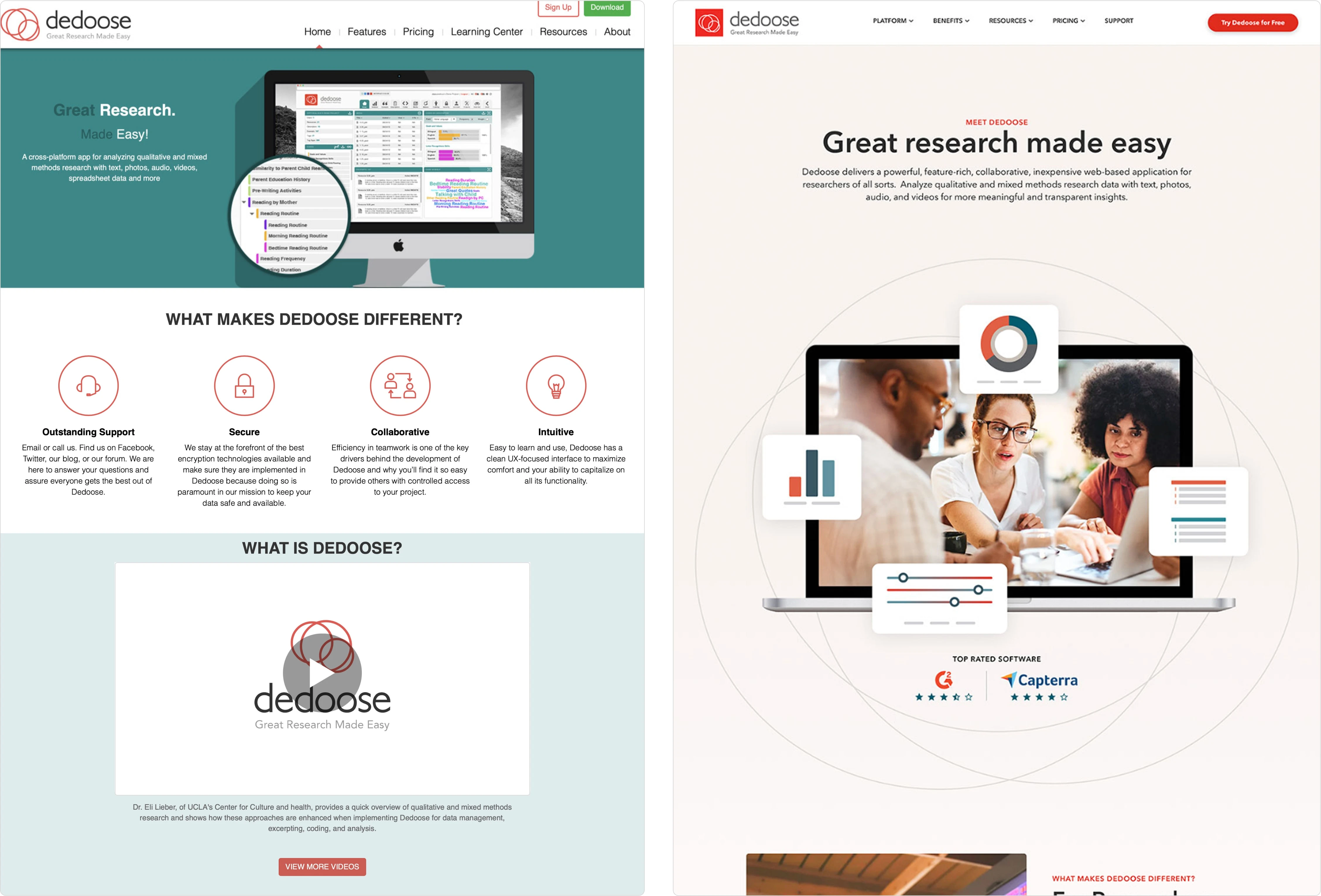
Old Homepage (left) and New Homepage Design (right)
My Approach
I took a phased approach, starting with brand alignment and moving through research, strategy, design, and implementation. Each step built momentum, ensuring the final product wasn’t just visually polished, but strategically designed for performance.
Brand Guidelines – Expanded the guidelines with a refreshed color palette, co-brand rules, graphic/photography styles, and usage standards, creating a solid foundation for consistency across all touchpoints.
Competitive Analysis – Benchmarked against best-in-class research and SaaS platforms to identify opportunities for differentiation and UX improvement.
Content Audit & Sitemap – Streamlined messaging, eliminated redundancies, and structured content for better SEO and discoverability.
Wireframes & Prototypes – Built in Figma and Axure to simulate realistic interactions, aligning stakeholders on flow and placement before design execution.
Visual Direction (Style Tiles & Library) – Defined a modern, approachable UI system with reusable components for efficiency and scalability.
Page Mockups & Webflow Development – Designed and launched a responsive, CMS-driven website in Webflow, with reusable modules for faster updates.
Documentation & Handoff – Authored a Notion wiki and video tutorials so the team could confidently maintain and evolve the site post-launch.
Brand Guidelines
I started by reshaping the brand identity through enhancing the existing guidelines. This included refining the color palette for accessibility, defining typography and photography styles, creating rules for co-branding, and specifying how graphics should be applied—giving the team a clear, consistent playbook across all channels. View the updated brand guide.
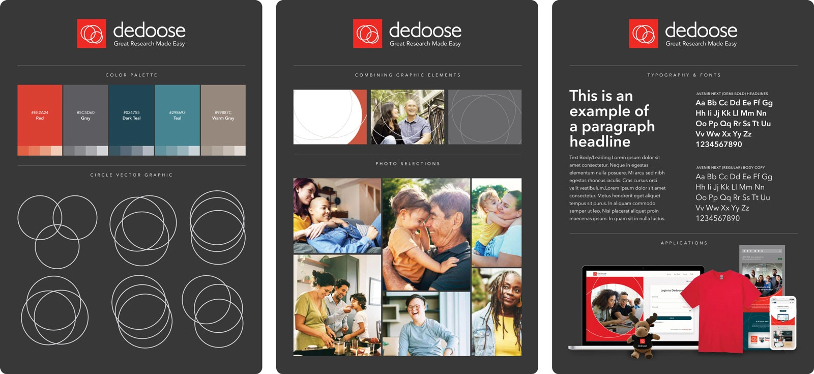
Refined Brand Guide Elements
Competitive Analysis & Content Audit
Before diving into design, I reviewed competitor sites to identify UX patterns, messaging opportunities, and visual conventions—capturing them in a Design Recommendations Deck. I also audited existing content, categorizing it by type, purpose, and SEO value, compiling them into a Content Audit Document. These steps revealed gaps and redundancies while shaping a new sitemap and content strategy.
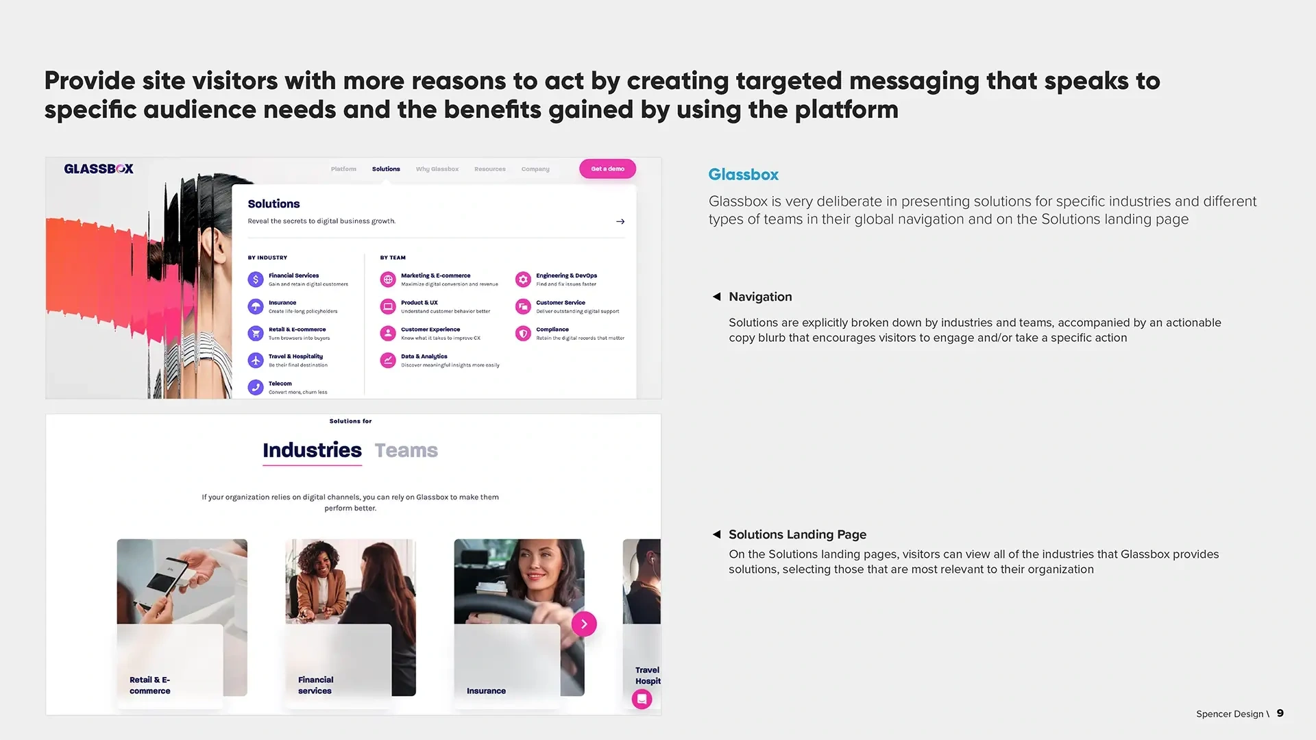
Slide from the Design Recommendations Deck
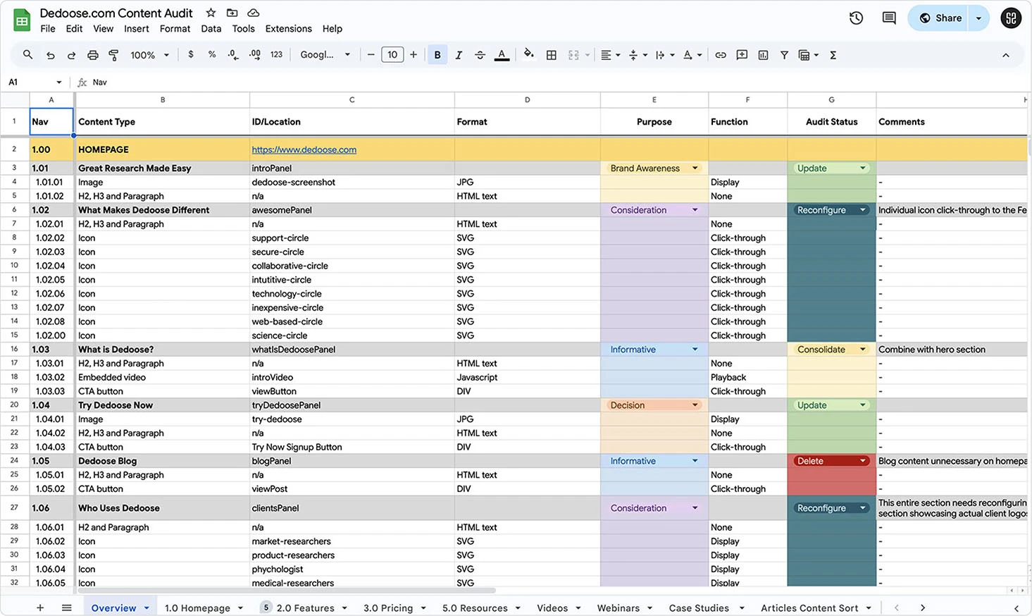
Screenshot of Content Audit Spreadsheet
Wireframes & Prototypes
With content organized, I created wireframes in Figma and built an interactive Axure prototype to simulate real user flows. This gave stakeholders a tangible preview of navigation and layout, aligning the team early on site goals and structure before committing design hours.
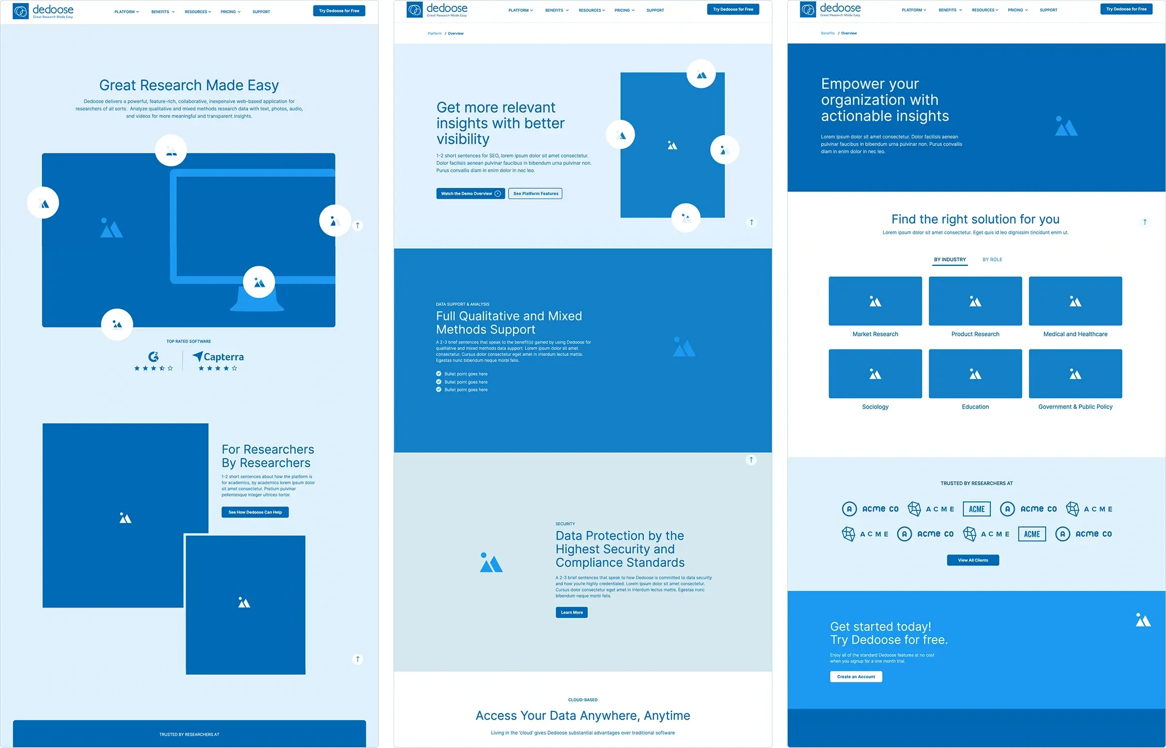
Screenshots of Wireframes from Axure
Style Tiles & Style Library
To define the site’s look and feel, I developed style tiles—exploring color, typography, buttons, and iconography. From there, I built a scalable Figma style library with reusable UI components, ensuring consistency while speeding up design and development.
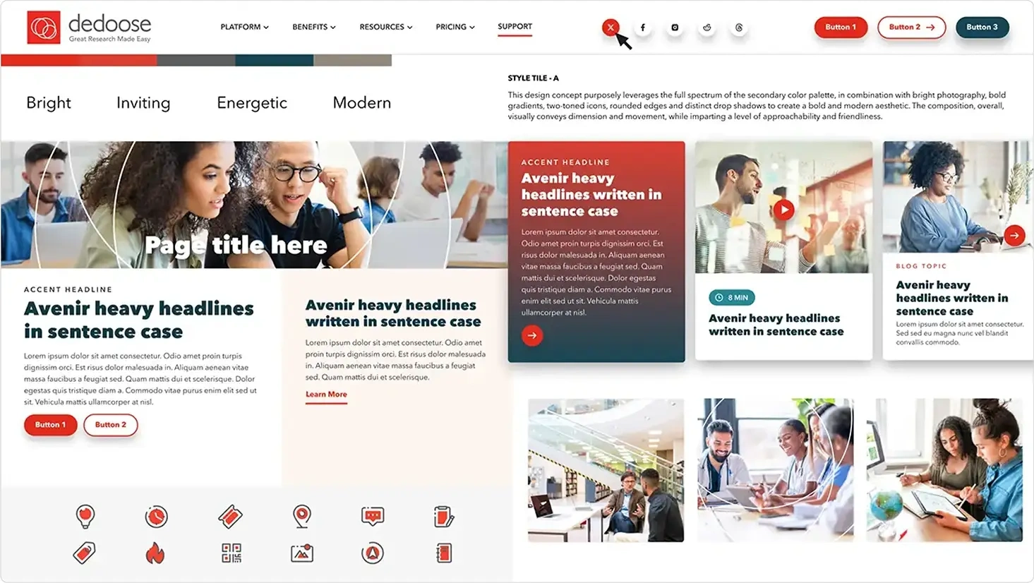
Style Tile Option A
Components from Style Library
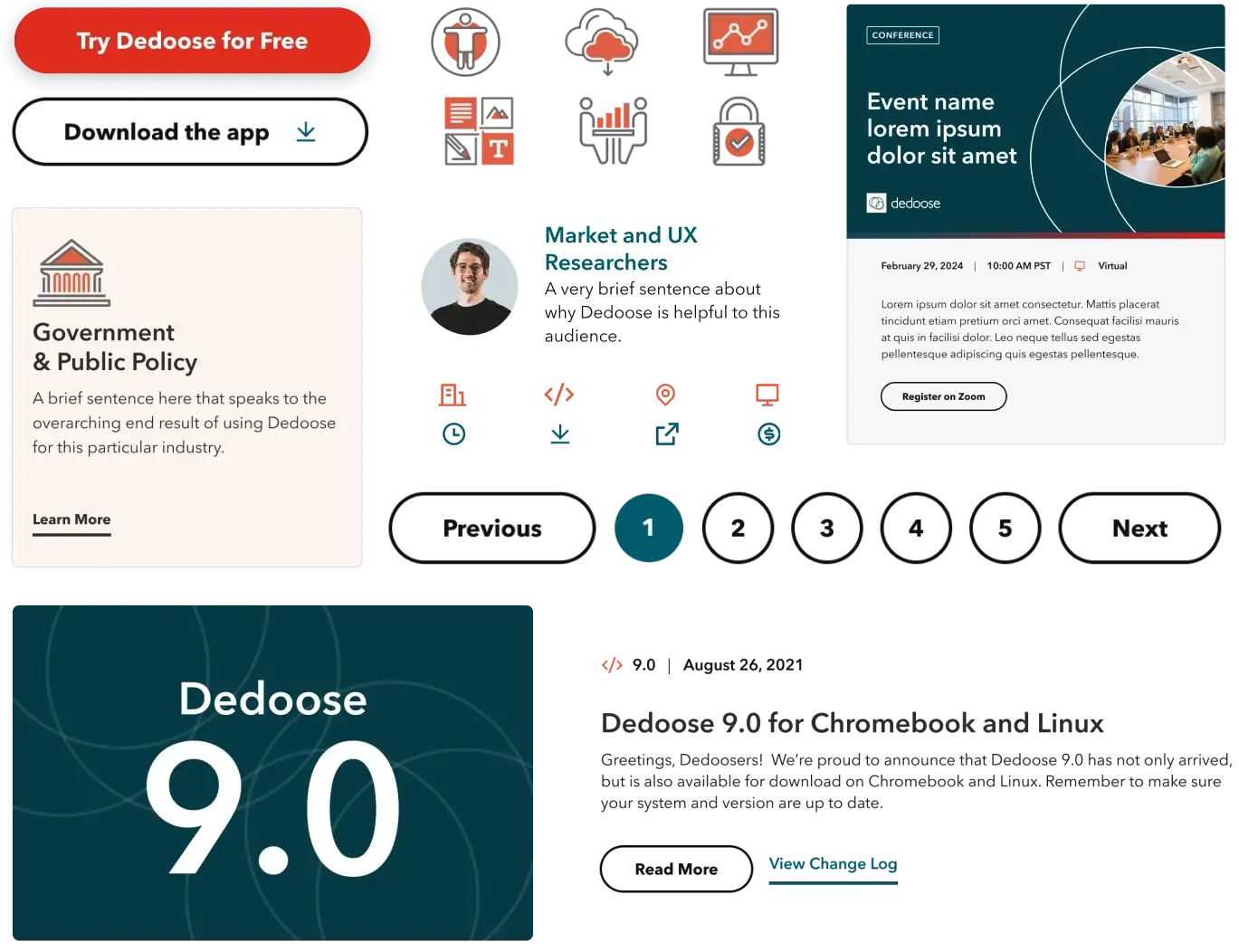
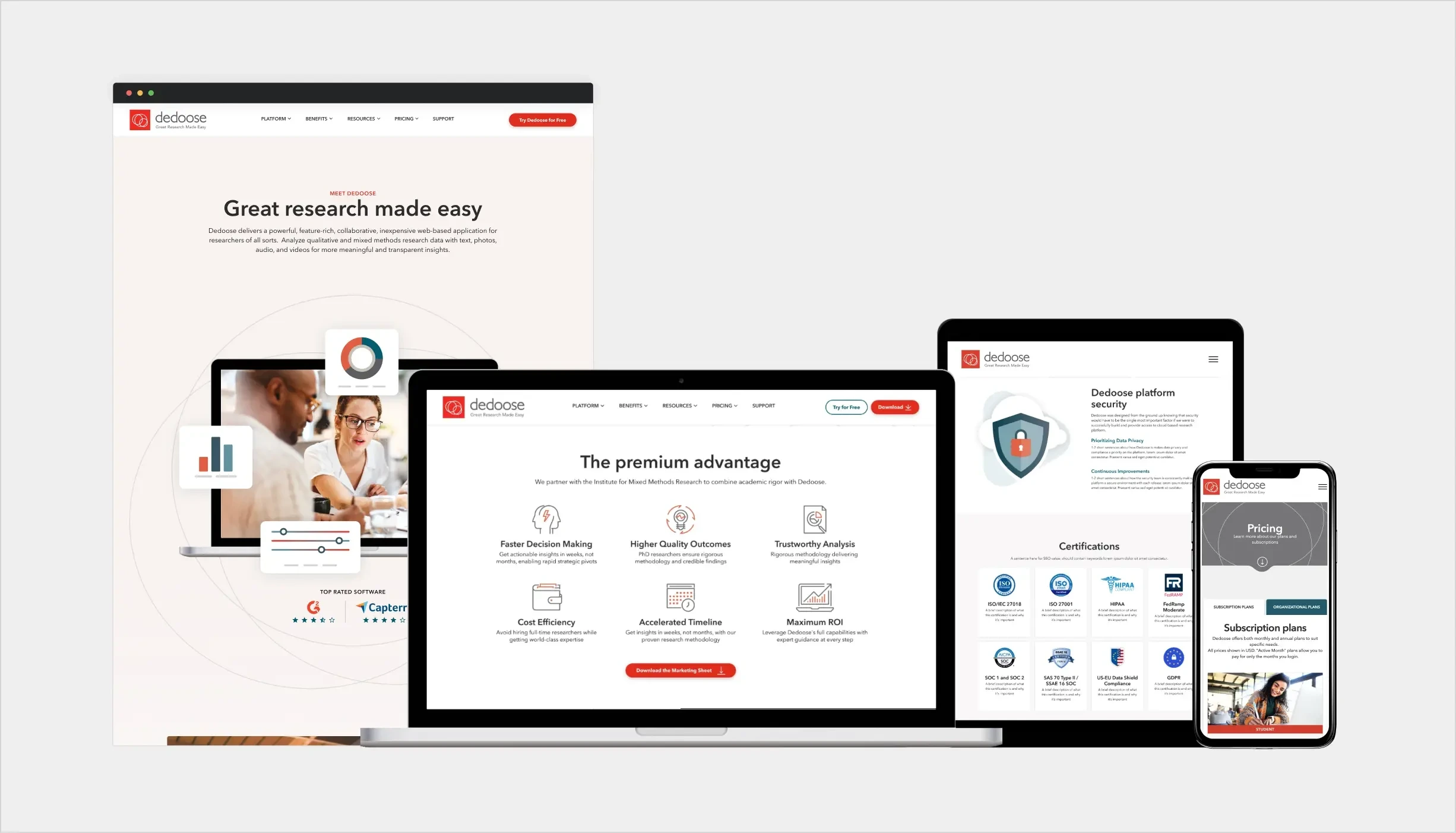
Page Mockups
Using the approved wireframes and design system, I designed key pages—homepage, platform features, benefits and pricing—in Figma. Each screen was optimized for responsiveness, with branded graphics that brought the platform’s story to life in a modern, approachable style.
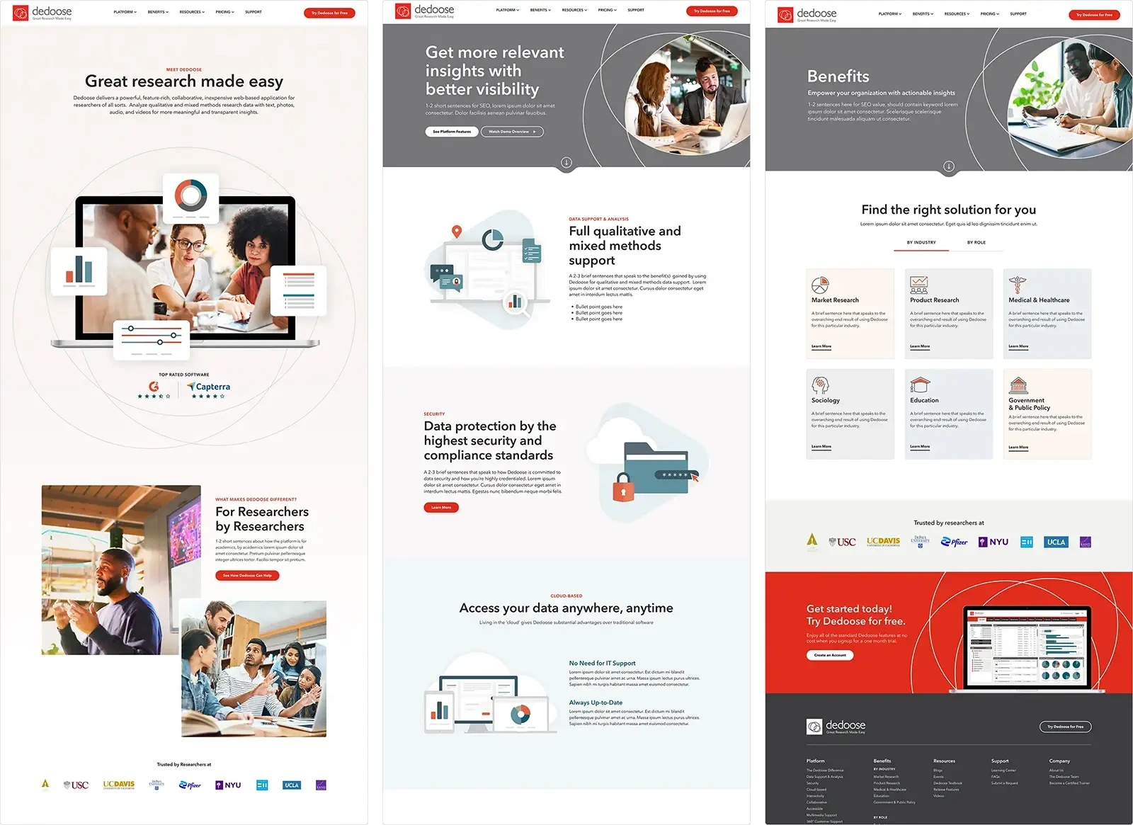
Homepage, Platform and Benefits Page Mockups
Webflow Development
I translated the designs into a responsive Webflow build. By leveraging CMS collections, reusable components, and the Figma-to-Webflow plugin, I created a site that was both consistent with the design system and easy for the team to update without technical barriers.
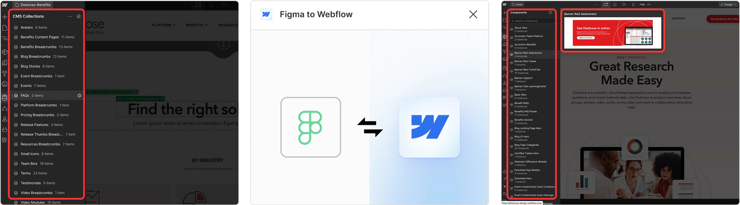
Webflow CMS Collections and Components
Documentation & Handoff
To set the team up for long-term success, I built a Notion wiki with step-by-step documentation and video tutorials. This ensured they could confidently manage updates, expand content, and maintain brand consistency post-launch.
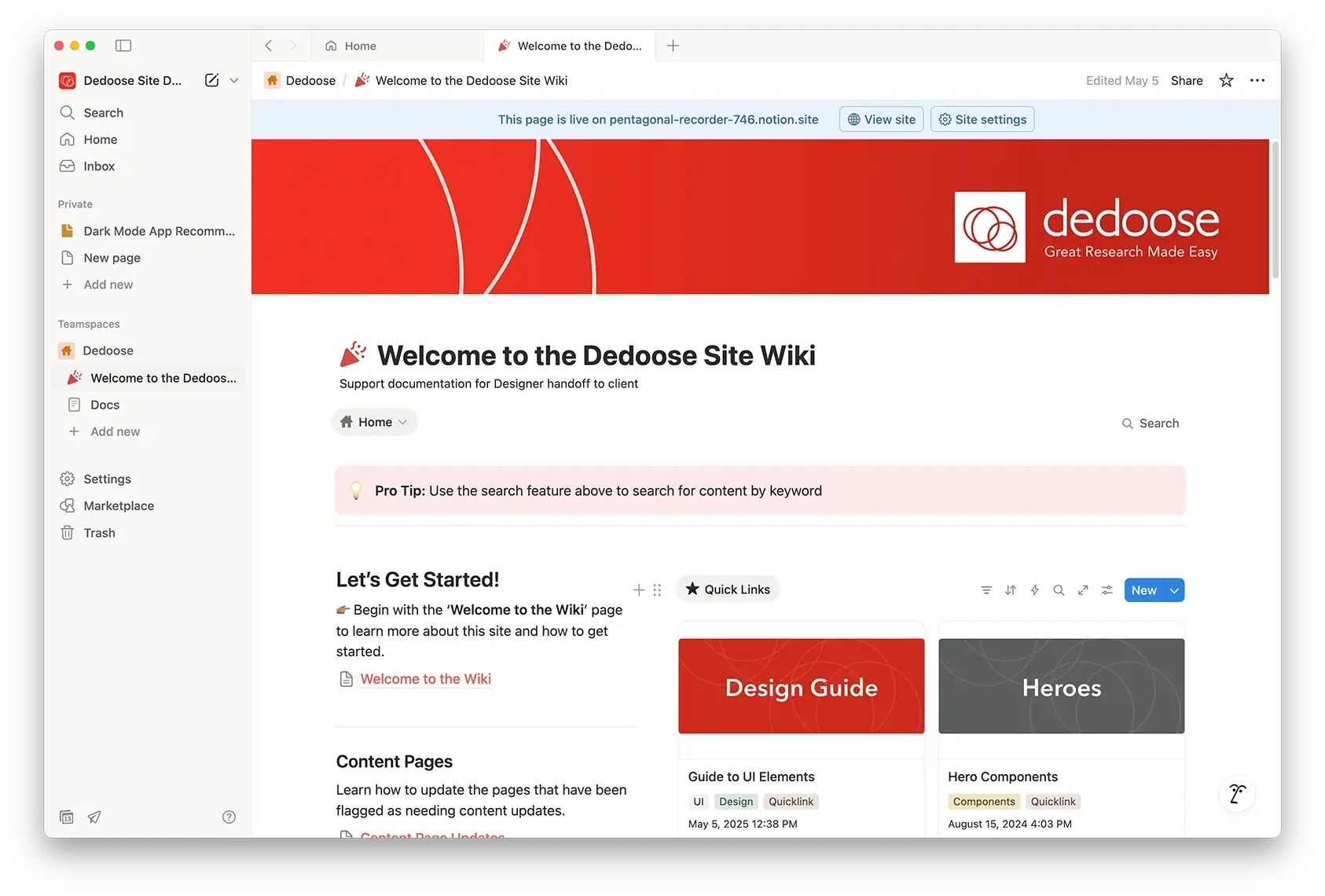
Home Screen from Notion Site
The Outcome
The redesign positioned Dedoose as a modern leader in research software, with a cohesive brand system, improved user experience, and a site the Digital Marketing Comms team could easily maintain. The impact was clear: stronger engagement from users and an immediate 45% lift in traffic when the new site launched.
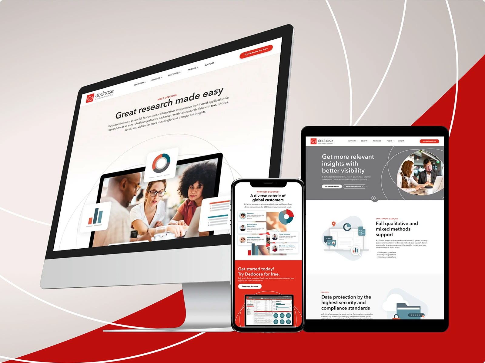
A new and improved Dedoose interface
Like this project
Posted Sep 13, 2025
Redesigned Dedoose.com for improved UX and brand perception.
Likes
0
Views
5