Optimizing UX for a ServiceNow HR Portal
Stephanie Spencer
Making Enterprise Software More User Friendly
While working with Accenture’s global technology team, I evaluated the usability of a self-service HR portal built on ServiceNow. My task was to uncover usability issues and recommend solutions that would make the enterprise software feel as seamless as consumer-facing products. To bring ideas to life, I translated findings into clickable wireframes and inspirational mockups.
The Challenge
The HR portal was essential for employees, but poor navigation, confusing content, and dated presentation made it hard to use. My goal was to identify the most critical usability barriers, prioritize them by severity, and recommend actionable design solutions that would modernize the experience.
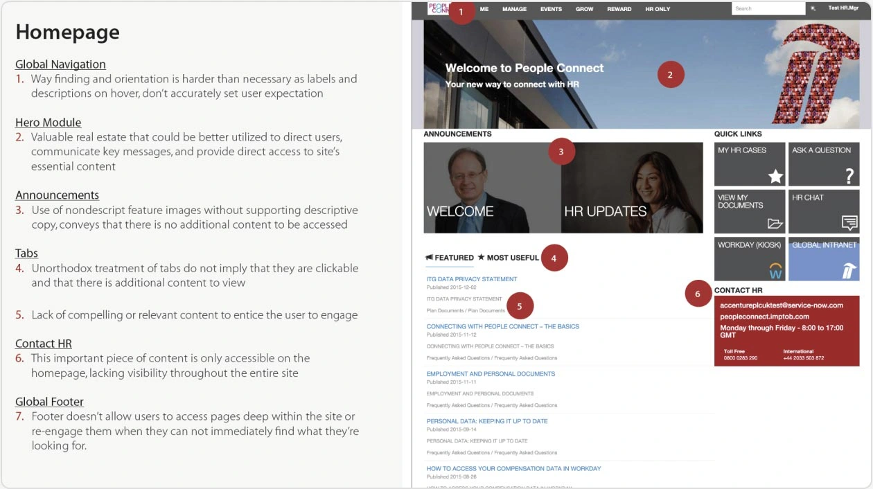
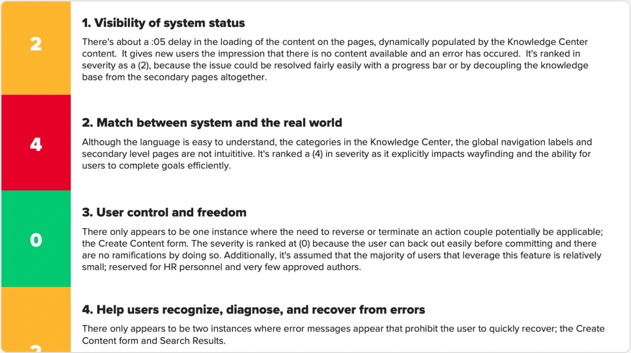
Evaluation of the Existing System
Evaluation & Scorecard
I began with a full site evaluation, documenting every usability impediment. Using UX heuristics, I built a color-coded scorecard ranking issues by frequency, impact, and persistence—from cosmetic to catastrophic. This structured approach gave the client a clear picture of where to focus improvements.
Snippet of the Heuristic Evaluation Scorecard
Design Recommendations
Based on the evaluation, I created mid-fidelity wireframes and recommendations to address key issues: clearer navigation, streamlined content, consistent visual presentation, and simplified interactions. The clickable wireframes gave the client a realistic preview of how the portal could evolve.
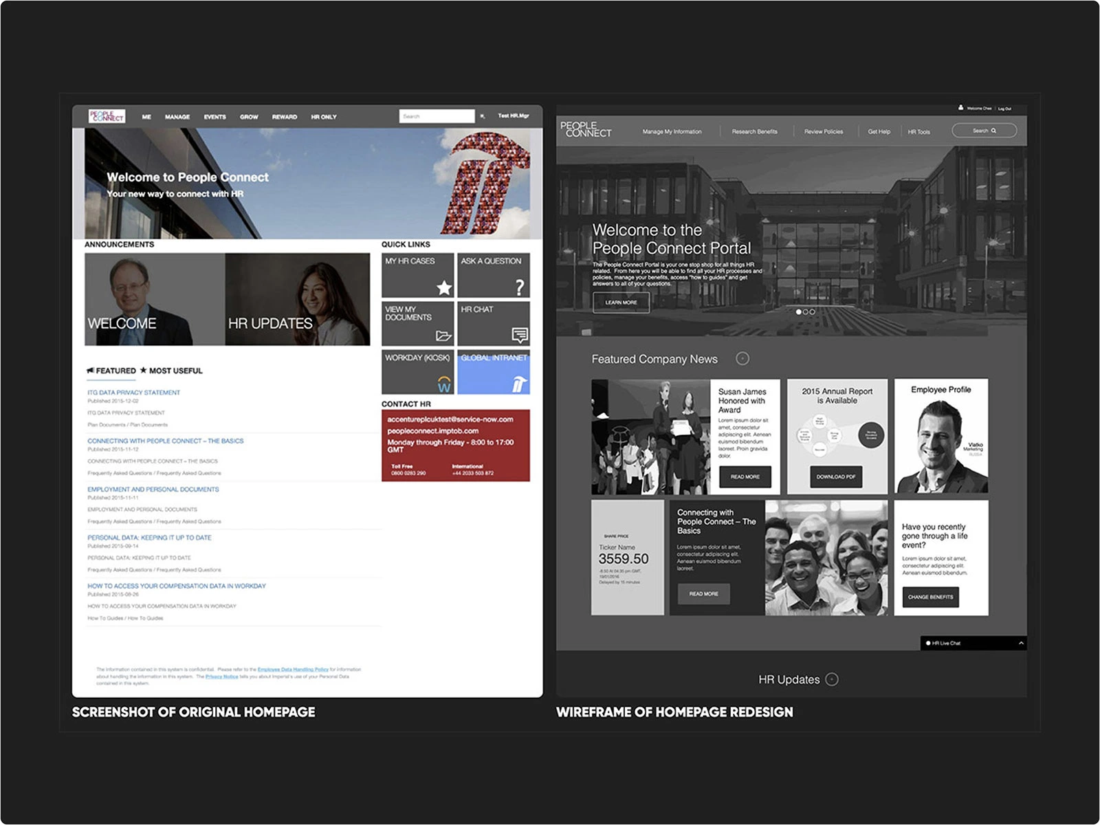
Left to Right: Original Home Screen and New Dashboard Wireframe
Key Features Designed
1. Home Screen Redesign
Hero imagery and news modules highlighted company culture and updates, encouraging pride and repeat visits. Team profiles added a social layer to foster connection and collaboration.
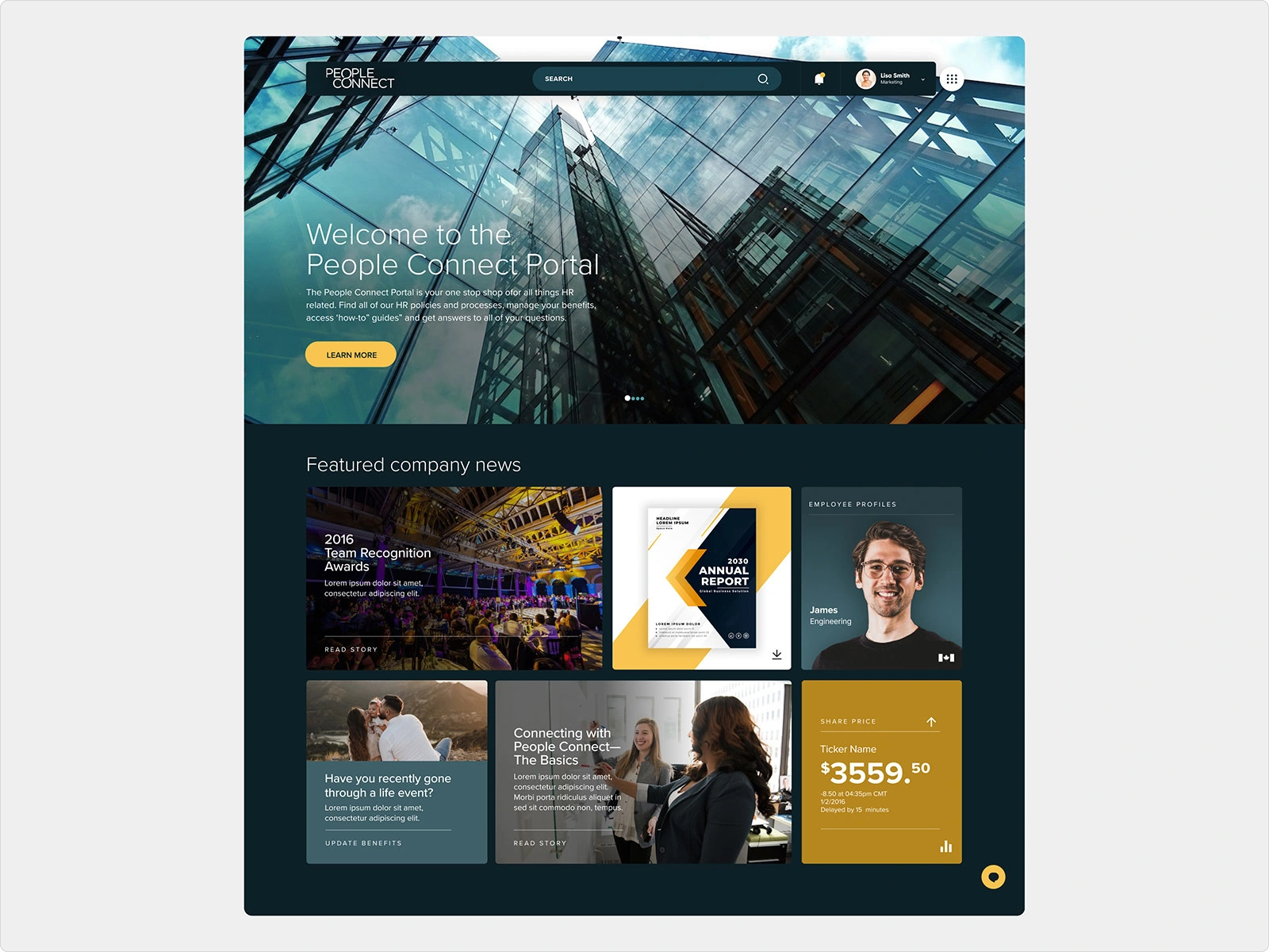
New Home Screen Design
2. Secondary Screens
Breadcrumbs improved orientation, intuitive left-rail navigation replaced confusing links, and a sticky live chat provided always-available support.
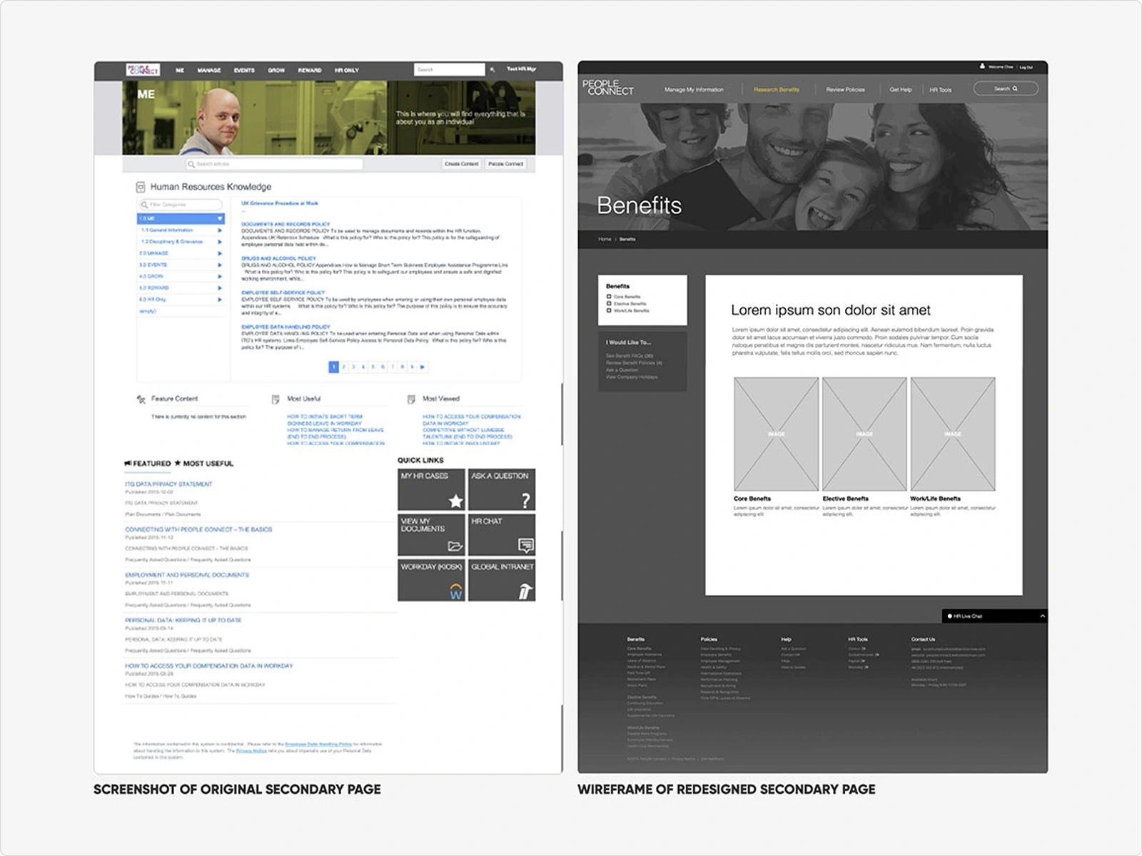
Left to Right: Original Secondary Screen and New Secondary Screen Wireframe
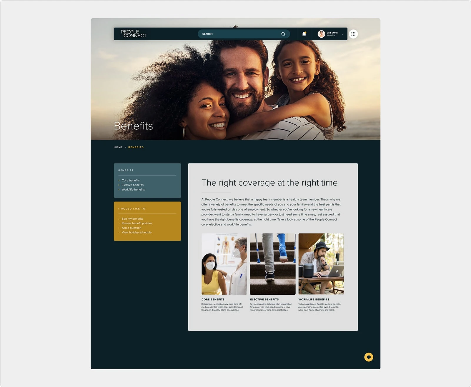
Secondary Page UI Design
3. Onboarding Dashboard
A new “My Information” page centralized benefits, payroll, time off, reviews, and travel in one dashboard. A dynamic onboarding timeline simplified new hire tasks in real time.
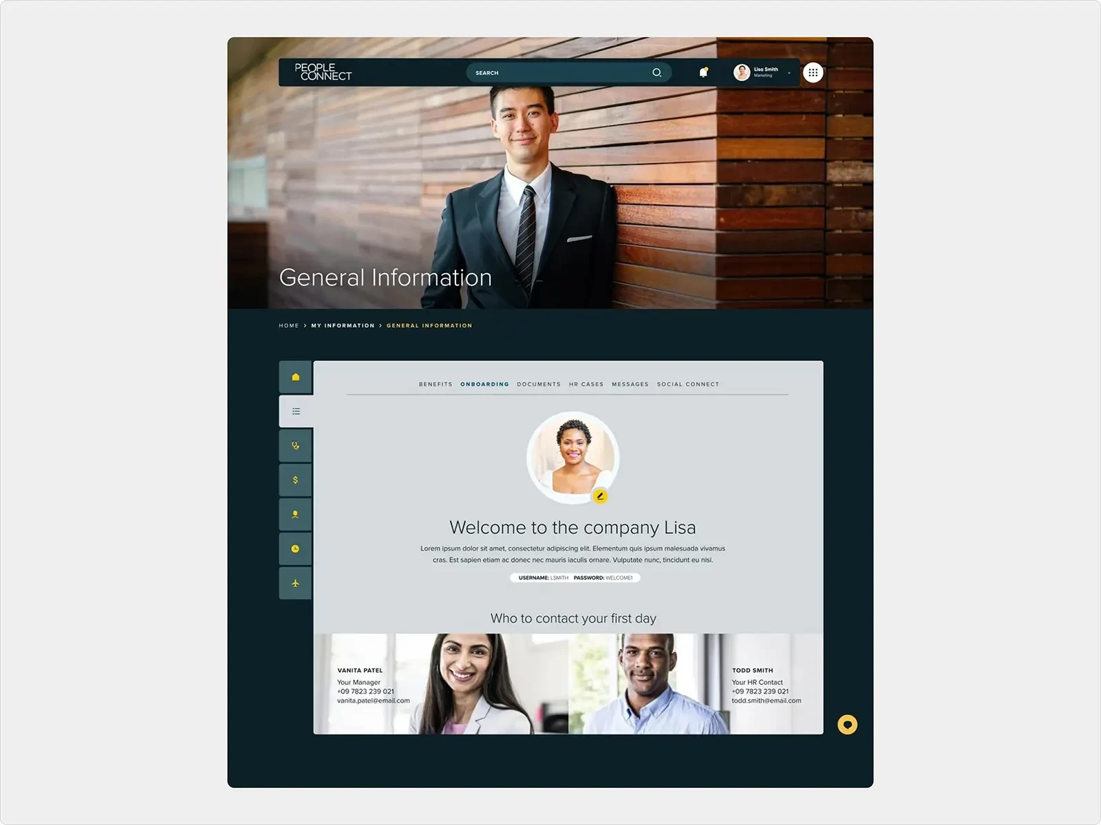
My Information Dashboard Screen
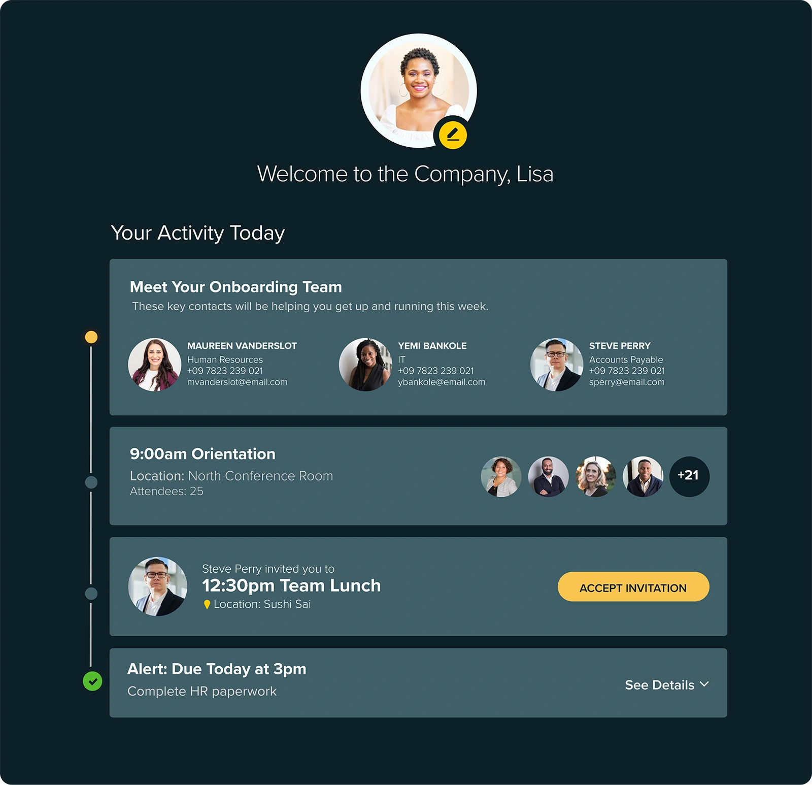
Onboarding Interface
4. Benefits Enrollment
A lifestyle-based questionnaire replaced dense benefits pages, making enrollment simple, personalized, and far less intimidating.
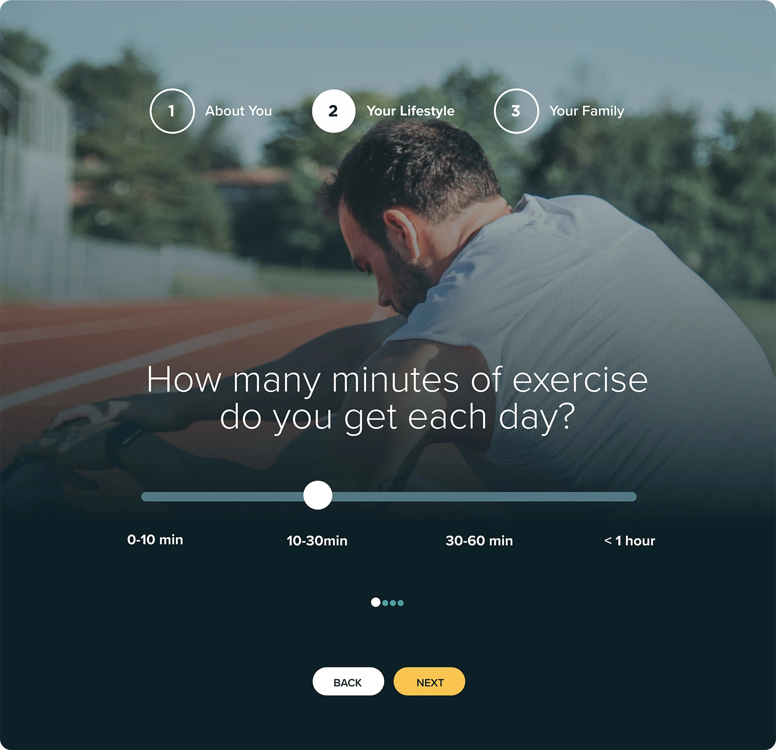
Benefits Questionnaire-Step 2
5. Travel Management
An integrated travel module (via API) allowed employees to book, manage, and expense business trips directly in the portal.
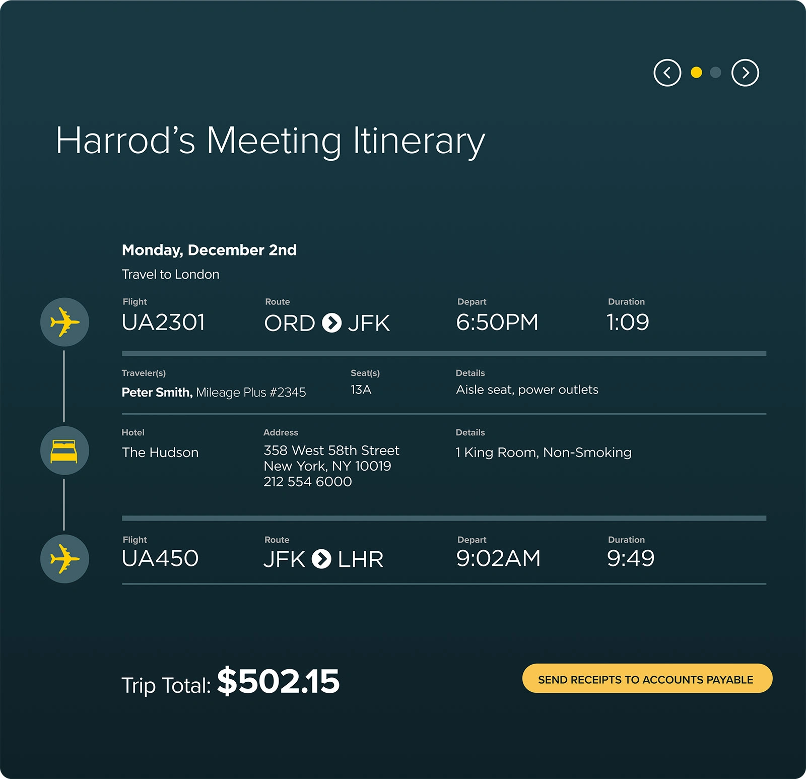
Travel Management Interface
The Outcome
The recommendations gave Accenture’s HR team a clear roadmap for evolving the portal into a more engaging, employee-friendly platform. By addressing usability at the system level, the redesign concepts showed how enterprise software could be reimagined with the clarity, ease, and polish of consumer apps.
Like this project
Posted Sep 13, 2025
Evaluated and improved the UX of Accenture's HR portal on ServiceNow.