
When your tooth is throbbing at 11pm, you don't read a website. You scan it for three answers: can you help me, how much is it, and how fast.
I redesigned the website for a dental telehealth platform. A licensed provider reviews your answers online and sends a prescription to your pharmacy. No video call, no waiting room. That's 11 pages, each with a desktop and a mobile version, all designed in Figma.
The price goes first
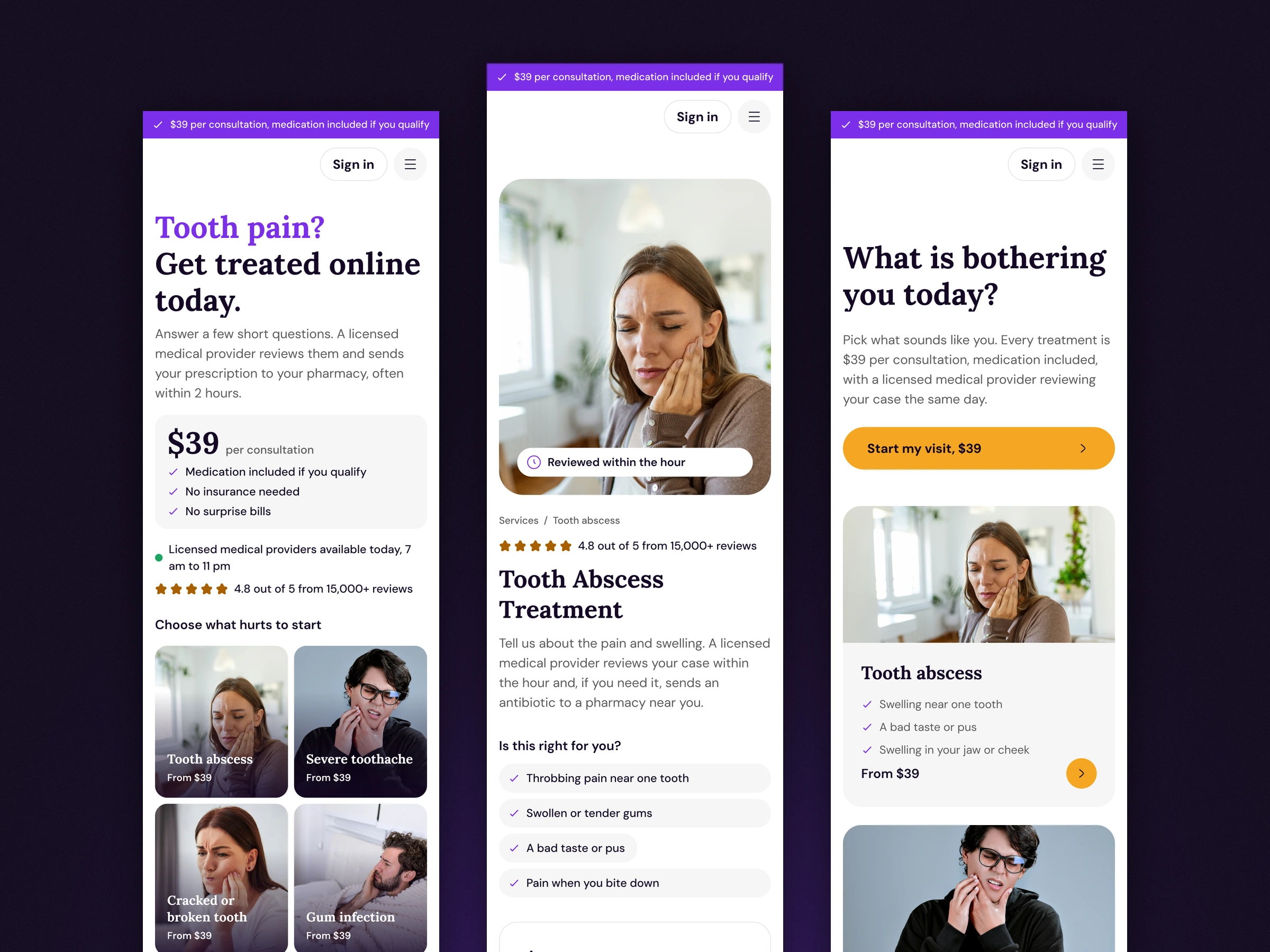
The hero says it straight: $39 per consultation, medication included if you qualify, no insurance needed. A strip at the very top repeats the five things people worry about most, on every page.
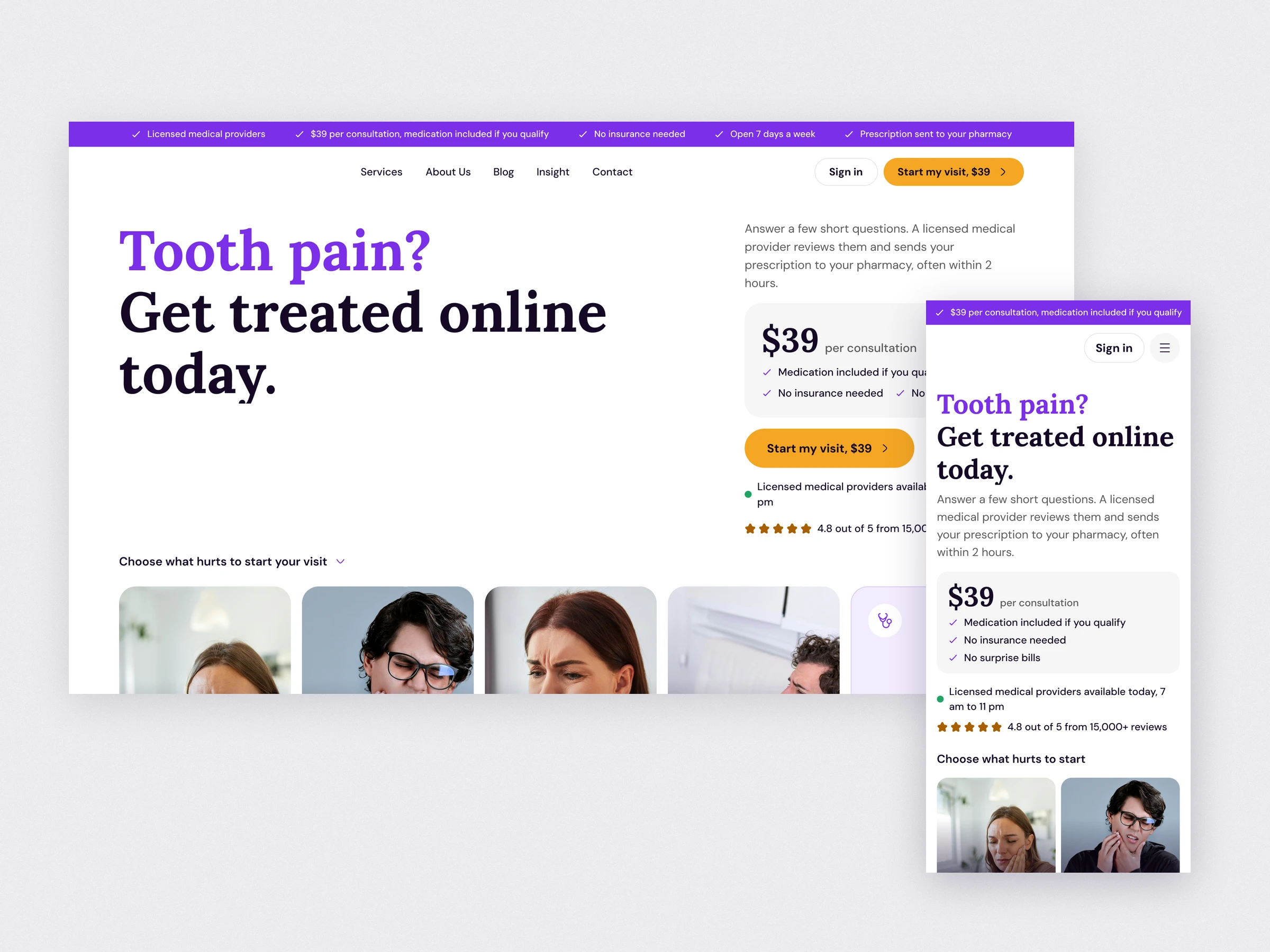
Pick what hurts, not a service
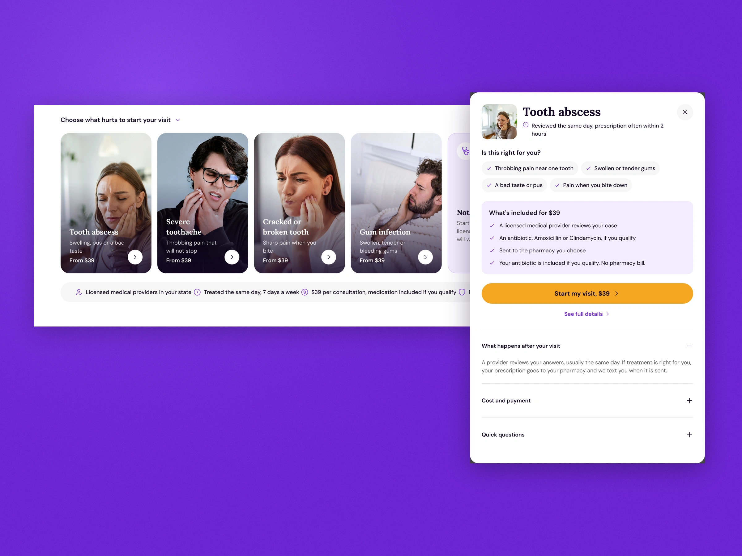
People don't search for "periodontal care". They know their gum is swollen. So the homepage leads with photo cards for each problem: abscess, toothache, cracked tooth, gum infection, plus a "Not sure" card. Each one opens a quick view with the symptoms to check and exactly what the $39 covers, so nobody has to leave the page to decide.
Be honest about the limits
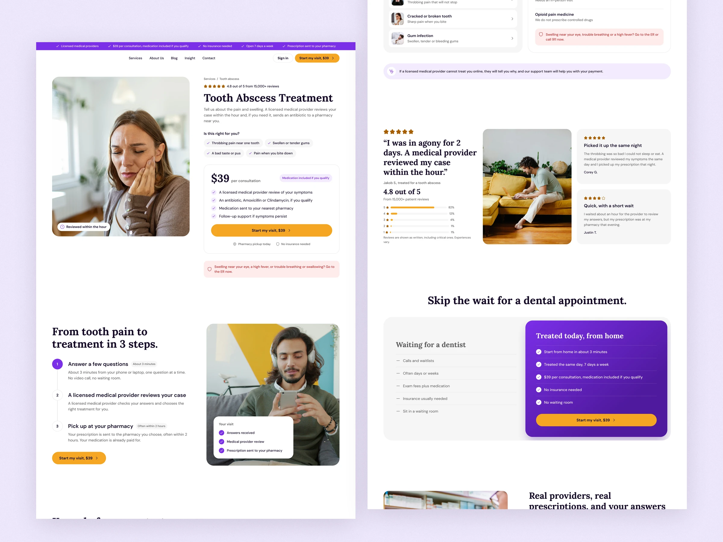
Online care can't fill a cavity, so the site says so. "Know before you start" puts what the team treats next to what needs a dentist's chair, and that includes no opioids. Pricing lists every add-on with its price, and a side-by-side compares waiting for a dentist with getting treated from home. Being clear about what you don't do makes the rest believable.
Every condition gets its own page
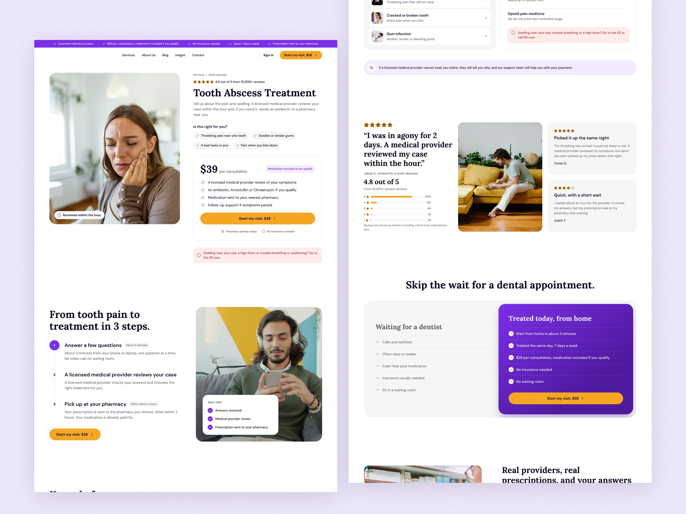
Abscess, toothache, cracked tooth and gum infection each get a page with the same build: symptoms to check, the $39 card, an emergency warning, the 3 steps, and FAQs written for that problem. It's one template across four pages, so someone landing from search gets an answer for their exact pain.
Designed for the phone
A lot of people with a toothache are searching on their phone, often in bed. Every page has a mobile version: the price card stays near the top, the condition cards stack in pairs, and a sticky Start my visit bar follows you down the page.
The checkout asks one thing at a time
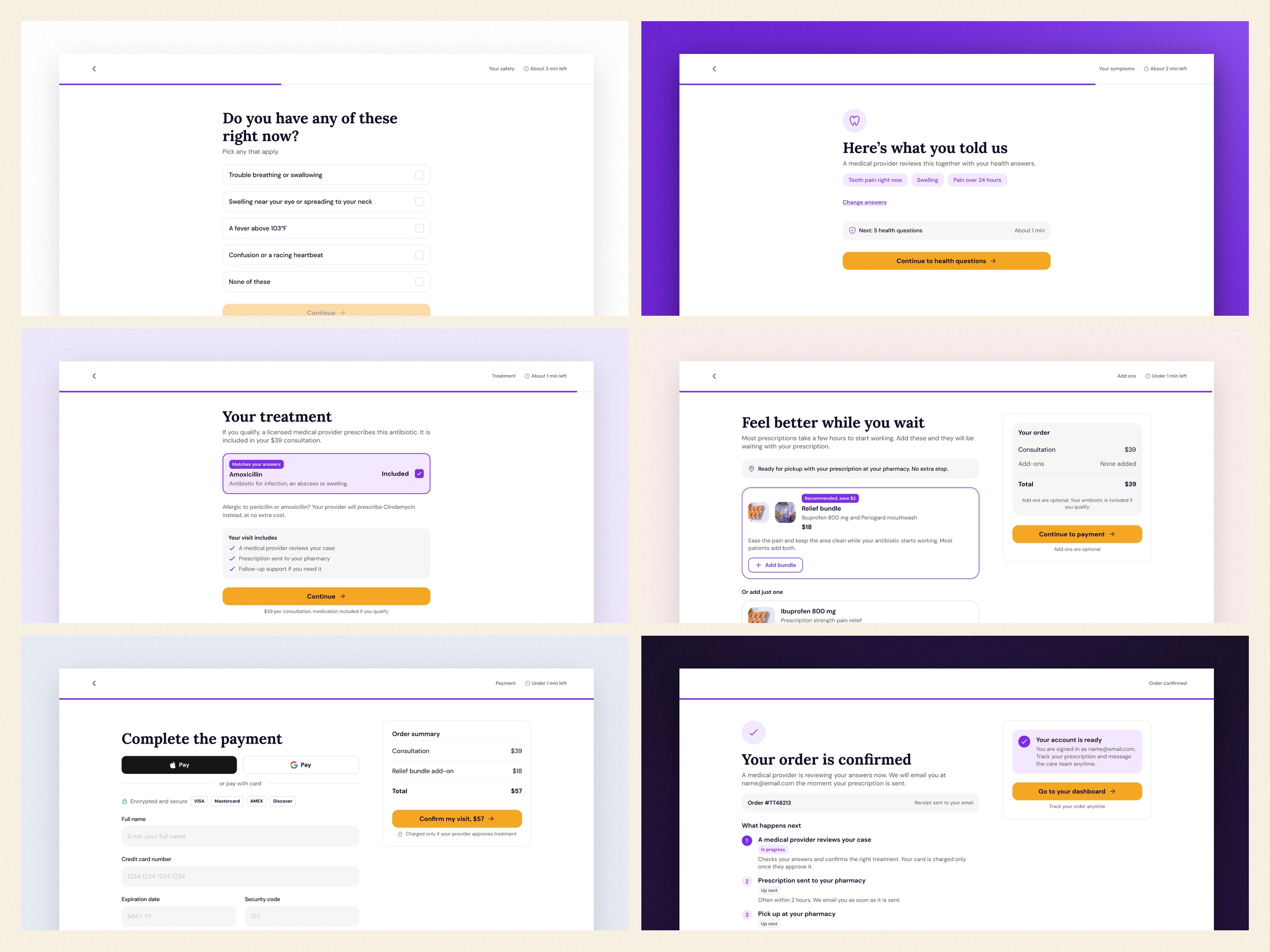
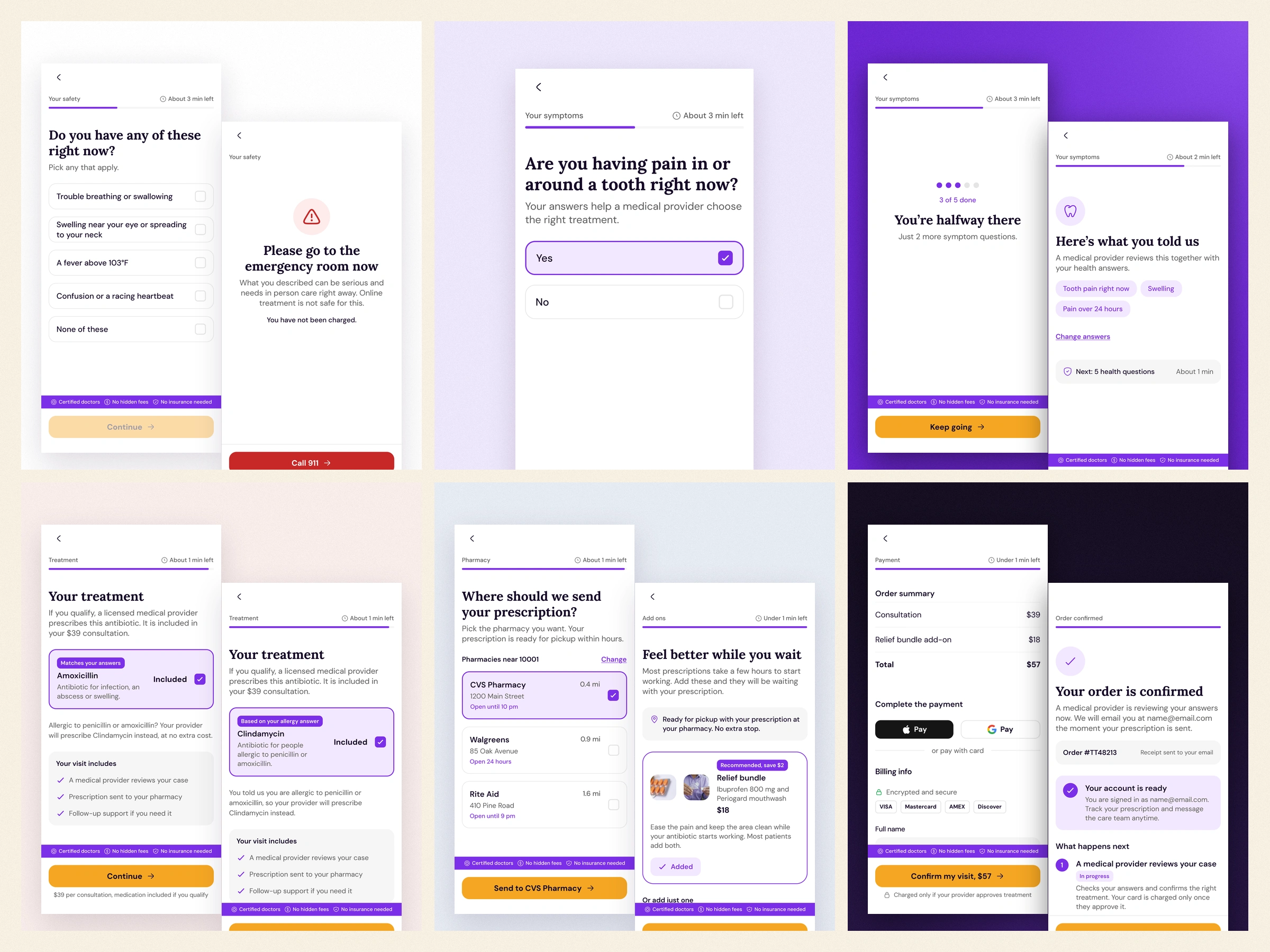
The checkout follows the same rules as the site, on desktop and on mobile. Every screen asks one question, shows how many minutes are left, and keeps the promises strip in view. Safety comes first: if someone picks an emergency sign, the visit stops, sends them to the ER and tells them they weren't charged. Their answers pick the antibiotic: Amoxicillin by default, Clindamycin after a penicillin allergy. Payment comes before the account, and the button says you're only charged if a provider approves treatment.
One system, eleven pages
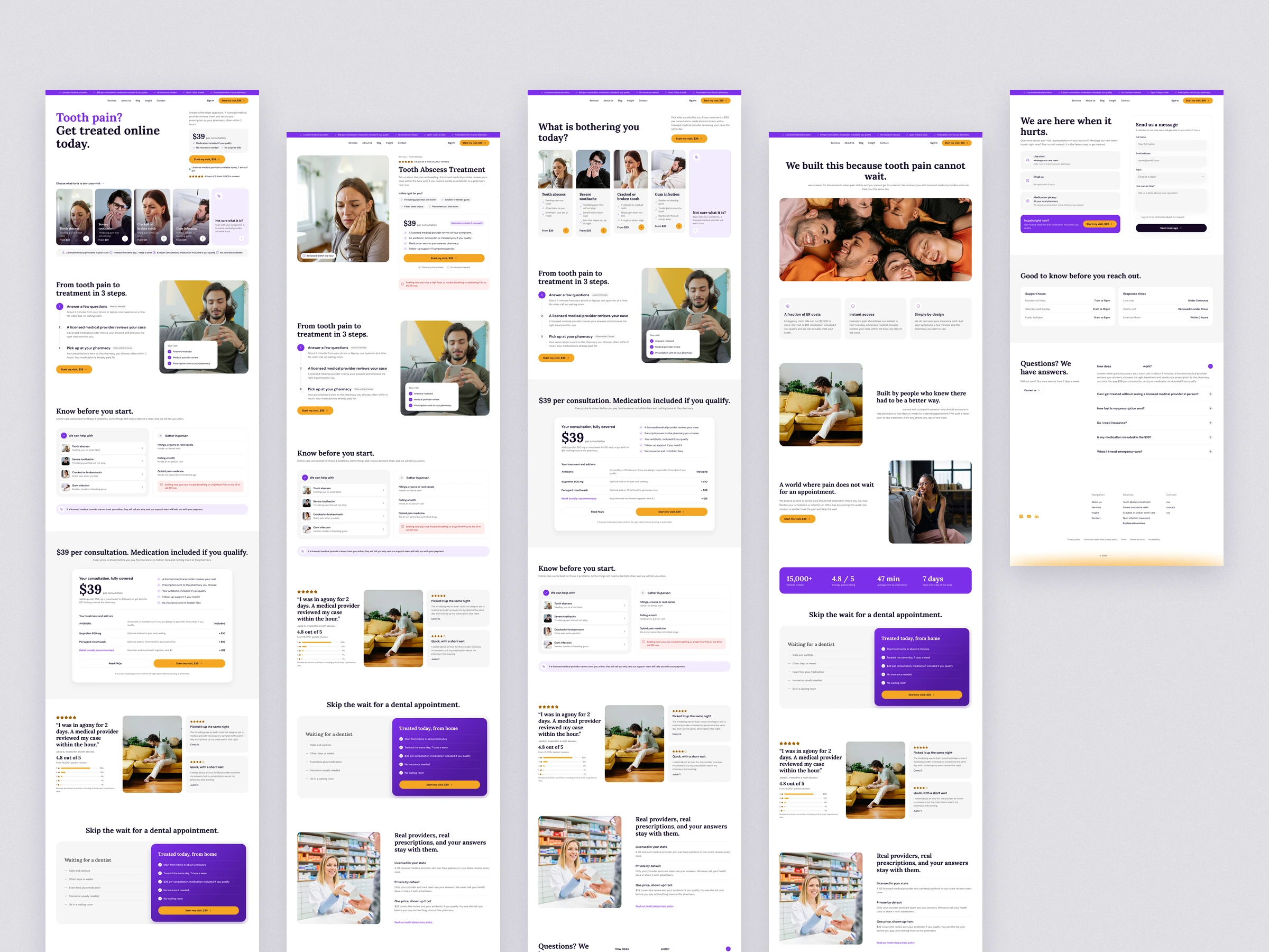
Home, services, the four condition pages, about, contact, blog and insight all share the same parts: trust strip, condition cards, steps, pricing and FAQs. That keeps the site consistent, and adding a new treatment is just one more page from the template.
Takeaway
People in pain don't browse. They scan for a reason to trust you. Put the price, the limits and the next step where they can't miss them.
0 likes · 0 views · Nov 20, 2026
I redesigned a dental telehealth website and checkout, 11 pages on desktop and mobile, so someone in pain sees the price, the limits and the next step fast.
