24hrDoc Conversion Redesign

Jose Perez


Three redesigns, no baseline
By the time I came in, three redesigns had already shipped. Each one changed how the site looked; none of them changed what qualified visitors did. With no baseline, nobody could say which had helped, so the next redesign would have been another guess, paid for at the same price.
I didn’t see a design problem. I saw a data problem that earlier redesigns had tried to solve with aesthetics. So I started with instrumentation, not a new visual direction.
Make the leak visible
I put analytics in first, as the one source of truth. Then I spent two weeks on instrumentation and session review before touching anything, and ran a step-by-step drop analysis with the cost of each leak attached. That turned an argument about taste into a ranked list.
Two findings carried most of the loss: a homepage that offered several options and no clear next step, and condition pages where the process instructions pulled more attention than the action.
Give the first screen one job
On the old homepage, a full navigation block sat level with the primary CTA, so a visitor’s first screen offered several options and an action at the same weight. Plenty of choices, no clear next step.
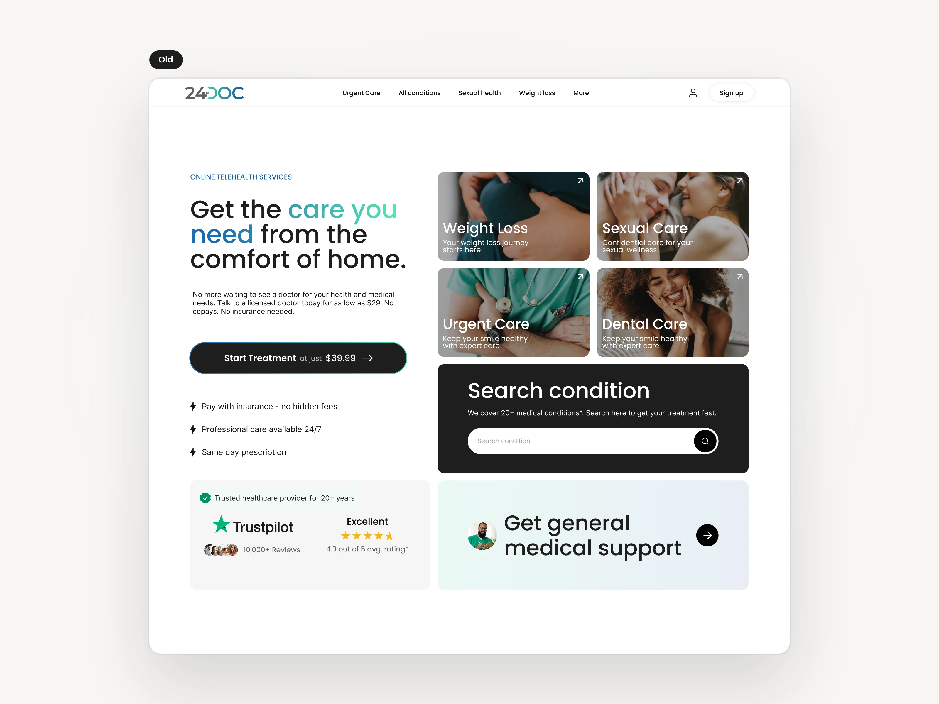
Before: navigation and the main action competing at the same weight.
The hero was never the problem everyone believed it to be. The offer had simply never been part of it. I rebuilt the hero around one offer and one call to action, and moved the navigation below it, so the first thing anyone sees is the single thing to do.
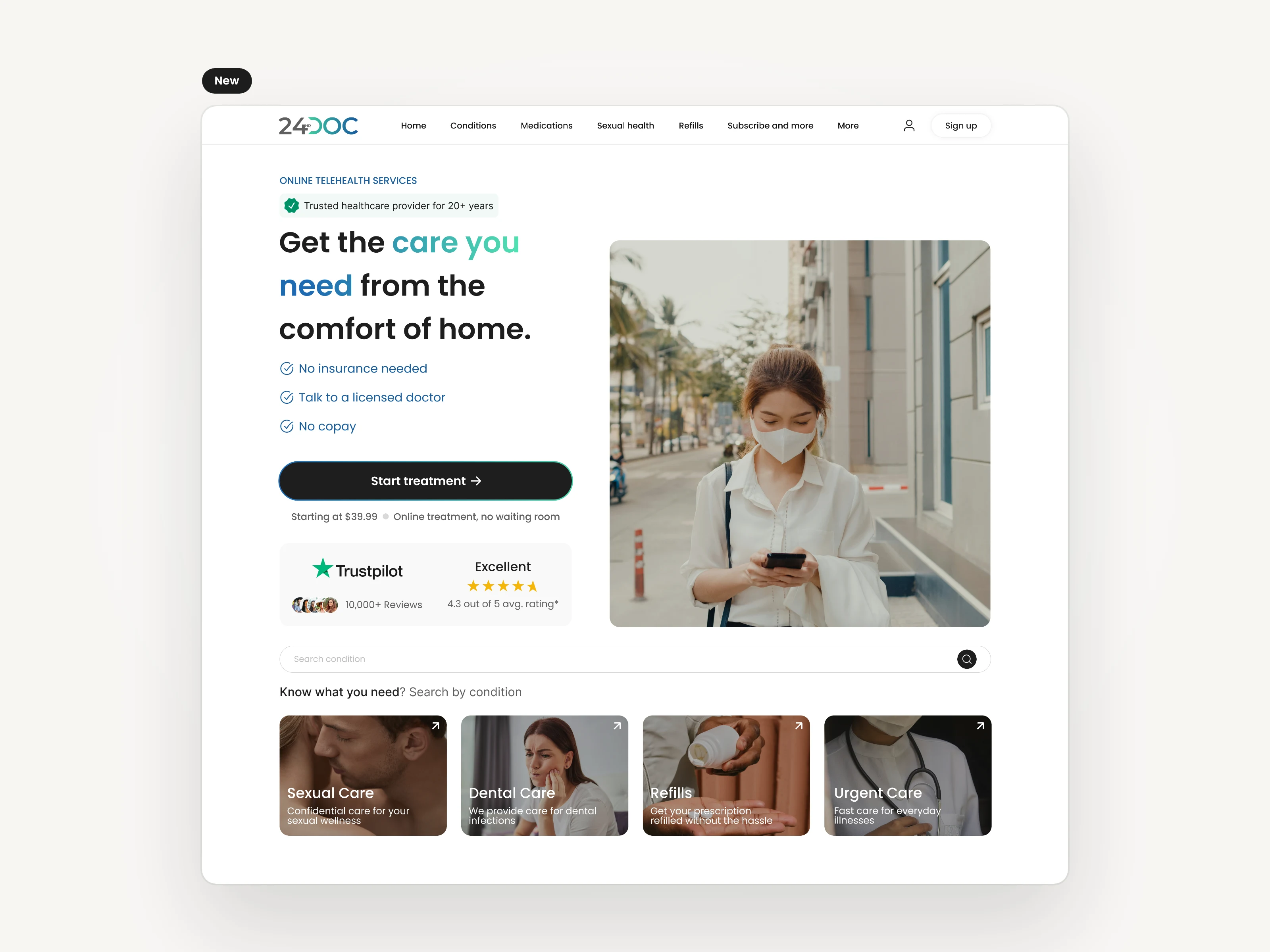
After: one offer, one action, navigation moved below the hero.
Move the steps below the decision
On the condition pages, the process instructions drew more attention than the action. Visitors read the steps, kept scrolling to understand them, and drifted away instead of into checkout.
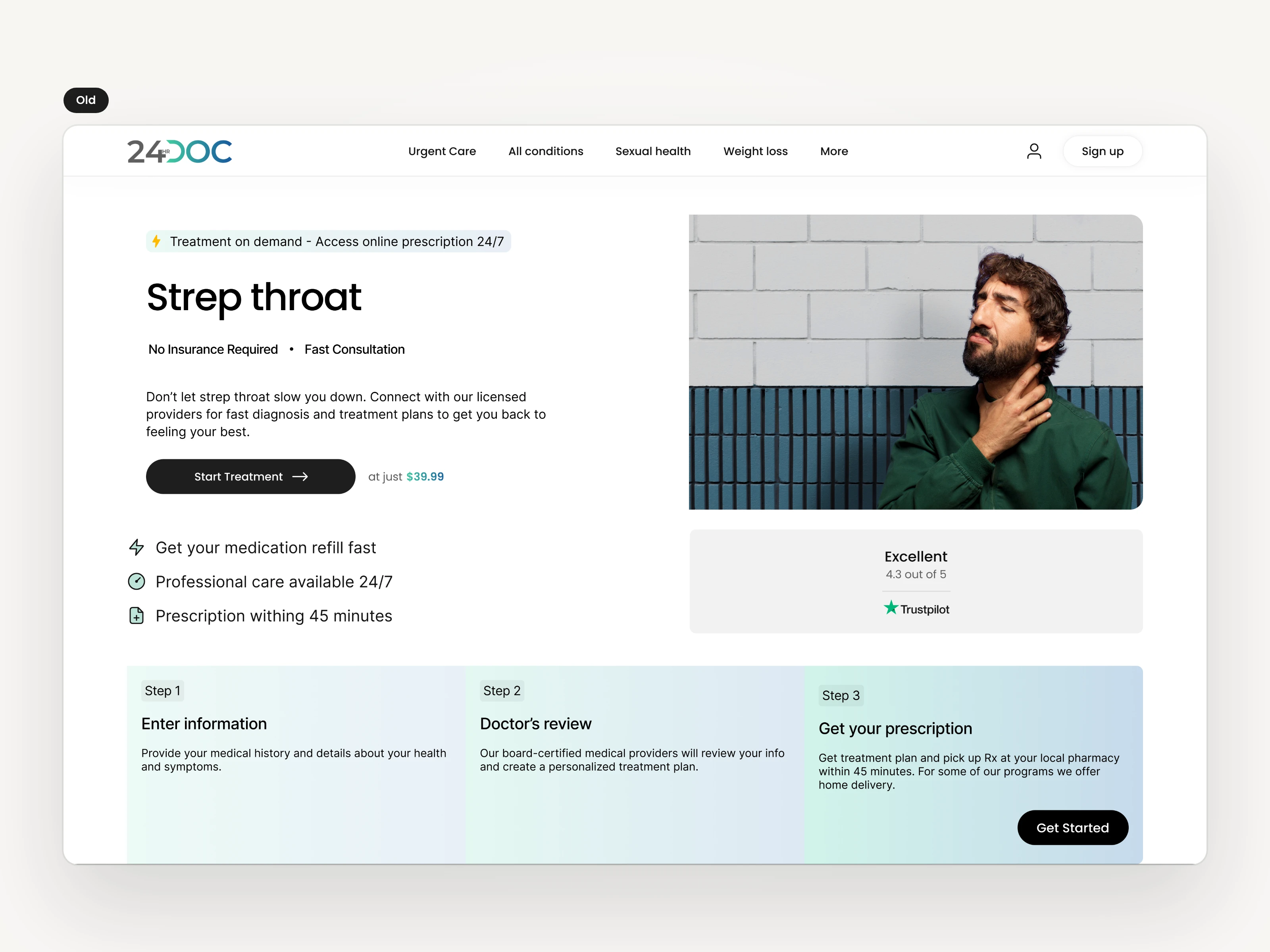
Before: the steps compete with the action.
I simplified the hero so “Get treatment online” is unmissable and gave the page a single focus.
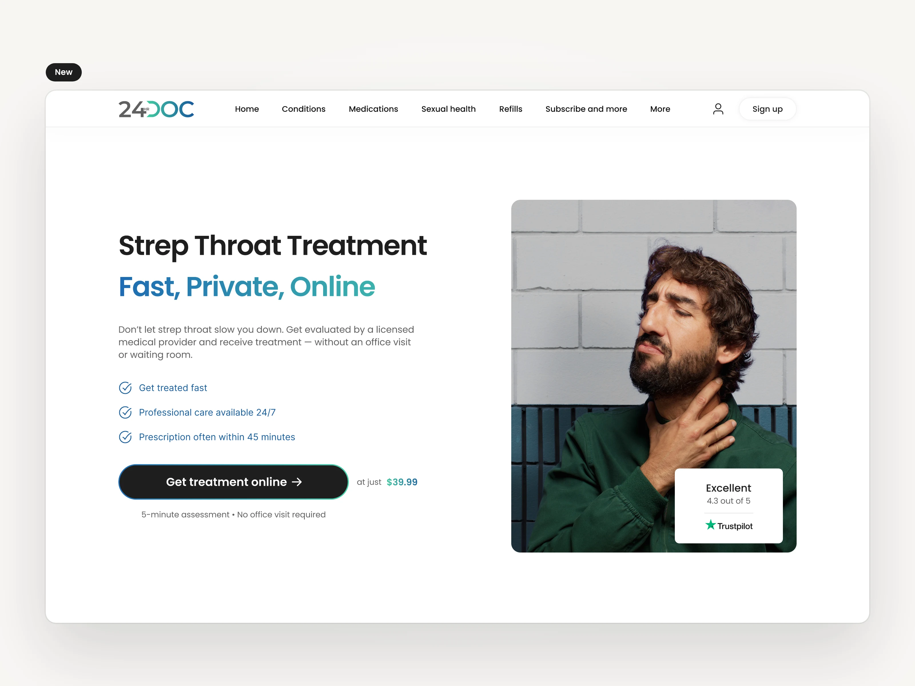
After: one focus, one action.
Beside the action, I placed the levers that ease hesitation at the moment of decision: benefit points, a “no insurance required” trust signal, and a clear time estimate, so visitors know exactly what they’re committing to before they commit.
Other Designs
The same system, applied across the rest of the site. Each page carries the priced CTA, the “no hidden fees” pill, and the Trustpilot badge beside a short benefit checklist.
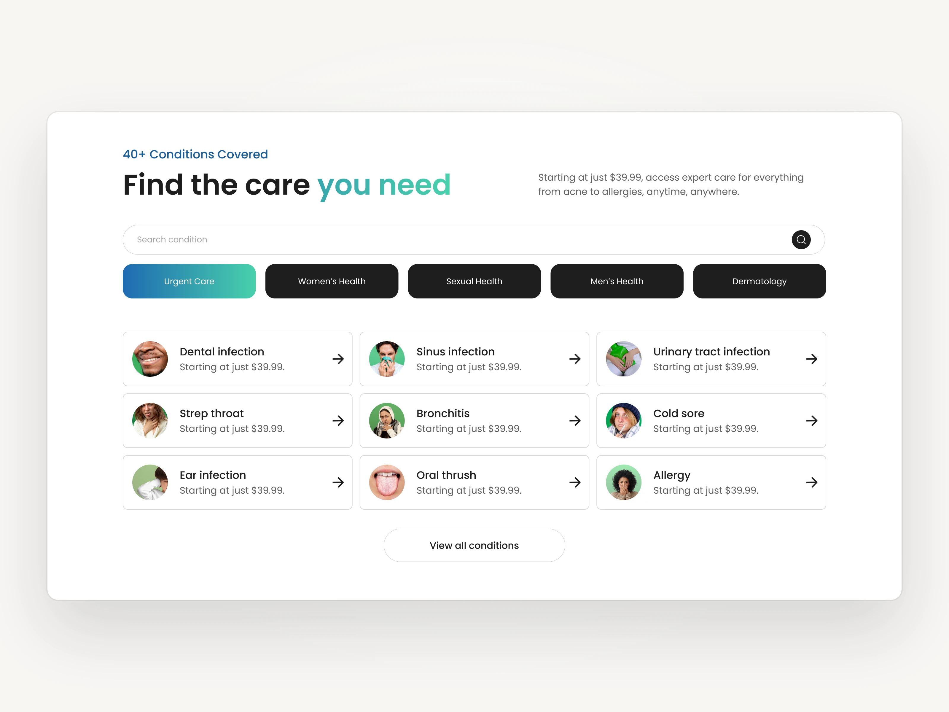
Conditions
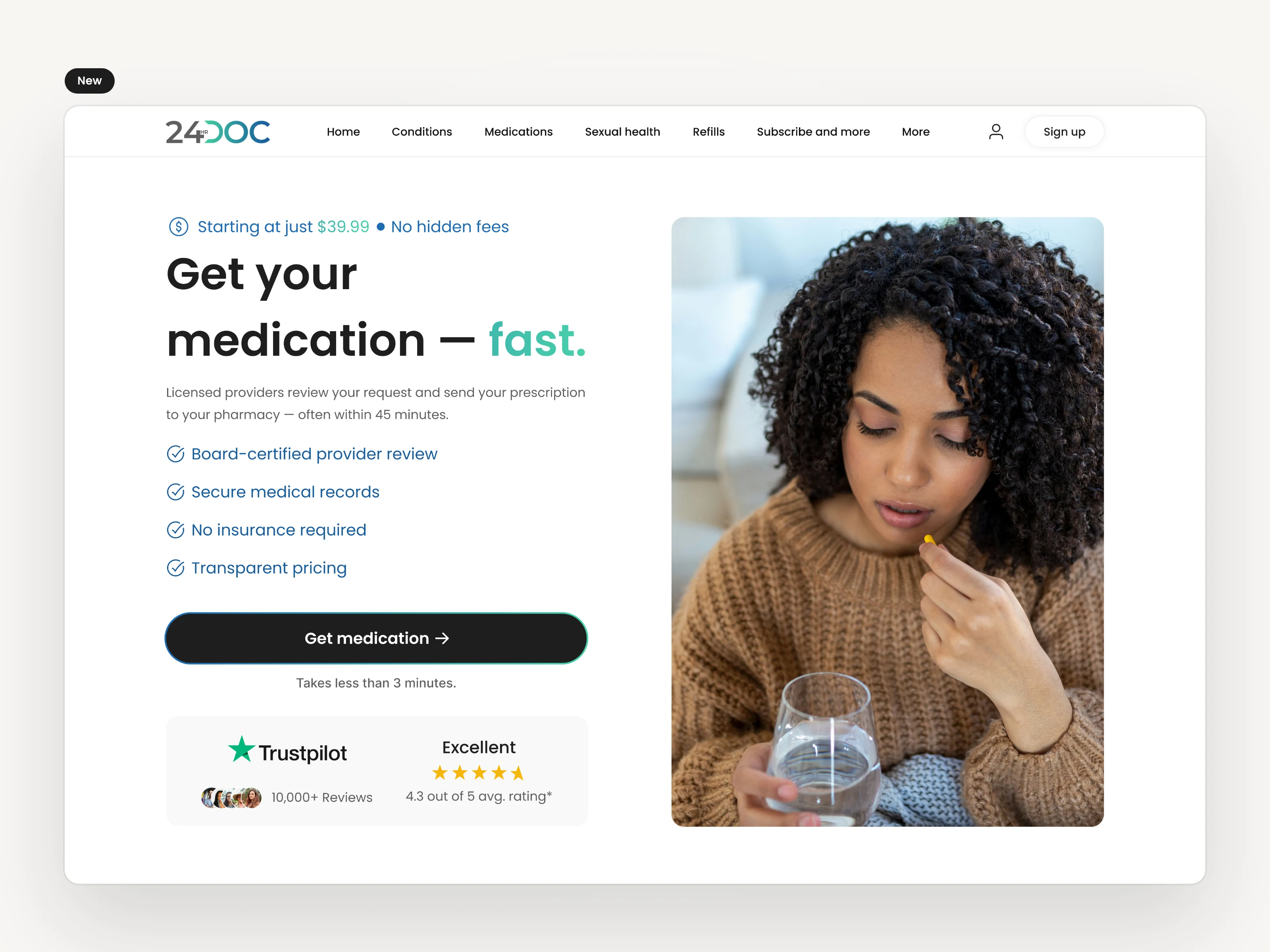
Medication
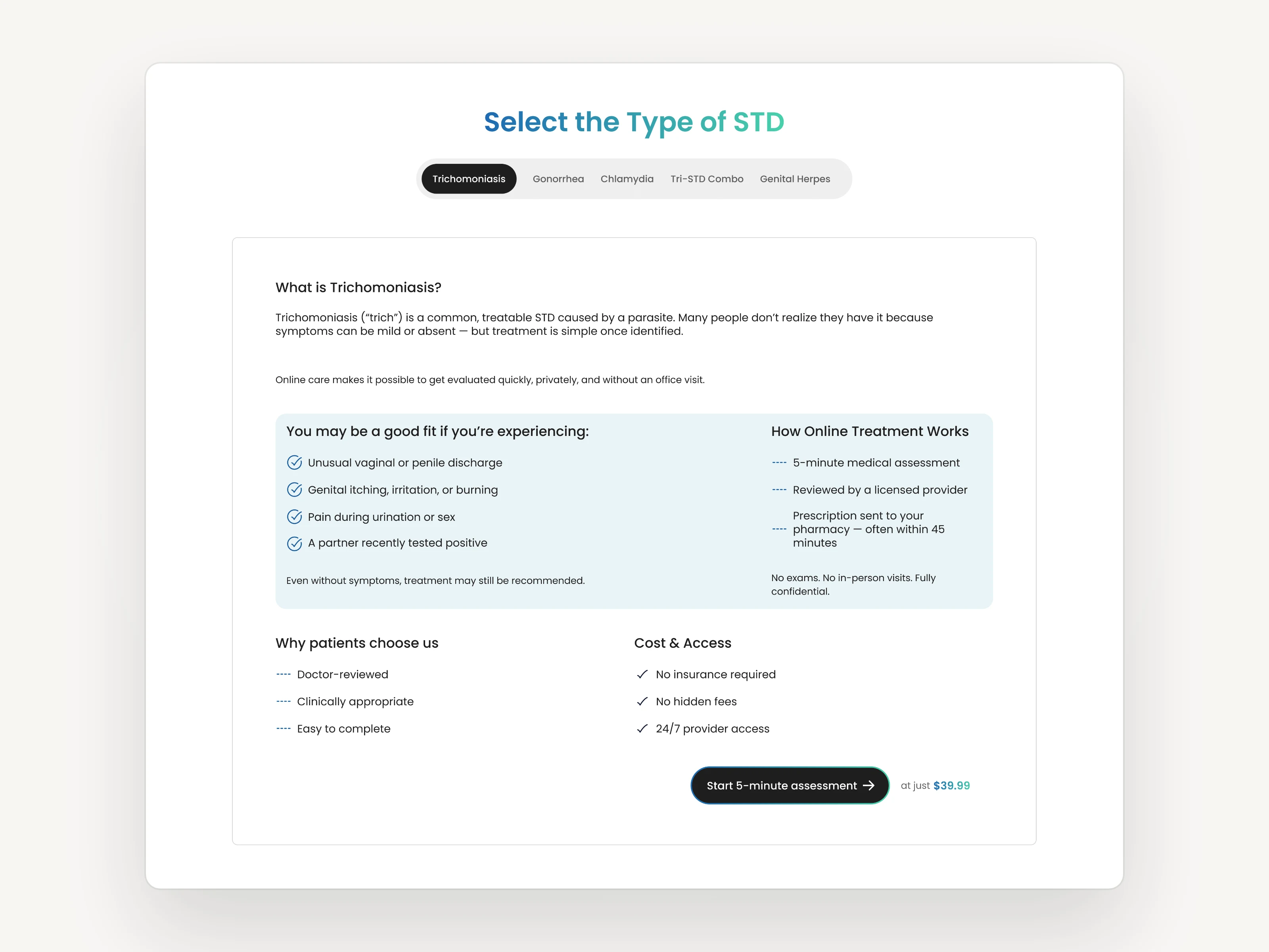
STD Treatment
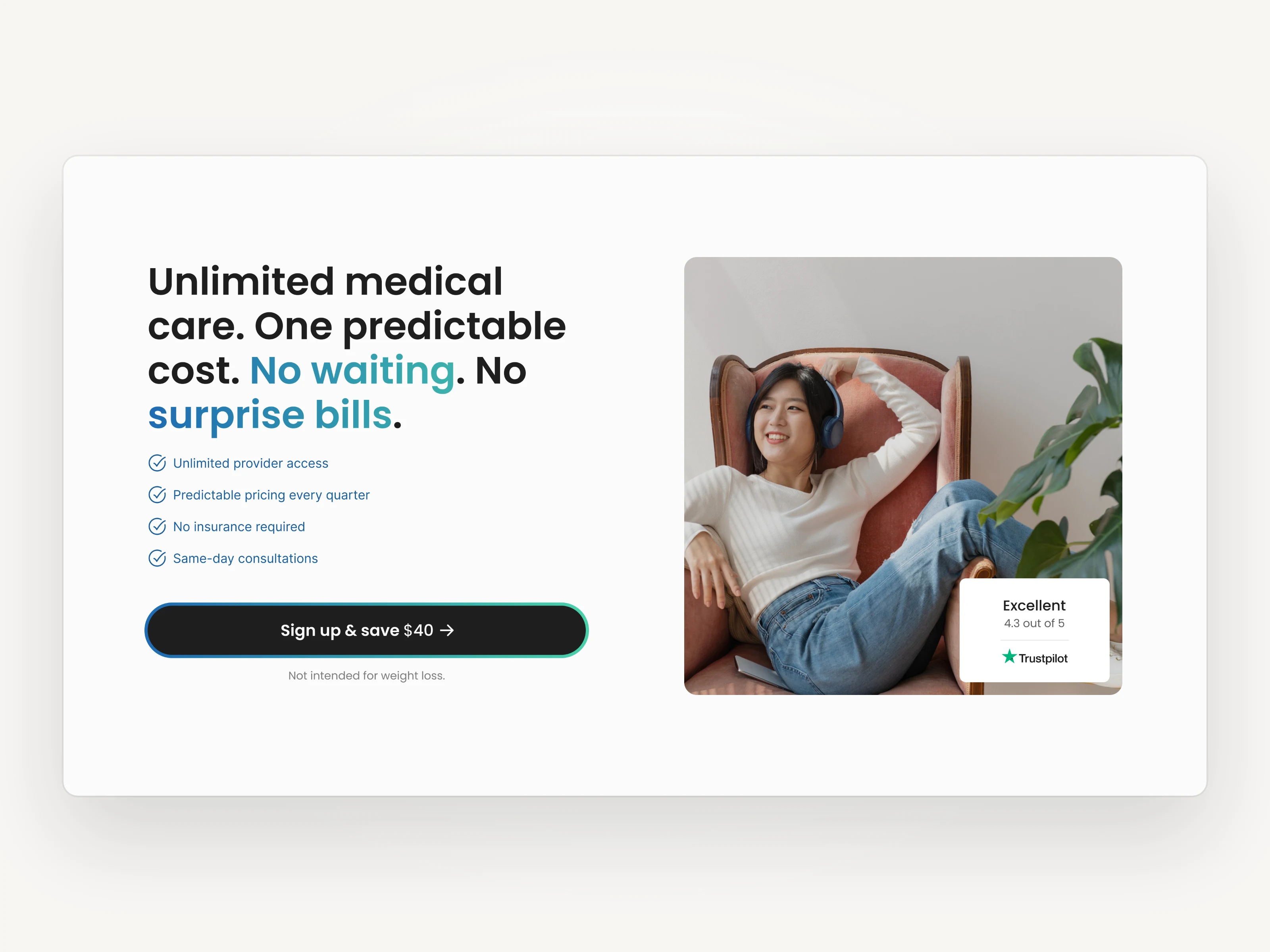
Refills
Prove it, then roll it out
The redesign launched March 31, 2026. I released it in stages, each against the same source of truth, so every change could be read on its own. Then I rolled the validated patterns across the rest of the site.
Three elements recurred on every page that gained:
the dark, priced CTA that names the action and the price together
the “no hidden fees” pill above every headline
the Trustpilot badge anchored to the hero beside a short benefit checklist
I kept each one because it was measured, not because it was assumed.
Site conversion went from 7.54% to 9.26%, and held there for six weeks
Overall conversion: 7.54% → 9.26% (+22.8%)
Paid search: 8.79% → 11.26% (+28%)
Organic: 5.26% → 6.39% (+21%)
Purchase funnel: 9.55% → 10.6% (+11%)
Cost per acquisition: reduced
Average engagement time: +23s
I measured against the baseline we agreed on before anything shipped, on the same source of truth and the same traffic mix. I wrote down the changes that didn’t move the number, too.
“Our website has undergone multiple redesigns, yet none of those versions led to a significant improvement in conversions. Jose recognized the problem as one related to the data rather than the design itself. He pinpointed the places where potential customers abandoned the process and redesigned those touchpoints accordingly. The result: conversion rates increased, and cost of customer acquisition dropped.” — Joseph, Founder, 24hrDoc
What this demonstrates
Conversion problems are often misdiagnosed as design problems. The value I brought wasn’t a new visual language. It was the discipline to measure first, find the exact points of loss, redesign against real behavior, and validate what worked before rolling it out. That’s the difference between a redesign and a repeatable system.
Like this project
Posted Oct 23, 2026
Three redesigns hadn’t moved conversion. I measured where patients left, rebuilt the costliest steps, and lifted site conversion from 7.54% to 9.26%.
Likes
0
Views
0
Timeline
Dec 20, 2025 - May 12, 2026