Lummi☀️

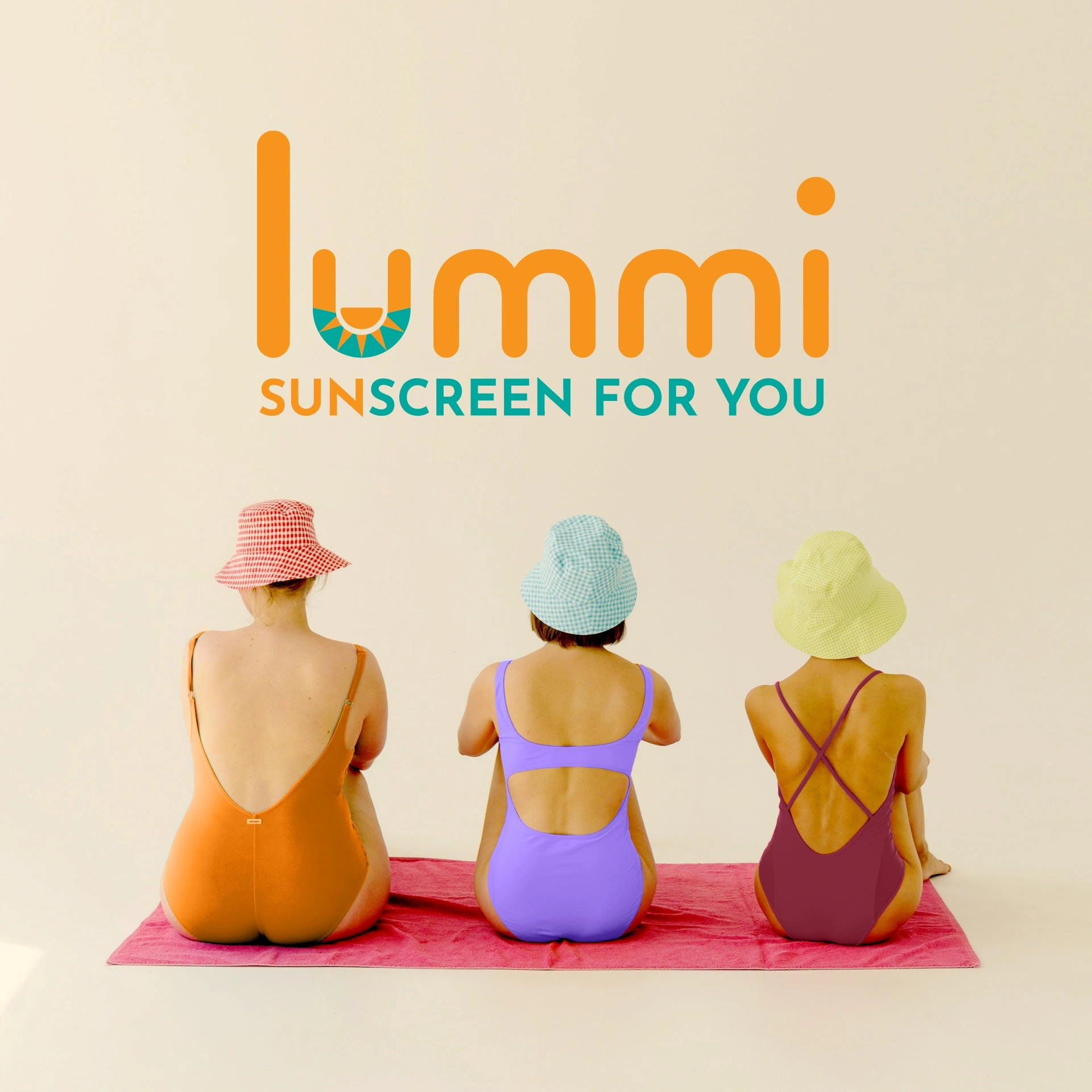
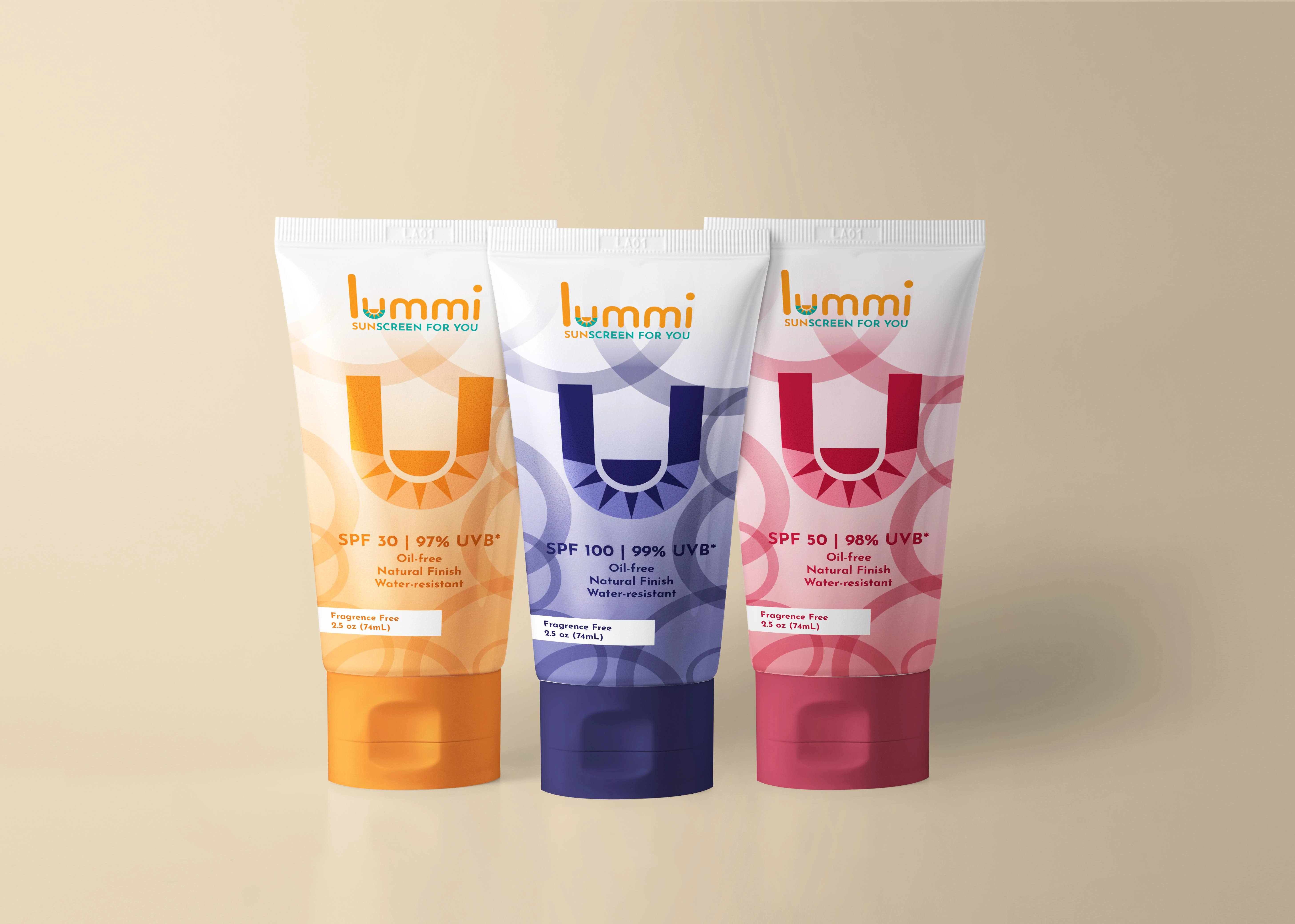
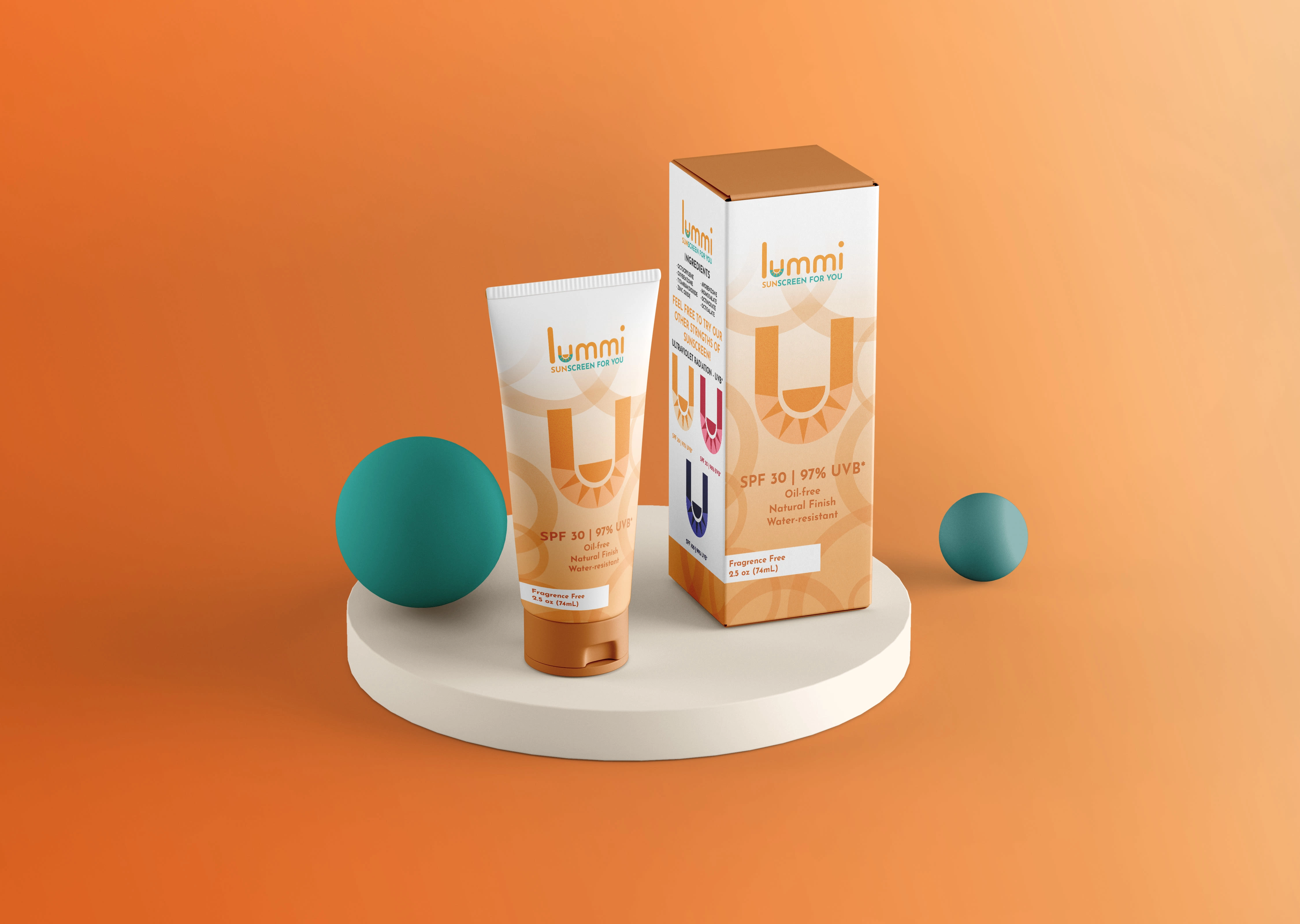
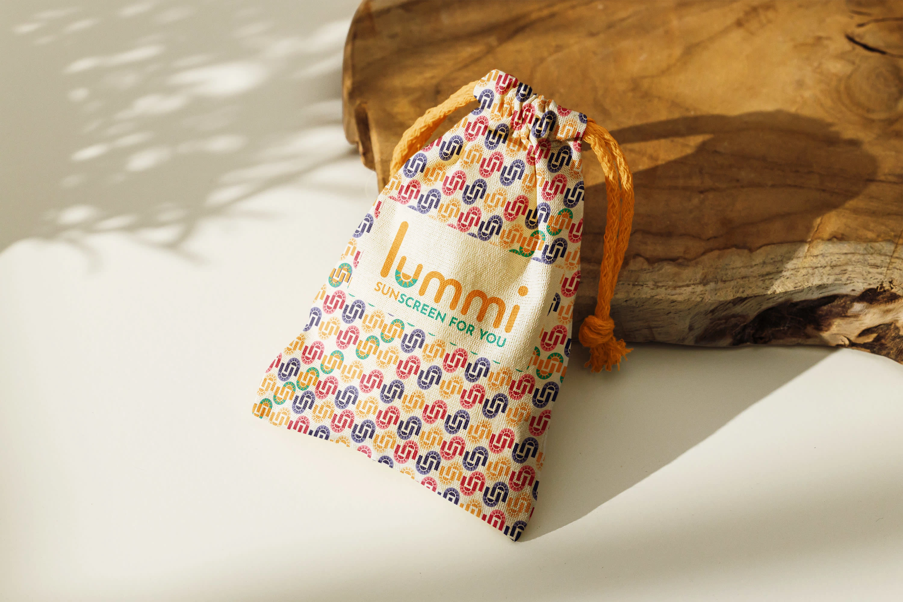
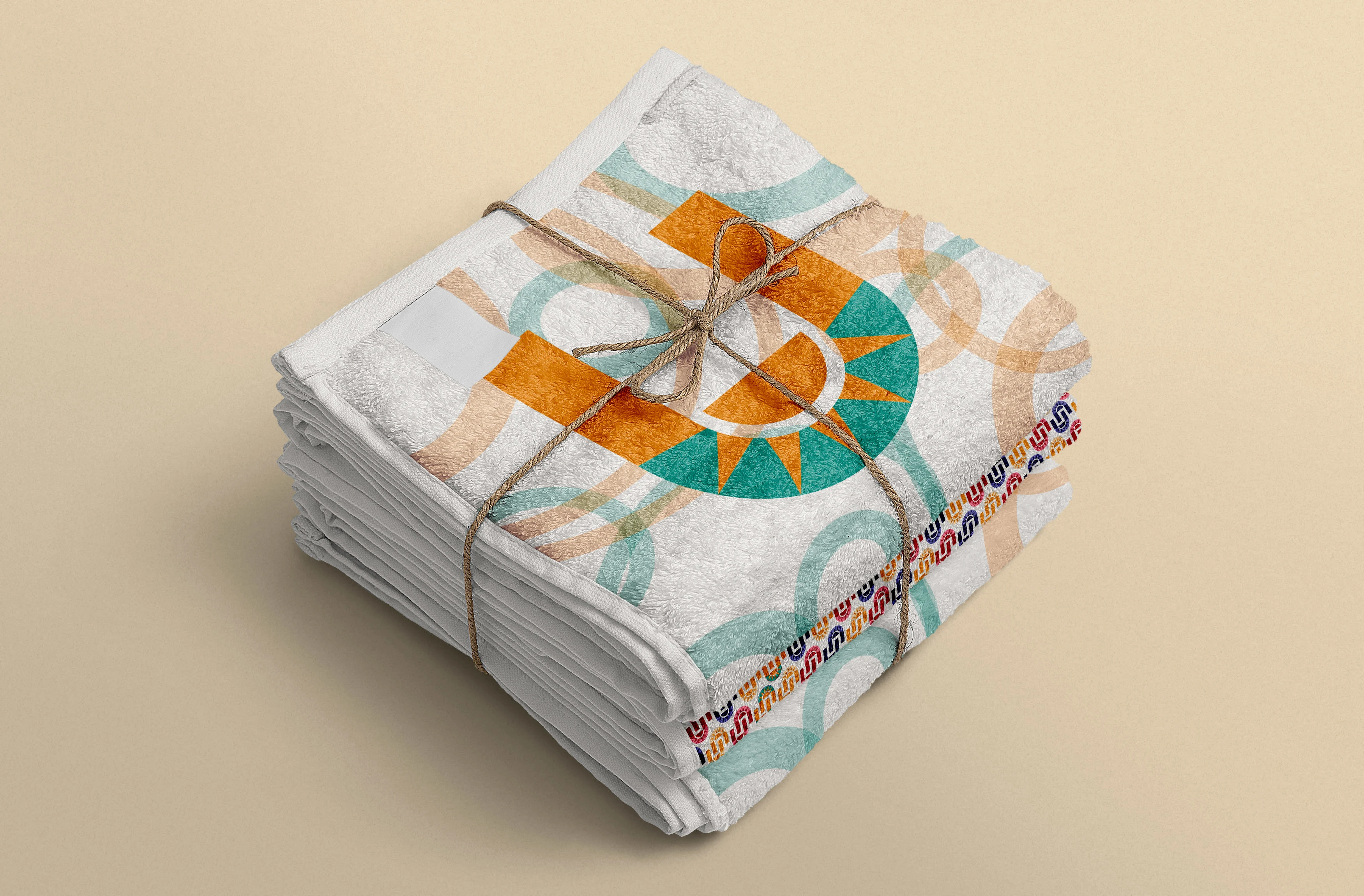
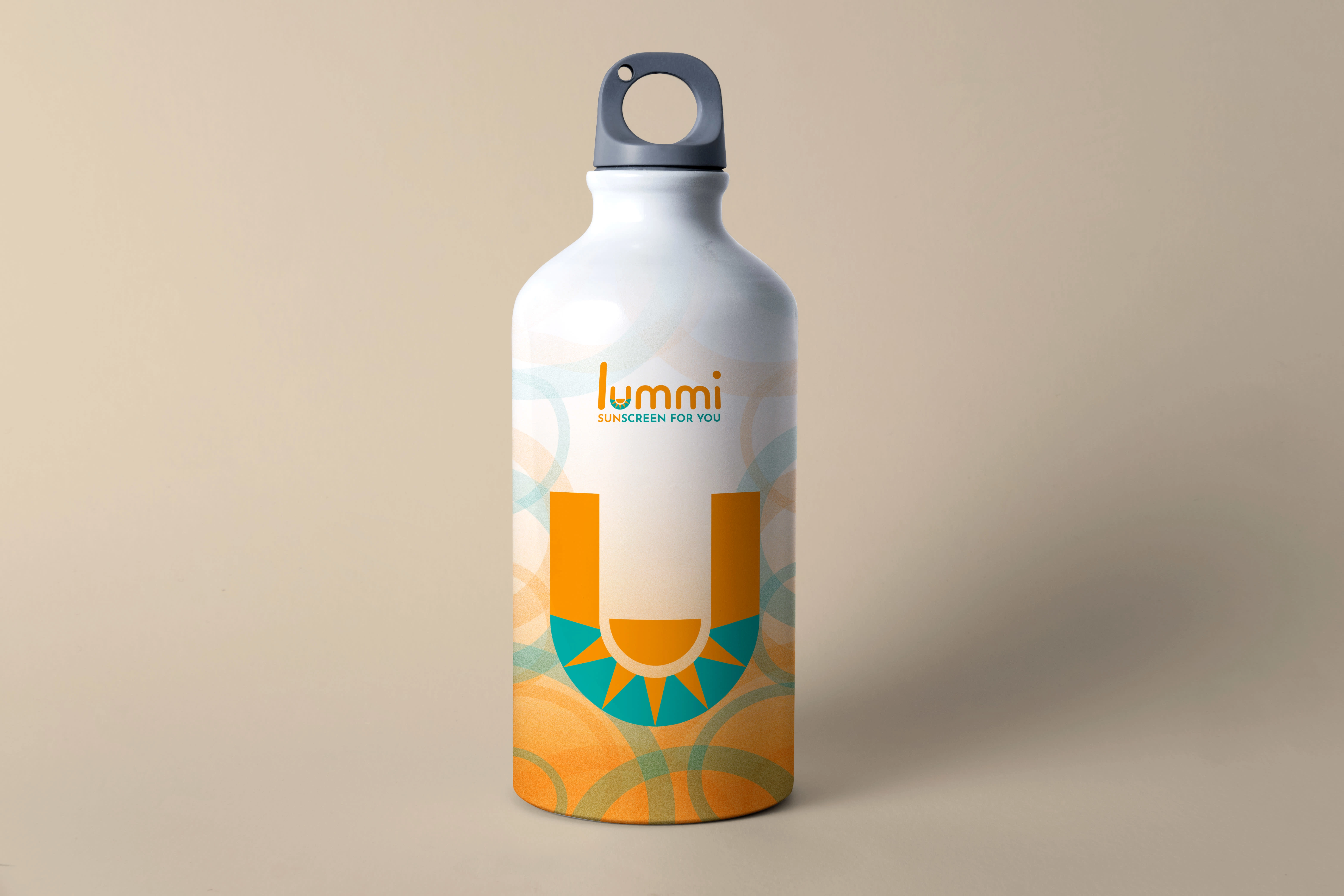
This brief was designed for a sunscreen brand nameed Lummi; due to the brand name being associated with the lumocity of the sun, i wanted to include that in the logo. While considering potential placement of the sun it was clear the it belong in the "U" because of the tagline. When beginning the packaging design processes I knew I wanted their logo to be used in different colors to symbolize the Sun Protection Factor(SPF) strengths of the sunscreen.
Like this project
Posted Aug 22, 2022
Lummi is a sunscreen brand meant for all people of all ages. Based on their brief they received a logo, packaging, product labels, and miscellaneous merchandise


