
Catalejo: Visual Identity for Inclusive Education
A brand that expands learning possibilities
Catalejo is an inclusive education brand built on the belief that different ways of learning deserve different ways of teaching. Its purpose is to expand learning possibilities through educational materials designed for neurodivergent audiences, with attention to clarity, adaptability, and the real needs of students, families, and schools.
The challenge
The visual identity needed to translate that purpose into a warm, creative, and trustworthy language. Catalejo had to connect with children and families while conveying confidence to educators and educational institutions.
The solution combines playful elements with an organized visual system that can adapt across ages, learning materials, and communication contexts.
Concept: See up close to see further
The central concept is rooted in the act of looking: observing with care, recognizing different perspectives, and discovering possibilities. The line “See up close to see further” connects attention to each student's needs with the expansion of their learning opportunities.
Looking closely makes it possible to understand individual needs and create learning paths that make sense for each person.
Brand strategy
Catalejo's personality is guided by the Explorer and Sage archetypes. The Explorer appears through curiosity, discovery, and the willingness to experiment with different paths. The Sage brings knowledge, clarity, and trust, grounding the brand in both creativity and educational responsibility.
Together, they shape a human, attentive, and specialized brand that encourages exploration while supporting learners throughout their journey.
Logo, symbol, and character
The logo uses lowercase lettering and rounded contours to create a sense of closeness. Its drawing includes movement and subtle variations, reinforcing a spontaneous and friendly expression.
The letter “o” incorporates an eye, linking the name directly to the idea of observation. The extended “j” suggests a path, a concept that also unfolds throughout the visual system. Horizontal and compact versions allow the signature to adapt to both institutional materials and smaller formats.
A symbol made of two eyes expands the brand narrative and works as a recognizable element beyond the full logo. Lejo, a telescope-shaped character, brings the brand universe closer to children and reinforces the connection between looking, exploring, and learning.
Visual system
The color palette brings together turquoise, deep blue, green, coral, purple, and yellow, balanced by neutral tones. Turquoise represents curiosity and openness to discovery; deep blue establishes trust; and green expresses connection and continuity. Coral, purple, and yellow add energy, movement, and fresh perspectives to key moments.
Curved lines, dotted paths, and freeform shapes represent learning journeys in progress. Color blocks reference building pieces and the gradual construction of knowledge, with multiple ways to combine and build.
The typography balances personality and clarity, creating hierarchy and supporting easy reading across print and digital materials.
Identity applications
The system was applied across institutional, informational, and everyday materials, maintaining a consistent visual language through different touchpoints.
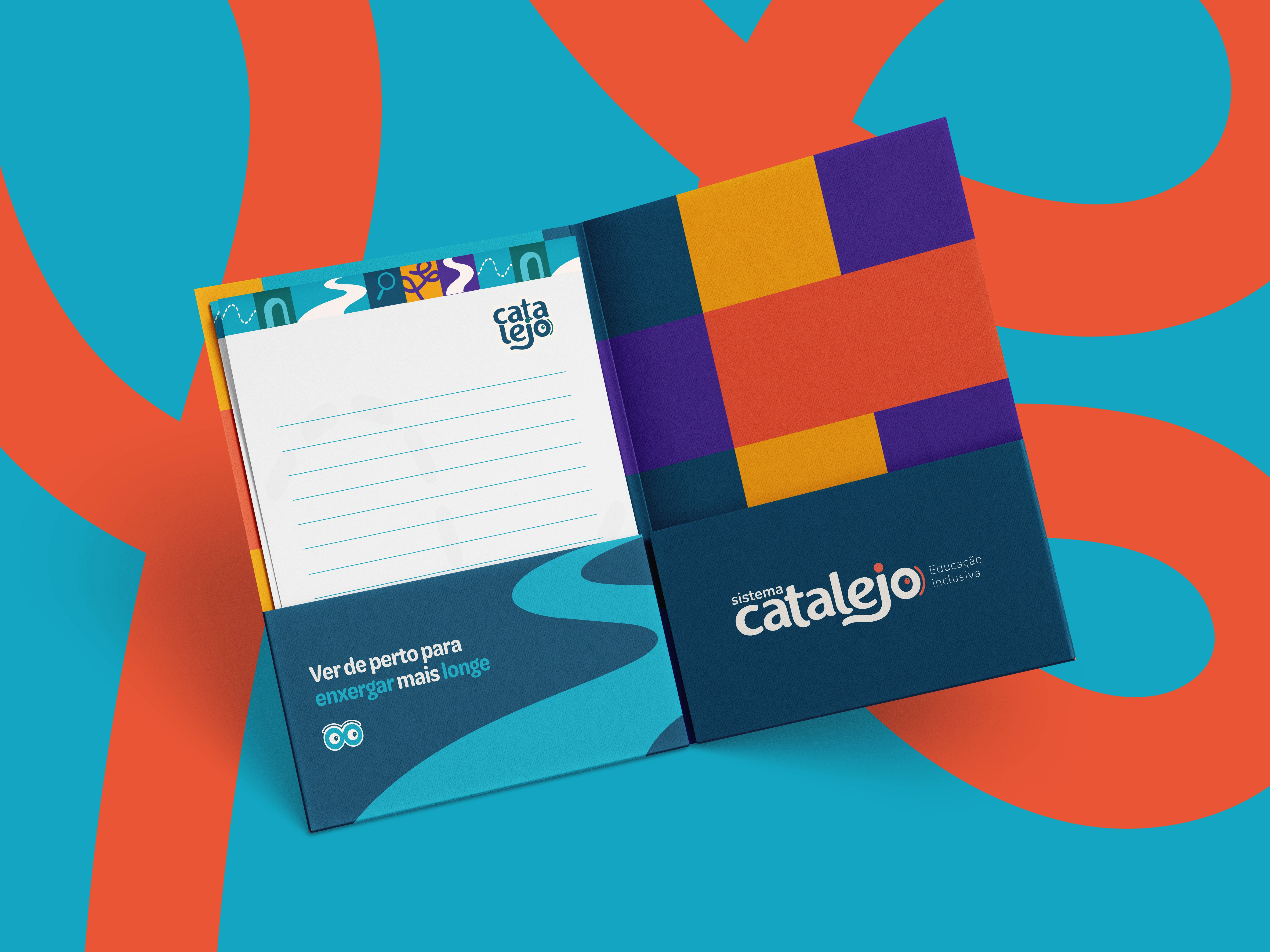
Catalejo stationery folder
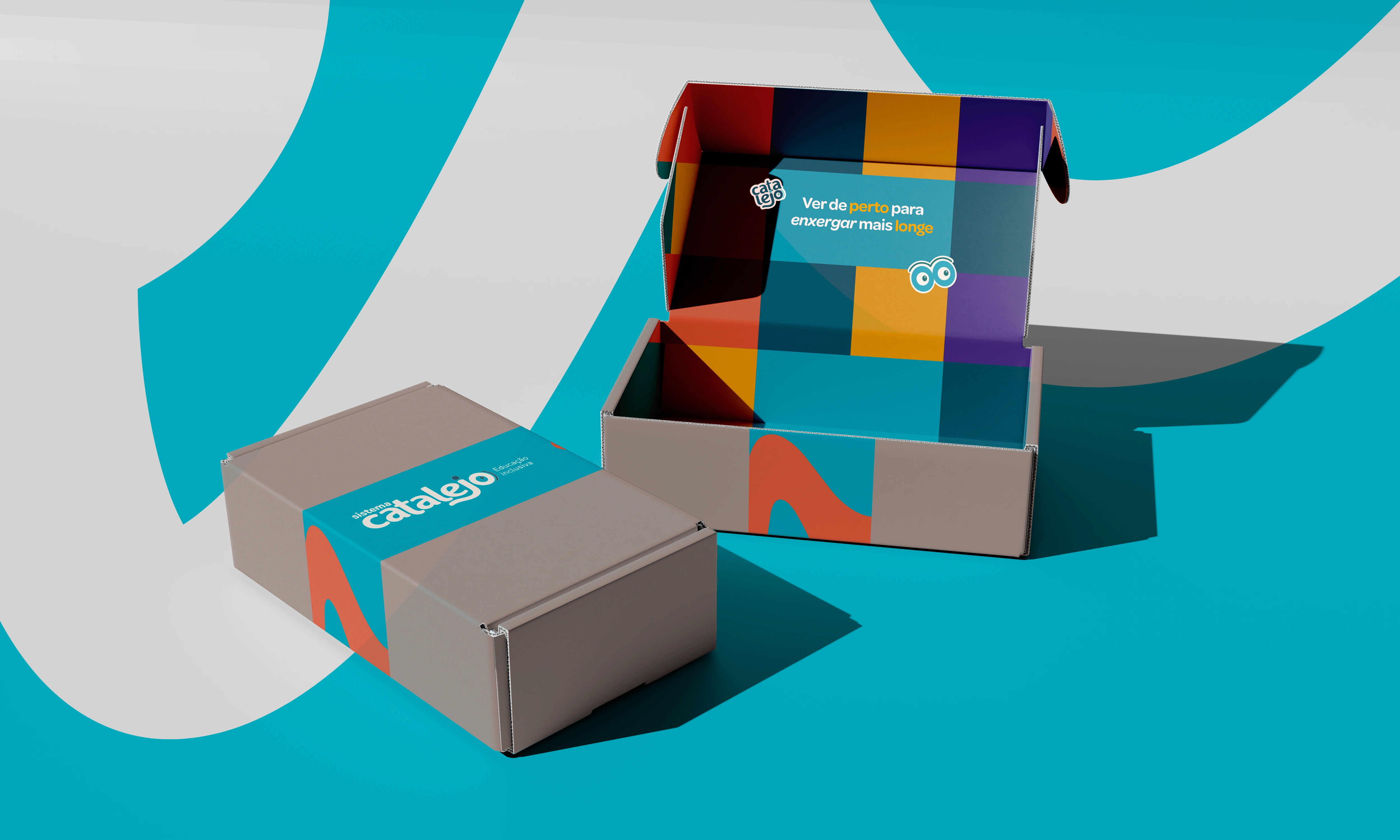
Catalejo packaging
Catalejo brand identity application
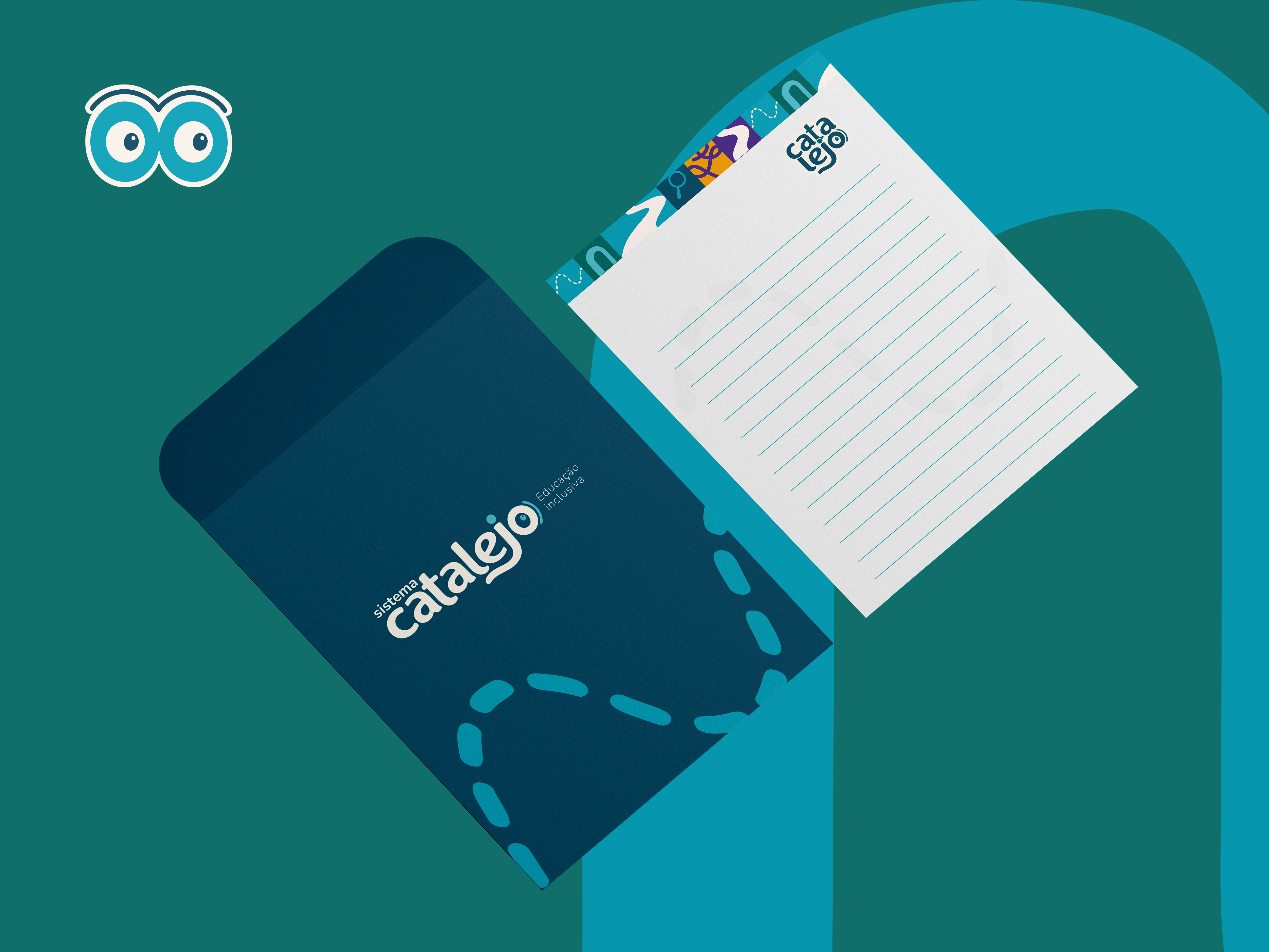
Catalejo stationery
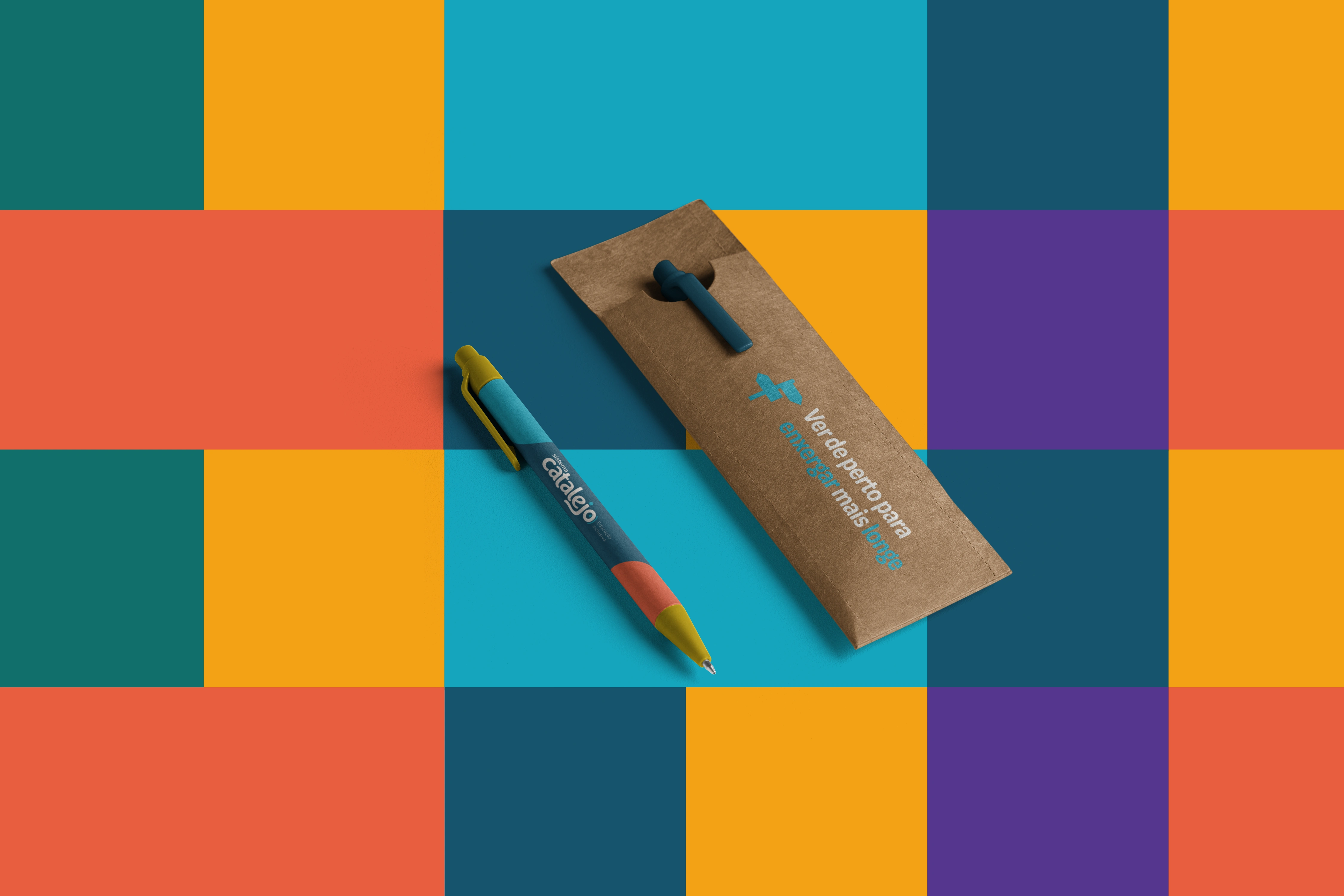
Catalejo pens and case
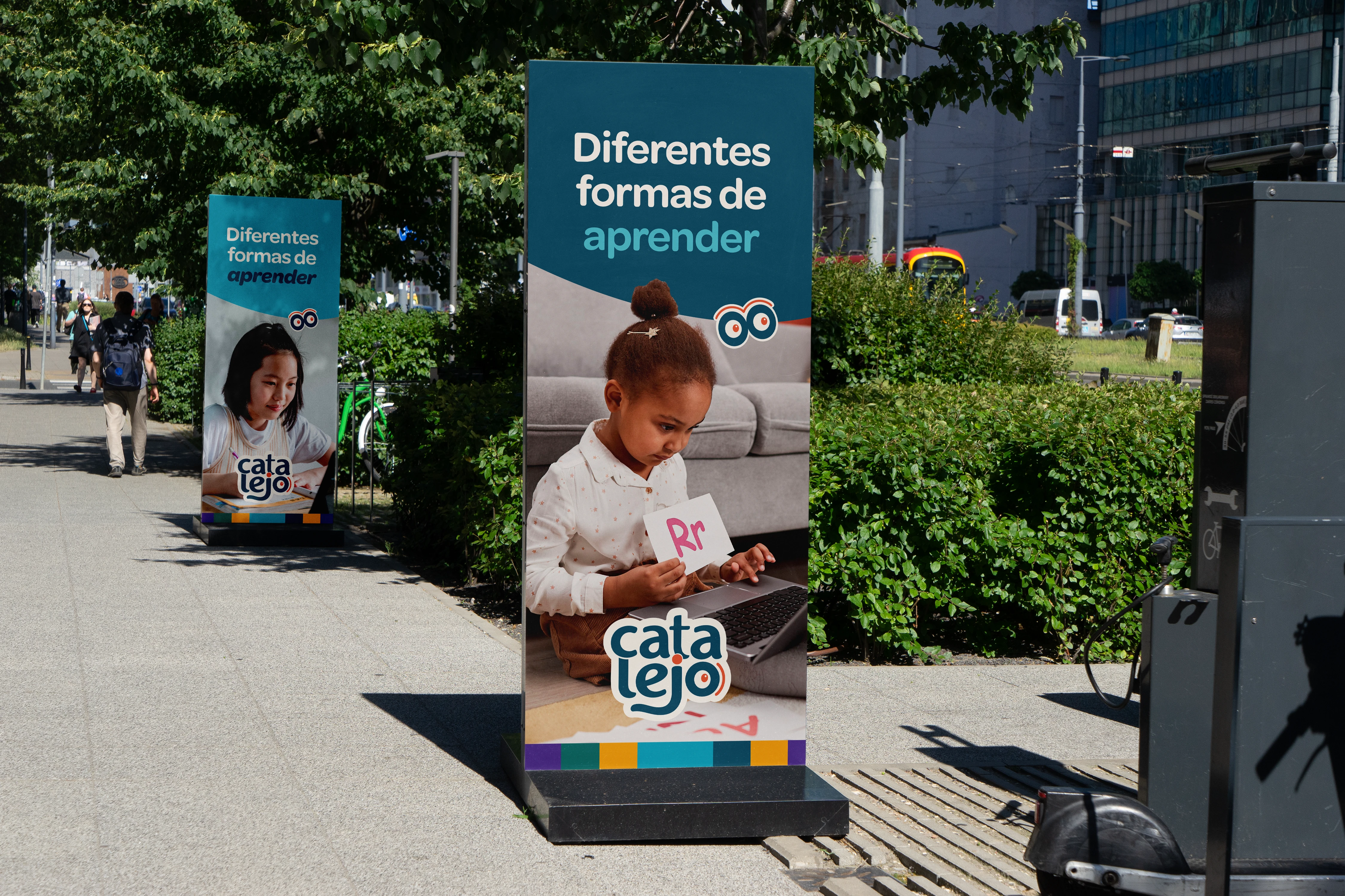
Catalejo banners
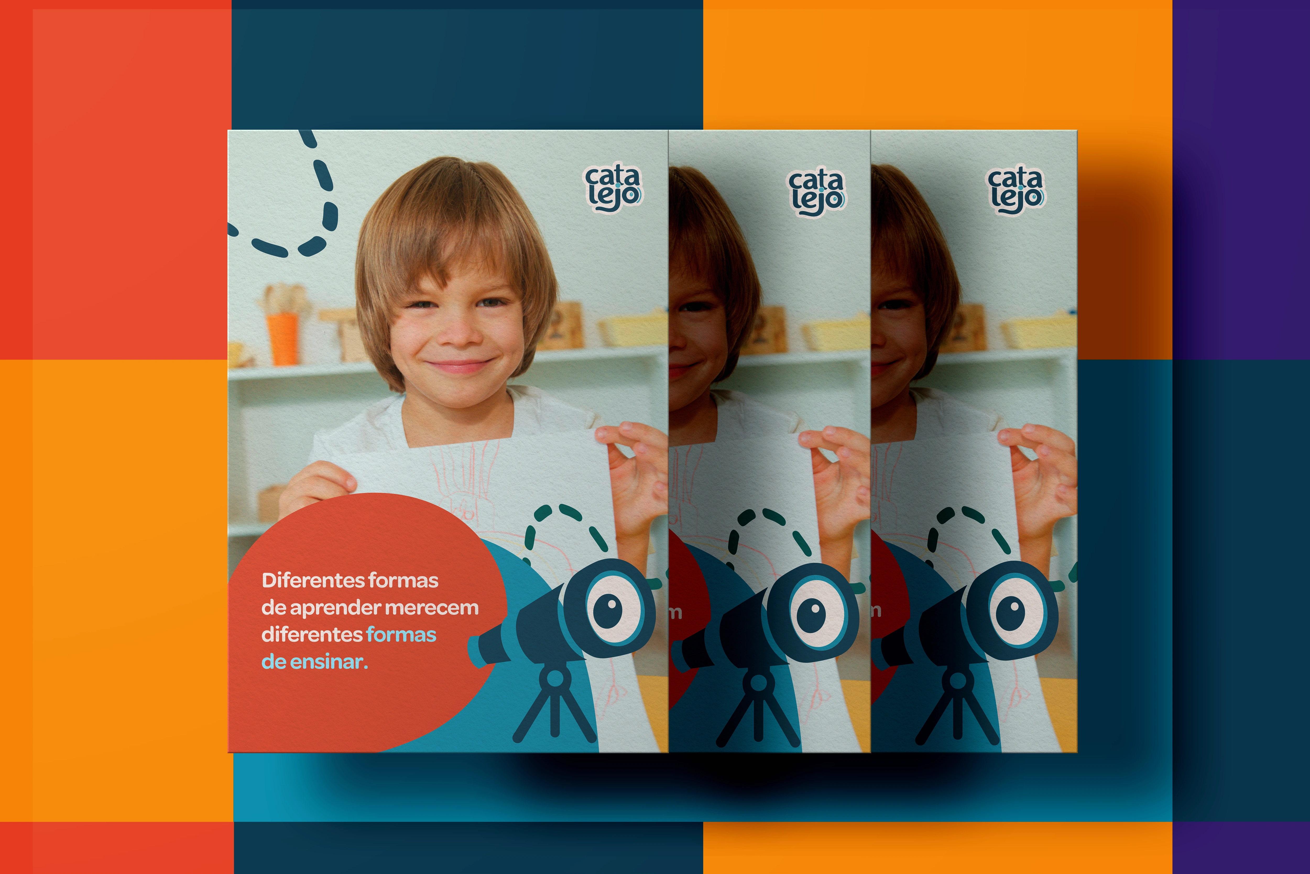
Catalejo visual system
Result
The result is a flexible visual identity designed to support educational materials, digital content, professional development, and solutions for schools. Across every application, Catalejo reinforces the same idea: looking closely at each person is the starting point for expanding their possibilities for learning.
1 like · 5 views · Nov 5, 2026
Visual identity for Catalejo, an inclusive education brand creating learning materials for different ways of learning.
Timeline
Aug 5, 2026 - Nov 5, 2026

