Edvoy: refreshed Student’s Homepage
Project overview
Edvoy, international ed-tech company.
• 300k monthly users.
• 85k+ students counselled from over 25 different countries across the globe.
• 607+ university partners in the UK, Ireland, USA, Canada, New Zealand & Australia
System’s components:
• Web portal
• Mobile apps
• In-house built CRM
Challenge
• Marketing and sales language is too complex and not aligned with the product
• Complicated sign-up process leading to a high drop-off rate
• Fraud issues related to student documents; the goal is to build a bulletproof, automated AI system for application validation without requiring counselors
• Manual inputs, multiple communication channels, and unethical practices by competitors (e.g., stealing student details, double agents, missing or hidden documents)
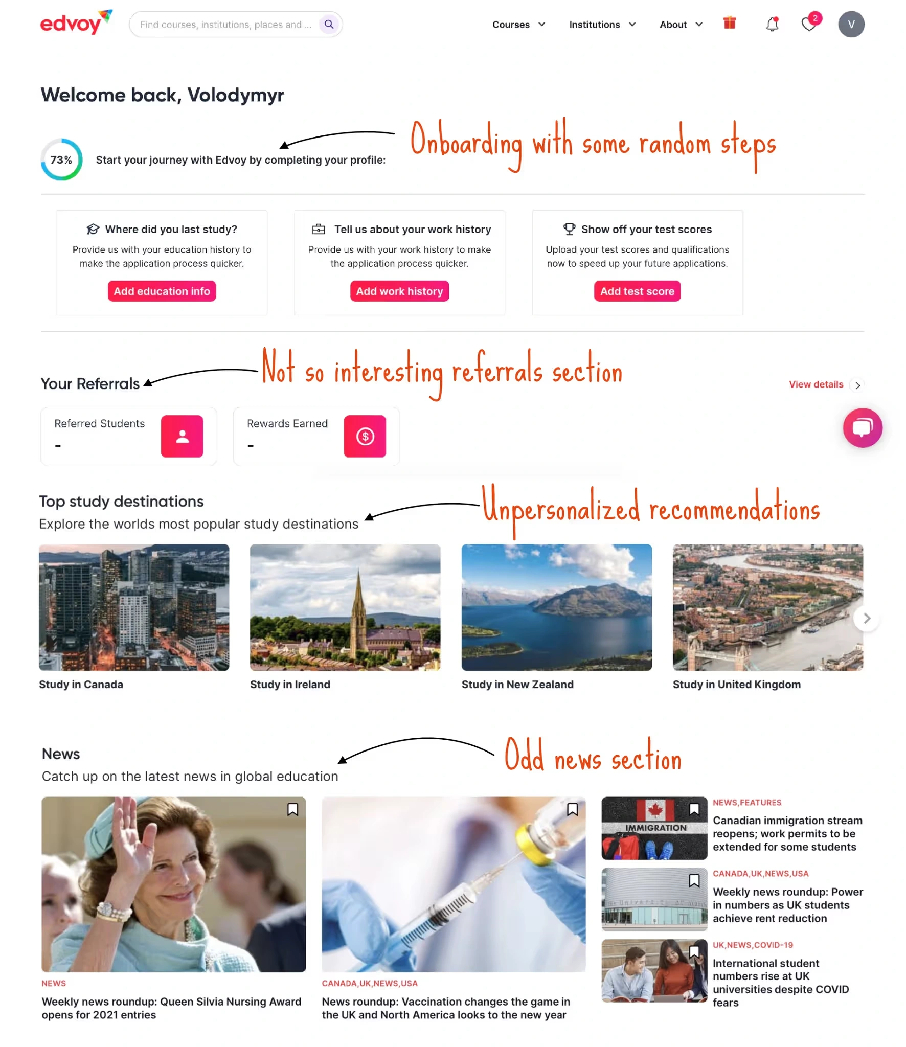
The company had a very basic and outdated user profile page, which is a crucial part of the service. Students use this page to upload documents and add personal details
We received a lot of feedback from students saying that the page is not user-friendly, and it’s often difficult to understand what the next step in their journey is.
Approach
As a Staff Product Designer and Individual Contributor, I led the project to refresh the Student profile page. The goal was not only to enhance its visual appeal but also to synchronize it with the feature set of the mobile app and the feature set of our CRM.
We analyzed user feedback and conducted a series of experiments. We developed a new information architecture, created dozens of low-fidelity prototypes, and gathered extensive feedback from stakeholders and users worldwide
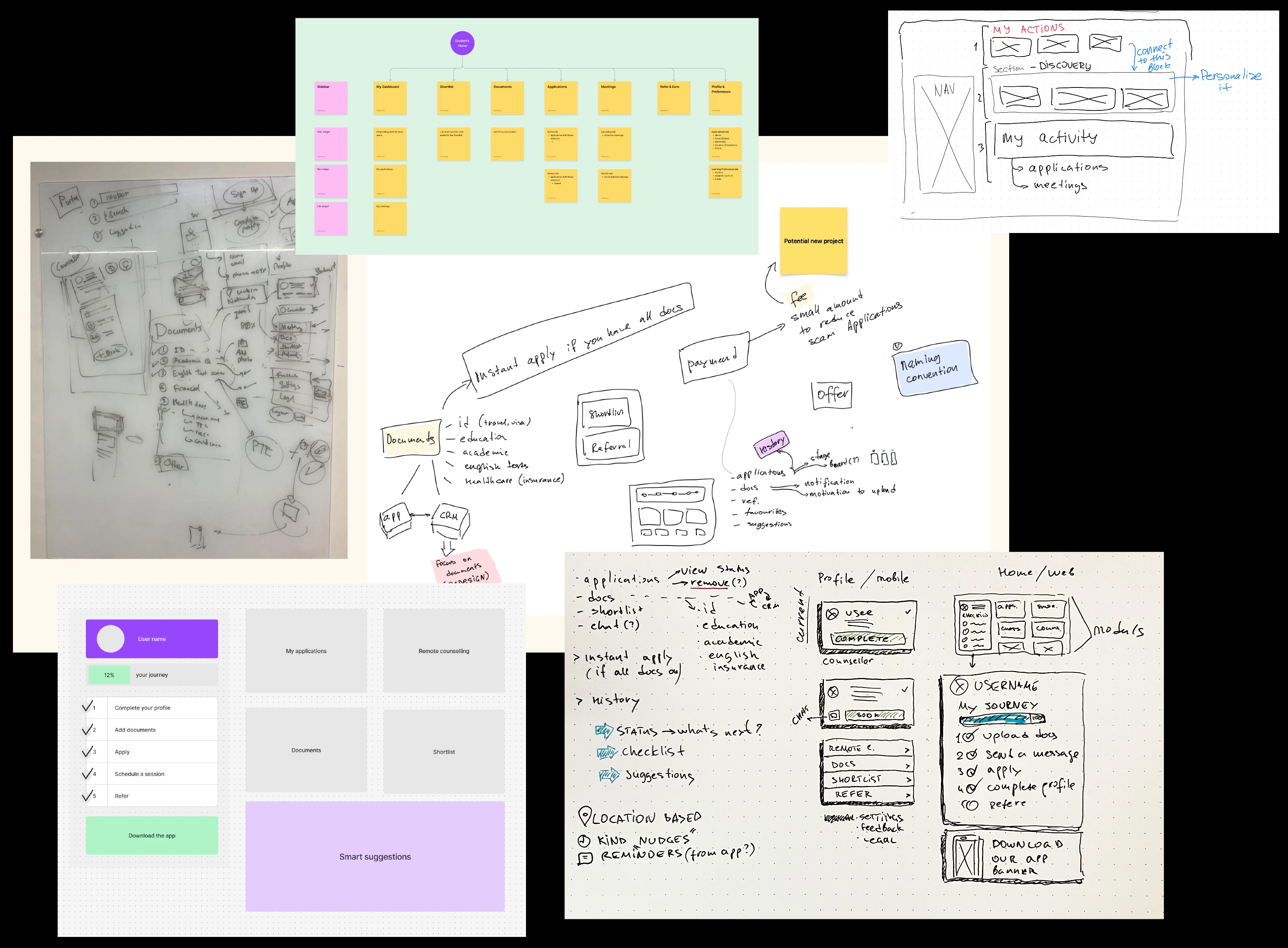
Ideation and early IA
Key Innovation
Synchronization of user experience across platforms
Implementation of user-centric design based on global feedback
Significant improvement in usability and user journey clarity
Outcomes
Remote counseling system
In-app Payments system
Updated Portal desktop + mobile web
Refreshed landing pages
Unified feedback management
Improved referrals program
New sign in and onboarding flows
Impact
The redesign resulted in 62% increase in user engagement, 75% in user satisfaction. We saw 40% growth of completed students applications (a critical metric) and 20% improvement in referrals.
Also, we refreshed our design system and drastically improved collaboration between teams.
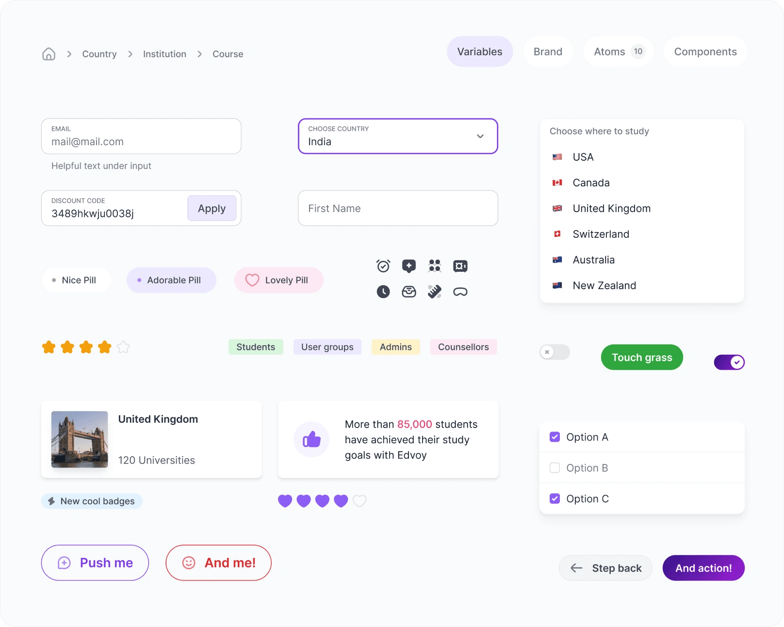
Design system components
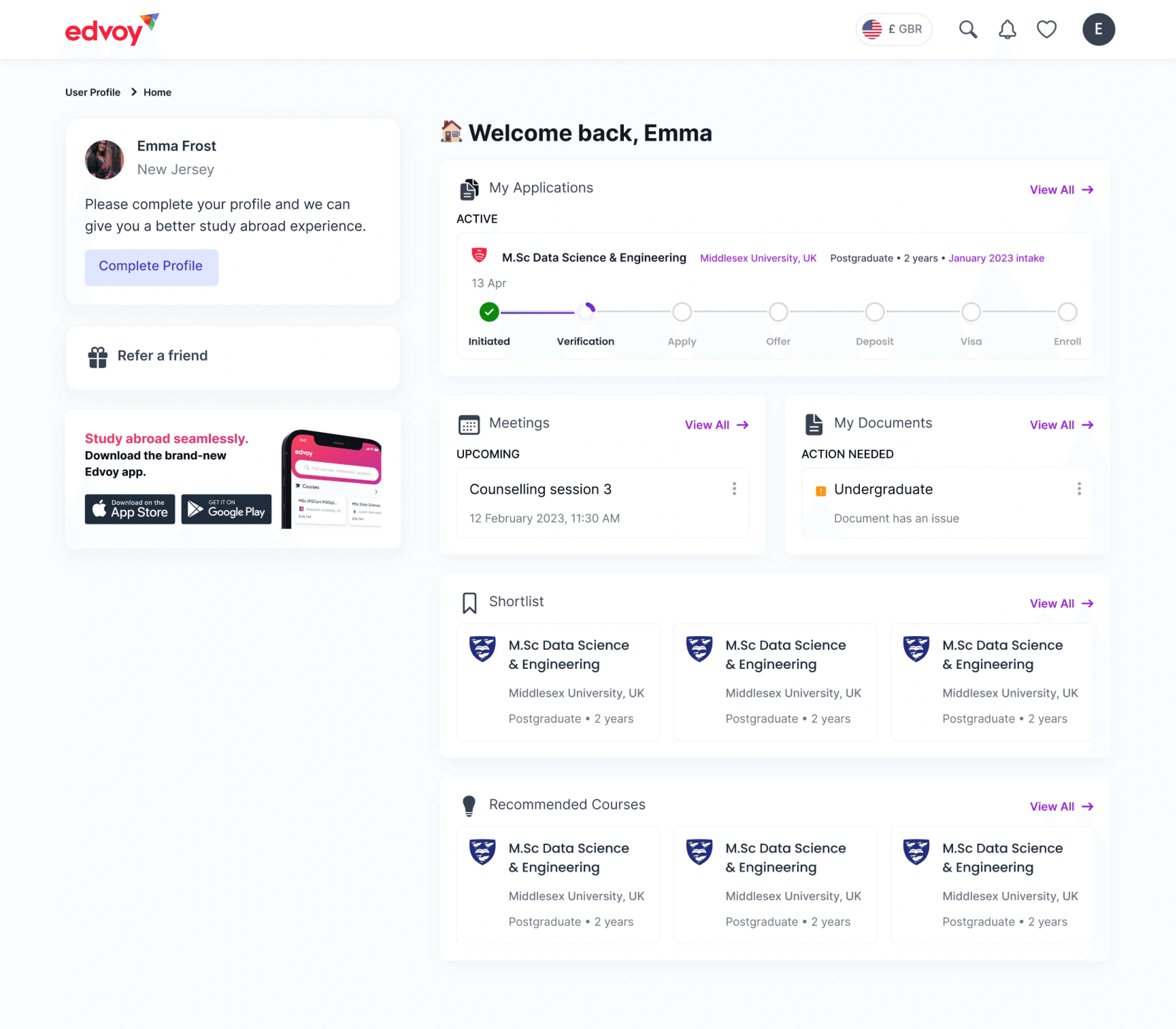
New dashboard
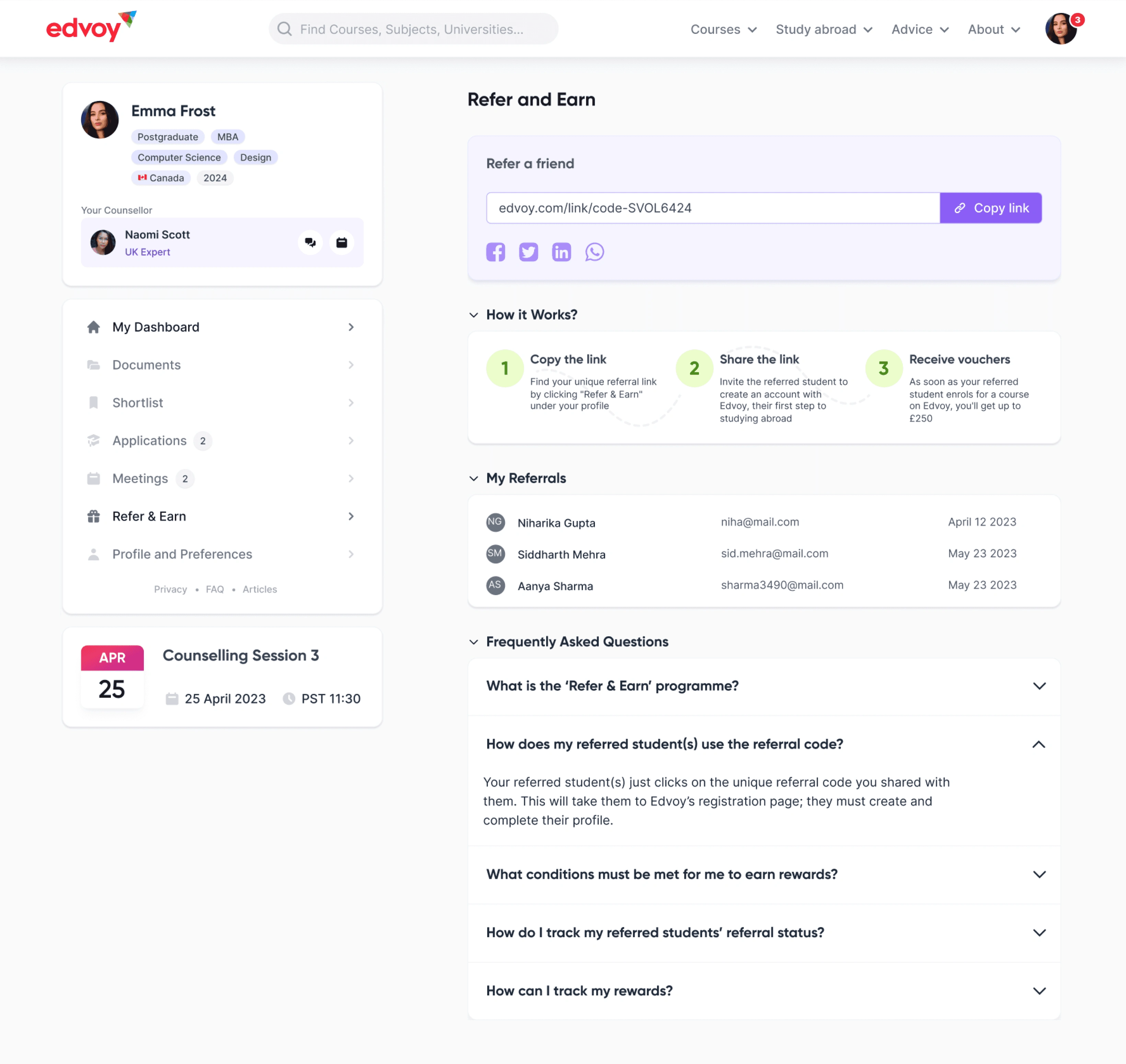
New referral UI
Like this project
Posted Jun 19, 2024
New, refreshed Student’s Homepage. From ideation and research to high-fidelity prototypes and successful launch
Likes
1
Views
47
Timeline
Jun 21, 2022 - Apr 21, 2024
Clients

Edvoy


