Built with Framer
Redesigning personal website
Designer’s portfolio has no fixed “ready” state. It’s more about relishing the journey, exploring new, beautiful, and hidden ways, choosing different tools and techniques. And learning how to see beauty
"The journey is all. The destination is beside the point" – Lao Tzu
Recently I've redesigned my personal website (aka "portfolio") from scratch. It was an ambitious project as I needed to sort out how to display a lot of visual works both on desktop and mobile.
I started from a hero section and a navigation menu:
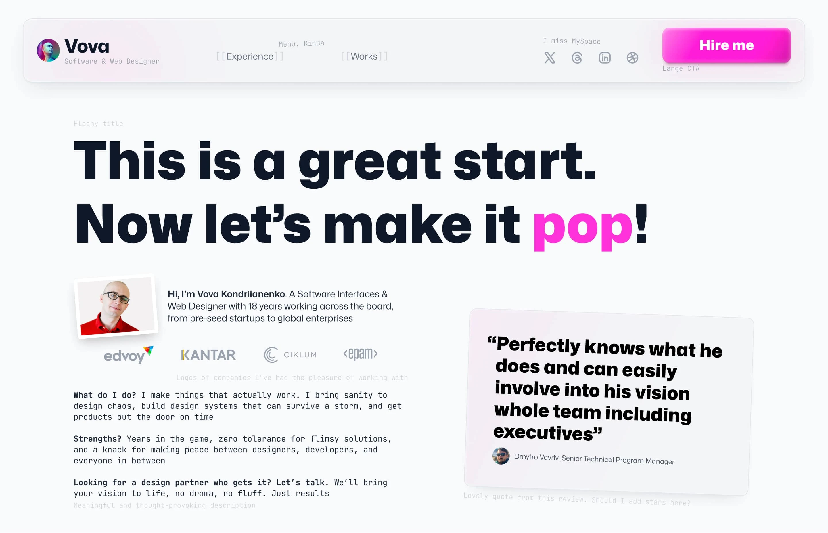
Desktop version
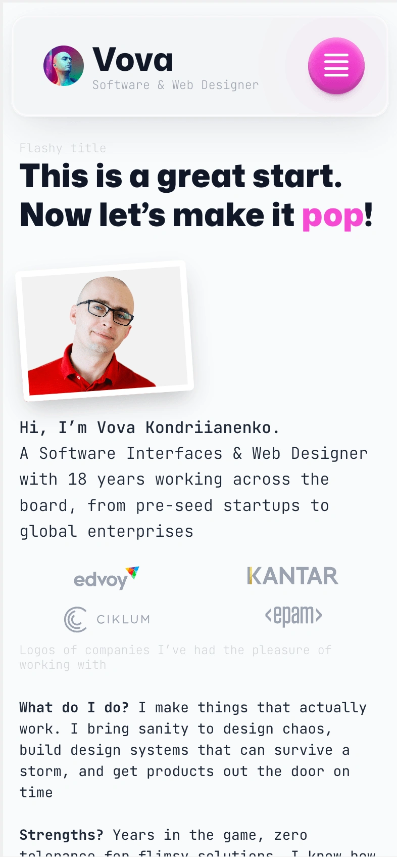
First scroll on mobile
I used bold typography with Mona Sans as a primary font and JetBrains Mono as a secondary one. For a primary color, I chose intensive magenta (#F649D3).
For displaying my favorite visual works, I used a bento grid. It works great on desktop and mobile.
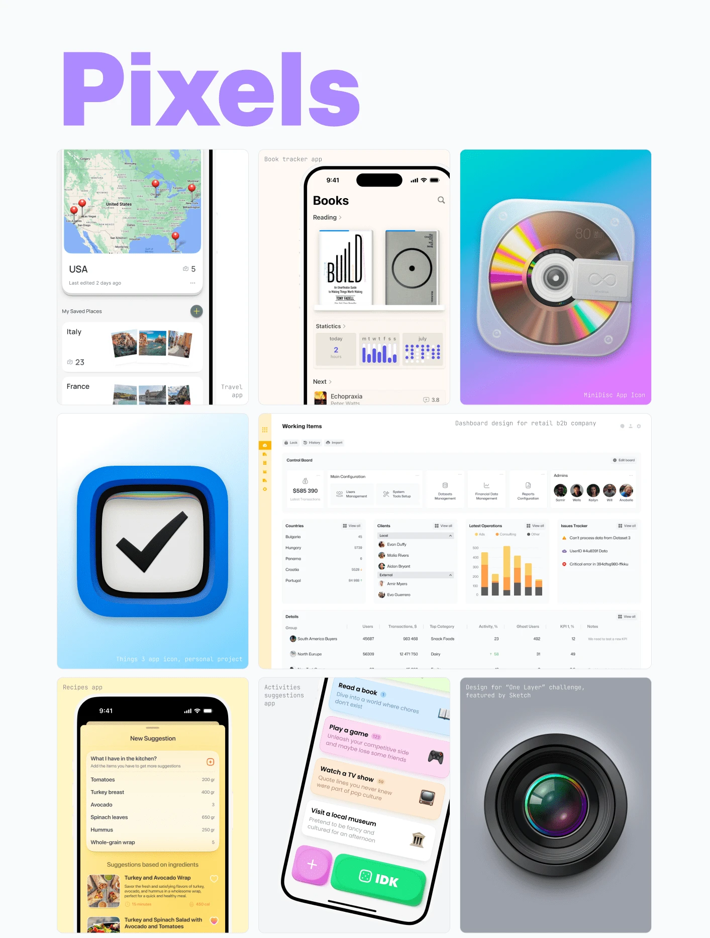
Desktop
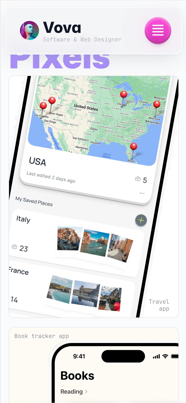
Mobile
For Projects section I used huge cards with bold titles
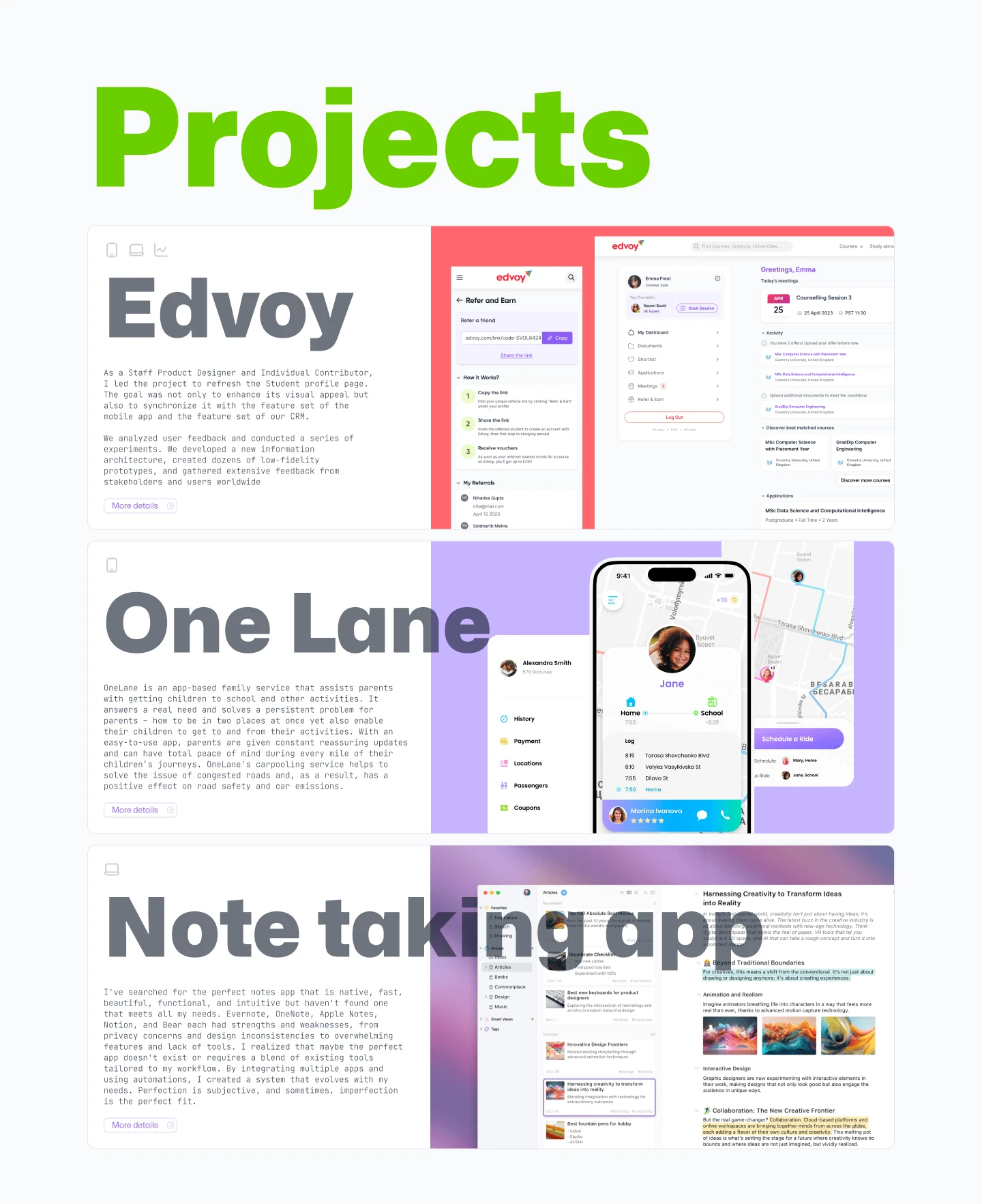
Desktop
And my favorite part is "About Me" section:
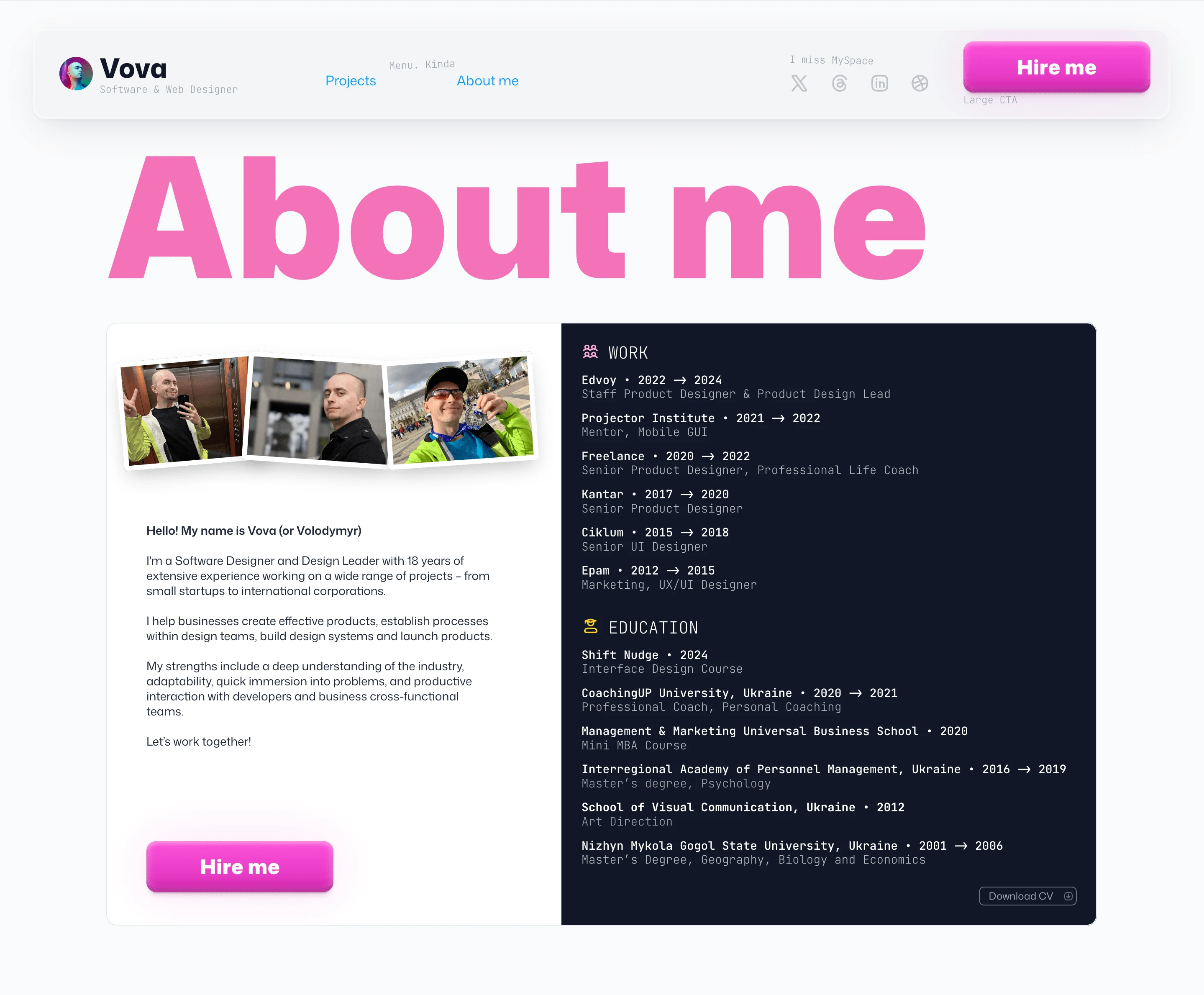
It has a two column layout and playful vibes
Final view:
Feel free to check a live version here: https://www.entrpswn.design

Like this project
Posted Nov 18, 2024
A fresh redesign of my personal website. Crafted in Figma, built in Framer, and designed to showcase creativity seamlessly across desktop and mobile
Likes
0
Views
23


