Creative Direction for Daily Dose Juice Therapy
Daily Dose Juice Therapy, offers a delicious and convenient alternative for daily nutrition through high-quality, cold-pressed juices.
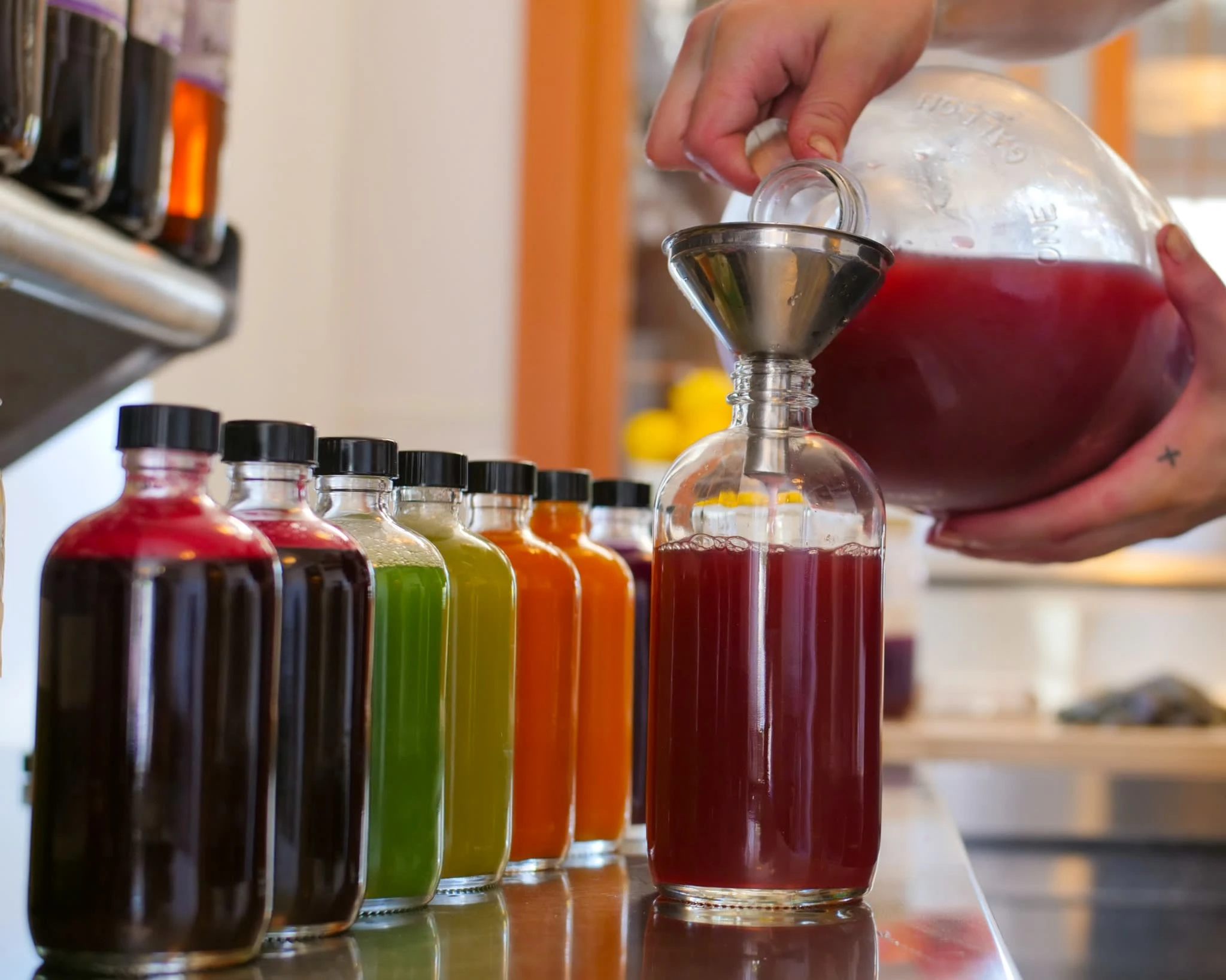
Photo of the product before the new labels
About the Brand
Daily Dose Juice Therapy utilizes therapeutic and medicinal plants to increases the body's ability to function optimally.
Guided by Ayurvedic nutritional principles, The Gerson Institute protocols and raw food methods, their juice intends to have therapeutic benefits for digestion, cancers, autoimmune diseases, infections and mental health.
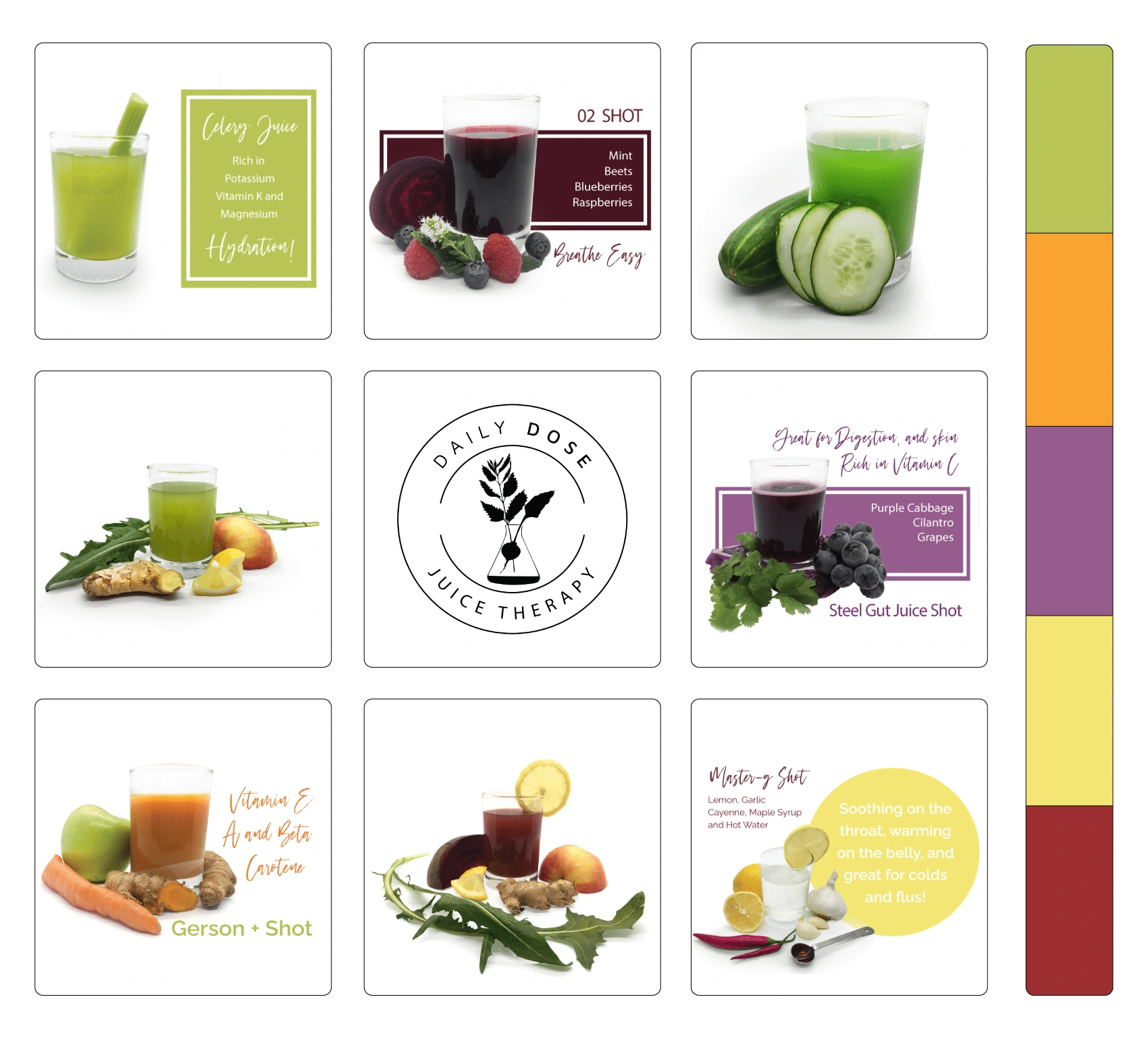
Mood board featuring my product photography
The farther we get from food’s natural state the more harmful it becomes to our body. This is a good reason to fill our bodies with life sustaining ‘alive’ and ‘cleansing’ food to not only help our foundational health, but to combat disease.
Laura Matthews - Owner of Daily Dose Juice Therapy
Brand Concept
For Daily Dose Juice Therapy, the design ethos revolves around simplicity and elegance. I have intentionally chosen a clean and minimalist aesthetic, to reflect the purity and simplicity of the brand’s philosophy.
By embracing a minimalist design, it places a spotlight on the essential aspects of the products and it's the high-quality organic ingredients. The absence of distracting elements in the visuals allows customers to focus on nutritional integrity of the the cold-pressed juices.
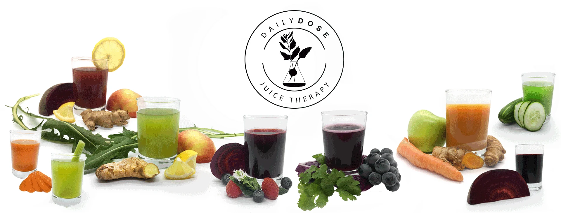
«Balance in every bottle» is the idea to appeal to the target audience.
The theme effects harmonious balance of nourishment and flavor, empowering individuals who prioritize holistic well-being without compromising on taste.
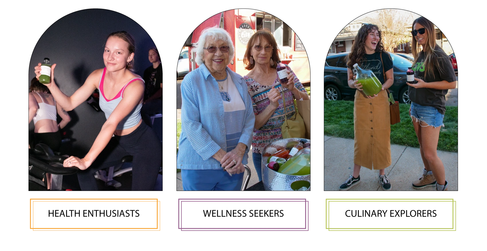
Daily Dose Juice Therapy - Target Audience (Photography by me)
Label Concept
The label design aimed to appeal to consumers seeking a holistic approach to their health and nutrition. By integrating the Yin Yang symbol, it not only reflects the brand's commitment to wellness but also communicates a powerful message of balance and vitality, aligning with the core values of Daily Dose Juice Therapy.

Daily Dose Juice Therapy Label Design Evolution
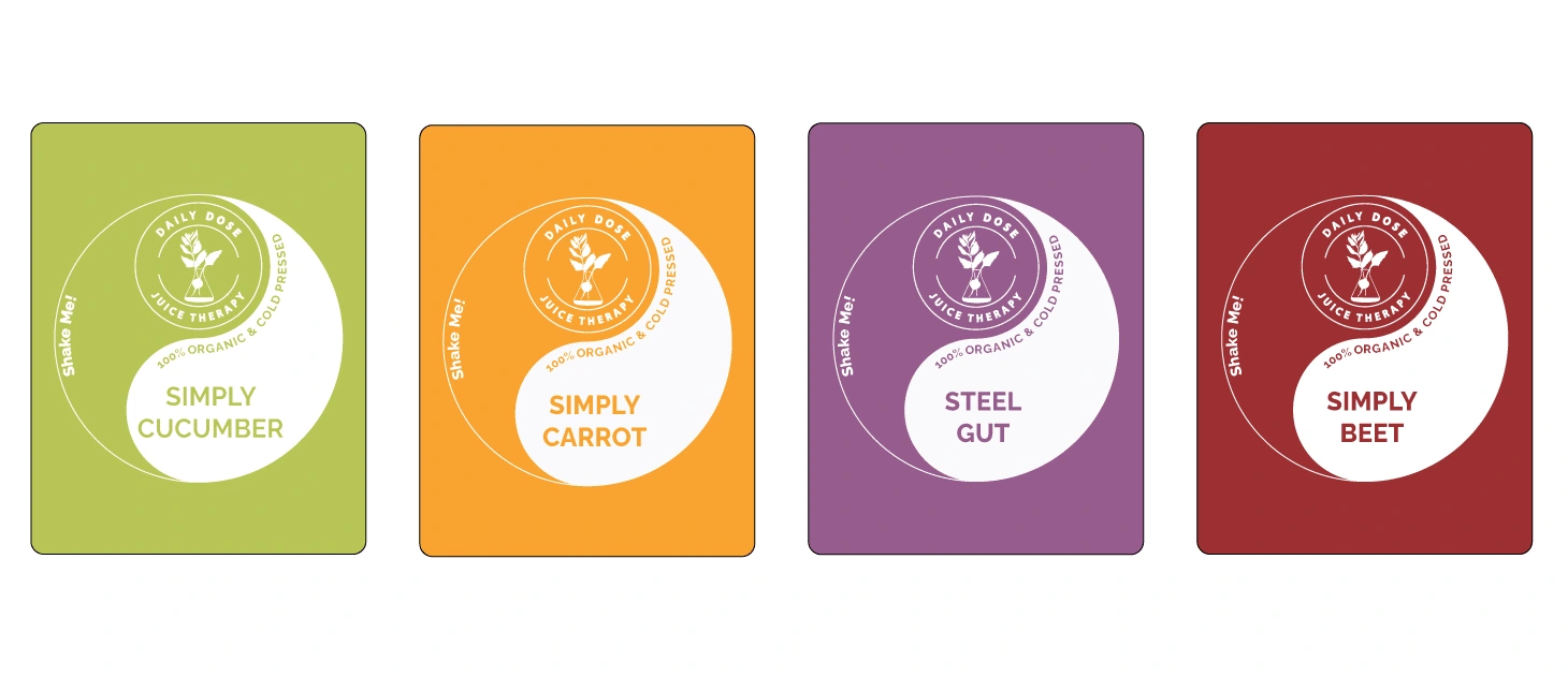
Label Design Showcase
The white label serves as a canvas for the vibrant and natural hues of the cold-pressed juices to shine through. This intentional use of a neutral color palette amplifies the vibrancy and purity of the juice, allowing consumers to visually connect with the freshness and quality encapsulated within each bottle.
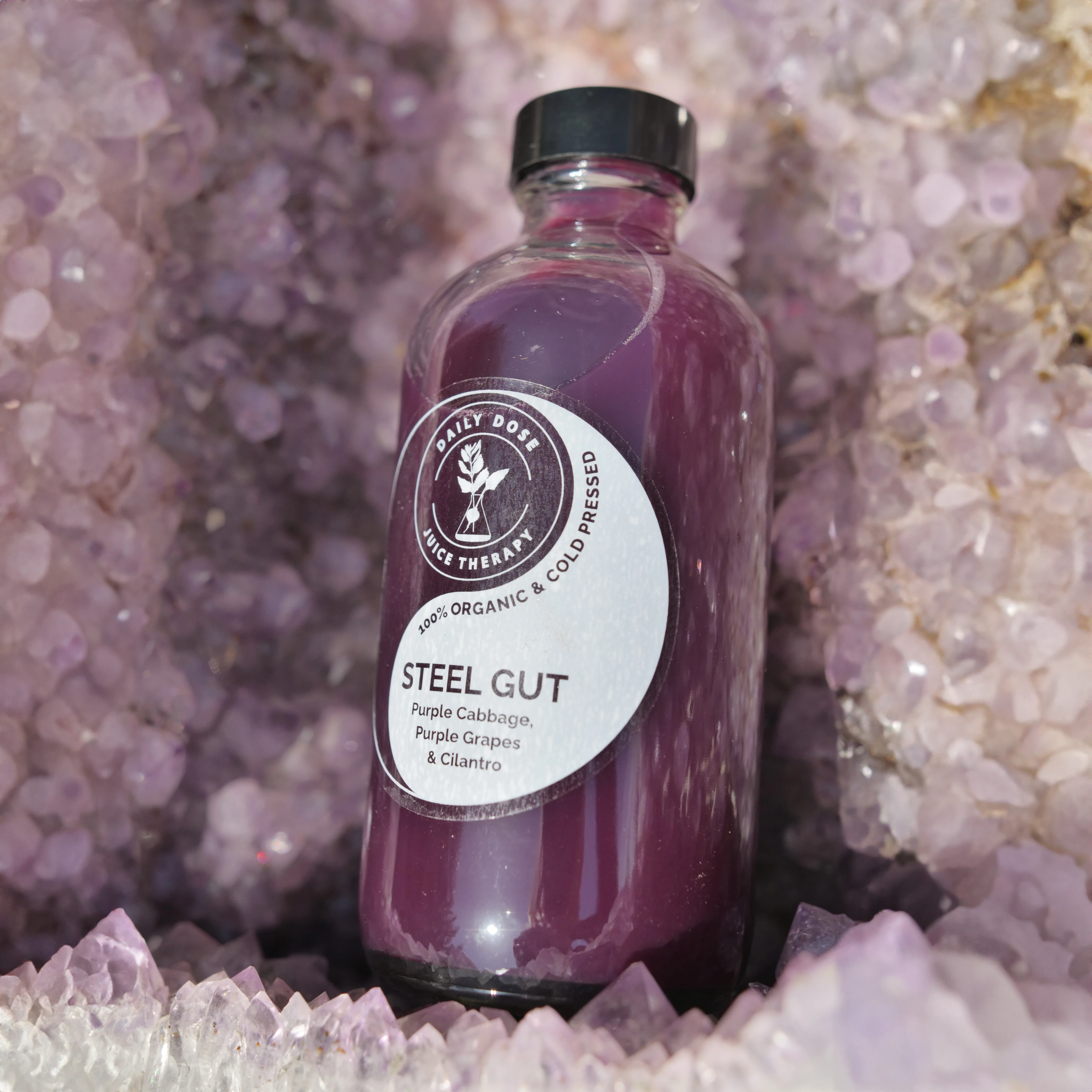
Label - Printed in small batches at the local print shop
Font System
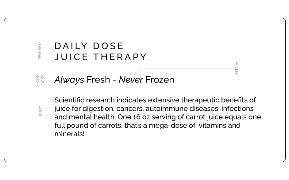
Daily Dose Juice Therapy - Font System
The choice of font reinforces our commitment to a clean, modern, and elegant visual language, aligning seamlessly with the brand's minimalist aesthetic. This versatile typeface family has an extensive range from the delicate Thin and commanding Bold weights, that ensures a harmonious balance between sophistication and readability.
Menu Design
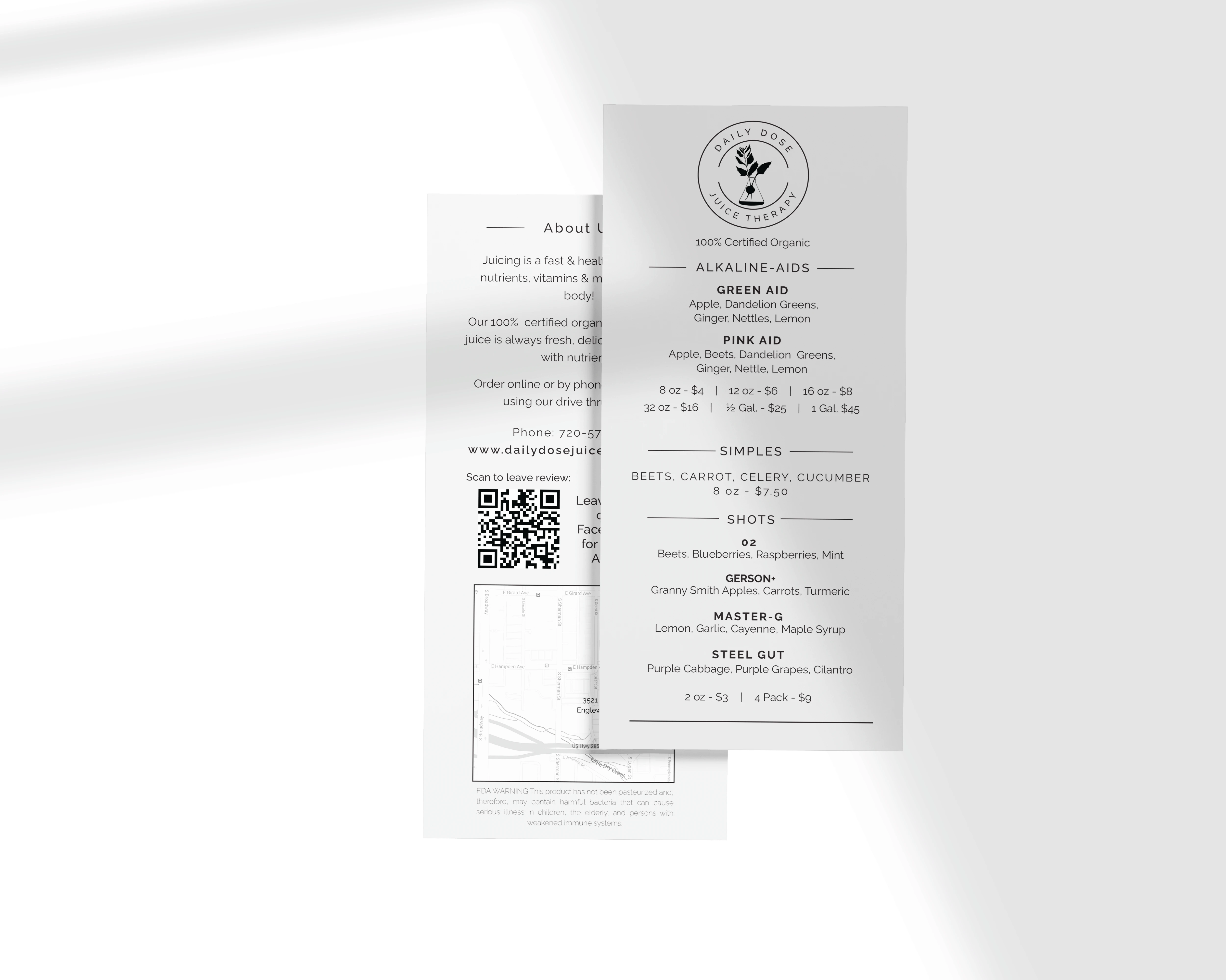
Font and Back of Menu - Featuring a Map & QR code to order online
The menu design for Daily Dose Juice Therapy is crafted with utmost clarity and readability. The menu is intentionally designed to be edited on Canva, empowering the team to make real-time updates and to easily print 3 menus at a time on durable card stock right from their shop printer.
Website
Objective: Craft a mobile friendly website, ensuring smooth processing of bulk orders with set pick up times, deliveries, and grab-and-go requests, while having an integrated portable POS systems.
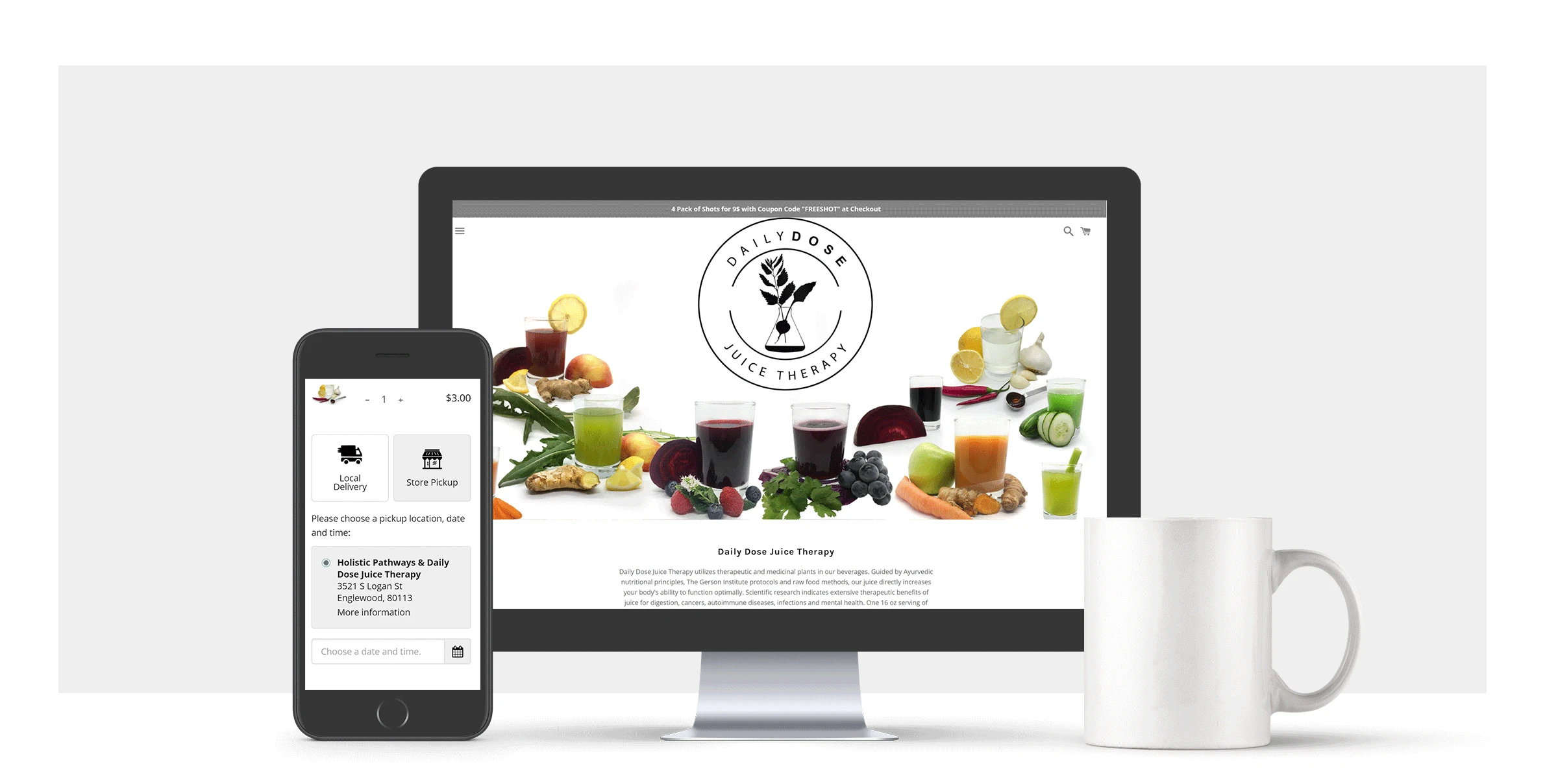
The website reflects a minimalist aesthetic, prioritizing clean lines and mobile responsiveness. The color scheme, inspired by the brand's commitment to purity, seamlessly integrates with the clean, white canvas to enhance the user's visual journey.
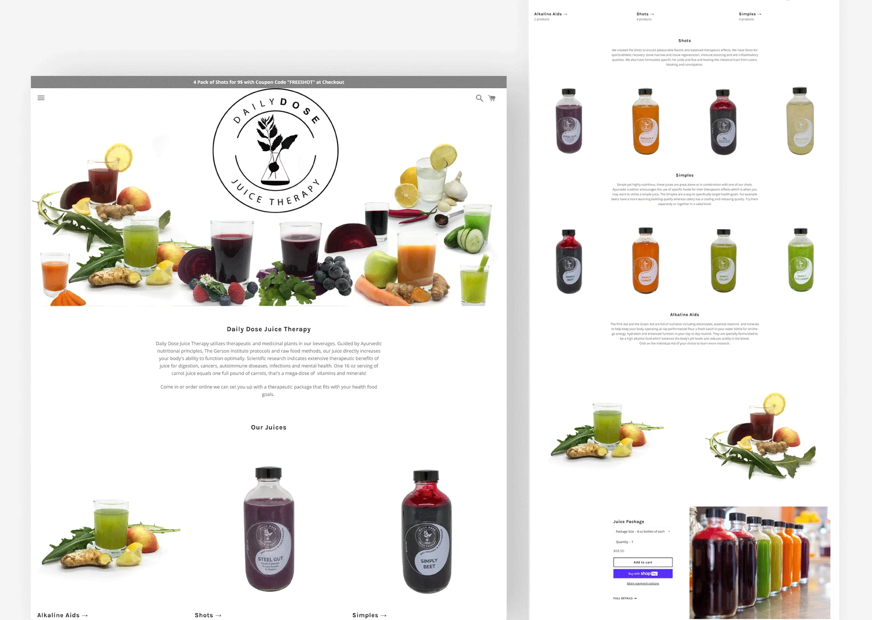
It aimed to communicate the brand's values of wellness, rejuvenation, and physical recovery while providing a seamless user experience.
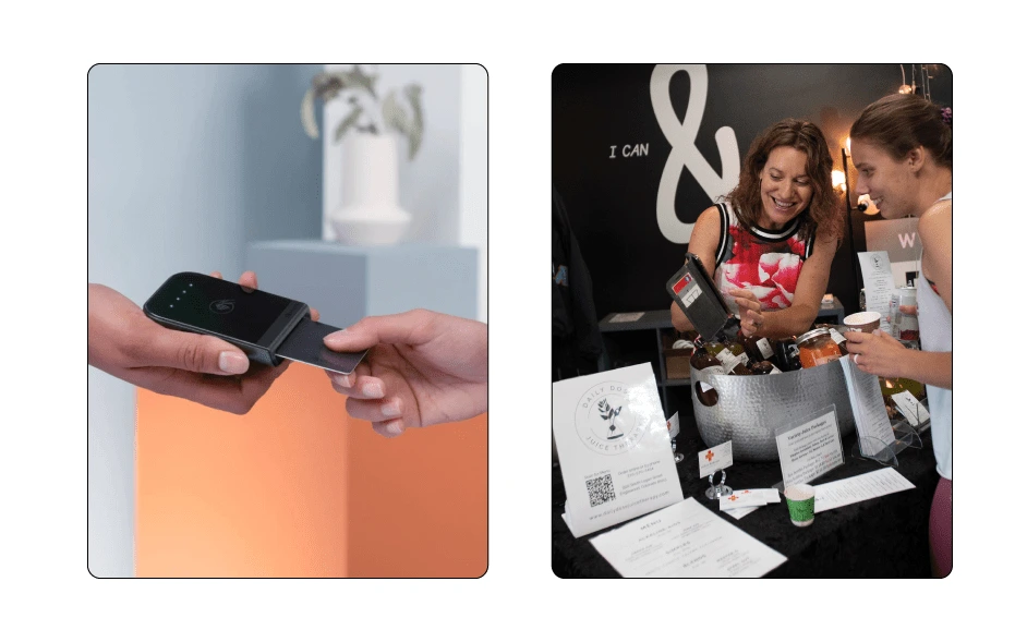
Example of using the POS system at a pop up shop
The integration with a portable POS hardware system, ensures secure and efficient payment processing online or at pop-up locations.
Design highlights:
The website features a user-friendly interface with clear navigation and calls to action. The design is also visually appealing, with high-quality images and the copywriting is persuasive and highlights the benefits of Daily Dose Juice Therapy.
Like this project
Posted Feb 9, 2024
Website + Product Design + Product Photography. Selling organic cold-pressed juices as a wholesome alternative for daily nutrition and essential vitamins.
Likes
0
Views
20


